
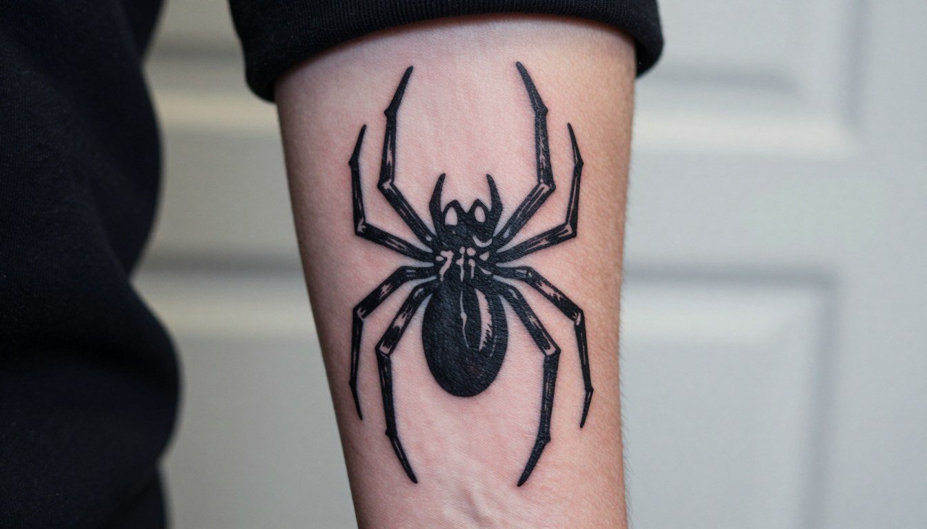
Solid black emblems often outlast the full red-and-blue comic palette when it comes to Spider-Man logo tattoos. Fans chasing the classic colors are still getting great results. Many collectors now pick a black-forward emblem for longevity, then add red accents later if they want the full suit look. The first idea below starts with the symbiote mark and why it holds up on the forearm.
1. Symbiote Emblem on Inner Forearm

The symbiote spider mark reads instantly and ages well because its silhouette is the feature that matters most. For the inner forearm this is usually a one-session clean blackwork piece that sits at medium pain and heals predictably. Bring a reference showing exact leg angle and ask the artist to bump line weight slightly so fine web details do not blur by year two. Styling note: roll up a short sleeve tee on session day so the artist has clear access and your healed photo can show the emblem cleanly.
2. Movie-Era Logo on Outer Thigh
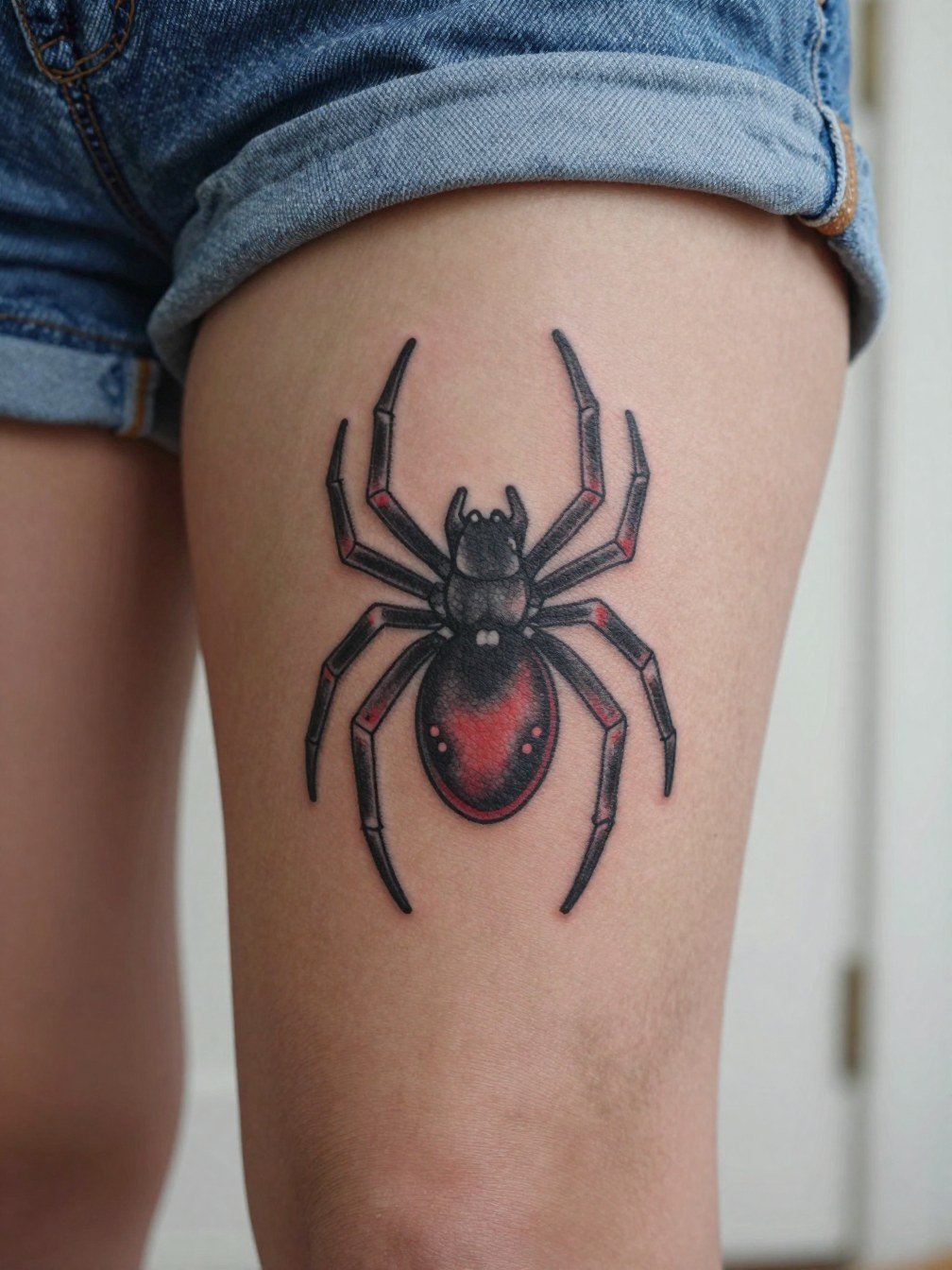
Thigh tattoos let you scale a film-era emblem large enough for crisp linework without crowding. Session time is typically shorter than a full portrait, and pain is moderate because of thicker tissue. For a Tobey-style homage, decide whether you want black-and-gray shading or a red infill. If you choose red, plan for a touch-up discussion since red loses saturation faster. Show-off pairing: plan to wear loose athletic shorts after healing so the piece is visible in summer while avoiding friction during the first two weeks.
3. Three-Logo Cluster for Spider-Verse Collage
A small suite of suit logos reads as a fandom montage and gives room to add more over time. Each emblem should be spaced so the legs do not merge when healed. During your consultation bring scale comparisons showing three sizes at arm level so the artist can map negative space between marks. This layout pairs well with a muscle tank top for easy showing and to keep the area accessible during session breaks.
4. Wraparound Calf Emblem
Wraparound logos track the curve of the calf so the emblem reads from multiple angles. The calf can tolerate saturated black, which helps with longevity. Expect one to two sessions and a bit more time on each pass because the artist needs to follow muscle contours. Session wear: bring cuffed joggers so you can roll the pant leg without pinching the fresh ink. Common mistake is asking for too much fine detail in a wrap; keep the silhouette bold for the best result.
5. Logo Integrated into Mask or Face Panel
Merging emblem and mask gives the piece character without a full-face portrait, and it is easier to age than a tight realism head. On the upper arm you will feel moderate pain and the session runs one to two hours depending on shading. For the consultation bring a mask reference with exact placement of the spider on the chest area so the artist can balance negative space. Showing it off works with an open overshirt that frames the panel without hiding the art.
6. Chest-to-Ribcage Panel Emblem
Large chest panels let the spider emblem breathe and hold graphic detail for years, but they take multiple sessions and a higher pain tolerance. Discuss how the design follows the chest contour and whether you want a full black panel or a negative-space logo that uses skin as an interior color. For session day wear, bring an open button-down shirt so the artist can reach the area without fabric interference. Expect a touch-up after healing on larger shaded fields.
Session Day Picks
This short list helps with the small, high-contact placements above, where access and initial bandaging matter most.
-
Stencil transfer paper kit. Previews the exact linework placement on your skin so you can confirm scale for the symbiote and movie-era marks before the needle starts.
-
Topical numbing cream. Applied before the session it can make chest and ribcage panels easier to get through without compromising linework.
-
Thin protective film roll. Keeps high-friction spots like the knee-adjacent piece clean during the first week when movement is constant.
-
Fragrance-free body wash. Gentle cleansers are easier on fresh color and avoid unnecessary irritation when rinsing the area.
-
Aquaphor healing ointment. A thin layer for the first few days helps protect lines and saturated black without clogging the surface.
7. Small Forearm Logo for First-Timers
The forearm is an excellent spot for a first Spider-Man logo because it is easy to show or cover and the area holds linework well. If you want a small emblem, make sure the web legs have at least a millimeter of spacing so they do not blur together over time. Bring a one-to-two-inch mockup and ask the artist to show how it reads at both sizes so you can choose. Session wear suggestion: a black henley shirt that you can roll up for access and still look put together in photos.
8. Red-Filled Emblem on Shoulder
Red draws the eye and reads as an unmistakable Spider-Man palette, but it does demand maintenance. One camp of fans argues the red is essential to authenticity. Another camp favors black-forward emblems for longevity because red tends to lose saturation faster. If you choose red, plan a touch-up at six to twelve months and again at two to three years for the best long-term saturation. For session wear pick a tank top so the shoulder is unobstructed and the artist can angle shading cleanly.
9. Skin-Tear Reveal Panel
The torn-skin reveal is dramatic and polarizing in fandom spaces. One group thinks the reveal is overdone and can read gimmicky when scaled too small. The other group values the narrative punch and thinks it creates a memorable piece. If you choose this route, scale it large enough so the torn edges and underlying emblem keep their shape after healing, and expect multiple sessions for texture shading. Session clothing: wear a sleeveless tee so the artist can work uninterrupted around the arm.
10. Miles Morales Variant on Calf or Forearm
A Morales-inspired silhouette broadens the fandom reference without requiring elaborate color. On the calf the design can be a little taller to follow muscle lines. Discuss how much red you want as accents and whether the emblem should be solid black or an outline with red fill. For the session wear bring rolled hem shorts for calf access and comfort. Expect touch-ups on red accents sooner than on black saturation.
11. Multiverse Sleeve: Multiple Suit Logos
A sleeve built from suit logos tells a Spider-Verse story and gives room to expand. Plan this as a multi-session project and map how each logo interacts with nearby tattoos so nothing fights for space. Bring a composite mockup and ask the artist about sequencing so larger logos do not overpower smaller emblems. For showing off, a muscle tank top frames sleeve panels cleanly.
12. Knee-Adjacent Bold Emblem
Knee-area work takes more frequent touch-ups because the joint moves and the skin flexes constantly. For pieces here prefer bold silhouettes rather than fine detail, so the emblem holds. Wear loose shorts the day of the session and expect the artist to warn about extra follow-up. Session wear suggestion: athletic shorts that do not press against the area during healing.
13. Negative-Space Logo on Thigh
Leaving skin as negative space reduces the need for color touch-ups and creates a restrained fandom mark. For thigh placement scale matters: too small and the negative space disappears. Bring two size mockups so you can compare how the negative forms read at three and five inches. Session wear tip: snap-side athletic shorts make access easier and avoid fabric rubbing during the first week.
14. Thigh Panel of Tobey-Era Emblem with Shading
A shaded thigh emblem lets you get cinematic depth while avoiding saturated red trouble. The larger canvas allows crisp web detail that lasts. Talk specifics with the artist about how much grey wash you want and where to preserve negative skin pockets. For session comfort wear loose shorts that are easy to roll or remove without tugging at the area.
15. Small Chest Emblem Over Sternum
Sternum placement can be more painful and requires careful mapping so the emblem sits centered when you move. One common mistake is asking for too-tight linework across curved anatomy. Ask the artist to mark the midline and show how the emblem sits when you breathe in and out. For session wear, use a fitted sports bra that the artist can work around without you being uncomfortable later. This spot benefits from bold lines to reduce blowout risks.
16. Outline-Only Logo on Outer Shoulder
An outline-only shoulder emblem is wearable and pairs with many wardrobe choices. Shoulders are relatively low-pain but the skin curve can make single-needle work tricky. If you want an outline, specify a slightly heavier single-needle weight so the contour does not soften into a blur over time. For showing the healed result choose an off shoulder top that frames the cap without covering it.
17. Small Logo Behind the Ear or Nape Accent
Behind-the-ear marks are intimate and subtle, making them ideal for a low-profile logo. The area needs shallow linework and an experienced hand because the skin is thin. Expect a quick session but plan for a small touch-up if lines soften. For a discreet reveal wear hair up in a bun; a nice accessory to pair with it is a simple open-back midi dress or similar to show the nape when you want.
18. Minimalist Web Antennae on Wrist
Wrist pieces are quick sessions but they face heavy sun and washing, which speeds fading. For the wrist pick a slightly bolder contour so the antennae remain readable at six months. Avoid asking for ultra-fine single-line antennae unless you accept earlier touch-ups. Session wear tip: a rolled sleeve tee that you can pull cleanly above the wrist helps the artist and keeps the area dry for immediate bandaging.
19. Logo Cluster for a Patchwork Sleeve Finale
A final cluster piece ties the sleeve narrative together and gives a neat visual endpoint. Treat this as a compositional job more than a single emblem. Bring a full-sleeve reference so the artist can balance scale, saturation, and negative space. This is often built in multiple sessions and the lower arm heals visibly faster than shaded upper panels. For showing off, an open overshirt frames the sleeve while leaving the cluster visible.
Frequently Asked Questions
Q: How much should I expect to touch up a red-filled Spider-Man logo?
A: Red typically needs touch-ups sooner than black because it loses saturation in sun and with regular washing. Plan for at least one touch-up in the first year, and expect another at two to three years depending on how exposed the placement is.
Q: Is a small emblem readable on the thigh or chest?
A: Small emblems can look great on the thigh or chest if they are scaled properly. On the thigh you need a bit more size so web legs and negative space remain distinct. On the chest the skin curves so center the mark and have the artist show how it reads at multiple scales before inking.
Q: I want a Spider-Verse collage. How do I find portfolios that show healed multiverse work?
A: Search Instagram and TikTok hashtags like #spidermantattoo, #marveltattoo, #spidermantattooideas, and add your city name to narrow results. Reddit threads in r/Spiderman and r/TattooDesigns are good for seeing how logos aged in real life. Look for portfolios that include both fresh and healed images so you can judge longevity rather than just crisp fresh shots.
Q: Which placements are easiest for a first Spider-Man logo?
A: The outer or inner forearm is the easiest place for first-timers since the skin stays relatively flat and linework reads clearly. The upper arm is also forgiving. Steer clear of high-motion joints like the knee and areas with constant sun exposure if you want lower maintenance.
Q: If I want the classic red color, what should I ask the artist to do during consultation?
A: Specify where the red will sit within the emblem and request a plan for saturation and touch-up timing. Ask to see healed red samples in your skin tone when possible. Also discuss pigment type and a realistic touch-up schedule so you are not surprised by maintenance.
Q: How do these emblem styles tend to age over five years?
A: Bold black emblems generally hold the best and need minimal touch-up. Outlines and single-needle pieces soften sooner and may blur in areas of movement. Red accents fade faster and will likely require re-saturation. Expect touch-ups for color-heavy or fine-line designs within two to three years on average.
