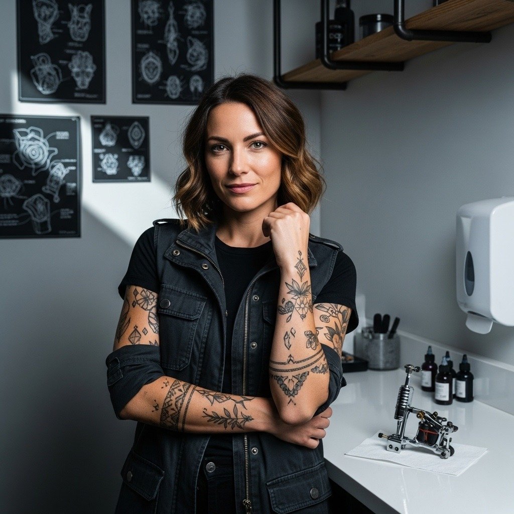
Fine-line quotes look effortless on a feed, but the truth is they live or fade based on line weight, placement, and how the stencil sits on your skin. Tiny cursive on high-motion zones will soften faster than a slightly heavier script in the same spot. If you care about how "No Risk No Story" reads in day-to-day life, think beyond the font and toward size, spacing, and the clothes you wear while it heals.
1. Clean Cursive on the Inner Forearm
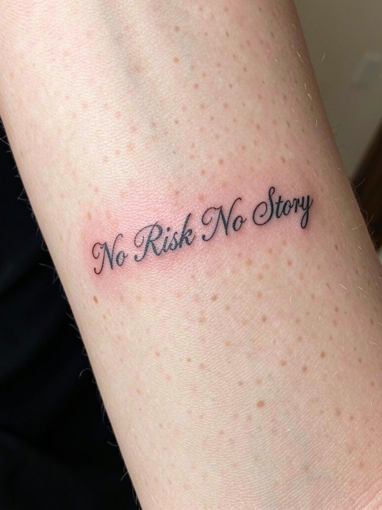
This is the classic take because the inner forearm keeps the quote readable and easy to photograph. I recommend a hair-heavier single-needle look than the slimmest Instagram cursive, especially for the letters with tight loops. For the session plan, bring two reference sizes and ask the artist to print a stencil at the exact length so you can view spacing on your arm. The biggest mistake is going micro on this flat, visible canvas and ending up with crowded letters after healing. Style-wise, rolled-cuff linen shirts or slim knit tees frame this placement well, try a rolled sleeve tee for show-off days.
2. Ribcage Script with Compact Spacing
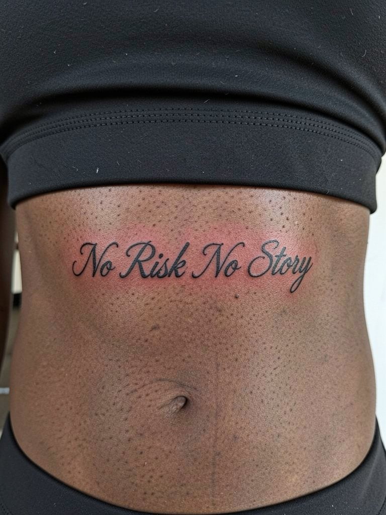
Ribs make the quote feel intimate and private, but there is a real debate about how fine the lettering should be there. One camp says fine line on ribs blurs quickly because the skin stretches and breathes under the needle. The other camp argues that slightly deeper placement and wider spacing let fine scripts heal cleanly, and they show healed photos to back that up. Be prepared: this area scores higher on the pain chart and sessions can feel longer. For the appointment, wear a loose sports bra so the artist has full access without fabric pressing on the fresh lines. If you plan to show it at the beach, pair it with a soft bralette for careful reveals.
3. Small Script on the Wrist
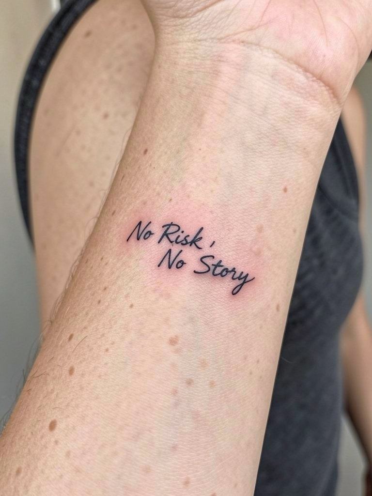
Wrist scripts read every day, so pick a size that keeps the letters legible when you glance down. The typical misstep is requesting ultra-thin loops that disappear under normal motion. For layout, get the stencil centered with the wrist crease in mind, and request slightly more space between letters than the mockup shows. Expect a short session and moderate sensitivity. Keep the tattoo wrist visually uncluttered when showing it by wearing a thin chain on the opposite wrist or stacking rings on your fingers. Try a thin chain bracelet on the non-tattoo wrist to balance the look.
4. Micro Script on the Ankle
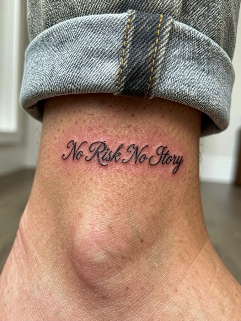
Ankle script is low-profile and easy to conceal in cooler months, but expect friction from socks and shoes during healing. The common error is making the letters so small they blur after a year. If you like the ankle idea, increase letter height and keep the loops open. Session wear advice is simple, pick easy-on shoes or sandals so the area is not compressed after the chair. For summer styling, cropped trousers or low-top sneakers show the piece cleanly, try cropped trousers to frame it.
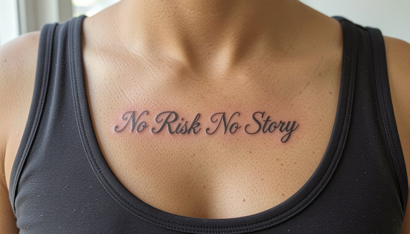
5. Collarbone Script with Airy Spacing
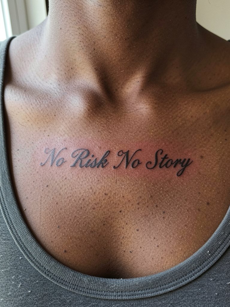
Text that follows the clavicle looks intentional when spaced to match bone rhythm. My preference here is slightly wider letter spacing than what people request online, because collarbone movement and necklace wear can compress tight scripts over time. During consultation, show how your favorite necklace sits so the artist can avoid overlap. Pain is moderate and sessions are short. For outfits, scoop-neck tops and layered delicate necklaces highlight the line, and an off shoulder sweater pairs especially well.
6. Black and Grey Script with Subtle Backing
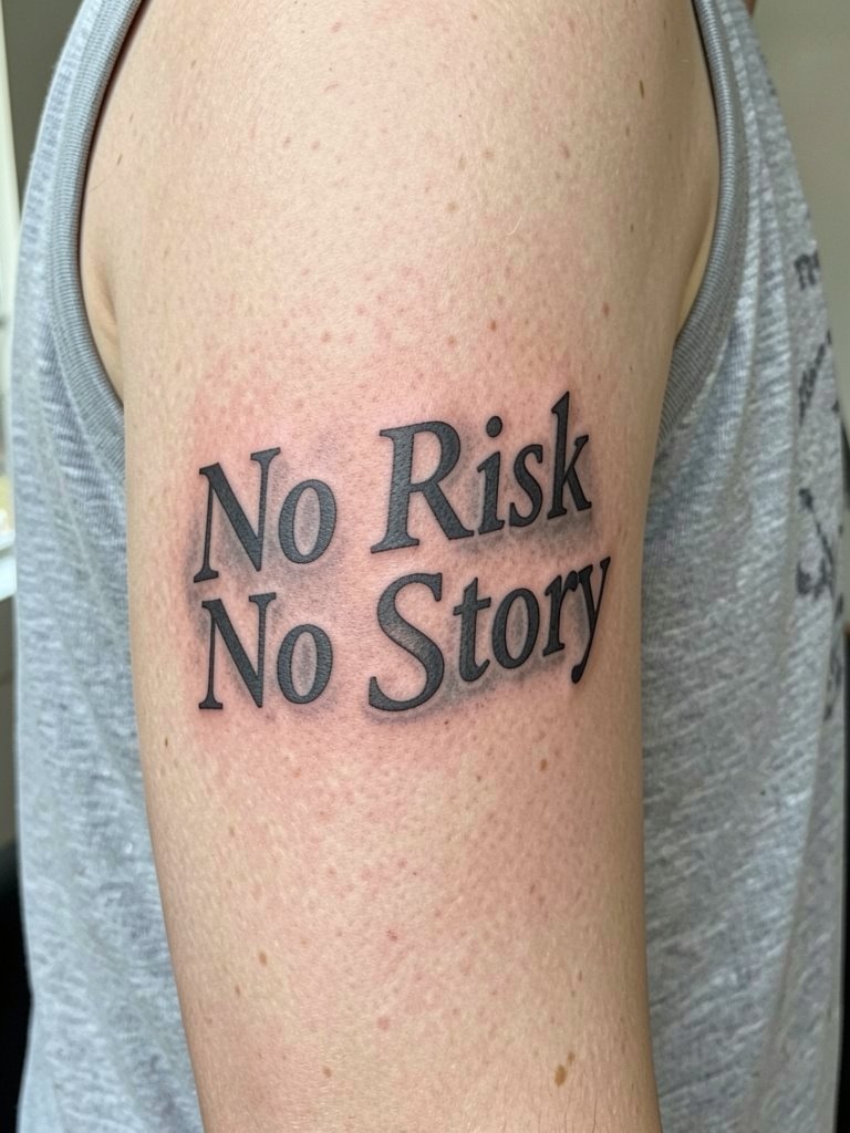
Adding faint grey behind a script can make short quotes feel finished without adding clutter. People split on ink choices here. One group favors black-only lettering because it keeps the quote crisp against time and sun exposure. The other group likes black and grey for depth and a more composed look, and they accept extra touch-ups during the lifespan of the piece. Inner upper arm is forgiving and low-friction, so this spot balances visual polish with sensible aging. For the session, wear a relaxed sleeveless knit so the artist can keep the skin taut. The usual mistake is asking for heavy shadow too close to the strokes, which reduces letter clarity.
7. Phrase with Small Compass Accent on the Inner Forearm
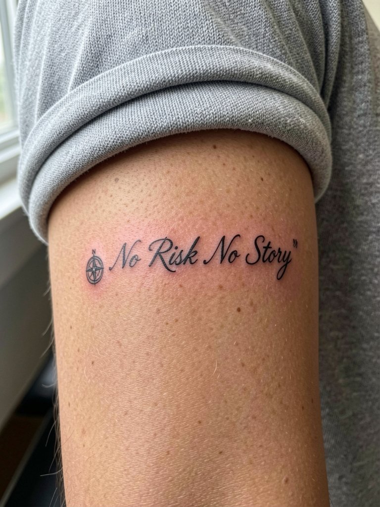
A tiny compass gives the phrase context without overpowering the script. If you want a symbol, keep it proportional and off to the side so the letters do not compete. Discuss exact scale with the artist and show how the compass sits three inches away from the first letter in your stencil. The inner forearm tolerates a small accent well and photographs cleanly. For outfits, this placement looks great with rolled-cuff linen shirts in neutral tones, try a linen button down shirt for intentional reveals.
8. Mountain Linework Under the Phrase on the Outer Forearm
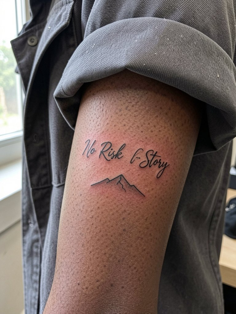
Pairing the quote with a low-contrast peak silhouette adds movement and reads as an intentional composition. Artists often recommend keeping the mountain graphic spare so the lettering stays the focal point. If you want the design to hold up, ask for a mountain no taller than one-third the text height so the pair breathes. Outer forearm gives more space for that relationship, and bold caps or slightly thicker linework keep the whole piece legible from a distance. This placement pairs well with straight-cut tees or cuffed overshirts, try a cuffed overshirt for a layered look.
9. Open Road Motif with Lettering on the Calf
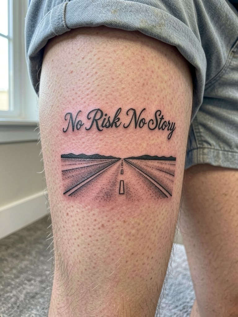
Calf real estate lets you expand the phrase with a small illustrative base, which helps the quote feel unique. The main risk is making the road too detailed for the scale, which turns into a muddled grey patch after healing. Keep the road graphic simple and contrast it with slightly bolder lettering. The calf is lower on the movement scale than ribs, so strokes hold better. For style pairings, mid-calf work looks good with casual shorts or slip-on sneakers, try low top sneakers to show the ink.
10. Tiny Script Behind the Ear
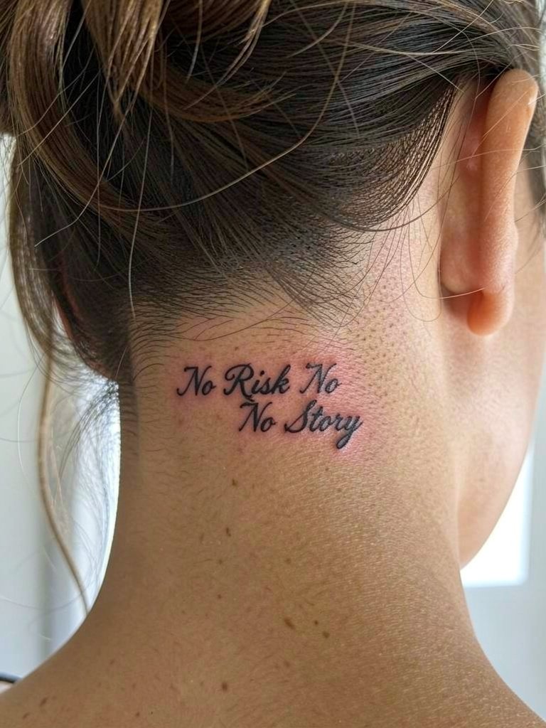
A mastoid script is a private reminder that only shows with an updo. At this scale, letter clarity is the biggest constraint. Avoid super-tiny joined cursive that reduces letter identity; choose slightly separated characters so the phrase remains legible. Session prep means tying your hair up and wearing a top that does not rub the nape. If you want it framed, small ear jewelry complements the area without obscuring the text.
11. Lower Back Horizontal Script
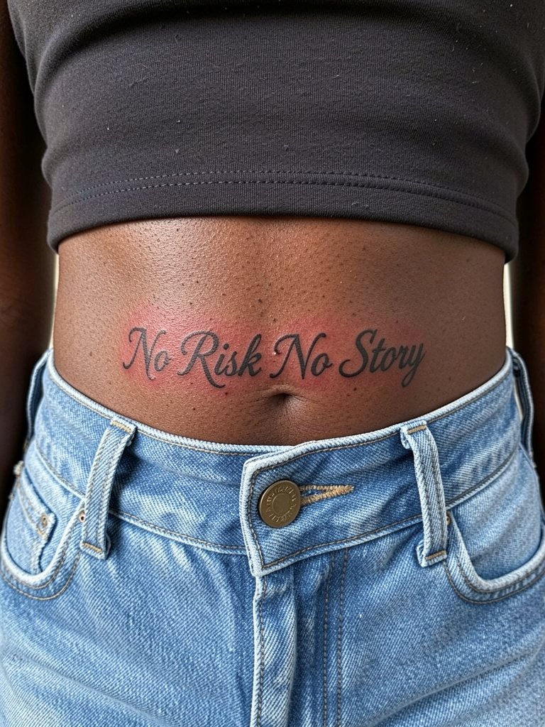
The lower back grants a longer horizontal layout for the full phrase and keeps it discreet. A common mistake is cramming the quote into a narrow band that looks fine in the chair and smears with a low-rise waistband later. For better longevity, pick medium letter height and a slightly looser tracking. This area is low-motion but may get friction from low jeans when seated, so wear elastic-waist pants the day of the session. For styling, cropped tops and high-waisted bottoms control the reveal, try low rise jeans in a relaxed fit.
12. Thigh Lettering with Decorative Spacing
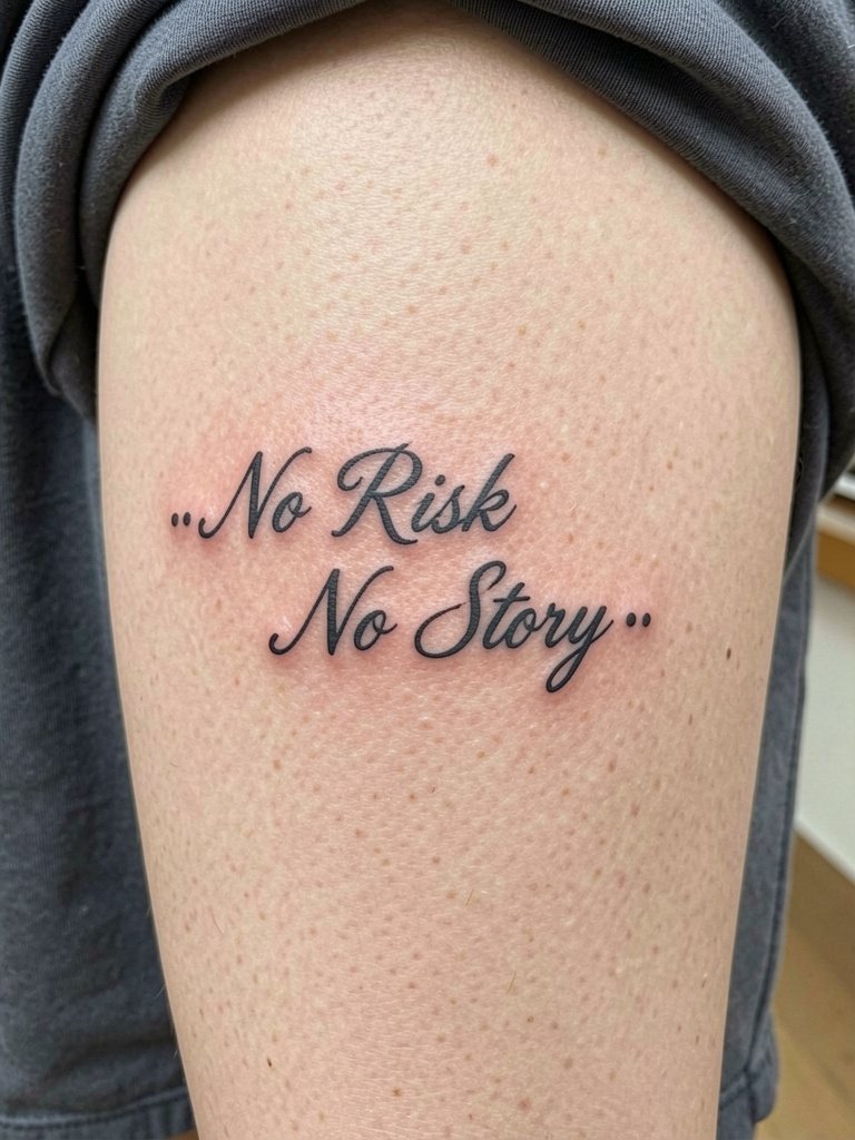
The thigh gives breathing room, so you can add spacing treatments or tiny accents without crowding the letters. If you like decorative spacing, map out the full phrase at life-size and test sitting and standing poses so the script does not compress. The session is comfortable and usually quick for medium scripts. For show-off looks, oversize shirts or slit skirts reveal the piece when you choose, try an oversized button down for casual framing.
13. Forearm Script with Bold Capitals
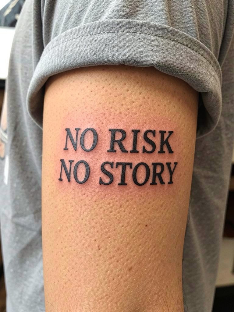
If readability across distance is a priority, bold caps are the solution. This approach trades the delicate look for longevity by using thicker strokes that resist softening. Discuss exact cap height and inter-letter spacing during the consultation so the word shapes remain balanced on your forearm. The outer forearm tolerates slightly heavier saturation, and touch-ups are less frequent than with whisper-thin scripts. For wardrobe, straight-cut tees and open jackets let the piece read clearly, try a work jacket open front for layered display.
14. Tiny Phrase with Dice Motif on the Inner Forearm
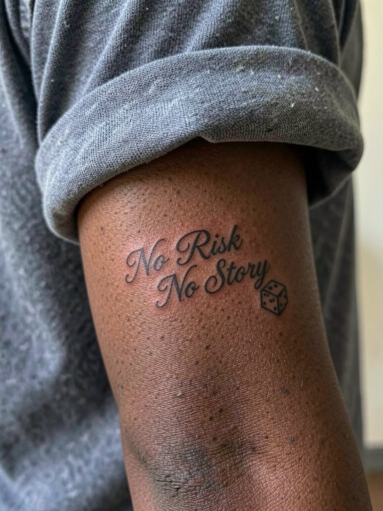
A small gamble icon plays on the risk theme and keeps the phrase from feeling generic. Keep the dice tiny and separated from the letters so they age independently. The mistake is stacking motifs too close to a short quote, which reduces legibility after a couple of years. Inner forearm makes placement planning simple and the session time short. This placement looks smart with slim knit tees and a minimal watch on the opposite wrist, consider a minimalist watch to balance the visual weight.
15. Collarbone Script with Tiny Star Dots
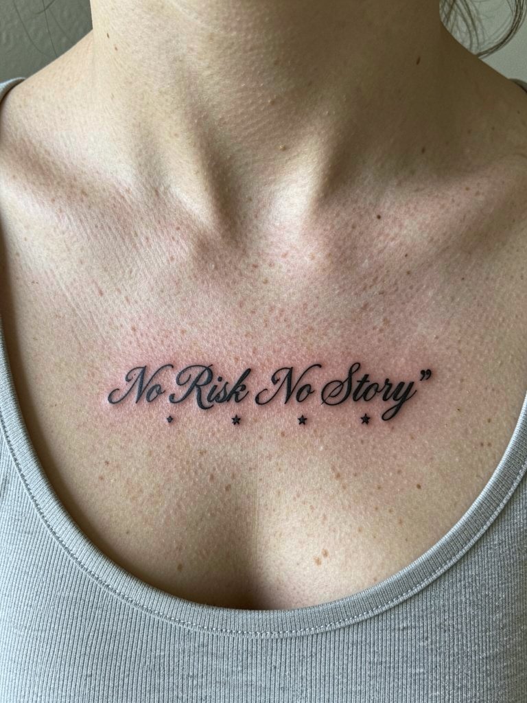
Tiny decorative dots give a subtle finishing touch without changing the phrase. My rule is to space stars at least half an inch from critical letterforms to avoid crowding. Collarbone movement and necklace wear are considerations, so place accents where jewelry will not rest. Sessions are short to moderate, and healed photos help confirm the spacing. Show-off styling with layered delicate necklaces enhances the area, try a delicate necklace for a coordinated look.
Session Day Picks
These first six lettering options span wrist, forearm, and ribs, so a few practical items make the session and first week simpler.
- Easy Tattoo Aftercare Balm. A lighter-feel balm some people prefer when a heavy ointment feels greasy on small lettering near the wrist and forearm.
- Bepanthen Tattoo Aftercare. A cream often mentioned by travelers and useful for people who like a non-greasy finish on inner arm and rib tattoos.
- Dr. Pickles Tattoo Balm. Helpful for dry or irritated healing skin when small linework scabs unevenly and you need a gentle moisturizer.
- Saniderm Protective Film. Useful for avoiding fabric friction in the first 24 to 72 hours, especially on collarbone and rib placements.
- Fragrance-Free Gentle Soap. A mild wash keeps fresh script clean during showers without irritating the healing lines.
Frequently Asked Questions
Q: How do I decide between fine line and slightly bolder script for "No Risk No Story"?
A: Think about how often you want to see it and where. Fine line suits low-motion spots and a delicate aesthetic, but slightly bolder strokes help maintain legibility in high-movement areas like the inner wrist or outer forearm. Ask for healed examples at the size you plan to get so you can see how similar work settled on real skin.
Q: Will thin cursive blur faster on darker skin tones?
A: Thin strokes can appear softer on some skin tones if there is less contrast or if the ink sits shallow. Bring the artist healed photos of the same style on skin tones similar to yours and request slightly heavier line weight if clarity is a priority. That concrete comparison is the best way to predict visibility.
Q: What should I wear to a ribcage or collarbone appointment?
A: Choose clothing that gives clear access and avoids rubbing fresh ink. For ribs, a loose sports bra or a button-down you can open fully works. For collarbone, wear a scoop-neck or wide V-neck top that exposes the area without needing to be tugged. These choices keep the session clean and reduce irritation while the piece heals.
Q: Where can I find healed-lettering portfolios and regional artist work without naming individuals?
A: Search visual platforms with hashtags like #scripttattoo and #finelinetattoo, and use location filters for your city name plus "lettering tattoo studio" to find nearby portfolios. Reddit threads focused on tattoos also surface healed shots and honest feedback about aging. Look specifically for "healed lettering" in image descriptions to avoid fresh-only photos.
Q: If I want a tiny compass or dice accent, what scale is safe?
A: Keep icons no larger than one-third the height of your lettering and place them at least a half inch away from key letterforms. That spacing prevents the icon and script from merging over time and makes touch-ups easier if needed.
Q: How often might I need a touch-up on small script?
A: Touch-up cycles depend on placement, sun exposure, and how aggressively the artist layered ink. Fine script on the inner forearm or ribcage often goes longer between touch-ups than micro wrist pieces. Plan for an honest follow-up at the one- to three-year mark if preserving crispness matters to you.