
Someone I know spent six months saving images and still booked the wrong placement. She wanted a soft wash of color, but picked a spot that stretched and dulled the hues. I spent time in five shops across Brooklyn and noticed the same mistake over and over. If you care about longevity, fading, and the right aftercare routine, these small watercolor tattoo ideas and placement notes will help you choose something that still looks deliberate after a few years.
1. Collarbone floral bouquet in painterly washes
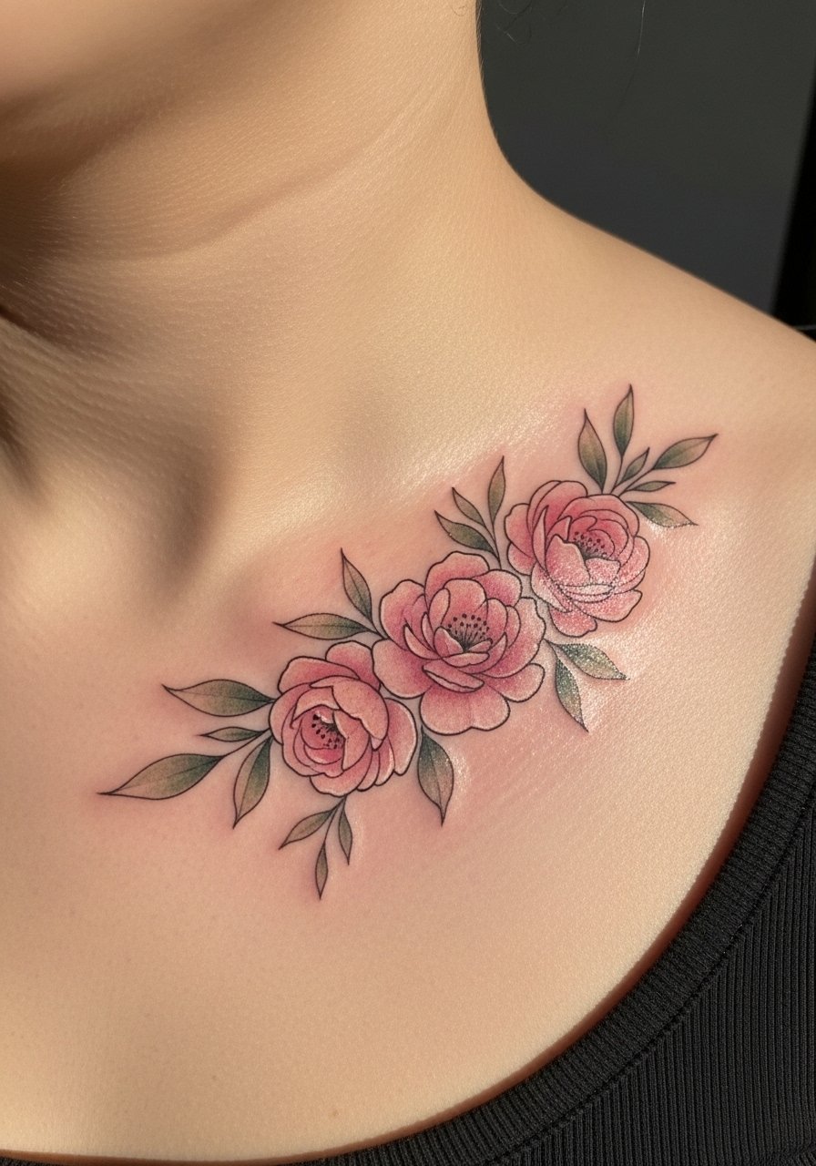
Someone I know first saw this on a friend and booked it the next month. The collarbone is a great canvas for a 4-inch watercolor bouquet if you want something visible in tank tops. Pain is low to moderate, and a single session of 60 to 90 minutes usually does it. Tell your artist you want painterly ink with light linework only where needed and heavier saturation at petal bases. A common mistake is asking for too much tiny detail, which blurs into a smudge at year two. At six months the colors look bright, at two years expect softer saturation, and plan a touch-up around year three if you want the original pop preserved.
2. Ribcage hummingbird with splash background
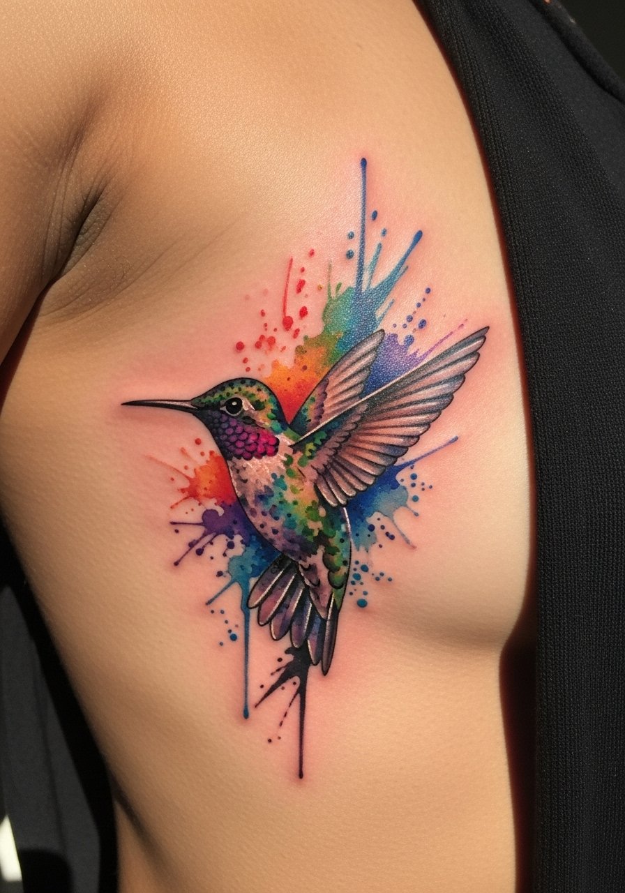
Fair warning, the ribcage is a 7 out of 10 on most pain scales. That said, the rib gives the hummingbird room to curve with your body, which looks intentional. During consultation ask for loose color fields and limited black contour to keep the wash airy. Artists split on fading here. One camp says the skin stretch on ribs makes color blur and the piece will need touch-ups sooner. The other camp says careful saturation and spacing mean it settles well. Ask where your artist stands and get healed photos from their ribcage work before booking. Sessions tend to run 60 minutes for a small hummingbird.
3. Forearm abstract splash hiding a short quote
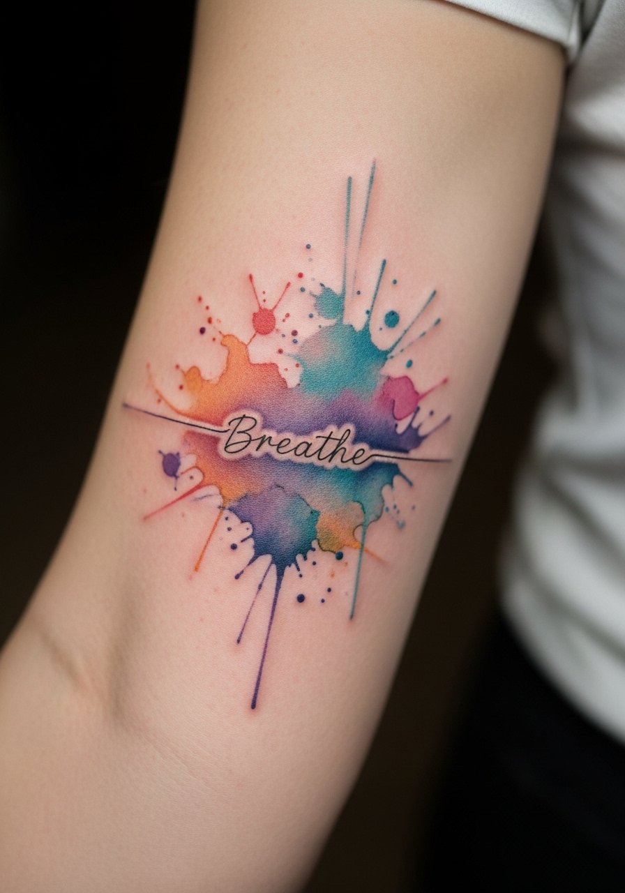
When you sit down with your artist for this one, bring the exact script you want. Text inside watercolor needs precise placement and negative space to remain legible as the ink ages. Pain is low and most small pieces like this take one session under an hour. The version that ages poorly uses dark script on top of thin washes. Instead, request slightly bolder lettering with soft color around it so the word reads at six months and still reads at two years. A real mistake is packing the quote too small. If you want discretion, keep the quote three to four words long and ask for surrounding gradients rather than heavy outlines.
4. Shoulder-blade peony cluster with soft edges
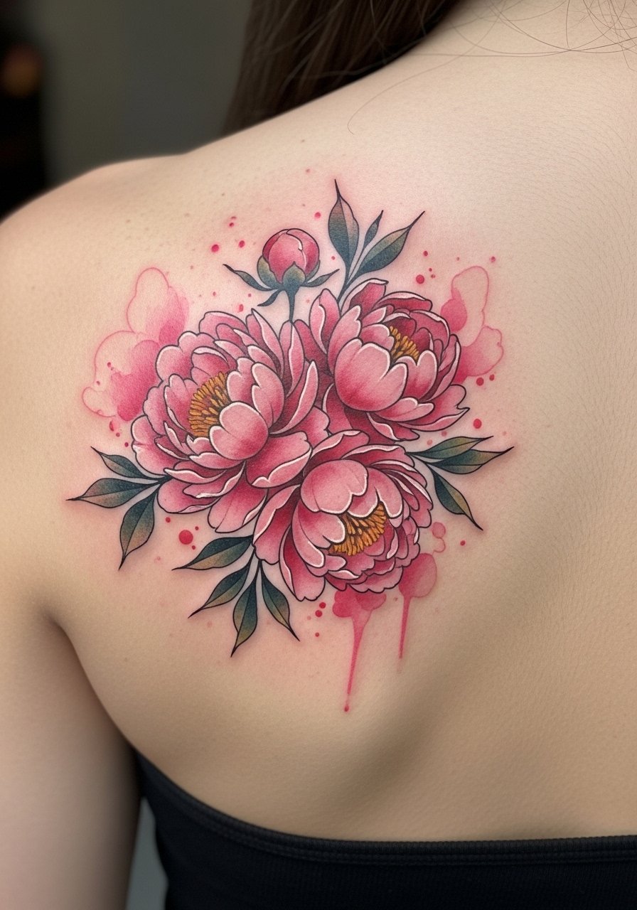
There's a reason the shoulder blade is a go-to for botanical watercolor. It lays flat and keeps washes from breaking up over joints. Expect a one to two session plan depending on size. Tell your artist to focus saturation in the flower centers and let petals feather outward. A common mistake is over-detailing veins and tiny stamens. Those elements can look muddy after a few years. At six months the petals read vivid, at two years they soften. If you want longevity, schedule a light touch-up at year three instead of heavy reworking.
5. Thigh owl portrait with blue-gray feather drips
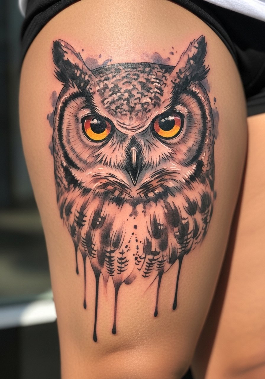
The outer thigh is forgiving for texture and larger washes, which is why owl portraiture works well there. Pain is low and a small, detailed portrait often fits in one session of 90 minutes. For a version that ages gracefully, ask for tighter linework around the eyes and looser washes on feathers. A mistake people make is asking for all-over soft blending with no defined focal point. That looks like a blurred patch at year two. At six months the eye should retain contrast. Expect a touch-up at around two to four years if you want to restore crispness in the gaze.
6. Inner wrist rainbow feather, minimalist saturation
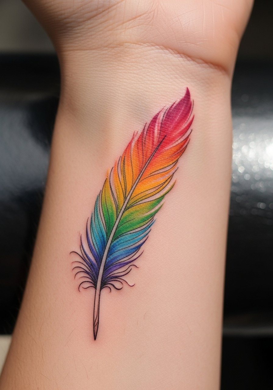
Wrist pieces are highly visible so think about daily exposure. The inner wrist is an easy placement for a 2 to 3 inch feather and it takes under an hour. Tell your artist you want strong saturation near the quill and softer washes at the barbs. Artists argue about whether full-color watercolor or black-and-gray will last longer. One camp prefers full color for the painterly look. The other camp recommends monochrome or mixed black to preserve contrast over time. Both views matter. For this small feather plan touch-ups sooner if you work outdoors, and use sun protection consistently to slow fading.
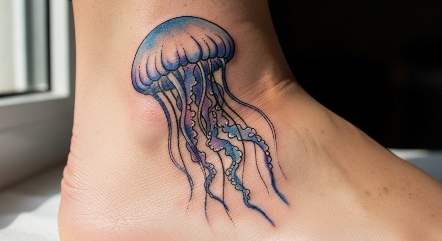
7. Ankle jellyfish with flowing tentacles
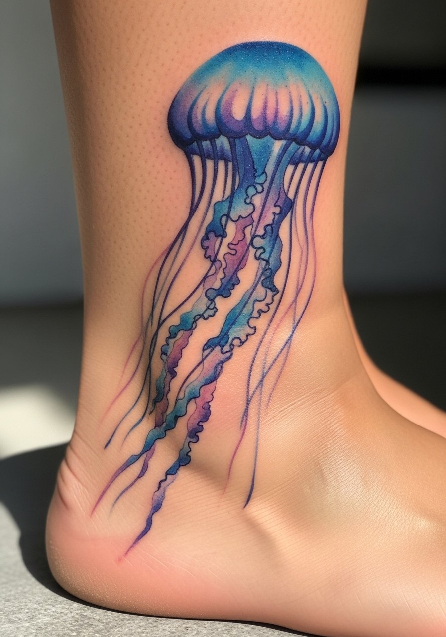
There's something about curved placements that makes jellyfish feel alive. The ankle wrap accentuates movement as you walk. Pain is moderate depending on bony areas and a 4-inch design usually fits a single session. During consultation ask for tapered tentacle ends and slight negative space to keep motion. A common mistake is packing too much pigment into tight tentacles. That creates a blob effect once healed. At six months the colors will read clearly, at two years expect some softening. Consider a yearly sun-safe routine and a touch-up if the gradients fall flat.
8. Lower-back grape bunch for personal symbolism
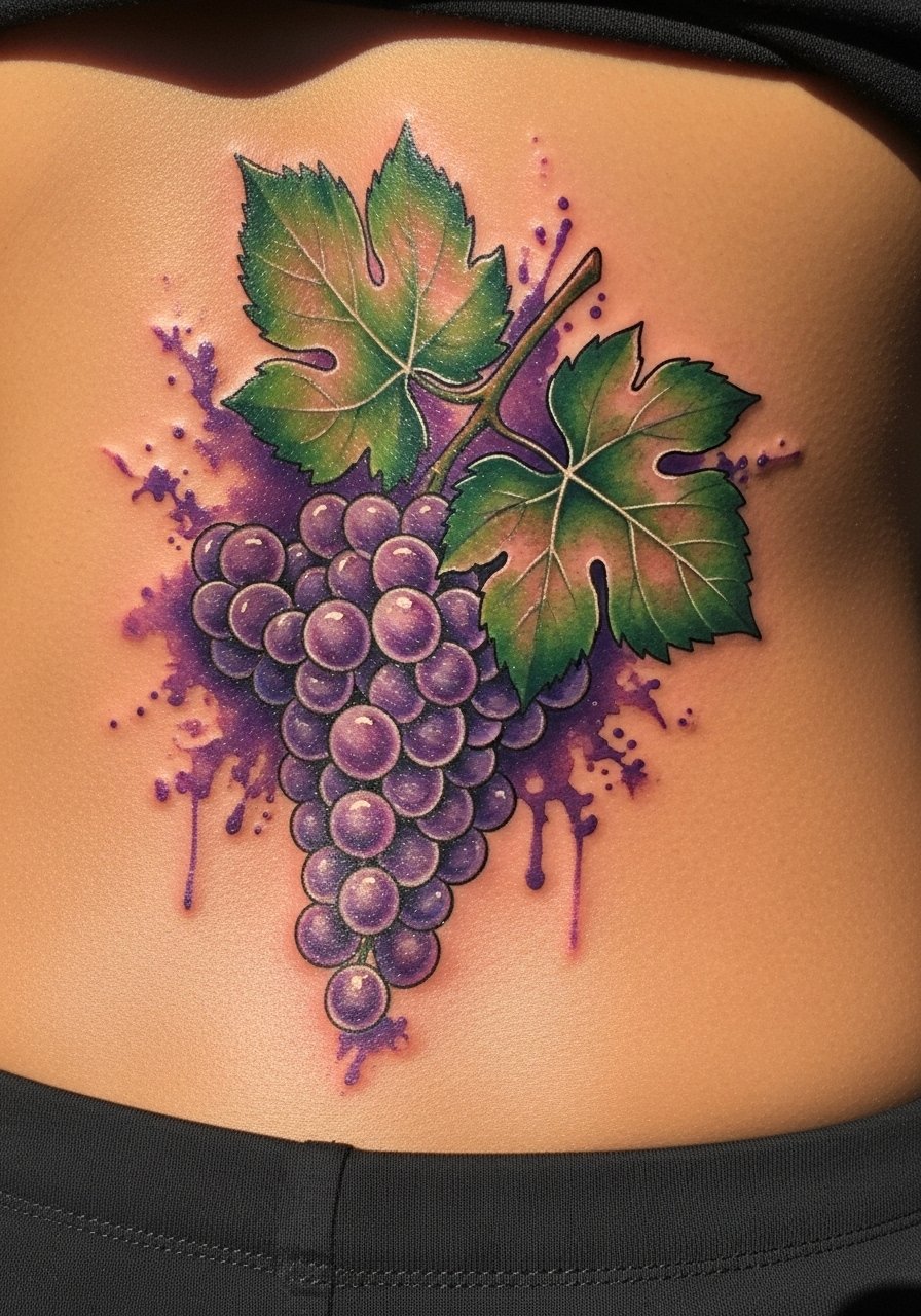
Lower-back pieces allow for a wider composition and can reference profession or heritage without being overt. Expect a two-session plan if you want lush saturation across a 6-inch width. Tell your artist you want juice-like highlights and some skin breaks to suggest shine. The common mistake is asking for fine detail in tiny grape skins, which loses definition after healing. At six months the cluster looks plump, at two years the washes blend more. If you plan body changes like pregnancy or weight fluctuation, discuss placement because movement can distort the composition.
9. Inner forearm tiger eye close-up with bold washes
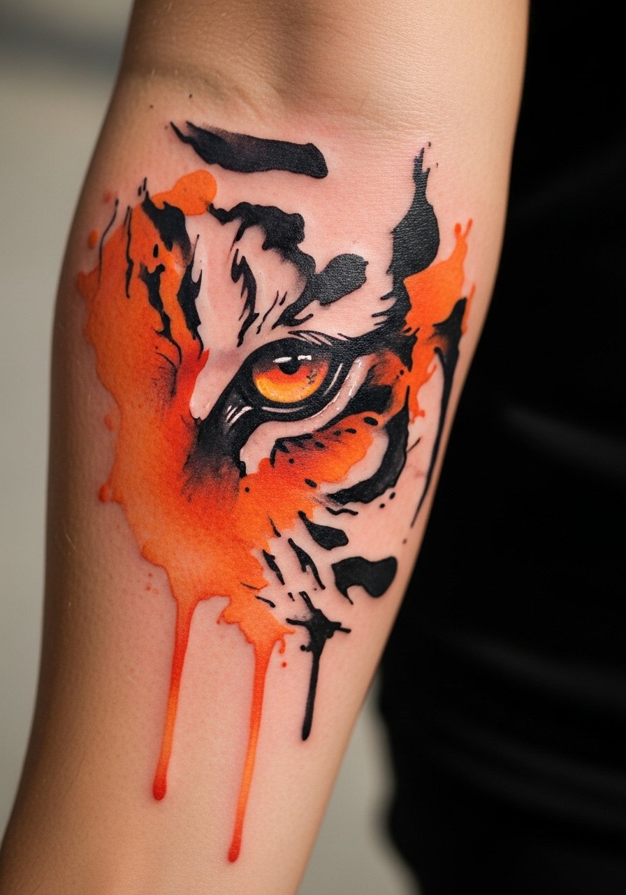
There's a visual impact to an animal eye placed on the inner forearm because it faces outward when you gesture. Pain is low and a focused 5-inch portrait often takes a single 90-minute session. Ask your artist to lock in contrast around the pupil so the gaze maintains presence as surrounding washes soften. The mistake is relying solely on diffuse color without any anchor. That makes the piece fade into the skin at year two. Expect heavier touch-ups for portrait pieces because human eyes are very sensitive to lost contrast. Bring reference photos of eyes with the exact expression you want.
10. Upper-arm bird flock in flight along the bicep
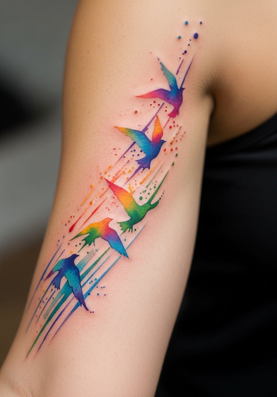
If you want motion that reads from a distance, the bicep is forgiving for a 7-inch flock that wraps slightly. Sessions are usually under 90 minutes for small flocks. During consultation show images of spacing you like and ask for varying saturation per bird to create depth. A common mistake is placing birds too close together. They can blend into a patch of color and lose the migratory feel. At six months the formation looks airy. By two to three years the individual colors will soften and you may choose a light touch-up to reinvigorate the separation between birds.
11. Calf mermaid silhouette with scale fades
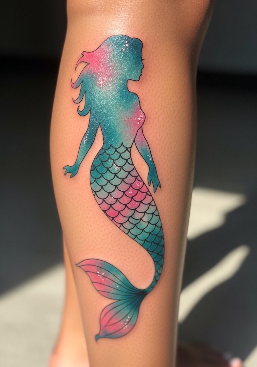
The calf gives vertical space for a silhouette that breathes. Pain is moderate and medium-sized calf tattoos usually fit one to two sessions. Tell your artist you want scale suggestion through stipple shading rather than heavy outlines. People often ask for densely packed detail that the calf cannot hold at small scale. That leads to muddiness after a year. At six months the silhouette reads clean and the scale hints are visible. Expect a touch-up at two to four years if you want the shimmer to come back. If you play sports that rub chafing against the area, mention that during booking.
12. Inner bicep rose with dripping petals
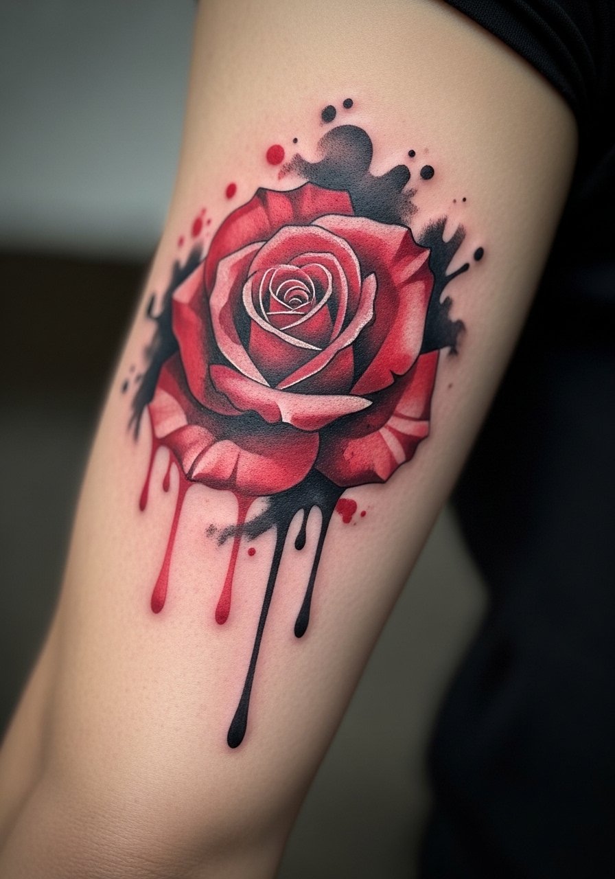
When you choose inner bicep placement, know it can age differently than outer arms because of friction. Pain is moderate and a 5-inch rose usually fits a single session. During consultation ask for concentrated saturation in the petal cores and lighter bleed toward edges. A mistake is requesting heavy black outlines around a watercolor rose. That defeats the style and can look harsh as it ages. At six months the drips look fresh. At two to five years expect those drips to blur slightly and plan a touch-up if you want to restore crisp petal separation.
Tattoo Prep and Aftercare Essentials
fragrance-free tattoo aftercare balm, lightweight non-comedogenic. Use after the initial scab phase to keep color from drying into flakes. Pick a balm with a light texture so it absorbs without suffocating the skin.
medical-grade second skin bandage, single-use sheets. Useful for the first 24 to 48 hours if your artist recommends occlusion. It reduces rubbing from clothing on sensitive placements.
gentle antibacterial foam cleanser, fragrance-free. Clean the area with light hands in the first week to remove excess plasma without stripping pigment.
breathable tattoo healing film, non-adhesive patch roll. Great for athletes or people who need protection from fabrics during the busiest healing days.
lightweight mineral SPF stick for tattoos. UV protection matters for watercolor pieces more than any single product. Apply after the tattoo is fully healed.
cold compress wrap, flexible gel pad. Use immediately after the session if swelling or bruising appears. It reduces inflammation and helps you feel more comfortable.
Aquaphor original healing ointment. If your artist recommends an occlusive ointment, Aquaphor is the mainstream option many people know. Use it sparingly and only as directed by your artist.
Every tattoo is different. Always follow your artist's specific aftercare instructions. Consult a dermatologist if you have skin concerns or unusual healing issues.
Frequently Asked Questions
Q: Do watercolor-style tattoos need different aftercare than traditional ones?
A: In my experience the basics are the same, but watercolor pieces often rely more on even initial healing because they lack heavy black anchors. Keep the area clean, use a light, fragrance-free balm during the scab phase, and protect healed work from sun with mineral SPF. If you want a product suggestion, try a gentle fragrance-free balm from the shopping list.
Q: Will a ribcage watercolor blur faster than one on the collarbone?
A: It depends on movement and skin type. Ribs stretch with breathing and body changes more than the collarbone, so many artists expect ribs to need touch-ups sooner. Ask your artist for healed rib photos from their portfolio so you can see how their technique performs on that placement.
Q: How often do small watercolor pieces typically need touch-ups?
A: From what I've seen, plan for a light touch-up around year two to four for most small color pieces if you want original saturation restored. High-exposure placements like wrists and hands may need attention sooner. Protection from UV and gentle long-term care extend the time between sessions.
Q: Will a quote hidden in a watercolor splash remain legible over time?
A: Yes if you size the lettering properly and give it contrast against the wash. Keep text to short phrases and ask your artist to use slightly bolder letters rather than hairline script. Legibility depends on font choice, placement, and how much pigment surrounds the letters.
Q: Are there discovery paths I should use to find an artist who understands watercolor?
A: Look at watercolor-specific hashtags, tag locations for local studios, browse Pinterest boards, and check tattoo directories that filter by style. Also spend time on r/tattoos to see healed photos and community feedback. Bring reference images and ask to see healed work in similar placements before you book.
Q: How does skin tone affect watercolor choices and what should I tell the artist?
A: Mention your skin tone during consultation and ask the artist how they balance saturation for contrast. On darker skin tones artists often suggest higher saturation and selective darker anchors to keep focal points readable. On lighter skin tones subtle washes show up easily but may need UV protection to keep from fading.
