
Someone I know spent six months saving reference photos and still booked the wrong style for their collarbone. The lesson was not that they had poor taste. It was that line weight, placement, and the artist portfolio matter more than the phrase. I visited five shops across Brooklyn and watched how the same wording read very differently on different skin tones. Below are 20 dark quote tattoo ideas with practical notes on aging, placement, and what to say at your consult.
1. "She Believed She Could So She Did" on the Collarbone
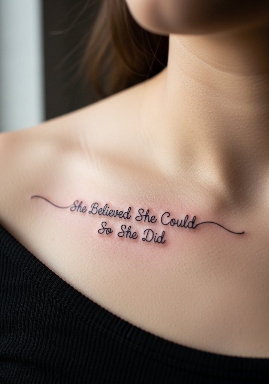
Someone I know first saw this on a friend's clavicle and booked it the next week. Collarbones show text beautifully when the lettering is spaced out and the stroke weight is slightly bolder than micro line. Tell your artist you want single-line script with open counter space so the words remain legible as the ink settles. Expect a 1 to 1.5 hour session and moderate pain. Common mistake is shrinking the lettering to fit a tiny area. At six months the linework should still read clearly. At year three expect a softening of edges and a possible touch-up if you want crisp contrast.
2. "No Rain, No Flowers" with Fine-Line Florals on the Inner Wrist
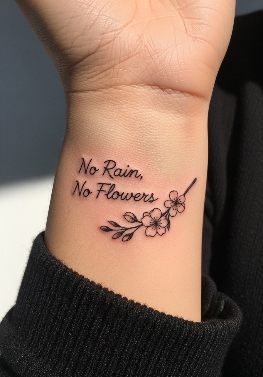
Fair warning: wrists move constantly so fine lines there face more wear. I recommend pairing the phrase with tiny floral dot work to give the lettering a visual anchor. Ask for slightly heavier linework than pure micro script and for artists to leave small breathing room between letters to reduce blur. Session time is usually under an hour. At six months the florals add contrast that helps the words stay readable. If you want a micro look, plan a touch-up at year two rather than assuming permanence.
3. "Nevertheless, She Persisted" on the Shoulder Blade
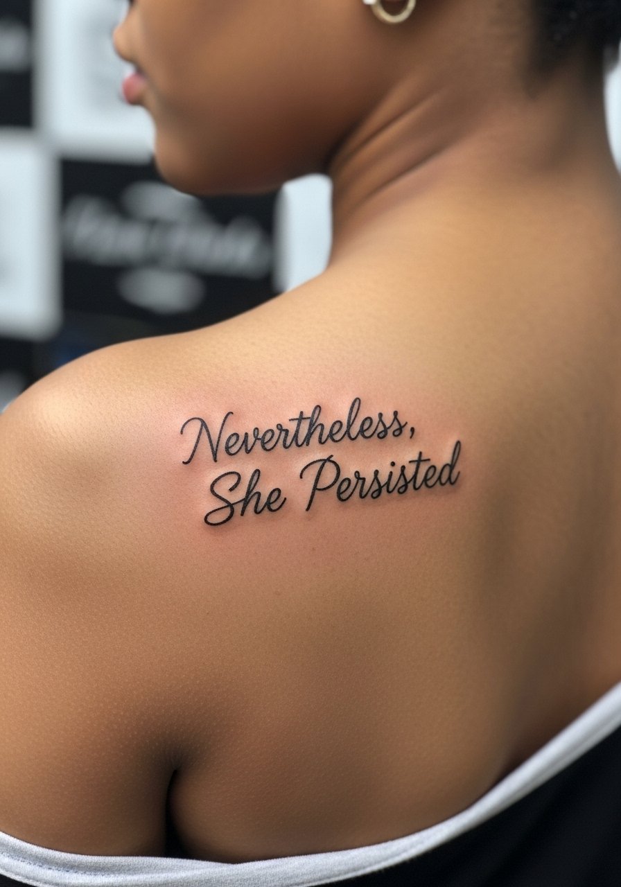
When the shoulder blade is the canvas the pain is mild and the text can be a medium size that reads from a short distance. This phrase works best in flowing cursive with consistent linework. A common version that ages poorly uses very thin flourishes that thin out into gaps over time. Tell your artist to keep the downstrokes slightly thicker than the upstrokes to preserve silhouette. Expect a single session and low blowout risk with experienced linework. If you plan to add shading or florals later, leave room around the text now.
4. "Have Courage & Be Kind" with Soft Color on the Ribcage
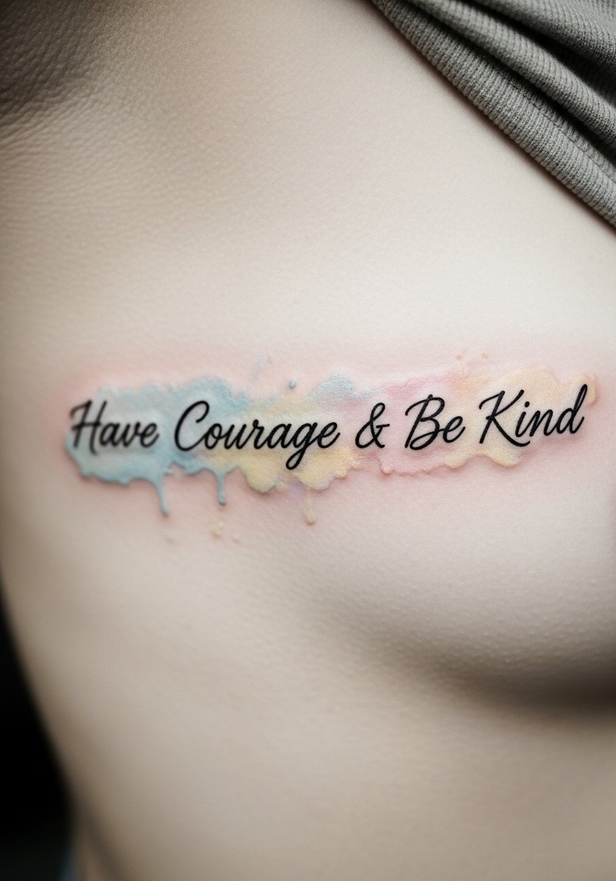
Fair warning: the ribcage is a 7 to 9 out of 10 on most pain charts. That said, the ribs give you room for medium-sized lettering and soft color. Artists split on using watercolor near text because fading can blur edges. One camp avoids color for ribs, the other uses controlled black outlines with light washes. If you want washes, ask for black contouring and minimal pigment saturation. Expect one to two sessions. Plan a touch-up at year two for the color to keep it soft but visible.
5. "Pain Shapes a Woman Into a Warrior" across the Forearm in Blackwork
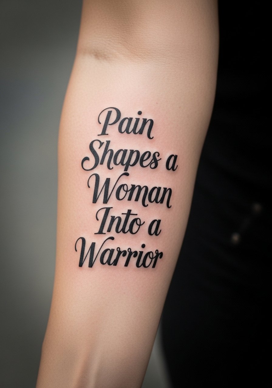
There is visual impact in bold blackwork for longer phrases. The forearm tolerates heavier saturation so the linework holds up longer than micro script. Tell the artist you want high saturation and clear letter spacing to avoid the common mistake of crowding words. This style usually takes two shorter sessions for a longer line and carries low blowout risk when the needle depth is consistent. Healed at six months the letters should stay dark. Expect touch-ups at year three if you want the original contrast maintained.
6. "Inhale sky. Exhale stars." as a Micro Ankle Script
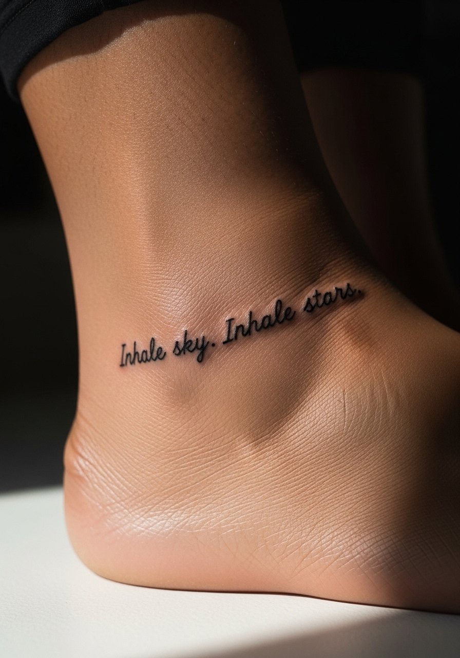
Most people who pick ankle micro text want quiet reminders that are easy to hide. The trade-off is that ankles see abrasion from socks and shoes. Ask for slightly heavier ink weight and for the artist to avoid ultra-tight script. Session time is short and pain is low to moderate. At six months micro letters may already show softening. Plan on a touch-up at year two if you want the punctuation and periods to stay sharp.
7. "This Too Shall Pass" with Wave Motif on the Inner Bicep
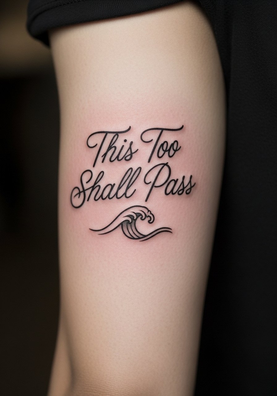
I opened a consult once where someone said they wanted a calm phrase for anxiety. Inner biceps give privacy and lower sun exposure. The mistake is choosing a tiny font that loses legibility when the arm moves. Tell your artist to place the baseline following the muscle curve and to avoid overly fancy ligatures. Session time is usually under an hour. At two years the text will soften but the wave motif helps keep the eye focused on the design, reducing the "blurred words" impression.
8. Stacked "Strong Women Lift Each Other Up" on the Upper Thigh
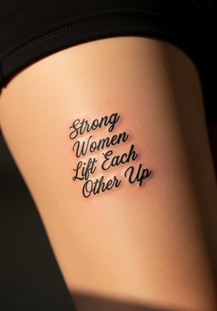
When you stack a phrase you gain visual rhythm and the thigh gives you room for medium size that tolerates aging well. The common mistake is using a script with too many thin flourishes. Ask for clear hierarchy between lines and consistent spacing. Sessions can be one to two hours depending on length. Thigh placement sees fewer touch-ups than hands or feet. If you plan weight fluctuation, discuss placement lower on the thigh where stretching tends to be less dramatic.
9. "You are enough" behind the Ear in Serif
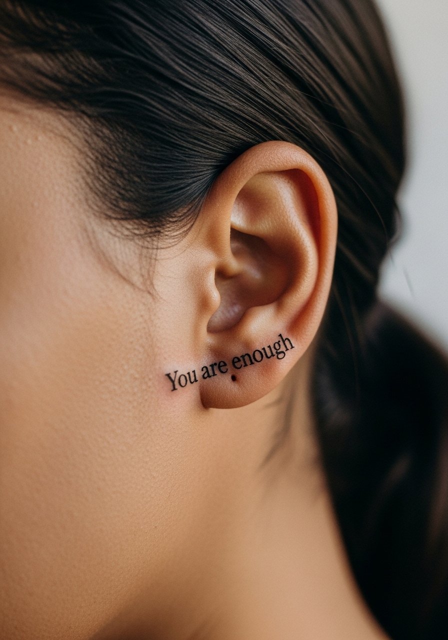
A tiny behind-the-ear script reads as a private affirmation. Pain is low but the area is sensitive and heals with scabbing sometimes. The main mistake is going too small. Ask for slightly larger serif characters and a single clean line of spacing. Expect a short session and the need for a touch-up sooner than forearm pieces. Be prepared for pigmentation shifts if you have thicker skin there. If visible text is important, consider placing it closer to the hairline where it ages more predictably.
10. "Belle est la vie" with Calligraphy on the Hip
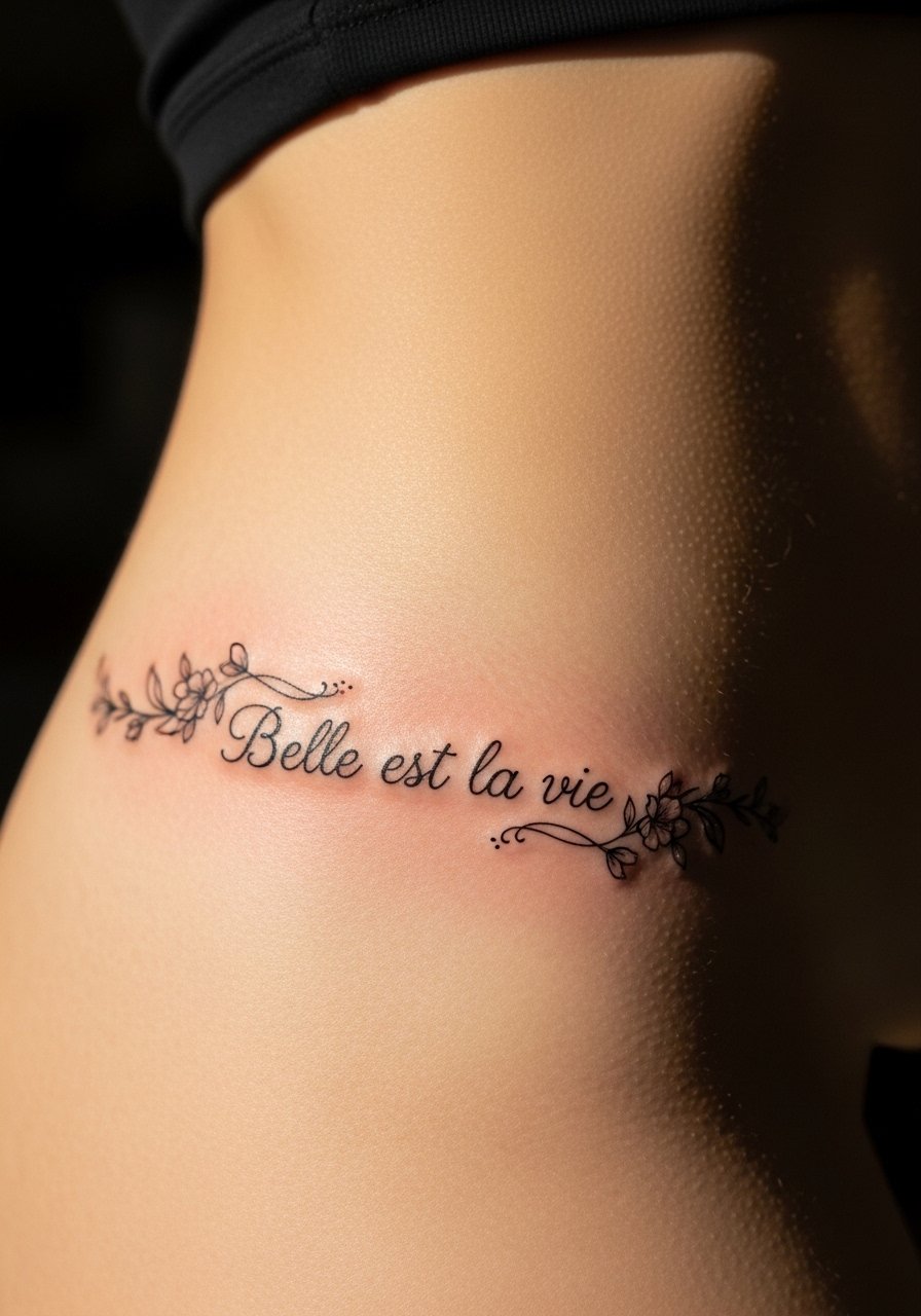
A French phrase can feel elegant on the hip. The hip moves with clothing and body changes, so tell your artist you want the script to breathe and avoid very thin tails. Session time is usually under an hour. For cultural sensitivity, note the phrase is French and many choose it for cadence rather than heritage. At two to five years expect modest softening and maybe a touch-up if you want crisp calligraphy restored.
11. "Choose joy" with Dotted Underline on the Finger
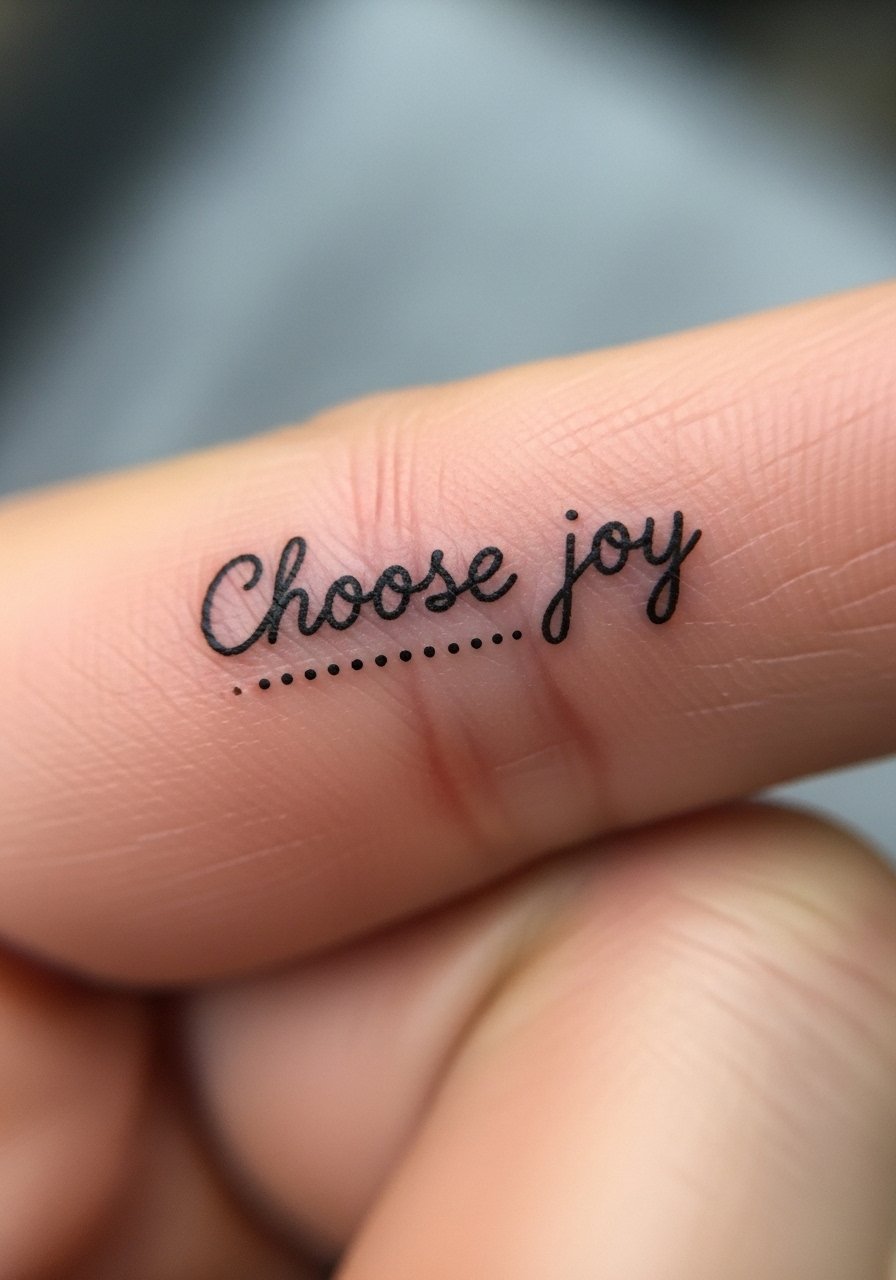
Finger text is convenient and visible but prone to fading fast. The biggest mistake is demanding ultra-fine script on a finger. Ask for slightly thicker letters and accept that touch-ups are likely every 1 to 3 years. Sessions are very short but healing is tricky because hands wash often. If you want longevity, consider moving this to the inner wrist or the side of the thumb where abrasion is slightly less.
12. "I am mine" on the Ribcage in Bold Script
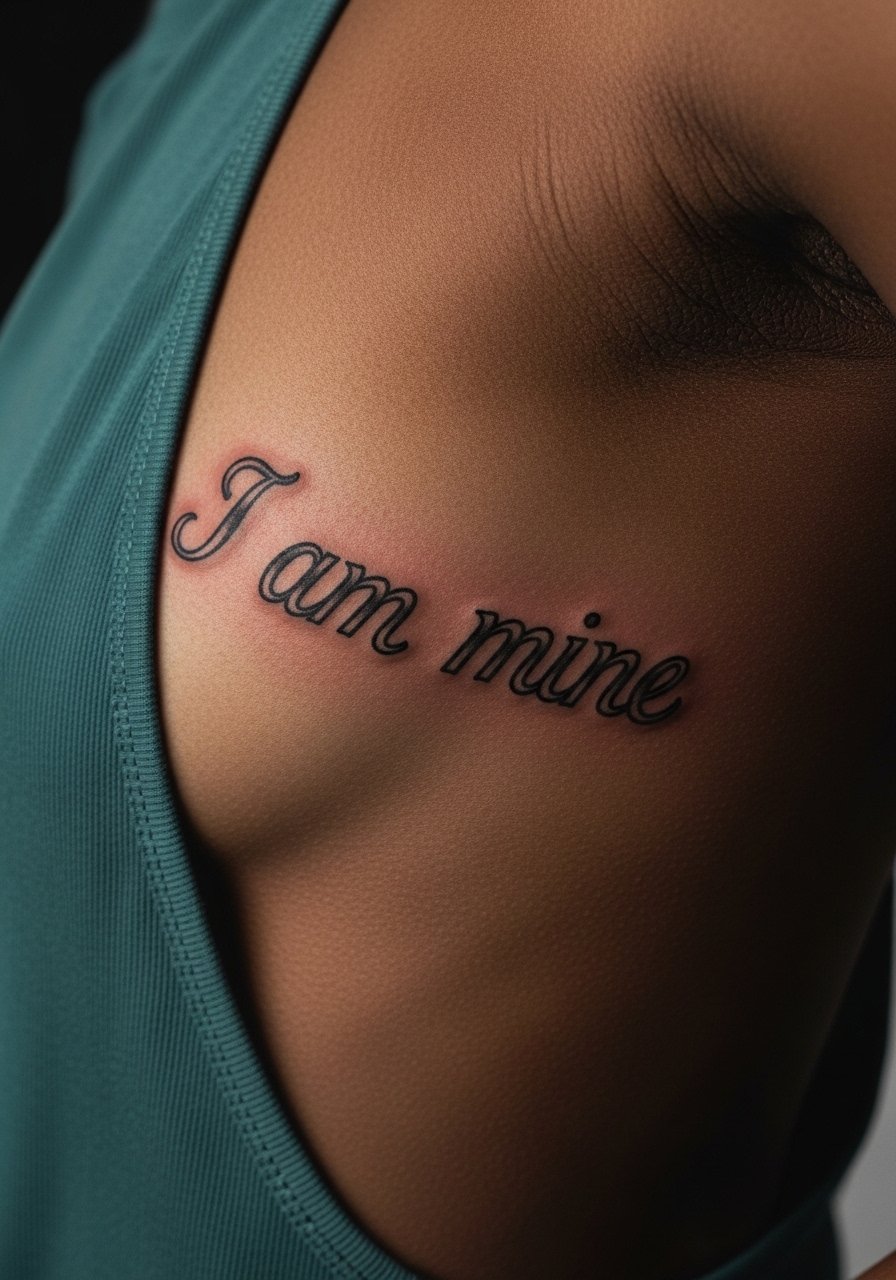
The ribcage allows powerful phrasing. Because this is a possessive, the visual weight matters. A common aging issue is using a flowing script that becomes illegible when the skin stretches. Ask for strong downstrokes and for the artist to plan letter spacing with breathing in mind. Expect higher pain and a single session for medium size. Touch-ups at year two help restore saturation if you want to keep the message bold.
13. "Memento Mori" in Blackletter along the Spine
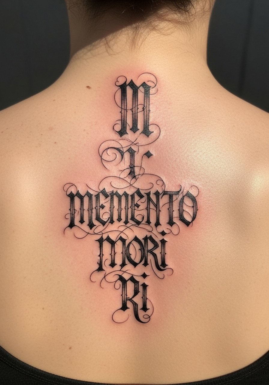
There is a clear origin to blackletter, and this phrase carries historical weight. Spine placement gives a striking vertical read but is sensitive. The common mistake is over-compressing letterforms. Tell your artist you want classic proportion and vertical breathing room. Session time varies and pain is high. For cultural respect, note the script style and avoid combining it with unrelated sacred imagery. Healed at six months blackletter tends to hold shape well if linework is strong.
14. "Breathe" with Minimalist Dot Work on the Nape
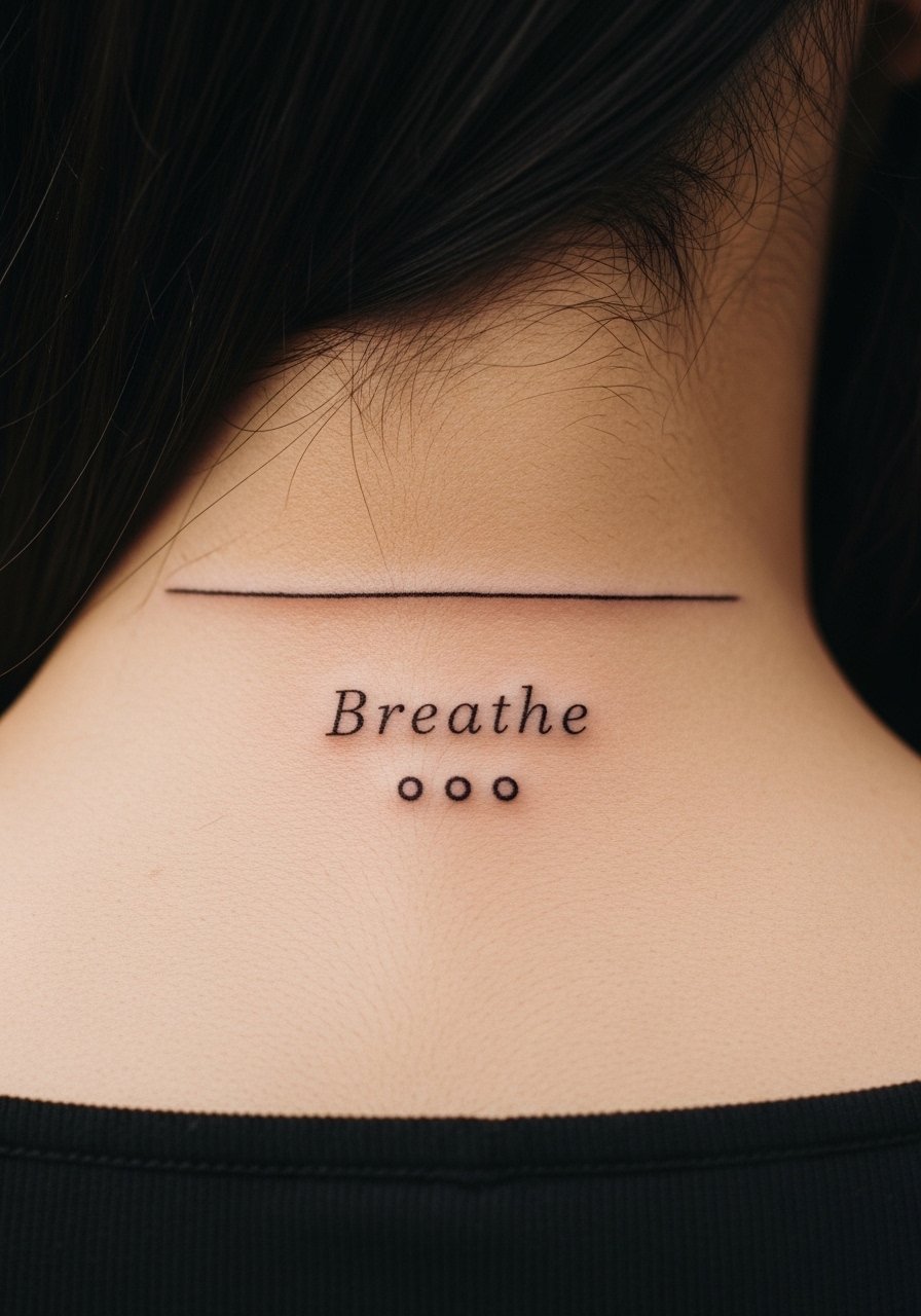
Consultation lead: when you sit with the artist for a nape text, bring photos showing exact height and hairline relation. The nape sees sun and neck movement so keep the lettering medium rather than micro. A common mistake is using thin strokes that blur into a thin line. Expect a quick session and a touch-up in a couple of years if you want the punctuation to stay sharp. Professionally consider how visible neck tattoos affect certain workplaces.
15. "Still I Rise" in Serif on the Upper Back
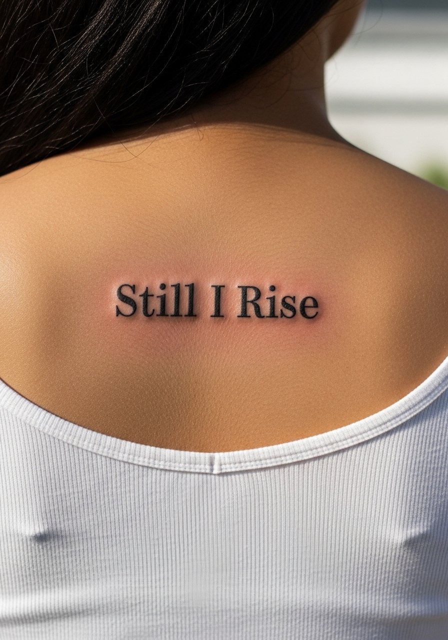
Visual impact lead: centered text across the upper back reads like a banner. The upper back tolerates several lines and keeps ink out of frequent sun exposure if you wear tops. Ask for moderate letter height and even kerning. The common mistake is making the phrase too low where it curves with the shoulder blades. Session time is one to two hours. Healed, the phrase stays legible and usually needs fewer touch-ups than hand or finger placements.
16. Short Latin Phrase with Roman Numerals on the Inner Wrist
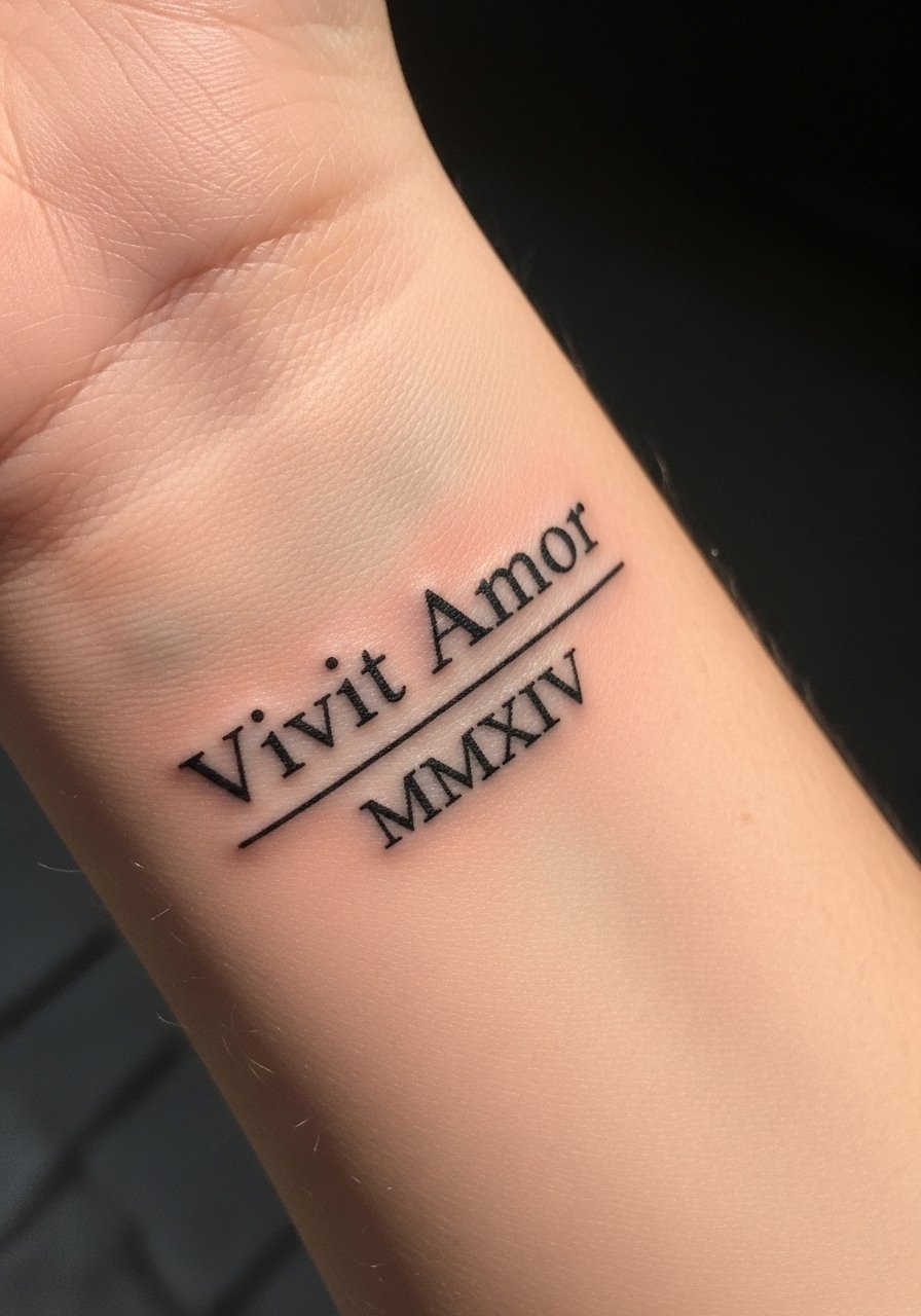
Mistake lead: people often cram dates and text into tight wrist space. If you want Roman numerals with a short phrase pick a slightly larger scale. Tell the artist to test spacing on your wrist during the consult. Session time is short and healing can be quick. Expect touch-ups at year two for the numerals if you want them to remain bold.
17. "She Is A Storm" with Stipple Shading on the Thigh
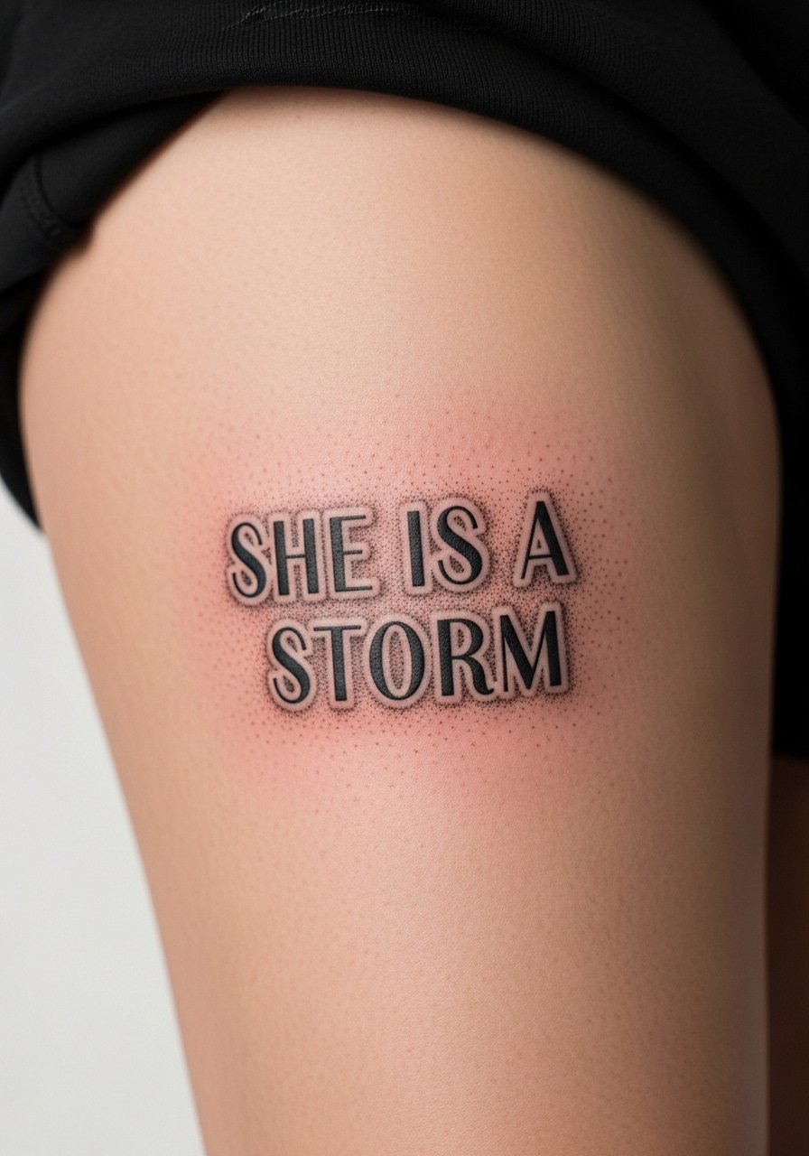
Controversy lead: some artists feel gendered wording reads dated, others see it as reclamation. If you choose this, pick font weight and shading that age well. The thigh handles big lettering and stipple shading nicely. Ask for dot work gradients rather than heavy gray wash to keep texture over years. Sessions can be one to two hours. The thigh is forgiving for touch-ups and for body shape changes.
18. Tiny Coordinates in Monospace on the Ankle
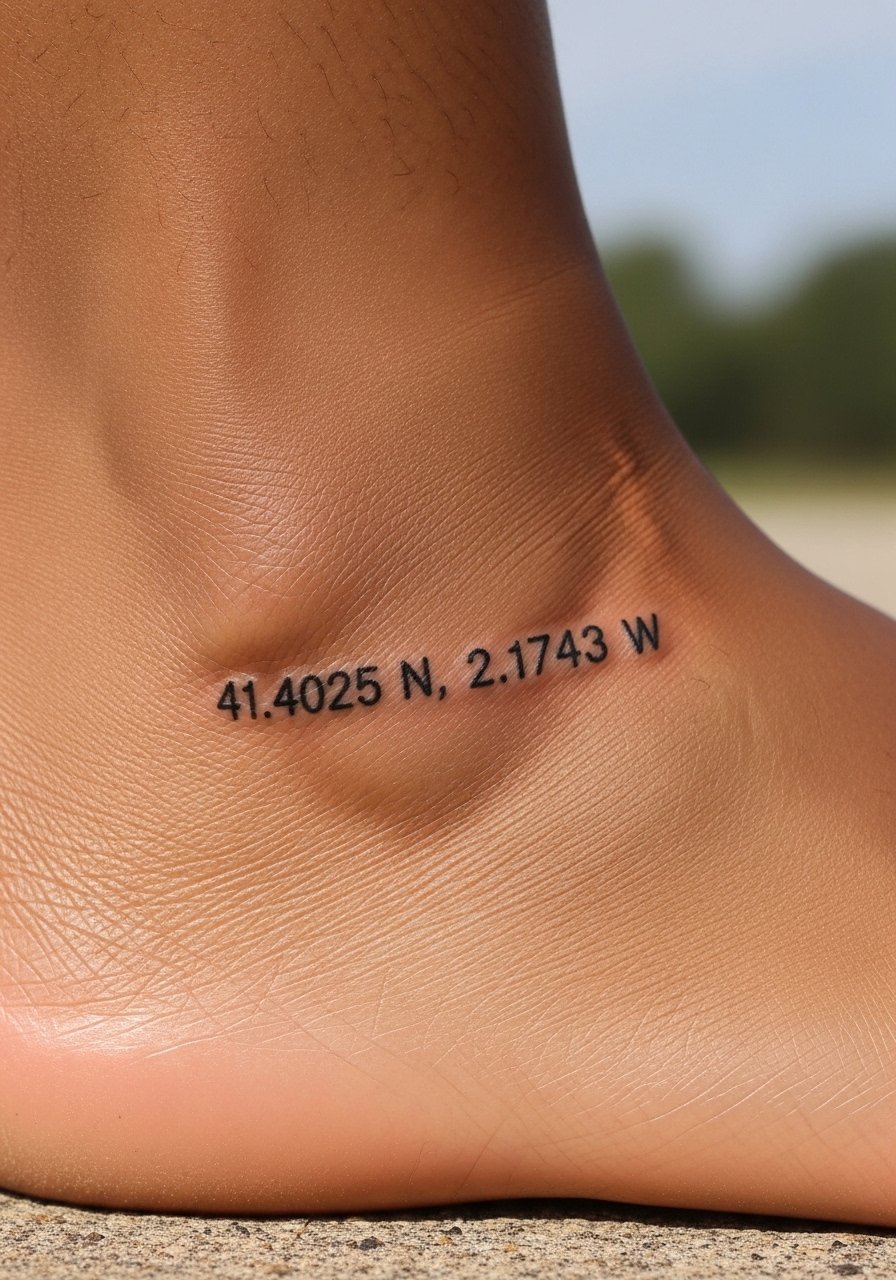
Consultation lead: because numbers require precision, bring exact coordinates and a mockup. Ankles suffer abrasion so request slightly bolder type and allow breathing room between numerals. Session is short and pain is low to moderate. Expect touch-ups sooner than forearm pieces if you wear low shoes often. This makes a discreet, literal marker of place that reads well when spaced correctly.
19. Short Philosophy Line on the Side Rib with Whip Shading Accent
Mistake lead: people pick rib text and then cram in ornaments that cause visual clutter. This placement benefits from clean script and a small shading flourish. Tell the artist you want the script to follow the rib curve and minimal whip shading for atmosphere. Healing takes longer and pain is higher. If you plan weight changes keep the line closer to the upper ribs where stretch is less dramatic. A touch-up may be useful at year three.
20. Single Word "Breathe" in Lowercase on the Forefinger Side
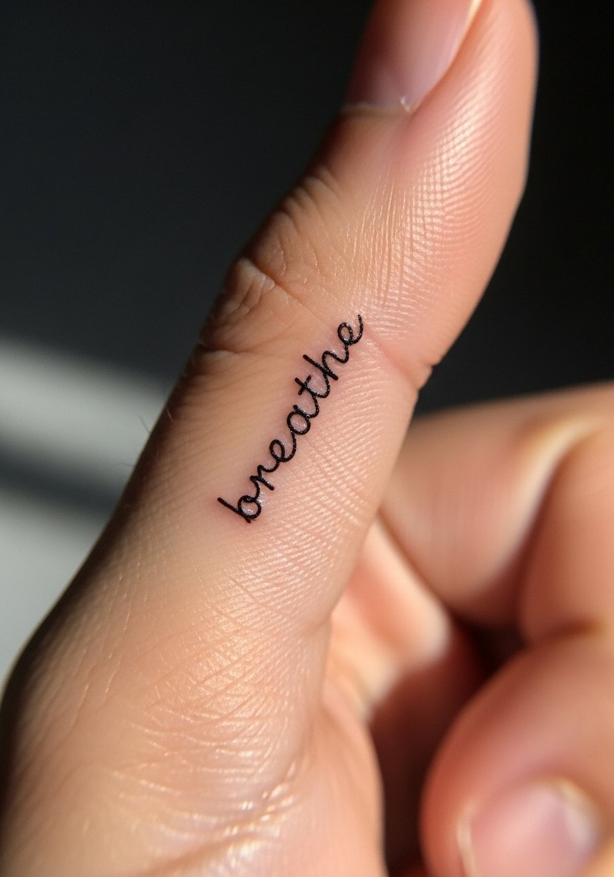
Mistake lead: fingers are the fastest to fade. If you insist on finger placement, choose a single word and ask for medium weight rather than micro. Sessions are quick but count on touch-ups every 1 to 3 years. Hands heal differently so follow aftercare carefully. If career considerations matter keep in mind visible hand tattoos may still affect some employers.
Tattoo Prep and Aftercare Essentials
Fragrance-free gentle foaming cleanser for sensitive skin. Use from day two when the initial scab softens. Cleans dirt and excess ink without stripping natural oils. Good for daily gentle washes during the first two weeks.
Lightweight fragrance-free healing balm. Apply thin layers after cleansing once scabs have flattened. Helps maintain moisture without clogging pores.
Medical-grade second skin bandage, 6-inch roll. Useful for overnight protection on high friction spots like ribs and forearms. Replace as directed by your artist.
Breathable compression band for rib and thigh placements. Wear briefly after large sessions to reduce swelling and bruising when recommended.
Broad spectrum mineral sunscreen SPF 50. Essential for long-term preservation of linework and saturation after full healing.
Antibacterial non-scented mild soap bar. Use cautiously in first week for gentle cleaning when your artist advises.
Saniderm transparent adhesive bandage pack. One mainstream product option for those who want an occlusive second skin approach. Follow your artist's instructions and count this as your one mainstream reference.
Lightweight silicone scar sheet for long-term care. Helpful months after healing to smooth raised areas and preserve crisp edges on letterwork.
Every tattoo is different. Always follow your artist's specific aftercare instructions. Consult a dermatologist if you have skin concerns or unusual healing issues.
Frequently Asked Questions
Q: Will fine line script blur faster on darker skin tones than on lighter tones?
A: From what I've seen, fine line can appear to blur faster on medium to dark tones when the contrast between ink and skin is low. The fix is to ask for slightly heavier linework or to pair the text with small shading or dot work for contrast. An artist who has healed photos on similar skin tones will show you realistic expectations.
Q: How long should I budget for a collarbone phrase like "She Believed She Could So She Did"?
A: Expect a single focused session of roughly one to one and a half hours for medium-sized collarbone text. Add time if you want decorative flourishes or color. Book with an artist who lists hourly rates so you avoid surprises and bring clear placement photos.
Q: Do ribcage watercolor washes need different aftercare than blackwork text?
A: Yes. Watercolor washes are more pigment-dependent so sun protection and gentle moisturizing are key after the initial healing. Use a gentle foaming cleanser and a lightweight healing balm until fully healed, then sunscreen to protect the washes. If you used an occlusive bandage like Saniderm discuss removal timing with your artist.
Q: If I want a quote on my finger, how often should I expect touch-ups?
A: Realistically you should plan for touch-ups every one to three years for finger text. Fingers face constant washing and friction. Choosing a slightly bolder stroke and accepting a maintenance plan will save frustration.
Q: Can I find artists who specialize in script near me without naming specific shops?
A: Yes. Search hashtags like #scripttattoo and check platform listings on Tattoodo or Booksy with your city query. Look for portfolios with healed photos and examples on skin tones similar to yours. Ask about healed work during the consult.
Q: Are there placements where long phrases age better than single words?
A: Longer phrases tend to age better on forearms, upper back, and thighs where movement and sun exposure are lower. Micro placements like fingers and wrists accelerate wear. Ask your artist where the phrase will keep linework clear as your body moves.
Q: Should I be worried about blowout with dense blackwork lettering?
A: Blowout risk depends on needle depth and placement. Dense blackwork on forearms and thighs usually has low blowout risk when the artist uses controlled depth and even saturation. If you see fuzzy edges in portfolio photos avoid that artist and ask about their linework technique.
