

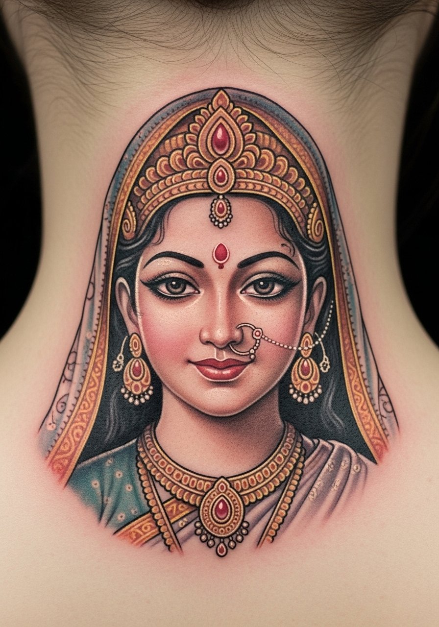
I spent months tracing Sanskrit script across portfolios and wrist shots before I realized the real problem wasn’t choosing a phrase. It was picking a style that keeps its sacred energy after healing. These 21 ideas pair Sanskrit text and symbols with styles and placements that age well, and I include what to ask your artist so the meaning stays crisp.
This list focuses on fine line, traditional blackwork, micro-realism, and calligraphic Sanskrit. Good for first-timers and collectors. From what I’ve seen in 2026 trends, artists favor compact scripts, seed syllables, and integrated mandalas that stand up to time.
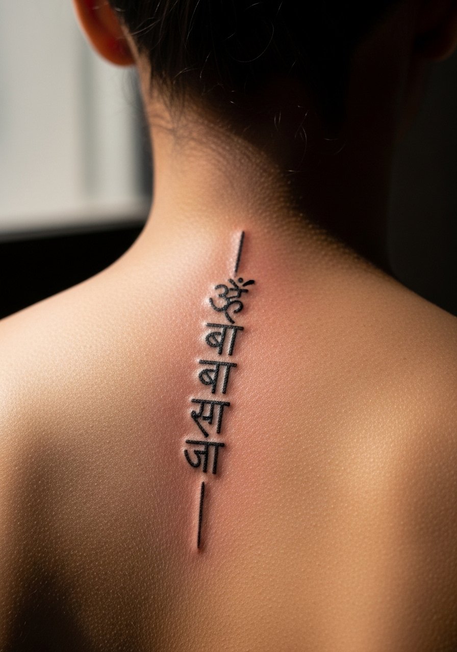
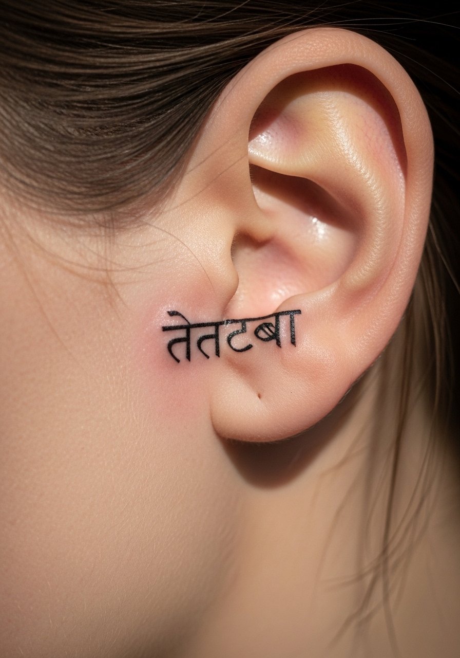
1. Fine Line "ॐ" Behind Ear
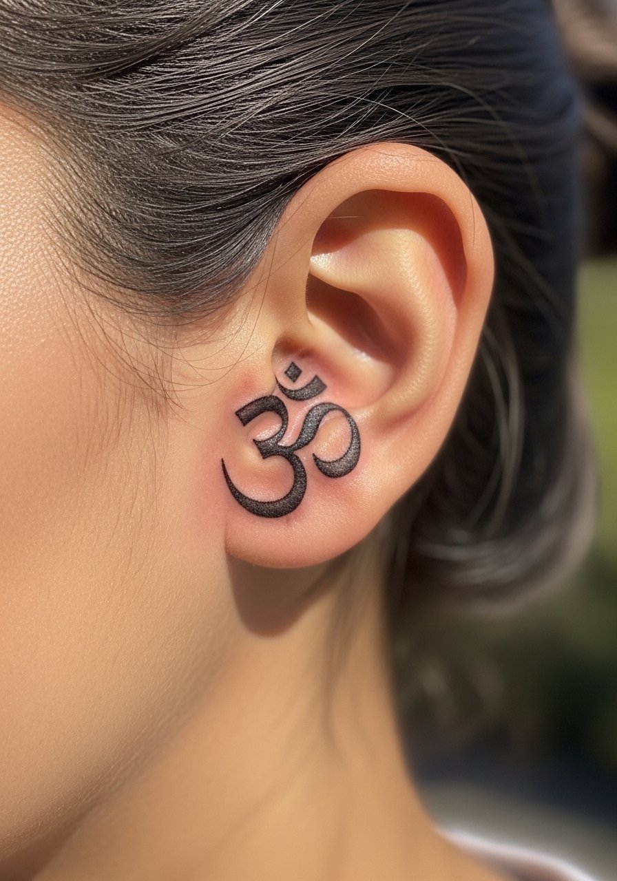
I first saw this small "ॐ" behind a friend's ear and kept staring at how intimate it felt. Behind the ear is low-pain for most people, but expect a tickly vibration during tattooing. A 10 to 20 minute session usually covers it. Ask your artist for a slightly heavier line than ultra-micro so it does not vanish after two years. From what I’ve noticed, pure ultra-thin strokes blur faster. The biggest mistake is asking for brush-thin script in that spot. Request healed reference photos of the artist doing small Devanagari script. It reads personal and discreet, and it holds energy without being showy.
2. Minimalist Script "शान्ति" Inner Wrist
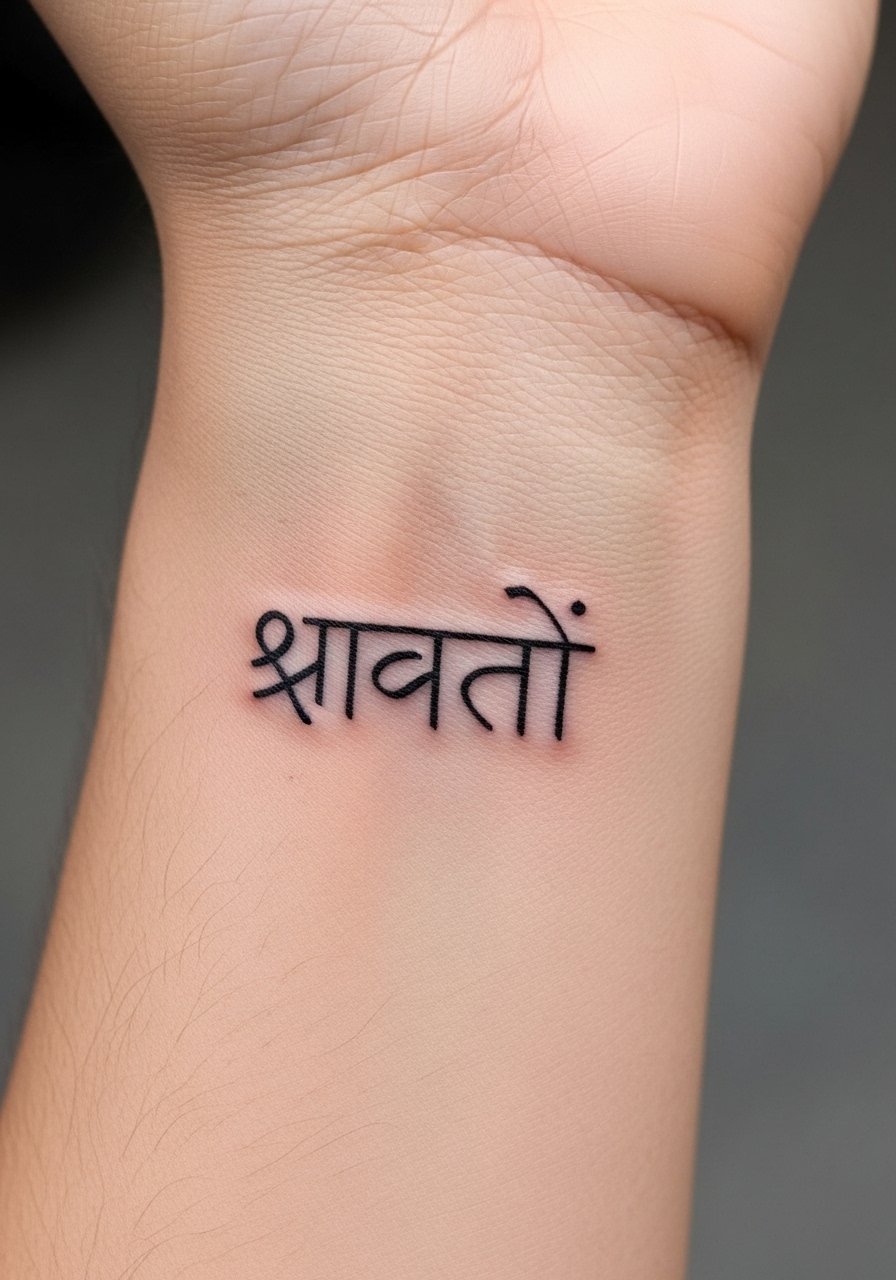
Fair warning, the inner wrist is sensitive. A "शान्ति" tattoo there takes about 20 to 30 minutes and feels like a sharp vibration. I recommend a single-session fine line approach. Tell your artist you want the spacing open between characters so the letters do not bleed into each other as the skin settles. From what I’ve seen, people who request cramped lettering regret it at six months. For aftercare, I use Aquaphor at night for the first few days. I’ve linked a staple product in the aftercare section. This placement reads calm and is easy to cover with a watch.
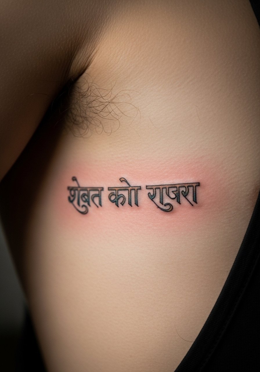
3. Blackwork Mandala With "ॐ नमः शिवाय" Sternum
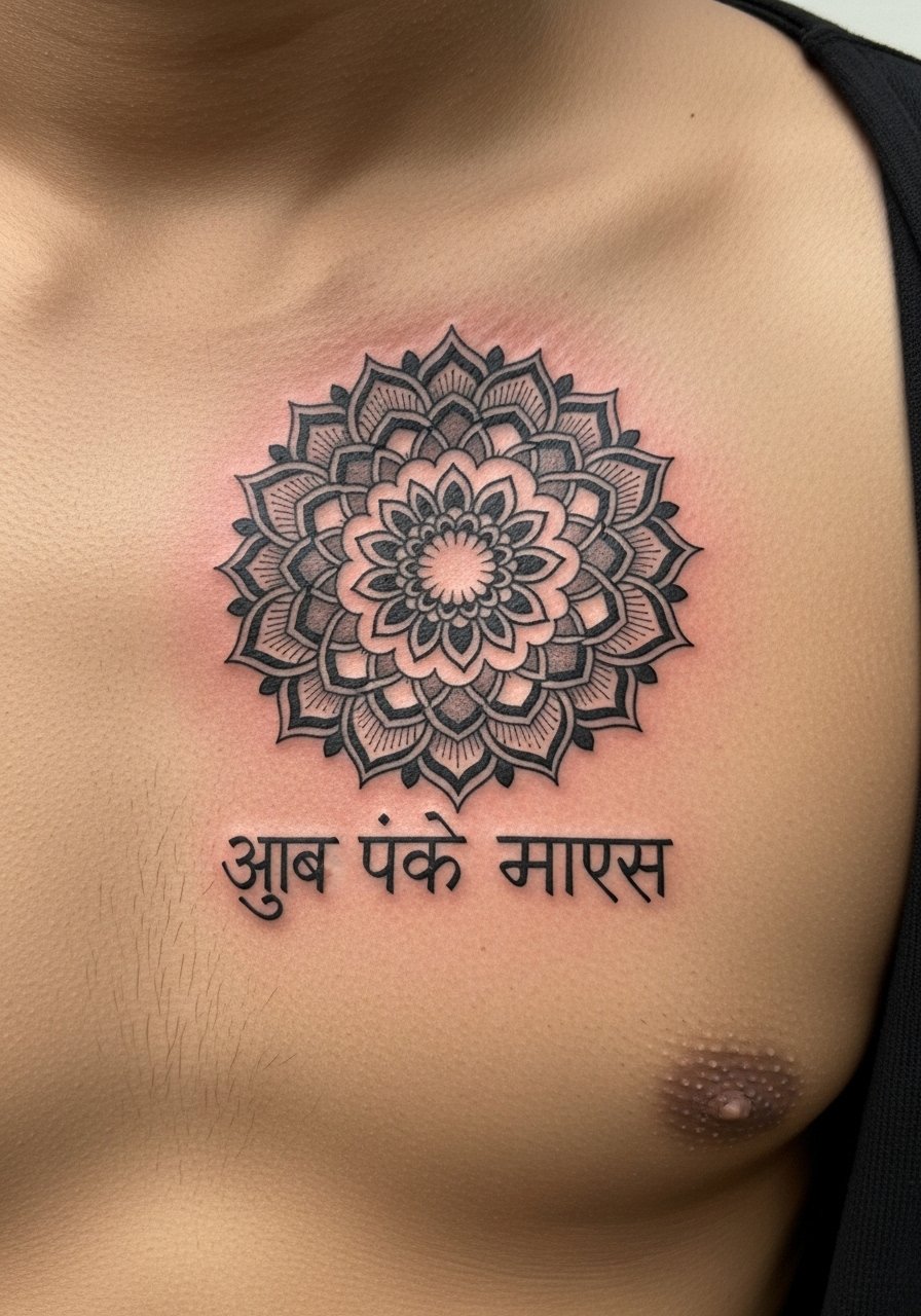
Most people underestimate sternum pain. Expect a 6 to 8 out of 10 on pain. The result can be deep and sacred. I suggest bold blackwork lines around the script so the Devanagari characters stay distinct as the piece ages. Ask for screens of healed chest tattoos from the artist, not just fresh photos. Artists I’ve talked to say chest ink holds well if lines are slightly thicker and spacing is generous. A common error is insisting on ultra-fine script inside heavy dotwork. The script needs breathing room to avoid looking muddy after a year.
4. Micro-Realism Ganesha Upper Arm
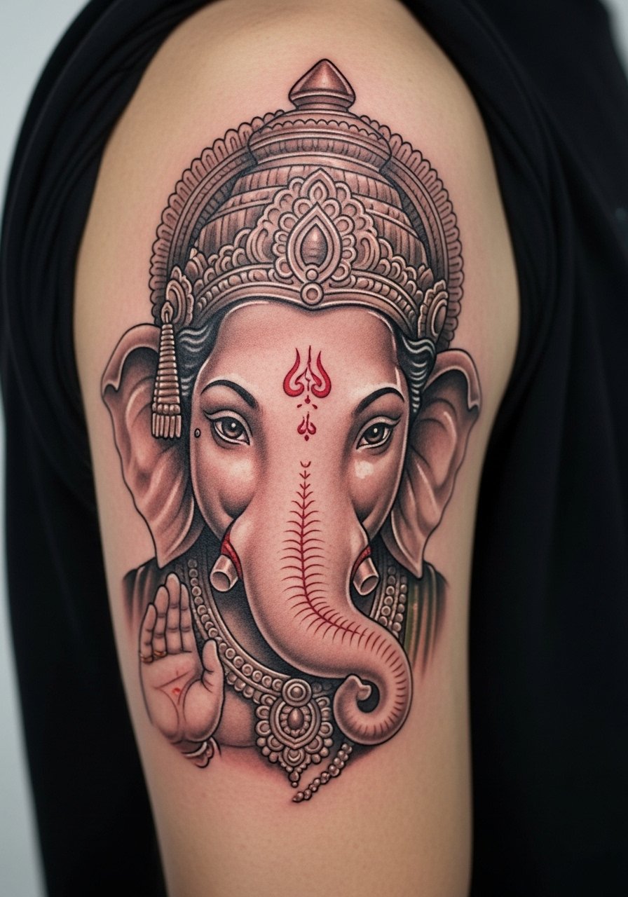
I came across this style at a studio that specializes in portraits. Micro-realism on the upper arm is forgiving and low to moderate on pain. Sessions often run one to three hours. Tell your artist you want softer contrast and deliberate highlights so the deity’s features remain readable after two years. From what I’ve observed, over-contrasted micro-realism fades into blotches if the highlights are missing. A mistake I see is shrinking a detailed portrait to fit a small wrist. Keep this on the arm for clarity. It reads like a devotional piece and ages like a photograph on skin.
5. Calligraphic "तत् त्वम् असि" Ribcage
Fair warning, the ribcage hurts. I rate it a 7 out of 10. But a flowing "तत् त्वम् असि" along the curve looks dramatic. Ask for vertical spacing that follows your rib line so characters do not stretch when you breathe. From what I’ve seen, rib scripts that hug the curve with medium-weight strokes stay readable. A common mistake is requesting cramped lettering to save space. This phrase needs space to breathe. Healing takes longer because of skin movement, so expect two weeks of careful aftercare and minimal friction from clothing.
6. Fine Line "अहिंसा" Collarbone
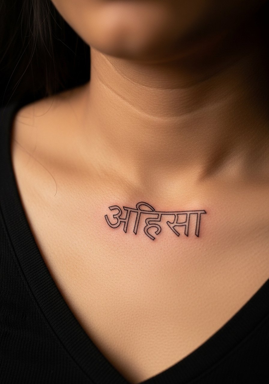
The collarbone can be bony and sting more than the upper arm. I’ve noticed it is very visible when you wear open necklines. Ask your artist for a slightly slanted script that follows the clavicle. From what I’ve gathered, thin lines here can blur if the letters are too tight. Also ask about Saniderm for the first 48 hours if you sleep on your side. I include a Saniderm link in the aftercare list. Avoid asking for decorative flourishes that touch the bone. They often break up during healing and look uneven after a year.
7. Geometric Mandala With "सत्यमेव जयते" Back Shoulder
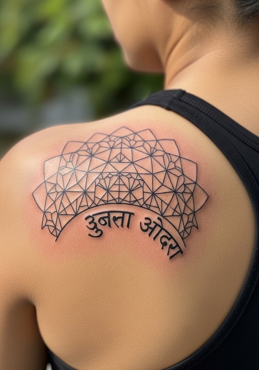
There is something about mandalas and text that reads like a personal emblem. The shoulder is low pain and ages steadily because it gets moderate sun and friction. I tell artists I want the phrase on a gentle curve, not a straight line, so it wraps with the shoulder blade. From what I’ve seen, small letters placed too close to intricate linework get lost after two years. A common mistake is packing script into tight geometric gaps. Give the script space and pick mid-weight lines so the letters remain legible when the mandala softens.
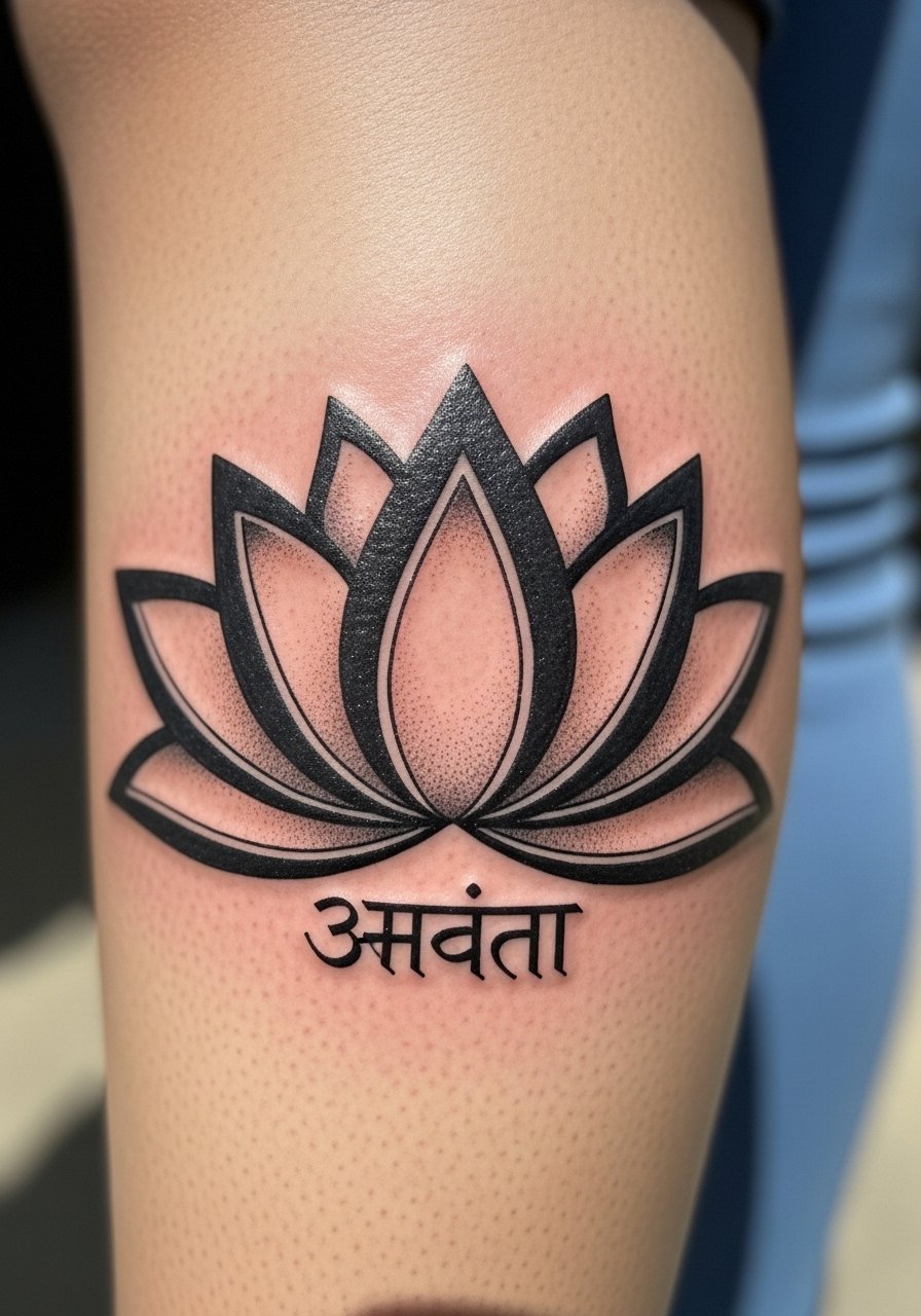
8. Watercolor Lotus With "श्री" Thigh
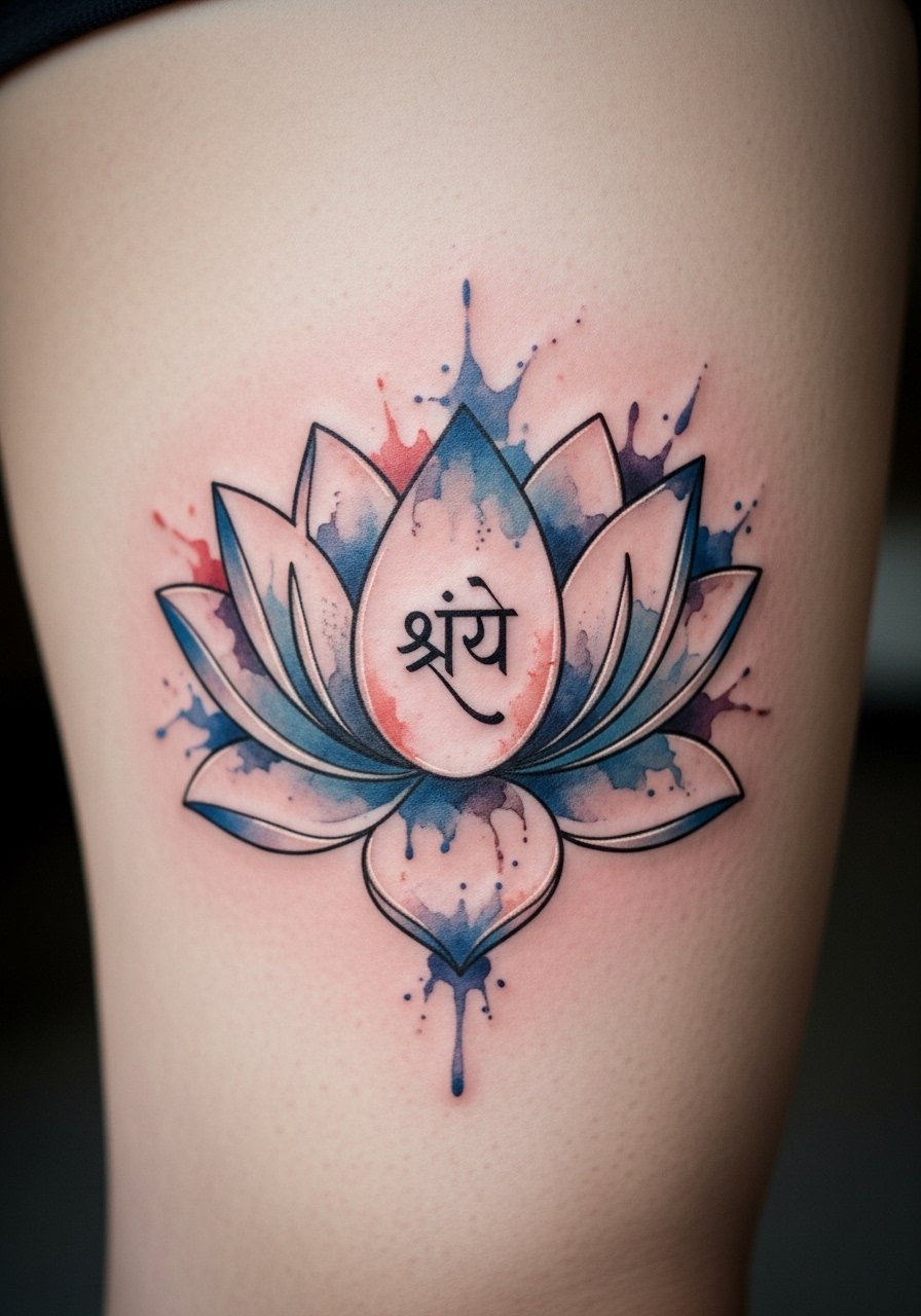
Most watercolor pieces on the thigh heal beautifully because there is plenty of soft tissue. The pain is moderate. I’ve seen artists keep the Sanskrit seed "श्री" in solid black while letting color float around it. That contrast makes the script hold up. Tell your artist you want the core glyph in solid pigment and the color in softer washes. From my experience, watercolor-only designs with script in the same thin wash fade into a blur. The thigh also allows for a larger scale, which helps legibility over time.
9. Vertical "राम" Spine
When you sit down with an artist for a vertical spine script, bring posture photos. The spine shifts and the letters can stretch visually when you bend. Pain on the spine is higher, around 7 to 8 out of 10. Sessions may be 30 to 60 minutes for a short phrase. From what I’ve observed, solid medium-thickness strokes are best. I keep Aquaphor on hand for the first few nights because that area can dry and scab if left uncovered. A mistake I see is asking for ultra-fine vertical lettering that becomes unreadable after six months.
10. Minimalist "धैर्य" Finger Script
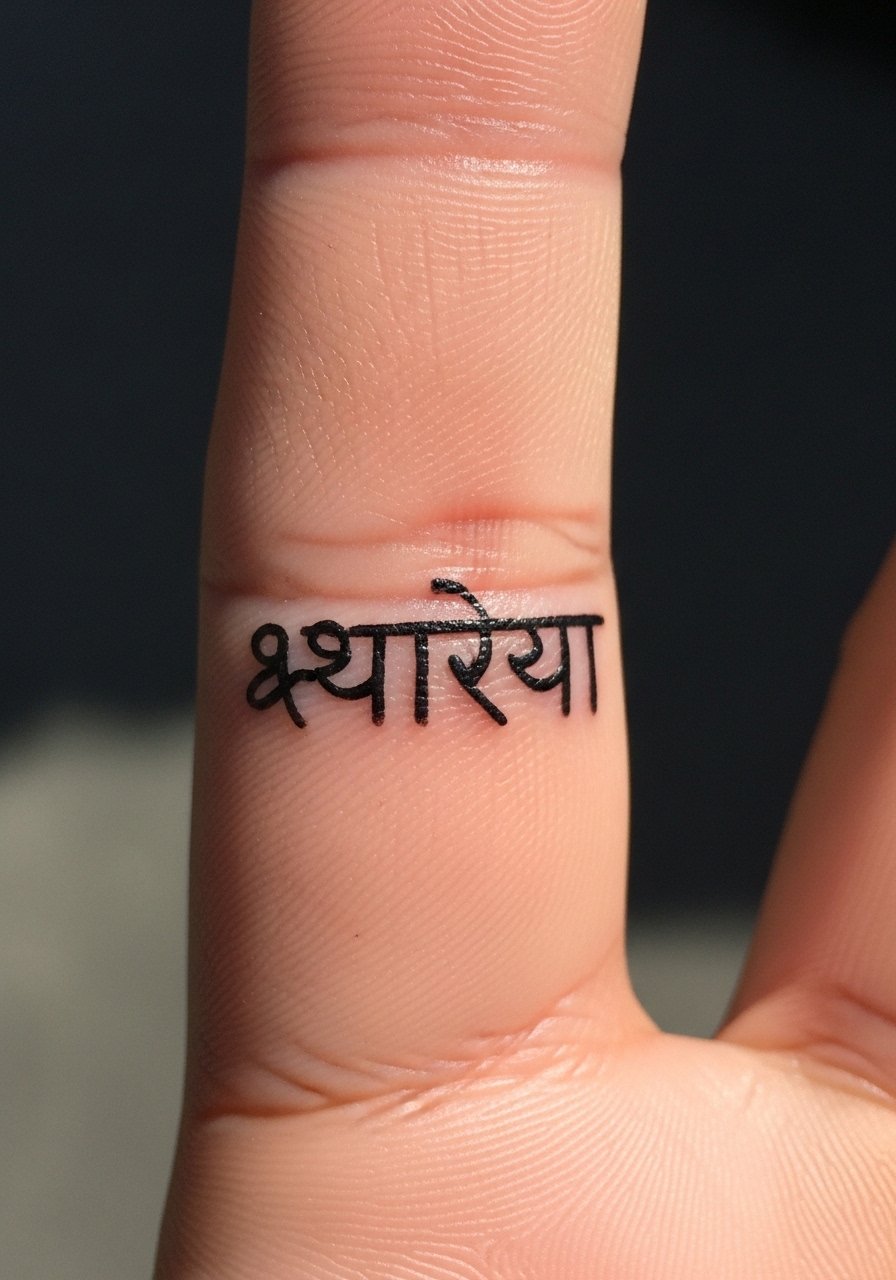
Fair warning, fingers are notorious for fading. I tell friends to expect touch-ups. The pain is sharp but quick. Keep the design tiny and accept that unrealistic expectations lead to disappointment. From what I’ve gathered, single-word finger scripts survive best when characters wrap slightly around the finger and use mid-weight lines. The biggest mistake is cramming complex characters into a single knuckle. Ask your artist about long-term maintenance and be prepared for a follow-up session after a year.
11. Blackwork Lotus With "अनन्त" Calf
I first saw this pairing at a convention and liked how sturdy it looked. The calf is low pain and holds blackwork very well. Sessions vary from one to two hours. Ask your artist to anchor the script into solid black spaces rather than thin filigree so letters remain readable. From what I’ve noticed, calf tattoos resist sun damage better than shin placements. A common error is placing thin script over delicate dotwork. That combo tends to blur into texture after a couple of years.
12. Sri Yantra Fine Line Chest
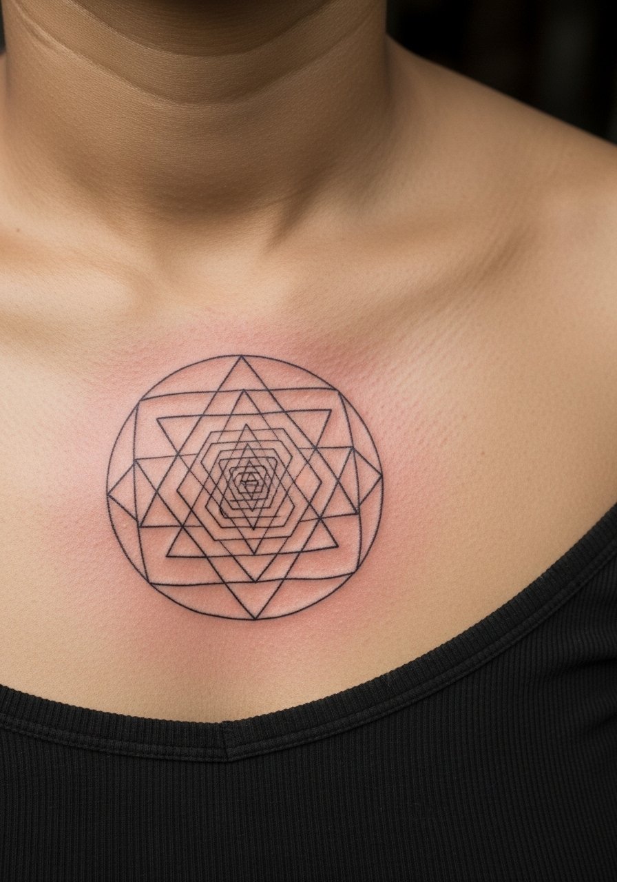
I’ve seen Sri Yantra chest pieces read as devotional centerpieces. The chest varies in pain but is generally manageable. Precision is everything here. Tell your artist you want slightly thicker anchor lines so the geometry does not lose its form with time. From what I’ve learned, perfect tiny intersections look great fresh but can melt into a muddled grid if they are too fine. A careful balance keeps the sacred geometry sharp as it heals.
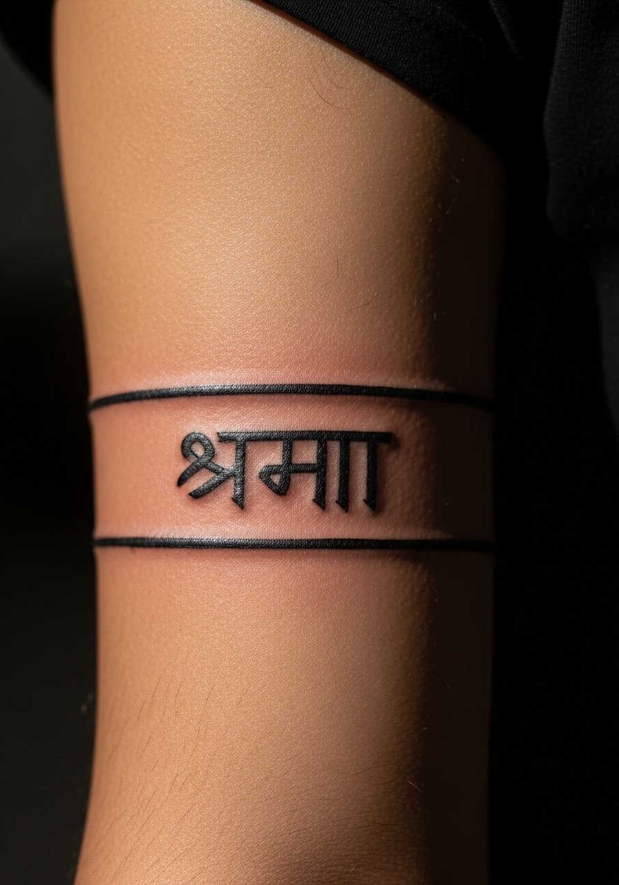
13. Forearm Band Mantra "शिवोहम्"
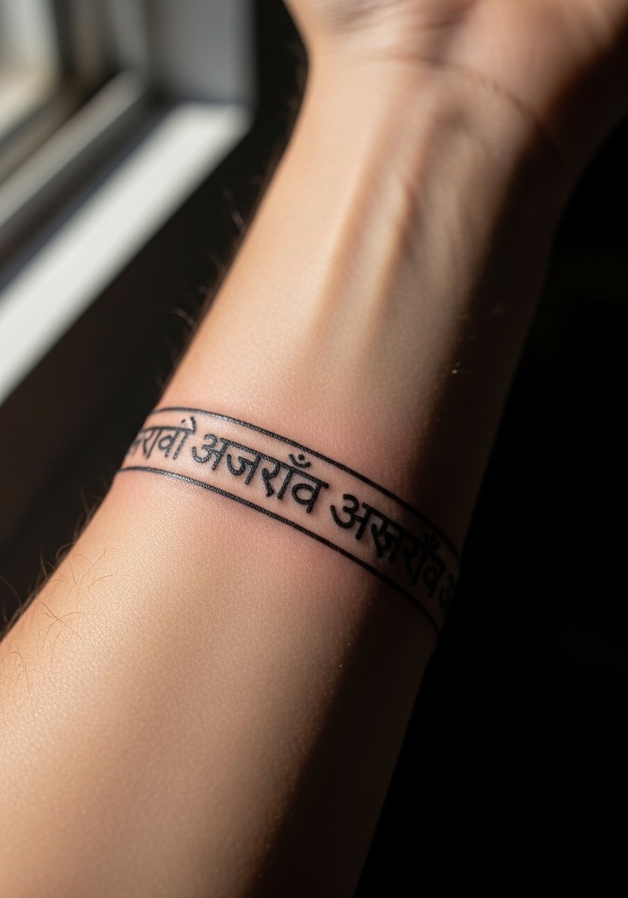
There is a visual impact to a mantra band. The forearm tolerates longer sessions and feels moderate on the pain scale. When getting repeating text, tell your artist you want consistent kerning and even letter spacing. From what I’ve seen, uneven letter height across the band looks sloppy once healed. I find Hustle Butter helps during the transition from scab to settled ink for larger bands. Avoid tiny repeat scripts in narrow bands. They compress and become unreadable after a year.
14. Small Seed Syllable "ह्रीं" Wrist
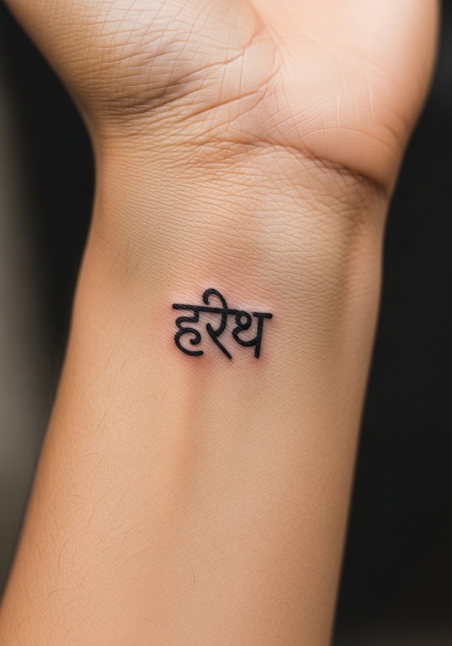
Most seed syllables need clarity. The inner wrist is visible and feels sensitive. Ask your artist for a heavier center stroke and tapered ends so the symbol retains form as it spreads. From my experience, products like CeraVe lotion work well after the initial healing phase to keep ink vibrant. I include a link to it in the aftercare list. The mistake I see is requesting an ornate flourish around the syllable that obscures the glyph after healing.
15. Back Of Neck "कृष्ण" Small Calligraphy
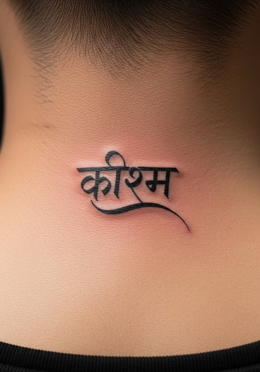
I’ve had friends get the nape done for subtle visibility. It is a moderate pain spot because of thin skin. This placement is great if you want occasional exposure. Tell the artist you want slightly bold curves so the letters do not shrink into skin texture. From what I’ve seen, very thin strokes at the nape disappear faster than you expect. Avoid tiny, ornate scripts that look great fresh but lose their shape by the one-year mark.
16. Fine Line Name "आशा" Inner Forearm
When someone asked to tattoo the name "आशा" in Devanagari, I suggested inner forearm for readability and low friction. Sessions take 20 to 40 minutes. Ask your artist to space vowels deliberately, because Devanagari ligatures can bunch. From what I’ve learned, ligature crowding is the most common mistake with name tattoos in Devanagari. A thin, steady line with open spacing preserves meaning and looks elegant even after years of wear.
17. Micro-Realism Saraswati Nape
There is a delicate quality to a deity portrait at the nape. The area is small, so pick an artist experienced in facial micro-realism. Pain is moderate and sessions can stretch depending on detail. From my experience, high-contrast highlights are what keep facial features readable over time. People who skip subtle highlights end up with flattened faces after a couple of years. Ask to see healed realist portraits on similar skin tones before you commit.
18. Geometric "अस्तेय" Upper Forearm
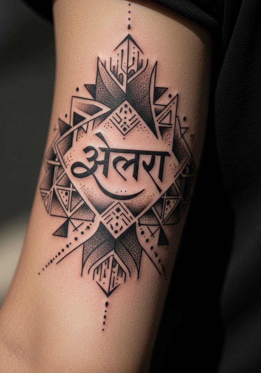
The upper forearm is forgiving. I found that geometric patterns anchor script well there. Ask the artist to place script in negative space, not layered over dense linework. From what I’ve seen, letters that sit on clear backgrounds keep their meaning through time. A mistake I see is stacking heavy geometry over thin script. The script disappears as the background saturates. Keep contrast high and spacing clear.
19. Minimalist "तत्त्व" Behind Ear Small Glyph
One mistake people make is underestimating scale behind the ear. Tiny glyphs can become smudged if they are smaller than a thumbprint. I recommend a size that reads at arm’s length. Pain is mild. Tell your artist you want the characters slightly bold and simple. From what I’ve gathered, compact but solid letters survive better than micro-detail in that spot.
20. Script Band "धर्म" Upper Bicep
I like the cuff effect for devotional words. The upper bicep gets sun and sweat but it heals well. Ask for even letter height so the band reads like a single unit. From what I’ve seen, inconsistent stroke weight breaks the rhythm and makes the band age unevenly. A typical session is 30 to 60 minutes. Avoid overly thin flourishes on a band. They tend to fragment with movement.
21. Mandala Foot Arch With Center "ॐ"
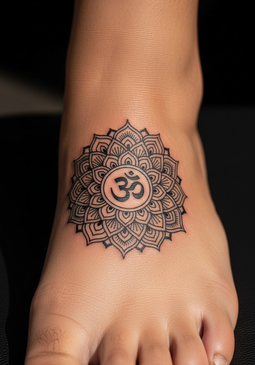
The arch is a finicky place. Pain ranges depending on how high on the arch you go. From my experience, mandalas here need slightly thicker anchor lines so they do not blur with weight and shoe friction. I suggest talking to your artist about waterproof bandaging options for the first week. People who skip protective measures often lose crisp edges. The reward is a remote sacred piece that peeks out with sandals.
Tattoo Prep and Aftercare Essentials
Aftercare Essentials:
- Aquaphor Healing Ointment, 14oz tube. Industry standard for first 3 to 5 days. I use a thin layer at night
- Saniderm Transparent Adhesive Bandage, 6-inch roll. Second skin healing method. Every artist I know recommends it for the first 24 to 72 hours
- CeraVe Fragrance-Free Moisturizing Lotion, 16 oz pump. Daily moisturizer for days 4 to 14. I prefer the pump bottle for hygiene
- Dr. Bronner's Unscented Castile Soap, 32 oz. Gentle cleanser for rinsing twice a day the first week. Dilute a small drop with water
Before Your Appointment:
- Numbing Cream with 5% Lidocaine, 30g tube. Apply 30 to 45 minutes before your session only if your artist approves. Some artists prefer no numbing
- Tattoo Stencil Transfer Paper, A4 Pack. Useful if you want to test placement at home before your appointment
Long-Term Maintenance:
- SPF 50 Sunscreen Stick for Tattoos, 0.5 oz travel size. Use on healed tattoos whenever they see sun. I carry one for beach days
- Mad Rabbit Tattoo Balm, 2 oz. Long-term maintenance for vibrancy. Artists I know recommend it for healed pieces
- Hustle Butter Deluxe, 5 oz. Vegan alternative that works during healing and after. Smells better than most aftercare
Optional Comfort Items:
- Tattoo Numbing Spray, 4 oz. Handy for touch-ups or sensitive areas mid-session
- Hydrocolloid Bandages, Large Size 10 pack. Good alternative to Saniderm for small to medium tattoos
Frequently Asked Questions
Q: Will fine line Devanagari blur if I get a full sleeve of Sanskrit text?
A: From what I’ve seen, fine line scripts blur faster when packed tightly into a sleeve. If you want a full arm of Sanskrit text, ask for mid-weight strokes and generous spacing. Also request that your artist staggers phrases with negative space or subtle dotwork. That breathing room preserves legibility at the six month and two year marks. For maintenance, I use CeraVe lotion after the first week. It keeps lines looking cleaner longer. CeraVe Fragrance-Free Moisturizing Lotion, 16 oz pump.
Q: Do watercolor-style Sanskrit tattoos need different aftercare than traditional blackwork?
A: Yes, in my experience watercolor needs the same initial cleaning routine but you should avoid heavy ointments that pool pigment. I pat with diluted castile soap and apply a light layer of Aquaphor the first few nights, then switch to a fragrance-free lotion like CeraVe. For long-term vibrancy, keep healed watercolor pieces protected with SPF sticks on sunny days. Dr. Bronner's Unscented Castile Soap, 32 oz and SPF 50 Sunscreen Stick for Tattoos, 0.5 oz.
Q: Are deity portraits in micro-realism harder to keep looking sacred over time?
A: From what I’ve learned, portraits need careful contrast and occasional touch-ups. Ask your artist for strong but natural highlights and mid-tones so facial features hold up. Keep healed portraits out of prolonged sun. For the transition period from scab to settled ink, I like a light application of Hustle Butter or Mad Rabbit. Hustle Butter Deluxe, 5 oz.
Q: For ribcage Sanskrit script, what should I tell my artist about size and spacing?
A: Tell your artist you want open spacing and medium-weight lines that follow the curve of your ribs. From what I’ve seen, letters placed too tightly disappear as the skin moves. Request healed images of ribcage scripts from the artist and confirm they plan a single session or staged sessions based on your pain tolerance.
Q: How often will finger or hand Sanskrit tattoos need touch-ups?
A: In my experience finger and hand scripts often need touch-ups within 9 to 18 months. The skin there regenerates fast and sees constant friction. If you want longevity, accept mid-weight strokes and plan for a maintenance session. Use a hydrocolloid bandage when possible for the first few days and moisturize with a light lotion thereafter. Hydrocolloid Bandages, Large Size 10 pack.
Q: Is it okay to get a name tattoo in Devanagari if I don’t speak Sanskrit?
A: I’ve seen many people do this respectfully. The important part is accuracy. Bring the exact Devanagari spelling you want and ask the artist to stencil it on so you can check placement. If you want, ask for a slightly bolder form to account for ink spread. For stencil testing at home, a stencil transfer paper pack can help you visualize placement. Tattoo Stencil Transfer Paper, A4 Pack.
