
Someone I know spent months bookmarking Sanskrit script and deity pieces before realizing the real question was not which symbol looked best. It was which one fits the life you lead, the skin you have, and the places you can commit to touching up. These 25 Sanskrit-inspired ideas balance readability, cultural respect, and how tattoos actually age so you can pick something that still reads well in five years.
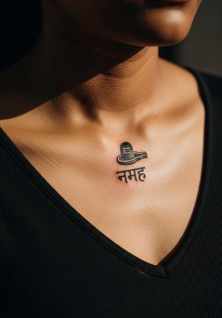
1. Om Symbol, Clean Bold Linework
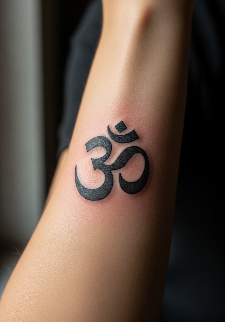
The Om symbol is the most requested Sanskrit element I see in shop portfolios. Artists split into two camps on its use. One camp warns that religious symbols on strangers can feel appropriative. The other camp says people connect to symbols through sincere personal practice. Tell your artist you want balanced linework and strong saturation so the character remains readable at two years. Expect a low to moderate pain level on the forearm and a one-session piece if kept simple. A common mistake is using tiny Om glyphs that blur into a smudge. Ask for slightly thicker linework than you might think, and schedule a touch-up around year two if you wear a lot of sun.
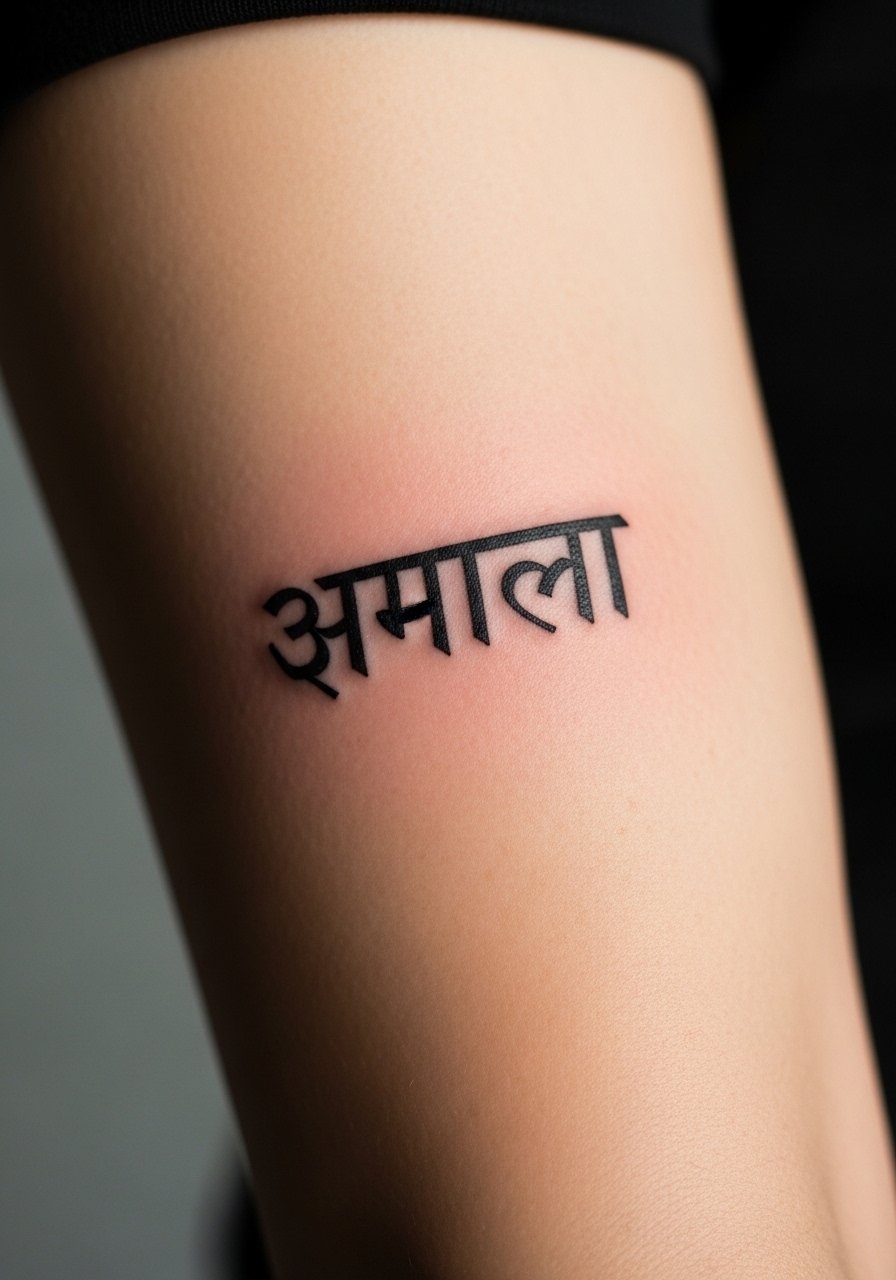
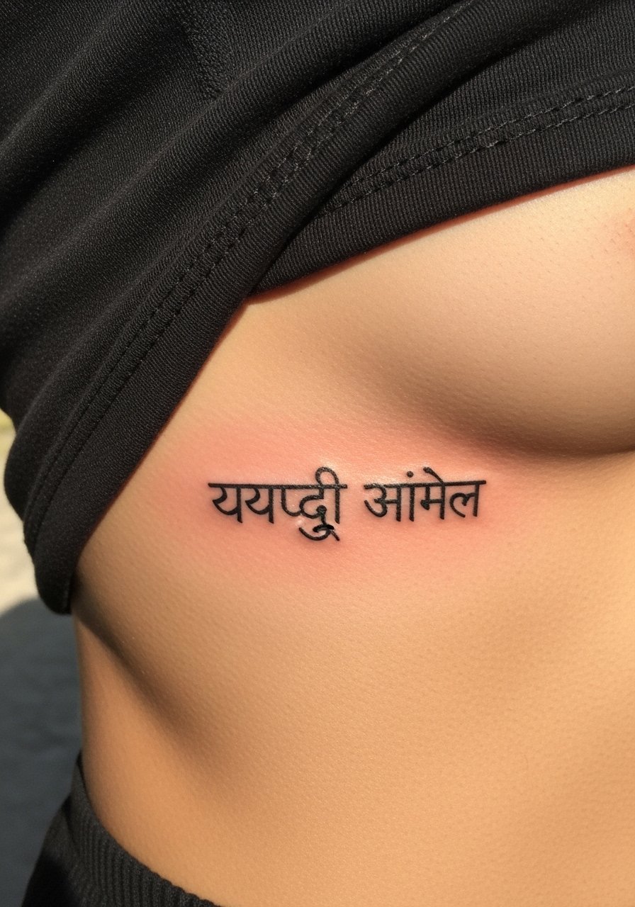
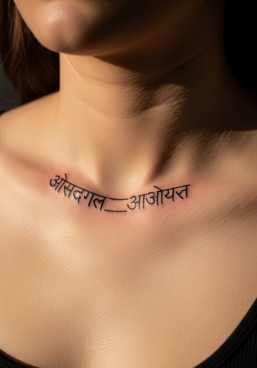
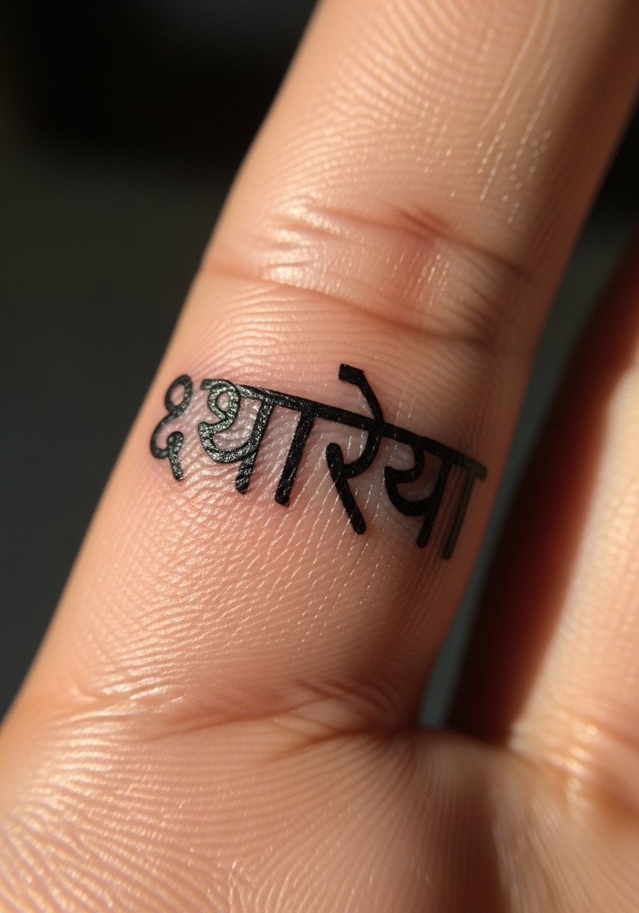
2. Single-Word Mantra in Devanagari, Inner Wrist
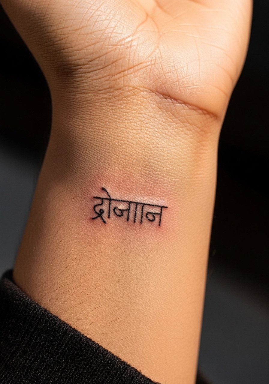
Fair warning, the wrist is a high-motion area and lines here can soften faster. I recommend one clear word like "शान्ति" so spacing stays legible. During consultation describe the exact font weight you want and bring a reference of the Devanagari characters at the scale you plan to wear them. The session is short and the pain moderate. A mistake I often see is asking for extremely fine script at wrist size. That tends to lose fidelity by year two. If you want a delicate look, ask for a slightly heavier line and plan a touch-up option.
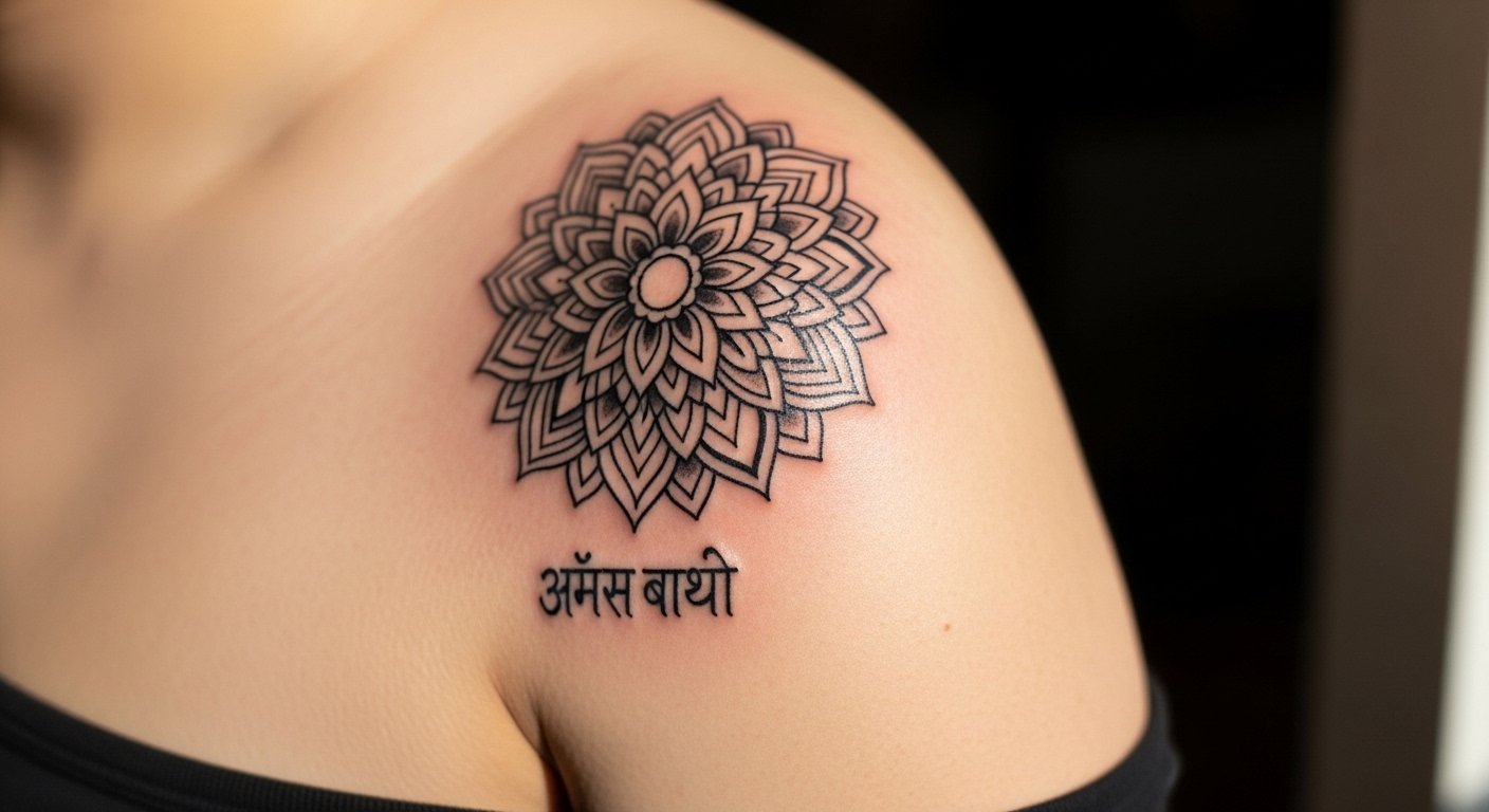
3. Mandala Ring with Sanskrit Band, Outer Bicep
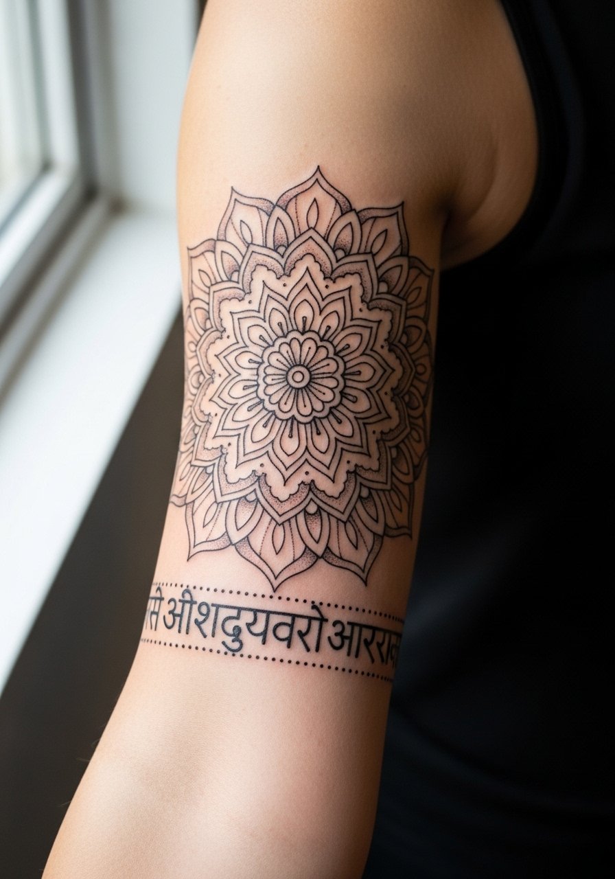
Someone I know liked mandalas for symmetry and then found the outer bicep kept the detail readable over years. Tell your artist to keep dots and stipple shading slightly spaced, so stipple does not merge as the skin ages. This placement is lower on the pain scale and offers room for a medium session. Common mistakes include cramming too many tiny petals into a small ring. If you plan a sleeve later, discuss how the mandala will integrate with future linework.
4. Ganesha Portrait with Short Mantra, Chest Plate
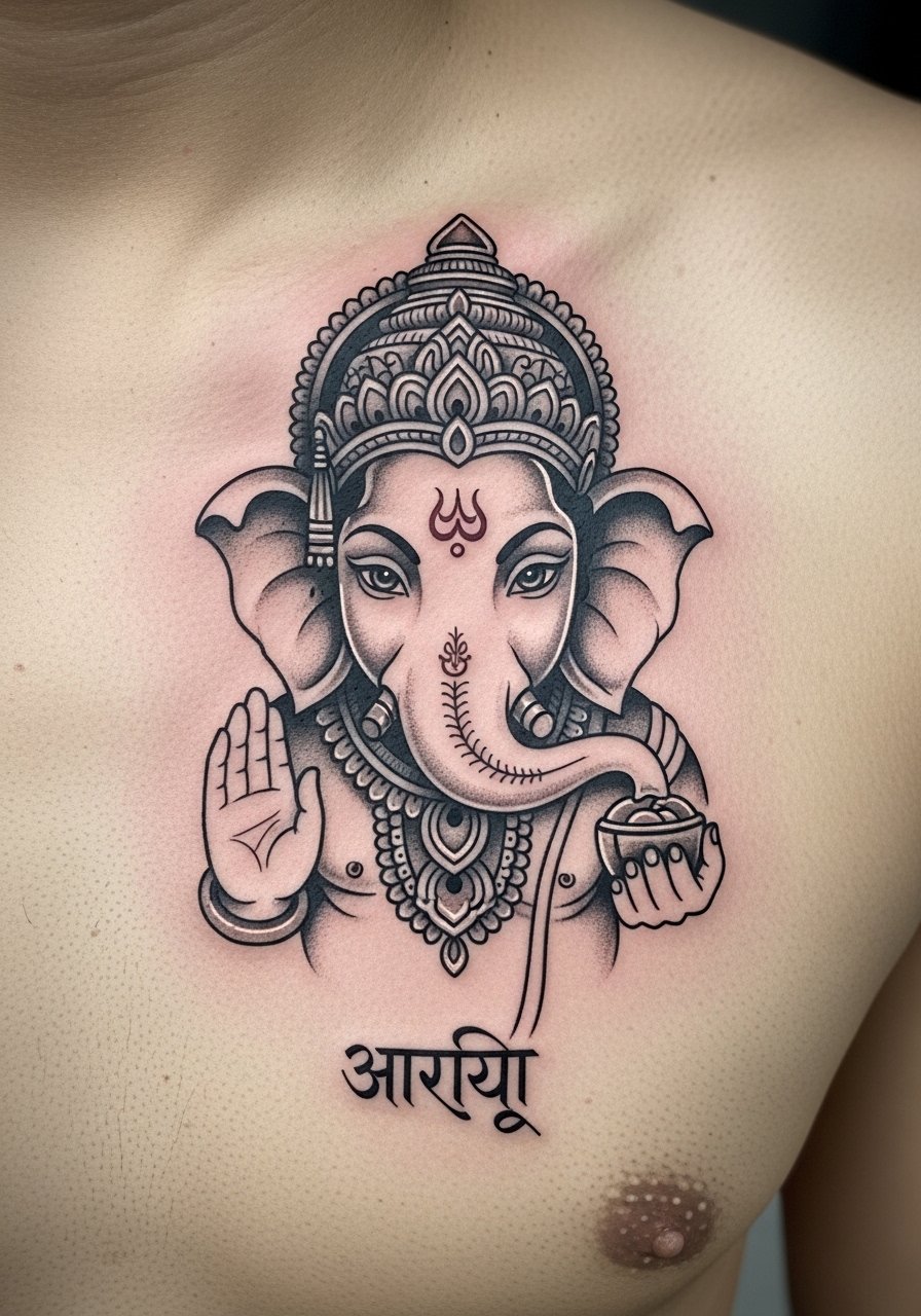
Religious imagery like Ganesha brings a clear controversy. One argument says sacred images are personal devotional choices and can be worn respectfully. The opposing view feels these images should not be used lightly by people outside the tradition. If you proceed, be explicit with your artist about respectful reference and avoid caricature. The chest allows for scale and saturation, which helps portraits hold detail. Expect higher pain near the sternum and longer sessions. Ask for reference variants that show facial proportions at different sizes. Portraits need time and touch-ups if you want the facial detail to last.
5. Vertical Seven-Chakra Script Along the Spine
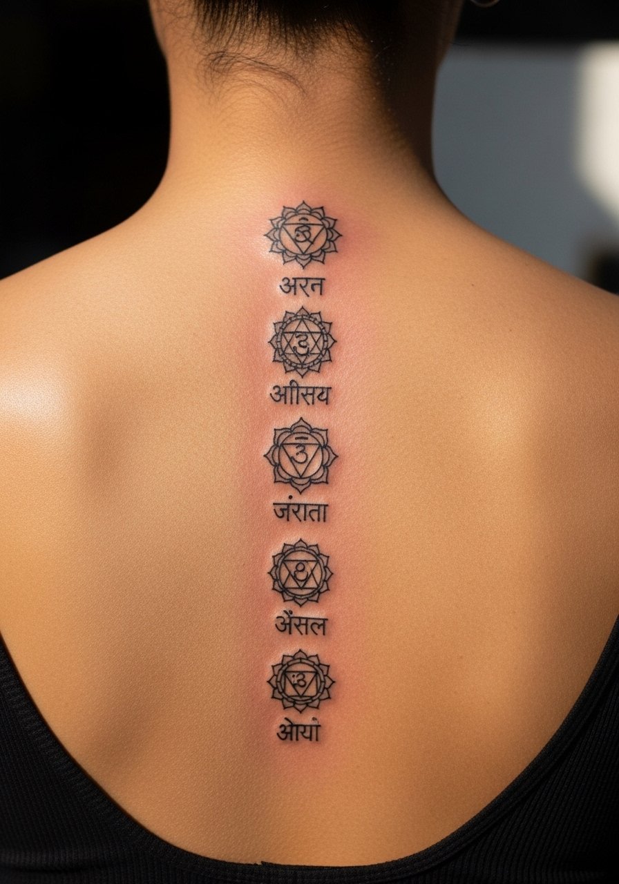
The spine is a dramatic canvas but it is a tender one. Most artists I talked to say spinal linework must be spaced to avoid those lines merging over time. Tell your artist you want each chakra symbol separated by clear negative space. Pain is higher along the spine, and this will likely take multiple short sessions. The payoff is a linear piece that reads from a distance. A common mistake is stacking symbols too tightly. Expect to revisit the piece for a touch-up at three to five years depending on sun exposure.
6. Trishula with Tiny Om at the Base, Forearm
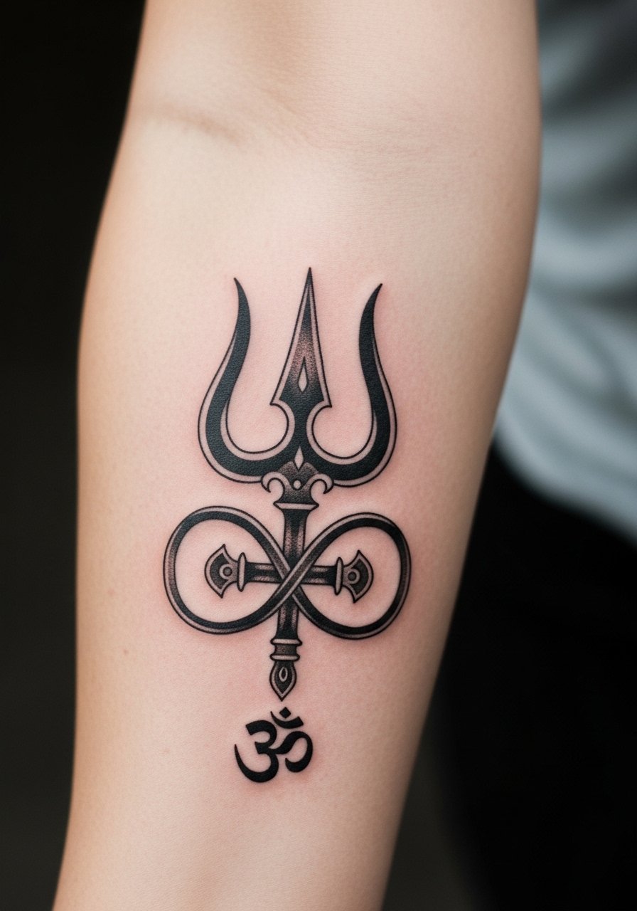
When you sit down with your artist for a trident, mention how much negative space you want around the prongs. That spacing reduces blowout risk and gives the symbol breathing room. Forearm placement feels moderate for pain and shows well. If the trishula has crossed thin filigree, those thin areas can blur first. The safer route is bolder prongs with fine interior detail. The wind-up is that black saturation and simple silhouettes hold longer than tiny filigree.
7. Lakshmi Lotus with Short Sanskrit Phrase, Thigh
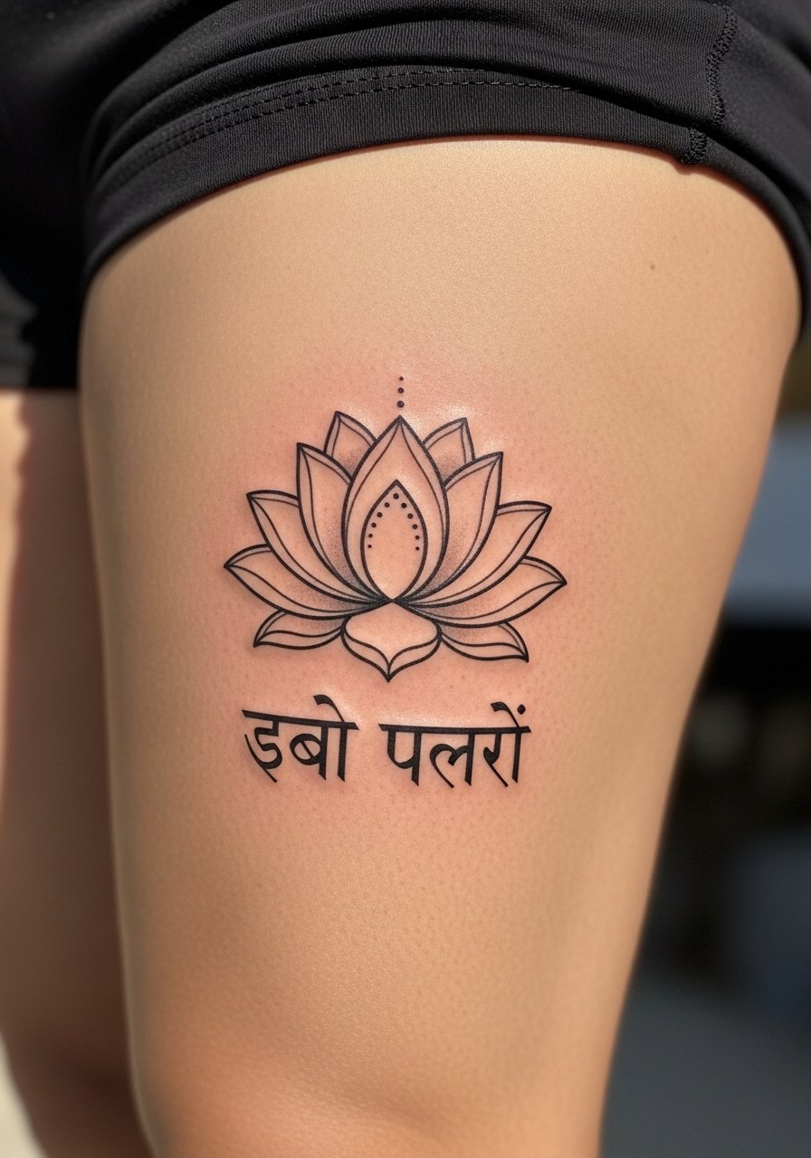
Thighs are forgiving for healing and keep complex motifs crisp. I advise a short Sanskrit phrase rather than a long sentence because long scripts on a curved thigh can warp when sitting or standing. Tell the artist you sit for photos a lot, so ask for the phrase to be placed where fabric will not rub it constantly. Pain is lower here and sessions are comfortable. Be mindful of very fine fills in the lotus center, as those can lose saturation faster than bold petals.
8. Hanuman Name in Bold Script, Inner Bicep
For deity names, I recommend bold script at a moderate scale so linework remains legible over time. The inner bicep hides well for work and heals under less abrasion. Ask your artist to use steady spacing and avoid cursive-flourish versions that crowd characters. Expect a medium pain level and a short to medium session. If your plan is to extend into a sleeve, show the artist how the script will sit with the rest of the layout.
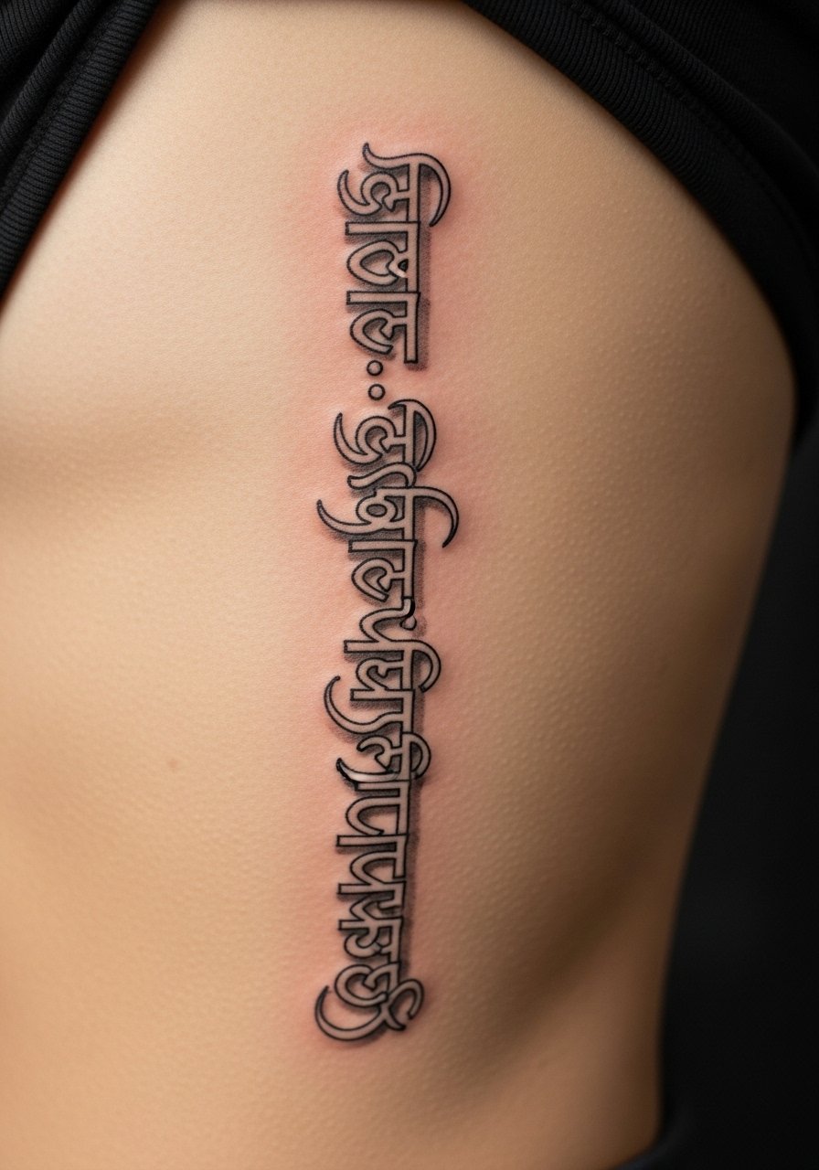
9. Sanskrit Quote Band Around Upper Arm
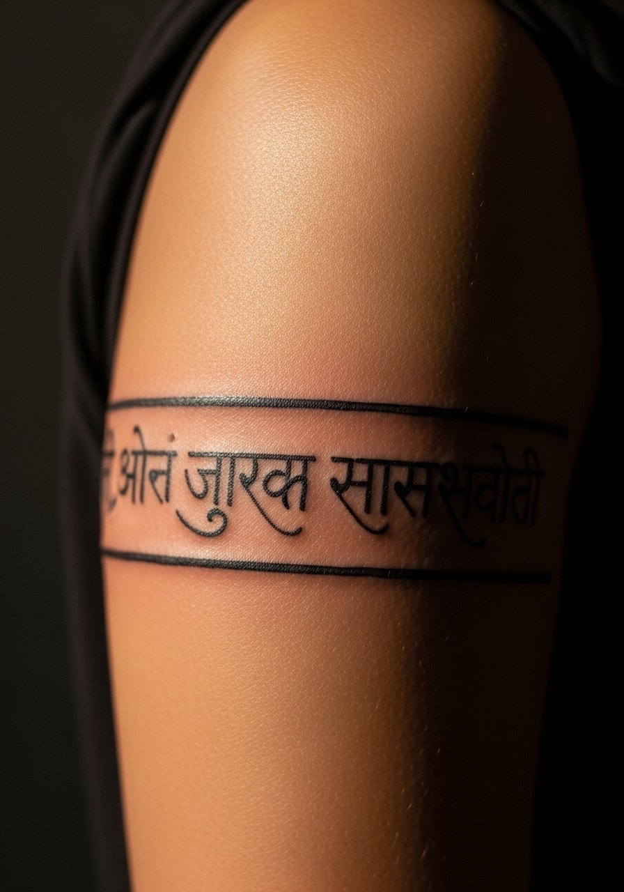
The biggest mistake with text bands is letting the script sit too tightly around the arm, which distorts letters when muscles flex. I suggest having the artist test the band with different arm positions during the stencil phase. The upper arm is a low-pain place and supports decent session time. Consider a slightly larger font size than you think you need to preserve readability at two and five years. Bands can be tricky to touch up later if the curvature was not planned.
10. Micro Om Behind the Ear
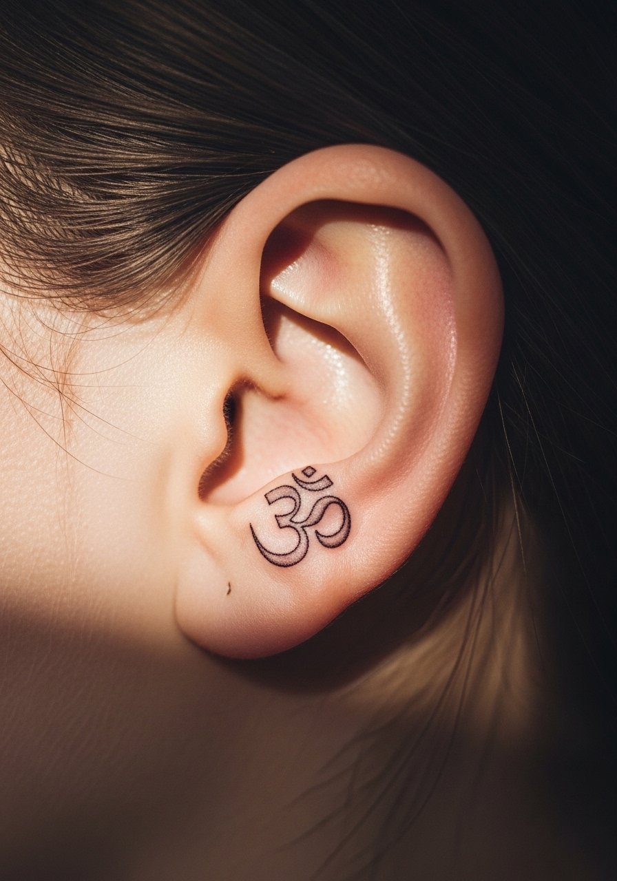
Small behind-the-ear pieces are discreet, but the skin there is thin and lines can spread. If you want micro script, ask for slightly increased line weight so it reads after healing. Pain is mild and the session is quick. Remember that hairstyles and jewelry may rub on the area during healing. People sometimes pick micro script too small and regret legibility loss at year two. A tiny but confident glyph will likely hold better than ultra-fine work.
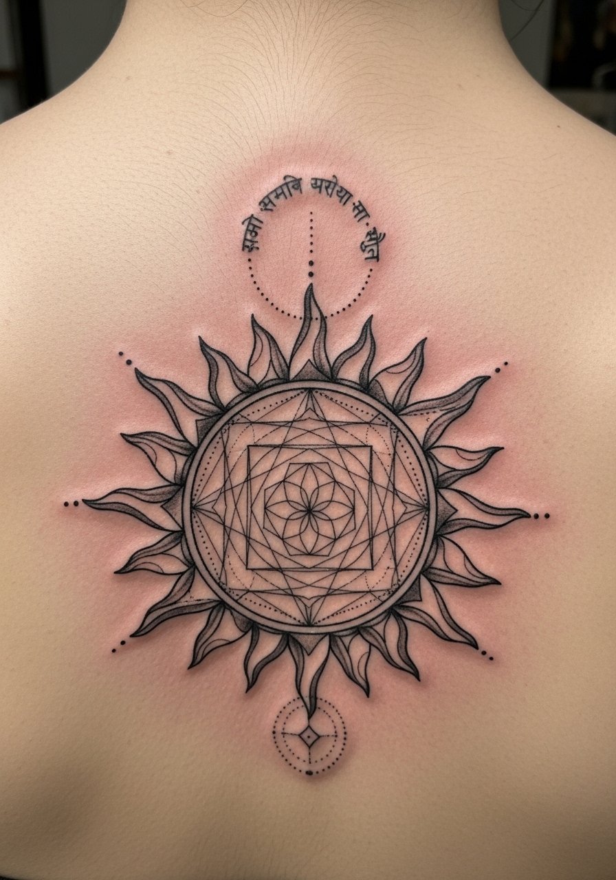
11. Sahasrara Mandala on Sternum with Om Center
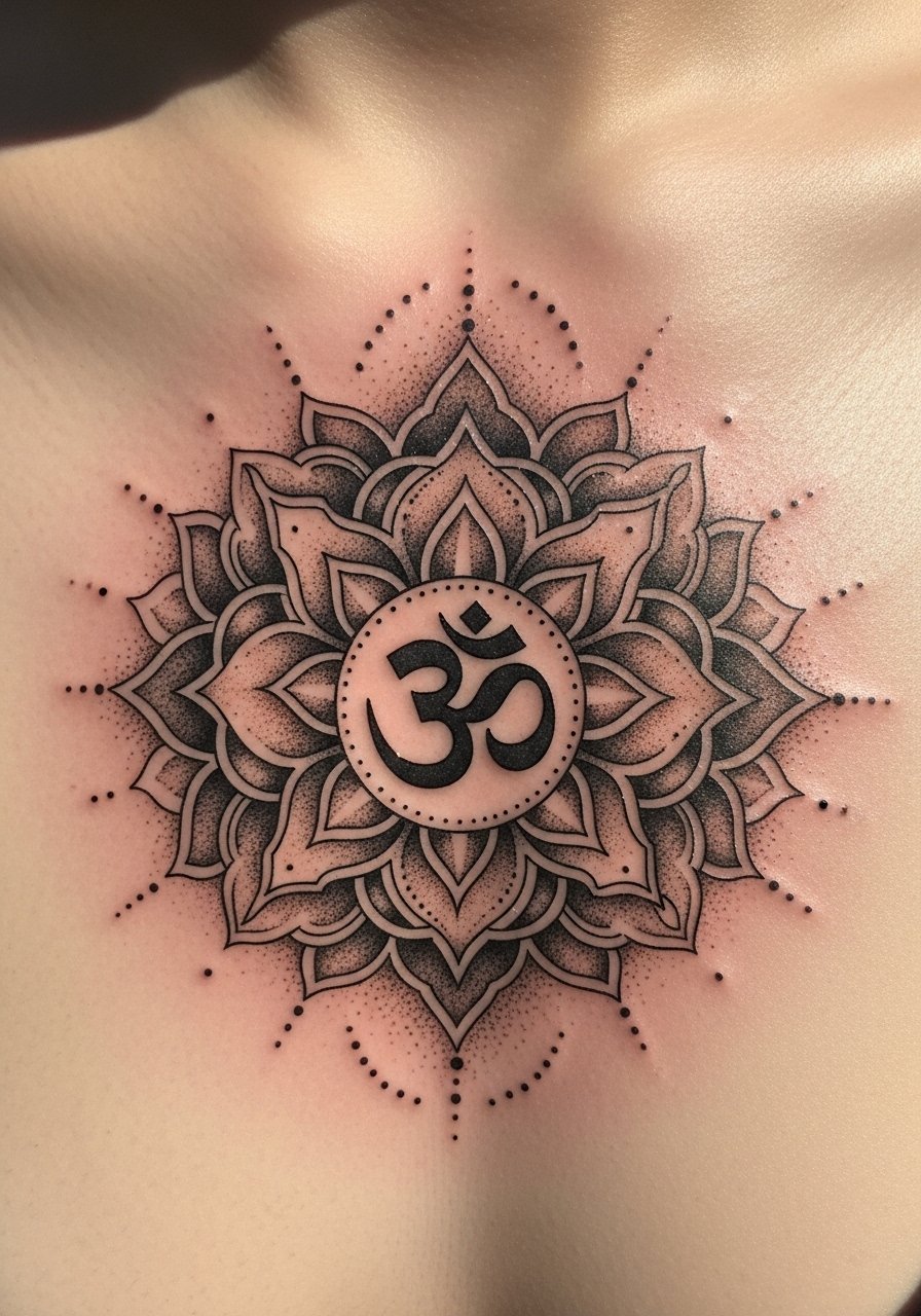
Most watercolor trends fade badly on chest because of low saturation and stretch. This mandala works best with high contrast black and careful stippling. The sternum is sensitive, so sessions are more intense. Ask for a design that uses negative space rather than tiny shaded gradients. Artists often disagree about fine detail on the sternum. One position says tiny dots blur; another says heavy stipple holds. Ask the artist their experience and look for healed photos of sternum mandalas in their portfolio.
12. Gayatri Mantra Short Line on Ribcage
Fair warning, the ribcage is high on most pain scales. But the area photographs well and the curve can make script feel intimate. The common mistake is requesting a long excerpt that wraps and becomes hard to read. Keep it short. Tell your artist the moment you need a breath during the session because breaks matter here. Expect one longer session or two shorter appointments. Lines on ribs tend to soften faster, so plan for a touch-up in a couple of years.
13. Chakra Symbols in a Wrist Cluster
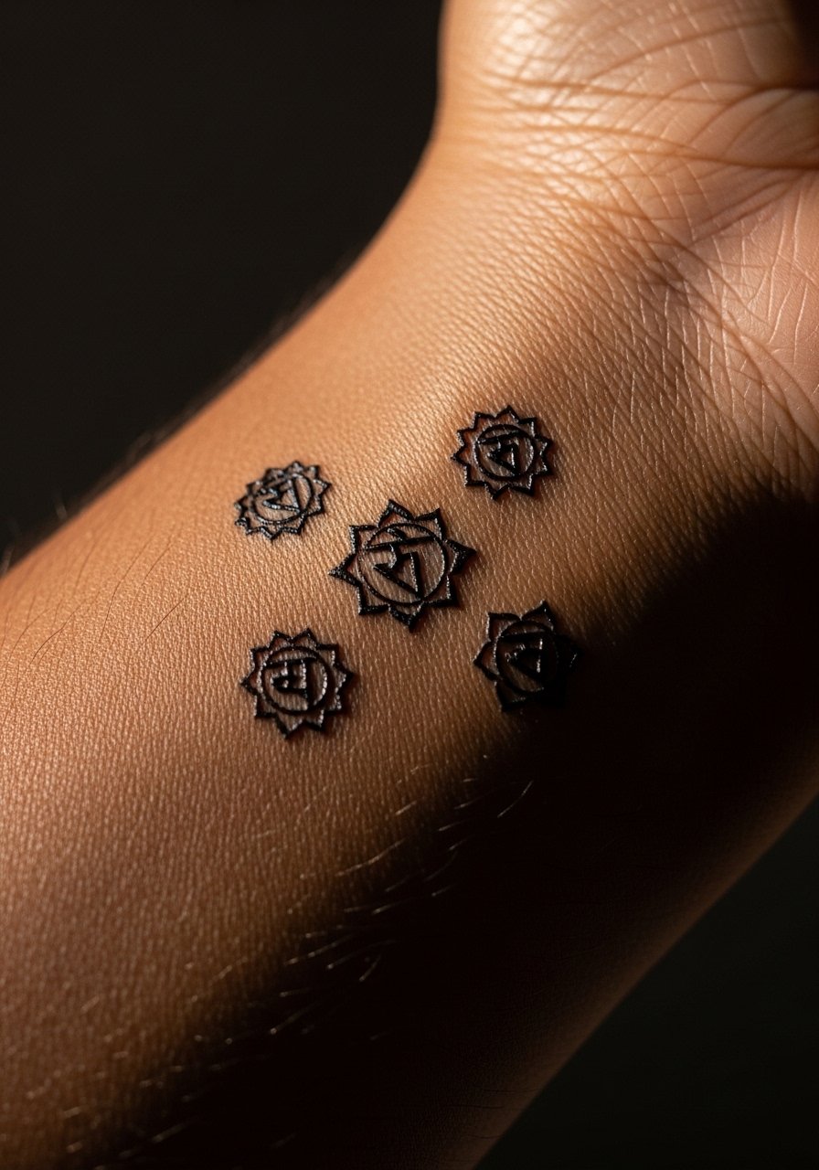
Wrist clusters must prioritize legibility over decorative filler. Ask your artist to give each symbol a buffer so the dot work and tiny elements do not converge. The wrist sees lots of movement and sun, which speeds fading. Pain is mild to moderate. If you want color, discuss how saturation will sit under bracelets and watches. Plan on a yearly check to see if any saturation needs boosting.
14. Saraswati Veena Outline with a Short Sanskrit Note, Upper Arm
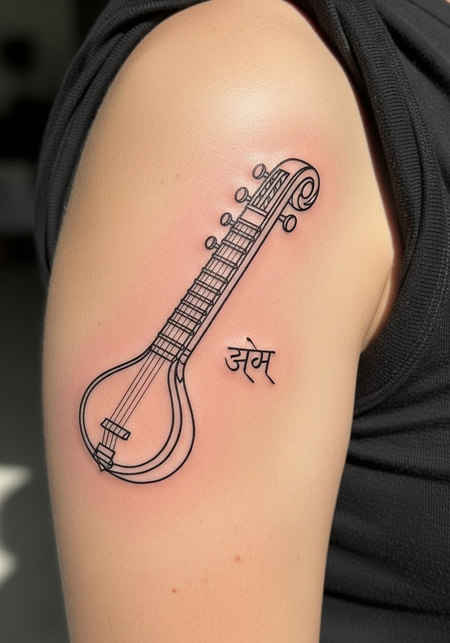
Instrument motifs work well at larger scales. I recommend an outline with modest interior detail so the silhouette reads at a glance. Tell your artist the cultural origin matters to you and ask for respectful reference, not a stylized cartoon. Upper arm placement keeps the piece visible but easy to cover. Sessions are comfortable and the design holds well because of clean shapes rather than tiny inner lines.
15. Dharma Wheel with Sanskrit Caption, Calf
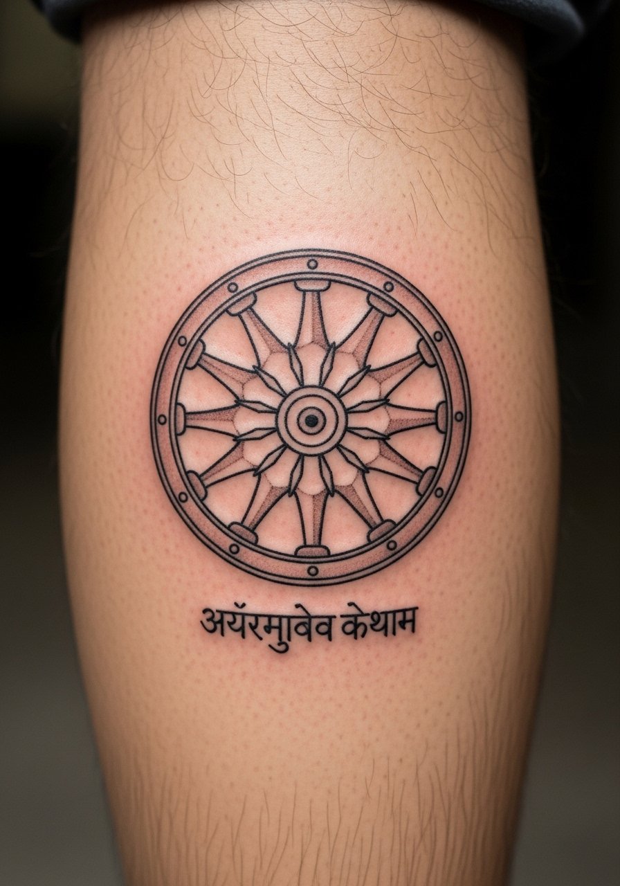
Calf placements age kindly and are low friction areas, so intricate iconography stays clear. Mention to your artist that you want the spokes and inner dots to have open space so stipple shading does not fill them in over time. Pain is moderate and you can sit for a longer session. Keep the caption short to avoid wrapping around the calf in awkward ways.
16. Minimal Shiva Lingam with One-Word Script, Sternum Edge
Minimal icons near the sternum edge can be bold and modern. The trick is to balance line thickness with the curvature of the chest so the symbol does not stretch awkwardly. Sternum-edge placements hurt more than forearms. If you favor minimal work, ask for a slightly heavier contour line to ensure longevity. This is one place where touch-ups are common at year three.
17. Sanskrit Couplet Band Across Collarbone
Collarbones present a mix of visibility and movement. A couplet can look elegant if each line is spaced to follow the bone. The skin over the collarbone moves with shoulders, so tell your artist you want the lines to land where fabric will not rub. Pain is moderate and shading near the bone can feel sharp. People sometimes ask for script too close to the bone which is uncomfortable during the tattoo and later when sleeping. Aim for a hair lower if you want comfort.
18. Chakra Wheel on the Palm of the Hand
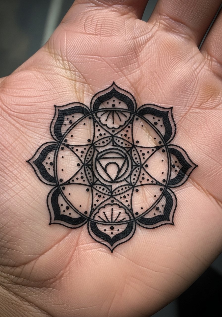
Hand tattoos are controversial in professional settings and they fade faster because of constant washing. If you still want a palm piece, expect touch-ups every year or two and talk frankly with your artist about how this will age. Hand skin has higher blowout risk for fine detail. Larger bold shapes and heavy saturation work better than tiny filigree. Note that hand placements may impact some jobs, so consider that before committing.
19. Sanskrit Coordinates in Monospace on Rib Side
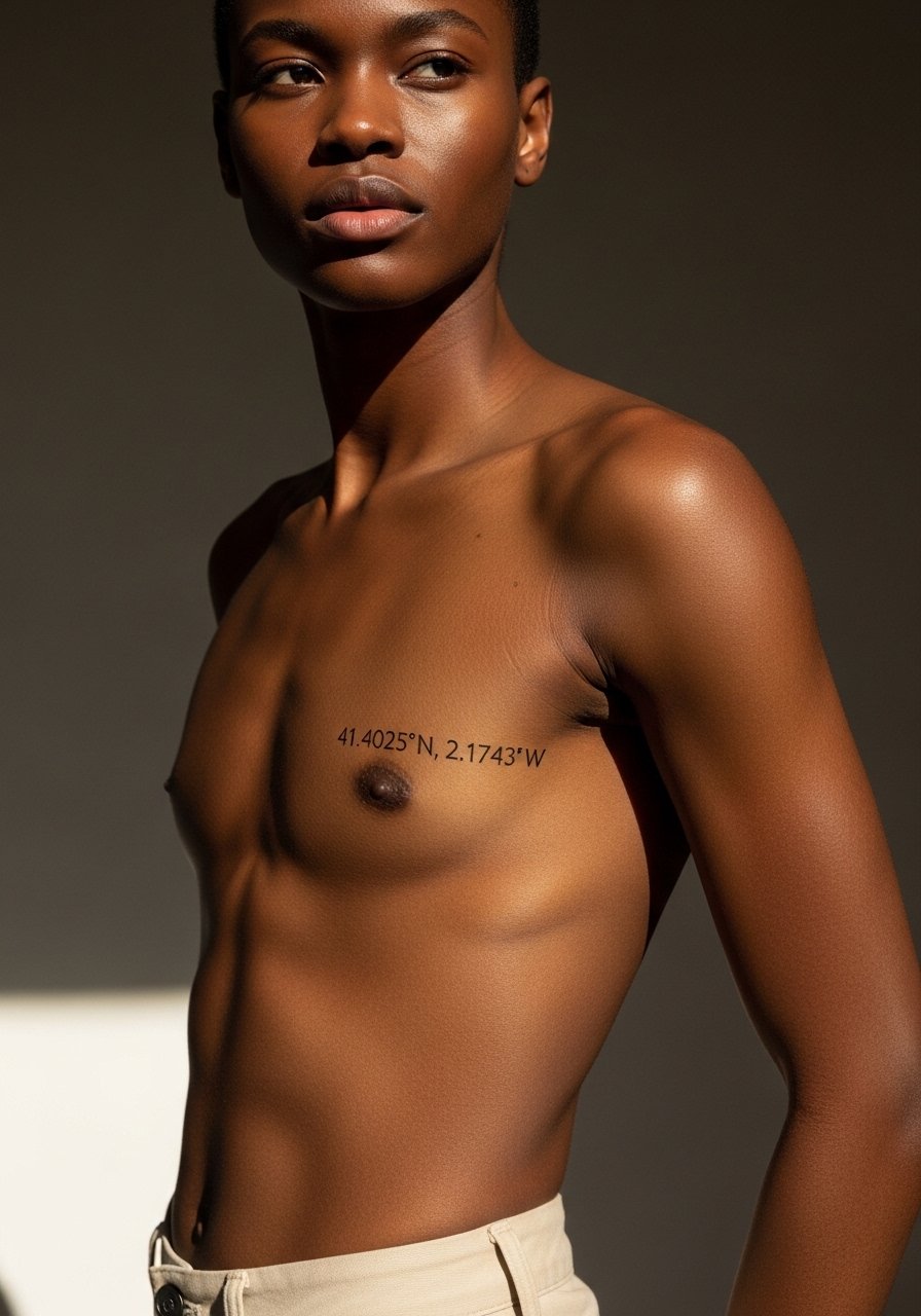
Coordinates translated into Devanagari or kept as numbers read well as personal markers. The rib side moves and stretches, so ask the artist to test the stencil while you shift positions. The main mistake is choosing very small numerals or glyphs. Slightly larger characters keep clarity. Expect a medium to high pain session. Keep the line weight consistent to avoid uneven fading.
20. Sun Yantra with Sanskrit Micro-Text, Upper Back
Geometric yantras rely on crisp line spacing. When small micro-text is added, the readability becomes the limiting factor. I suggest making the micro-text larger than you first imagine so it does not blur into the geometry. The upper back tolerates longer sessions and holds detail well. The risk is asking for fine script inside thin geometric arms. Keep interior text readable or leave it out.
21. Minimal Dot-Work Syllable on Ankle
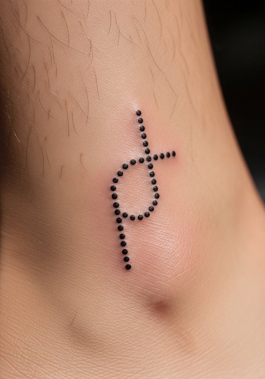
Ankle work is low for sessions but the skin there moves a lot. Dot work must be spaced to prevent merging. Ask for slightly wider spacing between dots and a modest overall size. Pain is moderate and healing can be fussy because of shoes rubbing. Avoid extremely tiny dots that look good fresh but fill in after a year.
22. Long Sanskrit Phrase Along the Rib Cage with Whip Shading
Long phrases on a curved surface need planning. Tell your artist whether you prefer the line straight, curved with the ribs, or broken into shorter lines. That decision changes how it reads when you breathe. The ribs are painful and sessions usually need breaks. Whip shading can add texture but overuse invites early fading. Be explicit about wanting more resilience than delicate shading.
23. Lotus Seed Mandala on Shoulder Blade
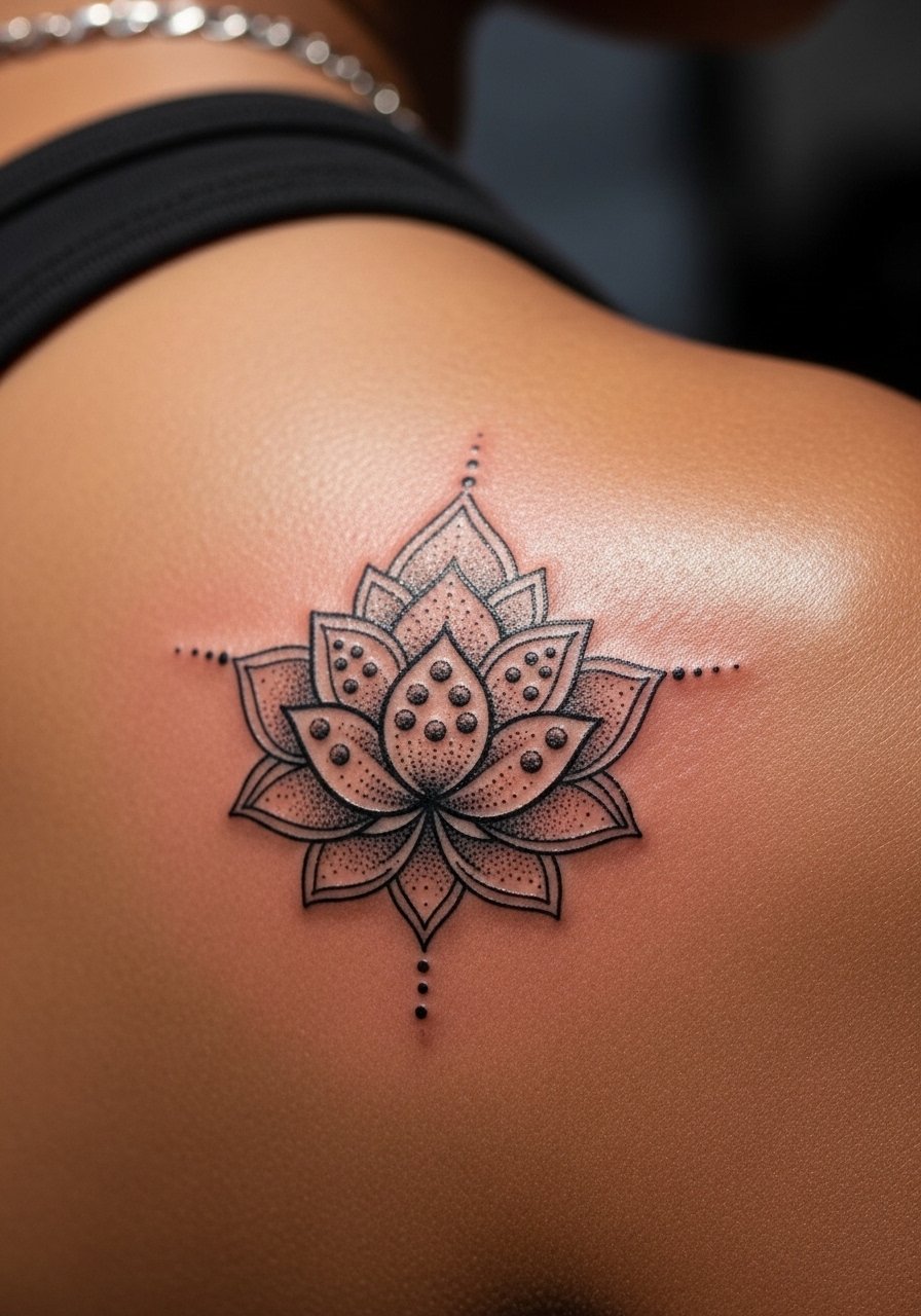
Shoulder blades are great for pieces that may become part of a larger back composition. I recommend open petal shapes so shading does not pool. Ask for healed photos from your artist of shoulder blade mandalas they have done. Pain is moderate and the area heals reliably. A frequent mistake is packing too many tiny concentric circles which lose crispness by year three.
24. Simple Sanskrit One-Word on Finger Side
Finger tattoos have a high fade rate from use and soap. If you want a finger script, ask for heavier strokes and plan on touch-ups. The session is brief but the upkeep is greater than most placements. Also be aware employers may notice finger ink, so weigh that against how visible you want the word to be.
25. Circular Mantra Badge on the Nape of the Neck
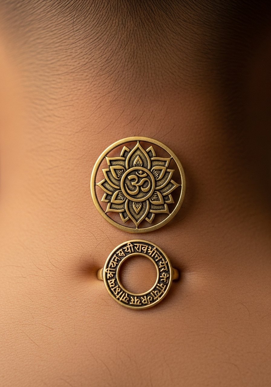
The nape can be a private spot that shows when you pull your hair up. A circular mantra badge sits neatly there and integrates with necklaces and collars. Ask your artist for a stencil check while your neck is in motion so the circle sits right. Pain is moderate and the area heals cleanly. Tiny inner ring text can blur, so keep the center open or make the inner text slightly larger.
Tattoo Prep and Aftercare Essentials
Lightweight fragrance-free balm for daily soothing. Use after the initial crust has fallen away and the skin feels dry. It prevents tightness without clogging pores.
Medical-grade second skin bandage, single-use sheets. Good for the first 24 to 48 hours if your artist recommends occlusive coverage.
Gentle pH-balanced foaming cleanser. Use to remove sweat and dust during the first two weeks. Pat dry with clean hands.
Antibacterial foam cleanser, fragrance-free. Only use if your skin tends to get oily or you were advised by a pro to prevent infection.
Broad-spectrum mineral sunscreen SPF 30, non-greasy. Apply after fully healed to protect saturation and slow fading.
Silicone-based scar and sheen gel. Useful after full healing to smooth raised texture on older work.
Soft non-stick dressing pads. Handy if you need to cover a piece while traveling or during heavy activity.
Aquaphor Healing Ointment. One mainstream product I mention for immediate post-ink use if recommended by your artist. Use sparingly and switch to balm once the skin starts to peel.
Every tattoo is different. Always follow your artist's specific aftercare instructions. Consult a dermatologist if you have skin concerns or unusual healing issues.
Frequently Asked Questions
Q: Will Devanagari script blur faster than Latin letters on thin areas like the wrist or ribs?
A: From what I have seen, Devanagari characters with compact shapes can blur if scaled too small on thin, high-movement areas. The fix is slightly larger characters and modest line weight. Ask to see healed examples from the artist on similar placements before you commit.
Q: How often should I plan touch-ups for a detailed mandala on the shoulder blade?
A: Expect to evaluate saturation and sharpness around year three. Shoulders age well but stipple and tiny lines can lose crispness with sun exposure. A light touch-up every three to five years keeps geometry tight.
Q: Are deity portraits like Ganesha more likely to need color touch-ups than blackwork?
A: Color needs more maintenance because pigments fade unevenly in sun and friction zones. If you want a portrait to last, consider strong black outlines with selective color accents and commit to sunscreen after healing.
Q: I want a short mantra on my ribcage but I worry about pain and distortion when I breathe. Any tips?
A: Tell your artist you will be breathing deeply during stencil placement so they can position text along a relaxed curve. Break sessions if needed. Short lines work best, and spacing must account for expansion during breath.
Q: Is hand or finger Sanskrit script a bad idea for longevity?
A: Hands and fingers fade faster due to washing, sun, and constant use. If you still choose that site, prioritize bold strokes, expect yearly touch-ups, and ask the artist for healed photos of similar finger scripts.
Q: How do I find an artist experienced with Sanskrit script and respectful cultural use?
A: Use tattoo directories, local convention rosters, Reddit forums with portfolio links, and shop websites that show healed photos of script work. During consultation ask how they source reference images and whether they have experience with non-Latin scripts. A good portfolio and clear conversation matter more than a big follower count.
