
Simple tattoos look effortless, but creating one that feels clean, balanced, and beautifully intentional takes more technique than most people realize. The best artists rely on line weight contrast, symmetry, negative space, and thoughtful scaling to turn minimal designs into timeless body art.
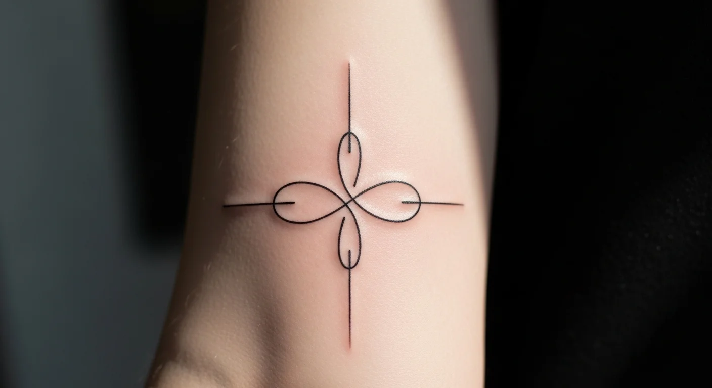
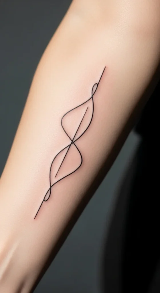
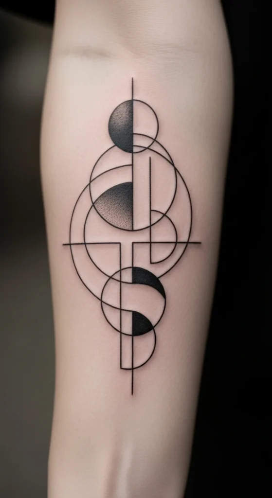
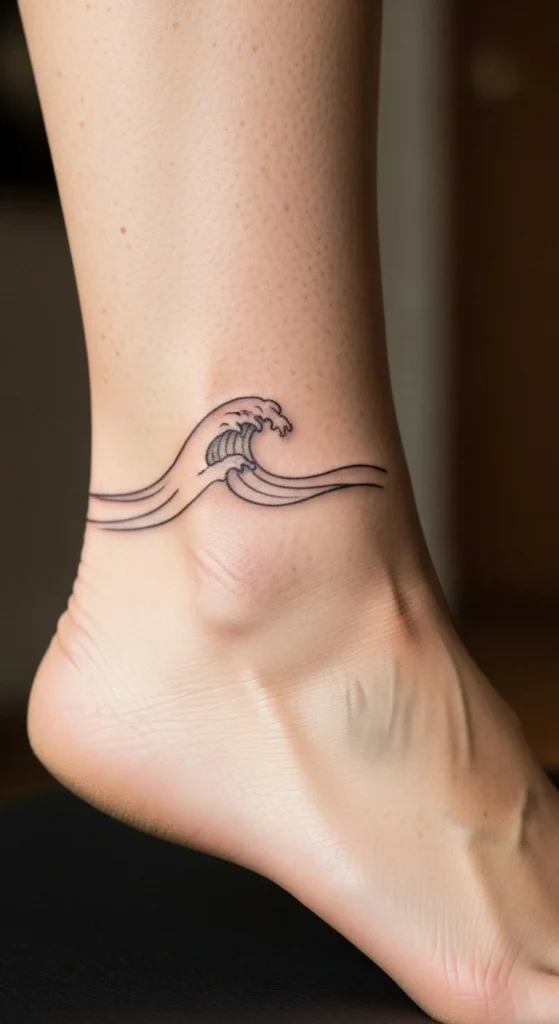
Before diving in, here’s a visual prompt to set the tone:
Why Simple Tattoos Look So Aesthetic in the First Place
Simple tattoos stand out because they strip everything down to what matters. No heavy shading. No clutter. Just the essentials — expressed through clean lines, curves, and thoughtful spacing.
Many top tattoo designers use digital tools like Linearity Curve or Procreate to refine shapes, test proportions, and polish the final stencil before it’s placed on the skin. Others sketch by hand with reliable supplies like Strathmore for layered refinement.
Now let’s break down the techniques that make a simple tattoo look elevated and clean rather than flat or amateur.
1. Master the Power of Line Weight
Varying line thickness is one of the biggest secrets the pros use to add depth without shading.
- Thicker lines shape the outer structure.
- Thinner lines add delicate detail.
- The contrast creates visual hierarchy — your eye knows what the “main idea” is instantly.
This prevents a simple tattoo from looking dull or unfinished.
Tips:
- Use thicker strokes for borders.
- Use micro-lines for texture, vines, or tiny symbols.
- Test both versions digitally before finalizing.
2. Use Negative Space Like an Artist
Negative space isn’t “empty.” It’s the breathing room that makes the design look clean. Top tattoo educators say that negative space is often what separates beginner-level designs from professional ones.
Great uses of negative space include:
- Florals where petals are outlined by empty space
- Stars or constellations with gaps between points
- Simple shapes (triangles, circles, waves) that feel balanced and open
The result is a tattoo that feels light, harmonious, and aesthetically modern.
3. Perfect Your Curves for a Softer Aesthetic
If your design uses curves — circles, arcs, petals, leaves, waves — precision matters.
Research on tattoo design shows that smooth, consistent curves always outperform jagged or inconsistent ones, especially after healing.
Wobbly curves are the #1 reason minimal tattoos look “off.”
Use tools like smoothing brushes in Linearity Curve or stabilizer settings in Procreate to refine your curves digitally before tattooing.
4. Scale and Test Your Design at Actual Tattoo Size
Simple designs can go wrong quickly if they’re too small or too detailed.
Before finalizing:
- Print the design at the intended tattoo size.
- Tape it to your arm, wrist, or ankle.
- Look at it in a mirror — does it read clearly from a distance?
- Does it look blurry or crowded when shrunk?
A common mistake is adding too many micro-details that won’t hold up over time. Clean, intentional scaling keeps your tattoo crisp for years.
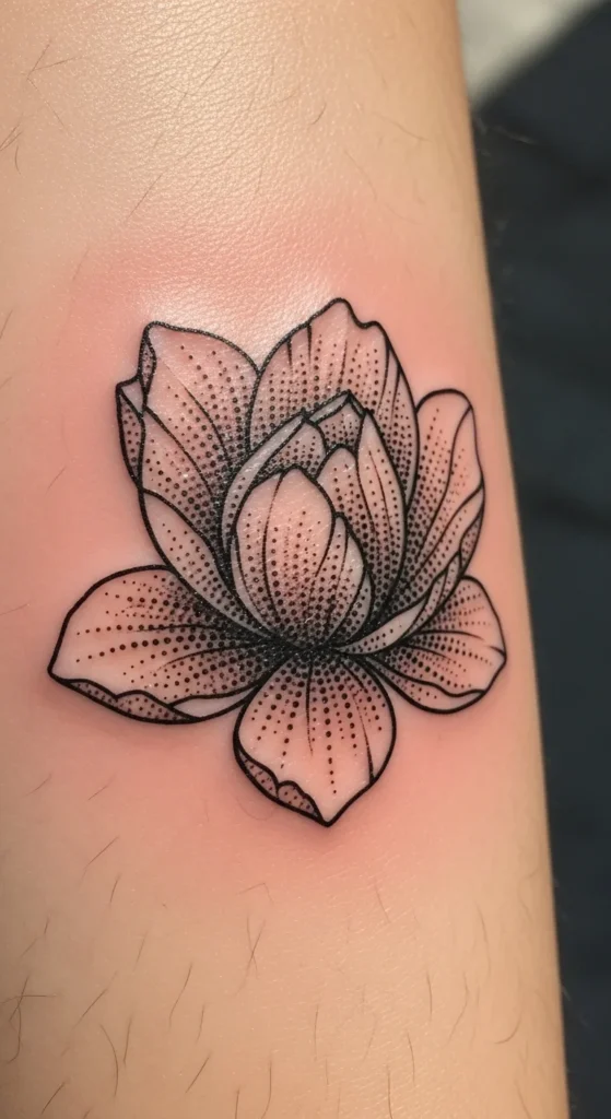
5. Add Stipple Shading for Texture Without Losing Simplicity
Stipple shading (dotwork) adds a soft, gradient effect using dots instead of full shading. It keeps the tattoo clean but gives it subtle depth.
Why it works so well:
- Dots heal cleaner than heavy shading
- They fade evenly
- They blend easily with minimal linework
- They look modern and artistic
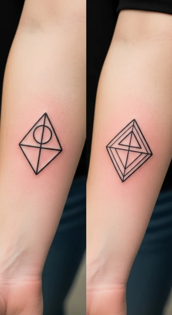
6. Build Symmetry for Natural Harmony
Symmetry is one of the strongest visual anchors in minimalist tattoos — especially for:
- Geometric symbols
- Mandala-inspired shapes
- Paired designs (ankles, wrists, forearms)
- Constellation layouts
Using duplicate-and-mirror tools in digital software helps you eliminate subtle asymmetries that the eye instantly notices.
This is how professionals keep shapes looking clean and mathematically precise.
7. Keep a Single Focal Point
Minimal tattoos look their best when they have one clear idea.
Examples:
- A tiny crescent moon with a few dots around it
- A line-art flower with one stem
- A single word or symbol
- A minimal mountain outline with sun or stars
If you add too many elements, the design quickly becomes busy — losing the elegant, spacious vibe that simple tattoos are known for.
8. Respect Body Contour for Natural Flow
One of the most underrated techniques: aligning the tattoo with the natural flow of the body.
Great placements follow curves like:
- Forearm lines
- Collarbone arcs
- Ribs (diagonal flow)
- Ankles (circular flow)
Tracing the body shape first — even with a pencil or digital overlay — makes the tattoo feel like it belongs exactly where it is.
9. Use a Layered Sketching Method for Clean Results
Professional artists often use a 4-layer process:
- Rough sketch — basic shapes and general idea
- Clean sketch — refine curves and remove clutter
- Precise outline — finalize proportions
- Stencil draft — the tattoo-ready version
Whether done on Strathmore or in a digital app, layering makes the final design crisp and intentional.
Final Takeaway
Simple tattoos are more than minimal — they’re deliberate. With attention to line weight, negative space, scaling, symmetry, and flow, you can transform even the smallest design into something timeless, clean, and deeply aesthetic.
If you found these tips helpful, save this article for later or share it with someone planning a minimal tattoo design!
