
Minimalist tattoos look simple… until you try to get one that stays crisp for years. That clean line, that tiny symbol, that perfect bit of negative space—if it’s even slightly off, you’ll notice it forever. The good news: lasting minimalist tattoo art isn’t about doing “more.” It’s about choosing smarter designs, smarter placement, and smarter aftercare.
Below is a practical, step-by-step guide to help you plan minimalist ink that looks clean now and still looks clean later.
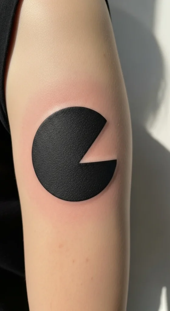
1) Start With a Design That Uses Negative Space (Not Extra Details)
Minimalist tattoos last longer when they’re built around strong shapes and intentional empty space. Negative space is basically “skin as part of the design.” It keeps the tattoo readable even when lines soften slightly over time.
Try these lasting-friendly minimalist concepts:
- A simple leaf outline where the “vein” is left as skin
- A circle with a cut-out gap (the gap becomes the focus)
- A mountain silhouette with open sky space around it
- A tiny wave where the crest is negative space
Quick rule: if your design relies on micro-details to make sense, it’s more likely to blur into a mystery blob later.
Below is a practical, step-by-
2) Pick Line Weight Like You’re Planning for the Future
Fine-line tattoos are popular for a reason. They look elegant and light. But ultra-thin lines can fade faster, especially if you’re out in the sun often or you choose a spot that rubs on clothing.
Instead of “as thin as possible,” aim for thin-but-confident linework:
- Ask the artist for a line weight that stays readable at a distance
- Avoid stacked lines that sit very close together
- If it’s a symbol, make it slightly larger than you think you need
- Keep spacing between elements so each part has room to breathe
A simple test: shrink your design on your phone screen. If it becomes hard to understand, it may not age well at tiny size.
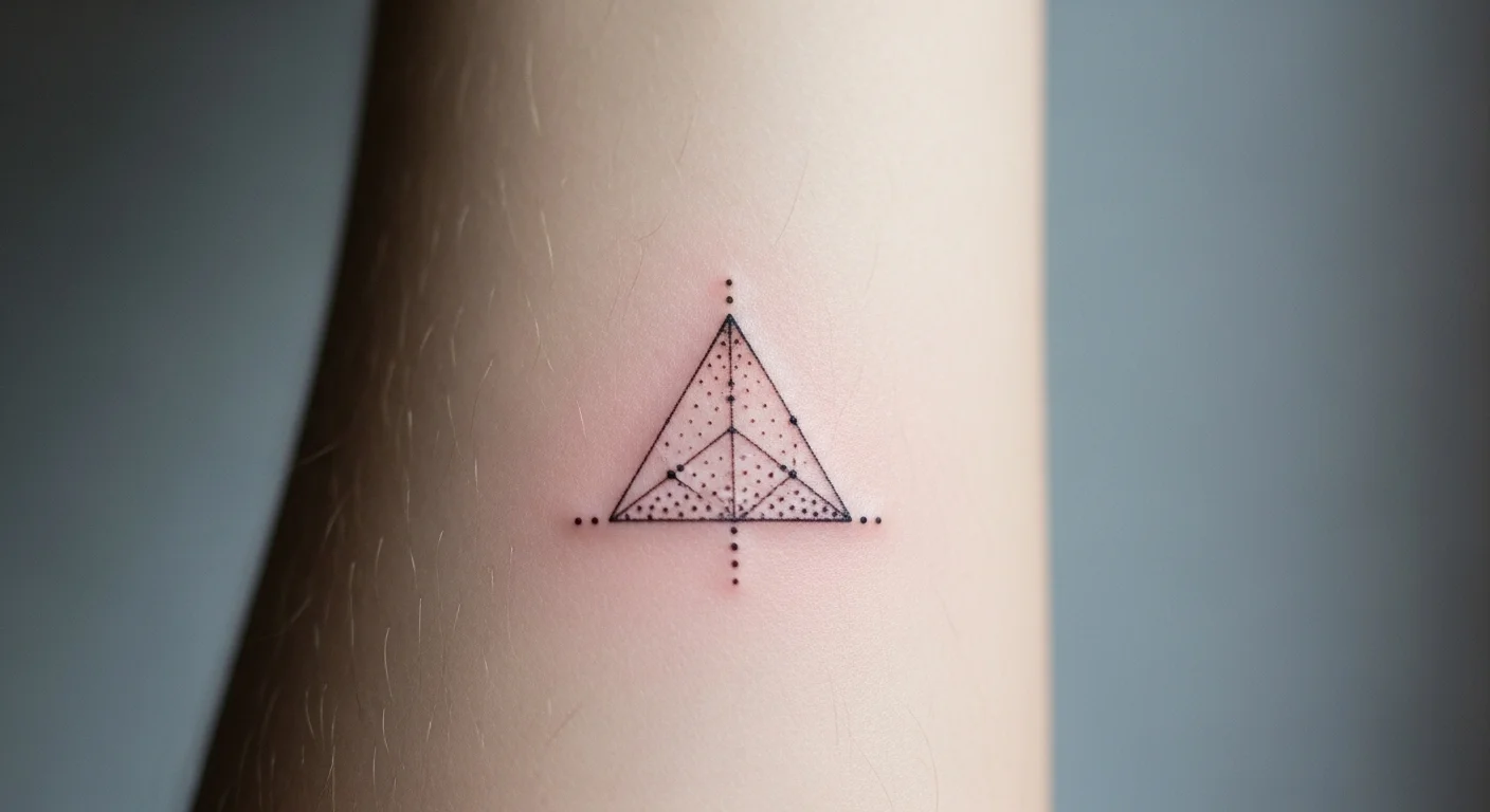
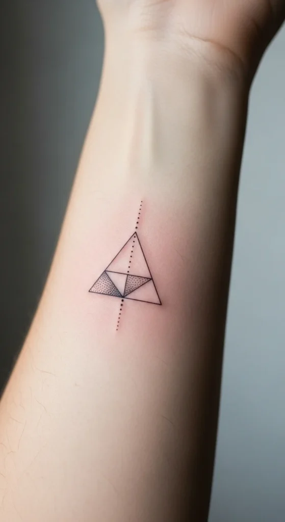
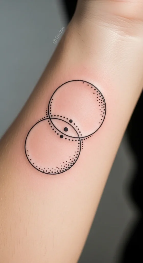
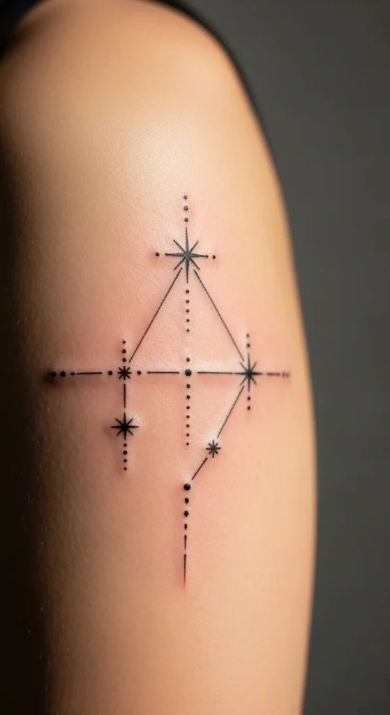
3) Use Geometry for Instant Clarity (Triangles, Circles, Sacred Forms)
Geometric minimalist tattoos are a cheat code for longevity. Why? Because clean geometry is readable even if the edges soften slightly over time.
Ideas that hold up well:
- Triangle + dot (simple, balanced, symbolic)
- Two overlapping circles (connection, duality)
- Minimal sacred geometry outline (clean lines, strong structure)
- A line + circle combo (like a “planet and orbit” look)
If you want it to feel personal, don’t add clutter—change the meaning with small choices:
- Add one tiny dot to represent a person
- Use three small circles to represent a milestone trio
- Place the shape on a spot that fits the story (inner wrist = private reminder, forearm = visible motivation)
Below is a practical, step-by-
4) Choose Placement That Helps Precision (And Reduces Rubbing)
Placement matters more for minimalist tattoos than bold styles. Tiny tattoos depend on clean edges. So you want a spot that supports stable linework and doesn’t constantly stretch or rub.
Great “precision-friendly” placements:
- Forearm
- Inner wrist (slightly larger designs do best)
- Upper arm
- Back of the shoulder
- Outer calf
Be cautious with these if you want ultra-fine detail:
- Fingers (high wear)
- Ribs (movement from breathing + friction)
- Ankles (shoes and socks rub)
- Inner bicep (constant friction)
If you love a tricky placement, you can still do it—just simplify the design and give it more breathing room.
5) Add Texture Without Making It Busy (Dotwork Is Your Friend)
Want depth without turning minimalist into “too much”? Dotwork gives you that soft texture while keeping the design clean.
Dotwork works especially well for:
- Tiny stars and constellations
- Shading behind a moon or sun
- Creating a halo effect around a symbol
- Adding a light gradient without heavy fill
Just keep it controlled. Too many dots in a small area can heal patchy if aftercare isn’t consistent.
Below is a practical, step-by-
6) Use “Micro Mantras” Carefully (Script That Stays Readable)
Minimalist typography is popular—single words like “breathe,” “evolve,” or a tiny date. The biggest risk is going too small or choosing a font that’s too thin.
To make script last:
- Choose simple cursive or clean serif lettering
- Avoid overly decorative loops
- Don’t cram words too close together
- Size it so it reads from at least arm’s length
If you want something extra personal, consider:
- Roman numerals for a date
- Coordinates for a meaningful location
- A single initial with a tiny symbol (heart, star, dot)
Script works best when it’s not competing with too many details around it.
7) Lock in Longevity With Aftercare and Sun Discipline
Minimalist tattoos can look “done” fast. But the healing phase is where your long-term crispness is decided.
Keep it simple:
- Wash gently with mild soap
- Pat dry (don’t rub)
- Use a thin layer of moisturizer
- Avoid tight clothing friction on the area
- Skip heavy sweat sessions for a few days
The long game is sun care. Sun exposure is one of the fastest ways to dull fine lines. Once healed, sunscreen on that spot is the easiest habit that pays off for years.
8) Pick the Right Artist (This Is Non-Negotiable)
Minimalist tattooing looks easy, but it demands precision. You want an artist who regularly posts clean fine-line work and healed results.
When checking portfolios, look for:
- Smooth, consistent line thickness
- Even spacing (no crowded micro details)
- Clean curves (no wobble)
- Healed photos (not just fresh tattoos)
If an artist only shows fresh work under perfect lighting, ask for healed examples. Minimalist tattoos are all about how they settle.
Final Takeaway
If you want minimalist tattoo art that lasts, think like a designer: strong shapes, clean spacing, smart placement, and simple aftercare. Minimal doesn’t mean “tiny at any cost.” It means clear, intentional, and built to age well.
Save this guide for later, and when you’re ready, sketch a few simple options and test them on your body with temporary placement. Your future self will thank you.
