
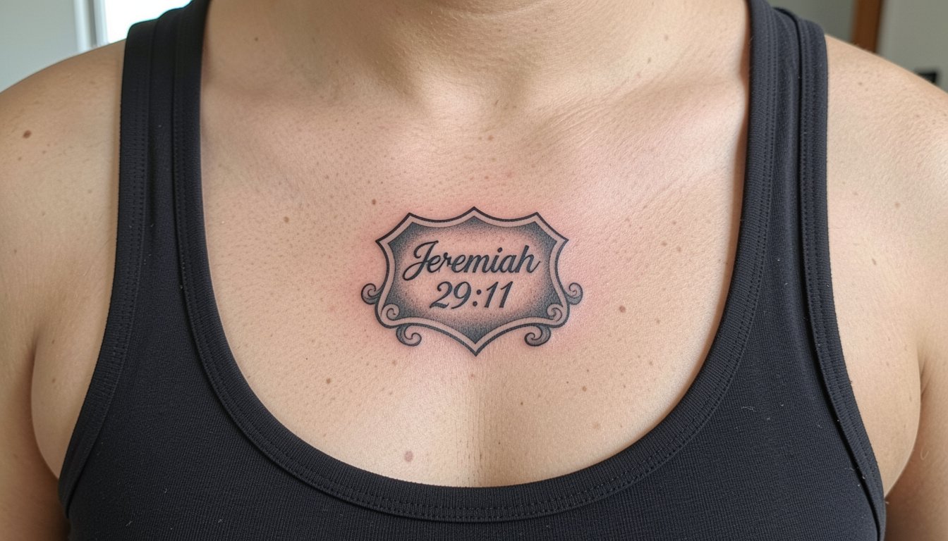
Jeremiah 29:11 is a line people tattoo when they want a visible reminder of a future-focused promise. For many, script alone will not age the same across placements, and the tiny single-needle text that looks crisp at the session can soften into a blur if it sits over thin, mobile skin. These ideas show durable ways to carry the verse, with practical notes on sizing, placement, and how the design reads after a few years.
1. Fine Line Script on Inner Forearm
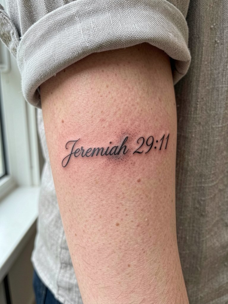
A soft single-needle script suits the inner forearm because the area stretches less than the wrist. Expect a moderate pain level and a one to two hour session for a three to five inch line. I tell people to size the letterforms up slightly from their Pinterest reference so the counters do not collapse over two to three years. A common mistake is asking for hairline strokes that vanish with normal wear. For showing this piece, pair it with a rolled-sleeve linen shirt so the script sits in clear sight without fabric rubbing the fresh ink during the first week.
2. Tiny Wrist Script with Cross Accent
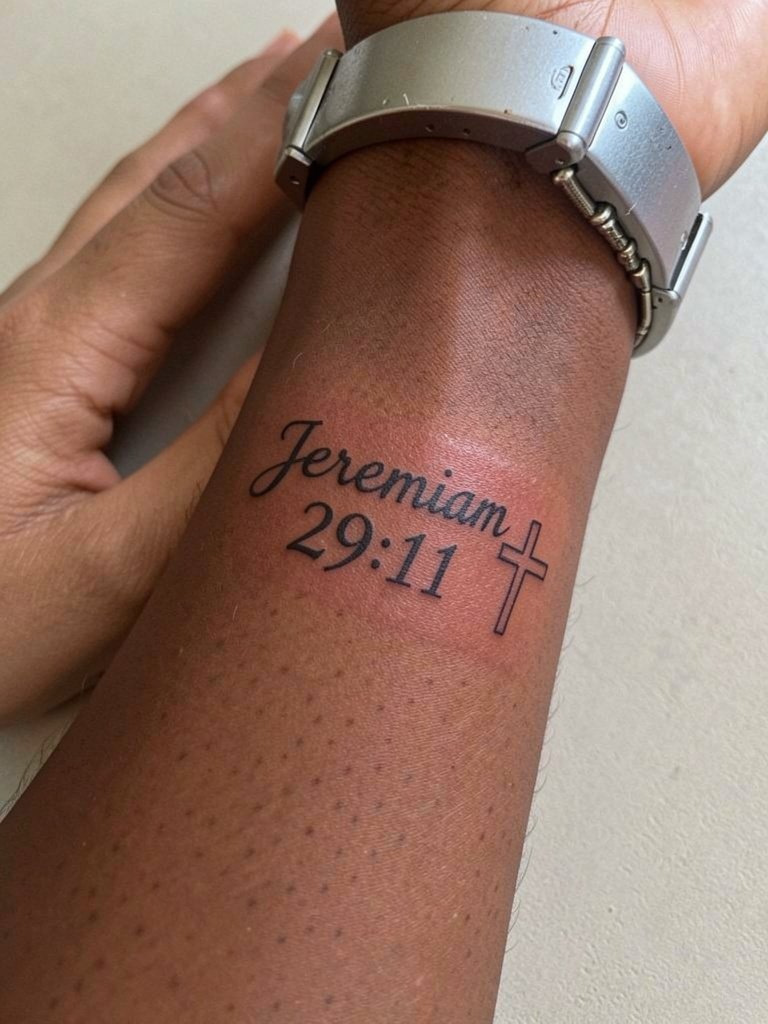
Wrist script is very visible and also very exposed to washing and friction, so the line weight should be bumped up. Expect a pain level around four out of ten and a thirty to forty five minute appointment for a compact script. Ask the artist for slightly more spacing between numerals and letters, not just thinner strokes. Many people regret tiny clocks of text that merge after a year. For styling, thin bracelets can frame the verse. Try a delicate cuff bracelet that sits above the wrist to keep the tattoo visible without rubbing.
3. Collarbone Herald-Style Verse Patch
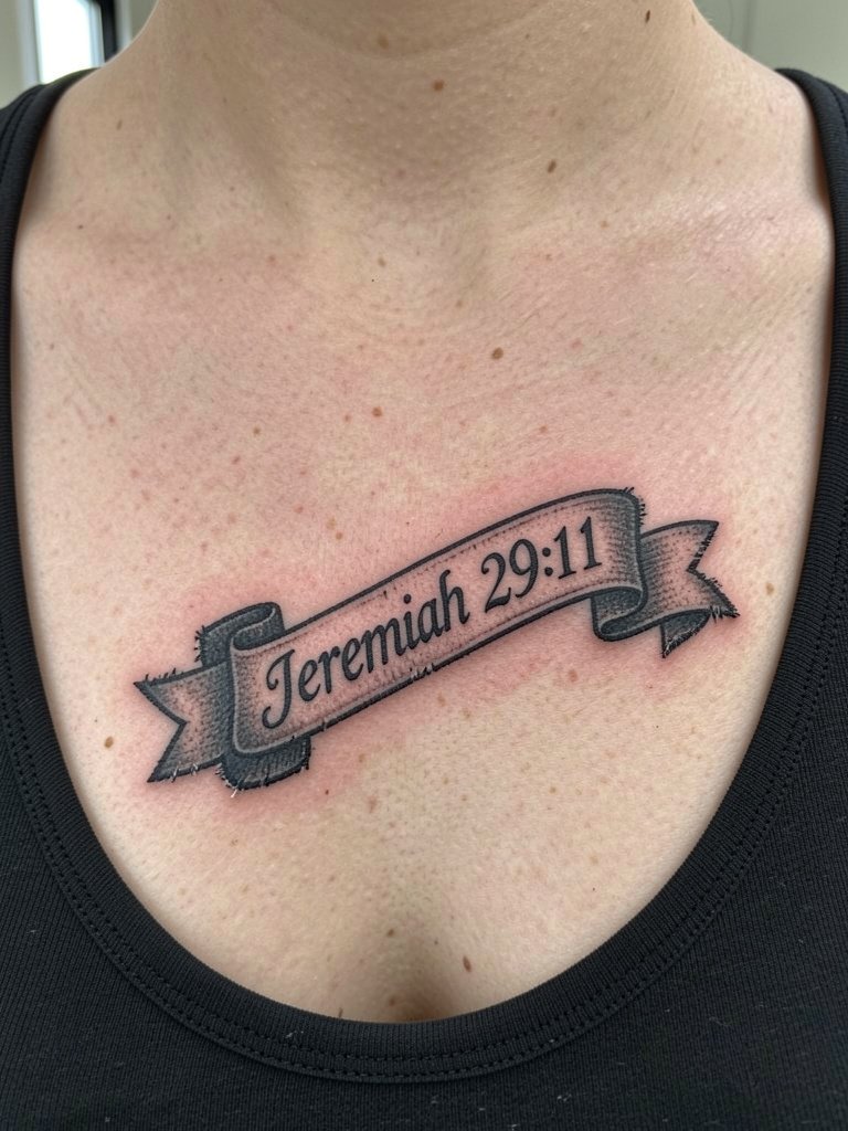
A herald-style patch gives the verse a graphic edge and helps keep small letters legible by surrounding them with solid shapes. The chest reads as moderate pain and usually takes between one and two hours depending on ornamentation. Talk to your artist about the proportion between the ribbon text and the surrounding shield so the letters sit in open space. A common aging issue is overfilling the ribbon with shading that blurs the script. For evenings out, this placement pairs with a scoop-neck blouse that frames the patch without rubbing the fresh ink while it heals.
4. Ribcage Quill and Snippet
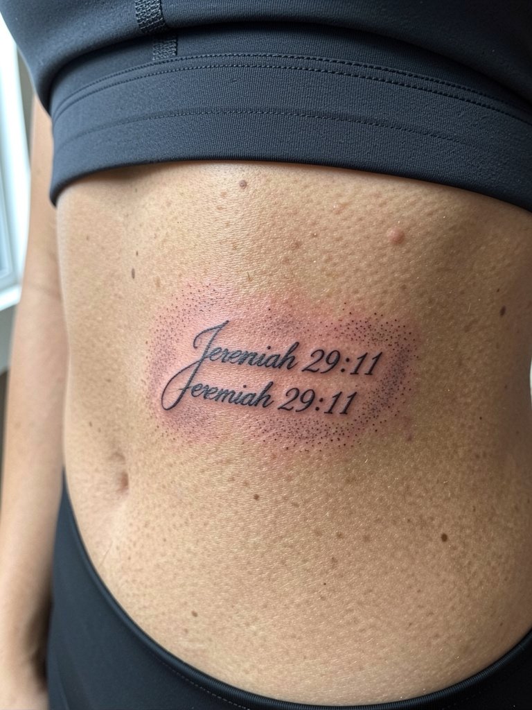
Rib pieces are beautiful but they divide opinion. One camp says the skin in that area stretches and moves enough that fine line text blurs within two years, especially where the torso creases. The other camp argues that with slightly wider letter spacing and precise needle depth the lines remain crisp for years, and they will point to healed photos as proof. Expect a higher pain score and a session that can run one to three hours depending on shading. For this spot bring a fitted sports bra so the artist has clean access without you needing to adjust fabric during the session.
5. Blackletter Bicep Band
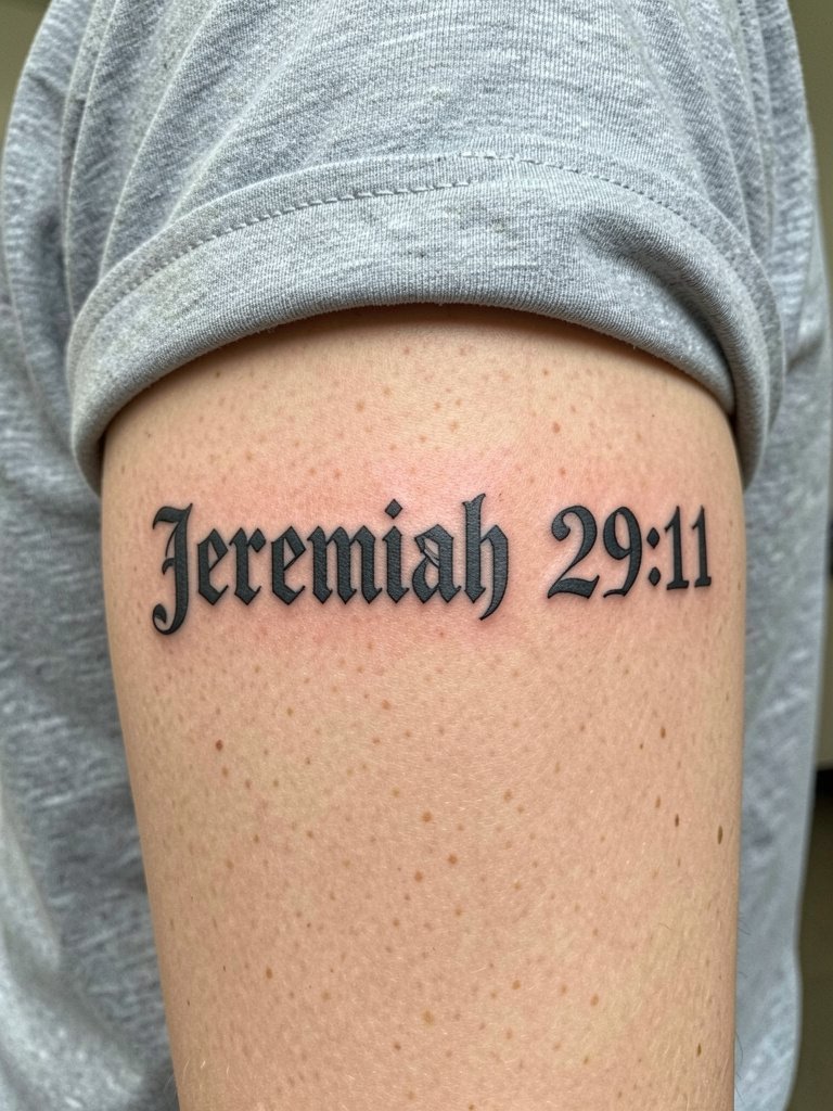
Blackletter gives a strong visual that holds up because the letterforms are constructed to resist smudging. Session time is usually around ninety minutes and the pain level is modest on the fleshy bicep. Tell the artist to leave small gaps or hairline negative space between letter strokes to avoid the letters bleeding together over time. A common mistake is compressing too many words into a tight band. For casual outfits this reads well with a rolled sleeve or a short-sleeve tee that keeps the band visible without constant friction.
6. Script Wristband Wrap
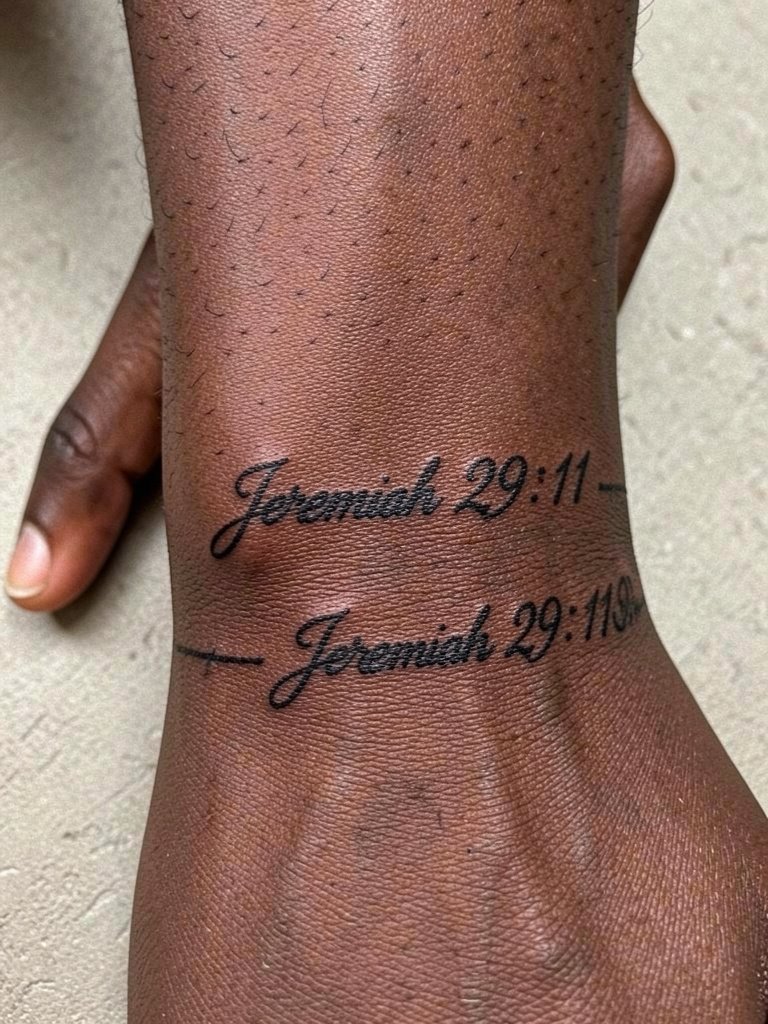
A wrap band feels like jewelry and avoids long vertical runs that age faster. This placement is higher risk for early fading from washing and bracelets, so plan for a touch-up window at around year two. The session is short and lower pain compared with ribs. A mistake people make is insisting on extremely tight script that becomes unreadable at the seams. To show it off, layer a few thin bands that sit above the tattoo and do not rub it during healing by using a soft woven bracelet set.
Pre-Session Essentials
A few small items make the first week easier for the forearm, wrist, bicep, and collarbone pieces above. These help with stencil placement, comfort during the session, and keeping clean in the first days.
-
Stencil transfer paper kit. Lets you preview how the script and ribbon proportions sit on skin before the artist inks anything, which is useful for ideas 1 through 3.
-
Topical numbing cream. Applied thirty to forty five minutes before a sensitive bicep or wrist session eases the first bites without dulling the artist's ability to work.
-
Thin protective film roll. Useful for wrist and forearm locations to guard against friction during the first two days of healing.
-
Fragrance-free gentle body wash. Cleans healing skin without additives that irritate fine line work.
-
Aquaphor healing ointment. Thin layers in the first forty eight hours help lock moisture for detailed script without clogging the line channels.
7. Watercolor Shoulder Blade Verse
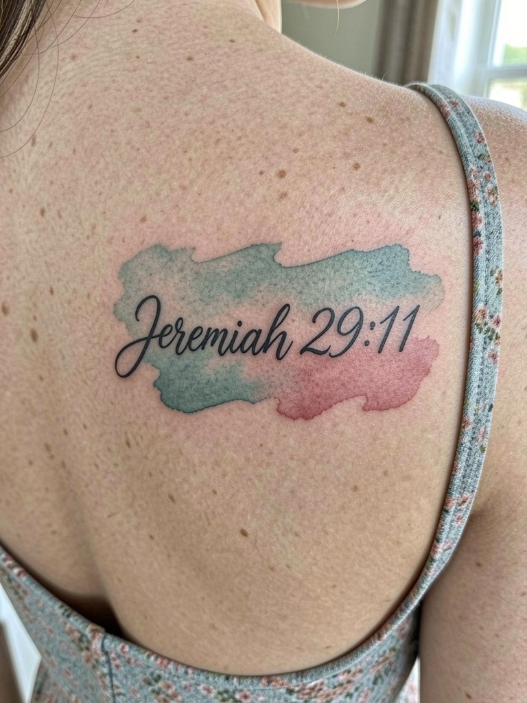
Watercolor backgrounds look modern but require strategic black anchors so the verse stays legible as pigments fade. The shoulder blade is a low-to-moderate pain area and sessions can be one to two hours. Ask for saturation in the darker anchor points and softer glazing around them so the script does not disappear into color after a year. A common error is over-softening the color edges which makes the text float without contrast. For showing the piece, open-back dresses frame the art well. Try an open-back midi dress that reveals the shoulder blade without rubbing the area during healing.
8. Finger-Side Micro Script
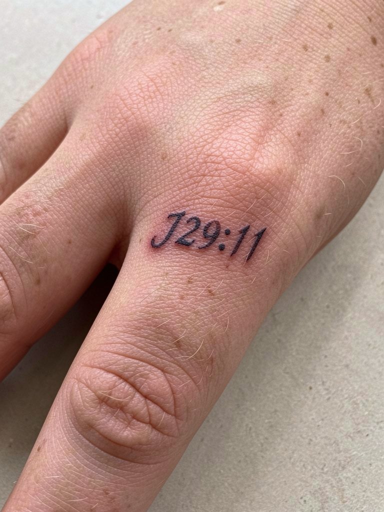
Finger-side text is one of the highest maintenance choices because skin there moves and washes constantly. One group of artists says micro scripts on fingers blur within months because of constant friction and thin skin. The other group contends that mapping the piece along a low-motion plane with denser strokes can last longer and they will show healed comparisons. The session is quick and the pain is sharp but brief. For this placement you need a specialist familiar with blowout risk on fingers. Consider stacking a slim ring above the script to draw attention without the metal contacting the fresh ink.
9. Sternum Center Line Script
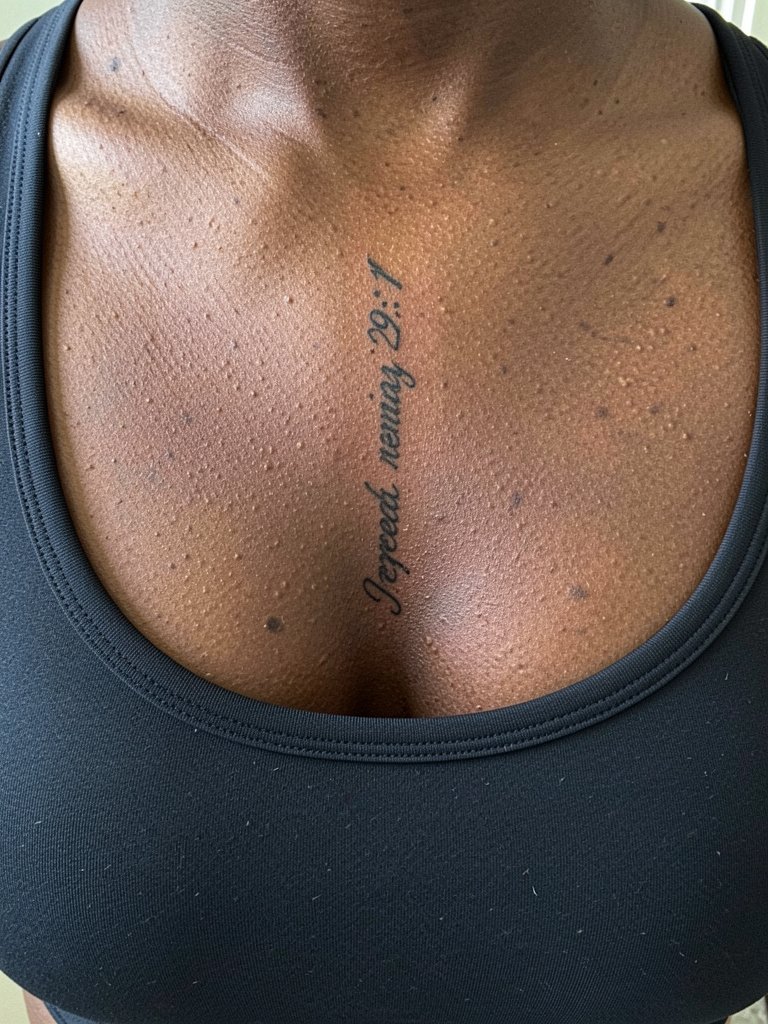
Sternum work is intimate and demands an artist experienced with chest contour and breath movement. Pain and session length vary widely depending on how deep the shading goes. Discuss breathing rhythm for the artist so the line sits straight across the natural curves. A mistake is insisting on tiny script directly beneath the breast crease without leaving room for tissue movement. Because this is a specialized area, plan for a practitioner who demonstrates healed sternum work in multiple skin tones.
10. Anklet Chain Script
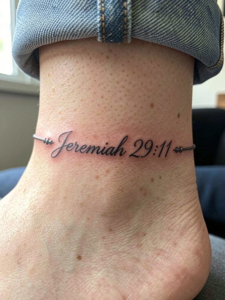
Ankle wraps are pretty and behave like jewelry, but that visibility comes with rubbing from socks and shoes. Expect a short session and a pain level that ranges low to moderate depending on bone proximity. Plan for a touch-up at around eighteen months if you wear tight footwear regularly. A frequent mistake is wrapping the script too tightly so the seam becomes illegible. For summer wear choose sandals that expose the area. Aiming for a few simple straps around the foot works well with this band.
11. Upper Thigh Botanical and Verse
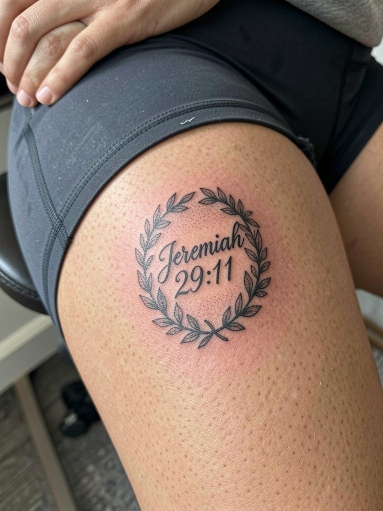
Thigh placements allow for larger letterforms that age well because the skin is more stable. Pain is usually lower than ribs and a session can be one to two hours for a detailed wreath. The biggest mistake is choosing microscopic script on fleshy areas where the ink will spread into the surrounding shading. For privacy and longevity, size the text to three to four times the single-word height you might pick for a wrist. Because this area is more intimate, pick an artist who shows healed thigh examples across skin tones.
12. Nape Script Hidden by Hair
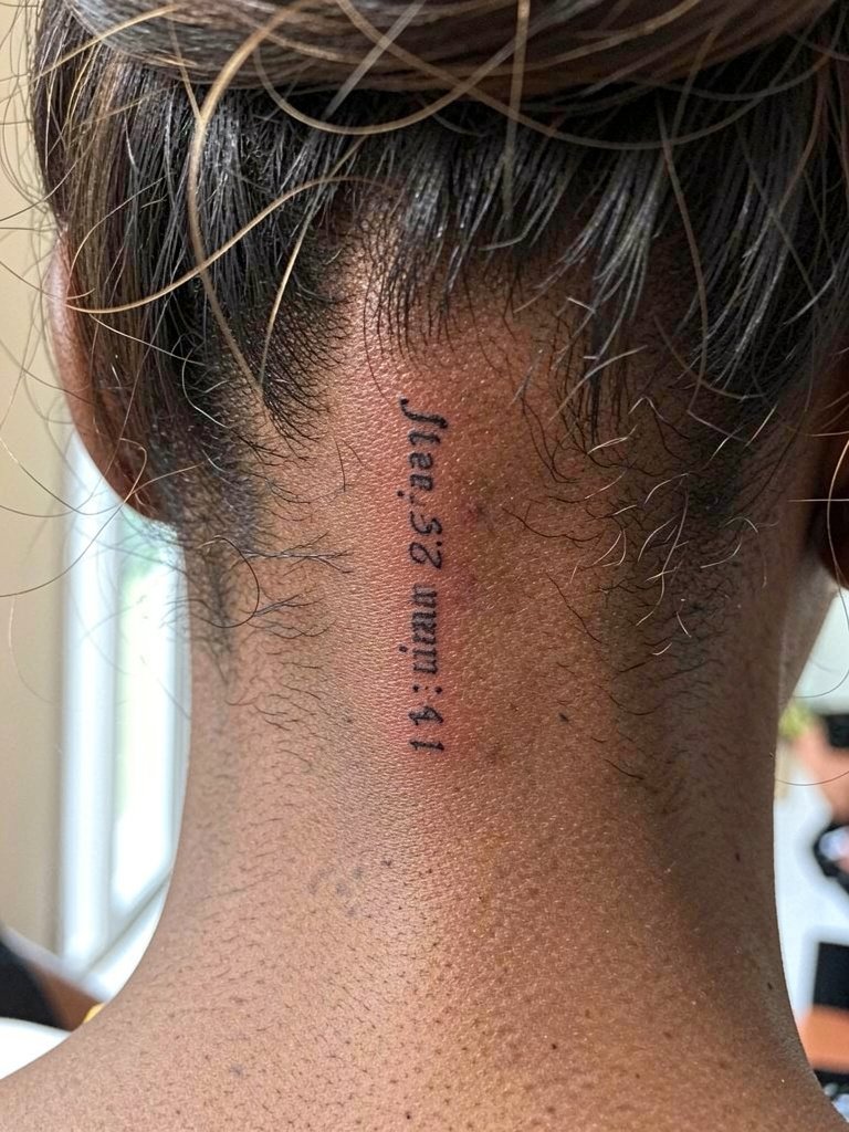
The nape is discreet and shows only when you put your hair up. Session time is short and pain is moderate. A misstep is asking for ultra-thin script right at the hairline where healing can be complicated by hair oils. Ask for slightly bolder strokes near the base so the word remains legible if minor blowout occurs. For styling, wear your hair up with a simple clip during the session and afterwards use a sleek hair claw to show the area without tugging at delicate new ink.
13. Behind-Ear Miniature Word
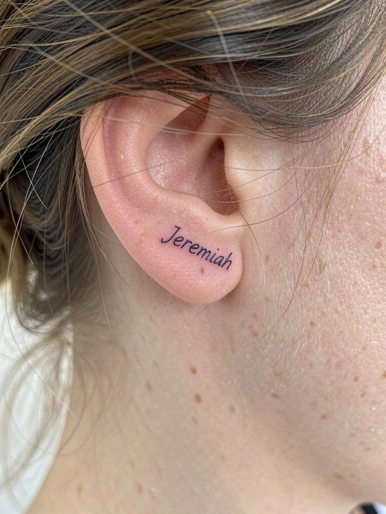
Behind-ear pieces are delicate and require precision because the canvas is tiny. Expect a quick session and a sharp sting. The main error is asking for letterforms so small they become illegible as the skin settles. Choose a font with generous counters and ask for a slightly heavier outline to preserve the word. Because this area sees little friction, touch-ups are often later rather than sooner, though you should expect minor softening over a few years.
14. Calf Vertical Script with Laurel
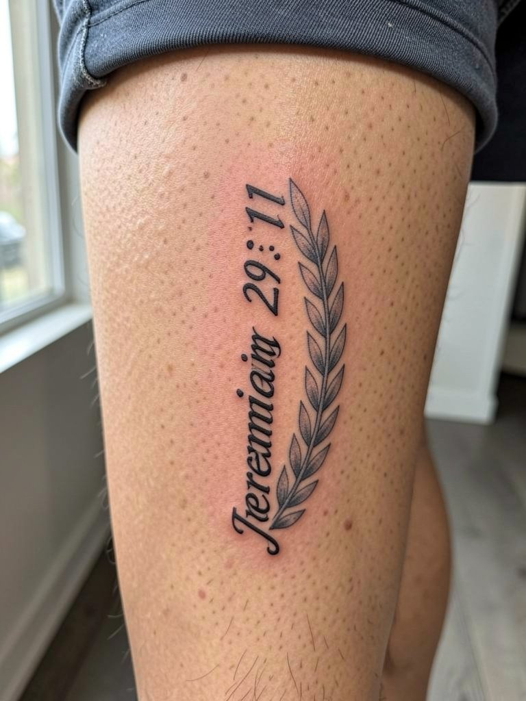
The calf gives room for taller letterforms that remain readable at distance. Pain is low to moderate and sessions vary from forty five minutes to two hours. A typical mistake is compressing ornate laurel detail too close to the letters which can make the text fade into the foliage. If you plan to show the tattoo on warm days choose shorts with a mid-thigh hem so the script sits clearly. This design ages predictably and usually needs a touch-up only after several years.
15. Scapula Horizontal Script Across Upper Back
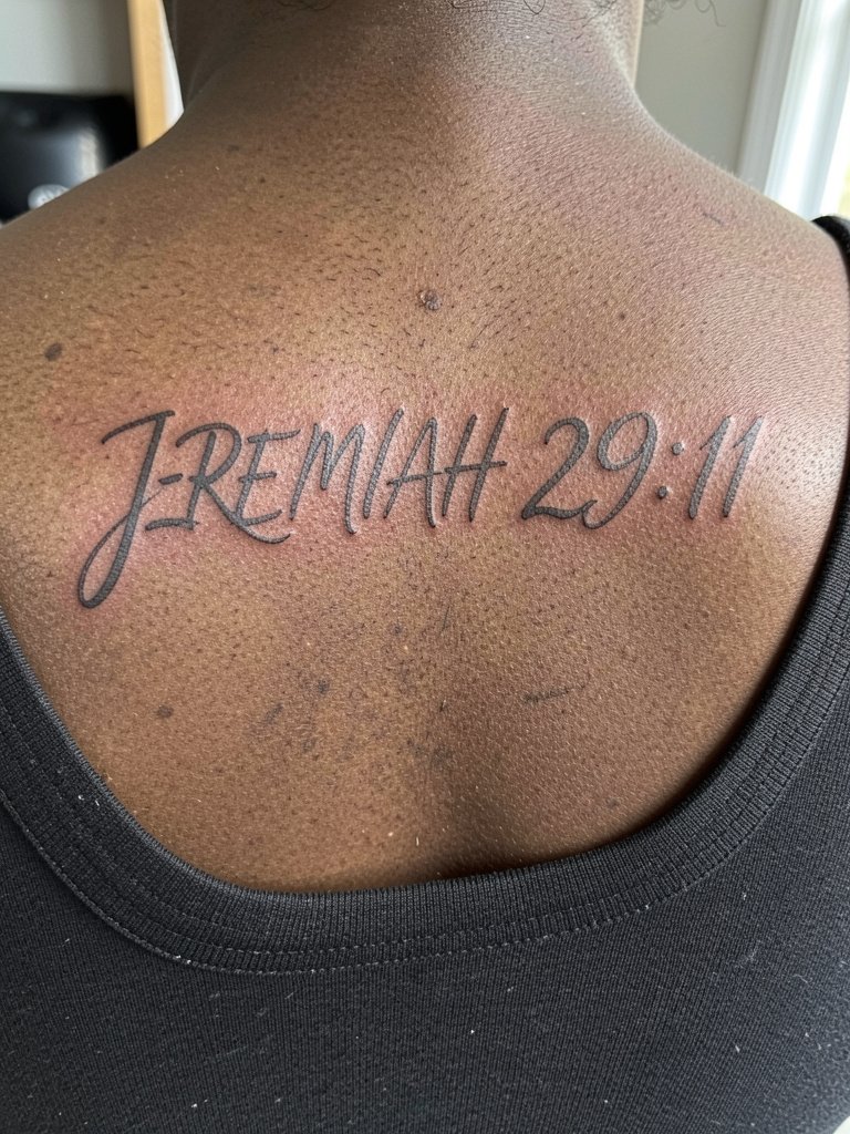
Across the scapula you can stretch the verse into a clean, modern typographic band that reads from a distance. This area has low-to-moderate pain and sessions are generally under two hours for text and light shading. Ask your artist to map the kerning across the shoulder blades so the line remains visually centered when you stand naturally. A common error is letting the text drift into the shoulder muscle curve, which makes the piece look off-balance as you move. For showing it off, wide-back tops frame the script without putting pressure on the healing ink.
Frequently Asked Questions
Q: How do I decide between fine line script and bold lettering for Jeremiah 29:11?
A: Fine line reads intimate and modern, but it needs stable skin and slightly larger spacing to avoid blur. Bold lettering sacrifices delicacy but holds up better on high-motion areas like the wrist and fingers. Choose fine line for inner forearm or scapula and choose bolder styles for wrists or hands.
Q: Where can I find portfolios and healed examples without naming specific artists?
A: Search social platforms for hashtags and keywords that include placement and style, such as #ScriptForearmTattoo, #ChestScriptHealed, and #FineLineJeremiah. Use location filters on social video platforms and browse portfolio sites by keyword like "script chest healed" to compare how a style ages across skin tones.
Q: How soon will a Jeremiah 29:11 wrist or finger script need a touch-up?
A: Wrist and finger scripts often need a touch-up between twelve and twenty four months depending on daily wear. Expect shorter timelines if you wash hands frequently or wear tight bracelets. Plan for a small top-up rather than a full redesign.
Q: Are there special artist considerations for sternum or rib placements?
A: Yes, those placements require an artist experienced with body movement and breathing rhythm. Ask for healed photos of rib and sternum pieces over multiple years so you can judge longevity. Bring references that show exact spacing and size so the artist can adapt the layout to your contours.
Q: What should I wear to the appointment for shoulder blade, chest, or hip tattoos?
A: Wear clothing that exposes the exact area without you needing to adjust fabric during the session. For shoulder blade and upper back choose an open-back top in a normal worn state, and for hip pieces wear low-rise jeans that are fully zipped and buttoned so the artist has clean access.
Q: How does skin tone affect the choice of script or ornamentation for this verse?
A: Contrast is everything. On darker skin tones, slightly heavier linework and bolder black saturation keep small text legible. On lighter tones you can preserve finer strokes with careful spacing. Look for healed examples across skin tones to see how spacing and saturation translate before you commit.