
Someone I know spent nine months saving reference images and still booked a dud because the design looked great in a feed but did not age well on skin. I have sat in five shops across Brooklyn and talked to artists who specialize in fine line and watercolor, and the same few motifs keep coming up this year. Below are 12 christian tattoos for women that balance symbol, placement, and how they actually heal.
1. Floral Cross on the Inner Wrist
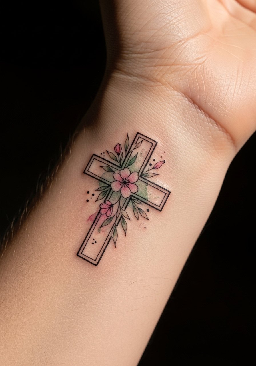
Someone I know first saw this style on a collarbone and booked it because the florals softened the cross. Recommend this to anyone who wants a faith symbol that reads feminine without losing definition. Tell your artist you want restrained saturation and clear black linework around the cross so the petals do not blur into the center as the color fades. A common mistake is asking for overly soft watercolor without a solid outline. That version looks like a bruise at two years. On the wrist the pain is mild and session time is short. Expect a touch-up at year two for color refresh if you want the flowers vibrant.
2. "God is greater than the highs and lows" Script on the Forearm
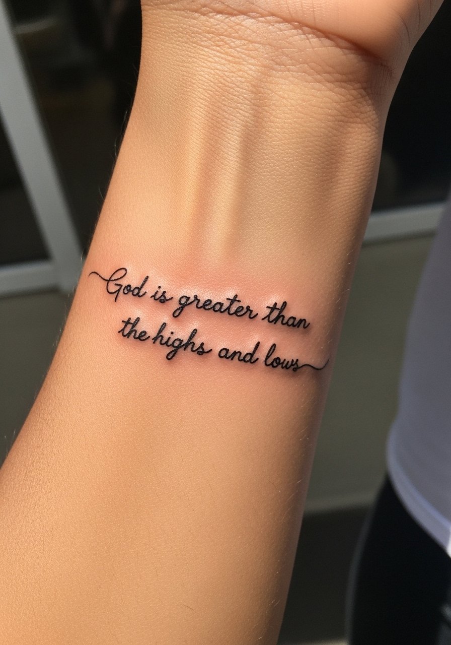
When you pick a phrase, pick exact wording before you walk in. I tell people to bring three font examples and point out letter spacing they like. Forearm placement makes the line readable and allows for a single session. The mistake is shrinking script too much for a wrist wrap. Tiny script on areas that flex will blur faster. Artists split on whether single-needle scripts hold up on the inner forearm. One camp says single-needle yields elegant hairlines that age quickly. The other camp says slightly heavier linework keeps letters legible longer. Ask which approach your artist prefers and why.
3. Crown of Thorns Outline on the Ribcage
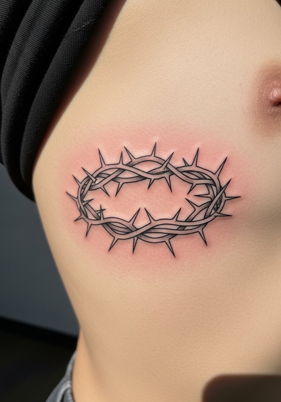
Fair warning: the ribcage rates high on pain scales, but the result sits closely to the body and reads intimate. For this motif, I suggest clean contour linework and minimal shading so the thorns do not become a gray blur. The common error is over-shading in the first session. That can turn a crisp outline into a muddy patch when healed. On ribs, expect two things: a longer session due to careful placement and a potential touch-up at two to three years because the skin there shifts with weight changes. If you want less pain, consider the ankle version where touch-ups may be more frequent.
4. Calligraphy Scripture Curve on the Collarbone
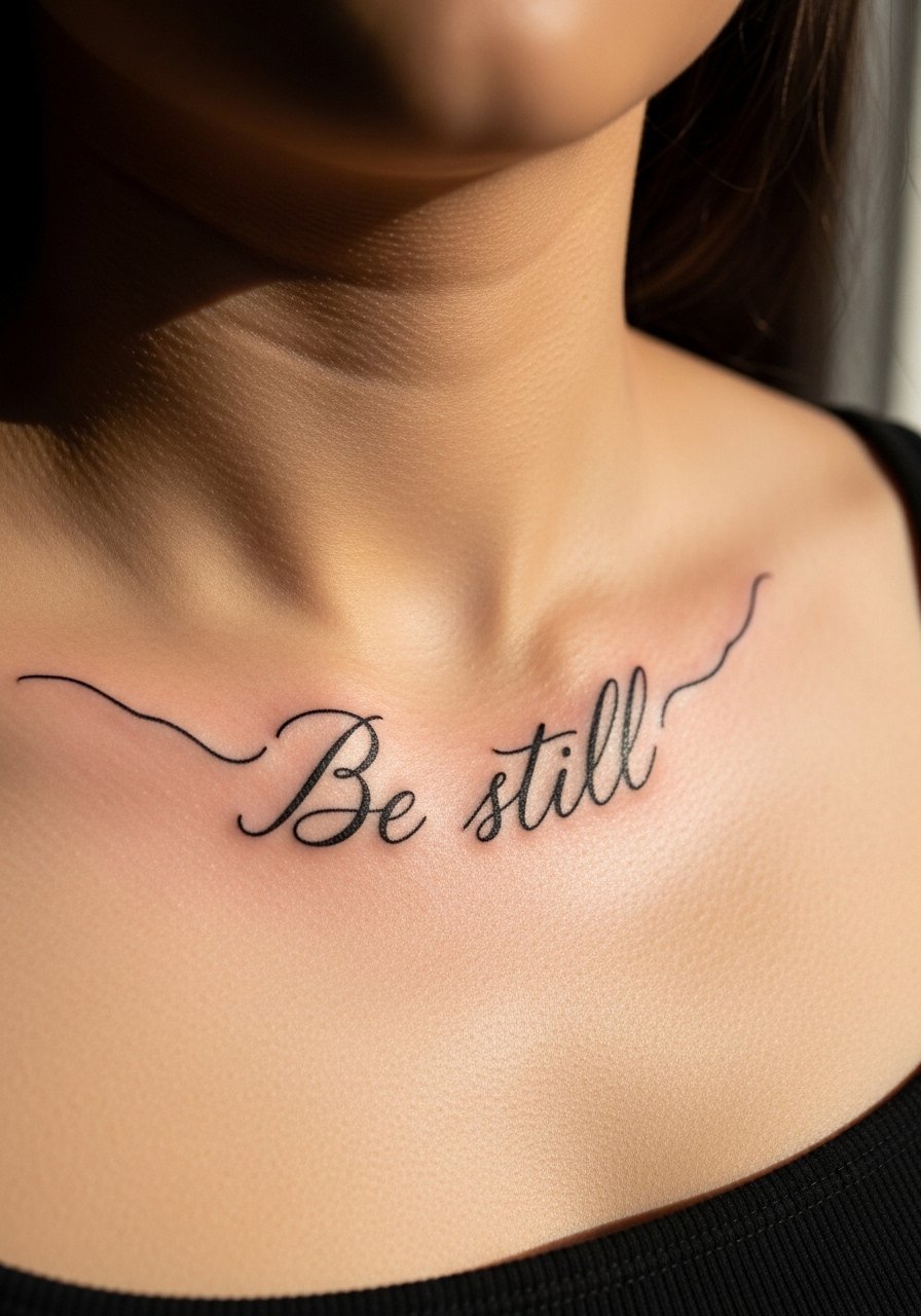
When a verse curves with the body it looks intentional rather than pasted on. For collarbone scripts, bring the exact text and a sample of the curvature you like. The most common mistake is choosing a long verse and forcing it into a tiny band. That ruins legibility and ages poorly. At six months a well-executed collarbone script looks crisp. By two years fine hairlines may need a touch-up, especially if the piece sits near clothing friction. Tell your artist how close to the bone you want the ink because that affects pain and ink depth.
5. Trinity Knot with Flower Accents on the Shoulder
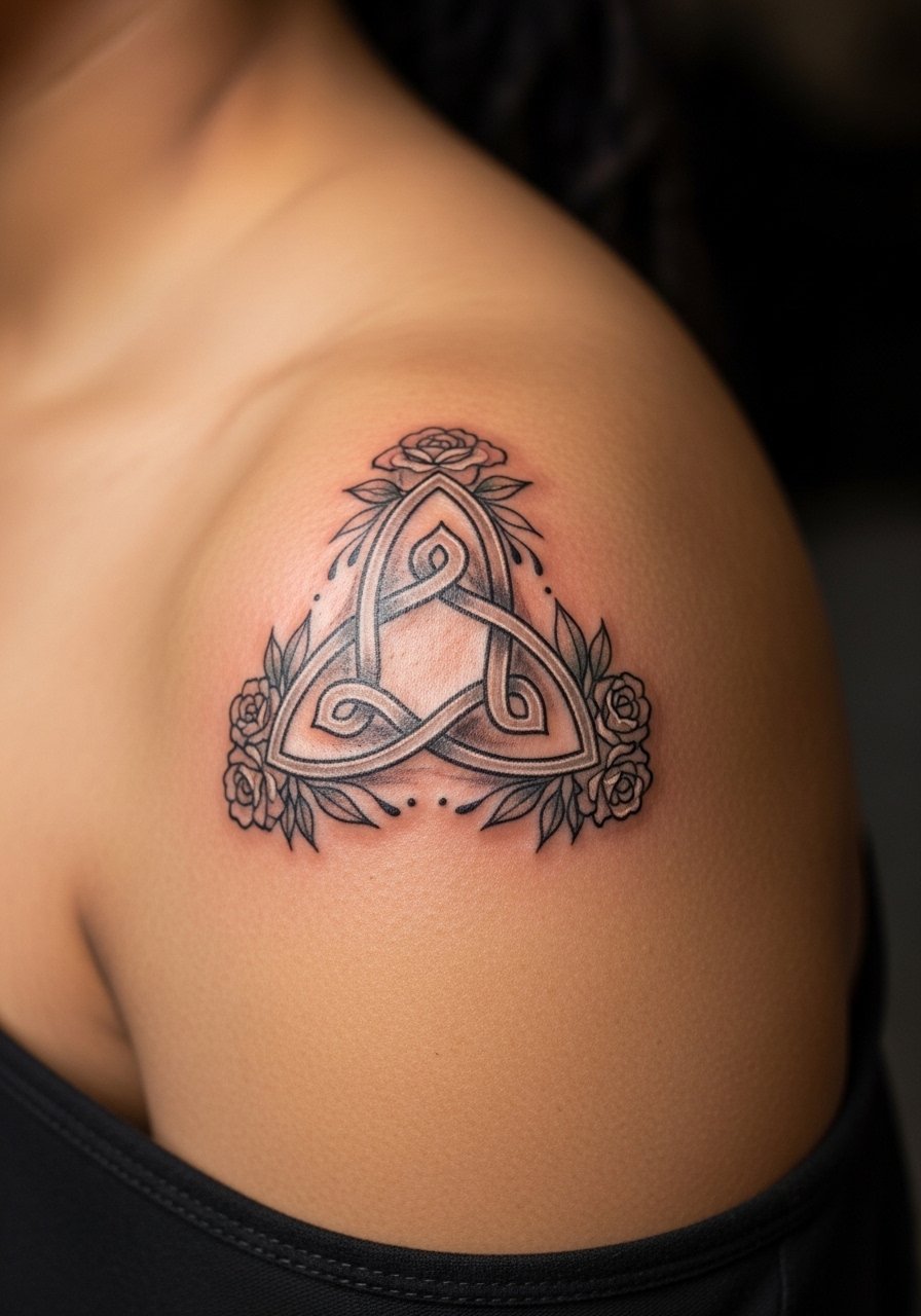
For shoulder pieces the canvas allows for more ornamentation and graceful movement. Ask for slightly heavier linework inside the knot and lighter stipple shading in the flowers so the pattern keeps its shape at three years. The error I see often is packing too much detail into a small shoulder dot. That detail collapses over time. Sessions are moderate length and pain is low. If you want the knot to sit under clothing straps, mention this so placement avoids constant rubbing that can accelerate fading.
6. Dove with Cross Micro on the Hand
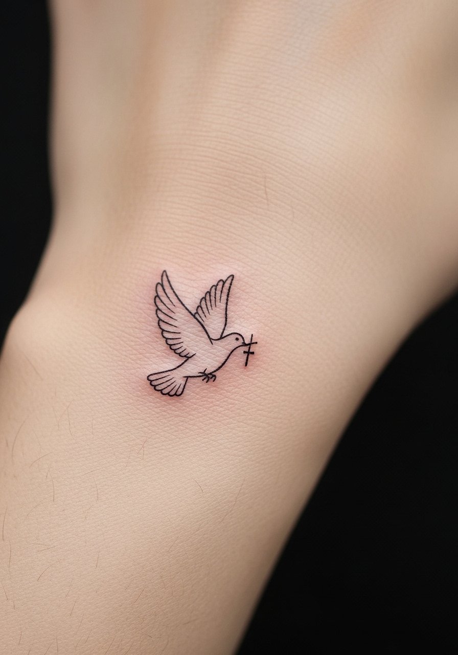
Hands are honest real estate. They heal fast but they face washing and sun daily. I recommend keeping the dove very small and lines a touch bolder than you might choose for a wrist to avoid blowout. The common mistake is treating hand micro work like wrist micro work. Hand skin moves and spreads ink more. Expect more frequent touch-ups, sometimes yearly. Also consider career context because hand tattoos still affect perceptions in some workplaces. If you book a professional who specializes in hand placement, that can reduce long-term blurring.
7. Mustard Seed Fine Line Behind the Ear
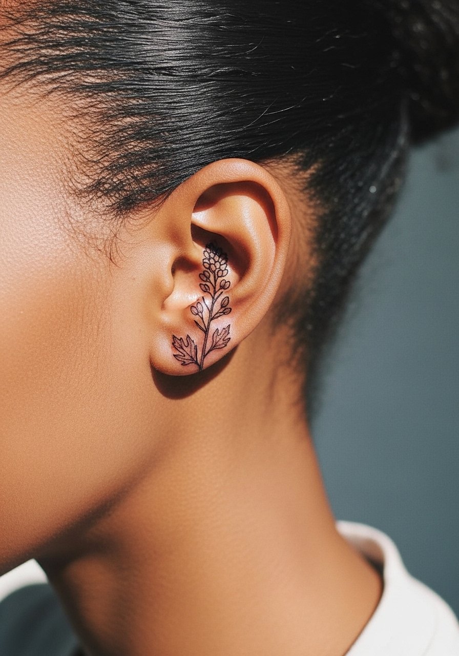
Mustard seed pieces are tiny reminders that read best when kept micro and simple. Behind the ear the skin is thin and touch-up sessions are usually quick. The mistake is forcing botanical detail into a micro space. Opt for a single seed or a short sprig with a small stem. At six months the piece will look crisp, and at two years expect some softening. If you want that permanence, scale up slightly rather than compressing too many dots into a tiny point. Sessions are brief and pain is low, though behind-ear sensitivity varies.
8. Ichthys Fish Outline on the Calf
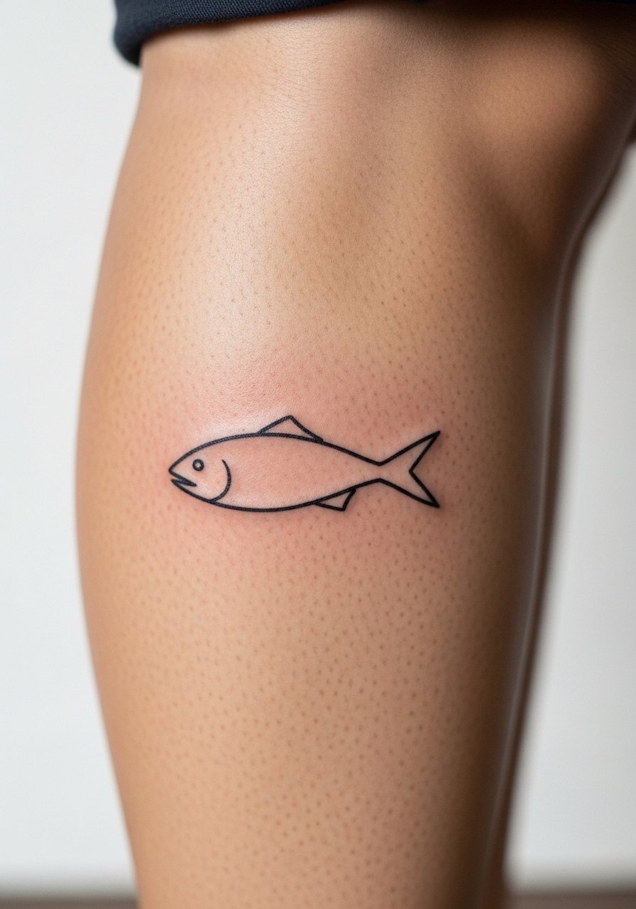
The calf gives room to scale the icon without losing its silhouette. I advise a single clean outline with a small negative-space center so the fish remains readable at distance. A frequent mistake is over-ornamenting a classic outline with heavy fill and small lettering inside the body. That interior detail blurs. Calf placements feel moderate in pain and heal predictably. If you plan boots or high socks, place the fish where clothing will not rub it constantly to reduce fading.
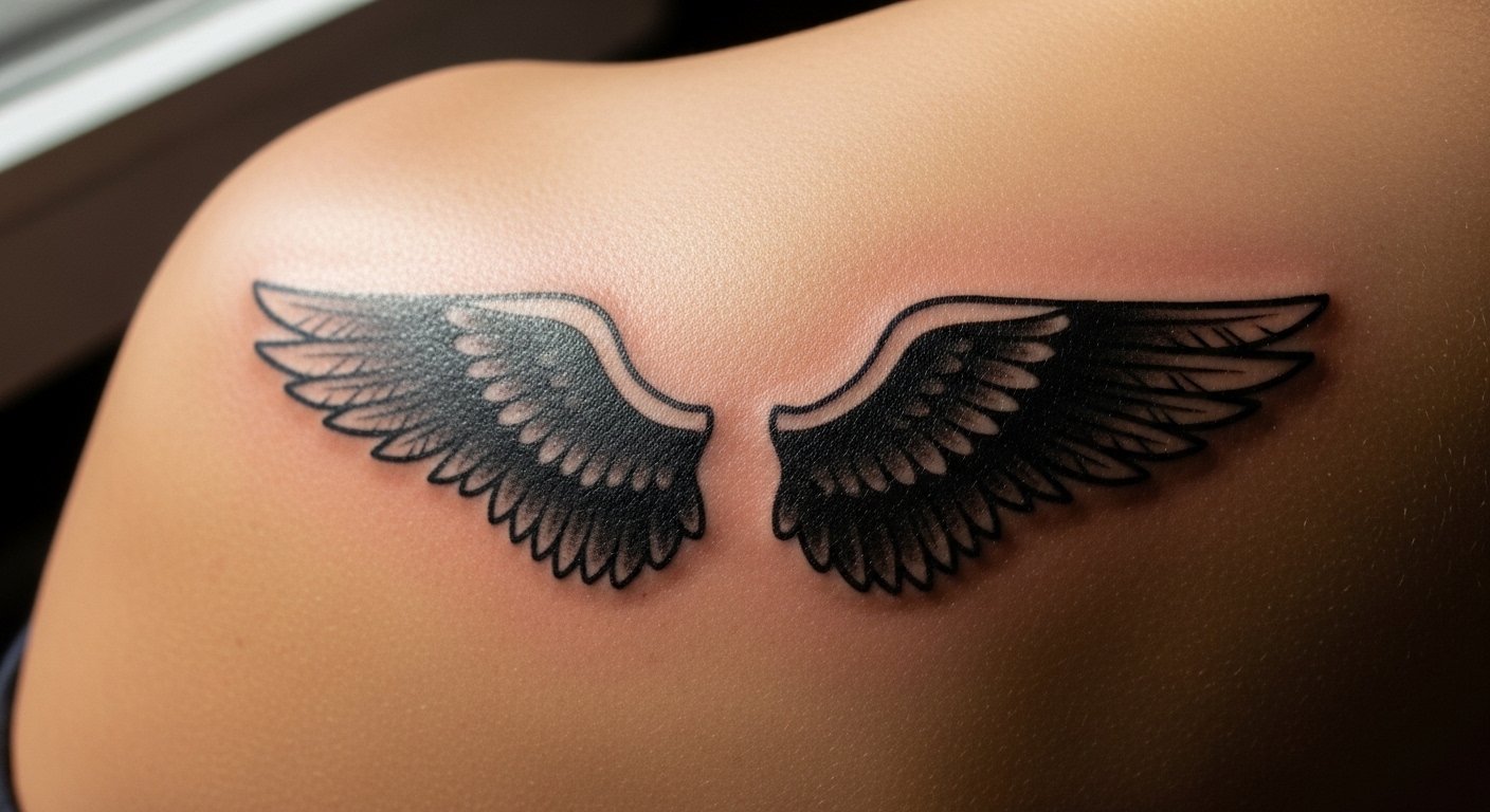
9. Angel Wings Silhouette Starting at the Shoulder Blade
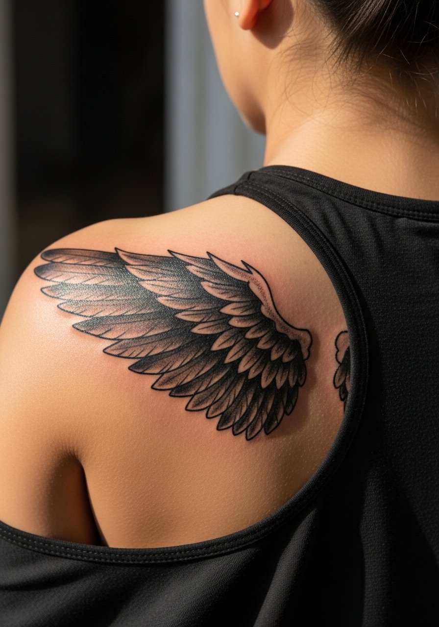
There are few pieces that translate into sleeve starters like wings. For a silhouette, strong black saturation near the base and softer gray wash toward the tips keeps the form legible from a distance. New artists sometimes over-texture the tips with tiny feather lines. That fine detail goes fuzzy over time. Expect multiple sessions for a medium-sized shield of wings and touch-ups at three years if you want the black to stay solid. If you plan to extend into a sleeve, mention that in your consultation so the wings read as the foundation.
10. Tiny Cross with Vine Along the Collarbone
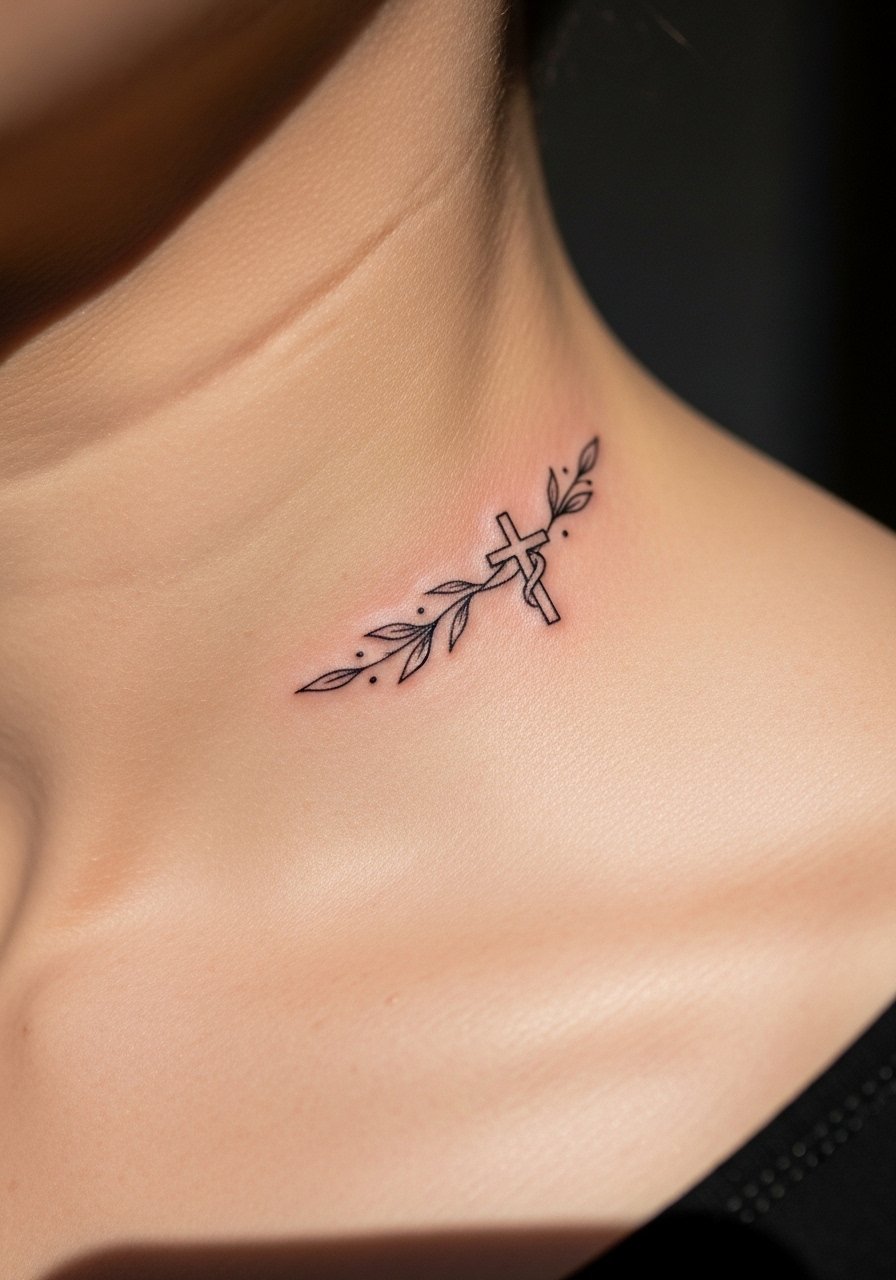
The collarbone is perfect for a small cross that integrates with a botanical vine. Tell your artist you want negative space between vine loops so the pattern does not fill in as it heals. A common error is continuous heavy shading in the vine. Over time that becomes a patch rather than a winding motif. Pain is mild and session time is short. If you move the design to ribs, expect more pain and possibly faster blurring where skin stretches with breathing.
11. Bible Verse Cursive Arc on the Upper Arm
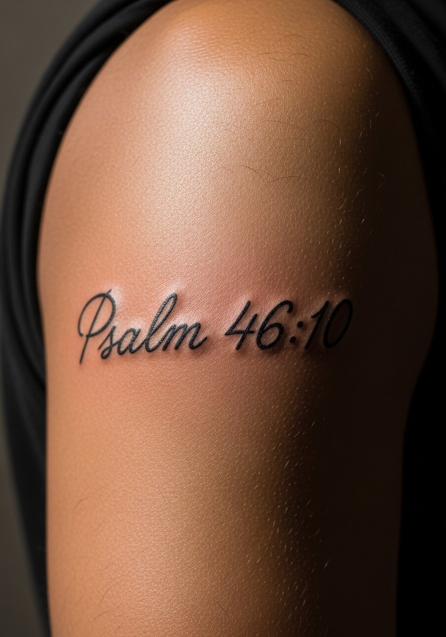
Phrase choices matter. For arcing verses on the upper arm, use a mid-weight script that stands up to sun exposure. The error I often see is choosing ultra-thin lettering for large arcs. Thin letters on outer arms fade faster because of sun exposure and friction. At six months a sturdy mid-weight script still reads crisp. At five years you will likely need a touch-up to regain initial contrast. Upper arm placement is forgiving for size changes and makes future cover-ups or expansions easier.
12. Lion of Judah Mandala on the Thigh
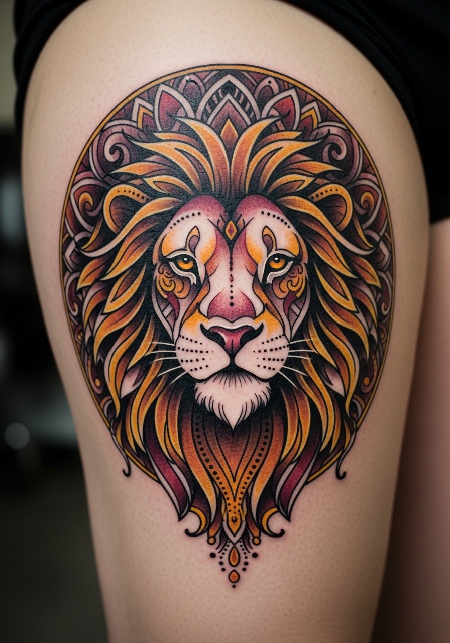
Large, ornamental mandalas let you combine figurative and decorative work. The thigh holds detail well and ages better than thin-skinned areas. Ask for areas of negative space and dot work rather than solid fill in the mane to prevent a heavy block of ink that can look flat at two years. A typical mistake is cramming intricate mandala geometry into too small a circle. Expect several sessions and a realistic touch-up schedule at three to five years depending on sun exposure. This pattern has cultural references, so consider minor stylistic variations rather than copying sacred motifs verbatim.
Tattoo Prep and Aftercare Essentials
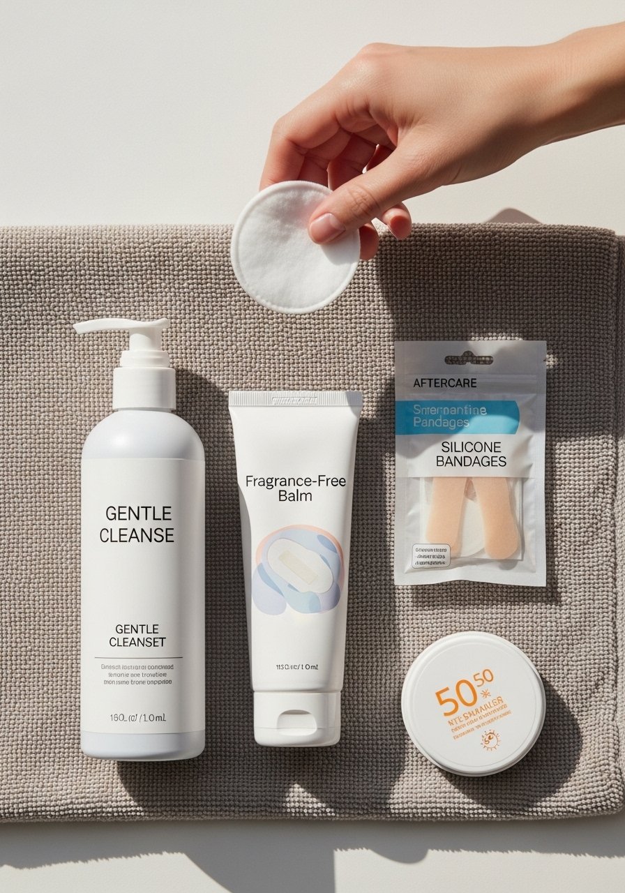
- Fragrance-free moisturizing balm for sensitive skin. Use sparingly after the initial peel. A light balm keeps scabs pliable and helps avoid over-moisturizing.
- Gentle, fragrance-free foaming cleanser. Wash twice a day to remove sweat and debris without stripping ink.
- Medical-grade second skin bandage, 6-inch roll. Useful for the first 24 to 48 hours on high friction areas like hands or ribs.
- Broad-spectrum mineral sunscreen SPF 50. Long-term sun protection preserves saturation on exposed placements.
- Lightweight fragrance-free lotion for daily maintenance. Apply after healing to keep skin supple and ink vibrant.
- Silicone scar and fade minimizer sheet. Optional for areas prone to raised healing.
- Disposable soft gauze pads. For gentle patting after initial wash.
- Aquaphor Healing Ointment. Use as your one mainstream option if recommended by your artist, applied sparingly in the first days.
Every tattoo is different. Always follow your artist's specific aftercare instructions. Consult a dermatologist if you have skin concerns or unusual healing issues.
Frequently Asked Questions
Q: Will fine line tattoos like mustard seed or tiny script blur faster on the hand or wrist?
A: Fine line on hands and wrists faces more friction and washing, so it often softens sooner. Expect touch-ups sooner than a forearm piece. If you want longevity, ask your artist for slightly heavier line weight and clear spacing between letters or dots.
Q: Do watercolor floral crosses need different aftercare than a blackwork cross?
A: Watercolor pieces rely on color saturation, so protect them from sun and friction especially during the first year. Gentle cleansing and a light balm help the color settle. I have seen watercolor fade unevenly when people over-exfoliate the area.
Q: Is a crown of thorns on the ribs worth the pain and touch-up trade-offs?
A: Ribs are painful but the placement reads intimate and stays mostly out of direct sun. You may need a touch-up at two to three years because of skin stretch and breathing motion. If pain is a major concern, consider a nearby flatter area like the side of the torso.
Q: How do I test a scripture or phrase without committing to permanent ink?
A: Temporary transfer tattoos or custom temporary prints are good trials. Etsy and local shops offer short-run transfers so you can live with the placement and size before booking.
Q: Will a Lion of Judah mandala translate well across different skin tones?
A: Yes, but contrast matters. On darker skin tones ask for stronger black saturation and consider selective color accents that read well. Show your artist photos of healed pieces on similar skin so they can plan saturation and spacing.
Q: How often should I expect touch-ups for pieces on high-movement areas like the collarbone and ribs?
A: It depends on ink depth, placement, and sun exposure. From what I have seen, collarbones commonly need touch-ups around year two to three, and ribs can need touch-ups earlier if the original session used very fine lines.
