
Tiny “Lucky You” scripts flood feeds, but the ones that still read clearly at year three usually share the same quiet choices: slightly heavier single-needle strokes, careful spacing, and placement that avoids constant rubbing. If you care how the phrase looks after a few summers in the sun, think beyond the font and toward how the skin will move. Start with a placement that lets the letters breathe and a line weight that will still read when the ink settles.
1. Fine Line Cursive on the Inner Forearm

A fine line cursive on the inner forearm reads like handwriting and stays visible for people who want something discreet but readable. If you want this look, request slightly wider spacing between letters and a hair heavier single-needle stroke rather than whisper-thin hairlines, so the script does not merge as it heals. Expect a low pain level for this placement and a single short session. A common mistake is shrinking the phrase too small to fit a trendy photo. For display pairing, roll sleeve cuffs and wear a rolled sleeve shirt to show the script in casual shots.
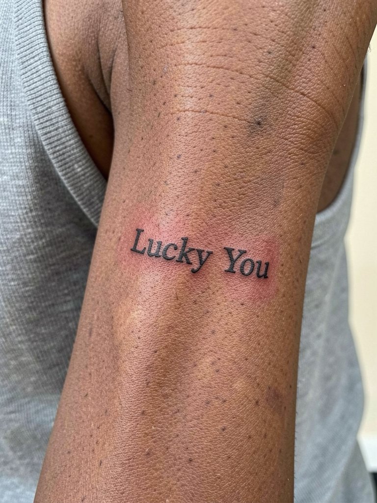
2. Hand-Poked Mini on the Wrist

The hand-poked method gives micro script a handmade rhythm that photographs softly. Tell your artist you want visible dot rhythm and slightly denser spacing so individual letters do not blur into a thin smear after a year. Wrist placement faces more washing and friction, so the session is quick but the first week needs extra care. For showing it off, stack a thin bracelet on the opposite wrist and consider a minimal watch to balance photos. A real mistake is asking for ultra-tiny letters without accounting for daily wear on the wrist.
3. Lower-Back Single-Word Centered “Lucky”

Lower-back placements can be read two ways. One camp says a lumbar small script is a modern, deliberate revival when the lettering is centered and restrained. The other camp sees the placement as still tied to older trends, and worries the context will date the phrase. If you like this area, pick balanced spacing and keep the word single and bold enough to survive waistband friction. Session pain is low but sleeping comfort during healing matters. For show-off outfits, low-rise waistbands or swimwear reveal the area best. Avoid overly thin lines that sit directly under tight elastic.
4. Tiny Tailbone Stamp

A tiny tailbone stamp reads as a private detail for people who want subtle luck motifs. The area is discreet and often hidden under clothing, so it pairs with low-rise bottoms when you want to show it. One professional note, tailbone work benefits from an artist experienced with the curvature and thin subcutaneous tissue there. Expect a short session and a healing window that avoids pressure from sitting on hard surfaces. A common error is requesting microcursive without checking waistband friction, which can blur the lowest letters.
5. “Lucky You” with Clover Accent on the Inner Forearm

A tiny charm like a clover makes the phrase feel anchored and gives the eye a resting point. If you want color, ask for a single tiny green patch focused on the clover rather than tinting the letters, and choose conservative saturation so the green ages gracefully. For wardrobe, cuffed shirts and neutral layers in cream or olive frame the forearm and let the tiny clover read in photos. The mistake is adding multiple colored accents that compete with the script. Expect a quick session and a likely touch-up in the first year if the green loses saturation.
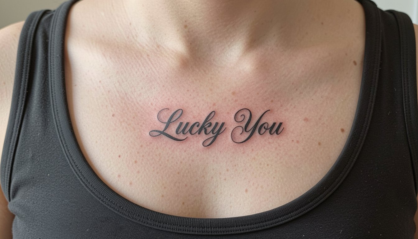
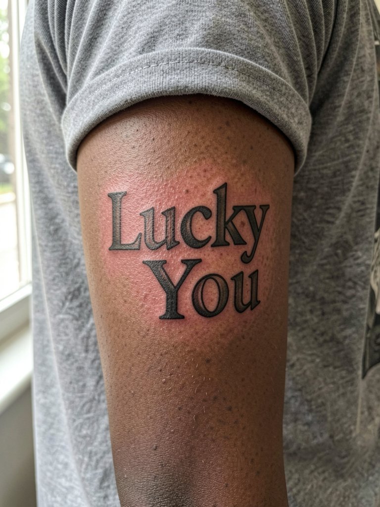
6. Bold Custom Lettering for Chest or Forearm
Custom bold lettering solves the longevity problem by increasing line weight while keeping a bespoke look. One camp argues fine line is the only way to get an elegant phrase, and accepts some softening over time. The other camp insists bolder script ages better because thicker strokes hold against skin movement and mild blowout. If you want chest placement, ask the artist to draw a custom letter with high contrast and clear counters so the word reads from a distance. For evenings out, pair with scoop or V-neck tops and a layered delicate chain.
Pre-Session Essentials
The wrist, forearm, and lower-back pieces above share short sessions and wardrobe needs, so a few small items smooth the appointment and first week.
-
Lightweight unscented tattoo balm. A thin, non-greasy balm helps dry-prone spots without smothering single-needle lines during the first week.
-
No-rinse barrier cream. Useful on areas that rub against waistbands during the first few days of healing.
-
Fragrance free gentle body wash. A plain wash reduces irritation while you bathe the healing area.
-
Thin protective film roll. A lightweight film helps protect low-back or wrist tattoos from friction when you need brief coverage.
-
Second skin bandages. For tiny designs that risk surface abrasion, a brief film barrier can cut down on scabbing from clothes.
7. Matching Pair: “Lucky Me” and “Lucky You” Inner Forearms

Paired phrases are a popular choice for friends and partners because the symmetry makes two small scripts read like a shared idea. For a good match, bring both reference photos scaled to the actual size you want so the artist can tweak spacing for different forearm widths. A session per person is short, and both pieces should be drawn to suit each arm length rather than copying a single template. Avoid matching identical micro sizes when forearm proportions differ, which makes one tattoo look cramped. For visibility, cuffed sleeves and neutral layers photograph the pairing well.
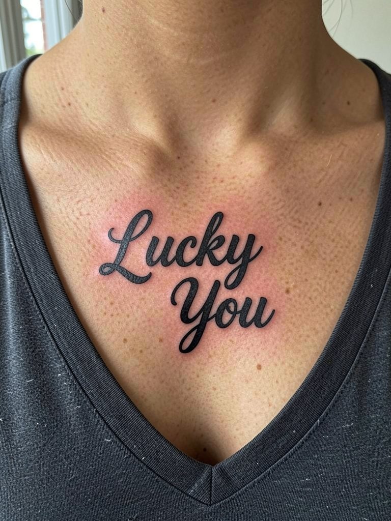
8. Calligraphy-Style Script Under the Clavicle

Calligraphy gives the phrase an elegant sweep while still being compact. Ask for test stencils at actual size so you can judge how the word sits along your clavicle. This placement is visible in low necklines and pairs nicely with scoop-neck tops and layered chains. Expect a brief session and moderate soreness while lying on the chest during healing. The common error is scaling calligraphy too small, which collapses the ornate flourishes into a patchy line after healing.
9. Negative-Space Lettering on the Inner Forearm

Negative-space lettering can make a tiny phrase feel graphic and modern while using heavier saturation to protect against blur. Tell the artist you want clear counters and larger black shapes so the negative letters remain crisp as skin texture changes. This approach ages differently from single-needle script because the black blocks hold up very well. For casual outfits, rolled sleeves and neutral linens keep attention on the stark contrast. A downside is that touch-ups on saturated blocks may be needed after several years.
10. Micro-Lettering Around the Wrist Crease
Wrist creases see frequent movement and washing, so micro-lettering here needs slightly bolder internals than photos suggest. Specify that letters retain internal space and that the artist avoids hairline strokes along the crease. Sessions are quick but the area may need a touch-up in the first year. For styling, stack a thin bracelet on the opposite wrist rather than the tattooed side during photos. The common mistake is sinking the text into the crease itself, where repeated bending blurs fine details.
11. Lower-Back Lucky Charm Word with Subtle Shading

A single-word lower-back piece can be bolder than a full phrase and still feel intentional. One camp celebrates this placement as a fresh comeback if the lettering is modern and centered. Another camp still reads the area through older trend associations and prefers placements that feel current for the wearer. Choose spacing and a touch of soft gray shading if you want weight without heavy color. Healing is straightforward but expect friction from waistbands during the first week. Avoid tight belts and swap to loose bottoms during initial healing.
12. Tiny Script with Floral Accent on the Ankle
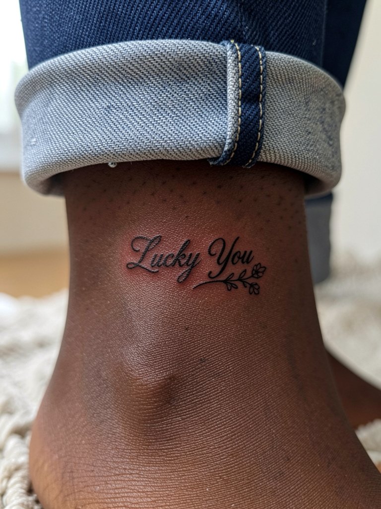
The ankle is a great discreet place for a small phrase plus a tiny floral motif. Since ankle tattoos see shoe and sock friction, keep the script slightly elevated from the bone line and pick a simple sprig that does not require heavy shading. For showing it off, cropped jeans or sandals are ideal. During the session, wear pants you can roll comfortably and avoid tight socks for the first week. A mistake is asking for dense shading too close to the ankle bone, which can create uneven healing.
13. Tailbone-Symmetric Script

Centered tailbone script benefits from perfect horizontal balance so the phrase aligns with the spine. This placement is intimate and often hidden, so keep the design small and symmetrical. Professionally, artists who do low-back work understand how the dimples and curve affect lettering, so book someone with healed photos of similar placements. Expect minimal session time and avoid sitting on hard surfaces during the first week. The real error is choosing too ornate a script that loses its rhythm on curved skin.
14. Font-Led Flash on the Outer Forearm
If you prefer a font-led starting point, treat the flash as a draft rather than the final decision. Font generators can help you visualize spacing, but a custom tweak from an artist keeps counters and baseline consistent with forearm anatomy. For session day, wear a short sleeve shirt so the artist has clear access. The common mistake is picking a tiny generator font that collapses on skin texture. For casual wear, rolled sleeves and simple bracelets create a clean frame for this bolder look.
15. Signature-Style “Lucky You” Behind the Ear
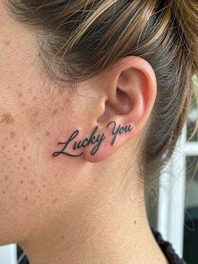
Behind-the-ear scripts are tiny and intimate, best for people comfortable with a visible small mark in hair exposure. The area is sensitive and requires an artist experienced with small curved surfaces. For session wear, pull hair up and keep it up for the first week so the area breathes. A typical mistake is asking for dense shading in that pocket of skin, which can heal patchy. This placement reads well with short hair or updos and will need careful aftercare to avoid tugging from hats or collars.
Frequently Asked Questions
Q: How much does a small script like "Lucky You" usually cost in the U.S.?
A: Expect a studio minimum plus time billed for custom work. A realistic range for tiny script in many U.S. studios is about $60 to $300 depending on whether the design is pre-drawn flash or a custom lettering piece, and whether the shop enforces a higher minimum on weekends.
Q: What line weight and spacing should I request to keep micro lettering readable over time?
A: Ask for slightly heavier single-needle strokes with clear counter space between letters and a little extra kerning compared with a font screenshot. Bring a printout at the exact size you want so the artist can show how spacing reads on your skin.
Q: Where can I find lettering-focused portfolios and healed examples without naming artists directly?
A: Search hashtags on social platforms like #luckyyoutattoo, #finelinetattoo, #scripttattoo, and #handpoketattoo to see process clips and healed follow-ups. Use Pinterest to build a font board, then filter Instagram location tags and booking platforms for studios that list lettering or fine line as a specialty. Reddit threads often have real healed photos in comments that show how different letter sizes fare.
Q: Will a lower-back or tailbone script age differently than a wrist or forearm piece?
A: Yes. Areas that experience more friction from clothing or frequent bending tend to blur sooner, while flatter forearm skin often holds fine detail longer. Consider slightly larger letters on high-friction placements and plan for a possible touch-up after one to three years.
Q: What should I wear to a session for a lower-back or tailbone tattoo?
A: Choose loose pants or a skirt with a waistband that can sit high or be lowered easily, and a cropped top or tank that stays put. For forearm and wrist appointments, a short sleeve or a button-down you can roll is ideal. If you want a specific look for photos, a cropped tank top usually gives the artist room and frames the healed result.
Q: How often do tiny lettering tattoos need touch-ups?
A: Many tiny scripts are stable for several years, but small pieces often need a touch-up within two to five years depending on placement, sun exposure, and how thin the original lines were. Expect the occasional maintenance session if you want crisp lettering long term.
