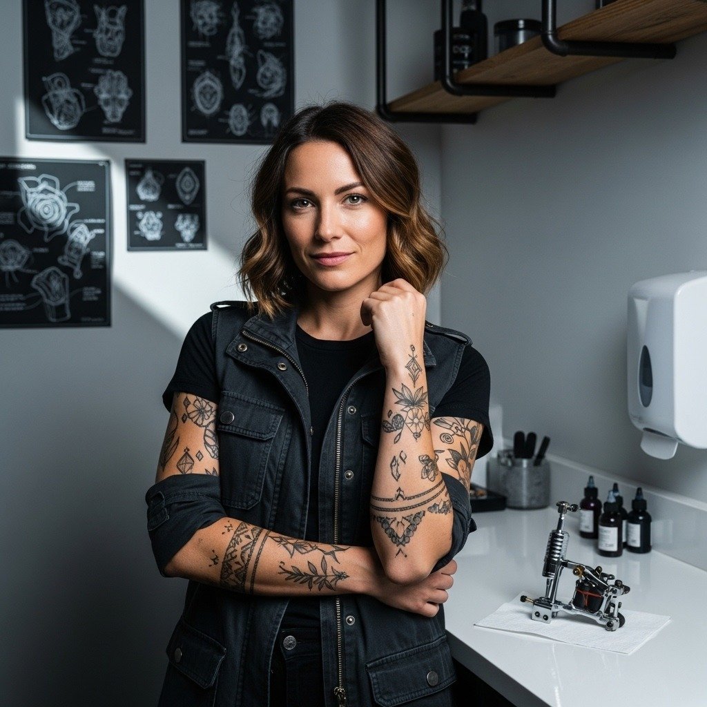
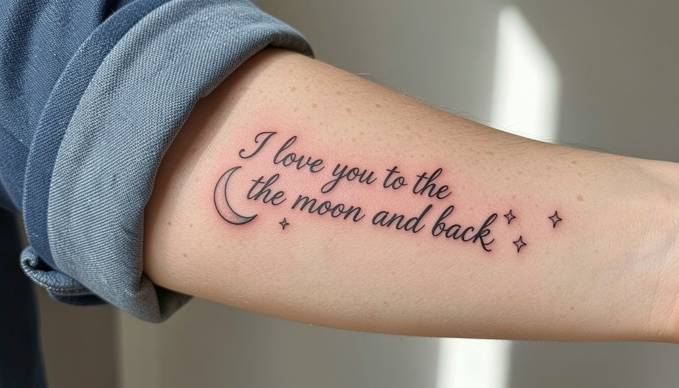
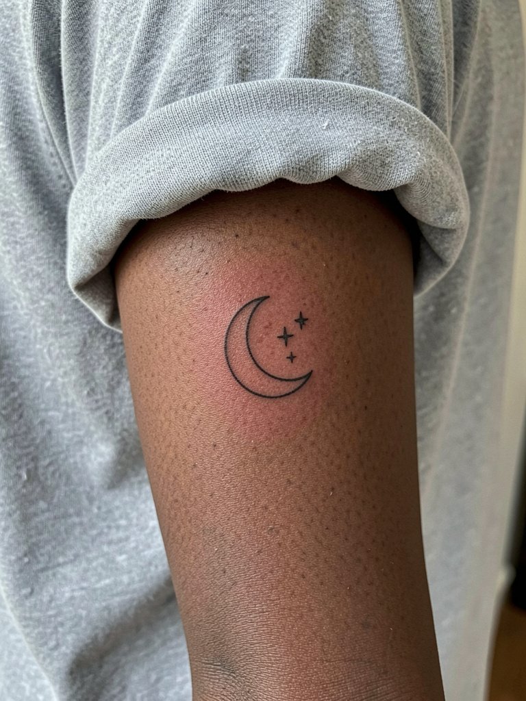
A small script crescent with little stars can feel like a private promise you glance at during a quick hug. Pick the right size and line weight and it reads clean for years. Pick the wrong scale and it becomes a smudge that only looks good from six inches away. Below the first idea you will find a clear image so you can see healed line weight, not just fresh ink.
1. Tiny Script with Crescent Moon and Stars
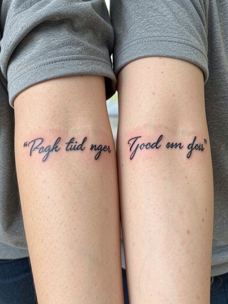
A neat tiny script works best when the letters have breathing room. Choose slightly larger letterforms than the smallest option on your mood board and the script will hold shape at six months and at five years. One camp says tiny script is worth it because the intimacy and subtlety are the point. Another camp warns tiny script blurs over time and recommends a slightly larger size or pairing with a symbol. When you sit with your artist, show the exact font at the size you want and ask for line weight that still reads after healing. For showing the piece off, wear a rolled sleeve linen button down so the forearm sits exposed without busy prints. Expect a short session, light stinging on the inner forearm, and a touch-up maybe after a year if the letters fade.
2. Matching Handwriting Script
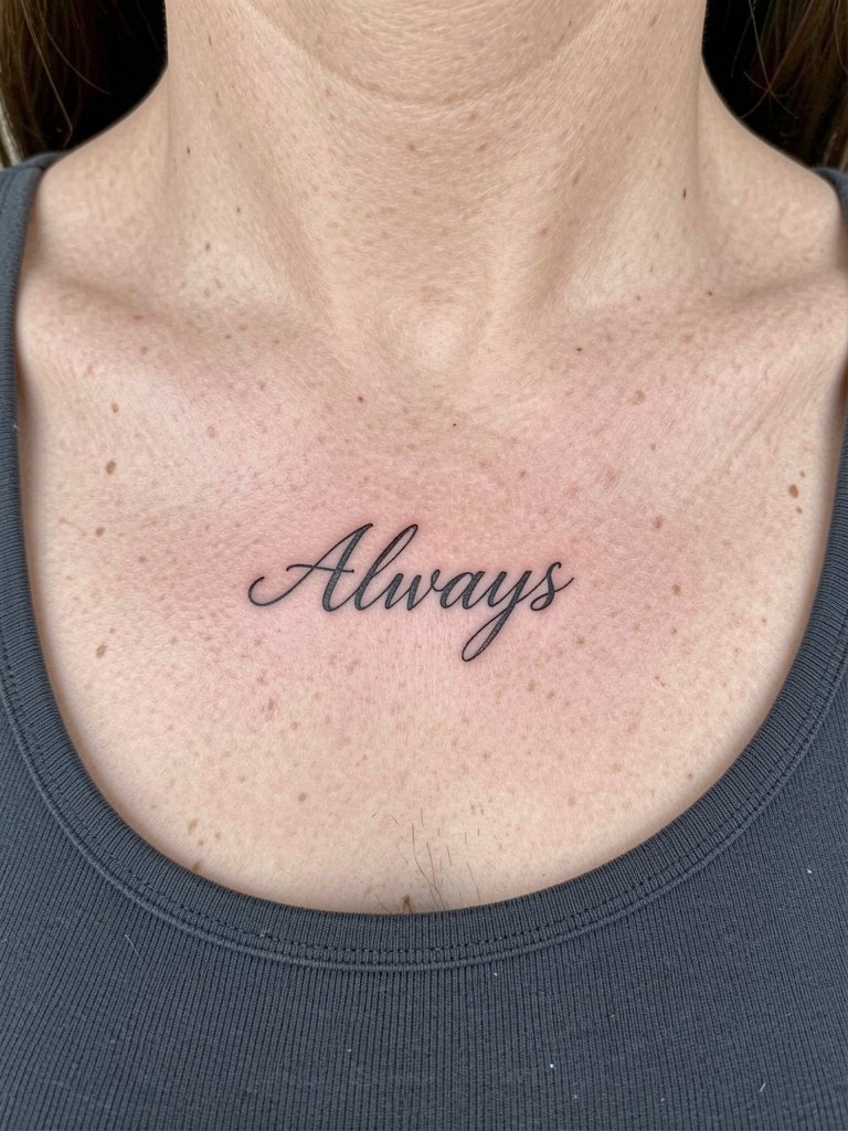
Using actual handwriting preserves the relationship in a literal way. The trick is scanning the note, cleaning the vector so strokes are consistent, and making the thinnest strokes a hair fuller to survive healing. A common mistake is copying the handwriting at its original tiny size. Instead bring a scan and ask the artist to scale up letters uniformly and keep single-needle look but with slightly denser linework. Healed at six months the letters look soft; at two years they hold with the adjusted weight. For session comfort, wear a scoop-neck or button-up top that opens easily if the placement is collarbone-adjacent. Expect modest pain on the collarbone and a quick session for wrist pieces.
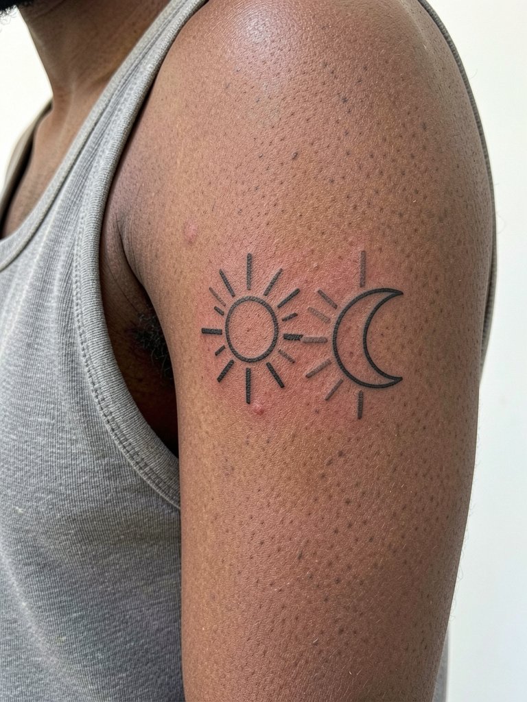
3. Sun and Moon Complementary Set
Give one person the sun and the other the moon for a matching vibe without identical copies. One camp likes identical tattoos because they display unity at a glance. The other camp prefers complementary symbols because each person keeps a piece that fits their style while still linking to the other. For each design, keep simple silhouettes and avoid tiny interior detail that will merge. If you want the sun to read like an icon at five years, keep thicker rays and modest spacing. For the session, sleeveless tops or a muscle tee give clear upper arm access. Plan on short sessions and a possible touch-up in two years if rays soften.
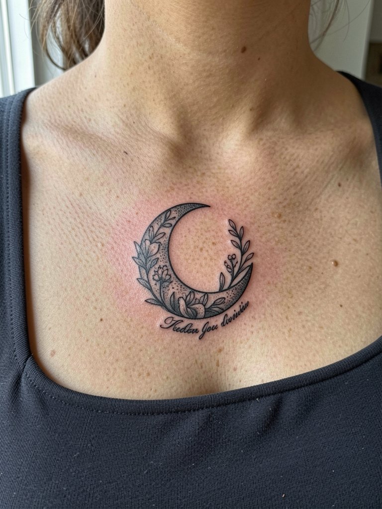
4. Floral Crescent with Wrapped Script
A crescent filled partially with small florals frames a short phrase beautifully and reduces reliance on tiny letters alone. Recommend that the floral fills stay airy, not densely shaded, so the silhouette reads from a short distance. A common aging mistake is over-detailing petals at micro scale. Instead, keep stipple shading sparse and contrast high. For styling, pair this collarbone-adjacent placement with square-neck dresses that frame the piece without covering it. During the session expect a longer single pass than a tiny wrist script, and ask the artist to show a healed sample with similar shading before you book.
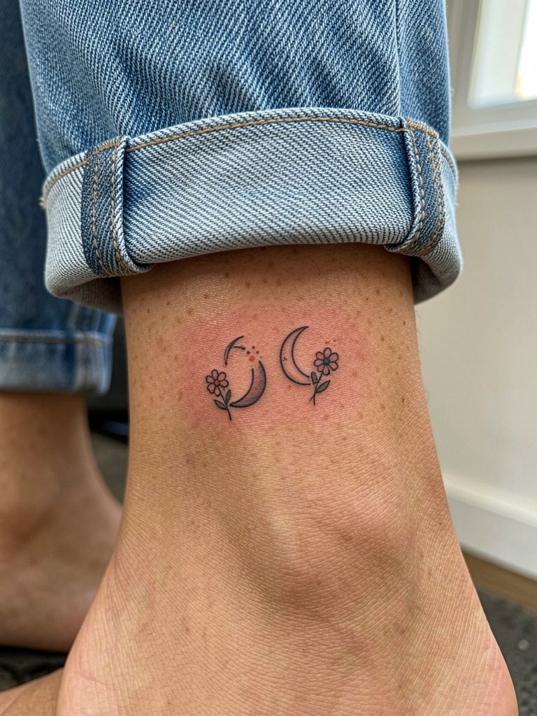
5. Tiny Crescent Pair with Birth Flowers
Pair matching tiny crescents with each person’s birth flower for low-key personalization. For wrist or ankle placements the linework must be a touch bolder than a single-needle whisper so petals and stems do not merge. A frequent error is compressing a complex bloom into a pinhead size. Instead simplify petals to one or two defining shapes. If you want subtle color, restrict it to single-stroke accents rather than full saturation. For showing off the ankle design try cropped straight-leg jeans and ankle-strap sandals so the tattoo peeks out, and wear shorts to the appointment for easy access. Healed photos at six months will show soft color if any, and touch-ups may be needed for color in year two.
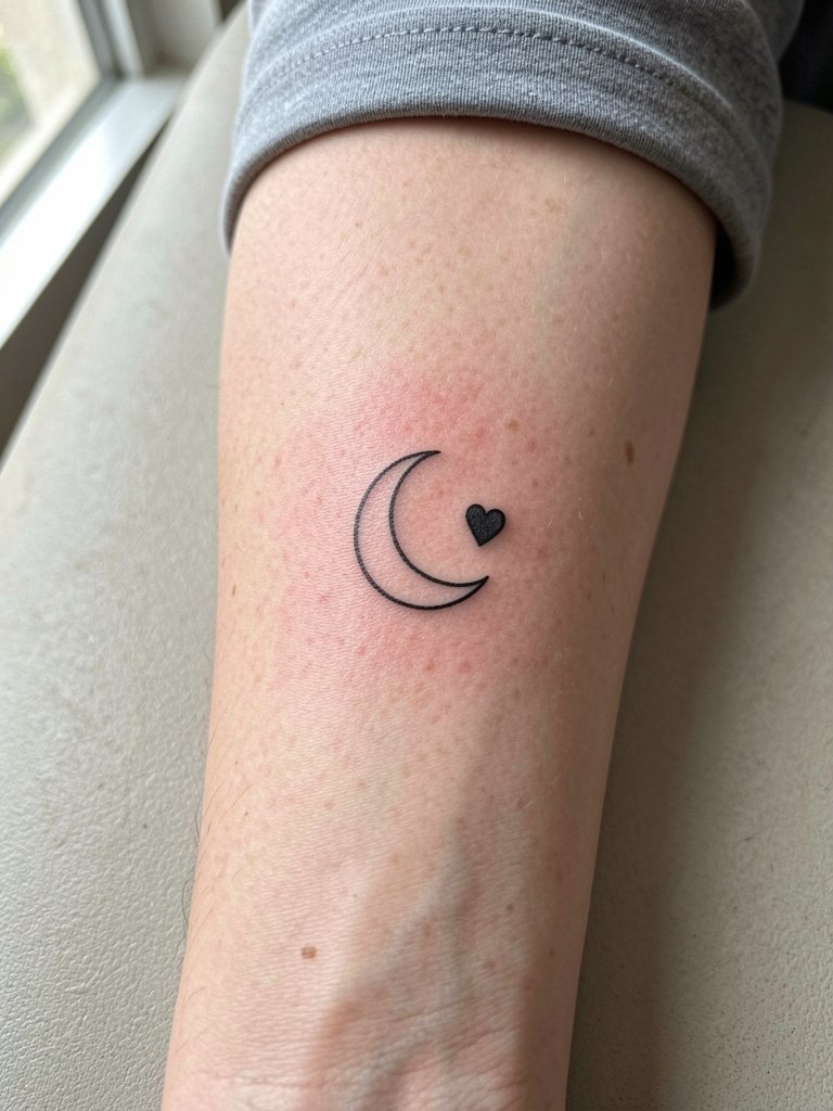
6. Minimal Moon and Heart Combo
A tiny moon next to a micro heart reads across many placements and keeps the message obvious at small scale. To age better, make the moon a thin crescent with a modest interior negative-space gap so it keeps silhouette. One common mistake is shrinking the heart until it becomes a blotch. Ask the artist to make the heart roughly the same visual weight as the moon. For wrist work, style with a thin chain bracelet on the opposite wrist so the tattoo remains the focal point, and bring a sleeveless top for the session. Try a thin chain bracelet set if you want a curated wrist stack that does not cover the ink. Expect a brief sit and a check-in at three months for any touch-ups.
Session Day Picks
The tiny scripts and wrist pieces above heal differently from larger ornamental work, so a few practical items smooth the session and the first week.
- Numbing cream search results. Useful for sensitive wrist or rib sessions when applied as directed about 30 to 45 minutes before the appointment.
- Thin protective film roll. Keeps small-piece areas clean during the first days when friction from clothing is a risk.
- Fragrance-free gentle body wash. Mild soap that will not irritate fresh linework during showers.
- Sterile stencil transfer paper kit. Lets you preview exact placement and line weight on skin before ink.
- Aquaphor healing ointment search. A thin initial layer can lock in moisture for fragile single-needle lines in the first 48 hours.
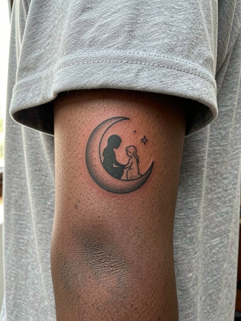
7. Micro Silhouette Parent-and-Child Moon
A tiny moon holding a simplified child-and-parent silhouette reads without portrait detail and keeps emotional impact. Recommend strong silhouette contrast rather than facial detail to prevent blurring. A common mistake is adding tiny facial lines which vanish into a blur. On the inner forearm the piece feels like a badge of relationship. Session pain is low and the sitting is short. For long-term clarity keep the silhouette size around three-quarters of an inch. Touch-ups at two years are typical for micro-illustrative black work.
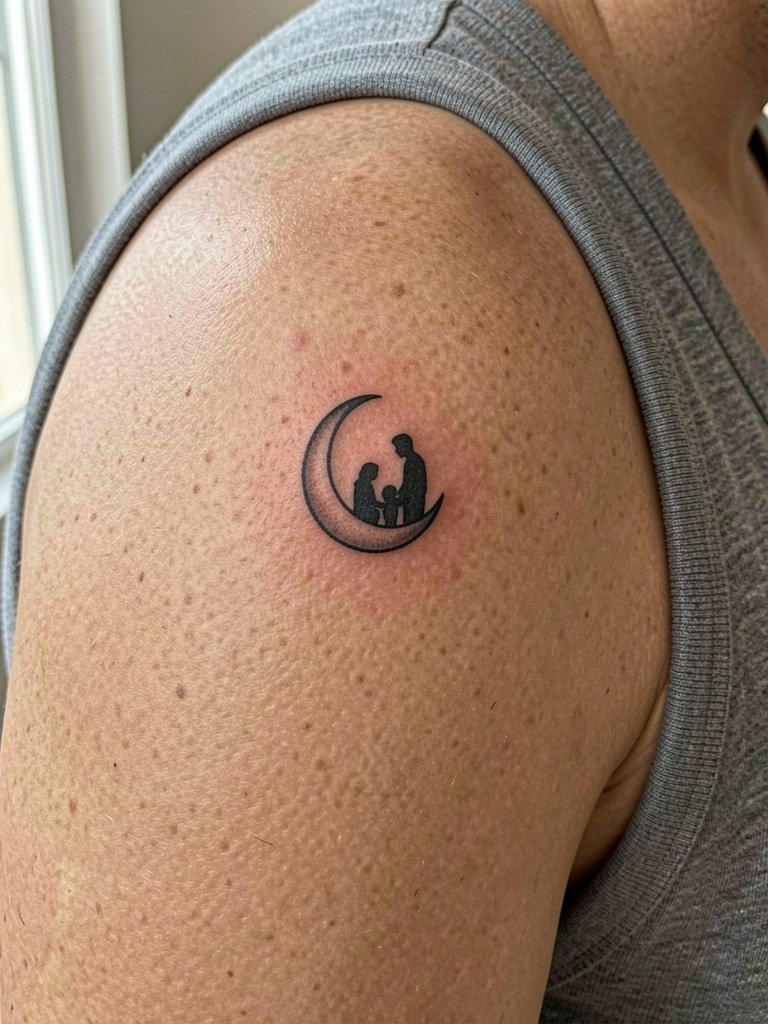
8. Moon Phases with Shared Single Word
A short row of moon phases with one shared word beneath turns a quote into a graphic sequence. The repeated round shapes help the eye read the phrase without tiny cursive. For inner forearm placement keep the phases evenly spaced and avoid tiny stippled craters that will muddle. For outfit pairing try boxy tees or rolled-cuff shirts so the forearm sits visible and the sequence reads across the arm. Use a boxy tee for casual reveal. At six months the phases keep crisp outlines, and at two years any super-fine internal shading may need a touch-up.
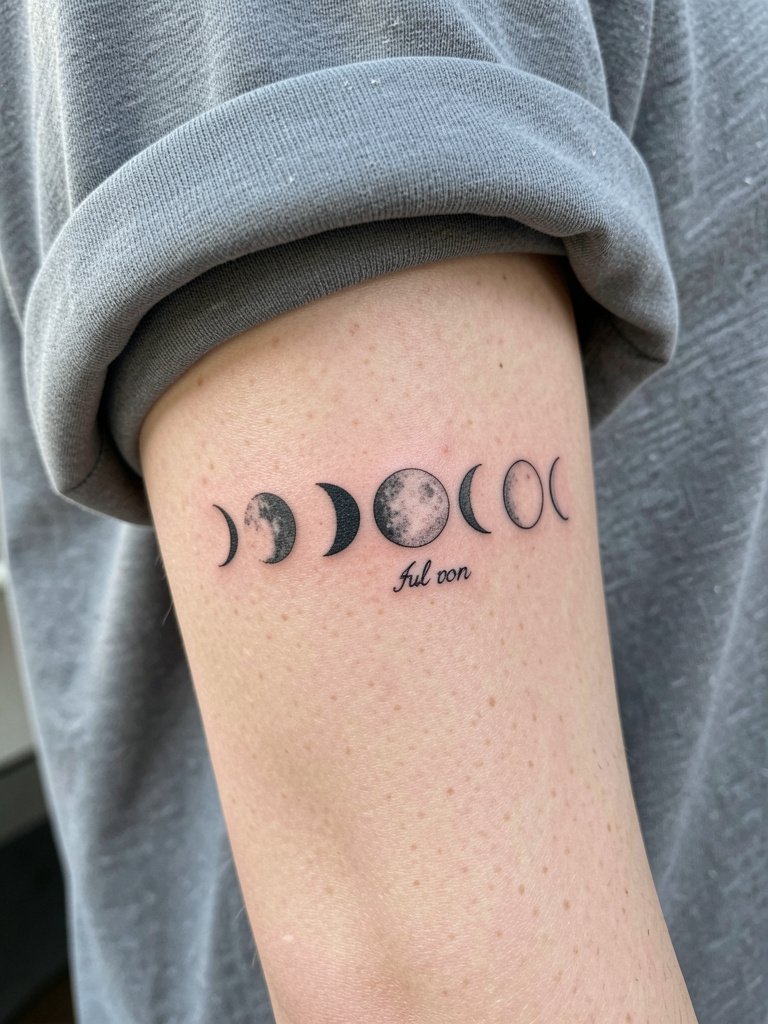
9. Small Script Under a Crescent
Putting short script under a small crescent keeps balance at tiny scale. Keep letters spaced more than you think the first day. A frequent error is compressing kerning to mimic printed fonts which crowds the ink. For wrist or ankle placements, the script should be three to four millimeters in x-height to remain readable. The session is quick and the healing timeline is typical for single-needle linework. If you prefer color, keep it minimal in the crescent only because color fades faster at small sizes.
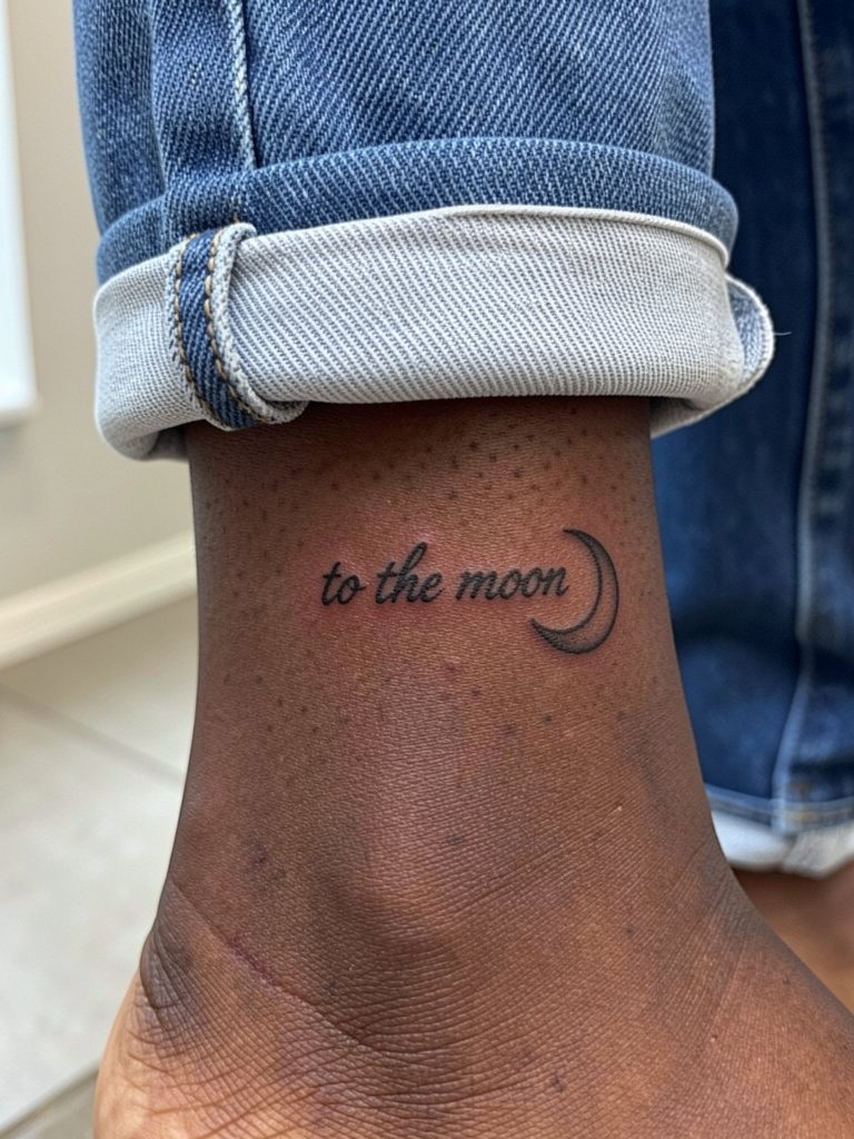
10. Split Quote, One Half Each
Split the phrase so each person wears half and the design completes when together. This is conceptual matching at its cleanest because neither half reads as clutter alone. For matching visual balance, agree on the same baseline height and line weight so halves align when placed side by side. If one person prefers an icon instead of text, match scale so the two elements feel paired. For collared or chest placements, wear a strapless or square-neck top to reveal the area for photos. Expect a short sit and plan for a touch-up if the halves blur unevenly after healing.
11. Tiny Moon with Dot-Work Accent
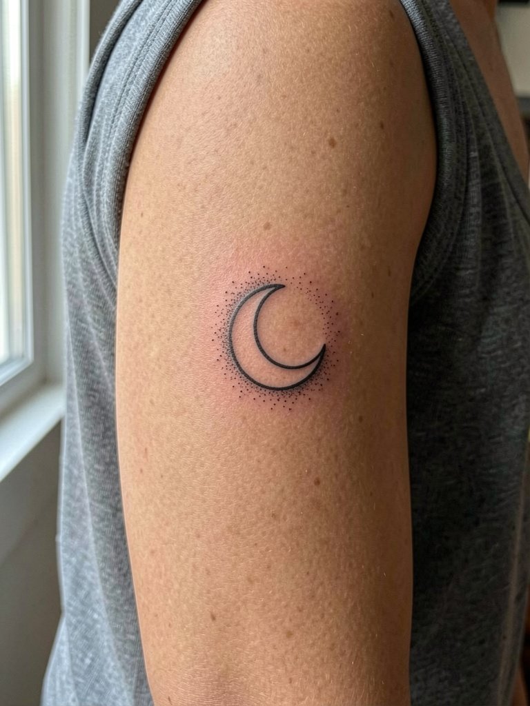
A tiny moon softened with a small stipple halo can look handcrafted without being ornate. Dot work ages well if dots are spaced and not packed too tightly. If the dots are too dense they turn into a patch at year two. For the shoulder or outer forearm this style benefits from slightly bolder moon outline and airy dot work. During the appointment wear a sleeveless tank for shoulder access and expect light pressure with steady needle passes. Healed texture at six months shows subtle grain from the stipple and rarely needs a touch-up.
12. Black-and-Gray Moon with Delicate Florals
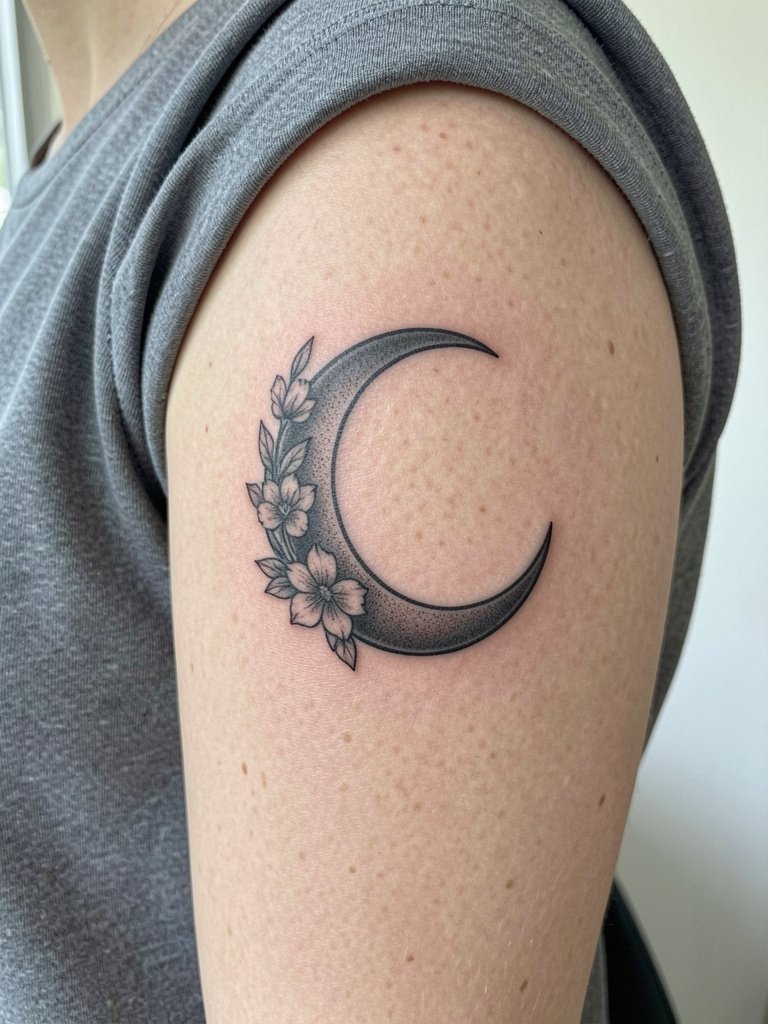
A medium-sized black-and-gray moon with soft florals is a safer canvas for subtle color-leaning clients who worry about small-scale color loss. Black-and-gray tends to keep contrast over time. Avoid tiny colored petals inside dense shading unless you plan on periodic touch-ups. For upper arm placement pair it with cap-sleeve tops and consider a sleeveless tank for showing off the piece. Expect a longer single session and a potential top-up at two to three years if you want the florals to stay crisp.
13. Ultra-Small Moon on Wrist or Ankle
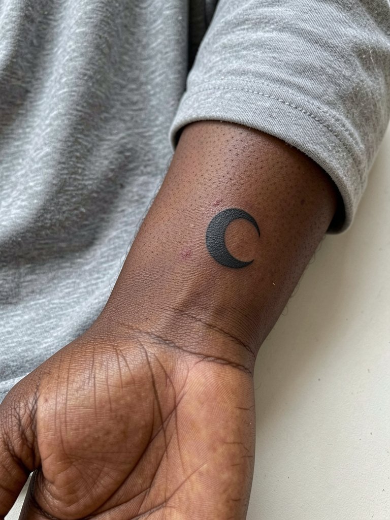
Ultra-small moons are low-commitment and easy to match, but they require bold outlines for longevity. The biggest error is choosing hairline strokes that vanish. If you want the discreet look, accept slightly heavier line weight. For the wrist the session is quick and healing can be fiddly because of scrubbing during hand washing. Plan to protect the area for the first week with light bandaging if your day job involves heavy hand use. Healed photos at six months will tell you if a tiny touch-up makes sense.
14. Phrase with Tiny Rocket or Constellation Accent
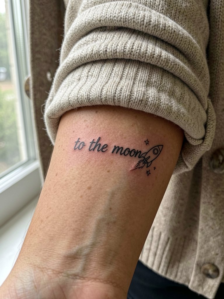
Add a tiny rocket or constellation to a short phrase for a modern twist that reads as graphic rather than cliche. Small illustrative accents need simple silhouettes and no internal fine detail. A common mistake is adding tiny stars with thin cross-hatching which softens into a gray patch. For inner forearm placement show it off with rolled-up sleeves and a neutral cardigan or fitted knit so the linework sits against a calm backdrop. The session is short and feels like focused linework with light shading.
15. Mirrored Placement Matching Set
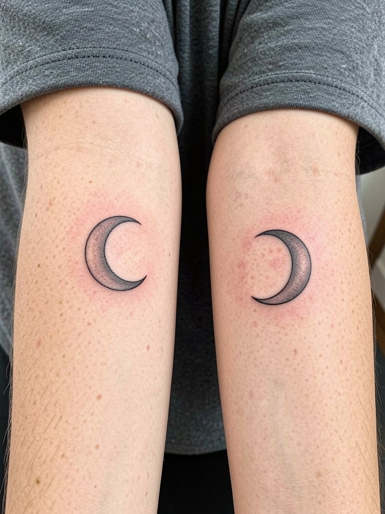
Mirrored placement, such as opposite wrists or inner forearms, amplifies the emotional effect more than design complexity does. Choose the same scale and line weight so pieces appear like reflections. One common misstep is matching a detailed design on a high-motion spot like the wrist where fine detail vanishes. For mirrored placements use bold, simple icons or slightly heavier script. For session wear pick a loose short-sleeve tee so both areas are easily accessible. Healing is straightforward and touch-ups depend on daily friction and sun exposure.
Frequently Asked Questions
Q: How much does a small mother-daughter moon-and-back tattoo typically cost?
A: Small single-session pieces usually fall in a wide range across studios. Expect small black-line wrist or ankle pieces to commonly land in the $50 to $200 range, and slightly larger or shaded pieces to reach into the low hundreds. Tipping customs in the United States are often around fifteen to twenty-five percent.
Q: Which placements hold fine line script best over five years?
A: Inner forearm and upper arm outer-facing skin tend to keep linework more stable because they face less direct abrasion. Wrists and fingers are visible but endure more washing and friction so thickening the line a touch upfront helps. I have seen inner-forearm scripts that still read clean at five years when the artist planned for slightly more space between letters.
Q: I keep seeing ideas on TikTok and Pinterest. Where should I look for healed examples and local artists?
A: Search Instagram, TikTok, and Pinterest for phrases like "mother daughter tattoo ideas," "handwriting tattoo," or "moon phases tattoo" and add your city to the query for local portfolios. Use platform filters to find reels and posts that show healed shots rather than just fresh ink. Local studio websites and booking platforms can show portfolios sorted by style like "fine line" or "small tattoo," which helps you find artists who post healed photos.
Q: If I want a matching set but not identical designs what are easy ways to personalize without losing the link?
A: Swap one person to a sun and the other to a moon, or use the same phrase split between two wrists, or keep the exact motif but adjust scale and placement so each piece fits the wearer. For wardrobe-friendly reveal try off-shoulder tops or scoop-neck shirts to frame chest or collarbone pieces during events.
Q: How long should I expect to wait to see healed photos that represent real long-term results?
A: Ask to see healed portfolio images at six months and ideally at two to three years for the artist’s comparable work. Fresh-ink photos misrepresent final contrast and line weight. A studio that keeps healed images shows the practical reality of how their fine-line work ages.