
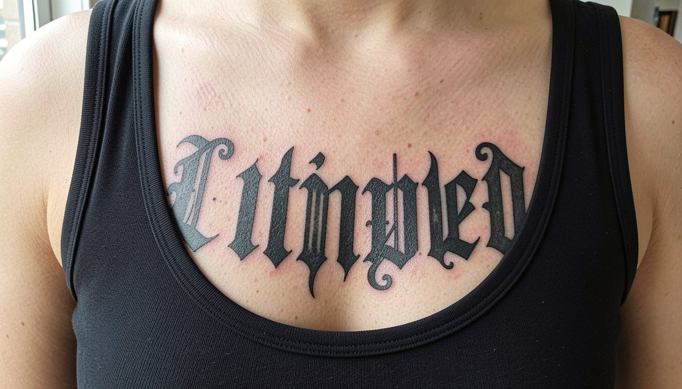
Dark gothic lettering reads like history written on skin, heavy with contrast and careful spacing. Too many people chase the tiniest script they can find and then watch it soften into a blur. These options prioritize readable blackletter, thoughtful spacing, and placements that suit movement so the words still read years from now.
1. Blackletter Nameplate Script on Inner Forearm
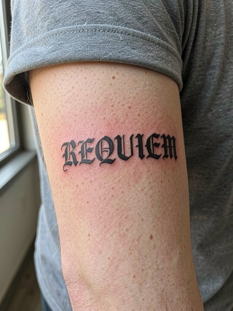
Blackletter nameplates work here because the inner forearm stays relatively flat and lets the vertical strokes breathe. Ask for a slightly heavier stroke than you see on social so the counters do not fill in over time. A common mistake is requesting the smallest possible size; that forces serifs so close they merge in two years. Session time for a three- to four-inch name is usually under an hour. Pain is low to moderate. For showing the piece, roll up a fitted sleeve and pair it with a rolled cuff button down for photos.
2. Gothic Script Quote on the Collarbone
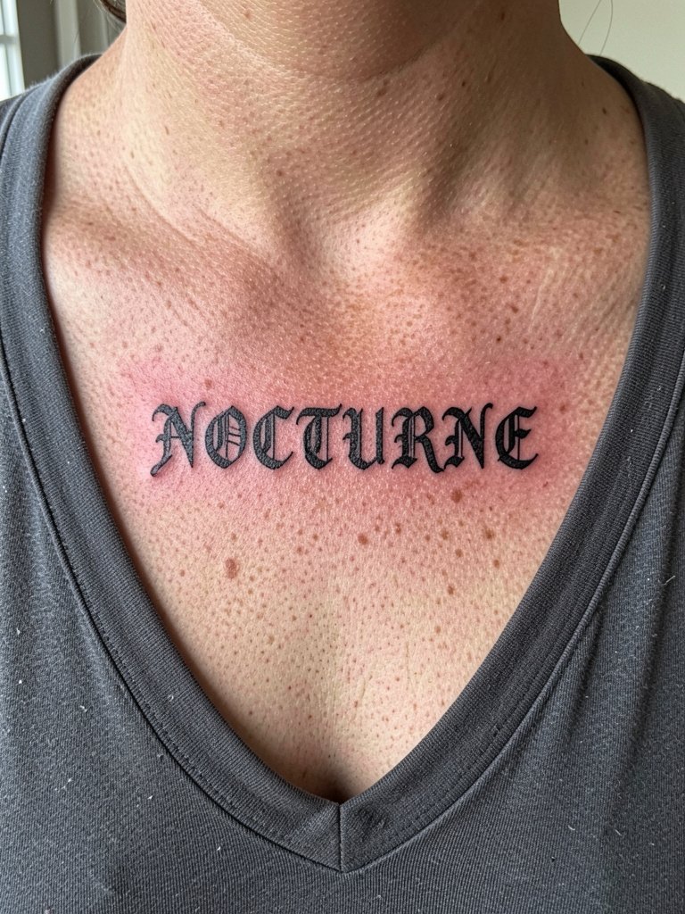
Collarbone quotes need careful spacing so letterforms do not get pinched by the clavicle angle. Bring a horizontal mockup that shows the baseline on the curve and request a small x-height increase for readability. Avoid overly ornate swashes that drop into the collarbone crease. Expect a single session for short quotes. For evening wear, this placement reads well with off shoulder tops that frame the clavicle.
3. Gothic Initial Behind the Ear
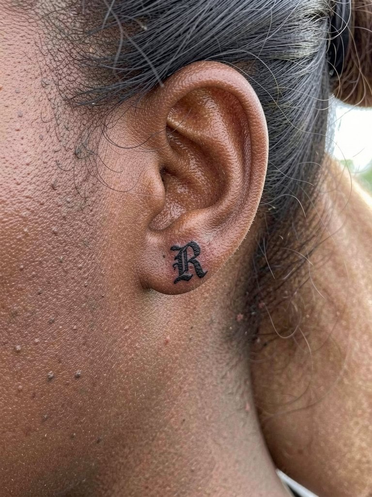
A monogram behind the ear reads as a tiny badge when the serifs are bold and spacing is generous. The big mistake is asking for ultra-fine hairlines there. That area heals with slightly more blur and a touch-up is often needed at six to twelve months. Pain is low to moderate. Wear your hair up to sessions. For reveals, small statement studs or a single hoop complement the area, try statement earrings small as an option.
4. Gothic Script with Blackwork Shading on the Ribcage
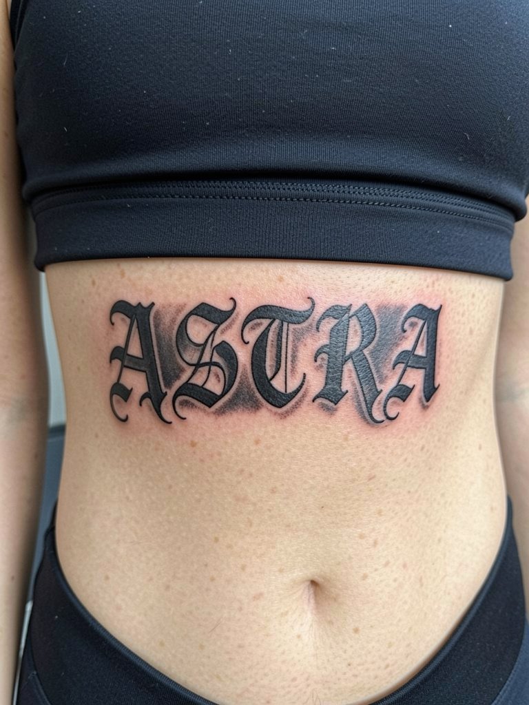
Ribcage text benefits from a shadow block so the letters stay legible against the skin's natural texture. Artists split on fine line on ribs. One camp argues that the skin there stretches and blurs delicate single-needle scripts within two years. The other camp says if you increase line weight slightly and give each letter extra spacing it settles fine, and they reference healed portfolios to back that up. If you want a long quote here, plan for one to two sessions and expect the rib area to be one of the more painful zones. For the session, wear a loose sports bra so the artist can shift fabric without pressure.
5. Dark Script with Thorn or Vine Framing on Outer Forearm
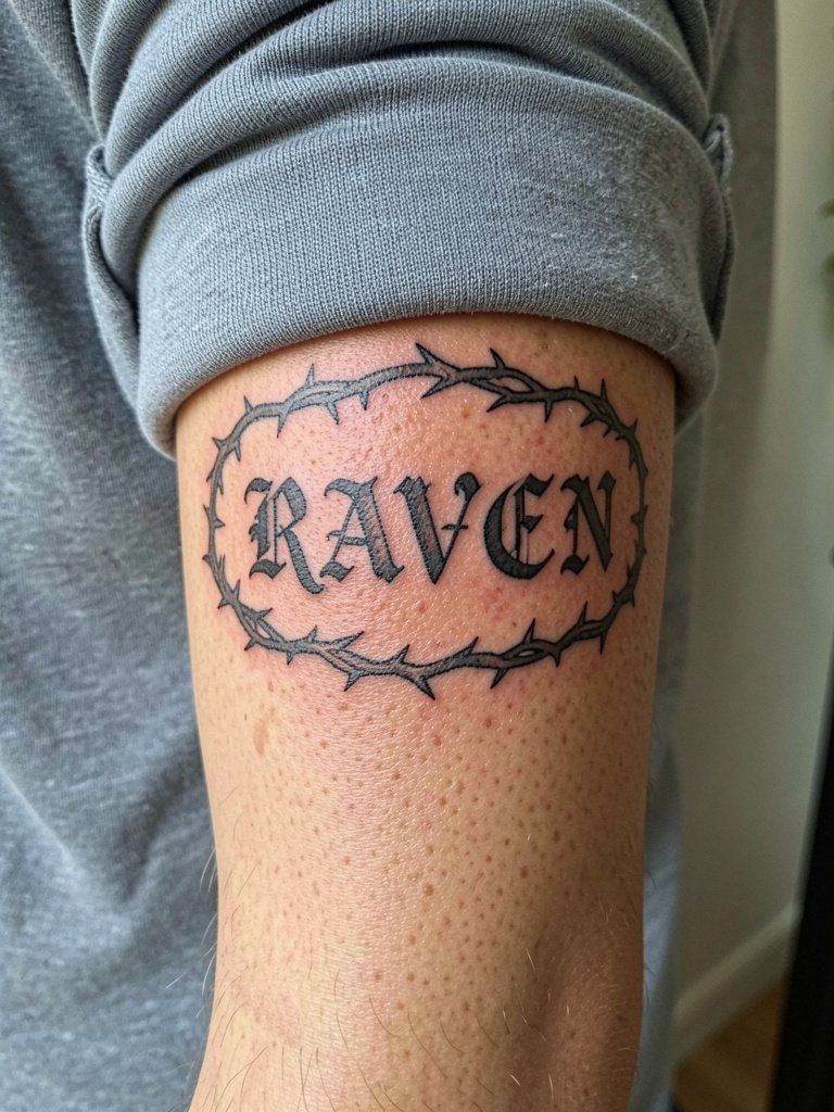
Framing text with a thorn or vine softens the blackletter block and creates visual margin. Ask for the vine to sit slightly off the letterforms so touch-up work can be focused on letters if needed. A common mistake is crowding the filler into the counters. Session time for a forearm with simple framing is often two to three hours. For showing the piece, cropped leather sleeves or a cropped leather jacket look sharp and let the outer forearm read.
6. Gothic Font Monogram Behind the Ear
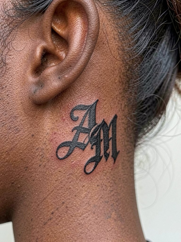
Monograms are ideal when you want something small and custom. The mistake is over-detailing inside a monogram smaller than one inch. Ask for simplified negative space so the letters remain distinct after healing. Touch-ups are common for tiny script in this area at the one-year mark. Pain is low. Wear hair up for the session and keep earring studs minimal afterwards.
Session Day Picks
The first six ideas include tight script on exposed forearms and behind-ear monograms. A few practical items smooth that first appointment and the first craving for a touch-up.
-
Stencil transfer paper kit. Lets you preview exact line weight on skin before the needle hits, which matters for inner forearm and collarbone pieces.
-
Topical numbing cream. Applied per product instructions reduces ribcage and sternum discomfort so you can sit through longer lettering sessions.
-
Thin protective film roll. Helps keep wrist or finger lettering clean during the first days of washing and typing.
-
Fragrance free gentle body wash. Cleanses healing ink without irritating fine line edges.
-
Aquaphor healing ointment. A mainstream option for the initial thin-layer care window recommended by many shops.
7. Gothic Lettering with Dagger Accent on the Upper Arm
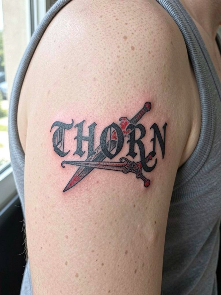
Pairing text with a symbolic object like a dagger adds narrative and prevents the design from feeling flat. Specify the dagger scale and distance from the baseline so it does not cut into the letter counters. This placement is medium pain and usually a single session if the dagger is simple. Style the reveal with a fitted short-sleeve tee or a black blazer with sleeves pushed up for a polished look.
8. Fine Line Gothic Script on the Inner Forearm
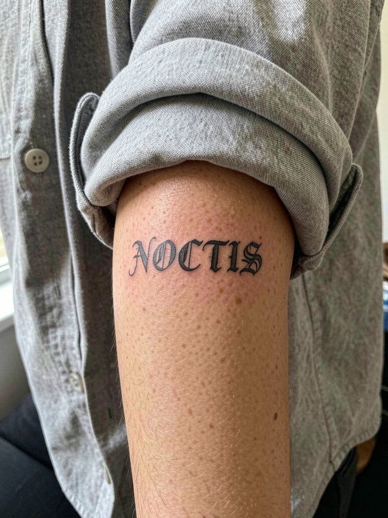
Fine line gothic gives a delicate take on blackletter but needs spacing tuned up. Ask the artist to widen letter spacing by about 10 to 20 percent versus the reference image. The inner forearm eats less detail than fingertips but more than the chest, so expect a possible touch-up at 12 to 18 months. For session comfort, wear a short sleeve or loose button-down and consider stacking thin rings on the opposite hand for after photos.
9. Bold Blackletter Chest Piece Under the Clavicle
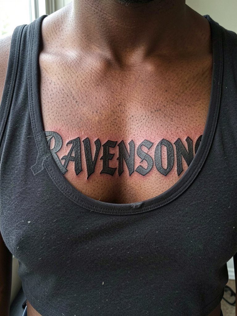
A chest nameplate reads from a distance when you choose bold strokes and give each letter plenty of negative space. The common error is packing too many words into a narrow band. Plan scale and expectation with a mock-up that shows the chest curve. Larger pieces require multiple sessions and a higher pain tolerance. For outfits, off-shoulder and scoop-neck tops help the piece sit in frame, try scoop neckline tees for casual reveals.
10. Mini Gothic Wrist Script
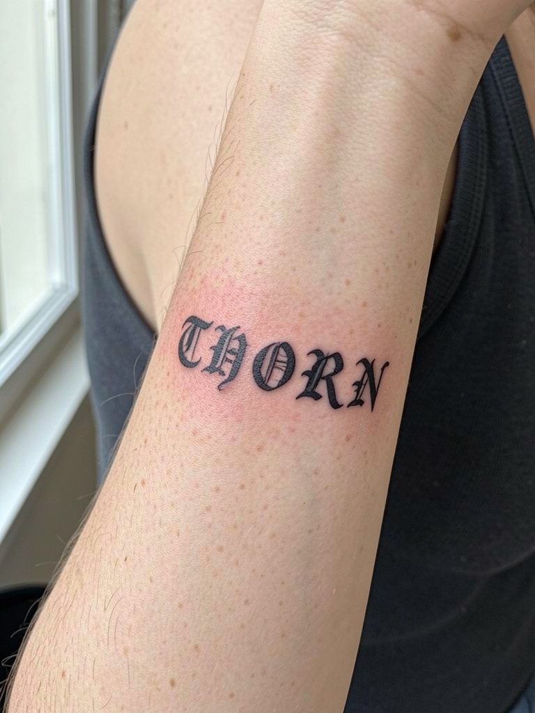
Wrist scripts are easy to hide and easy to show but the skin there moves a lot. Request a slightly heavier stroke and ask the artist to avoid extremely tight lettering. The session is short and pain is moderate. For the appointment, remove watches and bracelets and wear a sleeveless or short-sleeve top. A minimal watch on the opposite wrist pairs well for photos, consider minimal watch women options.
11. Vertical Dark Script Along the Spine
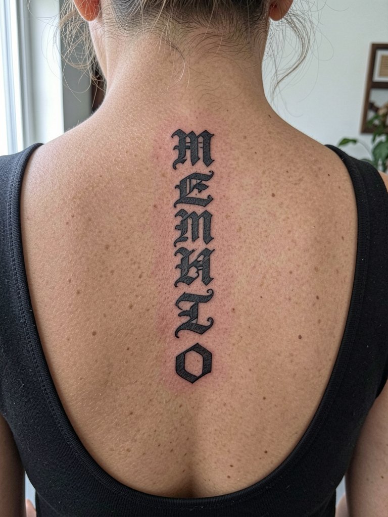
Spine lettering must follow the body's vertical line and allow for movement across vertebrae. Ask the artist to mark the baseline along the spine while you sit to verify symmetry. The spine is a moderate to high pain zone and often needs two alignment checks in a session. For showing the design, backless clothing and hair up make the line visible. Bring a hair claw clip for photos and session convenience.
12. Lateral Hip Gothic Lettering
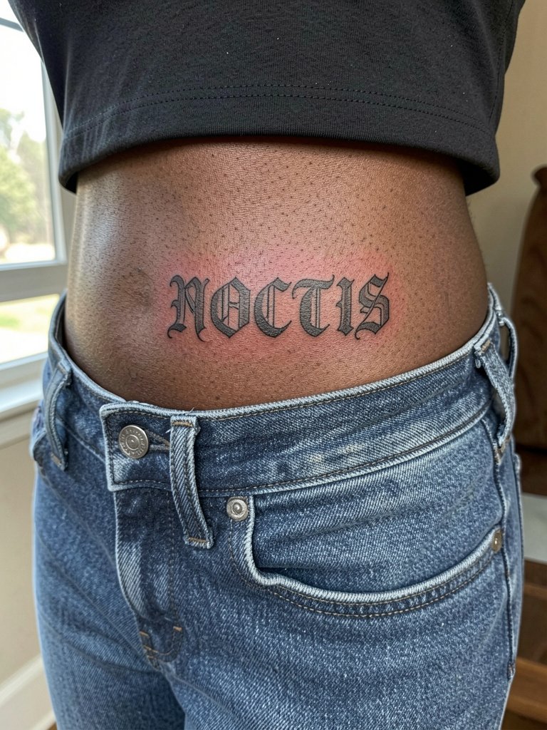
The lateral hip keeps text private and flat when you stand naturally. Make sure the artist places the baseline slightly curved to respect the hip contour. A common mistake is centering a long phrase where the waistband will cut across it. For the session, wear low-rise bottoms that can be shifted without pressure, and for reveals, side-tie bikini bottoms or low-rise jeans work, try side tie bikini bottom.
13. Ornate Gothic Name with Filigree on the Side Neck
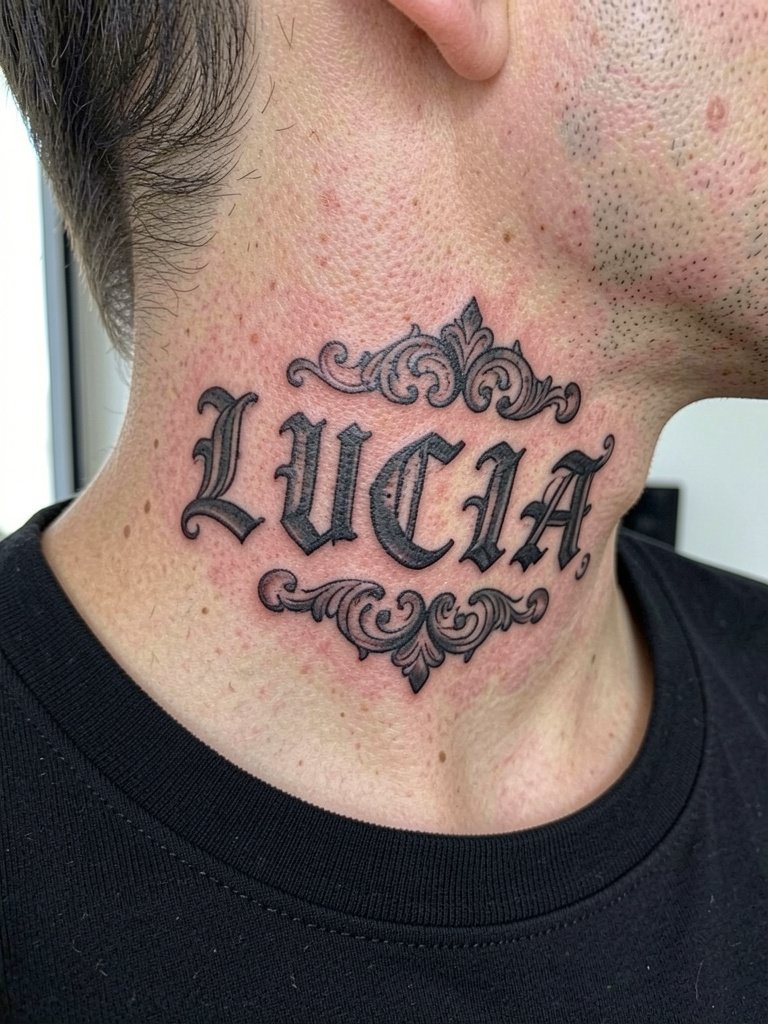
Side neck pieces must balance ornament and negative space so breathing and movement do not blur the filigree. If you want a name plus decoration, ask the artist to keep the filigree slightly detached from the letter outlines. The side neck is visible and sensitive; expect quick sessions with medium pain. Pair with low collars and small earrings, perhaps a black turtleneck for framing.
14. Dark Memorial Lettering on the Lower Back
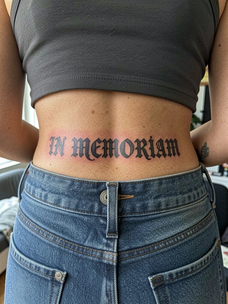
Lower back lettering benefits from horizontal bands of spacing so letters do not ride into the waistband. If the phrase is long, consider breaking it into two stacked lines with regulated leading. This area is medium pain and tends to heal reliably. For session wear, choose low-rise bottoms and a cropped tank to let the artist work without fabric tug, and for show-off looks try cropped tank top.
15. Gothic Lettering Wrapped with Haloed Spacing on the Sternum
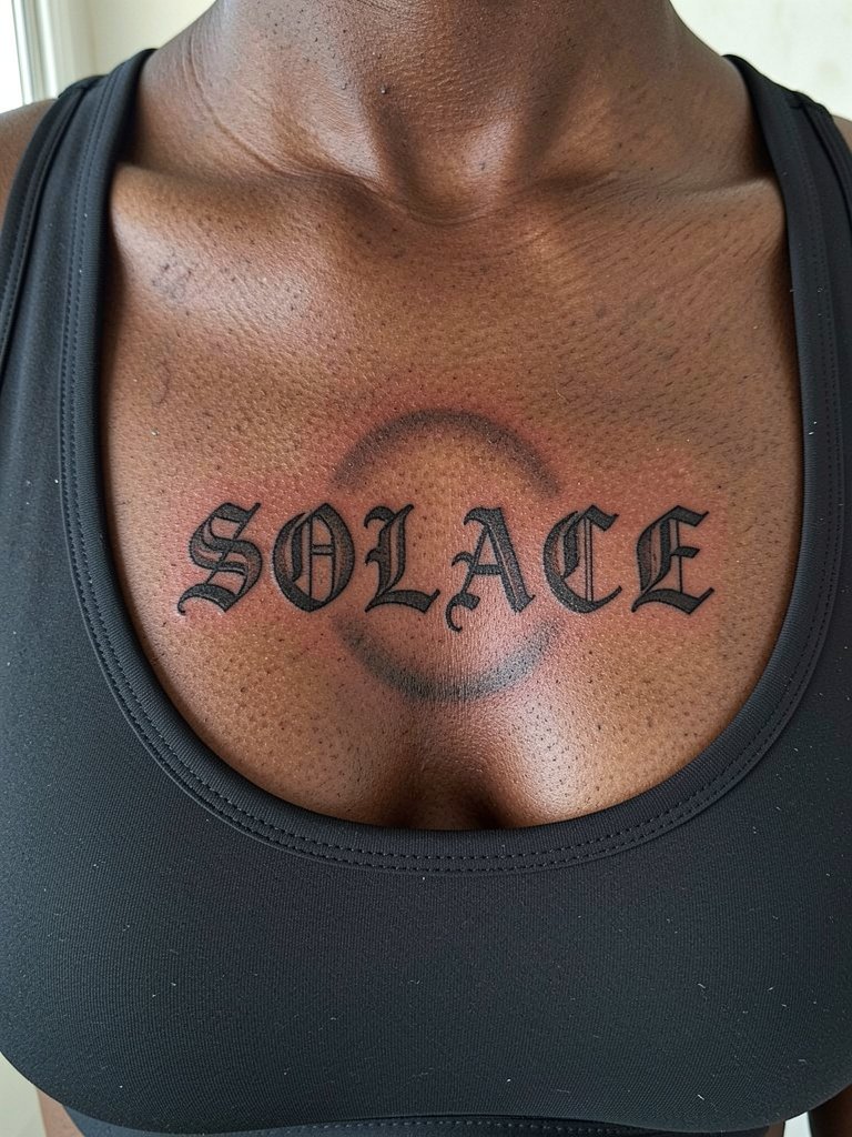
Sternum text must respect the breast crease and chest movement. The haloed spacing technique keeps letters isolated from adjacent shadows. This placement can be painful and often requires breaks. Ask about numbing timing and expect a single longer session. For session wear, a fitted sports bra or bandeau is easiest. For evening wear, a low-cut but supportive top frames the sternum.
16. Fine Line Gothic Script on the Ankle
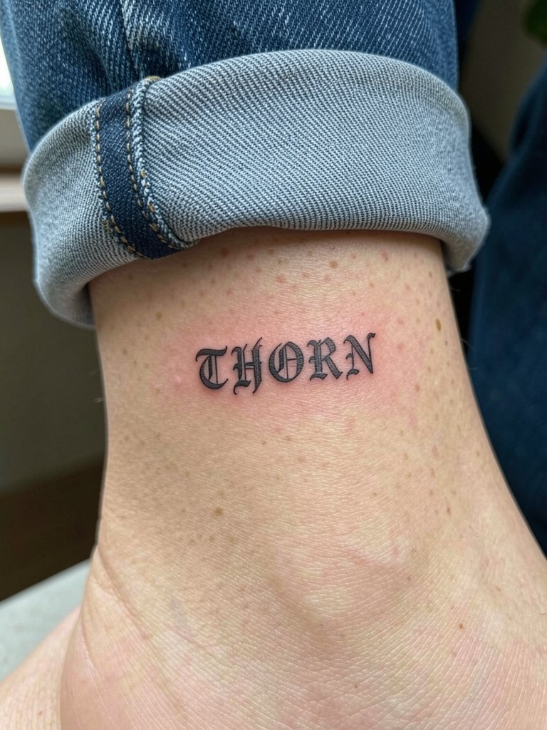
Ankle scripts face friction from socks and shoes while healing, so keep the line weight conservative and plan on patience for aftercare. Thin single-needle work here often needs a touch-up at six months. For shows, cuffed jeans or sandals reveal the ankle, consider rolled cuff jeans for styling.
17. Thin Blackletter Ring Around a Finger
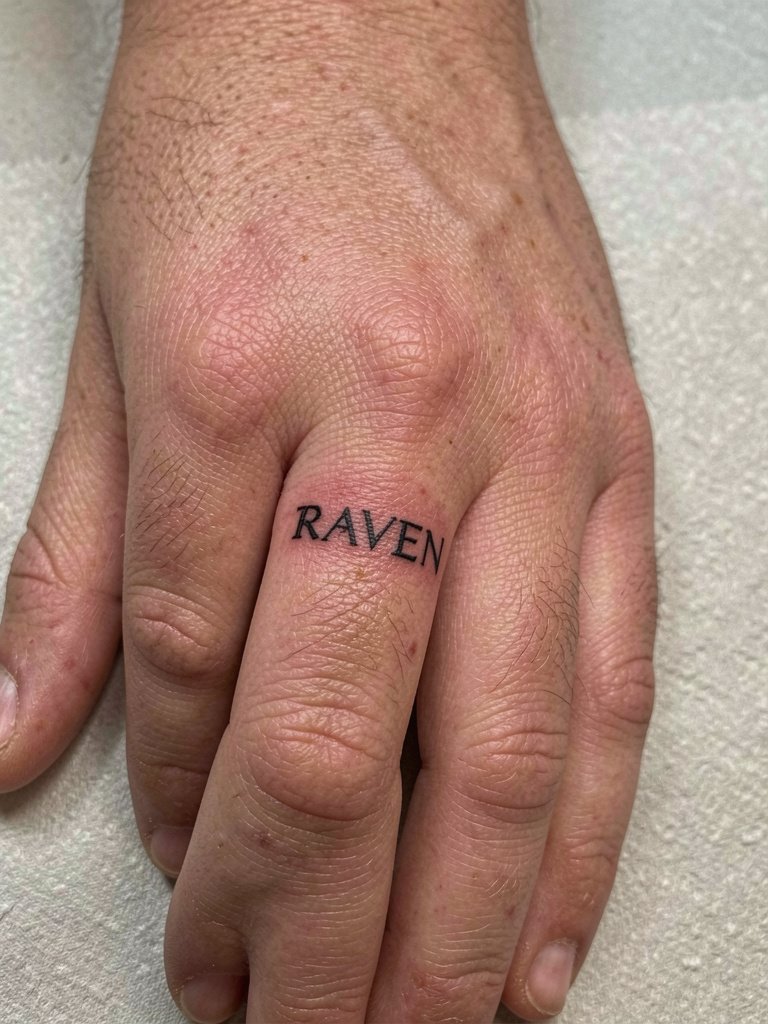
Finger lettering is high maintenance and exposed to constant washing. The usual mistake is placing too much detail into a narrow band. Request bold simplified letters with open counters and expect high touch-up probability within a year. For appointment-day wear, avoid rings on that finger and keep sleeves off the hand.
18. Gothic Script with Filigree on the Outer Thigh
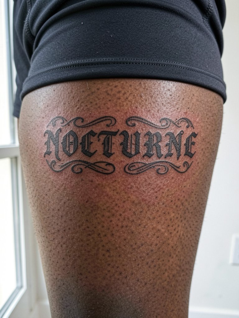
Thigh lettering has generous canvas and typically heals well. The only mistake is letting filigree run onto areas that crease with walking. Ask for filigree that ends before high-movement zones. Sessions are moderate to long depending on size. For reveals, high-slit skirts or swimwear frame the thigh, try side tie bikini bottom styling.
19. Ornamental Blackletter Name on the Upper Arm
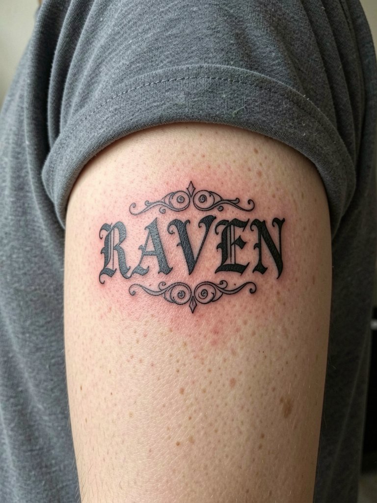
Upper arm pieces age well thanks to thicker skin and less constant abrasion. For ornate names, avoid tiny internal filigree that will soften over time. Expect medium pain and a single session for a medium-sized design. For shows, short sleeves or rolled sleeves work well, consider pairing with thin silver rings set for a cohesive look.
20. Dark Script Arcing Over the Shoulder Blade
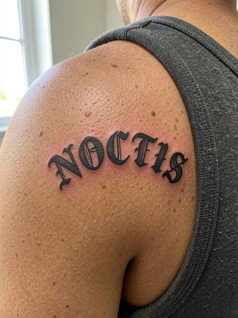
Shoulder blade lettering needs to follow the scapular curve so the baseline does not appear warped when you move. Ask the artist to seat the stencil while you move your arm to confirm placement. Pain is moderate. For session-day wear, a loose tank top works and for shows try back-exposing tops or halter dresses.
21. Gothic Script Embedded in a Rose Accent on the Bicep
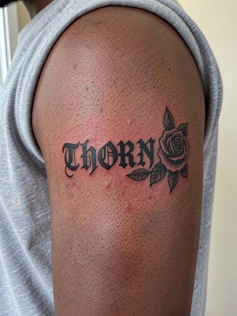
Combining text and a rose keeps the eye moving and prevents the lettering block from dominating. Make sure the rose does not sit on top of letter counters. The bicep tolerates shading well. Session time varies with rose detail, and the area is moderate pain. For styling, sleeveless or rolled sleeves work well, try pairing with thin silver rings set or a simple chain.
22. Subtle Gothic Date on the Lumbar Back
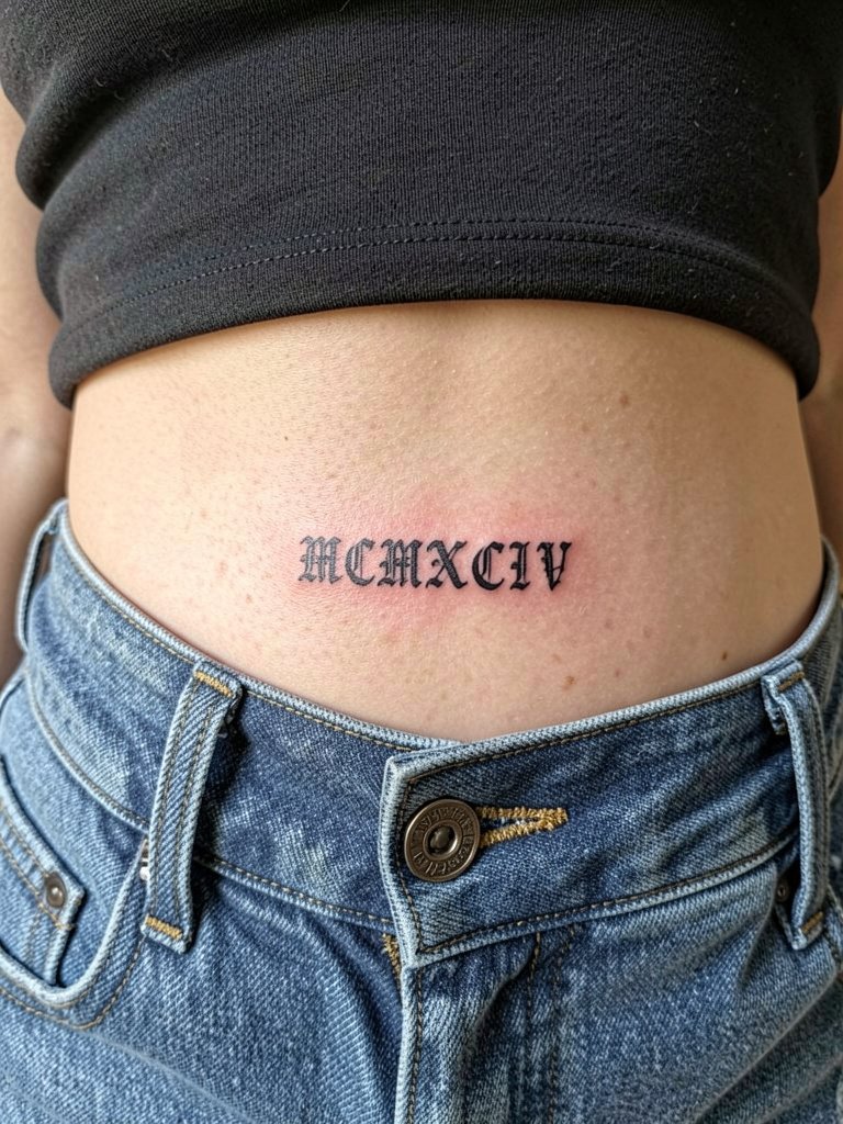
Dates and roman numerals make neat lumbar pieces. Keep numeral spacing even so each character reads at a glance. This placement heals cleanly but avoid placing the line under tight waistbands. For the session, wear low-rise bottoms and a cropped top so the artist can access the area easily.
23. Heavy Gothic Name Across the Collarbone with Dot Work Shadow
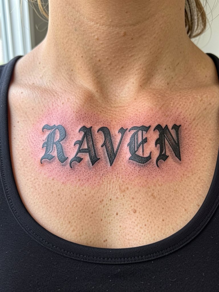
A saturated name across the clavicle benefits from a soft dot-work shadow because it lifts the letters without extra line weight. The main error is adding solid black behind serif letters which can swallow counters. Expect one session for medium scale work. For styling, off-shoulder or scoop-neck tops frame the area, try short pendant necklace styles to echo the collarbone line.
Frequently Asked Questions
Q: How much should I expect to tip my tattoo artist for dark gothic lettering work?
A: Standard tipping in the U.S. tends to be between 15 and 25 percent of the session fee. Many people tip toward the higher end for complex lettering because steady linework and saturation take precision and time.
Q: Where can I find portfolios and artists who specialize in blackletter and gothic lettering?
A: Search Instagram and TikTok hashtags like #blacklettertattoo, #gothiclettering, and #letteringtattoo and filter by location for local shops. Pinterest helps compare styles, and local studio portfolios often have healed photos in their galleries. Reddit threads about lettering can point you to artists with strong healed shots.
Q: Will fine-line gothic hold up on the ribs or should I go bold?
A: Ribs are one of the debated spots. One camp says fine single-needle scripts on ribs blur within a couple of years due to skin stretch and movement. The other camp says slightly heavier line weight and wider spacing will let fine gothic settle well, and they will show healed examples to support that. If longevity is the priority, err toward stronger line weight and give the letters room.
Q: How often do gothic lettering tattoos need touch-ups?
A: Touch-up frequency depends on placement and line weight. Exposed hand, finger, and wrist lettering commonly need a touch-up within a year. Inner forearm and chest pieces often go longer between touch-ups, sometimes two to five years. Plan realistic timelines with your artist during the consultation so you know when a small refresh is likely.
Q: What should I wear to a ribcage or spine lettering session?
A: For ribs wear a loose sports bra or a button-down the artist can slide aside. For spine sessions choose a backless or easily removable top so the artist can access the central line without fabric bunching. Bring something comfortable to change into and a hair clip if needed.
Q: Are there specific things to check in an artist's lettering portfolio before booking?
A: Look for healed photos that show consistent linework and clear counters at the scale you want. Check for examples in the exact placement you prefer, because line reading changes by body area. Ask the artist to show same-style work at multiple ages if they can.
Q: Can I pair gothic lettering with other styles like neo-traditional roses or daggers?
A: Yes. Pairing text with a single accent object works well when the accent does not intrude on letter counters. Ask the artist to place the object adjacent rather than overlapping the main letterforms and choose complementary line weight so both elements age similarly.