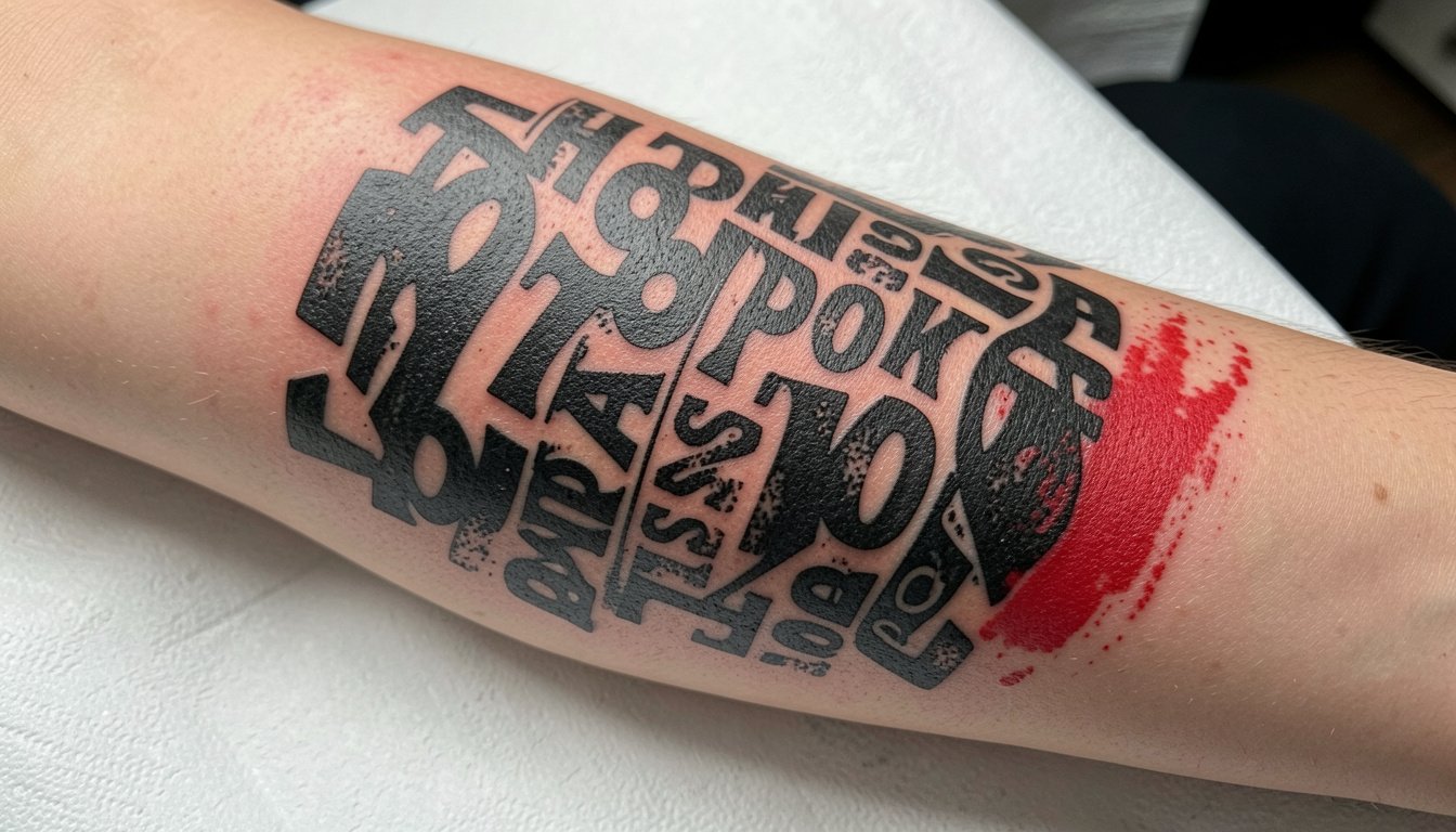
Healed Trash Polka sleeves that still read bold years later are rarely the ones rushed into a single marathon session. The sleeves that hold contrast started as collages on paper, then mapped to the arm across appointments so that black shapes, text fragments, and red hits get space to breathe. Expect design sessions before needle time and a plan for where negative space will live on the arm.
1. Full-Arm Collage That Reads As One
A full-arm collage is the canonical Trash Polka sleeve, and I recommend it when you want the chaos to feel editorial rather than random. Start the project by mapping two to three anchor pieces where the eye rests, such as a portrait fragment or a headline-style word, then let black blocks and red slashes weave between them so the arm reads as a single composition. On the consultation bring scale references at two sizes so the artist can show how a headline looks at three inches versus five. A common mistake is packing every empty patch with texture. Letting negative space live around anchors keeps the sleeve readable at six months and at five years. Expect sessions that run three to five hours for major panels and shorter follow-ups for fill work. For showing the finished sleeve, a fitted black tee keeps the arm as the focal point and complements the black-and-red palette, try black fitted t shirts for a clean look.
2. Leg-Sleeve Aesthetic Adapted to the Arm
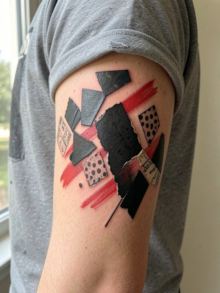
Translating a leg-sleeve composition to a full arm works when the design uses big, readable shapes rather than tiny details. The arm changes direction more than the leg, so ask for larger black fields and wider gaps between dense realism fragments. I recommend discussing how panels will wrap the elbow and sit over the triceps so nothing collapses into the crease. A session on the outer arm feels like steady vibration with moderate soreness around the elbow joint. One mistake I see is trying to cram portrait-level detail into a narrow forearm strip. Instead, plan the realism fragments as larger, offset components that merge into graphic swaths. Over time the red accents will soften a bit with sun exposure, so protect exposed areas regularly. For post-session comfort, wear loose short sleeves in the studio so the artist can rotate your arm without fabric tugging.
3. Big-Cat Face as a Sleeve Centerpiece
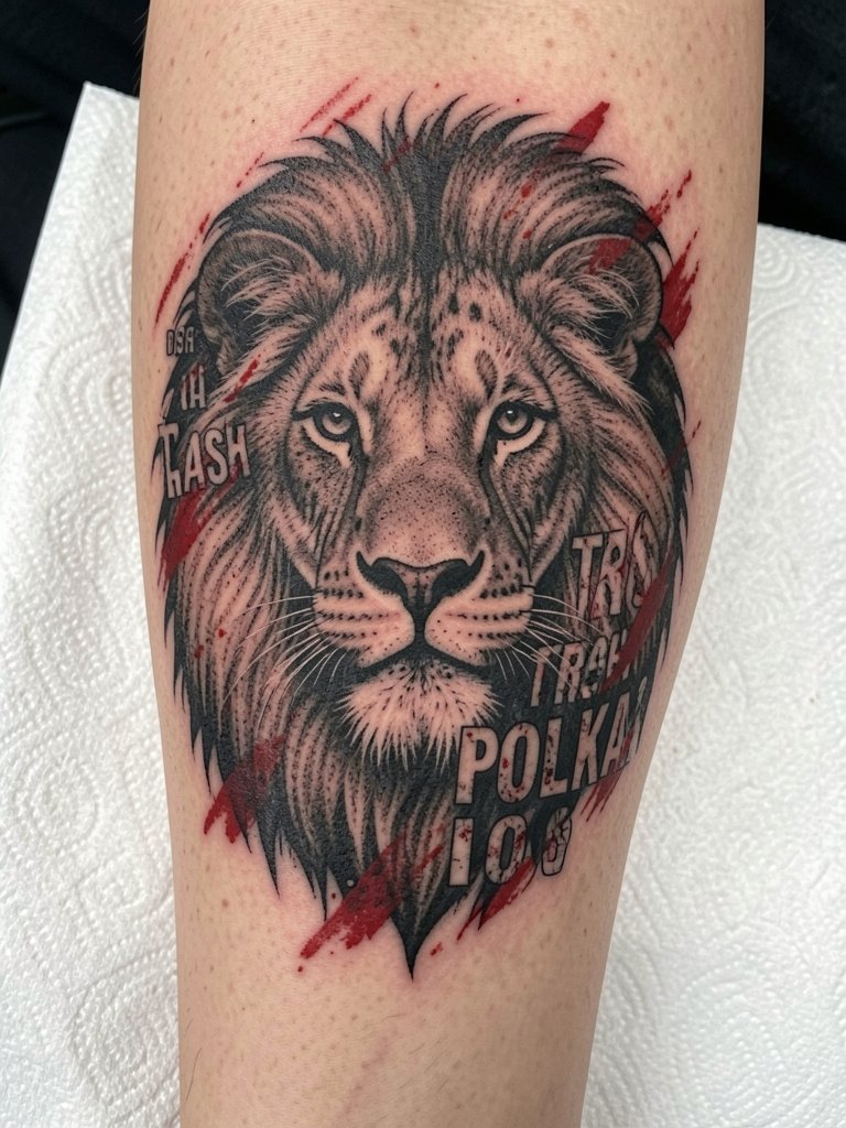
A lion or tiger face gives the sleeve a focal point that anchors the collage logic, so choose this when you want the chaos to orbit a single subject. For the portrait proportion, bring forward-range photos so the artist can plan highlights and heavy shadow areas at sleeve scale. If too much tiny stipple is used inside the face it can blur into the surrounding graphic texture by year three. A sensible approach is to use robust linework and high saturation in shadowed areas, paired with controlled red accents across the mane. Sessions for a large animal face are intense and often split into two long sittings to let the skin recover. Styling-wise the piece reads sharply with solid-color crew necks in charcoal or white, which frame the portrait without competing visually. Consider solid color crew neck shirts to keep attention on the artwork.
4. Aggressive Lettering That Wraps the Arm
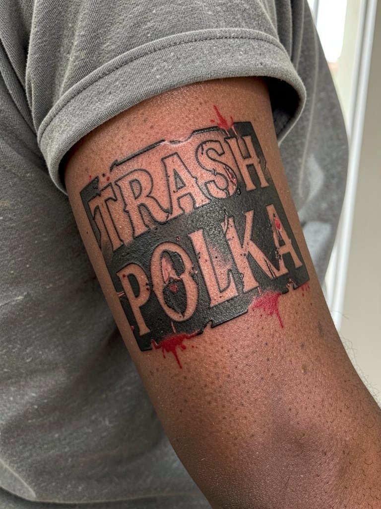
Lettering is a core Trash Polka device and it works best when treated as a graphic element rather than a script-only tattoo. Choose mixed fonts with distressed edges and plan where each word will break across muscle contours. Ask for mockups showing the lettering wrapped at three viewing angles so you can judge legibility at different arm positions. A frequent error is tiny, ornate script placed on the outer forearm where blowout risk is higher. For sleeves, scale the lettering up and intersperse solid black bars to create negative space. Healed lettering looks best when lines are slightly heavier than your initial visual reference. Sessions are straightforward but require patience to let the stencil settle. When you want to show off a lettering-heavy sleeve, cropped sleeves or rolled-up shirts keep the text readable and dramatic.
5. Sleeve Built as a Multi-Session Project
This style shines when treated as a multi-session composition rather than a single marathon tattoo. One group argues sleeves should be designed slowly and laid out over multiple appointments so each panel can breathe and the arm reads as a cohesive collage. Another group prefers starting fast and adding pieces organically and says that spontaneity can create energetic results. If you choose staged work, insist on layout rounds that show how the next two sessions will connect visually. Plan for an initial mapping session, two heavy-paint sessions, and 1–2 touch-ups later on the healed skin. During long sessions, expect a steady ache with sharp moments around bony landmarks. For studio comfort, wear a loose tee or button-up so the arm can be repositioned without rubbing. A good reference to bring is a printed collage rather than a single image.
6. Poppy Motif to Soften the Chaos
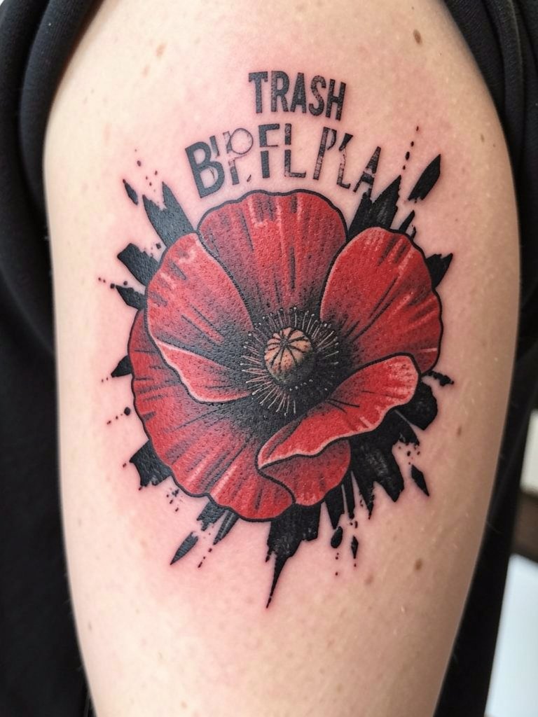
A single floral motif like a poppy can temper Trash Polka’s hard edges while keeping contrast high. I recommend using the flower as a secondary anchor, not the primary focal point, so it shoals the eye between graphic bars and text fragments. In consultation, specify how much naturalistic detail you want in the petal edges versus how much should convert into bold black silhouettes. The usual mistake is over-rendering delicate petals; florals in Trash Polka read better with selective detail and larger black backgrounds to give them context. If you plan extensions, leave breathing room around the bloom for later collage elements. Session pain is mild on the upper arm and heavier on inner forearm areas. For the appointment, wear a loose tank so the artist has clear access to the shoulder and upper arm.
Session Day Picks
The first six sleeve concepts above raise similar studio needs for long appointments and clear access to the arm.
- Stencil transfer paper kit. Lets you preview the scale of lettering and collage fragments on the arm before committing, which matters for sleeves that depend on readable type.
- Topical numbing cream. Applied before extended forearm or inner bicep sessions eases the early sting so you can finish mapping and major panels.
- Thin protective film roll. Useful for protecting fresh red accents and high-contrast black areas from friction during the first 48 hours.
- Fragrance-free gentle body wash. Cleans healed and fresh areas without irritating bright red pigment during the early healing window.
- Aquaphor healing ointment. A widely used ointment for the first few days that locks in moisture without clogging needle channels.
7. Realism Fragments Punctuating Graphic Chaos
Combining photo-real fragments with graphic Trash Polka elements gives the sleeve intellectual contrast that stands out. Use realism as a visual island inside abstract blocks so the eye has a place to rest. When you bring portrait references, provide both high-contrast and soft-light versions so the artist can decide what details will survive at sleeve scale. A common mistake is trying to reproduce every tiny highlight in a small fragment; instead pick the strongest planes and translate the rest into black texture. Healing behavior depends on placement. Areas with lots of movement need heavier linework to preserve detail. To show this hybrid in everyday outfits, roll up a button shirt sleeve for a casual reveal; a rolled sleeve button down frames the composition without covering the art.
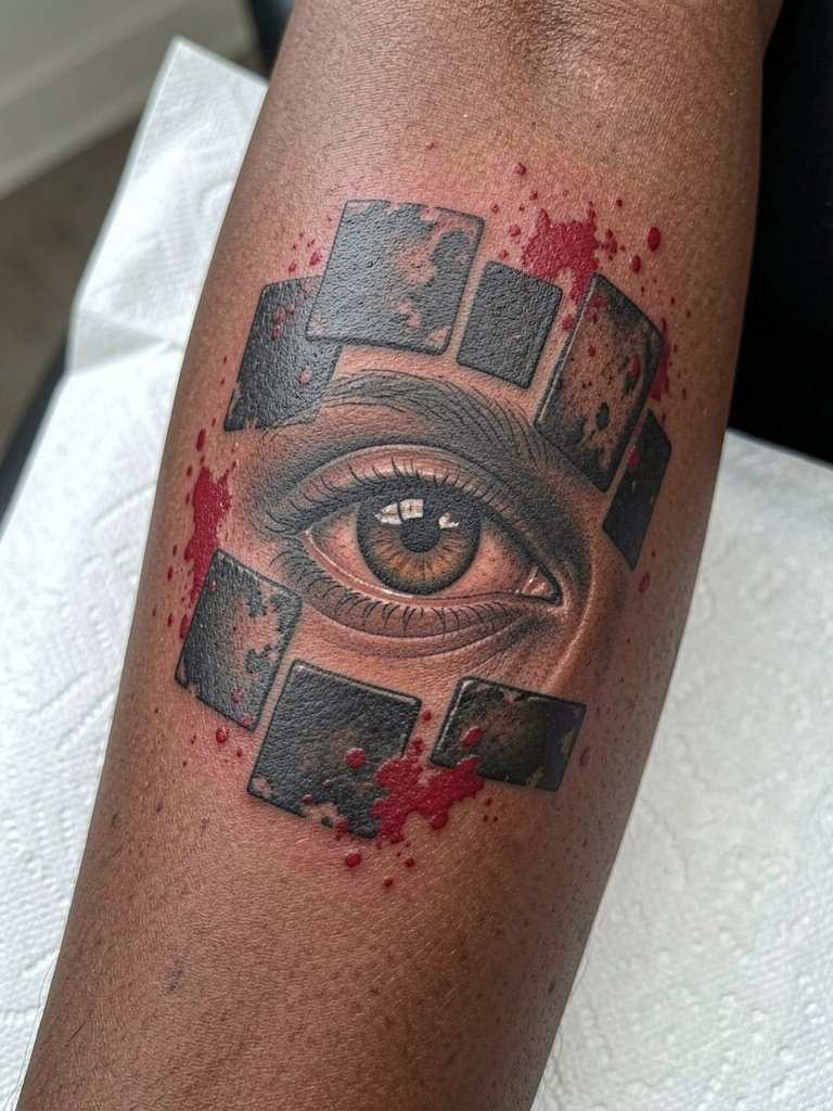
8. Distressed Graphic Blocks for Modern Flow
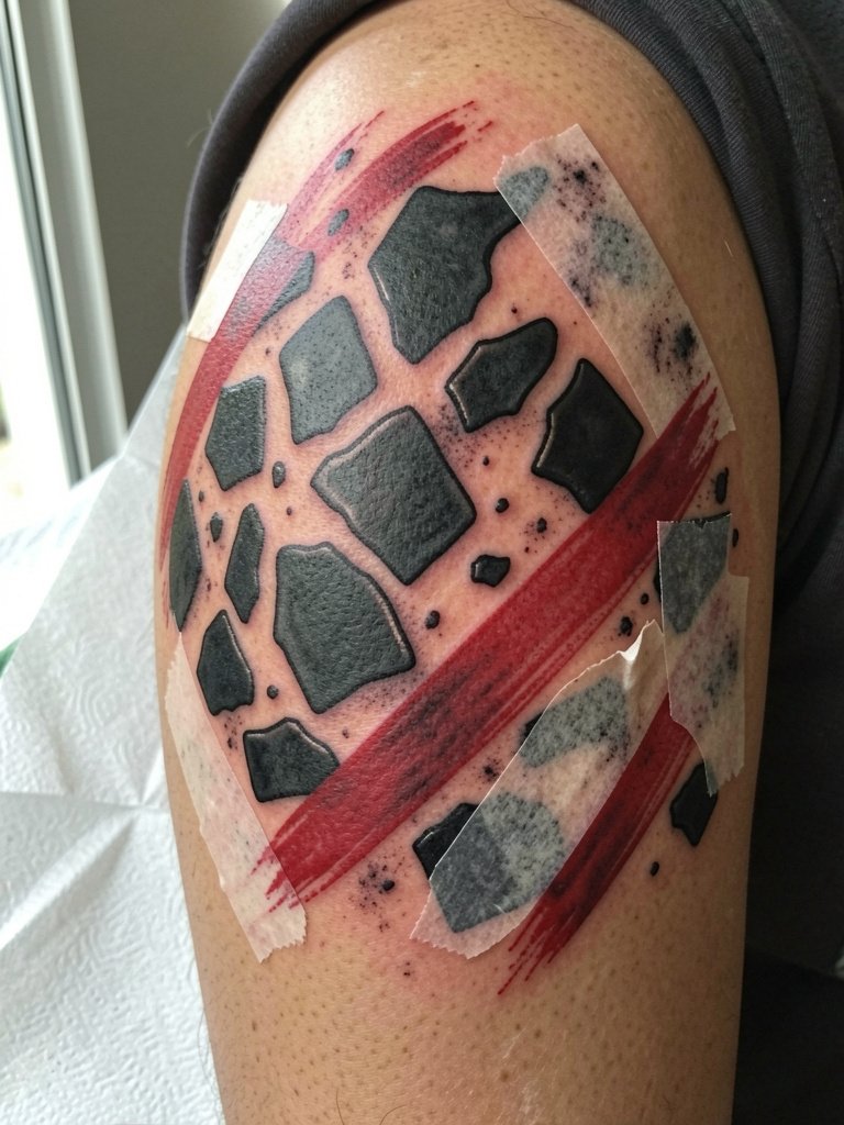
If you like the torn-poster aesthetic, go heavy on distressed graphic blocks placed diagonally across the arm. The geometry keeps collage areas from bleeding into one another as the skin ages. Plan spacing at the consultation and ask the artist to show how negative space will interrupt dense patches. The error most people make is creating too many near-matching textures, which reads muddy after the first year. For aging, allow slightly more space between blocks than you think you need. Sessions are efficient for block work but take longer when combined with detailed realism. For the studio, wear a shirt that can be rolled without pulling at the sleeve edge.
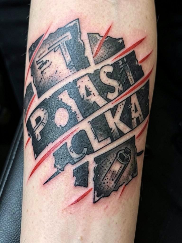
9. Skull Imagery as a Bold Anchor
Skulls fit the Trash Polka mood because they give the collage a confrontational center that still lets graphic fragments do the heavy lifting. For a skull anchor, decide whether you want it more anatomical or more graphic, and show two reference styles so the artist can translate either into the Trash Polka language. A common aging problem is over-rendering tiny teeth and nasal detail; opt for simplified planes and heavy black contours to preserve readability. Expect moderate pain on the outer arm and sharper sensations closer to the elbow. For showing off a skull-centered sleeve, a plain white tee keeps contrast high and the composition legible from a distance. Try plain white t shirts with clean sleeves.
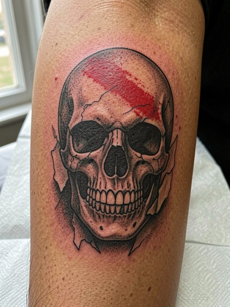
10. Geometric Slices and Paint-Splatter Energy
If you want control inside the chaos, geometric slices act like graphic seams that keep different panels readable. Use angular cuts and negative-space wedges to align key elements along muscle lines. A mistake I see is making slices too narrow; wider bands help the eye cross a curved surface without distortion. For longevity, avoid super-fine cross hatch inside each slice. Sessions for angular work are precise and require steady hands from the artist. For the appointment, wear a short-sleeve shirt that allows comfortable elbow flexion and does not bunch around the working area.
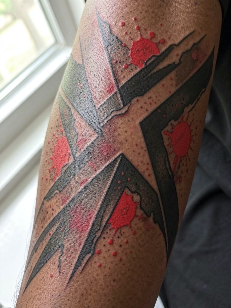
11. Memorial Script Nested in Graphic Bars
Script can carry personal content without looking soft if you place it inside hard graphic bars. For memorial text, pick a single short phrase and scale it to match surrounding panels so the letters do not collapse with time. Bring the exact phrasing and two font options to the consult so the artist can template how the letters will sit across biceps or forearm curvature. One common error is tiny cursive on moving skin where lines blur; instead go slightly heavier and allow space between letters. Touch-up rates tend to be lower when lettering is bold enough from the start. For reveals, sleeveless tops or relaxed tanks frame inner arm script nicely, so try a loose tank top on show days.
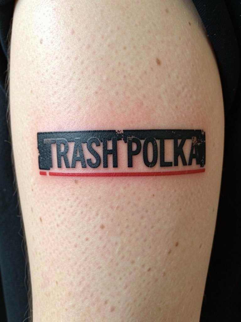
12. Patchwork Panels That Let You Add Later
A patchwork sleeve is built for expansion, so pick this when you know you want to keep adding pieces over years. The approach is to design separate panels with breathing room between them and consistent visual connectors like repeated red bars or a recurring typeface. Decide in consultation where future seams may attach and ask the artist to leave deliberate negative-space corridors. A classic mistake is leaving no connective theme, which makes later additions feel pasted on. Plan touch-ups after major fills only, not after every small panel. For session comfort across multiple appointments, wear an oversized black tee that the artist can move without stressing fresh ink. Consider oversized black tees for studio days and casual show-off.
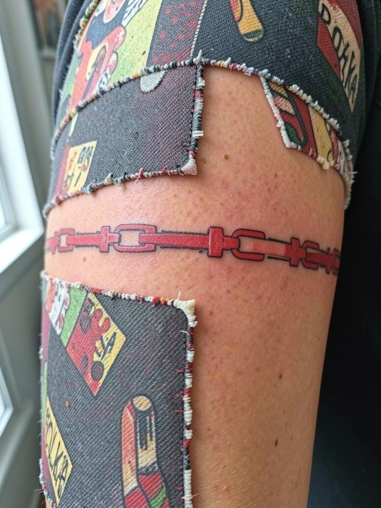
13. Stark Red Accents Only for Graphic Puncture
Some people want just a single saturated color to punctuate black work, and in Trash Polka red is the classic choice. One camp insists Trash Polka only works with black and red because the restrained palette preserves the poster-like impact. Another camp argues adding more color or going grayscale-only broadens the style and better matches varied subject matter. If you prefer the heavy red hit, plan accent placement carefully and avoid painting every small crease red. Red tends to fade faster than black, so expect re-saturation sessions one to two years after the initial work depending on sun exposure. For daily outfits, cropped denim jackets or black fitted tees frame the red and black well; try a cropped denim jacket when you want the sleeve to read bold.
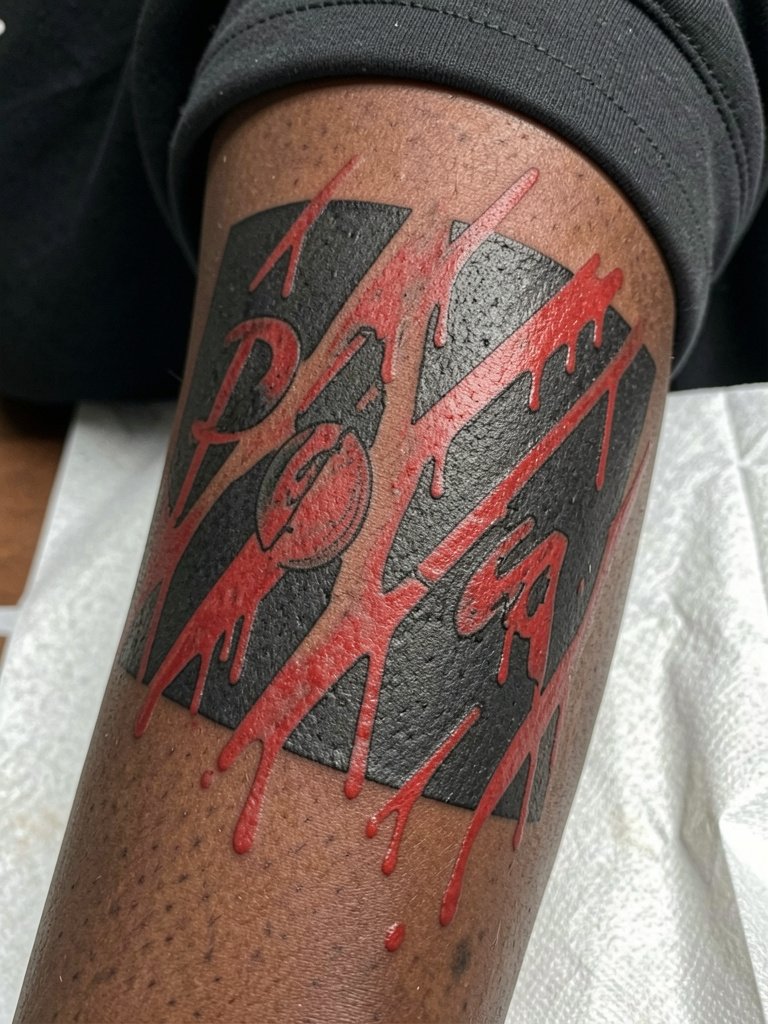
14. Bespoke One-Off Design Process
The best Trash Polka sleeves are bespoke and shaped to body flow rather than copied from pinned images. One camp says a truly successful sleeve must be custom-designed around the arm, because the collage depends on local anatomy and muscle lines. Another camp still treats Pinterest images as templates and prefers exact visual replication. If you want bespoke work, bring reference collages and discuss how the artist will adapt each element across shoulder, bicep, and forearm. Insist on seeing printed mockups and healed photos of similar-scale sleeves so you know the artist can carry a concept through multiple sessions. For session wear, a button-up overshirt or zip hoodie that opens fully makes long sittings easier. Consider a button-up overshirt for easy access and comfort.
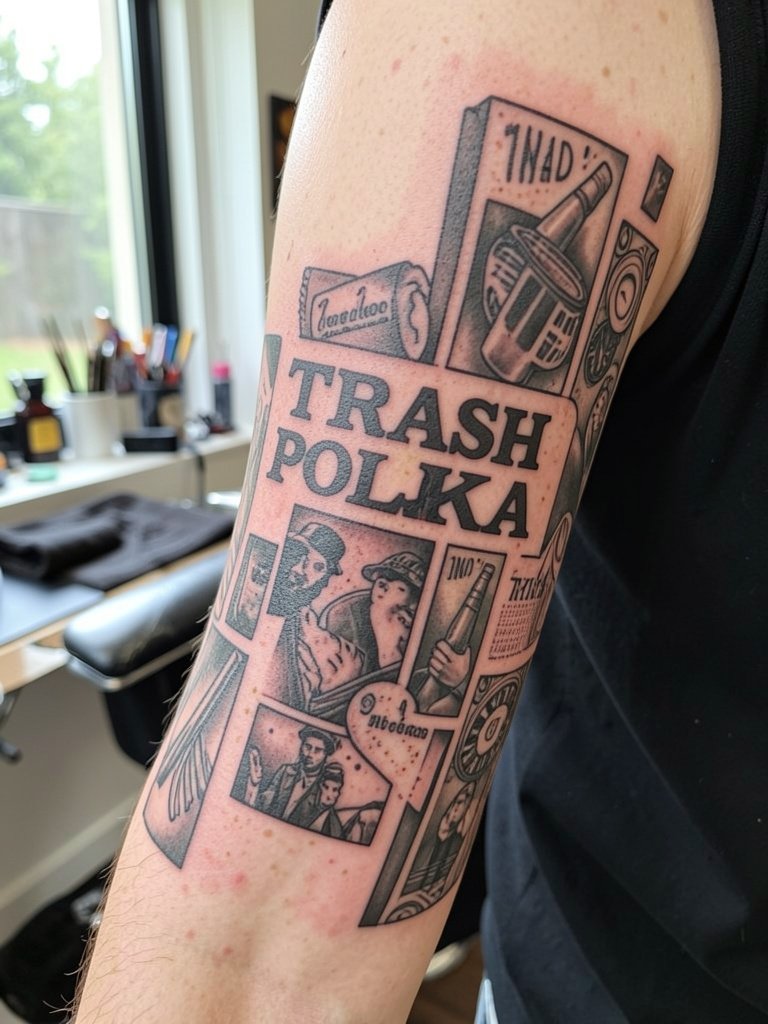
15. Negative-Space Band Sleeve for Readability
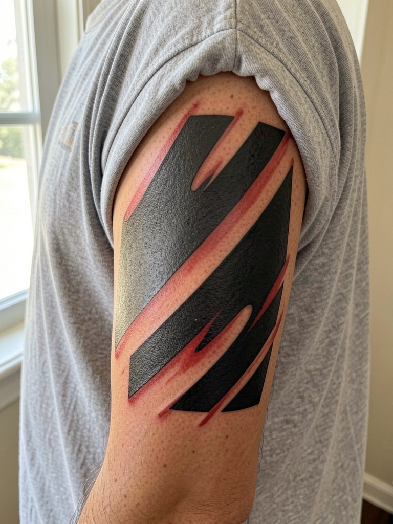
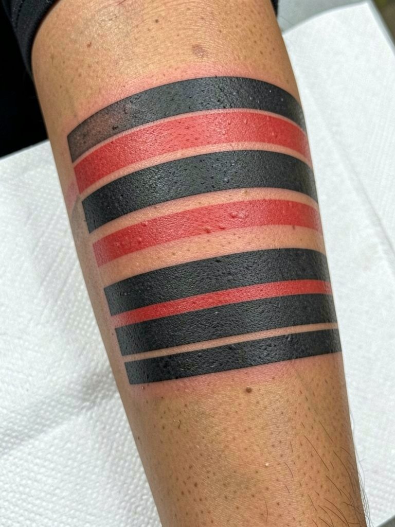
If you worry a full collage might read muddy, a negative-space banded sleeve gives Trash Polka energy while preserving clarity. The idea is to alternate dense black or red bands with clean bare-skin corridors that act as visual separators. Ask the artist to mock up the ribbon widths on your arm so you can see how curvature affects reading from the front and back. The mistake here is making bands too thin; wider spacing preserves contrast as the piece ages. Sessions are efficient because each band can be tackled in sequence and healed before adjacent work. For a show-off outfit, sleeveless muscle tanks or fitted tees keep the arm graphic and let the negative space read clearly. Try black sleeveless tanks for summer reveals.
Frequently Asked Questions
Q: How many sessions does a Trash Polka sleeve usually need?
A: It depends on size and detail, but most full sleeves are staged across multiple visits. Plan for an initial mapping/design session, two to four major inking sessions to build anchors and large panels, and one or two touch-ups on healed skin. Expect shorter follow-ups for red re-saturation later if you live in a sunny climate.
Q: Will the red fade faster than the black and how often will I need touch-ups?
A: Red pigment typically needs refreshers sooner than black because of natural light exposure and pigment chemistry. Realistic timelines are one to three years for visible red fading depending on aftercare and sun protection. Preserve saturation by using sun protection and scheduling a focused re-saturation session when contrast drops.
Q: I like a Pinterest piece, but I want it to hold up. How do I adapt that image?
A: Use Pinterest as a mood board and bring two or three images showing the exact elements you like. Ask for mockups that map those elements to your arm so the artist can scale and space them properly for longevity. Keep the centerpiece larger and simplify small details that could blur over time.
Q: Where should I look for artists and healed examples without naming specific accounts?
A: Search hashtags like #trashpolkatattoo and #trashpolkasleeve on Instagram and TikTok, then use location filters to narrow results to your city. Look for portfolios that include both fresh and healed photos, and watch YouTube process videos to judge how an artist stages sleeves.
Q: What should I wear to a session for a full-sleeve appointment?
A: Bring loose, layered clothing that gives easy access to the arm and does not rub fresh ink on the drive home. A button-up overshirt or a loose tee paired with easy-on pants is practical. If you want a show-off outfit for healed reveal photos later, solid-color tees or cropped denim jackets frame sleeves well.
Q: Are there placements on the arm I should avoid for Trash Polka detail?
A: Avoid cramming tiny details on high-motion or high-friction spots like the inner wrist or the bend of the elbow if you want long-term clarity. Reserve those areas for bold shapes or text with heavier linework. For anything near creases, ask the artist to preview how the design reads with the arm both flexed and relaxed.