
Someone I know spent a full season saving screenshots before booking a tiny script. The problem was not the designs. It was picking a style that actually keeps its shape, reads at a glance, and still looks like you after a few years. Below are 25 dainty script ideas that work on different placements, with notes on aging, what to tell your artist, and the mistakes that blur good lettering into regret.
1. Micro Ankle Name in Single-Needle Cursive
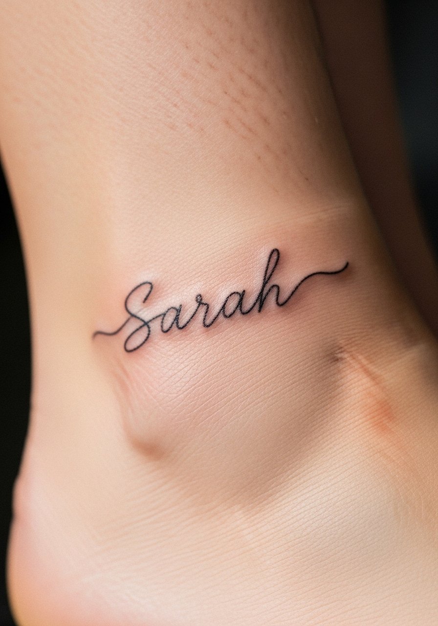
Someone I know got this as a travel memento and loved how jewelry peeks worked with sandals. Ask your artist for single-needle spacing and slightly increased letter spacing so the letters do not crowd as the skin moves. The ankle is low pain but the thin skin and movement mean touch-ups are common around year two. A common mistake is asking for ultra-tiny connected letters and then wanting them to stay razor-sharp. Request a test scale on the stencil and plan for a small touch-up after healing.
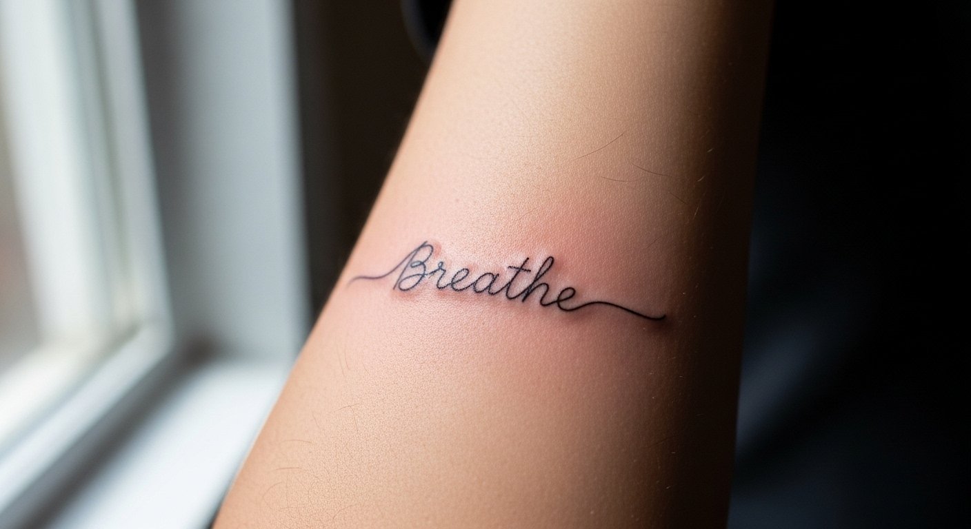
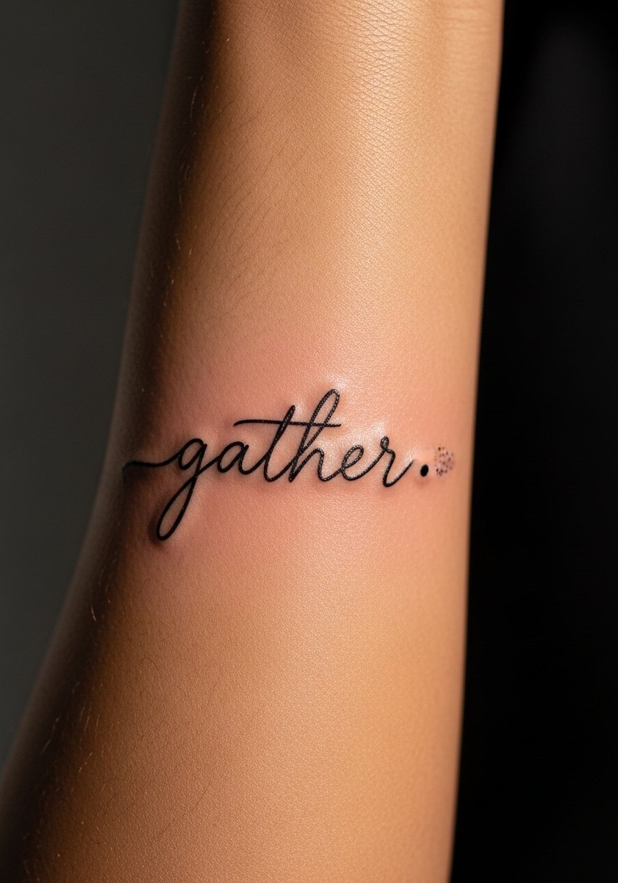
2. Inner Wrist One-Word Reminder in Lowercase Script
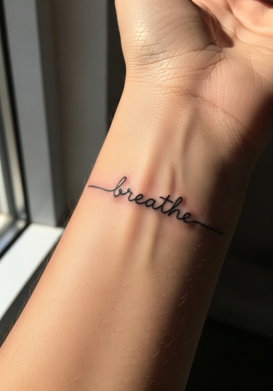
Fair warning, the inner wrist sees daily sun and friction from watches. Pick a comfortable single word you will not tire of and ask for slightly bolder downstrokes so the piece keeps contrast over time. Expect a 30 to 45 minute session for a tiny word and mild soreness afterward. The biggest mistake is making the letters too close together. Ask your artist to show how the stencil reads at arms-length and at a glance.
3. Forearm Cursive with Micro Red Heart Accent
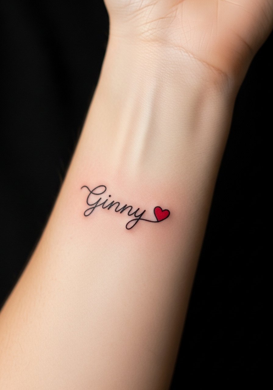
Micro color accents work as anchors and do not add session time if kept tiny. Tell your artist you want the red as a single dot heart placed after the last letter and ask which red ink brand they prefer for your skin tone. Some artists split on red inks. One camp warns reds can shift on darker tones, and the other camp says tested pigment and careful placement solve that. If you have medium or dark skin, ask about pigment brands and expect a tailored aftercare note.
4. Side Rib Script Phrase in Stipple-Friendly Calligraphy
Artists split on ribs for fine line. One group says the skin stretch blurs lines within two years. The other group says correct needle depth and spacing make ribs hold for many years. The rib is painful and breath-sensitive during the session. Ask for slightly increased spacing and plan for a follow-up touch-up at 12 to 24 months. Avoid asking for ultra-thin connected flourishes that trap ink when the area moves.
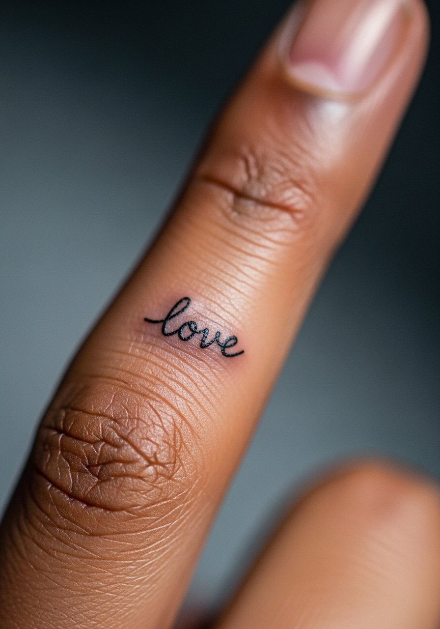
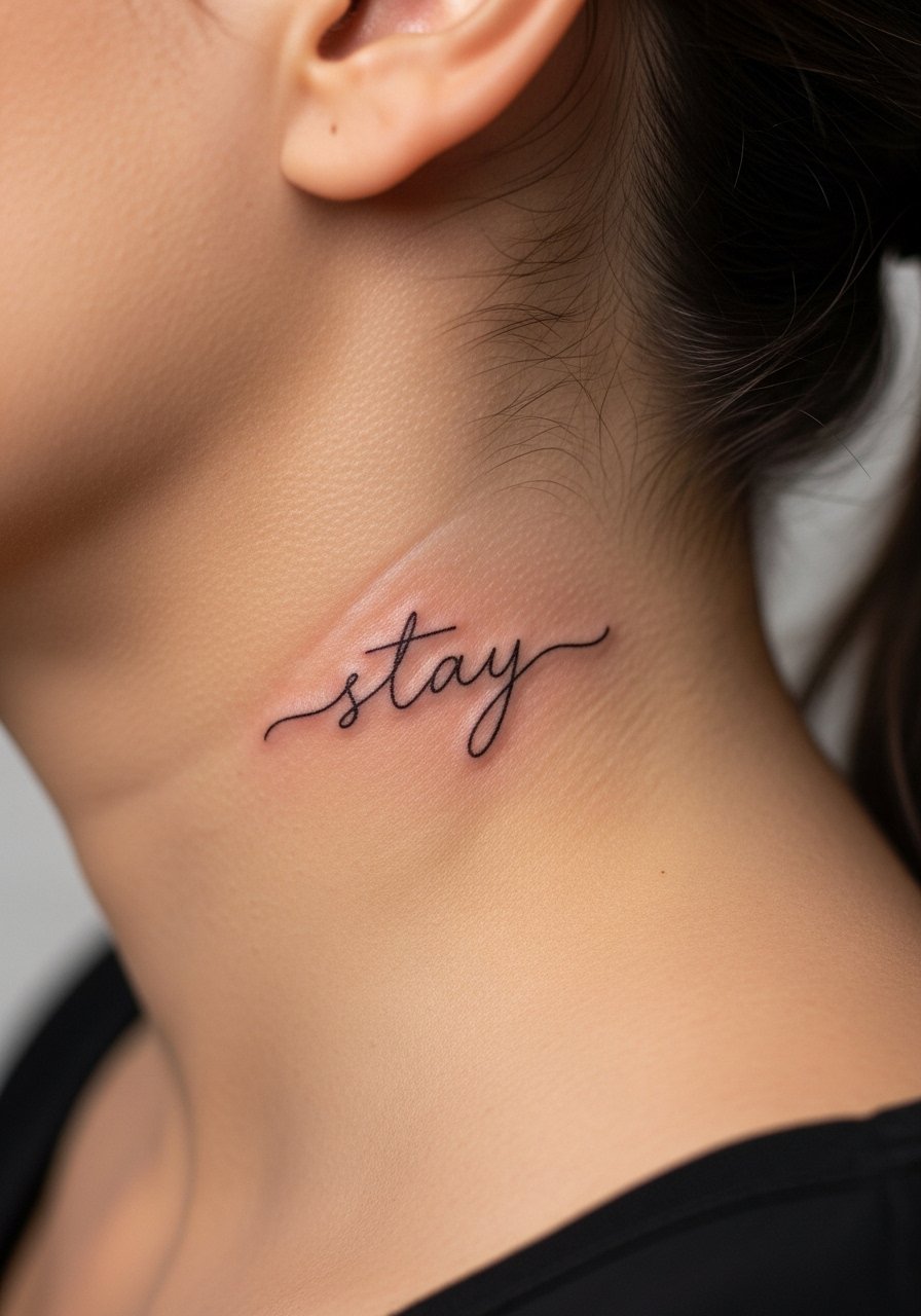
5. Behind-Ear Tiny Script Word for Hidden Impact
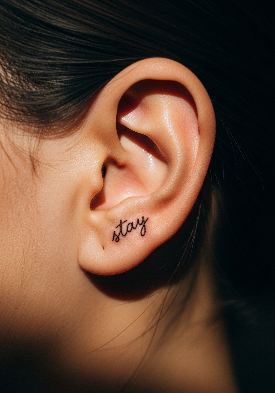
This placement reads as a secret signature when hair moves aside. Tell your artist you want clean linework with modest contrast so the piece is visible but not overpowering. Expect a short session with a stingy pain note because skin is thin. A common mistake is asking for long flowing tails on letters. Keep shapes compact to avoid ink migration and to make future touch-ups easier.
6. Collarbone Horizontal Script in Thin Italic
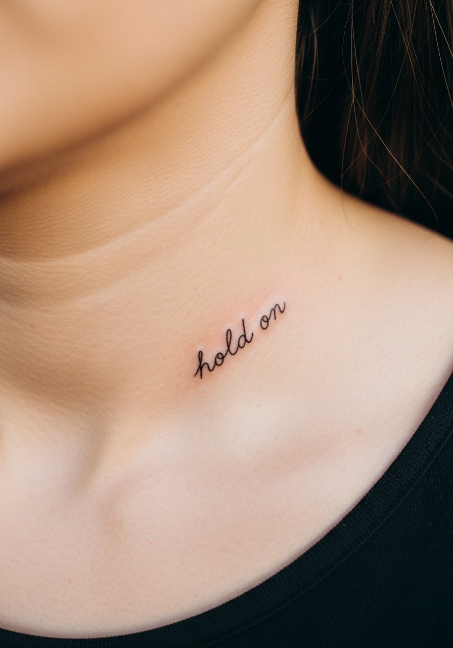
The collarbone is a styling spot. It can look like jewelry when angled and like a statement when shown off. Tell your artist about your daily wardrobe so they can pick the exact placement that peeks from necklines. The area moves with breathing and can require a touch-up after a year. Avoid curling letters under the bone because the stencil will distort when you sit or stand.
7. Inner Bicep Small Block Script for Discrete Visibility
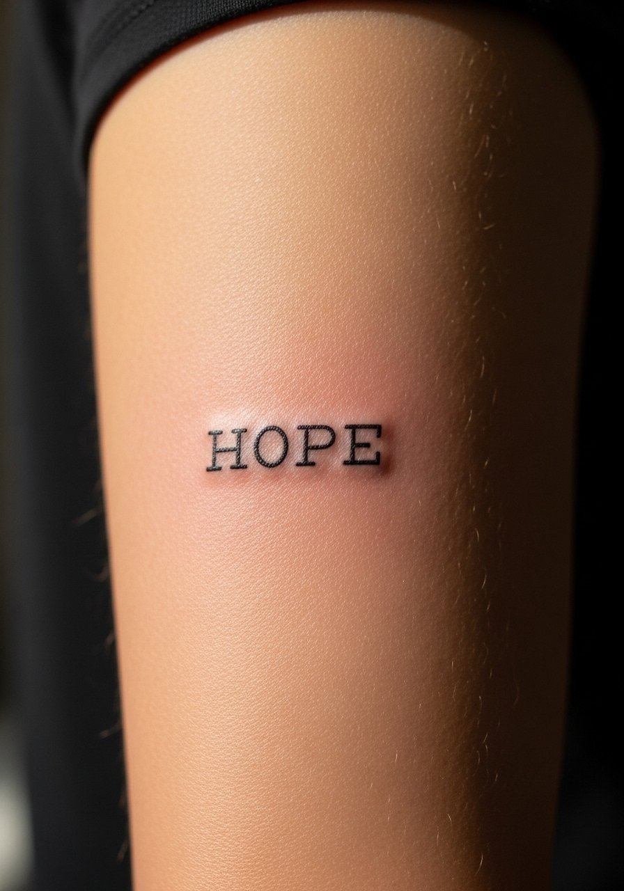
The inner bicep hides well during work weeks and shows in summer. This area tolerates slightly heavier saturation than wrists so the letters hold longer. Ask for compact letterforms and tell your artist you prefer short ascenders and descenders for longevity. A frequent mistake is requesting ultra-tiny serif details that blur into a smudge with time. Expect a calm session and moderate discomfort during longer stints.
8. Side-Finger Micro Script Lettering for Jewelry-Like Effect
Finger scripts are charming but notoriously high maintenance. The skin there renews rapidly and touch-ups are typically needed within 12 months. When you consult, ask for a slightly bolder basic form and expect a shallow healed look compared with other placements. Be clear you accept the likelihood of periodic touch-ups. Some artists advise against fingers for single-needle fine line and some will proceed with a heavier line that lasts longer. Pick the approach you prefer.
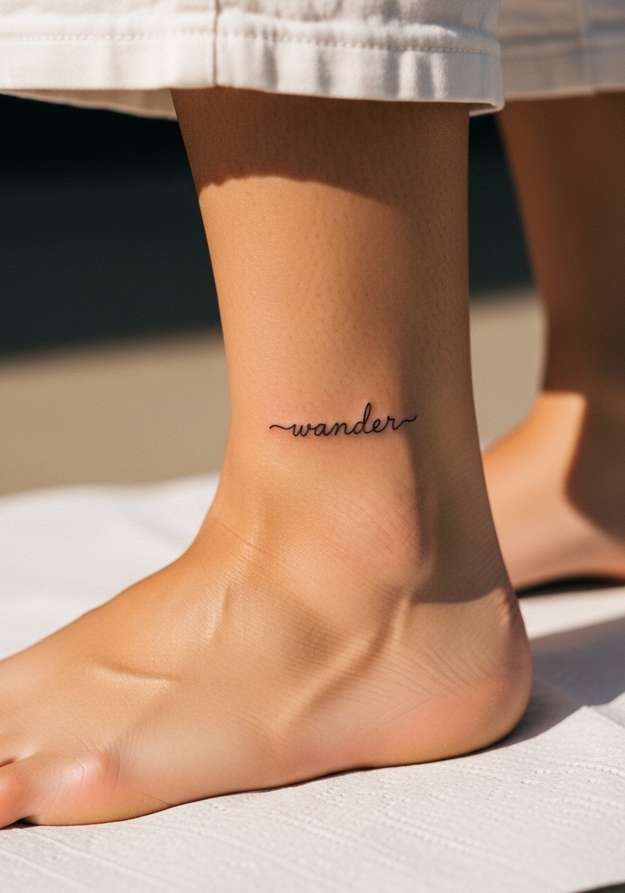
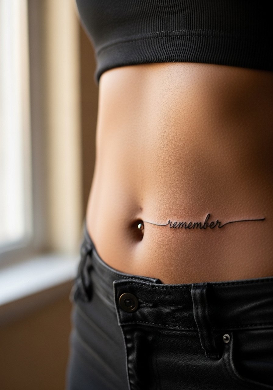
9. Ankle Looping Script That Peeks Like a Bracelet
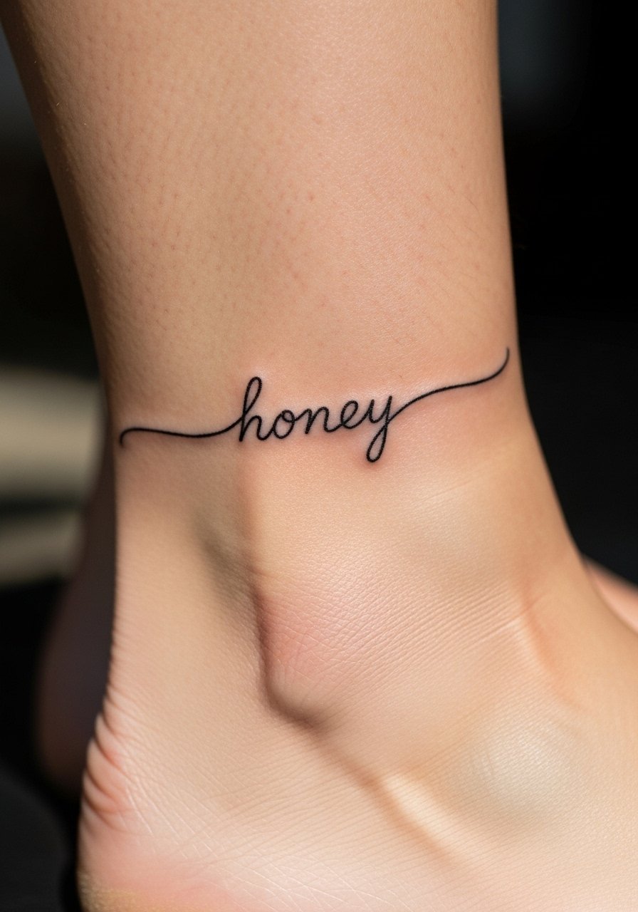
Ankle pieces behave like jewelry when you wear sandals. Ask for a flowing baseline that matches the curve of your ankle. The area moves and rubs against socks and shoes, so expect slower initial healing if you wear closed shoes. A common error is squeezing too many letters into a small circumference. Let the artist scale the lettering up slightly to keep shapes readable after settling.
10. Upper Back Nape Script on Vertical Line
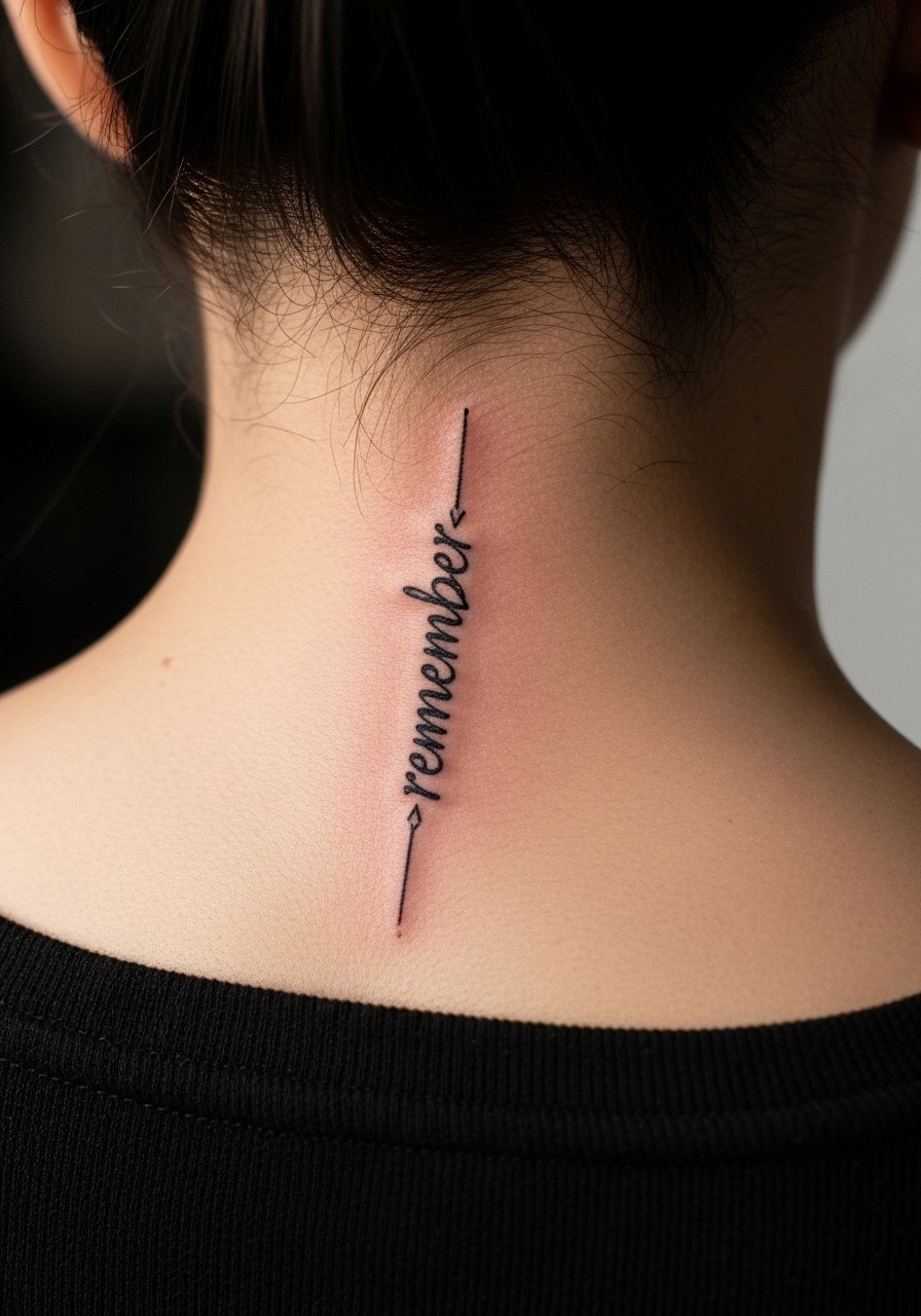
The nape is a low-visibility canvas that still photographs beautifully. Tell your artist you want the letters to read vertically and show examples so the kerning does not compress. Pain is mild and sessions are brief for small scripts. A pitfall is letting flourishes extend into hairlines where touch-ups become tricky. Ask how a stylist or hair growth might obscure details over time.
11. Inner Wrist Continuous Line Script That Wraps Slightly
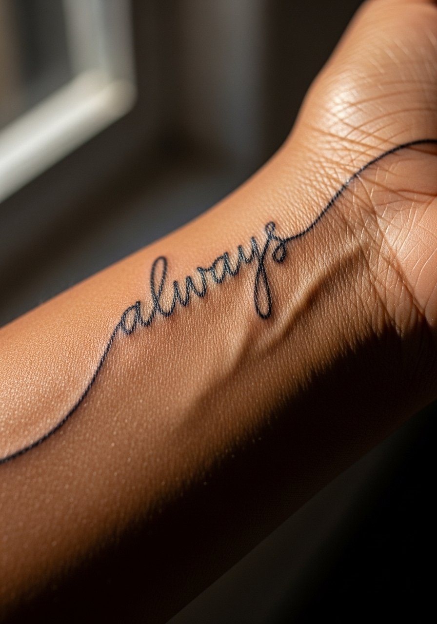
A continuous-line look reads like handwriting. Ask for a sketch that preserves negative space between letters. The wrist sees friction so opt for slightly stronger downstrokes that maintain contrast as the ink settles. Common mistakes include full-joined letters that merge after six months. Request a touch-up plan before you leave the chair.
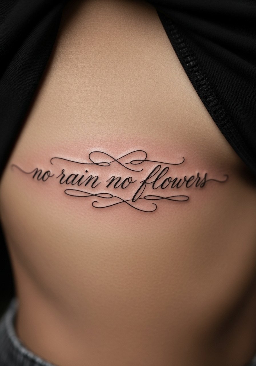
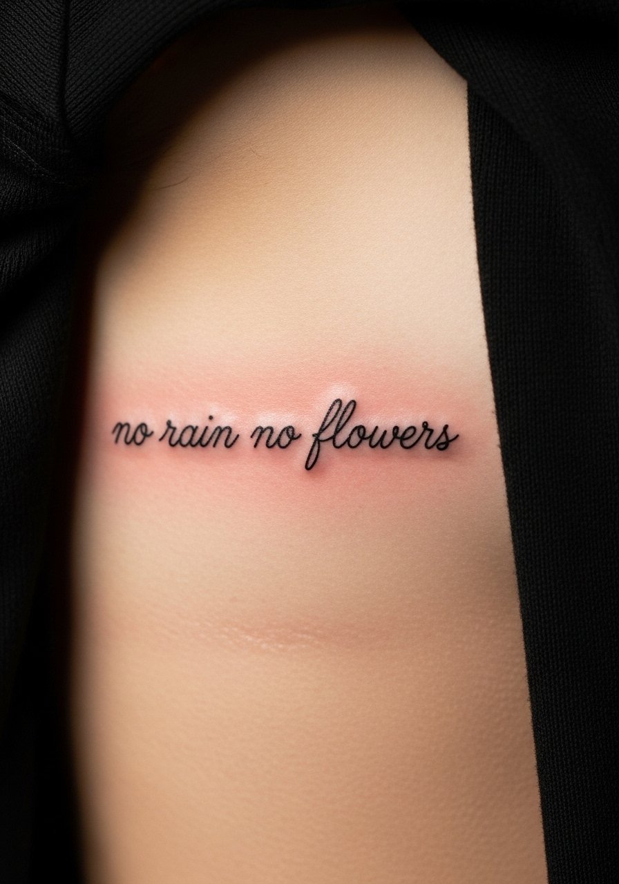
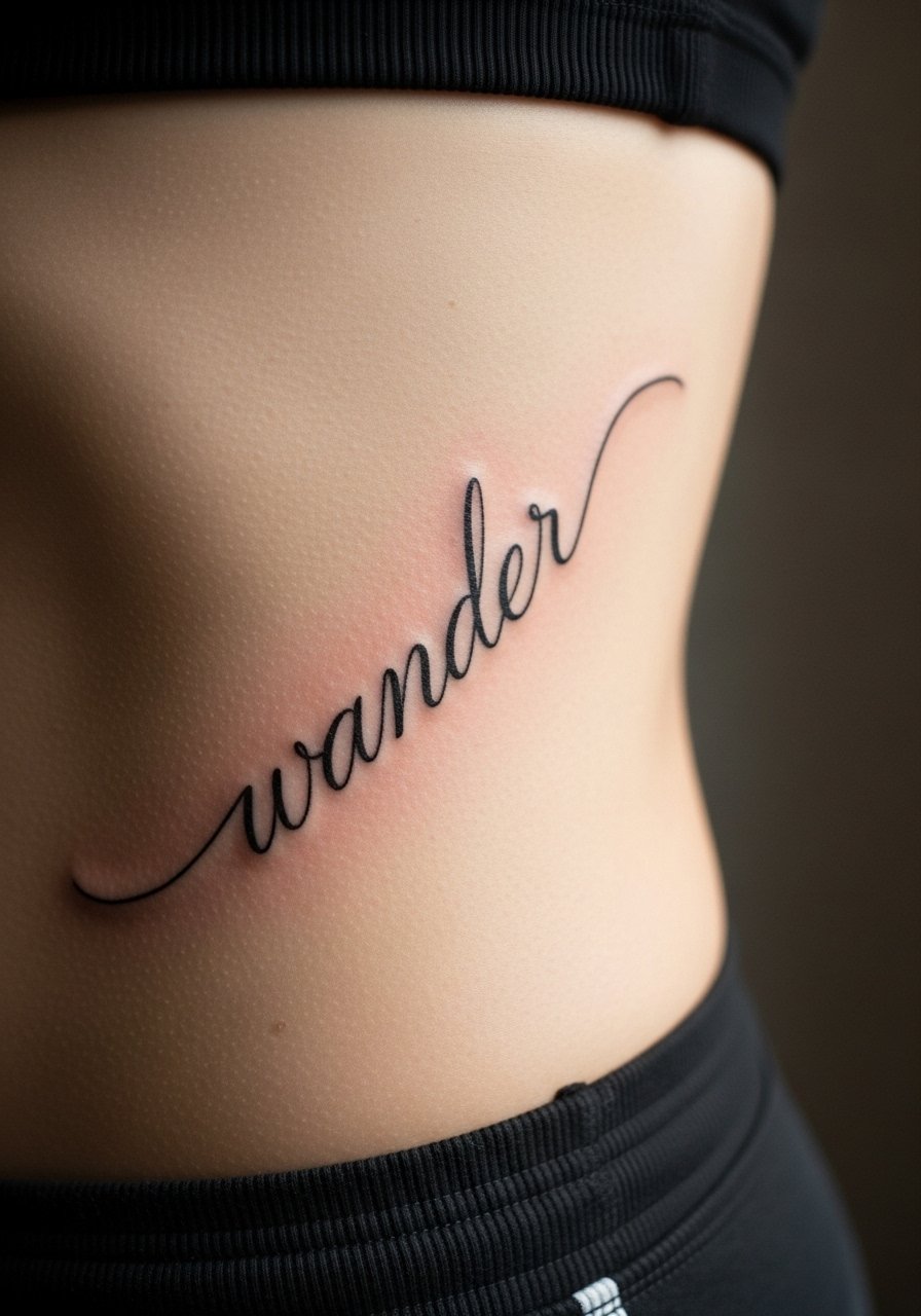
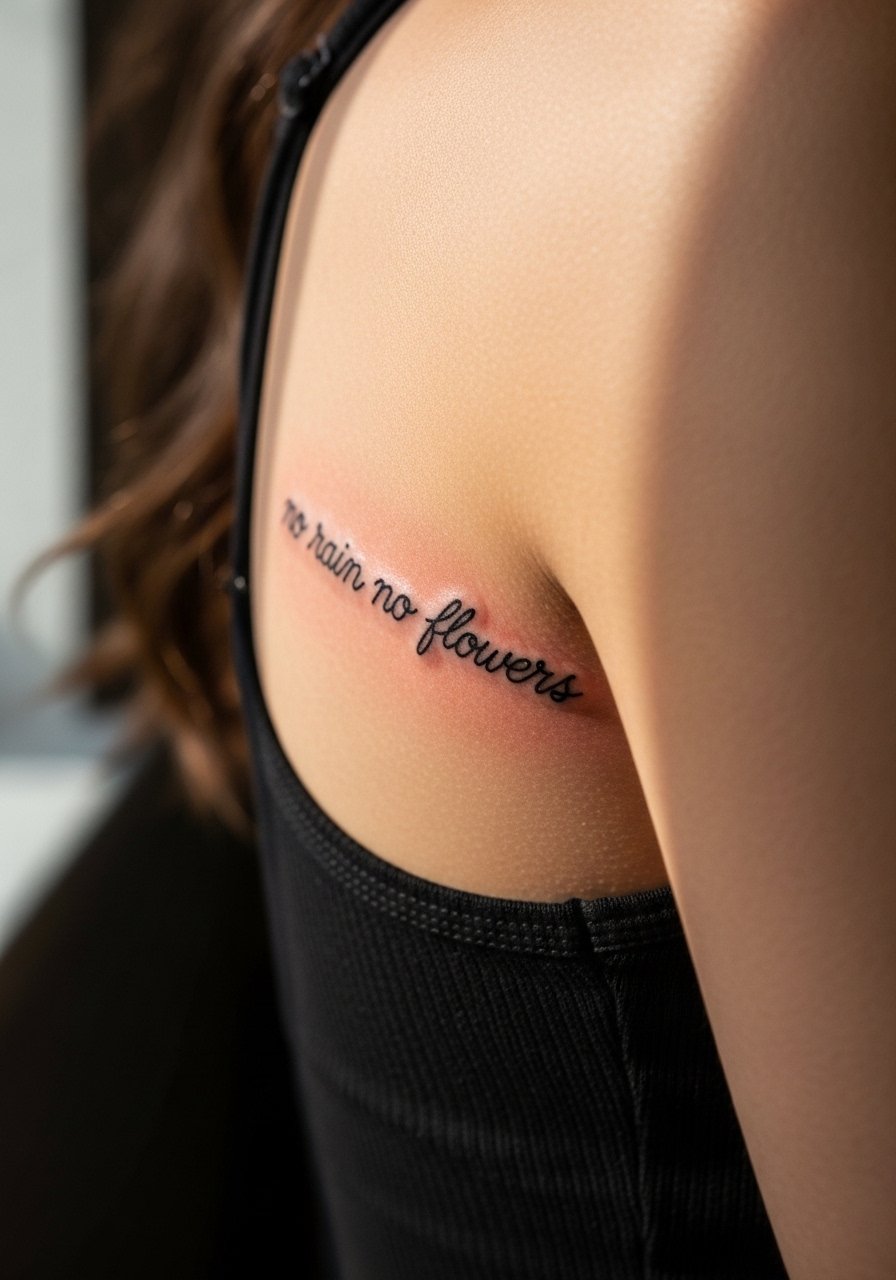
12. Ribcage One-Word Script in Slanted Handwriting Style
Ribs are controversial for fine line. One camp says ribs stretch too much and thin lines blur. The other camp says with proper depth and spacing ribs can hold detail well. If you pick ribs, ask your artist to test the stencil while you breathe and to increase spacing slightly. Session time is longer because of breaks. Expect a touch-up at 12 to 24 months and plan for higher discomfort.
13. Side-Foot Minimal Script with Curling Tail
Foot placements rub on shoes and bedding, so healing calls for open-toe shoes and extra care. Tell your artist you want a curling tail that does not extend into weight-bearing zones. The main mistake is placing too much detail where friction will wear the ink away. Expect the first six months to change the look and budget for a touch-up if you want crispness long term.
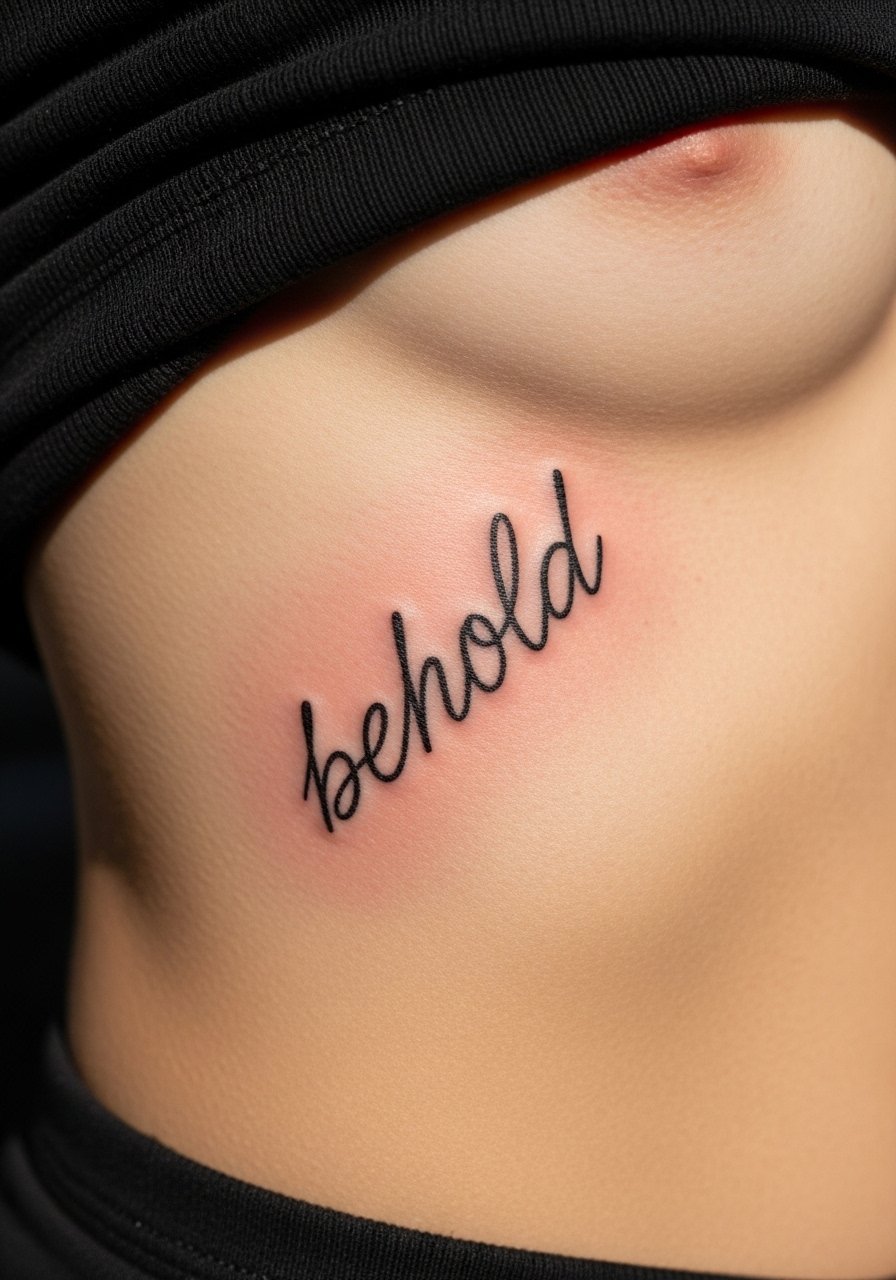
14. Sternum Centered Tiny Script with Small Star Accent
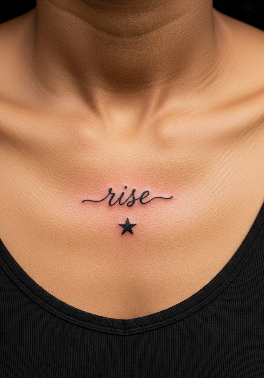
Sternum tattoos require a specialist comfortable with chest contour. Be upfront about clothing that may rub during healing and ask your artist for a placement that avoids the sternum midline tension. The area can be painful for the session. A typical mistake is requesting ultra-thin tails across the sternum. Slightly stronger letterforms hold shape better over time.
15. Behind-Rib Short Motto in Monoline Script
This placement benefits from monoline forms that do not rely on thick and thin contrast. Tell your artist you want even weight across letters so healing does not leave patchy contrast. The ribs move and sessions are broken into breathing-friendly segments. Mistakes include overly ornate ligatures that blur when the skin settles.
16. Side Neck Tiny Script for Bold Subtlety
Neck scripts sit on an exposed spot. Think about work environments before committing. Ask for discreet scale and avoid long tails that catch on clothing. Pain is higher and touch-up likelihood is moderate. People sometimes request tiny script and then regret visibility. Bring examples that match your tolerance for exposure.
17. Inner Thigh Horizontal Script for Personal Placement
Inner thigh is private and tolerates gentle shading well. Tell your artist about your clothing and how often the area will rub during workouts. The skin on the thigh is forgiving but weight fluctuation can affect long lines over years. Common mistakes include placing long phrases without accounting for stretch. Ask about how your planned body changes might affect placement.
18. Supra-Clavicle Tiny Script in Typewriter-Like Lettering
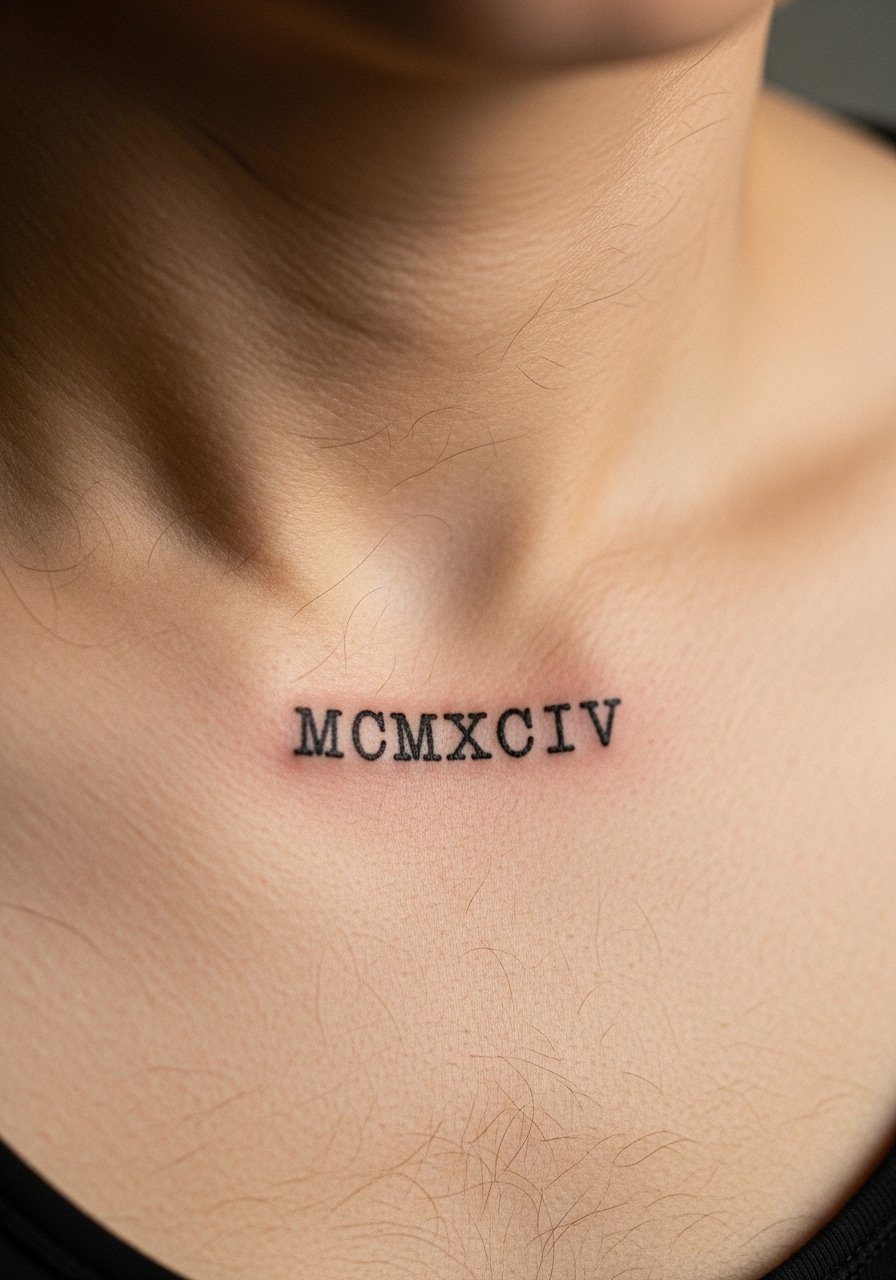
Typewriter-inspired script reads crisp and modern. For dates and numerals, specify exact spacing and opt for thicker strokes than pure single-needle to guard against fading. The area photographs well and is low pain. Mistakes include picking a too-fine serif that fills in during healing. Ask to see a photocopy of the stencil at true size.
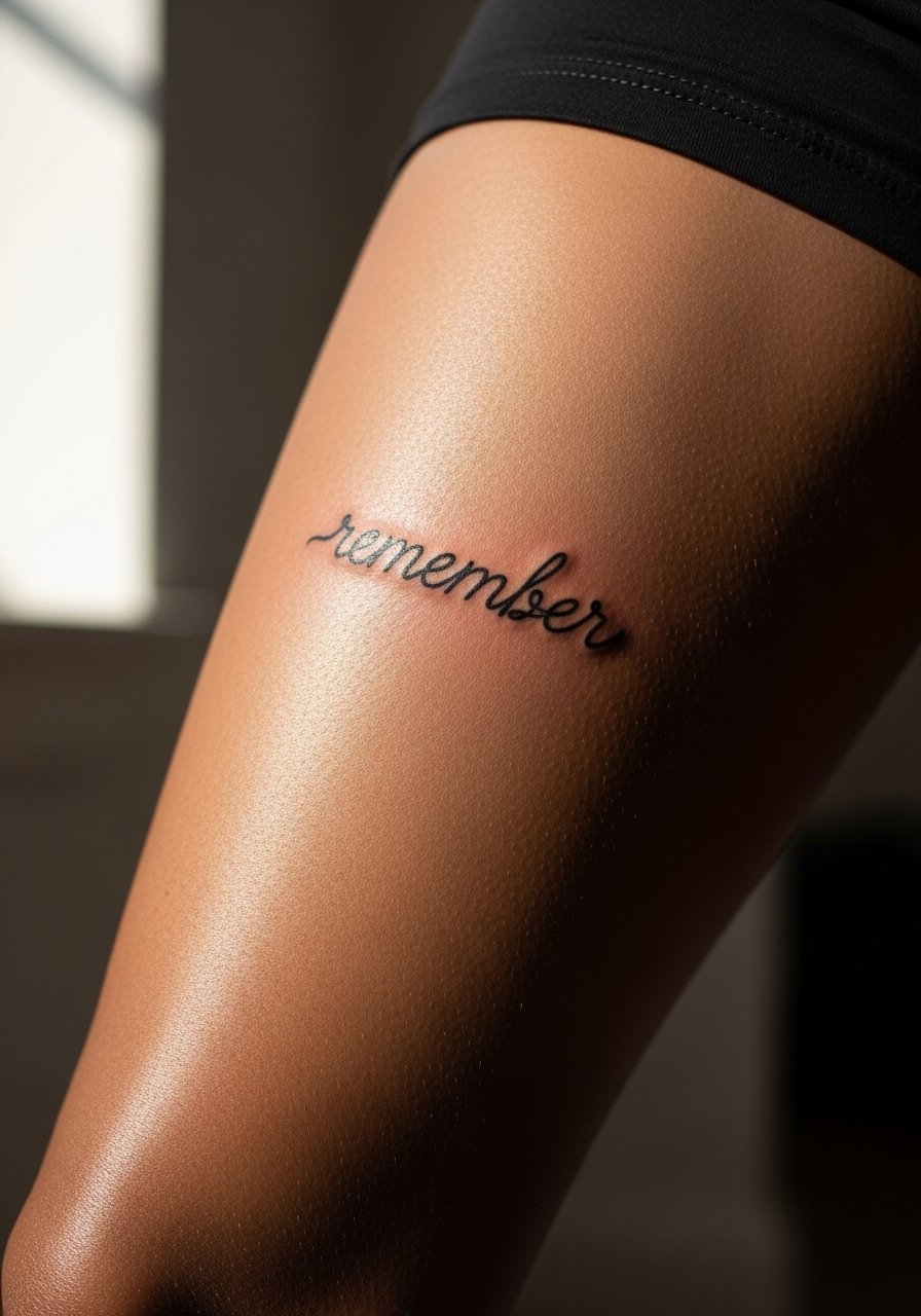
19. Inner Elbow Small Script in Looped Handwriting
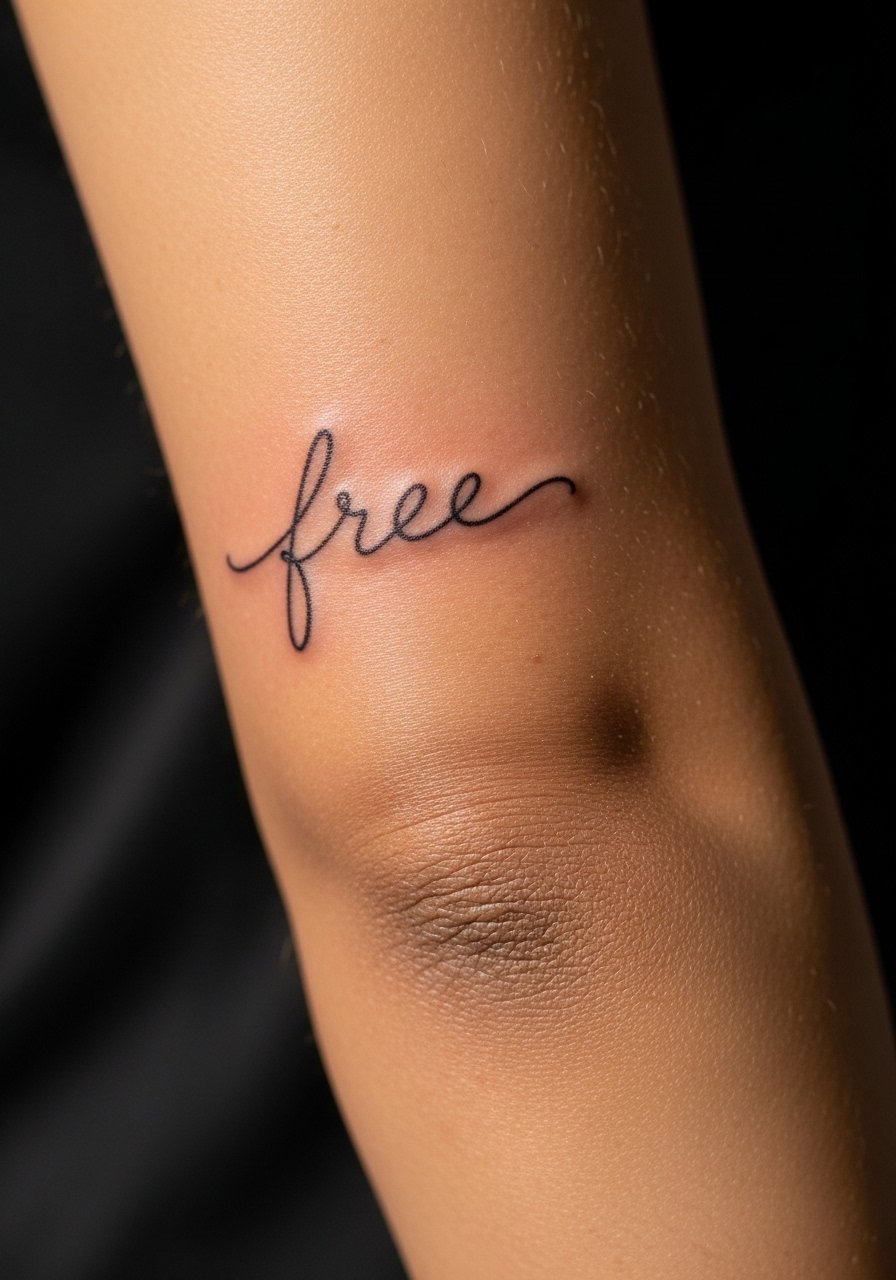
The inner elbow experiences motion and folding which affects longevity. If you want this spot, ask for letters that avoid heavy detail in the crease and for slightly bolder strokes. Sessions can be fidgety because you need to keep the arm relaxed. A common oversight is placing dots or tiny hearts inside the crease where they will fade quickly.
20. Lower Abdomen Delicate Script with Spacing for Growth
Abdomen scripts can shift with weight change and pregnancy. Ask your artist to position the line where you expect the least stretching. This is not a place for overly tight kerning. Sessions are comfortable and healing is straightforward if you avoid tight waistbands. If future body changes are possible, consider slightly looser spacing.
21. Rib-to-Side Short Script That Curves with the Body
Curved placement is about how you move. Ask the artist to draw the stencil on you in motion so the letters do not compress when you bend. The contender mistake is a straight baseline on a curved canvas. Expect breaks during the session and a touch-up if letters settle unevenly.
22. Heel of Palm Micro Signature Script for Bold Intimacy
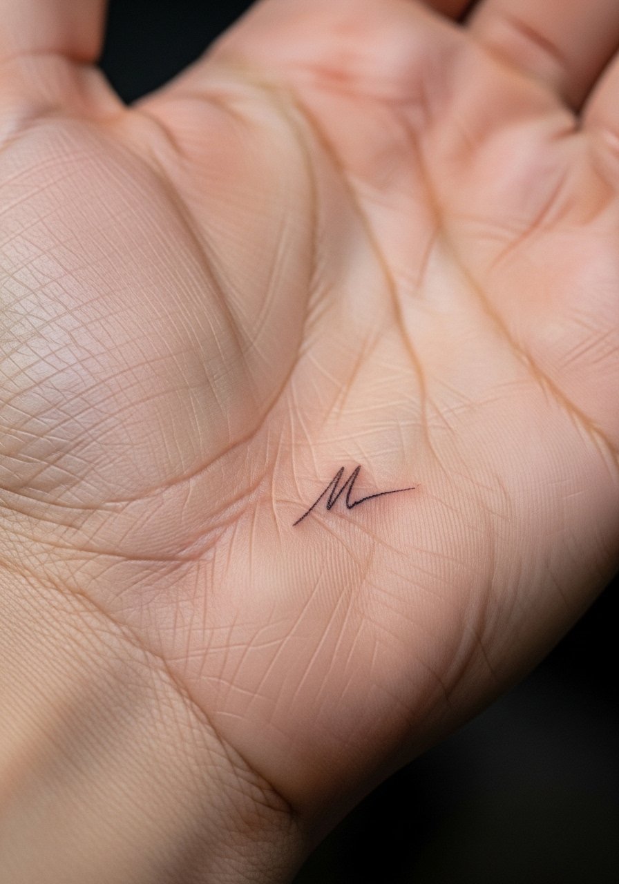
Hand-area scripts show quickly but fade faster. The skin on the palm changes and ink often needs refreshing yearly. Ask your artist if they recommend a slightly thicker approach for durability. Avoid ultra-tiny flourishes that will dissipate. Be upfront about your willingness to maintain the piece.
23. Collarbone Cluster of Two Tiny Words Paired
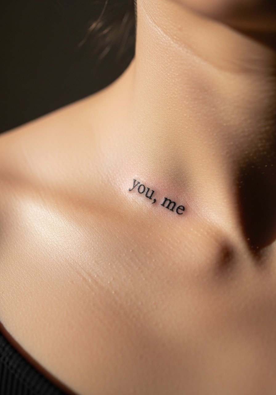
Paired words read like a discrete motif when spaced well. Tell the artist how far apart you want the words and whether the comma or connector should be visible at distance. The collarbone can flatten the look if letters crowd. Mistakes include crowding that makes two words merge when photographed.
24. Inner Forearm Script with Slight Stipple Shading Accent
A stipple dot can anchor a line without overwhelming the script. Ask for the stipple to be subtle and not to touch the letters directly. The forearm is forgiving and holds single-needle work better than fingers. A common error is asking for heavy dot clusters that age into dark blobs. Keep accents minimal.
25. Upper Rib Side Script in Slanted Human Handwriting
Slanted handwriting feels organic. Because ribs flex with breathing, discuss spacing and ask for a slightly relaxed slant so letters do not compress. The session requires breaks and can be sore. One frequent mistake is packing quoted phrases into a narrow width. Plan the curve and read the stencil while standing and while sitting.
Tattoo Prep and Aftercare Essentials
Below is a practical shopping list for prepping appointments and caring for small script tattoos. Most items are generic descriptors because many indie aftercare items vary by shop. One mainstream product is included once for reference.
- Fragrance-free healing balm for tattoos, small jar. Use this during the initial closed healing phase if your artist recommends a balm. It soothes and prevents tight scabbing when applied thinly twice a day.
- Medical-grade second skin bandage sheets, assorted sizes. Occlusive sheets reduce rubbing in the first 24 to 48 hours and can cut down on scabbing for tiny script areas.
- Gentle, fragrance-free foaming cleanser. Clean with lukewarm water and a light touch twice daily while the tattoo is weeping.
- Lightweight fragrance-free moisturizer lotion. Use after the initial closed-phase care to keep the healed skin supple and to slow fading from dryness.
- Broad-spectrum mineral sunscreen SPF 50, non-greasy formula. Apply to healed tattoos when exposed to sun to protect saturation.
- Alcohol-free antiseptic wipes for pre-appointment skin cleaning. Use before your session if recommended, especially on oils or lotions that resist stencil adhesion.
- Microfiber tattoo recovery wrap or light compression sleeve. Useful for areas that rub during sleep or exercise, particularly ankles and feet.
- [Aquaphor Healing Ointment, original] (https://www.amazon.com/s?k=Aquaphor+healing+ointment&tag=tattooengineer-20). Trusted by many artists for short-term occlusive care. Use sparingly and only if your artist approves as your one mainstream reference.
Every tattoo is different. Always follow your artist's specific aftercare instructions. Consult a dermatologist if you have skin concerns or unusual healing issues.
Frequently Asked Questions
Q: How long will a single-needle dainty script need a touch-up?
A: It depends on placement and lifestyle. For wrists, fingers, and feet, plan on a touch-up within 12 to 24 months. For forearms and upper back, touch-ups often come at two to four years. I recommend asking your artist their typical timeline and planning a small follow-up slot when you book if you want long-term crispness.
Q: Are micro color accents riskier on darker skin tones?
A: Some pigments read differently across tones. One practical approach is to ask which ink brands the artist uses and how they have healed on skin like yours. If you want a tiny red or pastel accent, request a small test spot in the stencil preview and discuss tailored aftercare to protect color saturation.
Q: Can I get a dainty script while pregnant or breastfeeding?
A: Most studios advise waiting until after pregnancy and breastfeeding because hormonal changes affect skin and healing. If you are unsure, check with your artist and a medical professional. Planning for timing helps preserve clean linework.
Q: Do occlusive bandages or dry healing work better for fine line scripts?
A: Artists split into two camps on this. One camp prefers occlusive second-skin for the first 24 to 48 hours to control scabbing. The other camp likes short open-air intervals and light balm to avoid trapped moisture. Ask your artist which method they use and why, and follow their protocol for the best results.
Q: How should I describe spacing to my artist so the script ages well?
A: Show photos and point out how much breathing room you like between letters. Ask for slightly increased kerning compared with the same text printed tiny, and request a stencil you can view at true size while standing and while moving the placement area. That reduces the chance of cramped letters blurring over time.
Q: Where is the safest place to get a dainty script if I want low maintenance?
A: Think forearm or upper back. These areas hold fine line better and see less friction than hands, feet, or ankles. Even so, sunscreen and occasional moisturization are important. If you want the lowest upkeep, ask for slightly bolder single-needle strokes so saturation lasts longer.
