
Someone I know spent months scrolling galleries before realizing the real problem was not picking a pretty wave. It was choosing a style that will still read sharp after a year, knowing where waves blur on curved spots, and finding an irezumi-friendly artist who does more than tourist flash. Read on for designs that work for first-timers and sleeves alike, plus concrete notes to bring to your consult so the piece ages the way you expect.
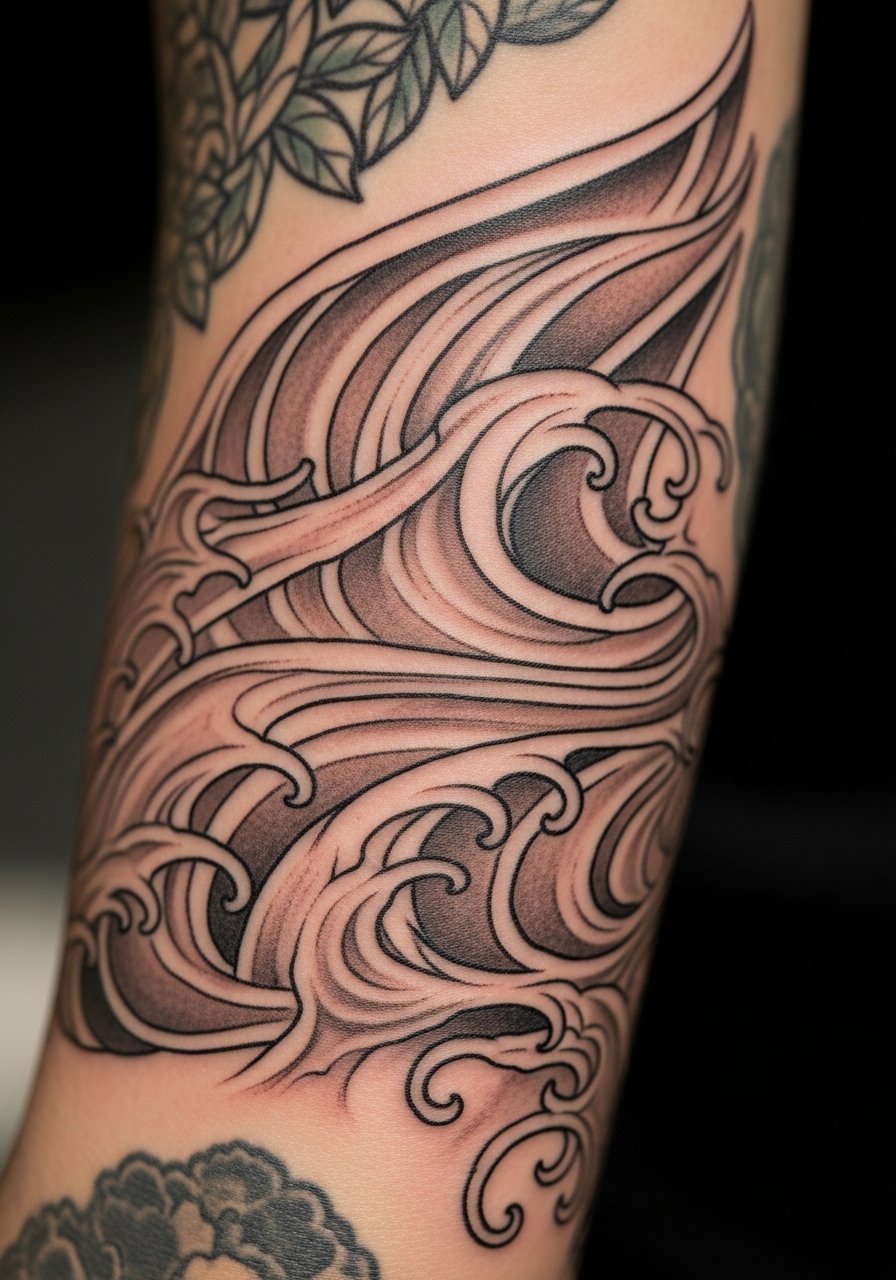
1. Hokusai Great Wave full sleeve

Someone I know first saw this as a back piece and opted for a sleeve instead because it fits daytime wear and hides well under shirts. Tell your artist you want the foam crests to read at arm distance and to keep big areas of solid black to prevent early blur. Most Hokusai recreations that age poorly use too-thin linework and tiny stipple in the crest, which softens into a brown wash by year two. Expect 4 to 6 sessions, moderate pain across the tricep and forearm, and a likely touch-up window at 12 to 24 months. Avoid asking for micro detail where the arm bends or the lines will spread.
2. Koi crashing through waves on outer forearm

When someone wants a narrative piece that reads from across a room, I suggest koi breaking through waves on the outer forearm. During consult say you want strong black wave linework and color reserved for the koi, so the motion reads as fish-first. A common mistake is overloading both elements with tiny shading that competes, which makes the koi lose contrast after a year. Sessions run shorter than full sleeves, usually three focused sittings. Forearm placement is lower pain and holds saturation well, but mention UV exposure to your artist so they recommend black and color placement that resists fading.
3. Minimalist single wave crest on inner wrist

Fair warning, the wrist is unforgiving for fine single-needle work because motion and sun accelerate loss of crispness. Fine line advocates argue that delicate single-needle pieces age gracefully with yearly touch-ups. The other camp insists that thin wrist lines blur within 8 to 12 months unless spaced and saturated properly. Tell your artist you prefer slightly heavier line weight than the smallest single-needle option and ask for a realistic touch-up plan. Expect a short session and brief pain with lots of aftercare focus because sleeves and watches rub the area during healing.
4. Dragon coiling through turbulent waves on the upper back
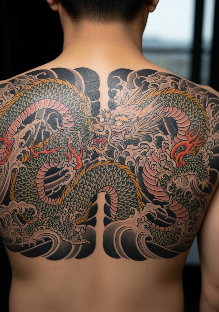
There is a visceral feel to a large back panel where dragon scales sit against crashing waves. When you book, bring reference photos that show scale size and where you want the dragon to breathe with the body. The ribs and spine sections of this panel are higher on the pain scale, expect five to eight sessions depending on coverage. A common error is asking the artist to compress the dragon and waves into a single sitting, which causes fatigue and loss of saturation. Staged sessions let tie-ins age, letting you evaluate blowout risk before continuing.
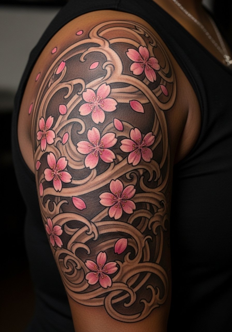
5. Cherry blossom waves half-sleeve on inner bicep

When someone wants contrast between soft florals and bold water, I recommend cherry blossom waves on the inner bicep. Tell your artist to keep blossom edges softer and to use saturated darks in the waves so the flowers keep their presence on darker days. Inner biceps can distort with weight changes and the area is tender, so plan session spacing and avoid compacting dots and stipple in high-stretch zones. Expect around four sessions and touch-ups for color at year two if you spend time in the sun.
6. Oni mask erupting from waves on the calf

The calf is a forgiving canvas for bold blackwork pieces that use solid fills to hold contrast on darker skin. During consult say you want the mask to read from a short distance and the waves to act as negative space rather than competing with facial detail. A mistake I see is requesting overly intricate facial shading in one sitting, which leaves the piece looking muddy after healing. Calf sessions are moderate for pain and usually wrap in three sitting blocks. For those who run, tell your artist about frequent leg workouts so they can plan line placement away from repetitive friction areas.
7. Fine line Hokusai outline on ribcage

Fair warning, ribcage lines stretch and breathe with the torso and that affects long-term clarity. One group of artists says fine line on ribs blurs within two years because of skin movement. The opposing group argues that careful depth and spacing make it hold up fine. Before booking, ask the artist which camp they belong to and to show healed rib photos from their own portfolio. Sessions are shorter but intense for pain. Expect a two-session plan with a likely touch-up at year two to maintain crisp outline.
8. Wave filler to stitch patchwork sleeves on the thigh
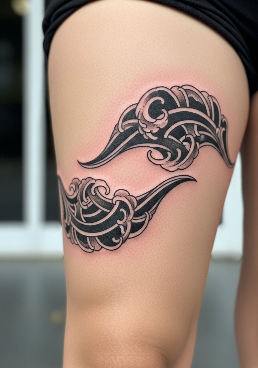
If you are repairing or finishing a sleeve, using waves as filler on the thigh is smart because the curves there allow the motif to flow without distortion. Tell your artist you want the wave shapes to act as bridges, not masks, so existing imagery keeps its identity. A common error is over-detailing fillers so they compete with main pieces. Thigh sessions can be shorter and less painful than inner-arm work. Plan for 2 to 3 sessions per section and ask about how weight fluctuation might shift the composition before you commit.
9. Micro-realism crashing wave ankle piece

Micro-realism on ankles demands precise shading and contrast to keep foam texture readable. Most ankles itch during healing because of shoe friction, so plan shoe-free days and breathable wraps for the first week. The mistake people make is expecting tiny detail to behave like fine line on flat skin. This placement is high risk for fading if you spend a lot of time in trainers. Sessions are short but focused. Expect a touch-up potential at 6 to 12 months to restore fine highlights.
10. Bold traditional wave with Mount Fuji shoulder cap

There is something about shoulder caps that read as intentional homage when paired with a clear landscape element like Mount Fuji. Tell your artist you want bold outlines and strong saturation, particularly near the shoulder edge so the piece reads when wearing a T-shirt. A common mistake is shrinking the Fuji into a tiny icon, which loses recognition after fading. Sessions usually run three sittings for balance of sky and sea. Shoulder placement tolerates heavy black well and ages better than collarbone exposure.
11. Watercolor wave splash on collarbone

Most watercolor styles demand different aftercare because their soft washes can fade faster in sun-exposed zones. I suggest asking for a slightly firmer transition edge so the wash has a reference point when pigment softens. The collarbone gets a lot of sun and rubbing from straps, which accelerates loss. Sessions are typically short and the pain moderate. Expect color maintenance sooner than with blackwork and plan a yearly check to see if re-saturation is worth it.
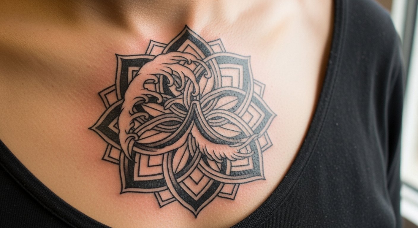
12. Blackwork wave mandala chest piece

When someone wants meditative geometry tied to wave forms, a blackwork mandala across the chest reads precisely because it uses negative space. This pattern traces to ornamental traditions so mention respect for origin and ask for slight variations instead of a direct cultural replica. Expect four sessions and heavier pain on the sternum area. People sometimes request super-tight dot work that clumps during healing. Ask your artist for spacing that will hold on your skin type and to show healed photos from similar placements.
13. Wave borders framing larger irezumi pieces

When you need subtle framing for a larger composition, micro wave borders give structure without stealing focus. Tell the artist you want the border to sit slightly away from the main element so both can age independently. A mistake is pulling the border too close where blowout risk from main shading spreads into the border. Sessions are brief and placement is lower pain. For sleeves, specify whether the border should be bolder near joints to compensate for movement related blur.
14. Curved wave adaptation for thigh and hip panels

If your anatomy includes prominent hips or thighs, ask for wave shapes that follow natural contours rather than forcing flat motifs. One under-covered idea is designing waves as compression-friendly arcs so weight changes do not distort the crest. During consult request mockups with the body flexed and relaxed. These panels can be lower on the pain scale but may need multiple sittings for complex shading. Avoid tiny detail near the groin that will blur; instead opt for bolder blocks that keep contrast over time.
15. Seasonal wave and sakura memorial combo on upper arm
For memorial work, combining ephemeral sakura with steady waves creates clear narrative cues without overloading imagery. Tell your artist which elements are memorial and which are purely decorative, so priority is given to placement and clarity. A common oversight is adding too many small symbols that merge after healing. Upper arm placement tolerates color well and is lower on the pain scale. Expect two to four sessions and consider slight contrast increases so petals remain visible on darker backgrounds.
16. Negative space waves as sleeve connectors
Negative space is a practical way to bridge older flash and new custom work without adding more heavy black. When you consult, bring photos of the existing work and ask for wave shapes that create visual pathways rather than covering older ink. The mistake is trying to match styles exactly, which can make the sleeve feel patched. Sessions vary by how much connector work is needed. This technique is ideal if you want to avoid long redraw sessions and keep session counts predictable.
17. Micro-border wave accents around a koi or dragon

I recommend micro-border accents for anyone who wants a subtle frame without a full background. Tell the artist you want the border at least a finger-width from the main subject so shading does not invade. Common errors include borders placed too close which creates muddiness as shading settles. Forearm placement keeps the accent visible and lower in pain. Sessions are short and usually add a natural finishing touch that avoids full background commitments.
18. Micro-realism horizon line ankle cuff

The ankle cuff reads like jewelry when executed with fine contrast. Mention to your artist that you want the horizon to remain legible in trainers so plan for negative space pockets. Ankle healing is itch-prone, so prepare for shoe-free windows and breathable bandage use. A common mistake is crowding the cuff with tiny highlights that vanish. Expect one to two sessions and a possible touch-up once the swelling settles.
19. Bold chest-to-shoulder wave panel with color accents

There is visual payoff when a wave panel flows across chest into shoulder because it reads with clothing and movement. In consult, specify which side you prefer emphasized so design balance suits your posture. A mistake is asking for symmetrical mirroring when your body is naturally asymmetrical, which can look off after healing. Expect three to four sessions and plan for seasonal touch-ups if you spend time outdoors. Chest placement tolerates bold black and color better than collarbones.
20. Bold forearm wave anchor for a starter sleeve

When someone wants to start a sleeve, I advise beginning with a strong forearm anchor that can guide future additions. In your consult ask for clear line separations and reserved negative space for later motifs like koi or flowers. A frequent error is committing petite detail that forces you to build around it awkwardly. Forearm work is lower pain and holds saturation well for years when outlined boldly. Plan for 3 sessions to set the anchor and leave room for touch-ups as you add elements over time.
Tattoo Prep and Aftercare Essentials
When you book a wave piece, three prep moves matter most. Bring reference photos that show healed work on the same placement, mention any skin conditions, and ask your artist for session pacing so you do not pack every detail into one exhausting day. Aftercare choices have a real debate. One camp prefers occlusive bandage healing to keep linework crisp, the other camp favors dry healing to let scabs form naturally. Also, some artists recommend simple petrolatum for initial moisture while others use lighter balms to avoid clogging dense blackwork. Decide with your artist and follow their plan.
Shopping list (7-10 items)
Lightweight fragrance-free balm for initial healing. Use sparingly during the first week to prevent scabbing oversaturation. Good for blackwork and areas prone to clumping.
Medical-grade second skin bandage, single-use sheets. Useful for high-friction spots like ankles and forearms during the first 48 hours.
Gentle pH-balanced cleanser, no fragrance. Use to wash inked areas twice a day during early healing.
Silicone scar sheets for long-term smoothing. Helps with raised scars and keeps blackwork edges clear as skin matures.
Breathable tattoo-friendly wrap for sleeping. Keeps sheets off fresh ink and reduces accidental rubbing.
SPF 50 mineral sunscreen stick. Essential for collarbones and forearms to avoid color loss.
Lightweight aftercare balm from a lesser-known tattoo brand. Look for non-comedogenic ingredients if you have darker skin or dense blackwork.
Fragrance-free soothing lotion for long-term maintenance. Use daily to keep saturated areas healthy once healed.
Aquaphor healing ointment search page. Mentioned by many as a quick-absorb option but ask your artist whether it suits dense black fills.
Every tattoo is different. Always follow your artist's specific aftercare instructions. Consult a dermatologist if you have skin concerns or unusual healing issues.
Frequently Asked Questions
Q: Will fine line Hokusai recreations blur faster than bold traditional waves on a sleeve?
A: In my experience fine line needs more frequent touch-ups because small single-needle contours can soften with movement and sun. Bold traditional linework tends to hold contrast longer on forearms and shoulders. If you prefer fine detail ask your artist for slightly heavier line weight in high-motion spots and plan on a touch-up at year one or two.
Q: For a wave wrapped around the thigh, how should I ask my artist to prevent distortion with weight changes?
A: Ask for wave arcs that follow muscle flow and avoid tiny internal details where skin stretches. Request mockups while flexing and relaxed so the artist can place anchors where the skin moves least. Also space lines to allow for skin shifts and expect a touch-up if you undergo major body changes.
Q: Is Saniderm better than dry healing for keeping wave edges crisp?
A: Artists split into two camps. One camp says occlusive dressings like Saniderm prevent scab disruption and keep edges sharp. The other camp prefers dry healing to avoid trapping moisture that can lead to ink migration. Ask your artist which approach they use and why, and follow their aftercare plan for the best outcome.
Q: Do watercolor wave styles need different sunscreen or aftercare than blackwork waves?
A: Yes, watercolor washes fade faster in sun, so a mineral SPF 50 stick applied once healed is critical for collarbones and chest. Blackwork withstands sun better but still benefits from daily moisturization and SPF for long-term saturation.
Q: How do I find artists who do authentic irezumi without tourist flash?
A: Search hashtags like #IrezumiWave and check portfolios for full-body or panel work that shows consistent healed photos. Use local listings for "Japanese style tattoo studio" and Booksy searches for guest spots. Spend time viewing healed pieces in portfolios rather than only fresh photos.
Q: Will an ankle micro-realism wave itch more during healing than other placements?
A: Ankle tattoos often itch because of shoe friction and movement. Plan shoe-free windows and breathable bandaging for the first week. If you have persistent irritation consult your artist or a dermatologist.
Q: Can black and gray wave work on darker skin tones without losing foam detail?
A: Yes, but you should ask for higher contrast and bold negative space in the foam areas. Artists who work across skin tones often adjust saturation and spacing so the texture remains readable. Bring healed examples from similar skin tones when you consult.
