
I spent months curating back tattoo ideas after watching healed photos more than fresh ones. I realized the real choice is picking a style that keeps its drama after a year of sun and shirts rubbing. These 28 cinematic back tattoos are built to feel powerful long after the needle comes off.
This list leans into cinematic, high-contrast looks that read across a room. Most designs work across upper back, full back, and spine placements. From what I've seen, artists in 2026 favor clean negative space and chiaroscuro shading for pieces that still read well after a few years.
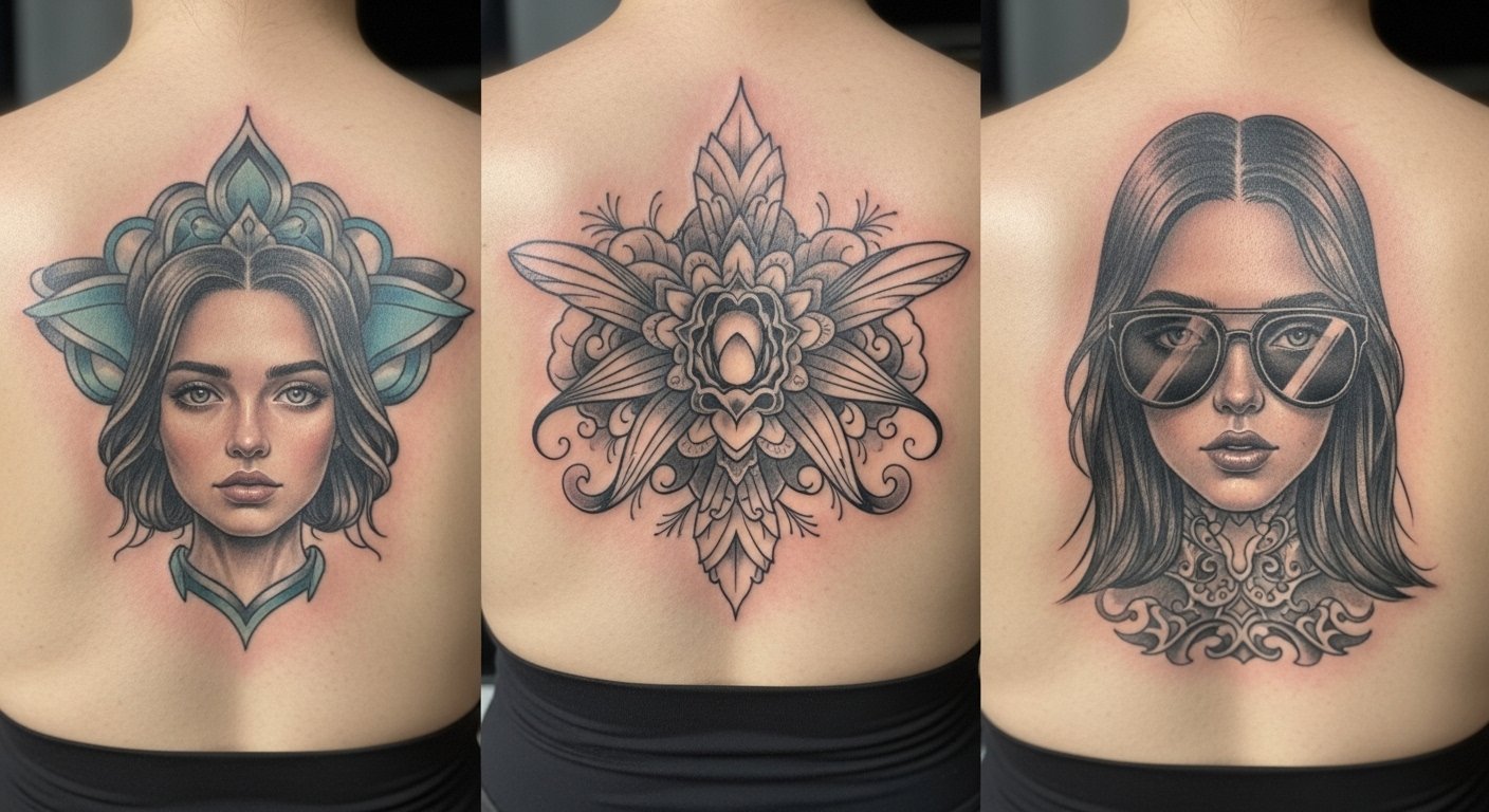
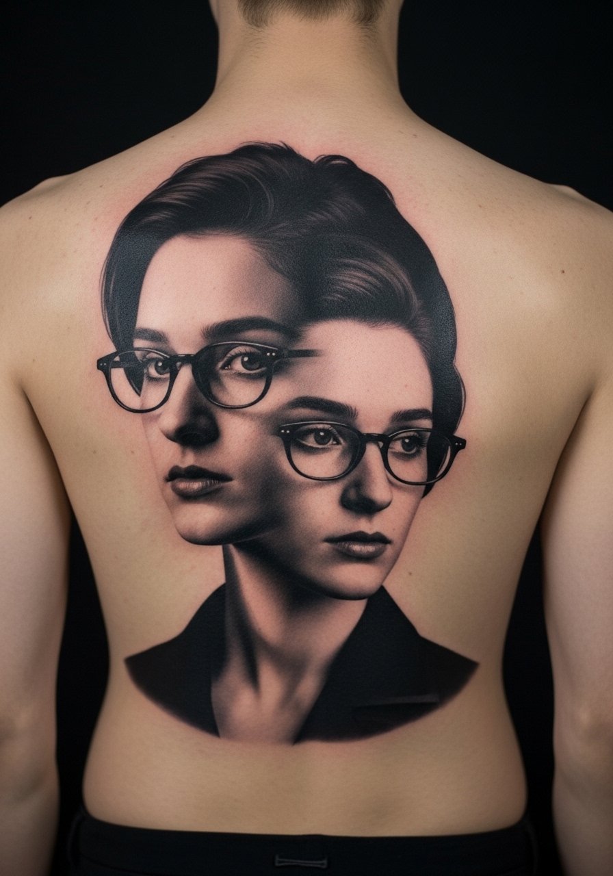
1. Fine Line Cinematic Spine Portrait on Upper Spine
I first noticed this style on a musician whose back portrait still read clearly after a year. The look relies on micro-realism and fine line work placed along the spine. Expect honest pain for spine work. Sessions are often split into 1.5 to 3 hour passes. Ask your artist for slightly thicker mid-tones near the edges so the portrait holds after healing. Many people make the mistake of requesting ultra-thin lines for faces. In my experience those blur faster. Tell your artist you want reference photos that show the lighting you want, not just the subject. Healed, portraits soften at six months but keep depth if shaded correctly.
2. Blackwork Silhouette Across Shoulder Blades
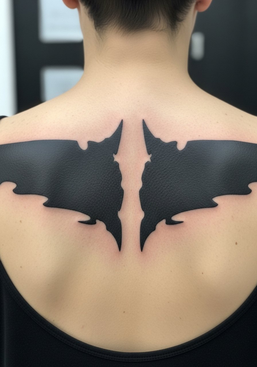
Fair warning, large black fills sting more near the scapula. Still, strength comes from contrast. I recommend sessions of 2 to 4 hours for solid fills. If you want the piece to hold, ask for slightly heavier line borders around the silhouette. A common mistake is shrinking the image to fit a small stencil. This style needs scale to read from a distance. After healing, heavy black stays strong for years but may sheen slightly where skin creases. For the consultation bring silhouette references and tell your artist the exact size and distance you want it to be readable from.
3. Micro-Realism Movie Scene on Full Back
There is a real cinematic impact when you stretch a micro-realistic scene across the entire back. I saw one on a collector who broke the work into three sessions. Plan for multiple long sessions. Pain varies across ribs and lower back. Tell your artist you want the background softer than the focal figures. A typical mistake is packing the whole scene with equal detail. Healed at six months, tiny highlights soften, so ask for crisp contrast in the foreground. This works best for someone who already has a few larger tattoos and can commit to touch-ups.
4. Neo-Traditional Winged Figure Across Upper Back
I loved a neo-traditional angel I saw above a friend’s shoulders. The bolder outlines help color hold, especially on the shoulders where fabric rubs. Expect moderate pain around the shoulder blades. Sessions usually run 2 to 3 hours for color layers. Ask for strong outlines and color packing in the first session so the piece keeps its punch after scabbing. Newcomers often pick thin outlines for a delicate look. From what I've seen, that leads to patchy color later on. A heavier outline ages cleaner.
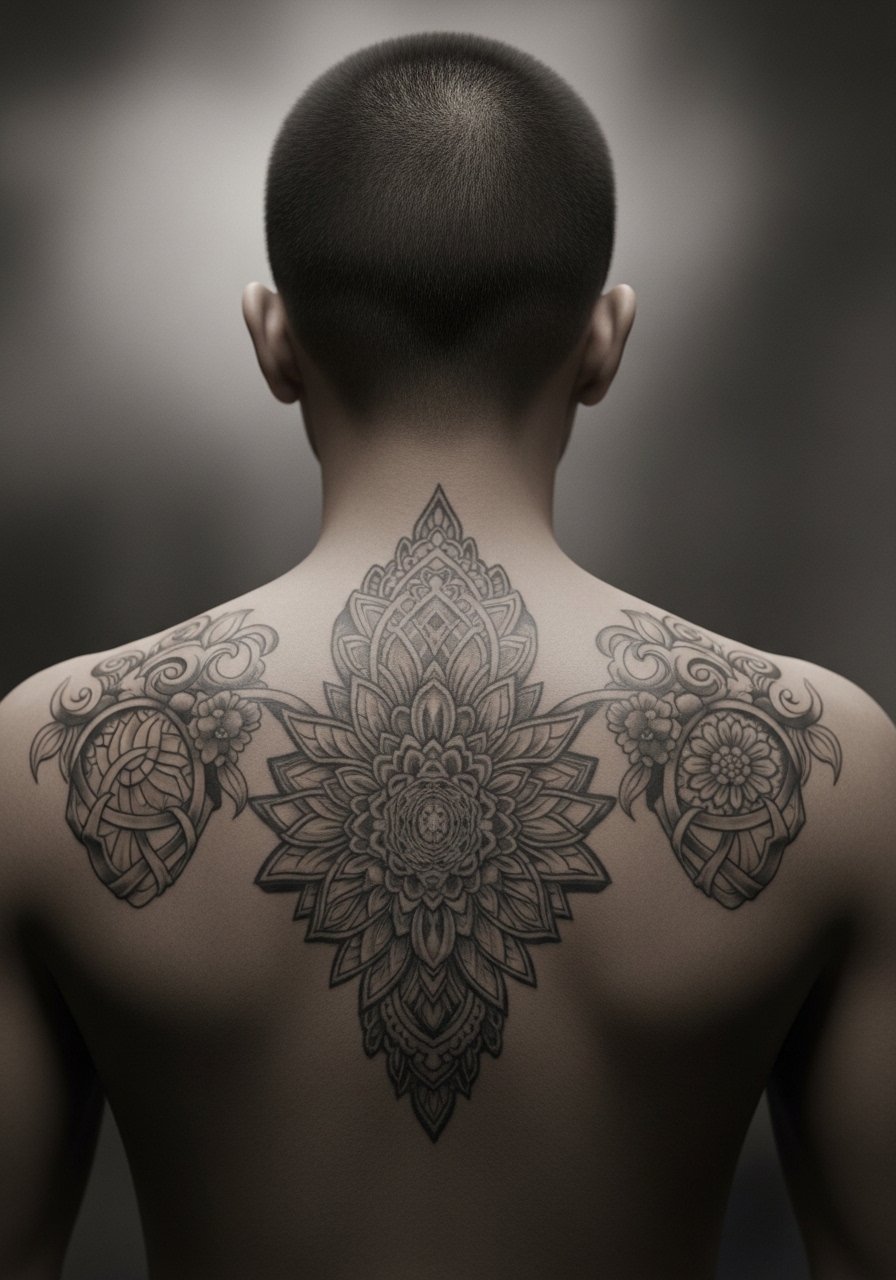
5. Chiaroscuro Black And Grey Thoracic Scene
Most artists I follow have been leaning into dramatic light and shadow for cinematic back pieces. The thoracic area accepts shading well. Pain ranges from low to moderate depending on depth. Expect long shading sessions. If you want longevity, instruct your artist to avoid overly soft stippling in highlight areas. Stipple fades first. A common mistake is over-detailing texture that will blend after two years. Tell your artist to mark the darkest and lightest points in the stencil so the contrast survives healing.
6. Japanese Neo-Classic Dragon Coil on Full Back
I grew up looking at traditional Irezumi and modern reinterpretations. A dragon that wraps from shoulder to lower back needs planning for flow. Expect higher pain near the spine. These are usually multi-session projects stretching over months. Ask your artist how they will map scales and where they’ll place negative space. The biggest mistake is trying to cram in too many small elements. Large scale and intentional empty areas make the mythic feeling last. Healed color can remain vivid if packed properly and protected from sun.
7. Stained Glass Baroque Panel on Upper Back
I saw a stained glass panel in a studio that read like costume art. This style uses bold outlines and saturated color to mimic glass. Placement on the upper back reads well under shirts. Pain is moderate. Ask the artist to leave slightly thicker black leading lines. Thin leads tend to break up with time. A common version that ages poorly uses pastel fills without contrast. That looks washed after a year. If you want vibrancy at two years, request strong separation between color and line.
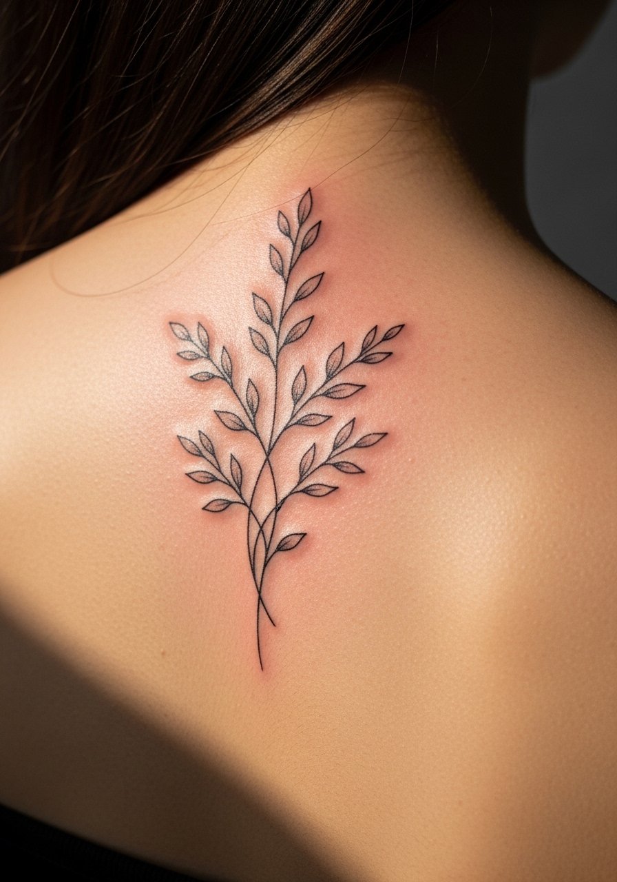
8. Negative Space Forest Across Scapulae
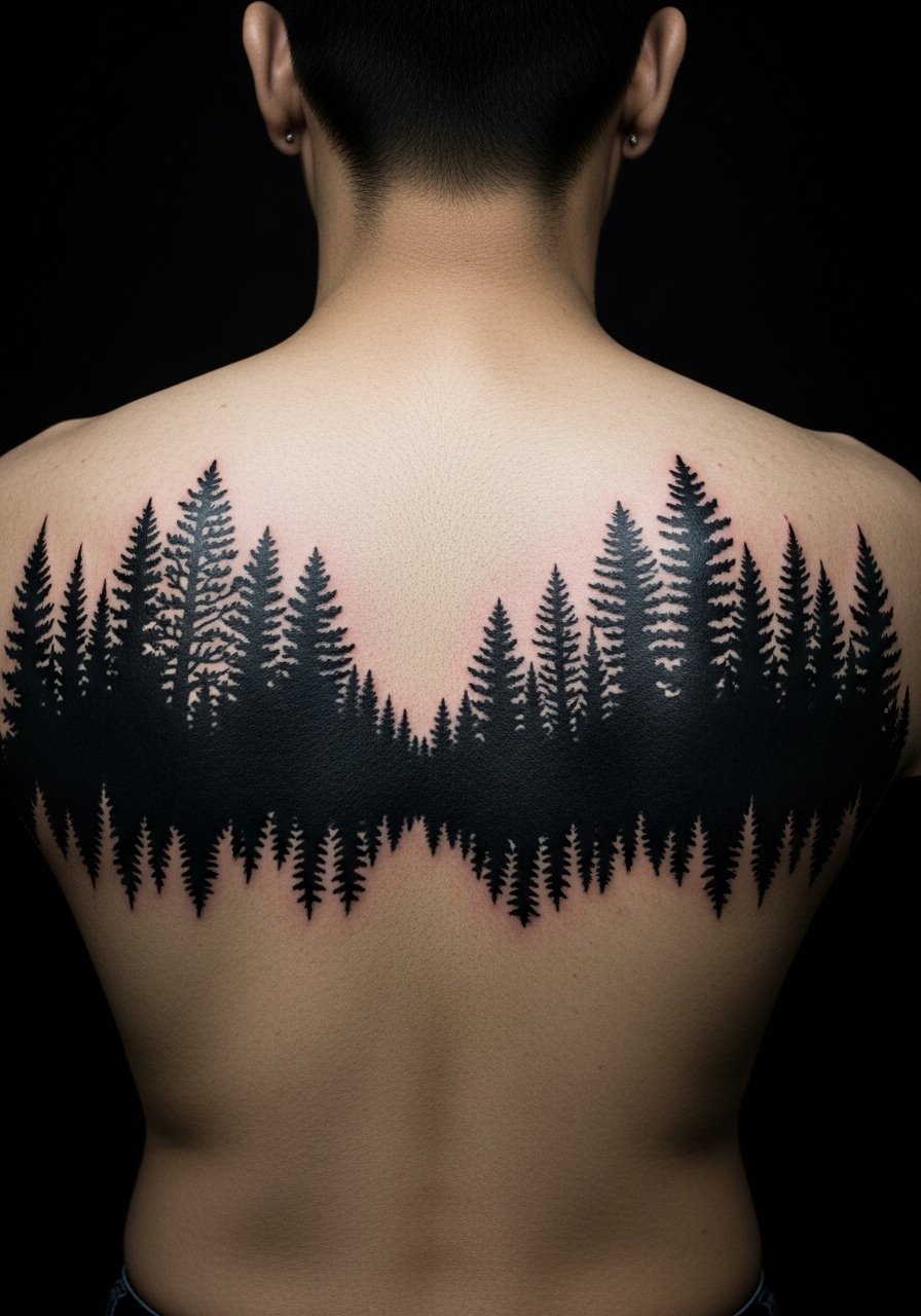
One of my friends used negative space to show trees against a black field and it still reads after a year. The smokiness of negative space makes the shapes pop. Pain around the shoulder blades is tolerable for most. Small sessions under two hours work well. Avoid asking for tiny tree branches; those thin elements disappear fastest. Tell your artist you want bold primary shapes and softer internal texture. In my experience the design holds best when negative space is planned like a stencil for breathing room.
9. Cinematic Cityscape Across Lower Back
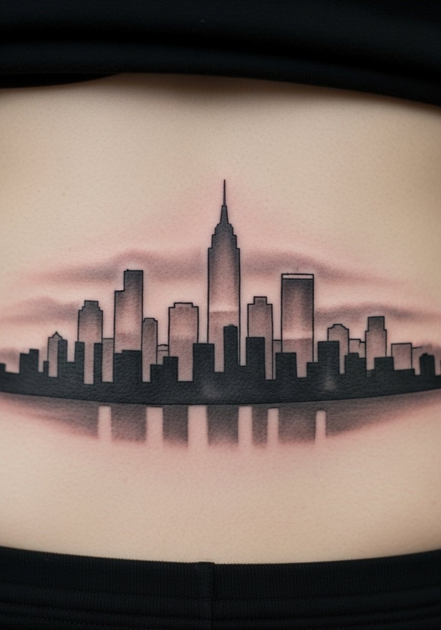
I remember a lower back cityscape that looked like a movie poster. Lower back tattoos have a different pain profile, often more painful near the spine. Sessions can be broken into skyline and fill passes. Ask your artist to anchor the skyline with heavier lines and layer fog effects with smooth shading that will soften in months. A common mistake is a skyline made too small, which reads as a blur after healing. Scaled properly, a cityscape keeps its narrative impact for years.
10. Watercolor Aurora Across Mid-Back
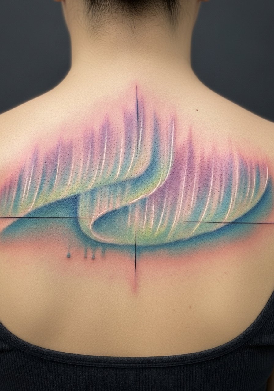
Watercolor on the back can be gorgeous, and painful near the lower ribs. I tell people that watercolor ages differently. Soft washes tend to feather more over time. To avoid a muddy result, ask your artist for discrete anchor lines or dot work to maintain structure. Sessions are medium length, often 1.5 to 2.5 hours. A frequent mistake is asking for all-soft color without contrast. After a year, color settles and may need occasional refreshes if you want vibrancy.
11. Film Noir Silhouette with Spot Lighting on Upper Back
I was struck by a film noir piece that used a single dramatic highlight to tell the story. This works well on the upper back where the light can feel theatrical. Pain is moderate. Ask your artist to exaggerate shadow edges for a long-term punch. Artists often warn that small highlight areas get consumed by surrounding shading. Tell them you want crisp edge definition around the highlight. Healed, the single-light effect softens but remains readable if contrast was prioritized.
12. Mythic God Bust in Chiaroscuro on Upper Spine
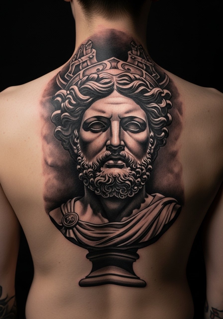
I came across a bust tattoo that read like a marble statue. Placed along the upper spine it has a regal stance. Spine work is painful in places. Sessions usually split into linework then shading. Tell your artist to fortify the darkest areas so they do not flatten over time. A typical mistake is over-fine hairline details in the face that merge after a year. Recommend slightly stronger mid-tones in the first pass to keep dimensionality.
13. Surrealist Collage Full Back With Floating Objects
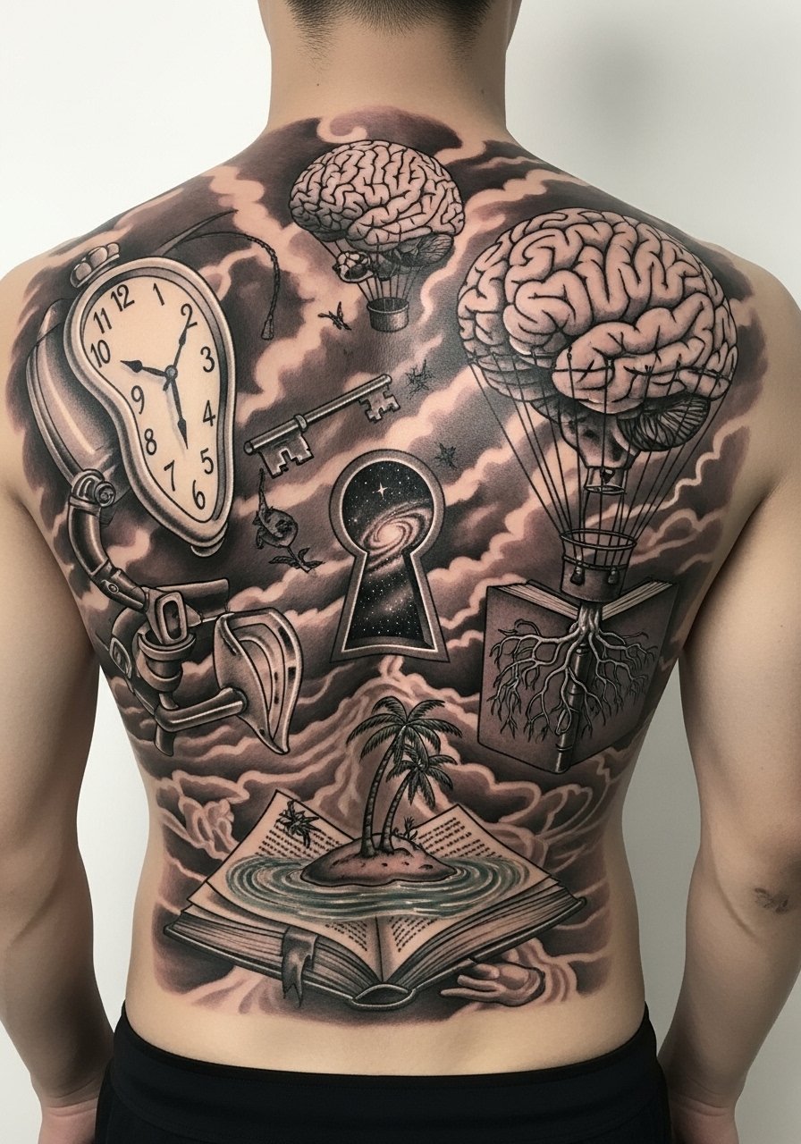
Surreal collage pieces need space to breathe. I saw a full back where negative space separated each floating element and it still read after a year. Expect varied pain across different zones. Sessions are modular. When consulting, map which elements you want crisp and which can blur gracefully. A rookie mistake is filling every inch with tiny surreal details. Instead, choose a few anchor images and let them float. After healing, small micro-details lose definition, so plan accordingly.
14. Neo-Classical Framed Portrait on Upper Back
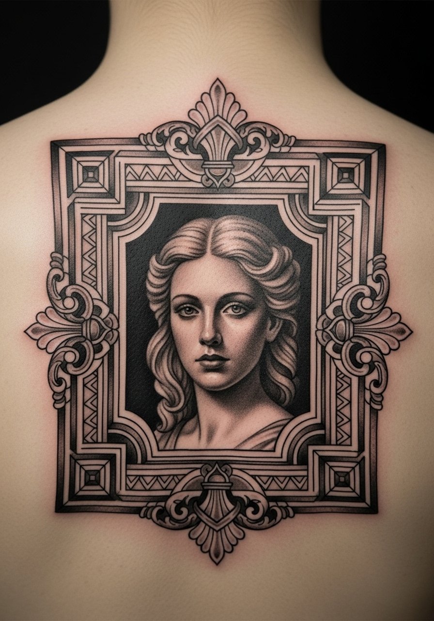
I noticed the best framed portraits combine ornate blackwork frames with simpler portrait shading. The frame holds better than delicate filigree over time. Pain is moderate near the shoulders. Book enough time for the frame in one session and the portrait in another. Tell your artist you want the frame slightly bolder so it acts as a visual border as the portrait softens. People often request the frame too fine and lose the border’s integrity after healing.
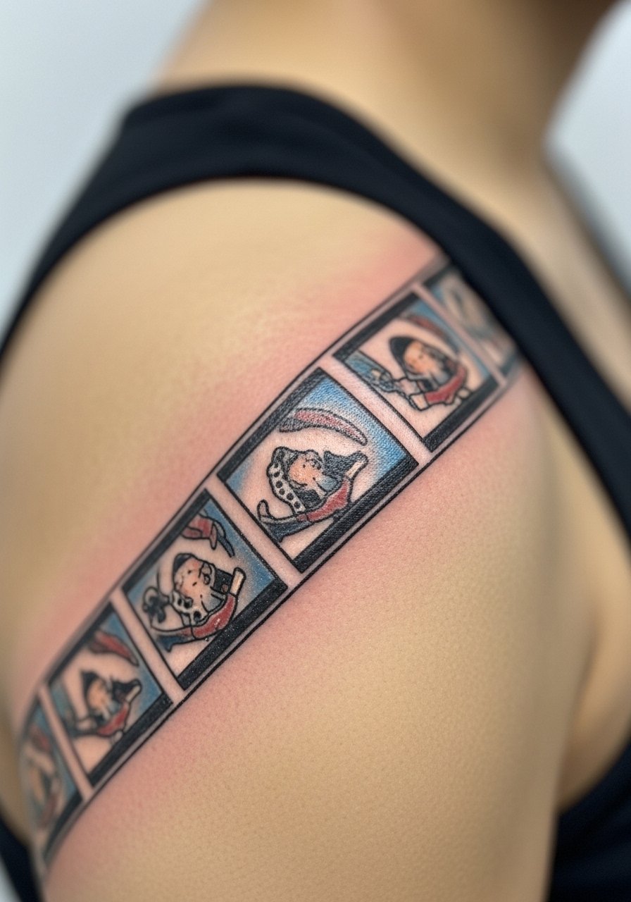
15. Minimalist Line Film Strip Along Lower Spine
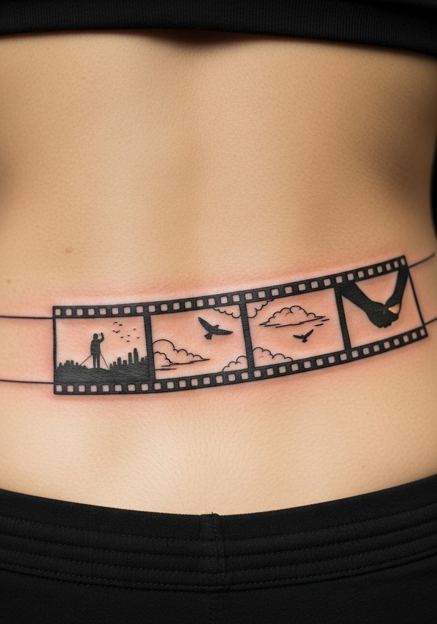
A friend put a tiny film strip along their lower spine to tell a short story. Minimalist line on the lower back can be painful but reads well when scaled. Session time is short. I suggest asking for slightly thicker outer frame lines so the strip remains legible after a year. A common mistake is making the frames too small. At six months, thin lines may merge. If you want long-term clarity, ask for moderate line weight.
16. Gothic Rose and Clock on Right Scapula
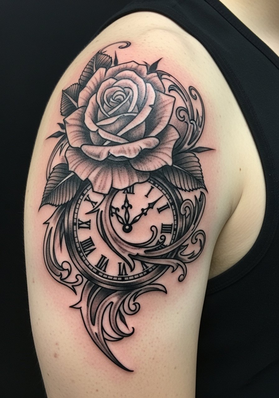
I first saw this on a friend who wanted a time-themed piece. The scapula accepts dense blackwork well. Pain is tolerable. Tell your artist to prioritize clean linework around the clock face so the numbers survive. A frequent mistake is asking for ultra-fine numerals. Those become unreadable. Healed, the rose petals soften but the clock stays readable if lines were prioritized.
17. Planetary Alignment in Micro-Realism Across Upper Back
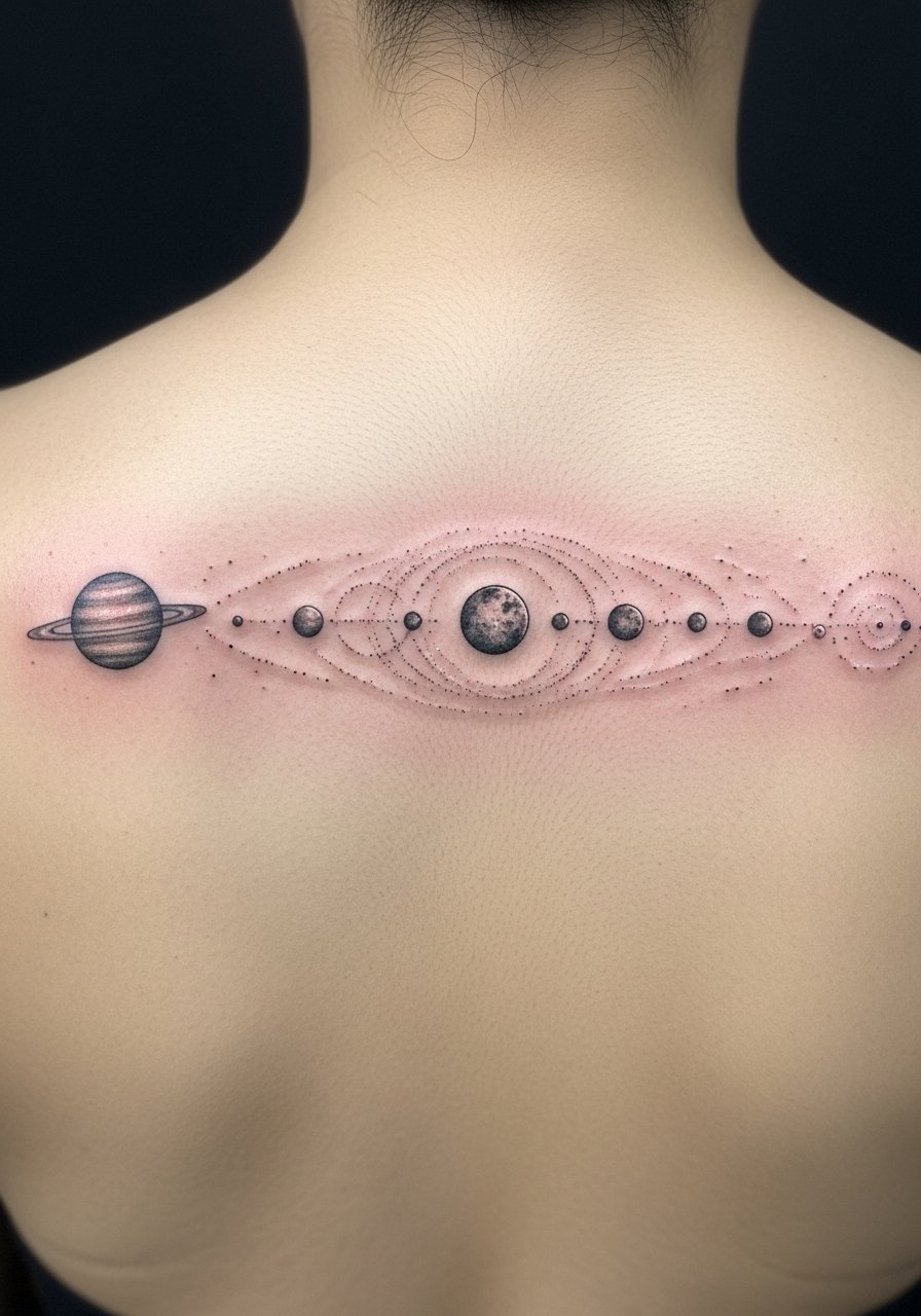
I love small celestial scenes stretched into a band across the upper back. Micro-realism here looks cinematic when the planets have scale variation. Pain is mild to moderate. Sessions are short per planet. Ask your artist to space the planets adequately. Placing them too close causes merging after healing. Many clients want packed detail, which blurs. Give each planet room and ask for crisp outer rings.
18. Baroque Frame With Blackwork Scene Inside
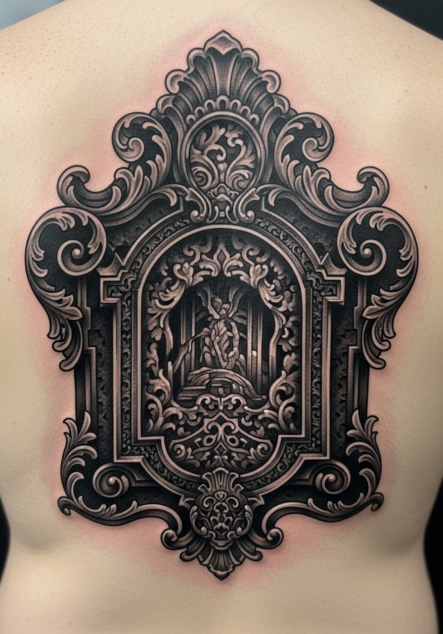
Baroque frames anchor a back piece visually. I noticed the frame often outlives inner detail. Pain around the mid-back varies. Book the frame early. Tell your artist you want the frame to act as a contrasting container. A common error is delicate inner linework that loses contrast against a heavy frame. Balance the inside and outside weight so both age together.
19. Motion Blur Racing Car Poster Style on Full Back
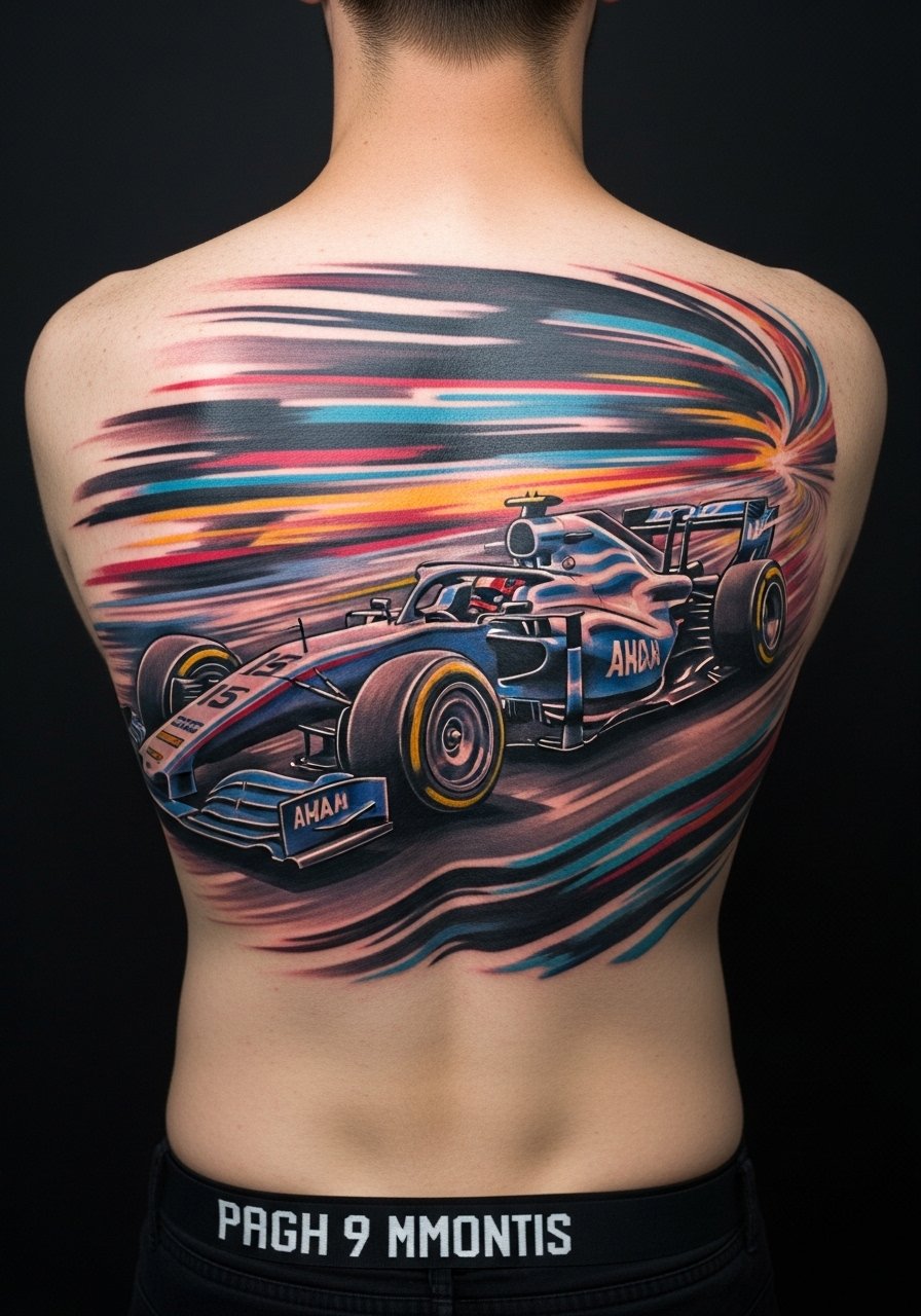
I followed a motorsport fan who got a motion-blur full back piece. The blur effect relies on directional shading and color streaks. This placement will require multiple sessions. Pain is mixed across ribs and back. During consultation ask for reference images with the exact motion direction you want. People sometimes ask for too many fine speed lines that disappear as the ink settles. Request bolder streaks to preserve the motion after healing.
20. Gothic Script Quote Along the Spine
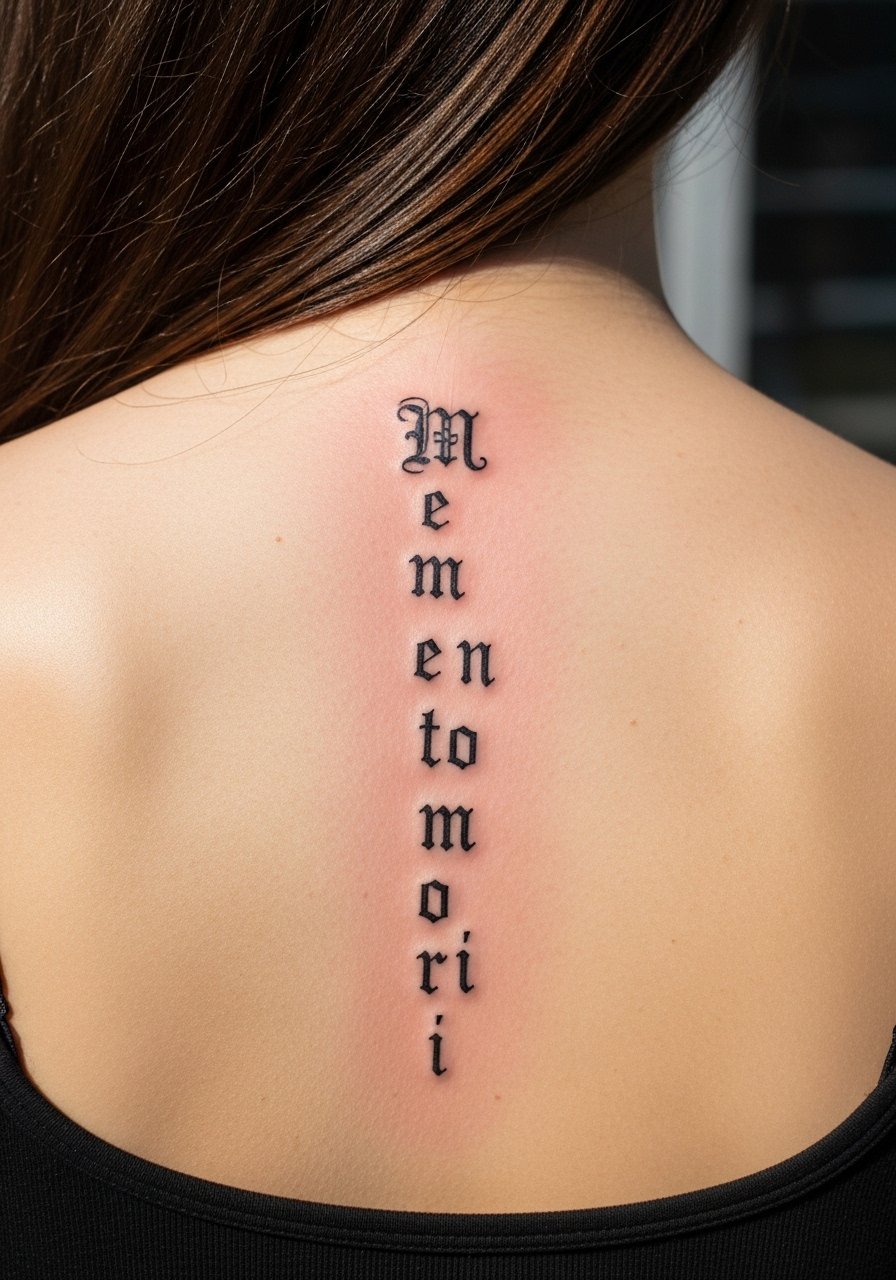
I picked "Memento Mori" for this example because script tattoos need precise wording. Spine script looks striking but can be painful. Sessions are short. Tell your artist the exact phrase and font you want. I recommend a slightly bolder gothic weight for spine script because thin strokes fade first. A common mistake is choosing intricate flourishes that clog after healing. Keep the letters readable at arm’s length.
21. Botanical Chiaroscuro Garden Across Lower Back
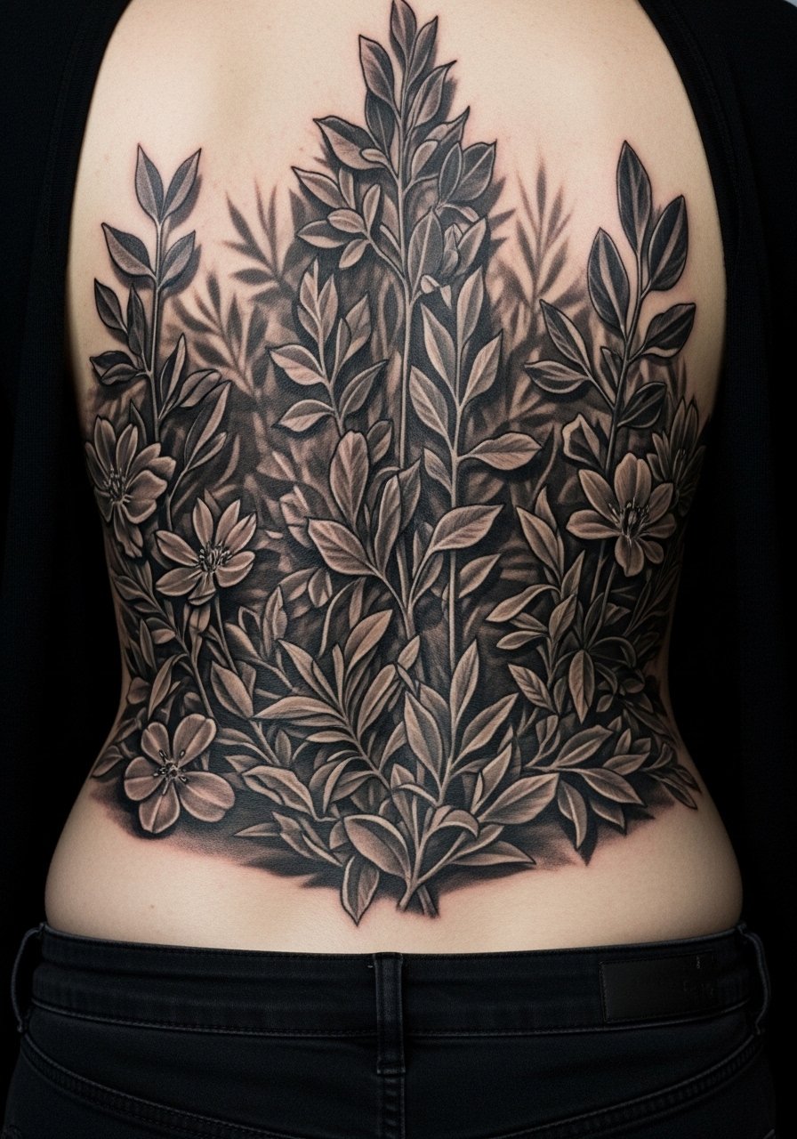
I saw a lower-back garden where contrast was everything. Deep shadows between leaves keep the composition readable as the piece ages. Lower back pain can spike near the spine. Ask for layered shading in staggered sessions. The mistake I see is using too much delicate veining on leaves. Those details blur sooner. Healed, the silhouette survives if the shadow work was solid.
22. Mythic Beast Half-Back Blackwork Panel
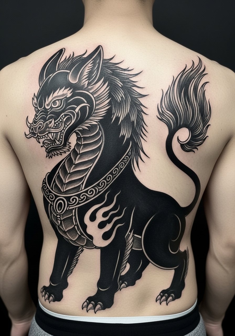
I watched a half-back mythic beast transform after a year because the artist used large blocks of black and planned negative space carefully. Pain is moderate in the flank area. Sessions can be demanding. During consultation map out where the negative space will breathe. The biggest error is filling every inch. Large black areas age predictably, so plan for occasional touch-ups if you want perfect black density long term.
23. Staged Film Poster Collage on Upper Center Back
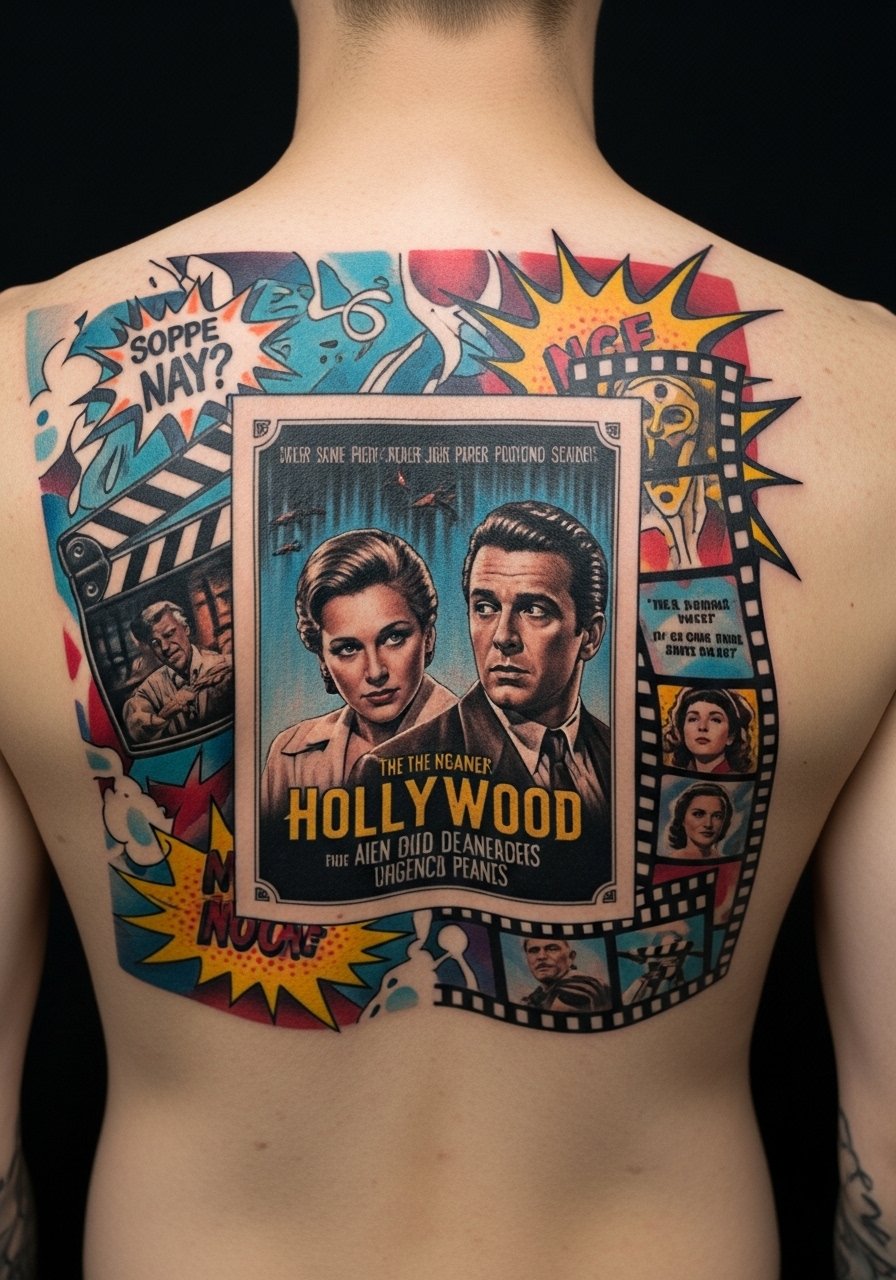
I found one poster-style collage that read like a movie cover from across a room. This placement suits a central focal piece. Pain is moderate. Tell your artist to design hierarchy into the collage so a single element remains the focal point as small elements soften. A typical mistake is balancing all parts equally, which becomes visual noise after a year. Prioritize one clear subject.
24. Surreal Double Exposure Portrait on Mid-Back
Double exposure portraits feel cinematic but demand smart contrast choices. I saw one that used a bold portrait mask with softer landscape fills. Pain is moderate. Sessions are longer. Ask your artist how they will keep the portrait mask crisp as the layered textures soften. A common error is equalizing both images without a dominant mask. Healed, the dominant image should still read clearly.
25. Frame-by-Frame Animation Strip Along Shoulder Line
I saw a small animation strip where each tiny frame was clear because the artist planned spacing and line weight. Shoulder line placement is moderate in pain. Sessions are short and modular. Ask for consistent frame sizing and leave space between frames. When frames are too tight they blur into a single block. Healed, you'll still see the sequence if the frames were sized for skin movement.
26. Posterized Actor Portrait With Bold Color Accents
I admired a piece that treated a portrait like a vintage poster, using flat color pops. This method ages well because flat color and strong edges keep their readability. Pain is variable. Plan for color sessions. Tell your artist which color accents must remain bold. A common mistake is shallow color saturation that dulls quickly. Strong packing and proper aftercare avoid early fading.
27. Gothic Cathedral Facade in Architectural Blackwork
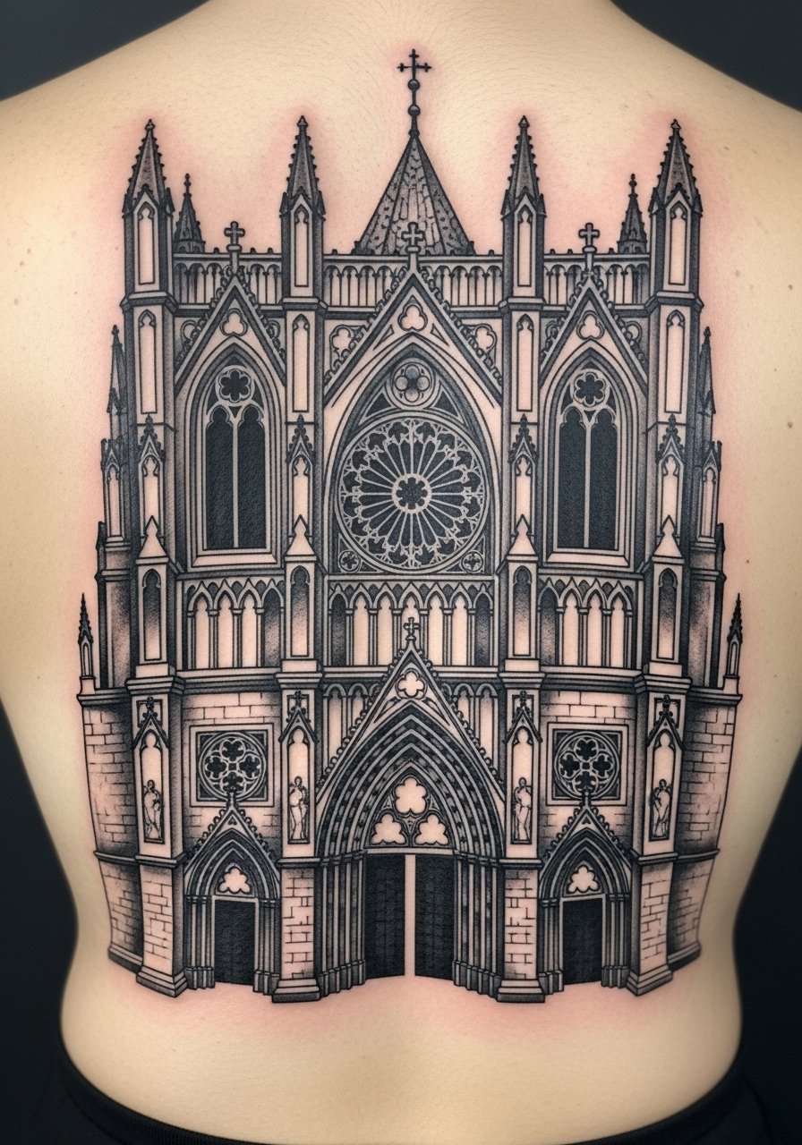
Architectural blackwork can feel monumental. I know artists who sketch in negative space windows to preserve detail over time. Pain can be higher near the spine. Break sessions into linework and fill. A mistake I see is asking for overly fine tracery that becomes indistinct as the skin shifts. Ask for simpler tracery with defined frame lines for long-term clarity.
28. Epic Fantasy Battle Scene Across Full Back
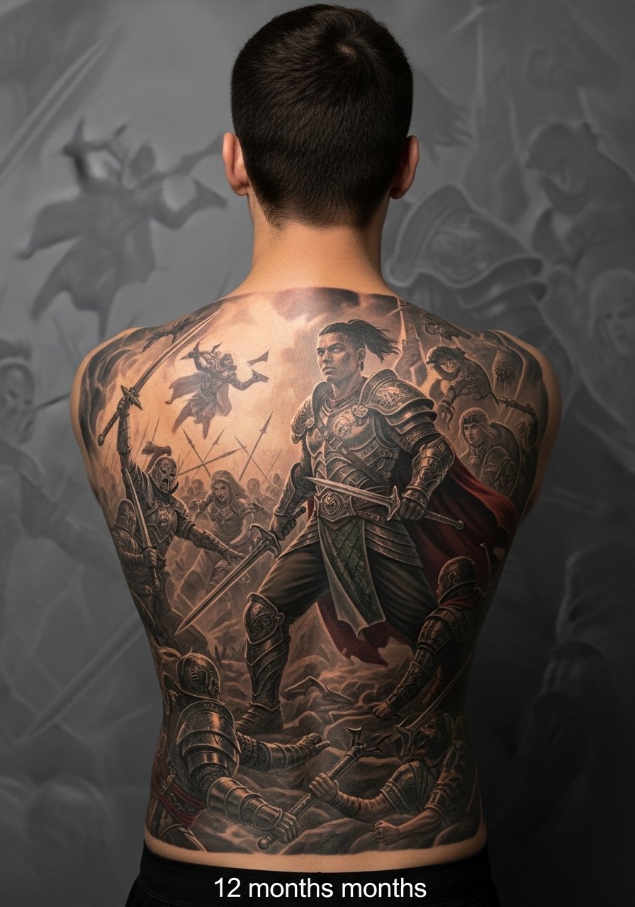
I watched a full-back fantasy battle come alive when the artist prioritized a single heroic focal figure. Full back epic scenes need scale and session commitment. Pain varies by zone and sessions will be multiple. Tell your artist which element you want to remain sharp and which can be more atmospheric. A common mistake is filling every corner with equal detail. When small combatants are too tight they blur into texture after healing. Design hierarchy makes the story readable for years.
Tattoo Prep and Aftercare Essentials
Aftercare is where cinematic back pieces keep their life. I use these products and every artist I've talked to mentions many of them.
Aftercare, Healing, and Prep
- Aquaphor Healing Ointment, 14oz tube. Industry standard for the first 3 to 5 days. I put a thin layer at night
- Saniderm Transparent Adhesive Bandage, 6-inch roll. Second skin method for 24 to 72 hours. Every artist I know recommends it for precise pieces
- CeraVe Fragrance-Free Moisturizing Lotion, 16 oz pump. Use daily from day 4 to 14. Pump bottle keeps it hygienic
- Dr. Bronner's Unscented Castile Soap, 16 oz. Gentle cleanser for twice daily rinses during the first week
- Hustle Butter Deluxe, 5 oz. Vegan option I use during healing and to moisturize healed skin
- Mad Rabbit Tattoo Balm, 2 oz. Long-term maintenance for vibrancy. Artists I know recommend it for healed pieces
- SPF 50 Sunscreen Stick for Tattoos, travel size. Use on healed tattoos whenever exposed to sun. I carry one for outdoor shoots
- Tattoo Numbing Cream with 5% Lidocaine, 30g. Apply 30 to 45 minutes before your session only if your artist approves. Many artists prefer no numbing
- Tattoo Stencil Transfer Paper, A4 Pack. Handy if you want to test placement at home before the appointment
- Hydrocolloid Bandages, Large Size Pack. Good alternative to Saniderm for spot coverage
- Tattoo Aftercare Spray, 4 oz. Useful for keeping large areas moist during early days
Before your appointment I use the transfer paper to test placement and occasionally a numbing cream if the artist okays it. During healing I rely on Saniderm for the first two or three days then switch to Aquaphor for nights and CeraVe for daily moisturization. For long-term color I apply Mad Rabbit or Hustle Butter when skin feels dry. Sunscreen is mandatory for any exposed back piece.
Frequently Asked Questions
Q: Will fine line spine portraits blur if I get a full-sized piece?
A: From what I've seen, spine portraits blur faster when the lines are ultra-thin and the piece is scaled too small. Ask the artist to thicken key contours and add subtle mid-tone shading so the portrait keeps depth. During consult show the photo size and lighting. Use Aquaphor in the early days and switch to a moisturizer like CeraVe for long-term care.
Q: Do watercolor auroras need different aftercare than neo-traditional color?
A: Yes. Watercolor washes benefit from a gentler touch and minimal rubbing. I pat them dry more carefully and avoid heavy ointment layers that can smear pigment early on. For the first week I rely on diluted Castile soap like Dr. Bronner's and then switch to a light moisturizer such as Hustle Butter. Neo-traditional pieces accept more robust packing so they handle standard ointment routines better.
Q: How should I ask my artist to make a full-back cinematic scene age better?
A: Tell them you want a clear focal hierarchy, bold foreground contrast, and softer background atmosphere. From what I've gathered, prioritize one central figure or element with stronger lines and let secondary details breathe. Also ask about planned touch-up windows. Use Saniderm for initial healing and keep sun off the piece with an SPF 50 stick after it's healed.
Q: Are negative space designs better for people who wear tight shirts often?
A: In my experience, negative space designs can look cleaner longer if the black areas are packed properly. Tight clothing causes friction and can dull delicate strokes. When you consult ask your artist to emphasize larger shapes and avoid tiny filigree. For healing, Saniderm and a gentle moisturizer help reduce rubbing effects.
Q: My artist recommended numbing for a large back session. Should I use it?
A: Use numbing only if your artist agrees. Some prefer clients without it because it alters skin tone and makes shading tricky. If approved, a 5% lidocaine cream applied 30 to 45 minutes before can make long sessions manageable. I test it on my skin first and discuss any meds with the artist. Keep your aftercare kit ready with Aquaphor and CeraVe for the days that follow.
Q: How often will I need touch-ups on bold blackwork versus watercolor back pieces?
A: Bold blackwork tends to hold longer and needs fewer touch-ups, usually a small correction after a year or two in my experience. Watercolor pieces often require refreshes sooner if you want high vibrancy. Sun exposure speeds up both types fading. For maintenance I use products like Mad Rabbit Balm and strict SPF protection.
