
A crisp, well-placed Sagittarius mark can read as a quiet badge of curiosity or a full mythic scene that fills your back. Pick the size and line weight based on how you want the piece to age, and plan clothing for the session so the artist has clean access. Below you will find clear options that solve common problems like skinny line blur, crowded tiny stars, and how to wear the tattoo while it heals.
1. Classic Bow and Arrow on Inner Forearm
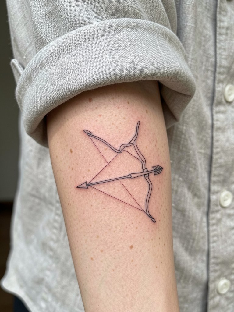
The classic bow and arrow reads instantly and fits the inner forearm like it was meant to be there. I recommend a slightly heavier line weight than your Pinterest reference so the shaft and arrowhead keep definition after a few years. For the session, wear a loose short-sleeve or a shirt you can roll up easily to let the artist see the whole palm-up surface. If you want a subtle twist, add a tiny star cluster near the tip rather than tiny flourishes that crowd the shaft. Expect a one-session piece, mild vibration discomfort, and a touch-up chance around year two if you keep it very thin. A common mistake is requesting hairline strokes that disappear on the inner forearm texture.
2. Micro Constellation Behind the Ear
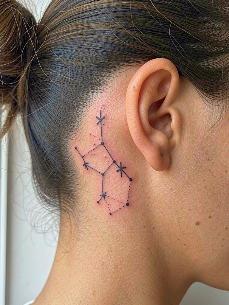
Tiny constellations work well here because the area stays mostly protected from sun and abrasion. If you choose delicate dots, ask for slightly larger star dots and a touch more spacing so they do not blur into a single line as the skin settles. There is a clear split in opinion among artists about micro-dot work. One camp says micro fine dots are elegant and fine for behind-the-ear placements if the dots are punched with a little extra saturation. The other camp argues that anything too small will become indistinct within one to three years and recommends bolder dot sizes instead. Both positions are valid, so show your artist healed example photos that match the dot scale you want.
3. Centaur Silhouette on Outer Forearm
A centaur silhouette gives you myth and movement without tiny fiddly detail. It ages well because the silhouette relies on mass, not micro lines. Plan for a medium session length and moderate pain. During consultation bring two scale references so you can see how the silhouette reads at three inches versus six inches. A mistake is trying to cram too much anatomy into a small silhouette. If you want to show off the piece, pair it with a cropped jacket or a plain white tee when you go out. Mention to the artist that you want solid black saturation in one pass to avoid patchy fill later.
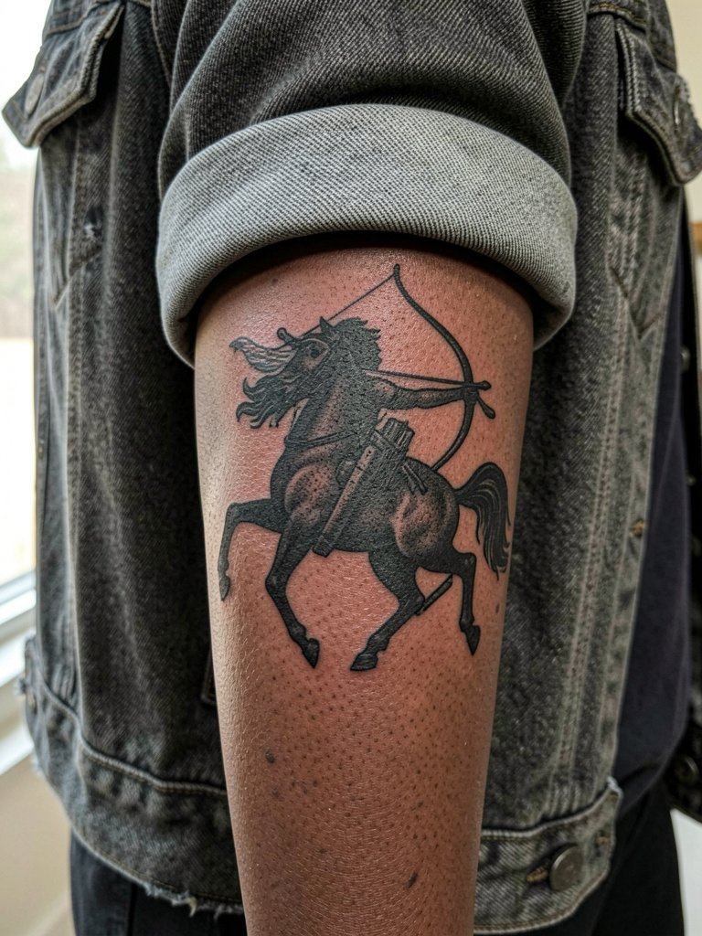
4. Archer in Motion Across the Shoulder Blade
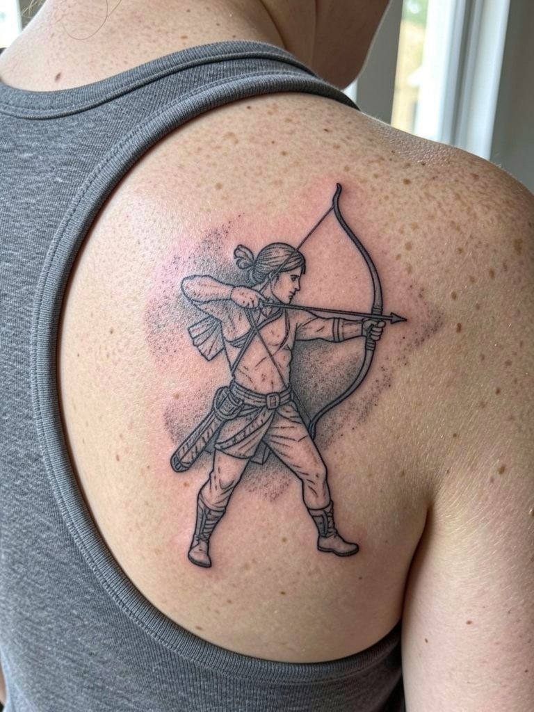
When you want energy, a dynamic archer that follows shoulder blade curves looks great in motion. This placement needs a slightly larger composition so limbs do not collapse into each other as the skin moves. Session feel is longer because of the area size, and you will want to plan clothing that lets the artist work unimpeded. The common error is tiny limbs or an elbow placed too close to the spine, where movement causes distortion. Ask for contour lines with modest negative space around the figure so the posture reads from a distance.
5. Watercolor Bow with Splash Accents
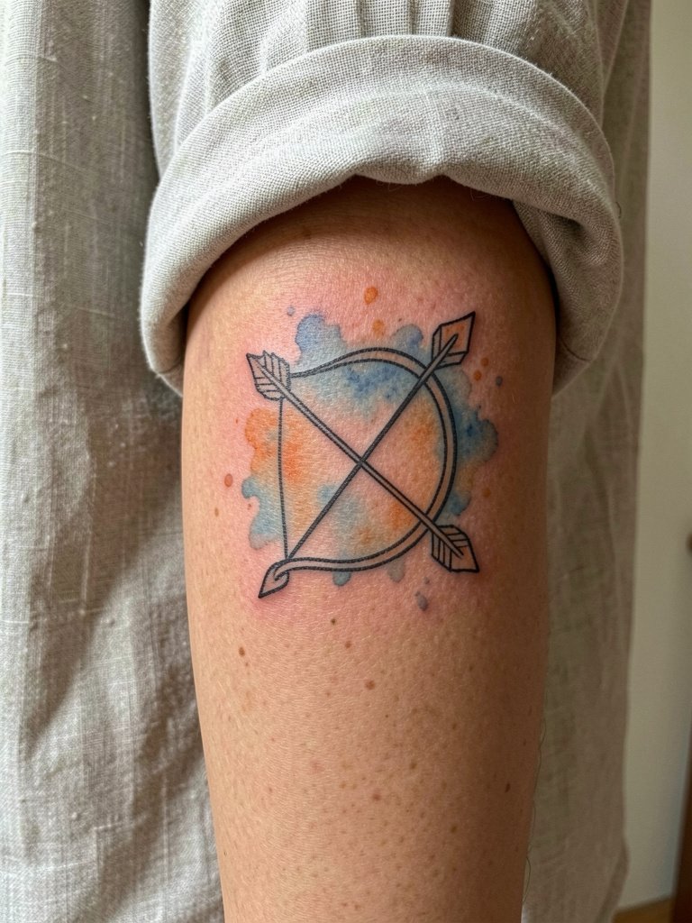
Watercolor gives the Sagittarius bow a loose, painterly energy, but artists disagree on color longevity. One camp loves watercolor because it reinforces the fire-sign feel with expressive pigment and softer edges. The other camp points out that watercolor fades and can muddy over time, and they recommend black-and-gray accents to preserve contrast. If you favor color, keep the watercolor as an accent behind solid black linework so the shape stays readable. For the session wear a short-sleeve shirt you can roll, and expect a slightly longer healing time where color saturation is used.
6. Bow with Floral Accents on Inner Upper Arm
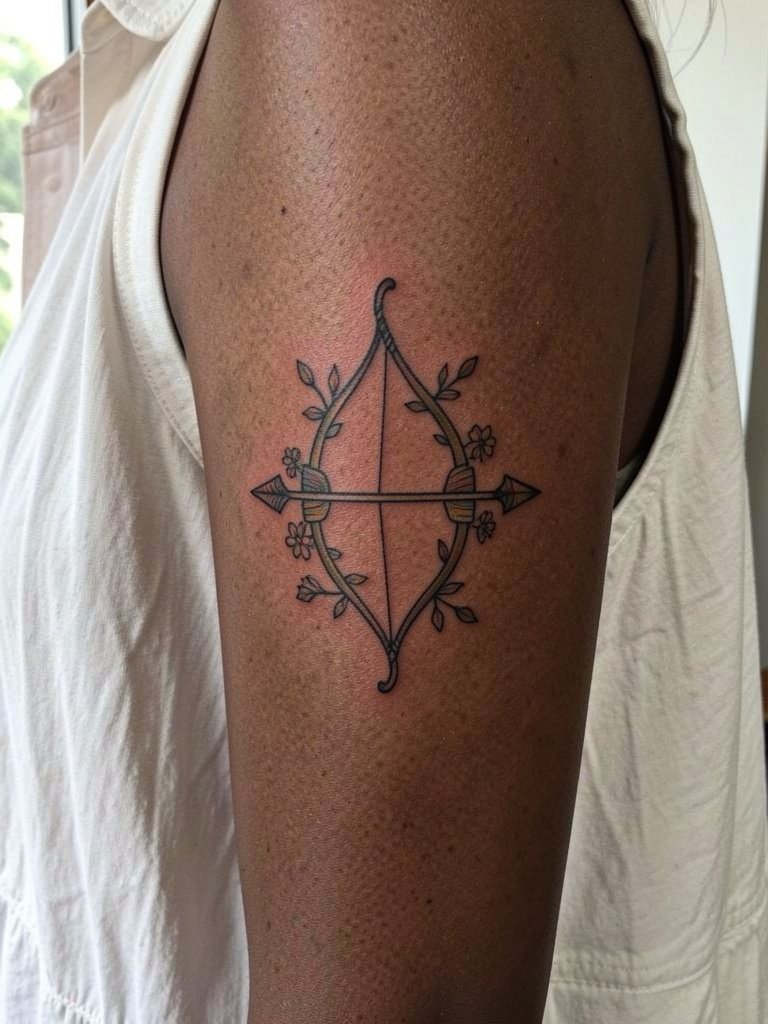
Floral accents soften the archer symbol and adapt well to the inner upper arm's smooth canvas. This placement hides easily and is lower on the pain scale than ribs. During the consult, provide exact flower references and point out which elements should stay black only to prevent color bleed. A common mistake is asking for many tiny petals that get lost when the arm shifts. For showing off, a racerback top or sleeveless blouse frames the piece nicely and keeps the skin accessible for touch-ups.
Session Day Essentials
The tiny wrist and behind-the-ear designs above heal differently from larger forearm and upper-arm pieces, so pack a few items that make the first week easier.
- Bepanthen Tattoo. A gentle cream many people use in the first days when a heavier ointment feels too thick, helpful for sensitive skin on the wrist and behind the ear.
- Easy Tattoo cream. Lightweight formula that soothes small fine-line areas without leaving a greasy film during the first week.
- TattooMed Aftercare Lotion. A structured lotion option for people who prefer a tattoo-specific maintenance step after the initial healing window.
- H2Ocean Aftercare Spray. Handy for quick, minimal-contact cleansing during a busy week when you want to avoid over-touching.
- Second skin bandages. Protective film for the first few days that reduces scab friction on high-movement spots like the wrist or ankle.
7. Tiny Glyph on the Wrist or Finger
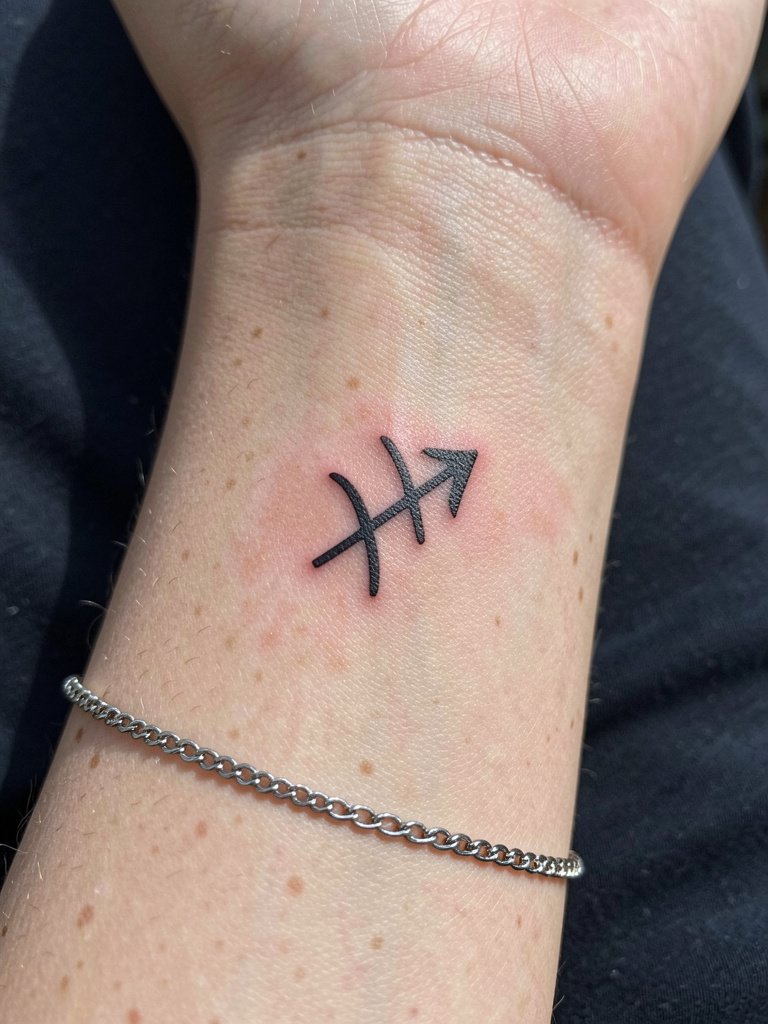
A glyph is low-commitment and sits well on the wrist or finger. Keep the glyph slightly larger than the tiniest reference so the symbol does not blur. Fingers are highest risk for fading and touch-ups, and you should expect more frequent touch-ups there than on forearm skin. For session comfort, remove rings on that hand and wear short sleeves. To style the finished piece, a thin chain bracelet or minimalist watch on the opposite wrist balances the look. If you want a very discrete mark, place the glyph on the inner wrist rather than the finger for better longevity.
8. Starry-Night Arrow on the Calf
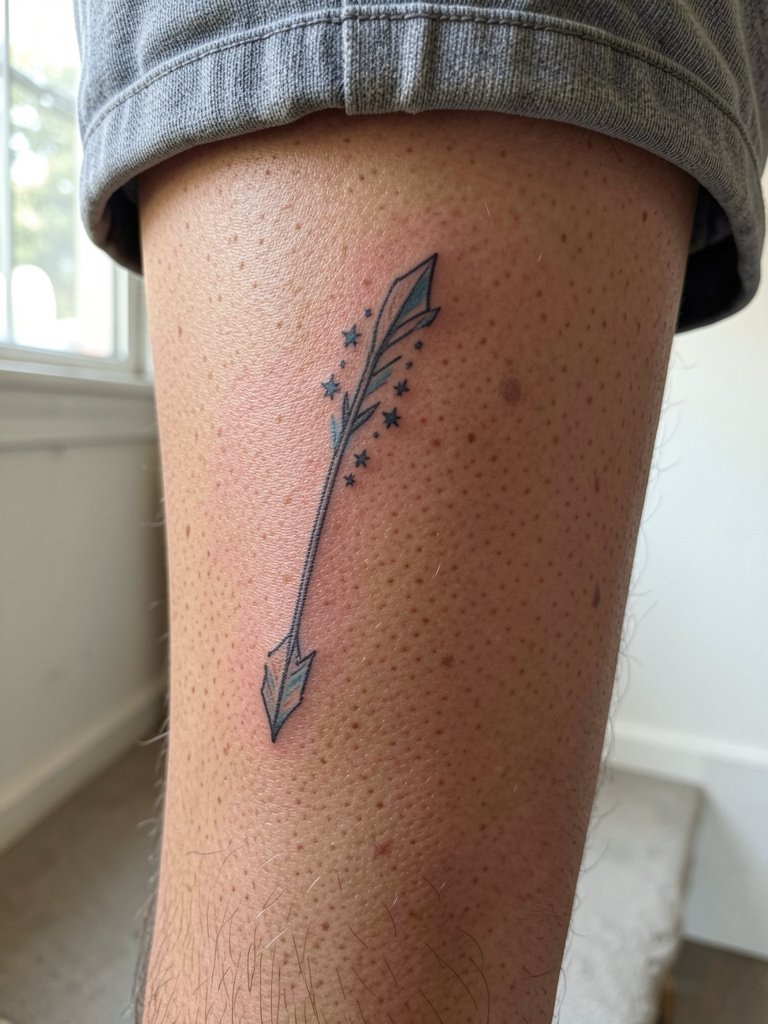
A starry-night arrow reads like travel energy on the calf, and the area gives the artist room to play with star spacing. Calf skin tolerates medium detail and ages predictably. The session can be slightly uncomfortable when the needle crosses denser muscle, but most people manage it well. Avoid packing the arrow with micro stars; use spaced clusters so each star keeps its dot-work integrity. For a summer reveal, pair the piece with shorts or a midi skirt with a side slit.
9. Ornate Arrow at the Nape or Neck Line
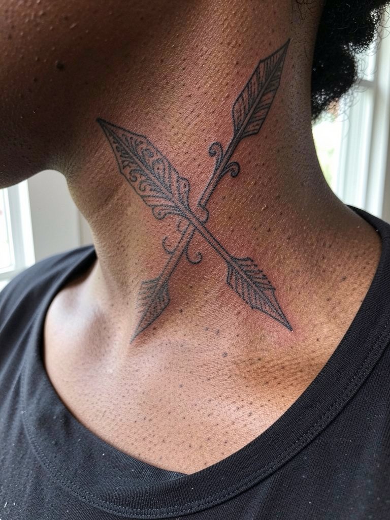
An ornate arrow feels jewelry-like at the nape or side neck. Keep the piece slim with patterning that reads at a smaller scale. Neck skin shows motion and sun exposure, so plan for extra touch-up possibility over the years. For session wear choose a wide-neck or scoop-neck top that lets the artist access the area without you lifting or pulling fabric. If you want to hide the tattoo often, the nape is ideal. A common error is requesting filigree so small it becomes a blur when the neck moves.
10. Short Quote with Tiny Glyph on the Collarbone
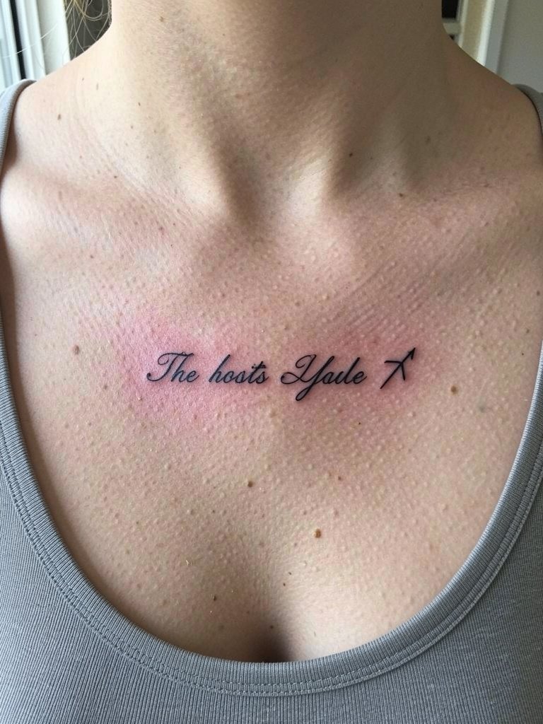
Script on the collarbone can be elegant, but thin script needs breathing room from the clavicle. Bring the exact short phrase in the font size you want and ask for a mock stencil held in place so you can see spacing. For session access wear a wide-neck shirt or off-shoulder blouse. Delicate layered necklaces that sit below the ink pair well when you show the piece, but avoid anything that rubs the fresh tattoo during healing. Plan for one session for short text, and expect that touch-ups may be needed to restore crisp letter edges after a year or two.
11. Constellation with Stars and Moon on Upper Back
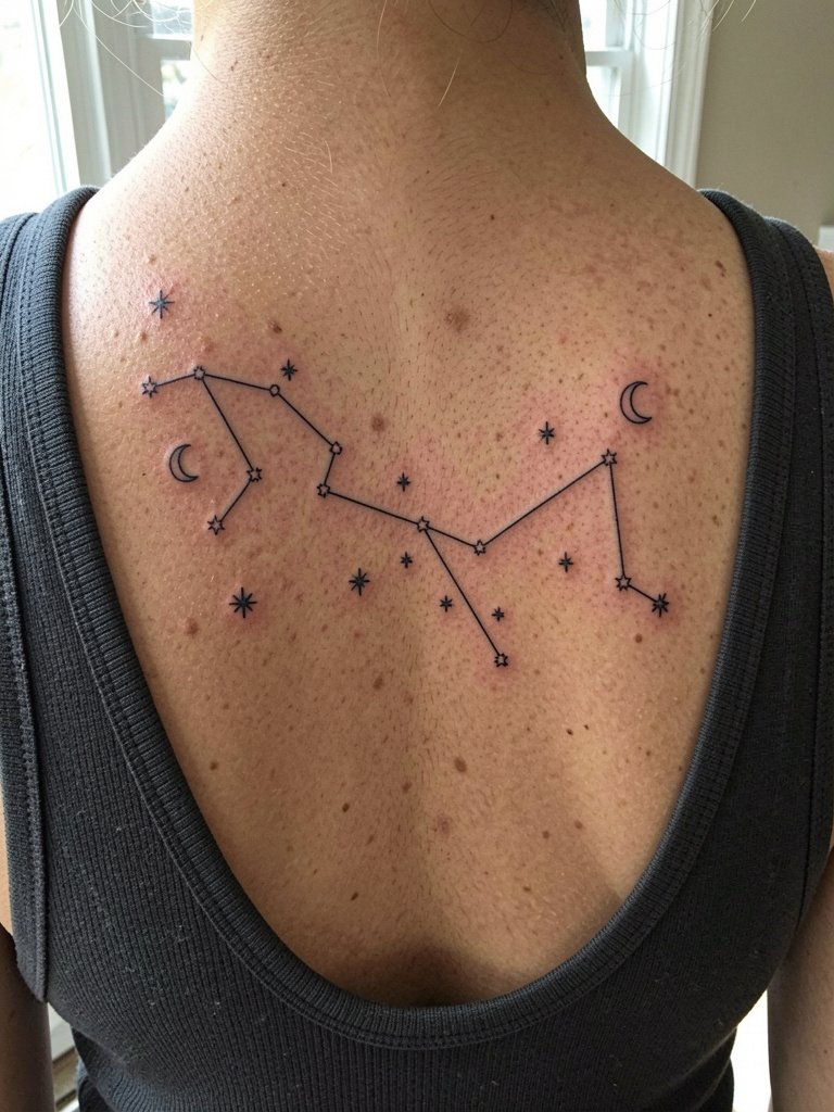
Celestial add-ons give a constellation a broader atmosphere and better reading at a distance. The upper back is large enough to hold spaced stars and a small crescent moon without crowding. During the consult show the artist where you want the constellation axis to sit relative to the spine so it follows natural contours. For reveal moments wear backless dresses or racerback tops to show the scene. Expect minimal blowout risk on the upper back compared with the wrist, but plan for a two-session rhythm if you want extra stipple shading around stars.
12. Bold Blackwork Sagittarius Symbol on the Forearm
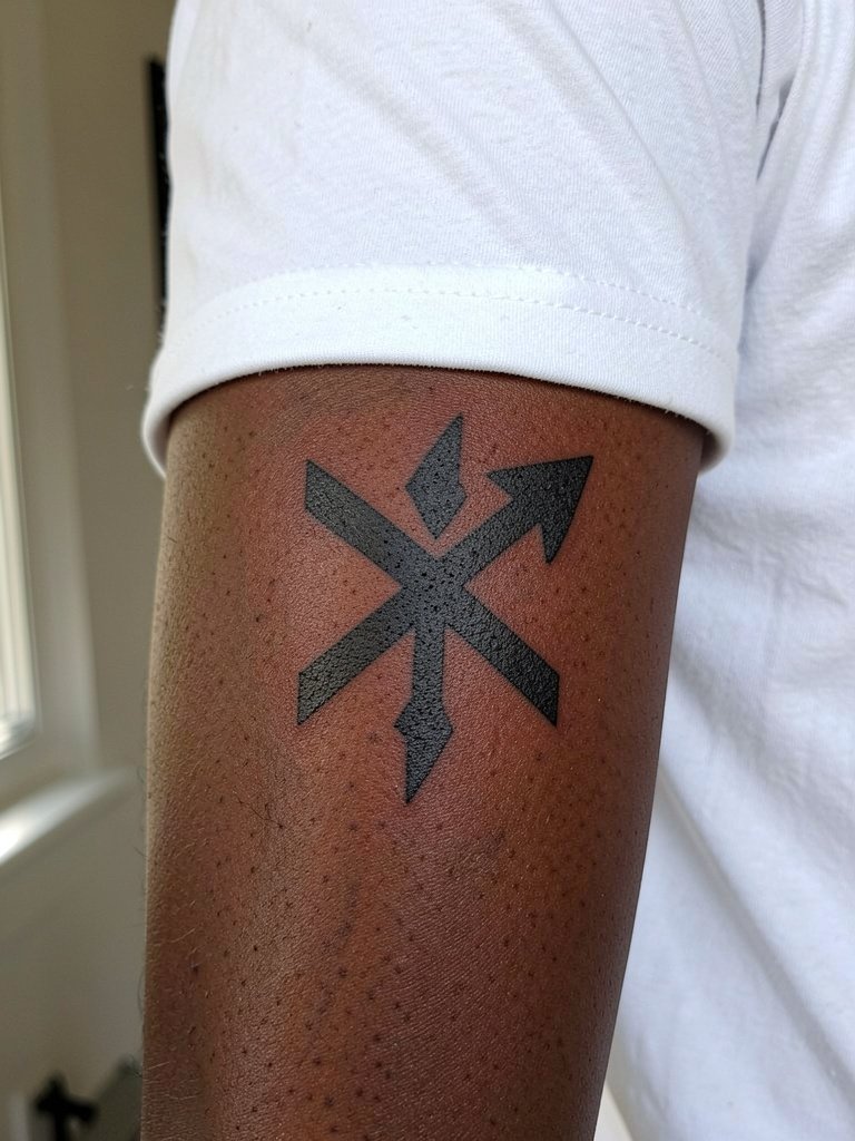
Blackwork is the durability option when you worry about year-five blur from skinny lines. Thick shapes and strong contrast stay readable across skin types. If you like the glyph look but want longevity, ask for a bolder silhouette and slightly more space inside the symbol. The forearm is forgiving for bold work and the session tends to be brisk. A common mistake is asking for a black-filled glyph with tiny internal detail that vanishes; let big shapes do the heavy lifting.
13. Sagittarius with Fire Motif on Outer Upper Arm
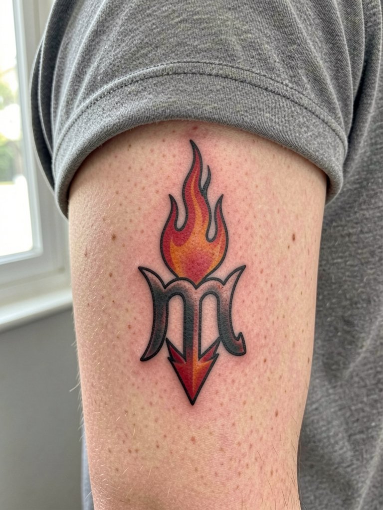
Fire elements emphasize the sign's element and add motion to a glyph or arrow. Color accents look lively, but keep the colored areas small and saturated so they age with more clarity. During the consult specify which flame areas should remain black and which can take color. The outer upper arm tolerates color well and the session is moderate in length. Avoid watercolor fills that spread into the flames if you want tighter longevity.
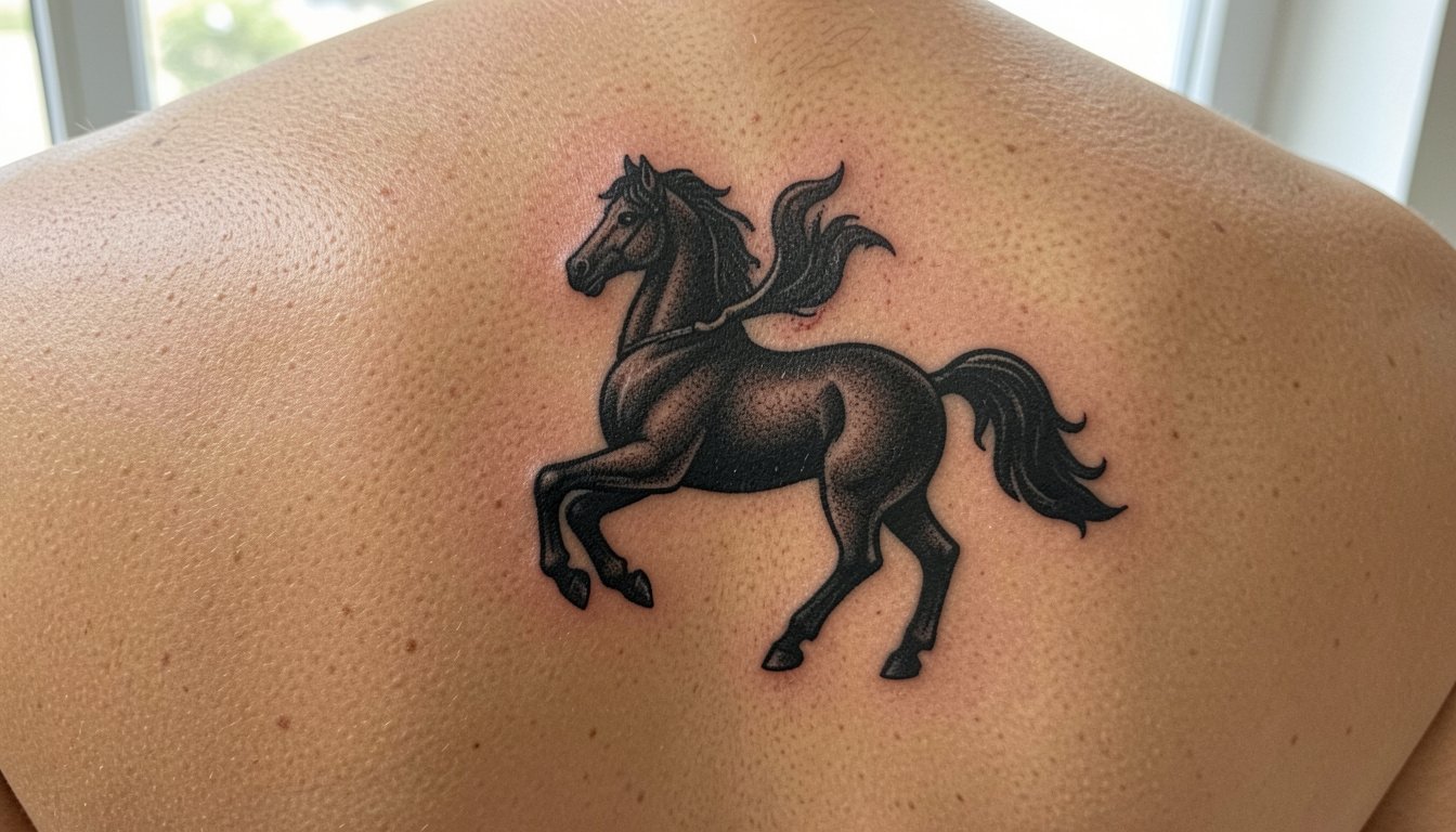
14. Ornate Full Centaur Back Piece
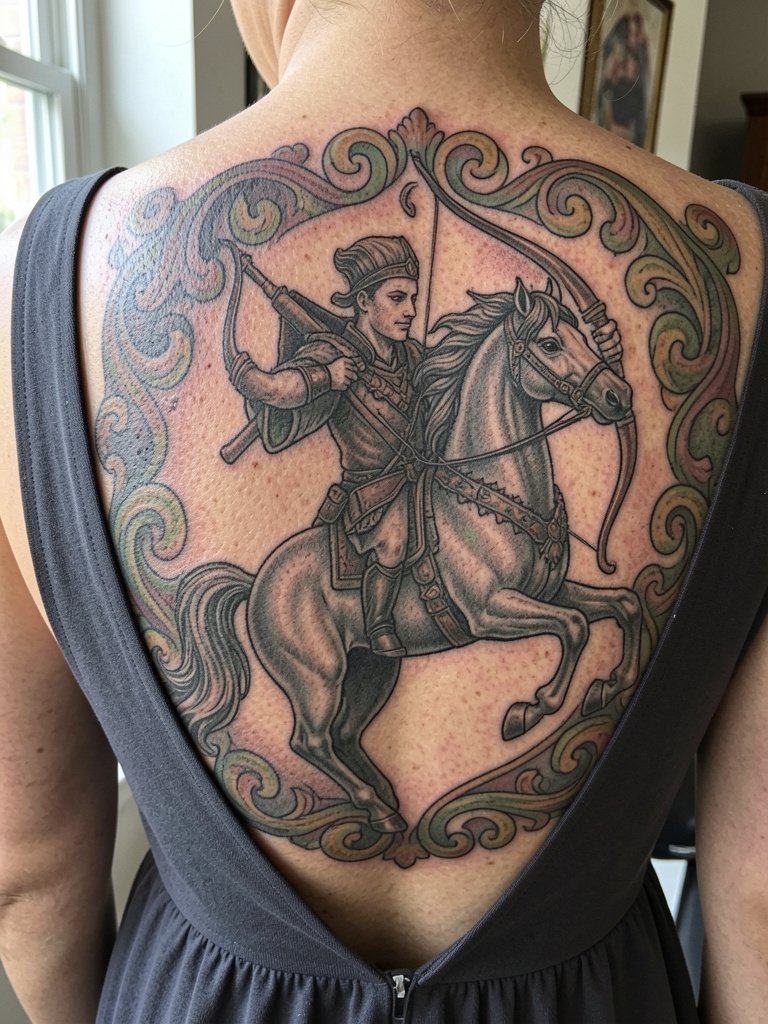
A large centaur back piece is for collectors who want the mythic reading to be unmistakable. This work requires multiple sessions and careful planning of negative space to avoid muddy shading. Bigger scale solves the "reads like a blur" problem of tiny centaur attempts. For session wear a button-up shirt or zip-front top you can remove without touching your back repeatedly. Expect deeper saturation passes and at least one follow-up session for smoothing. If you plan color, pick conservative accents so the main black-and-gray form stays anchored.
15. Minimal Arrow with Negative-Space Stars on the Ankle
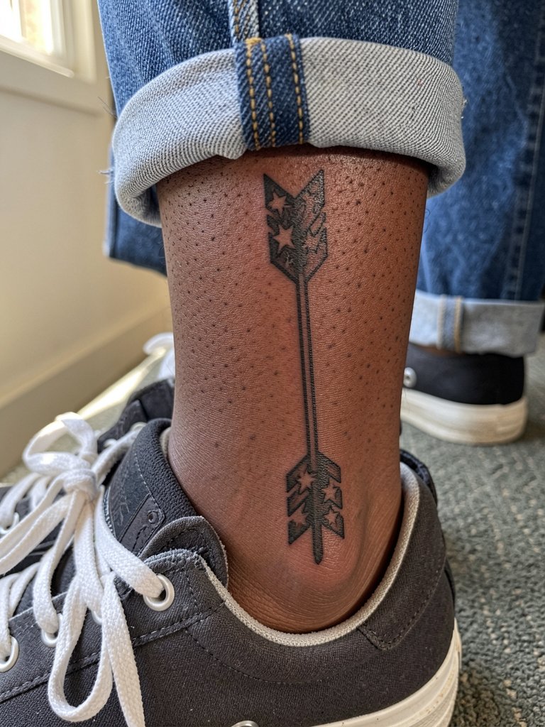
Ankle placements work for small arrows, but friction from shoes and socks is a real issue. Keep the design clean with fewer details so negative-space stars remain crisp. Session wear includes rolled pants or shorts and a plan for light footwear during the first week. The ankle often needs a touch-up after the initial healing, so schedule follow-up availability. Avoid tiny dot clusters that face constant abrasion from footwear.
Frequently Asked Questions
Q: How much should I budget for a small Sagittarius tattoo like a glyph or tiny arrow?
A: Expect a range rather than a fixed price. For a tiny glyph or small arrow budget for the lower tier of local shop minimums up to a modest one-session price. Larger or color-added pieces move into higher brackets. Plan to tip your artist in the 15 to 25 percent range if the shop culture supports tipping.
Q: Which placements hurt the most for Sagittarius designs and how can I prepare?
A: Ribs and sternum are commonly higher on the pain chart, while outer forearm and calf are lower. For sensitive placements pre-apply a topical numbing product if the artist allows it, and choose loose clothing like a loose tank top that gives full access without rubbing during the session.
Q: Will a fine-line constellation blur faster than a bold glyph?
A: Artists split into two camps on this. One group favors fine line for its delicate look and says it works well if the dots and lines are given slightly larger scale. The other group recommends bold line for longevity because tiny spacing can collapse. Both approaches work when the scale matches the placement and the artist adjusts depth and spacing.
Q: How do I find artists who post healed photos and specialize in Sagittarius motifs?
A: Search social platforms by hashtags like #sagittariustattoo, #zodiactattoo, #finelinetattoo, and #blackworktattoo. Use location filters on Instagram and TikTok, and check directories with keyword combos such as "Sagittarius constellation" or "fine line bow and arrow." Reddit threads on r/tattoos and r/tattooadvice are useful for healed-photo discussions and booking tips.
Q: What should I ask during the consultation to avoid a shrinking, blurred fine-line tattoo?
A: Bring two reference images at different scales so the artist can show you what reads at three inches versus five. Specify that line weight should be slightly heavier than your smallest reference and point out any elements you want to preserve as bold shapes rather than tiny detail. Ask to see healed photos of similar-scale work.
Q: Can I get color and still keep the design readable long term?
A: Yes, if you use color as an accent rather than the main structure. Many artists recommend keeping the core linework in black and adding limited color splashes to reinforce the motif. Larger compositions handle color better, while tiny placements benefit from single-needle black with selective color touches rather than full watercolor fills.
