
Someone I know spent six months bookmarking lyric snippets before realizing the real challenge was choosing a line that still reads like them at fifty. I spent time in five shops across Brooklyn and watched fine line scripts fade into soft gray in some portfolios and hold crisp in others. These 20 dark lyric concepts pair moody One Direction lines with styles that age reliably, and tell you what to ask for at the consultation.
1. "What Makes You Beautiful" in Fine Line on Inner Forearm
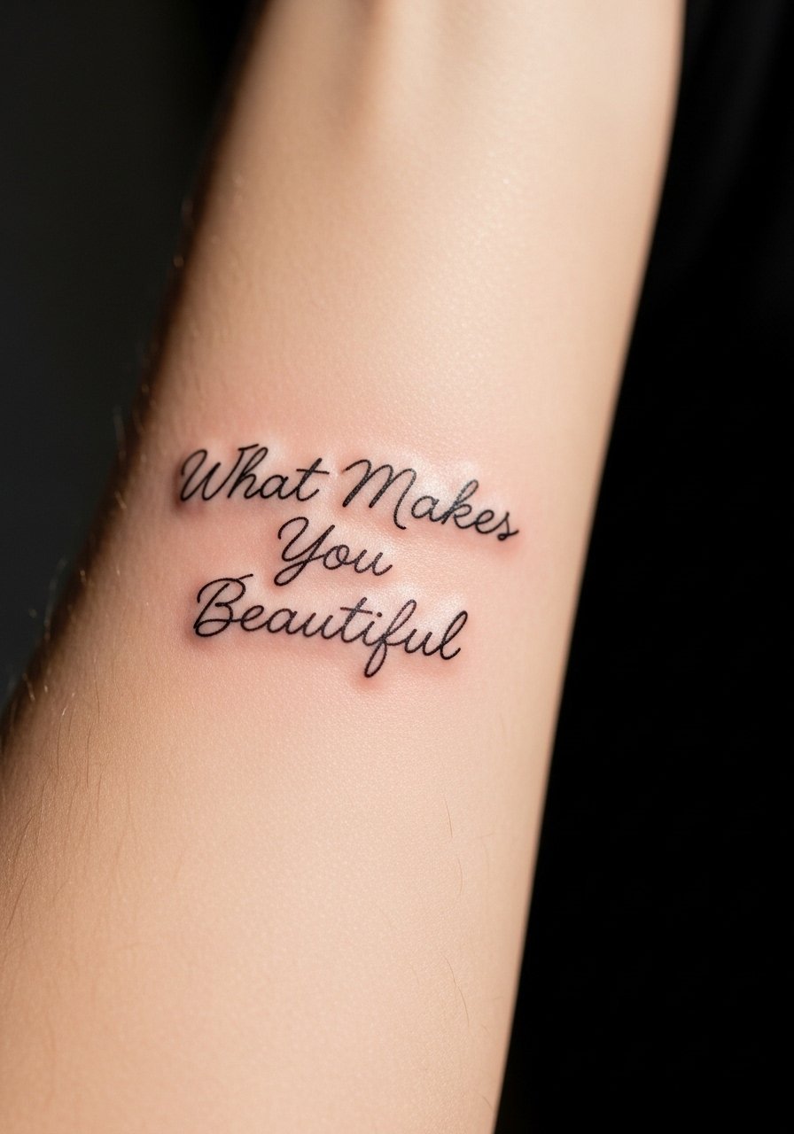
Someone I know first saw this lyric as a tiny homage and later added shading around it to anchor the script. Fine line here reads intimate and personal. Tell your artist you want even spacing between letters and slightly looser kerning so the script has room to breathe as it settles. Fair warning, fine line blurs faster on skin that stretches, so expect a touch-up around year two to three. Pain is mild for the inner forearm and the session will usually be under an hour. Avoid asking for ultra-tiny lettering that sits too close together. That is the most common mistake that leads to a muddy healed result.
2. Minimalist "Up All Night" Arc with 1D Logo on Collarbone
When you want something discreet and wearable, the collarbone arc reads like jewelry. Ask for single-needle linework with a steady baseline so the letters follow the curve cleanly. The biggest aging issue is movement and sun exposure, so plan for gentle sunscreen once healed. The collarbone is sensitive, so expect a sharper sting than forearm work. This placement tends to need fewer touch-ups if the script is not too thin. If you want it to peek from a shirt collar, ask the artist to map the arc while you stand up. That makes sure it sits where you expect.
3. Watercolor "Story of My Life" Wrist Wrap with Black Script
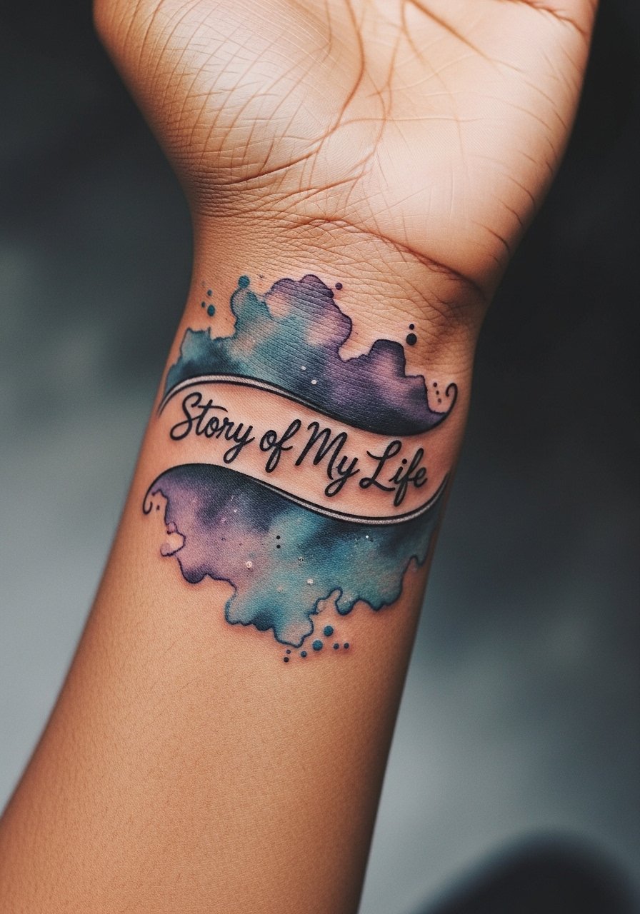
Most watercolor from a decade ago looks like a bruise now. This wrist wrap avoids that by keeping the text in solid black and using watercolor as a soft halo rather than a fill. Tell the artist to keep the color edges feathered and not packed, and to prioritize saturation where the skin takes pigment easily. The wrist is a high-movement area so colors will fade faster. Expect a shorter touch-up window for the watercolor than the black text. Pain is moderate. For visibility on medium to dark skin, ask for slightly higher pigment saturation in the linework so the lyric stays legible.
4. Neo-Traditional Four Arrows Cluster with "Together" Banner on Upper Arm

This is for collectors building a sleeve. Neo-traditional linework and bold saturation help the symbol stay readable at a distance. During the consult, show reference palettes and decide whether you want the banner script serif or script. The upper arm tolerates bold saturation well, and blowout risk is low there. Sessions usually run two hours if color is involved. A common mistake is crowding small arrows too close together. Give each arrow breathing room so the cluster does not merge over time. Expect to come back for a color boost at year three to five.
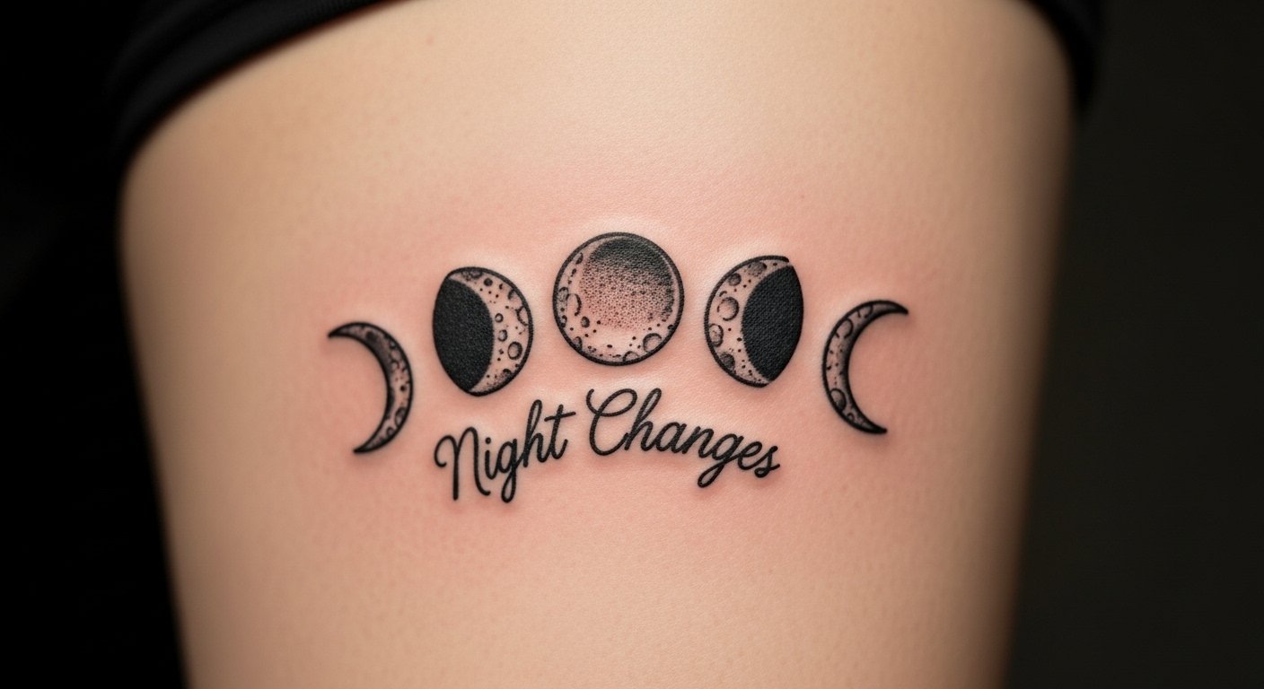
5. Blackwork "Night Changes" Moon Phases with Lyric on Ribcage
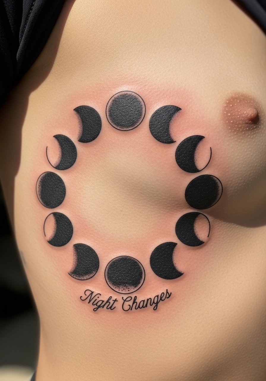
Fair warning, the ribcage is a seven out of ten on most pain scales. But the canvas is excellent for blackwork. Artists split on fine line on ribs. One camp says skin stretch and breathing blur lines within two years. The other camp says with correct needle depth and spacing, fine line settles fine on ribs. Ask your artist where they stand and request slightly bolder script if you lean toward longevity. Black filled phases age nicely and hide minor blurring better than thin lines. Expect two to three sessions for a larger ribcage piece and plan for a touch-up after healing.
6. Micro-Realism Microphone Outline with "Drag Me Down" Behind the Ear

Behind-the-ear micro pieces are tiny statements that feel private. Tell your artist you want crisp contrast and shallow depth to avoid scarring. The area heals fast but lines can feather if placed too small. Session time is short, under 45 minutes. A common mistake is going smaller than 1.2 centimeters. Anything tinier risks loss of detail in a year. Because placement is visible only when hair is up, consider how often you will expose it. Expect a touch-up at year two if you want the tiny script to stay legible.
7. Ornamental "Perfect" Lyric Mandala on Shoulder Blade

This pattern traces to mandala traditions, so many people choose slight variations rather than direct replicas. For this shoulder blade piece, ask for stipple shading and dot work to keep contrast without heavy solid fills. The shoulder blade sees low friction, so linework holds well and sessions are comfortable. A common mistake is packing the mandala too densely, which makes dot work blend as it heals. Space the dots and lines to allow natural skin movement. Expect this to need a touch-up after two to three years for crisp central letters.
8. Ignorant Style "Live While We're Young" Block Letters on Outer Ankle

There is something about thick black outlines that read from across a room and age predictably. The ankle sees friction from socks and shoes so expect faster edge wear. Ask your artist to keep a clean gap between letters so the black stays tidy instead of bleeding into one shape. Pain is moderate. Session time is usually under an hour. The common mistake is making letters too thin in an ignorant style. Keep the strokes substantial to avoid early touching up. If you work in a conservative job, remember ankle placement is easy to hide.
9. Stipple-Shaded "Half A Heart" on Sternum with Tiny Script
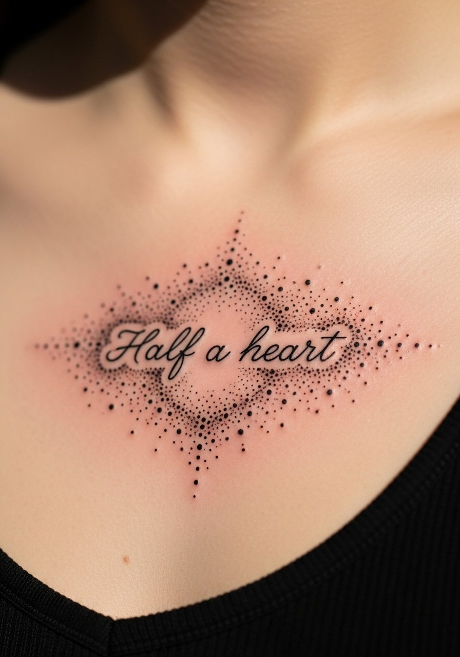
Sternum work is sensitive and demands an artist experienced in stipple shading. The pain is high and sessions should be planned with breaks. Tell your artist you want dot work with gradual saturation so the central script remains clear. One mistake I see is overworking this area during one long session. Break it into two shorter sessions to avoid excess swelling. Stipple holds beautifully if spaced correctly. For visible text across the sternum, expect more frequent touch-ups than on limbs.
10. Constellation Map with Lyric Dates "We Were Young" Along a Rib Line
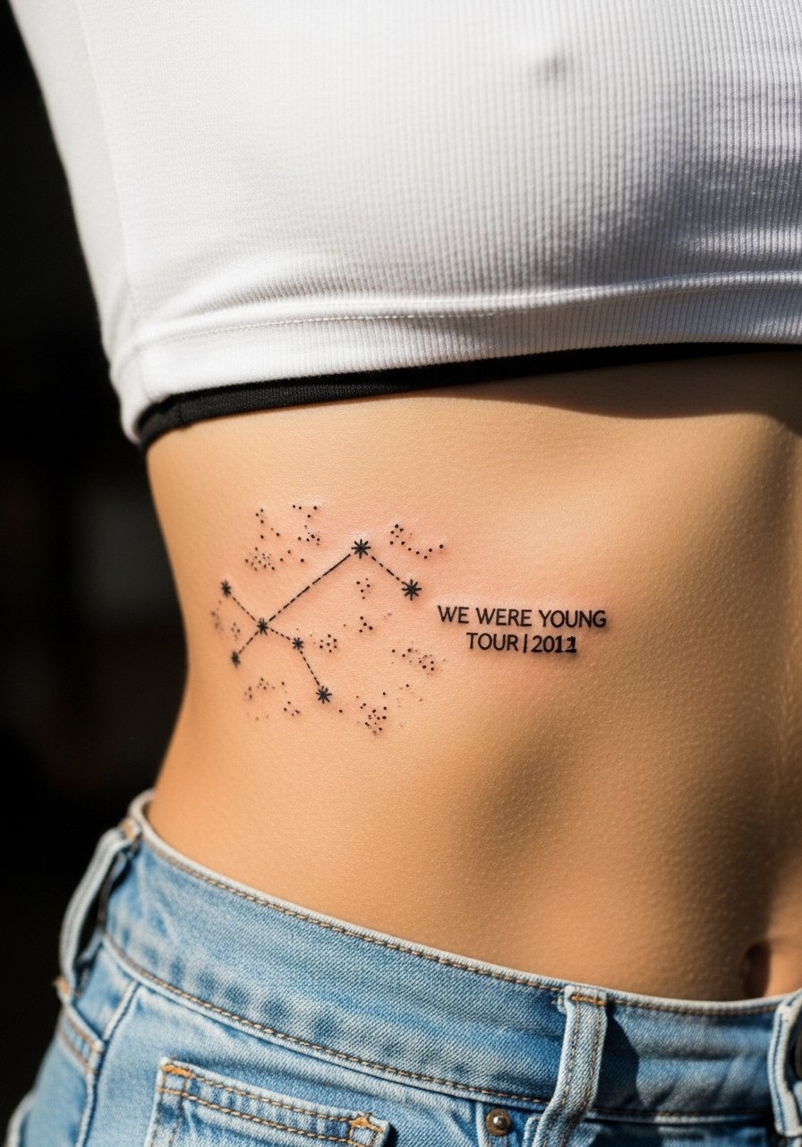
Lyrics integrated into constellation maps make for a private map of dates and memories. When you include numbers or dates, specify exact text like XII.XI.MMXV. The rib line placement is dramatic but moves with breathing. Ask your artist to plan star spacing so the constellation reads at rest and when you shift. The main mistake is crowding tiny stars close to script. Give each element space to preserve clarity. Expect moderate pain and a likely touch-up within two to three years for the tiny points.
11. Dark Script "Fireside" in Blackwork on Side Thigh
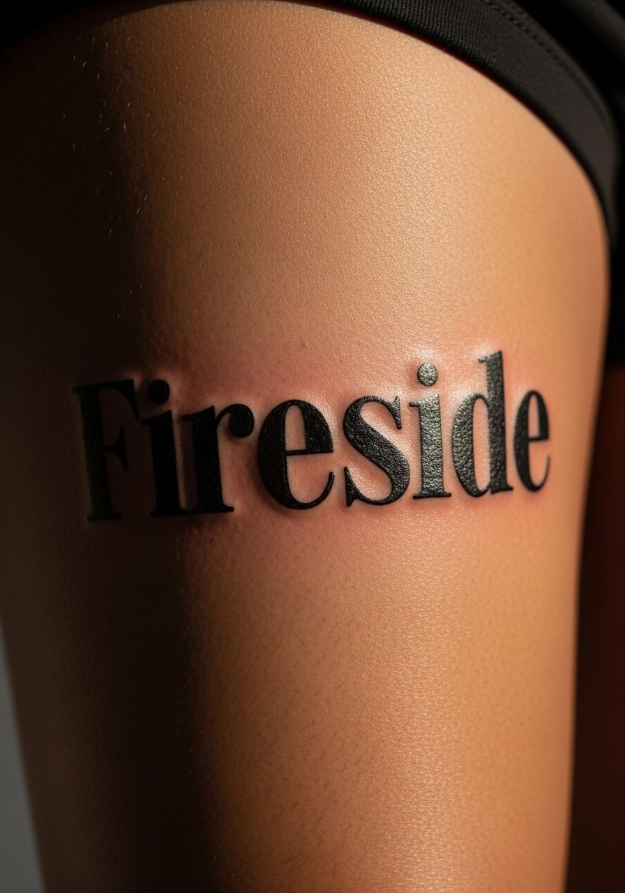
There is comfort in a single word done as a statement. The outer thigh takes saturation well and protects the ink from sun. When you request heavy black script, ask for measured saturation at the edges so it does not pill as it heals. The session is usually one to two hours depending on size. A common mistake is to place heavy black too close to crease lines like the hip fold. That raises the chance of minor distortion when standing. Thigh placements tend to need fewer touch-ups over five years.
12. Tiny "Breathe" in Lower Rib with Whip Shading Accent
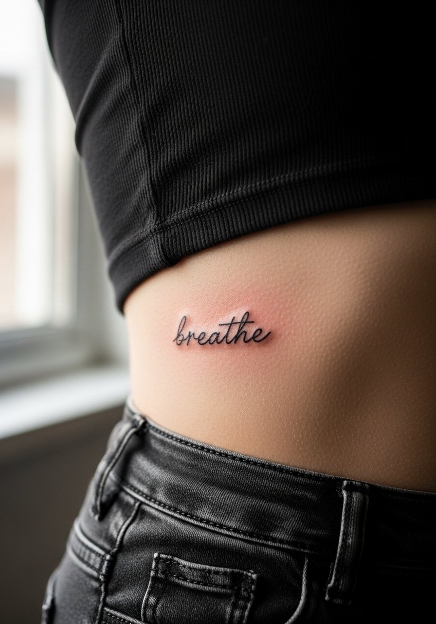
This is a quiet choice that sits under clothing. Artists split on tiny script on ribs. One camp says the area is too mobile and lines spread. The other camp counters that shallow, deliberate depth and slight spacing keep it legible. Ask your artist how they handle rib elasticity. Whip shading accents can help the word anchor visually. Pain will be higher. A frequent mistake is requesting the word in ultra-thin single needle without allowance for skin movement. Plan for a touch-up around year two.
13. Blackwork "Little Things" Script Wrapped Behind the Elbow

The behind-the-elbow area is unusual and prone to wear from flexing. Expect a more involved healing process with scabbing in the crease. Tell your artist you want slightly bolder stroke weight to compensate for movement. That prevents early blurring. Session time is short but healing requires gentle motion limiting for a week. The common mistake is choosing an overly delicate script that disappears as the crease softens. Plan for a touch-up in year one to maintain crispness.
14. Micro-Realism Lyric Fragment "Half A Chance" on Side of Finger

Finger placements are notoriously high-maintenance. The skin regenerates fast which makes ink fade. If you want a lyric fragment here, ask for slightly heavier linework and accept a likely annual touch-up. The area hurts more than the forearm. A frequent mistake is expecting finger script to last like forearm script. It does not. Consider placing the lyric on the side of the finger to reduce constant abrasion from daily tasks. Plan for scheduled touch-ups rather than surprise fixes.
15. Gothic Script "If I Could Fly" Across Upper Chest
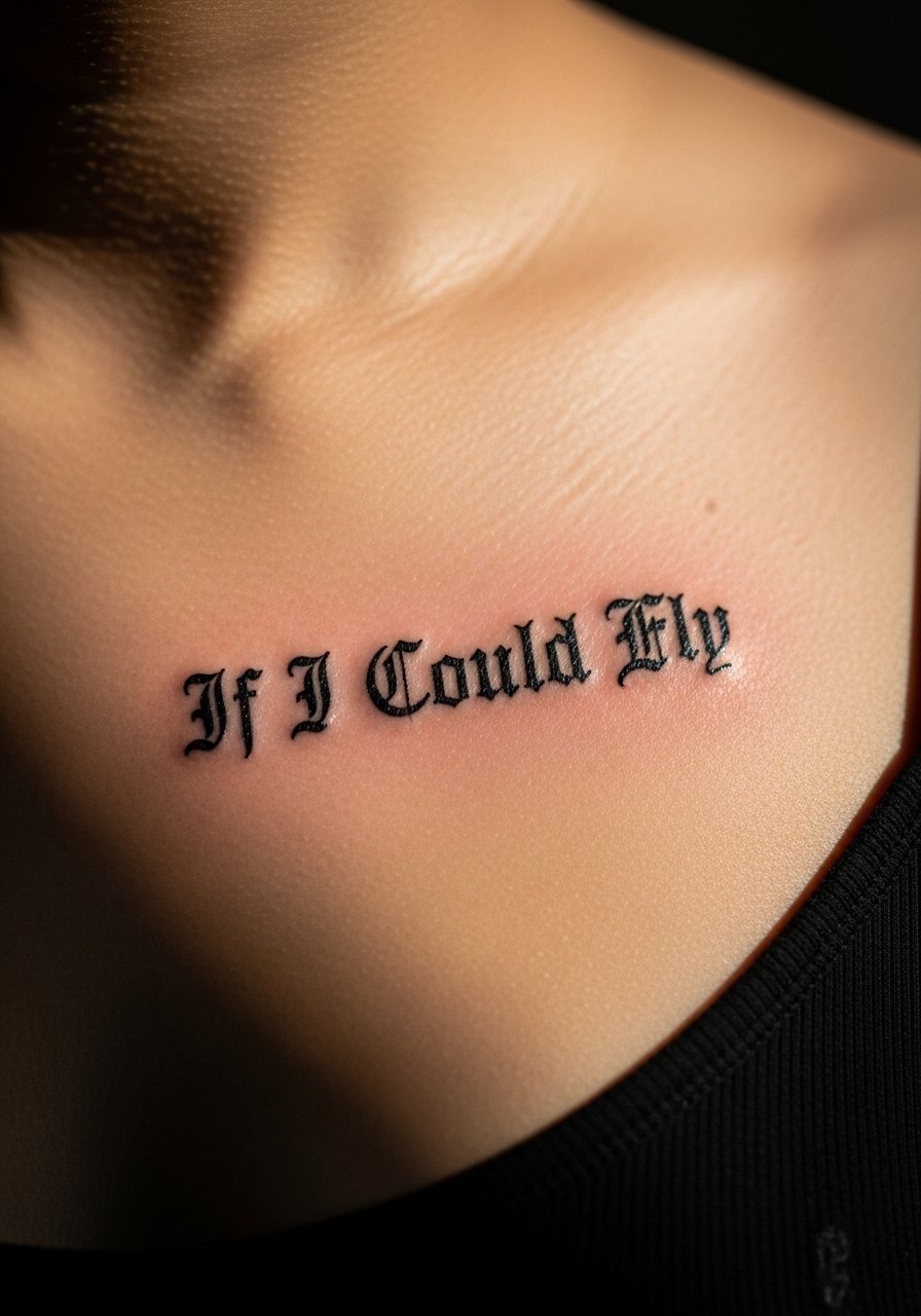
Gothic lettering reads bold and moody when spaced correctly. Upper chest skin holds bold script well unless you have deep cleavage or curves that distort the baseline. During consultation, sit and stand so the artist can see how the letters flow with your posture. If you are athletic and build muscle, tell the artist so they map for stretched skin. Pain is moderate. Expect a touch-up in two to three years if the edges soften. A common mistake is crowding Gothic letters without clear counter space.
16. Dot Work "Story of My Life" Spine Runner
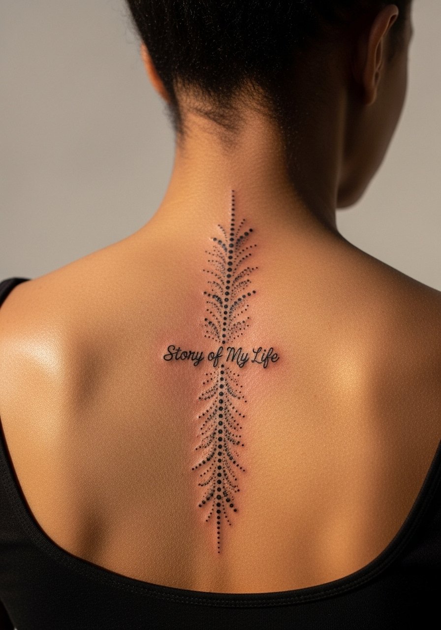
Spine placements are dramatic and require careful dot spacing. The spine is bony so pain is high. Tell your artist you want stipple density to increase toward the center and fade outward. That creates a visual runner that supports the lyric. A common mistake is too heavy stippling next to delicate script. Give the script a slightly larger scale so the letters do not disappear among dots. Healing on the back is straightforward if you sleep on your side for the first week.
17. Blackletter "Little Things" Ring Finger Band
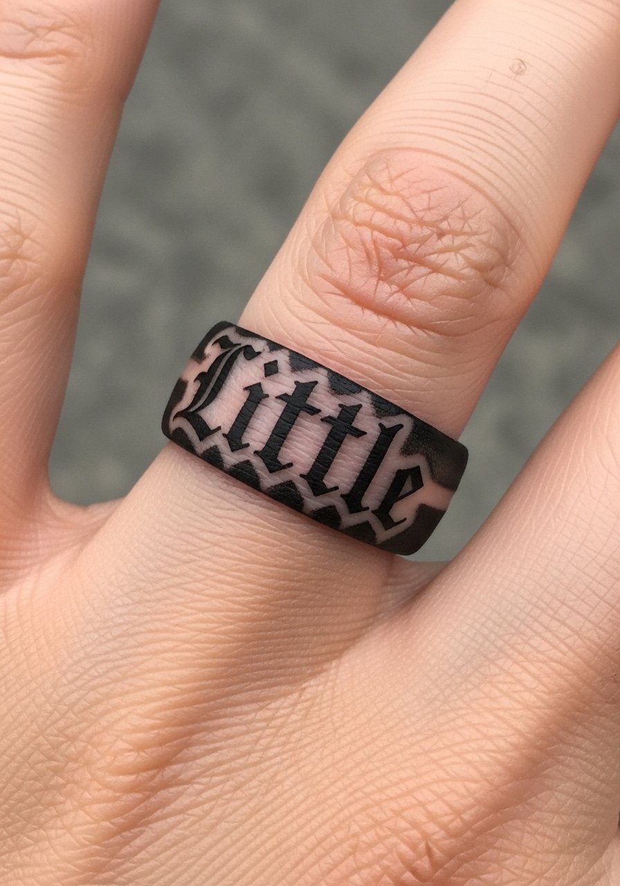
Finger bands in blackletter are striking but wear quickly. If you plan to keep the band as a daily symbol, accept annual touch-ups. Ask the artist to leave a tiny safety margin between strokes to avoid merging. The ring finger sees constant contact, so black fills will soften into gray faster than on the torso. A common mistake is expecting the band to remain sharp for years without maintenance. If career visibility matters, remember ring finger work is very noticeable.
18. Ornamental Mandala Lyric Frame with "Perfect" Under Collarbone
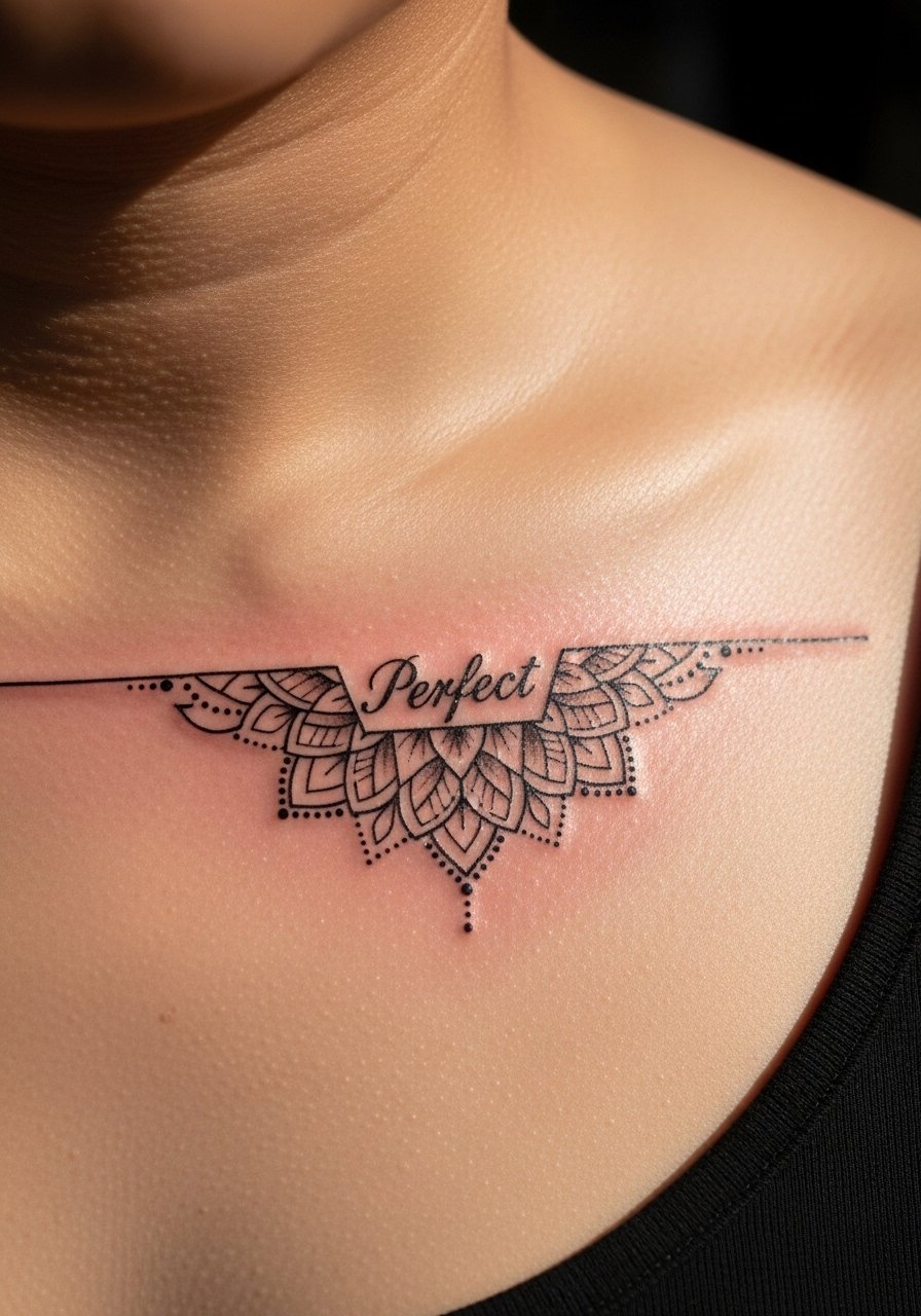
This design blends ornament with lyric and respects mandala origins by adapting patterns rather than copying sacred symbols. Ask for lighter spacing in the ornament so the central lyric breathes. Collarbone placements are sensitive. Expect sharper pain than on an arm. The ornament holds well if dot work lines are not packed. A mistake is over-detailing in a very small area. Scale up slightly to preserve the mandala's geometry as it heals.
19. Dark Block Script "Gotta Be You" on Side Rib Panel

Side ribs give a cinematic canvas. For block script here, tell your artist to test the lettering while you breathe so the baseline stays consistent. This area is high pain but low sun exposure, which helps long-term saturation. A common mistake is making the letters too narrow for the skin's movement. Wider letterforms fare better. Expect two sessions if you want heavier ink. Touch-ups at year three keep the edges crisp.
20. Collaborative Arrow Set with Small Lyric Fragments for Friends
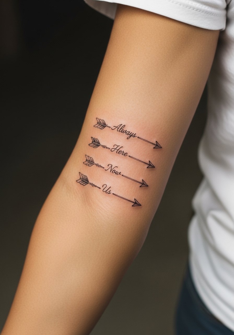
Matching pieces for friends work best when each person selects a lyric fragment that means something to them. During consultation, plan spacing so the arrows can later connect into a sleeve if you want. Forearm placement is forgiving, and single-needle linework will need a touch-up sooner than bold linework. A common mistake is choosing identical tiny text without agreeing on scale. Decide together on text size and line weight before booking. Discovery pathways like specific hashtags and tattoo directories help you find artists who have done matching sets.
Tattoo Prep and Aftercare Essentials
Fragrance-free gentle foaming cleanser for tattooed skin. Use this in the first 3 to 7 days to remove ointment and blood without stripping the skin. It keeps scabs soft and lowers infection risk when used gently.
Lightweight fragrance-free balm, non-comedogenic, small tin. Apply a thin layer after the first wash. This generic balm substitutes for niche products and reduces irritation without clogging pores.
Medical-grade second skin bandage, 6-inch roll. Useful for large blackwork sessions or rib pieces to protect from clothing during the first 48 hours.
Antibacterial saline spray for sensitive areas. Gentle spray that soothes and cleans awkward placements like behind the ear or sternum without needing direct rubbing.
SPF 50 mineral sunscreen stick for healed tattoos. Long-term maintenance for vibrant color and crisp blackwork. Apply after full healing to prevent UV-driven fading.
Soft, breathable covering band for sleeping first week. Use on ribcage or sternum tattoos when you sleep on your side to reduce friction.
Silicone scar management sheets, small pack. Helpful if a piece scabs heavily or if you scar easily. Use only after the tattoo has fully closed.
Every tattoo is different. Always follow your artist's specific aftercare instructions. Consult a dermatologist if you have skin concerns or unusual healing issues.
Frequently Asked Questions
Q: Will fine line script like "What Makes You Beautiful" blur if I get a full sleeve of varied styles?
A: Fine line in a sleeve can blur faster than bold work where the skin stretches a lot. If you mix styles, tell your artist which elements you want to keep crisp over time so they can adjust spacing and line weight. Expect touch-ups for the finest scripts at year two to three depending on placement and sun exposure.
Q: Do watercolor-style wrist wraps need different aftercare than black script wraps?
A: Yes. Watercolor areas rely on softer saturation and are more vulnerable to early fading. Use a gentle foaming cleanser and a lightweight fragrance-free balm during the first week, and avoid prolonged sun exposure after healing. The black script usually needs fewer color boosts than the watercolor halo.
Q: Why are ribs and sternum listed as high pain for blackwork and fine line pieces?
A: Those areas sit close to bone and move with breathing. That increases discomfort during the session and can influence how pigment settles. For ribs, artists split on fine line reliability. Ask how they manage needle depth and consider breaking big sessions into two to control swelling and healing.
Q: If I want a matching lyric set with friends, what should we agree on before booking?
A: Agree on scale, exact text characters, and line weight. Make sure everyone chooses the same size for text and the same level of saturation for shared motifs like arrows. Use discovery pathways like specific hashtags and Tattoodo filters to find artists experienced with matching sets.
Q: How often will small placements like fingers and behind-the-ear need touch-ups?
A: Fingers and behind-the-ear placements often need yearly touch-ups. Finger skin renews rapidly and fades with daily contact. Behind-the-ear ink can fade if placed too superficially. Plan touch-ups into your maintenance routine rather than seeing them as failures.
Q: Which aftercare products are essential for dark blackwork to keep saturation long-term?
A: After the initial healing, consistent use of a mineral SPF and gentle moisturizers helps protect saturation. During healing, a fragrance-free balm and gentle cleanser are essential. The shopping list above links to product search queries that match those needs.
