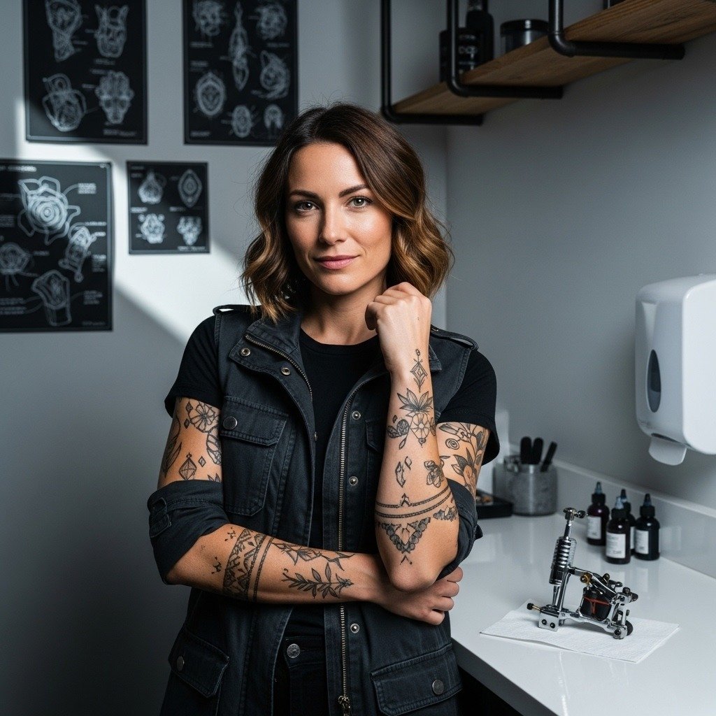
Fine-line script looks soft and modern on a fresh arm, but I have seen dozens of "Never Give Up" pieces blur into unreadable smudges when the line weight is too thin for the placement. Choose a slightly heavier single-needle weight or small-serif lettering and the phrase stays crisp for years. Below I start with compact forearm and wrist options that balance presence with subtlety so the phrase remains a clear reminder.
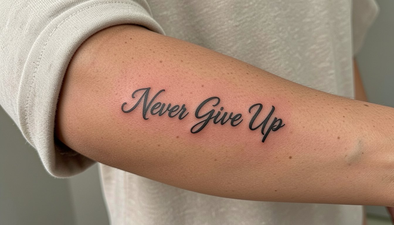
1. Fine-Line "Never Give Up" on Inner Forearm

This is the go-to placement for a daily reminder. Recommend the slightly heavier single-needle weight during consultation so the script reads at arm length. A common mistake is asking for hairline cursive and then placing it too close to the wrist where movement and washing speed blurs the strokes. Expect a one-hour session and mild soreness the first two days. Plan for a touch-up at year two if the letters soften. For showing the piece, rolled cuffs or a short-sleeve linen shirt frame the forearm nicely and keep the script visible. Try rolled cuff linen shirts for casual reveal during warm months.
2. Tiny Wrist Script with Accent Dot
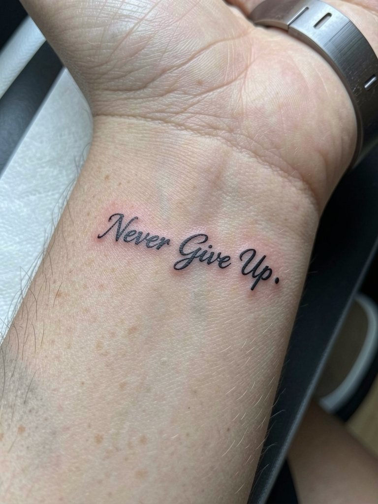
A wrist micro script is intimate and highly visible. Because wrist skin moves constantly, pick a slightly bolder letterform than you might think. Ask for letter spacing that leaves white space between ascenders so the words do not collapse. The session is usually under 30 minutes and local swelling fades fast. The main aging risk is edge softening from hand washing and friction from bracelets. For daily wear, keep the opposite wrist accessorized with a thin watch and let the tattoo wrist stay bare if you want clean contrast. If you plan to cover for work, a slim cuff watch can mask a tiny wrist mark during meetings.
3. Vertical Spine Quote in Fine Script
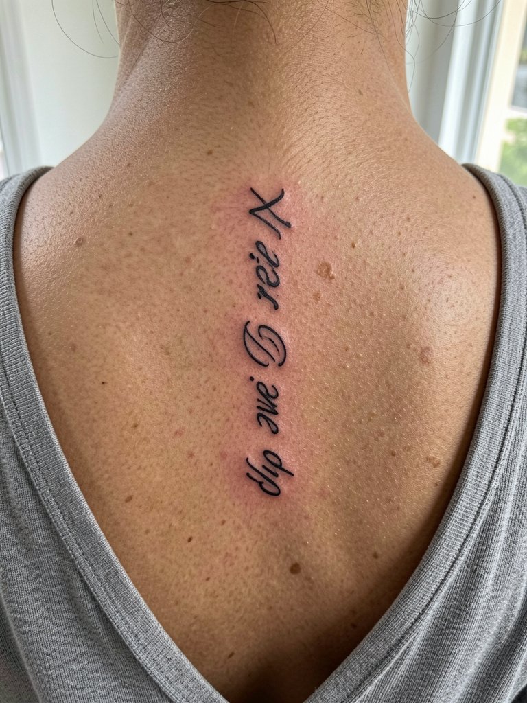
Vertical text follows the body's natural line so slightly longer phrases can sit without looking crowded. The spine placement has a comfort cost. Expect a longer session and sharper sensation because the skin is thin over bone. A common mistake is squeezing too many words into a narrow column. Keep each word on its own line and allow breathing room. Healed photos at two years usually show stable linework when the artist sets the depth correctly. For showing this piece, back-revealing tops and racerback tanks frame the vertical layout well. Wear a racerback tank on session day for easy access.
4. Boxing Gloves Illustration with Script Banner
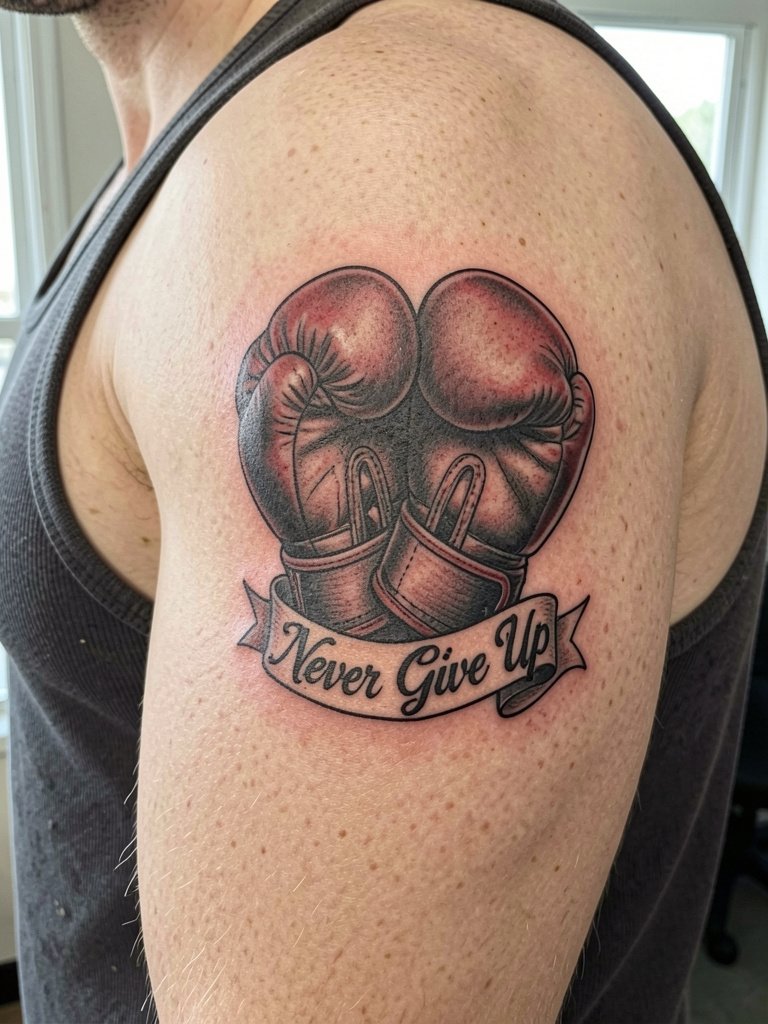
Pairing a symbol with the phrase tips this away from generic text. For a neo-traditional glove piece, ask for clean bold outlines and limited color accents so the banner script stays readable. Discuss banner placement and curvature so the phrase follows the glove contour. A single-session medium piece with light color highlights will usually heal into solid saturation. Many people over-detail the gloves and lose focus on the words. Keep the glove design simple so the phrase remains the center of meaning. Wear sleeveless tops to show this placement, and bring a muscle tank top on appointment day.
5. Calligraphy Collarbone Script with Flourish
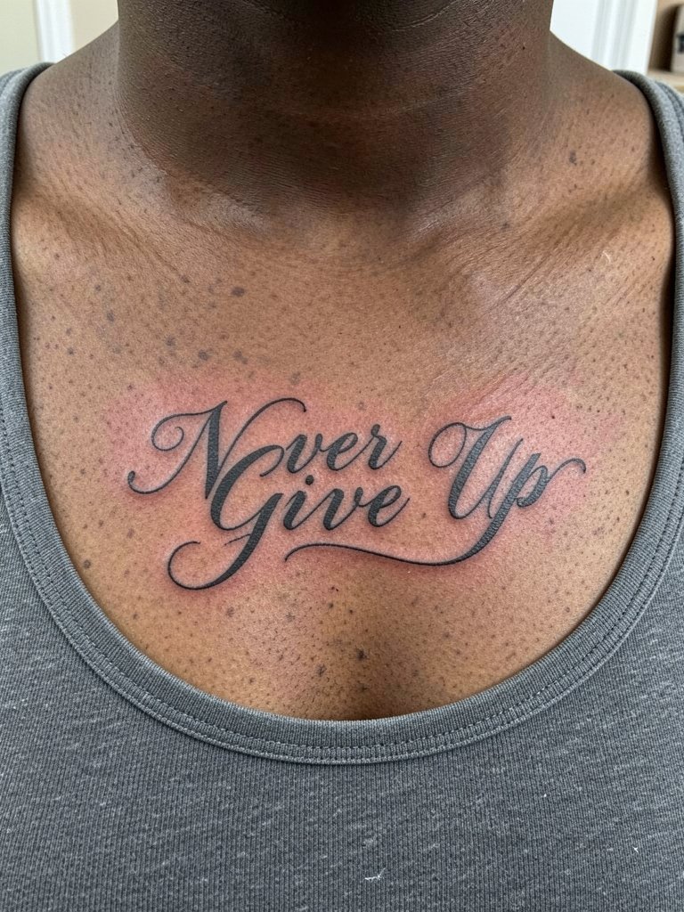
Collarbones are flattering for short quotes but move with breathing and posture. The main mistake is adding tiny decorative flourishes that clog up when the area settles. During consultation, show the exact script size you want and ask the artist to scale the flourish down if the letters look crowded. Pain is moderate and session time ranges 30 to 60 minutes. For reveal outfits, open-neck blouses and layered necklaces frame the script without overwhelming it. Bring a fitted scoop or V-neck top on the day so the artist has clear access.
6. Minimalist "Never" Split Across Two Wrists
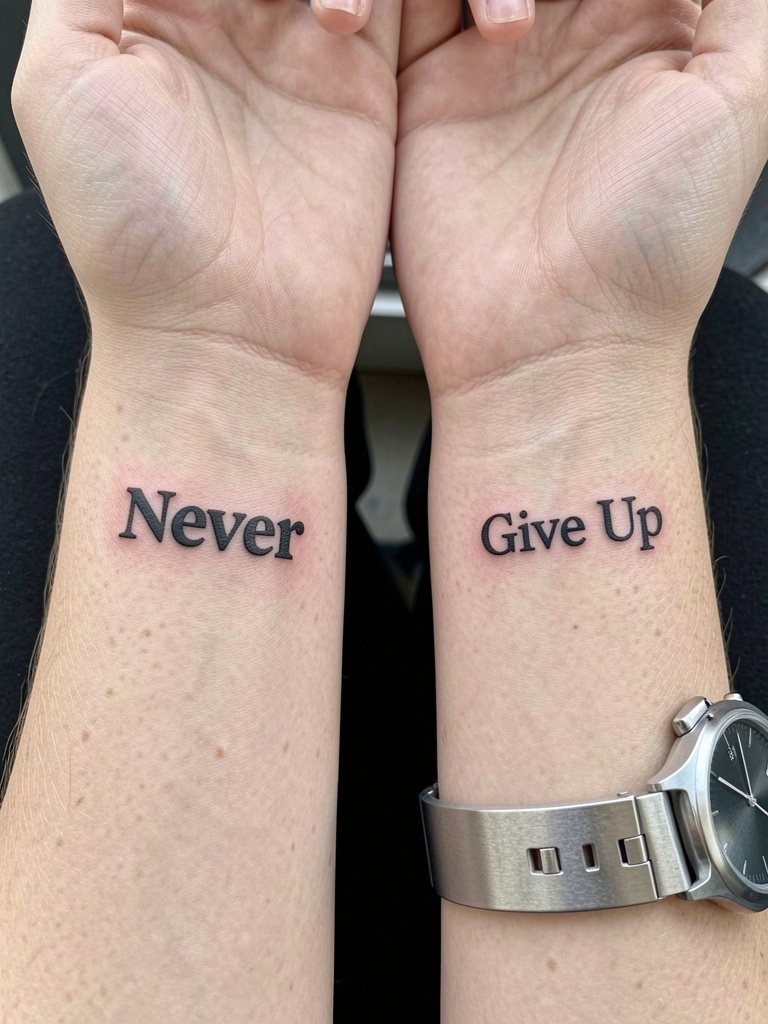
Splitting the phrase across wrists is conceptual and editorial. The risk is inconsistent scale and alignment. During the consult bring two matching references and ask the artist to tattoo a small lined template on each wrist to check spacing. A common error is going too small on the letters which then blur into each other. Expect short sessions for each wrist and a minor touch-up at 12 to 18 months. For outfits, balanced accessories work best. Try a minimal watch on one wrist and a thin bracelet on the other to complement the split layout.
Session Day Picks
The first six ideas include small, visible placements and design choices that affect healing and early wear. These five items smooth the appointment and the first week for wrist, forearm, and collarbone pieces.
-
Stencil transfer paper kit. Lets you preview how the script sits on the skin before the needle hits, which is especially helpful for the split-wrist and collarbone layouts above.
-
Topical numbing cream. Applied before a short wrist or collarbone session eases discomfort without changing linework when used as directed.
-
Thin protective film roll. Useful for wrist and forearm tattoos to protect fresh linework from friction during the first 24 to 48 hours.
-
Fragrance-free gentle body wash. Cleans the area during showers without additives that can irritate delicate script lines.
-
Aquaphor healing ointment. A mainstream choice for initial moisture locking that many artists recommend for short bursts during the first few days.
7. Blackwork Block "Never Give Up" on Outer Forearm
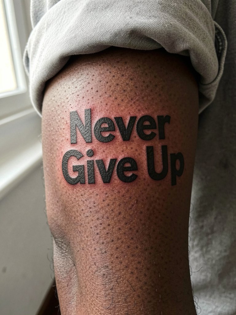
If longevity is your priority, bold blackwork checks that box. This layout reads at a distance and ages into a strong silhouette. The trade-off is size. If you want bold text in a small wrist area it can overpower the space. For this outer forearm piece, plan a single medium session and expect deeper saturation that holds up. A common mistake is thin fonts in a blackwork block. Discuss exact font weight and ask for bold caps, not thin serif styles. Roll sleeves or wear relaxed tees to show the block text. A relaxed fit tee complements the graphic look.
8. Purple-Accent Script with Tiny Heart
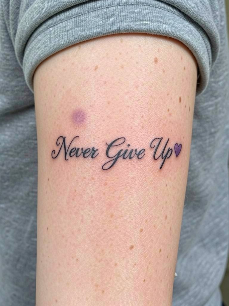
A small color accent adds personality while keeping the main phrase classic. Color decisions matter. Purple works well because it contrasts with black but does not dominate. Tell the artist exactly which purple shade you prefer and where to place the accent so it reads as a point, not a blob. Color may need a touch-up sooner than black, commonly around year two, especially on sun-exposed forearms. For styling, cream or neutral tops let the purple pop without clashing. Try a neutral tee when you want the accent to stand out.
9. Single-Word "Never" Minimalist on Side Wrist
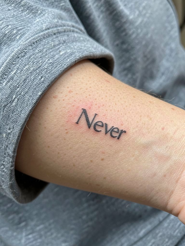
Edge placements like the side wrist feel editorial and look subtle in photos. The downside is rapid fade from friction and hand washing. To get duration, increase letter weight slightly and avoid ultra-fine micro script. Session time is short but expect a needed touch-up within 12 months. A common error is picking a typeface with tightly spaced counters which merge on healing. For day-of clothing, leave the wrist free of tight bracelets and wear sleeveless tops for easiest artist access.
10. Ribcage Long-Form Script with Line Breaks
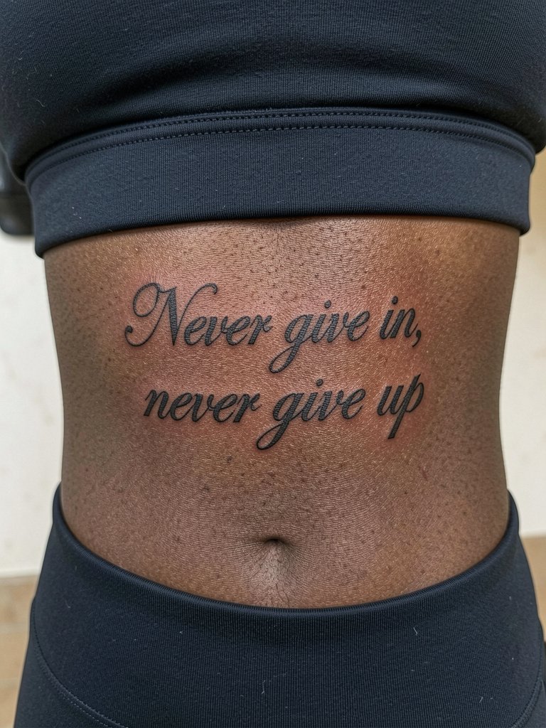
Ribcage gives space for long phrasing, but it is one of the higher pain areas. Fine script here can stretch and blur if the spacing is tight. When you book, ask the artist to map line breaks that follow the rib curve rather than forcing one long line. A two-hour session with breaks is common. Some artists advise a slightly heavier line weight on ribs to counter the stretching from breathing and weight changes. Bring a loose crop top for the session and plan for a touch-up at year two if the outer edges soften.
11. Behind-the-Ear Micro Script Reminder
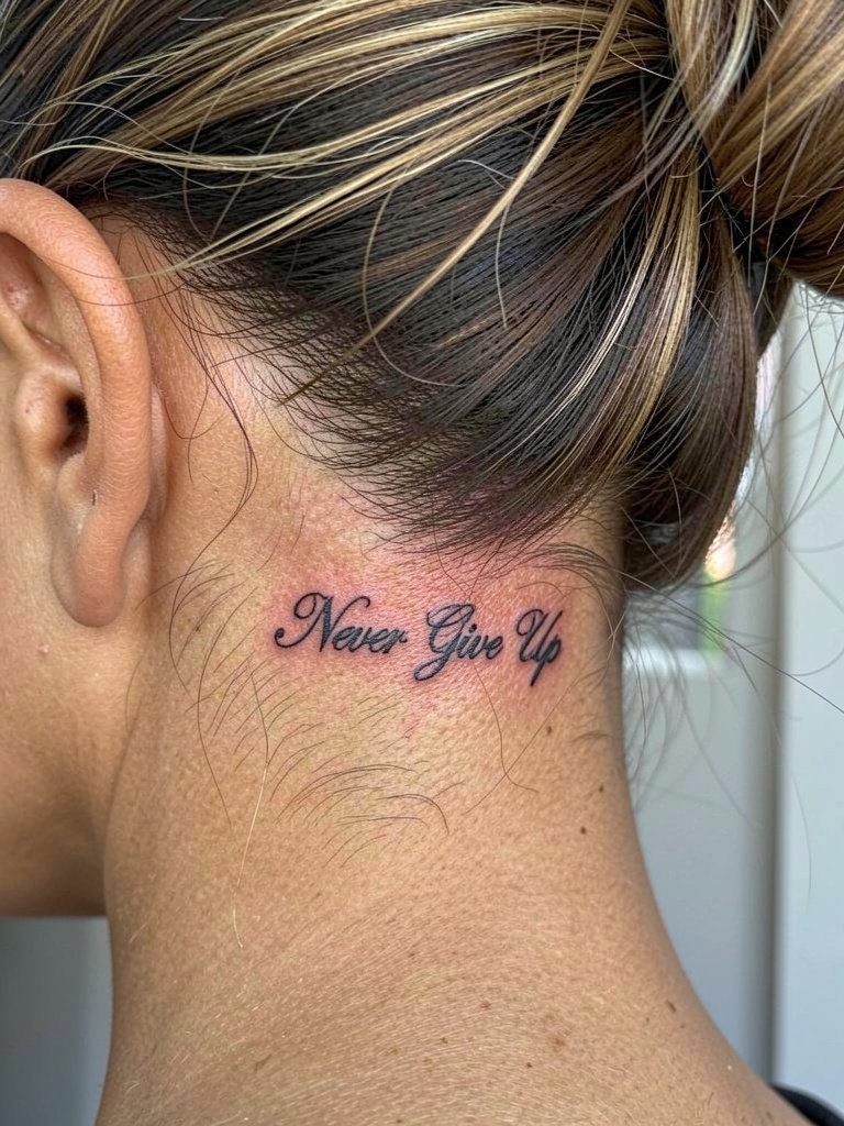
Behind-the-ear placements are private and discreet. They take under 20 minutes but require an artist who is steady with tiny lettering. A one-sentence professional note: these placements need precise stencil placement and experience with small lettering on curved areas. Expect light soreness and fast healing, but also quicker fading because of hair and neck motion. For reveal, wear hair up in an effortless bun or a clipped style. Bring a hair tie for the session so the area is fully exposed.
12. Infinity Mark with Phrase on Ankle
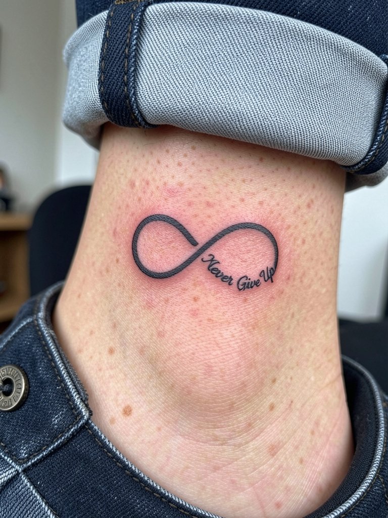
Ankle tattoos face friction from socks and shoes. The best versions use clean silhouettes with slightly stronger lines. During consult, ask for the script to be placed on the outer loop so daily rubbing from a shoe tongue is minimized. Pain is low to moderate and session time is short. Expect faded edges after heavy walking seasons and plan for a touch-up at 18 months if you wear tight footwear frequently. For showing the ankle, cuffed jeans or cropped pants keep this placement visible without overexposing the area.
13. Stacked Script with Small Feather Accent on Upper Arm
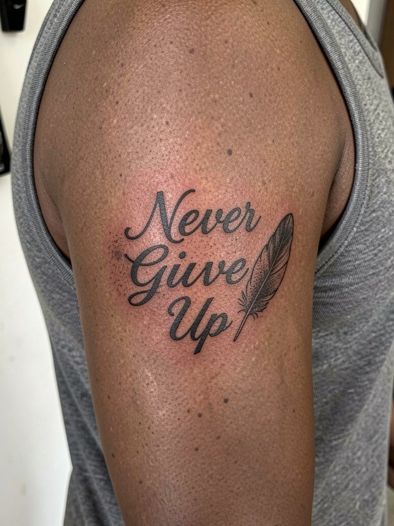
Stacked text works well on the upper arm because there is room for the phrase and an accent. The feather should be rendered with stipple shading to avoid high-contrast areas that pull focus from the words. Tell the artist your preferred feather scale so it complements rather than competes with the script. Healing tends to be smooth on the upper arm and a single session usually suffices. For outfits, tank tops and cropped tees frame the stacked layout and let the feather detail read clearly. Bring a loose tank top on the day to give the artist access without tugging.
14. Traditional Flash Banner with Bold Caps on Calf
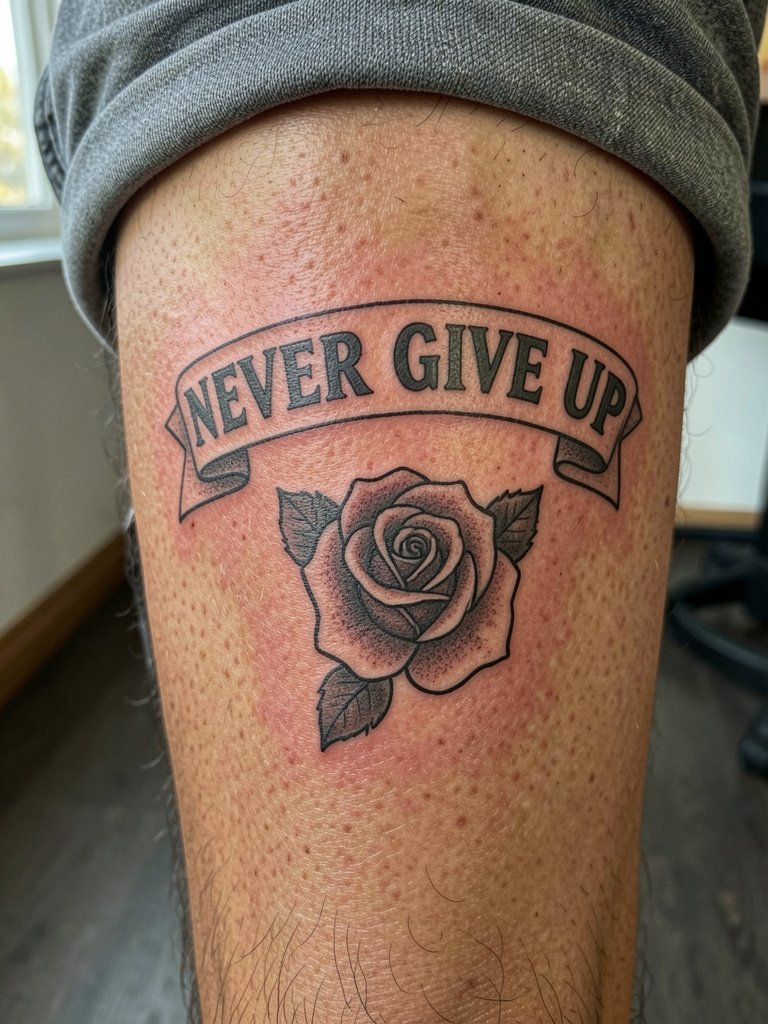
Classic banner text ages well when executed with thick outlines and flat fills. The calf offers good space, and the bold caps read decades later. A frequent mistake is tiny caps that get swallowed by muscle contours. Discuss banner size relative to the calf curve and ask for even line weight. Sessions can be single or two-part depending on color. For summer wear, cropped pants or shorts show this piece well.
15. Script with Small Heart or Ribbon on Upper Chest
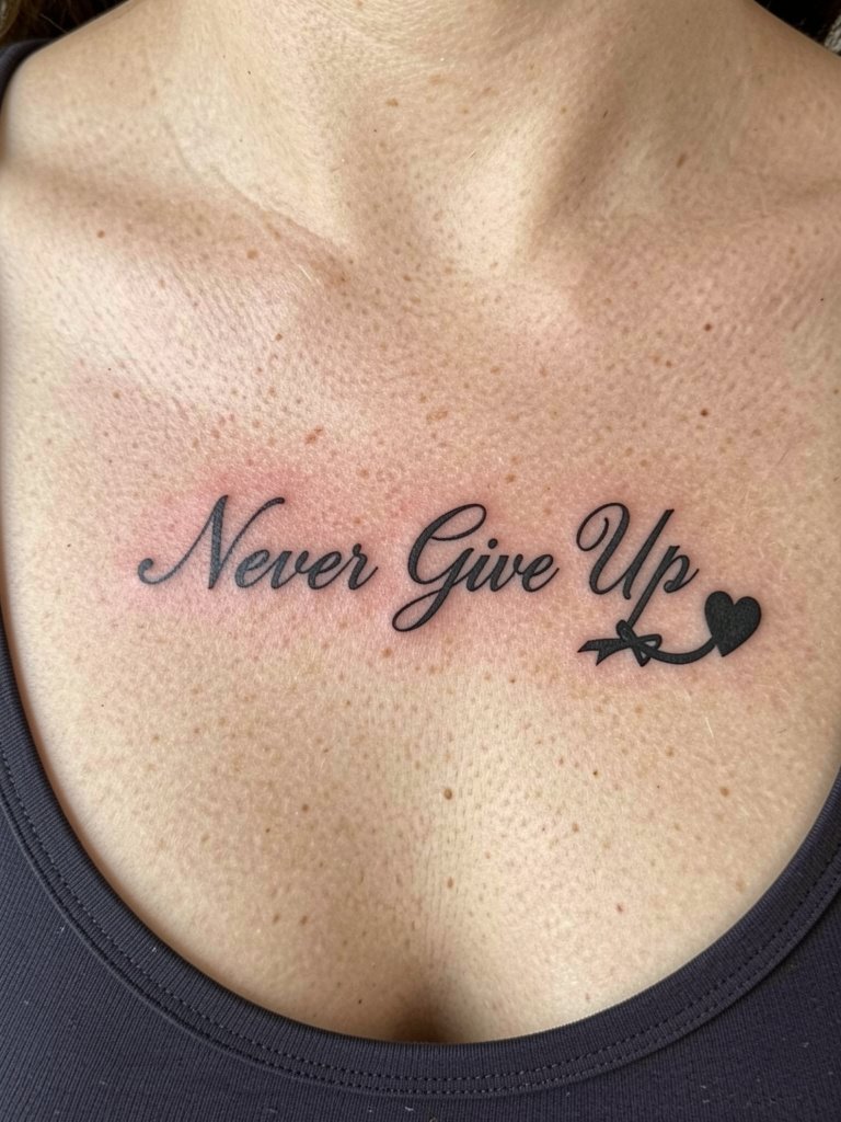
A small symbol paired with words softens the sentiment without turning it into a scene. Placement near the collarbone should respect natural movement and clothing lines. Avoid placing the ribbon so close to the sternum that it migrates into shadow. Session time is short and soreness is moderate. For showing, layered necklaces and open-front shirts give a tasteful reveal. Bring a low scoop top to the appointment so the artist has unobstructed access.
16. Single-Needle "Never Give Up" on Side Rib Curve
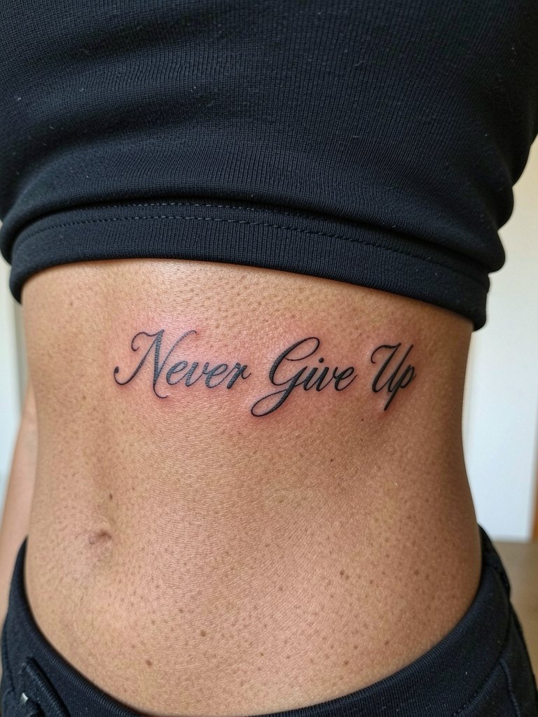
The ribs are a high-motion area and can blur thin lines if the spacing is naive. One camp of artists says ultra-fine single-needle here blurs quickly. The other camp says slightly wider spacing with correct depth holds fine. You should hear both perspectives in consultation. Practically, pick a measured single-needle script scaled to the arc of your ribs and plan for a two-hour session with breaks. Wear a fitted crop or sports bra on appointment day to allow clean access.
17. Split-Word Editorial on Side Wrist and Inner Forearm
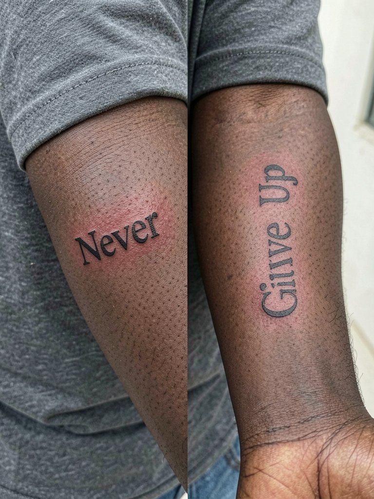
Split-word layouts feel intentional when the scale and font match. A common mistake is inconsistent letter spacing between the two sites. Bring both reference scales and ask the artist to stencil them at your preferred size before inking. Consider how daily movements affect each site and choose a slightly stronger line weight at the wrist. For the session wear, short sleeves allow the artist to work without tugging. This layout pairs well with a slim bracelet on the opposite wrist to balance the visual weight.
18. Minimalist Lower Rib Quote in Small Caps
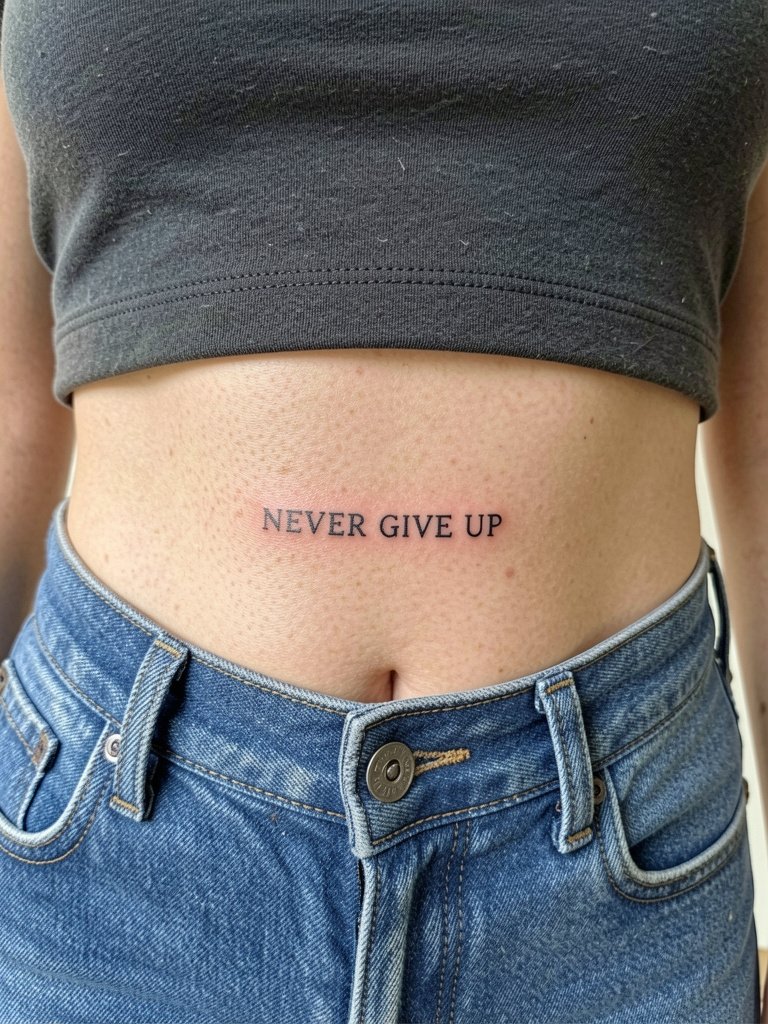
Small caps read more boldly than thin script in low-visibility areas. Because the lower ribs experience fabric contact with waistbands, keep the text a touch higher than tight waistlines. A frequent mistake is placing the text too near the waistband where constant friction accelerates fading. Sessions are moderate in pain and may need a touch-up after seasonal wear. High-waisted jeans and bralettes reveal the line nicely when you want to show it.
19. Micro Script Behind Collar of Neck
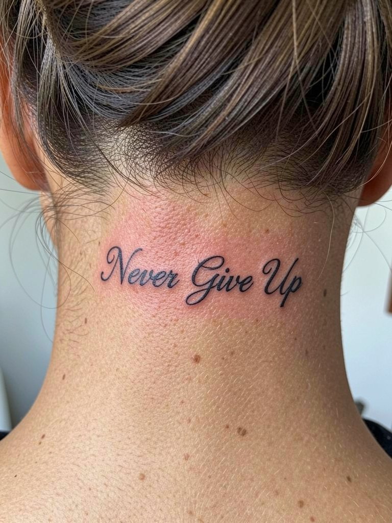
Neck nape placements are discreet and human-friendly but require careful stencil alignment. The skin there can be slightly textured and movement can soften ultra-fine lettering. Ask for a slightly bolder micro script and expect a fast healing window with some early scabbing. Wear hair up on session day and keep sunscreen off the fresh ink until healed.
20. Ring-Finger Mini "Never" with Negative Space
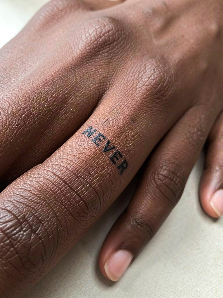
Finger tattoos are high-maintenance. They fade faster and often need touch-ups every 6 to 12 months. The trade-off is extreme intimacy. If you want durability, pick bolder letterforms and accept the maintenance timeline. A realistic session plan includes brief touch-ups and a willingness to re-ink lines when they soften. Keep hands moisturized and protected from harsh chemicals during the first four weeks.
21. Vertical Thigh Script Along Inner Leg
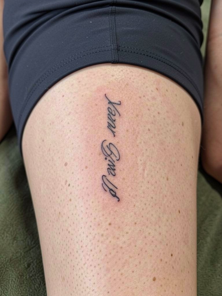
Inner thigh offers privacy and space for vertical pieces. The main hazards are rubbing from clothing and moisture. Ask for a slightly wider letter spacing than your initial reference so the type breathes as the area moves. Sessions are comfortable when you are relaxed and usually finish in one visit. For outfit pairing, high-waisted shorts and skirts that reveal the inner thigh create a striking, intentional reveal.
22. Script Wrapped Around Small Anchor on Wrist
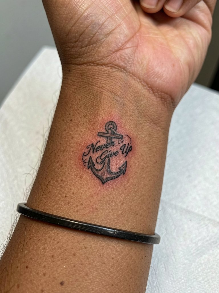
Pairing a small icon anchors the message visually and gives the phrase context. Wrist anchor pieces need clean negative space so the wrapped script does not appear busy. When you sit with the artist, have them lay the script around the motif in marker to confirm readability before inking. Healing is quick and the piece looks good with bracelets on the opposite wrist or a minimal watch.
23. Bold Single-Line "Never Give Up" Across Sternum
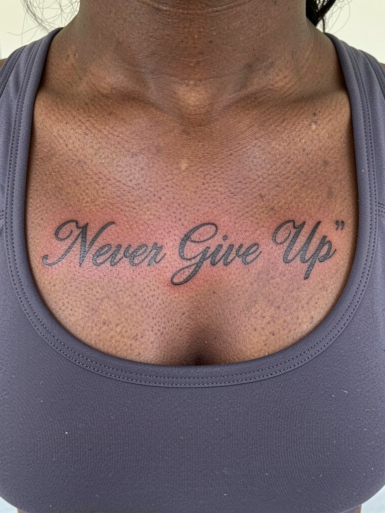
The sternum makes a central, statement placement. Pain is higher and healing requires careful aftercare and positioning during sleep. Controversy exists on fine-line here. One group of artists says the sternum's motion and thinness cause ultra-fine scripts to smear within a couple of years. The opposing group argues that with correct spacing and slightly heavier strokes, the script settles and reads beautifully. When you book, ask for a stencil mockup centered on your sternum and be prepared for a two-hour session. For reveal outfits, bralettes and open-front tops work well.
Frequently Asked Questions
Q: Which holds up better over time, fine-line script or bold lettering for a "Never Give Up" quote?
A: Artists split into two camps on longevity for quote tattoos. One camp recommends bold lettering because thicker strokes resist blowout and edge softening. The other camp supports fine-line script when it is done with measured depth and slightly wider spacing. My observation is to choose line weight based on placement and your willingness to accept touch-ups.
Q: Should I pair the quote with a symbol or keep it pure text?
A: Some people prefer pure text because the phrase stands alone and feels direct. Other people want a small symbol like gloves, a feather, or an infinity mark to personalize the idea. Both choices work, and the deciding factors are how much visual space you want and whether the symbol will compete with the words as the piece ages.
Q: Where can I find real healed examples and local artists without naming individuals?
A: Search hashtags like #nevergiveuptattoo, #motivationtattoo, and #scripttattoo on Instagram and TikTok and filter by location to see nearby portfolios. Browse Reddit tattoo threads for honest healed shots and ask community members for local studio names in your city. Pinterest boards can help you compare layout options before booking.
Q: How much should I plan to touch up a small wrist or finger script?
A: Finger and wrist scripts commonly need touch-ups more often than arm or calf pieces. Expect a realistic touch-up timeline of six to eighteen months for fingers and around twelve to twenty-four months for wrists depending on sun exposure and friction. Keeping the area moisturized and protected will stretch out those intervals.
Q: What should I wear to a session for an upper arm, rib, or forearm tattoo?
A: For an upper arm, bring a tank top or loose short sleeve so the artist has access without tugging. For ribs and sternum, a fitted crop top or sports bra keeps the area exposed and comfortable. For forearm work, short sleeves or a rolled-cuff shirt are best. A practical item to bring is a loose button-down shirt that you can easily move without stretching the design area.
Q: Are there any placements to avoid if I do not want frequent touch-ups?
A: High-friction sites like fingers, side wrists, and ankles often require more maintenance. Areas that move a lot like the ribs and sternum can also need additional work if ultra-fine lines are chosen. Choosing slightly bolder lettering and giving the design room to breathe reduces the likelihood of frequent touch-ups.
Q: Can small color accents like purple be worth it for a quote tattoo?
A: A small accent color can make a common phrase feel customized and can age acceptably when used sparingly. One camp prefers black only for safety and longevity. The other camp embraces a tiny accent to mark the piece as personal. If you choose color, pick a muted tone and ask about touch-up schedules for pigment retention.