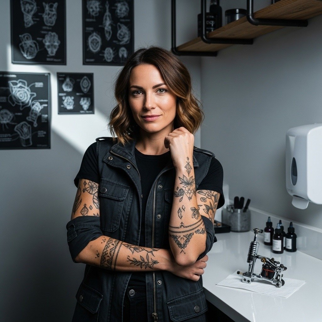
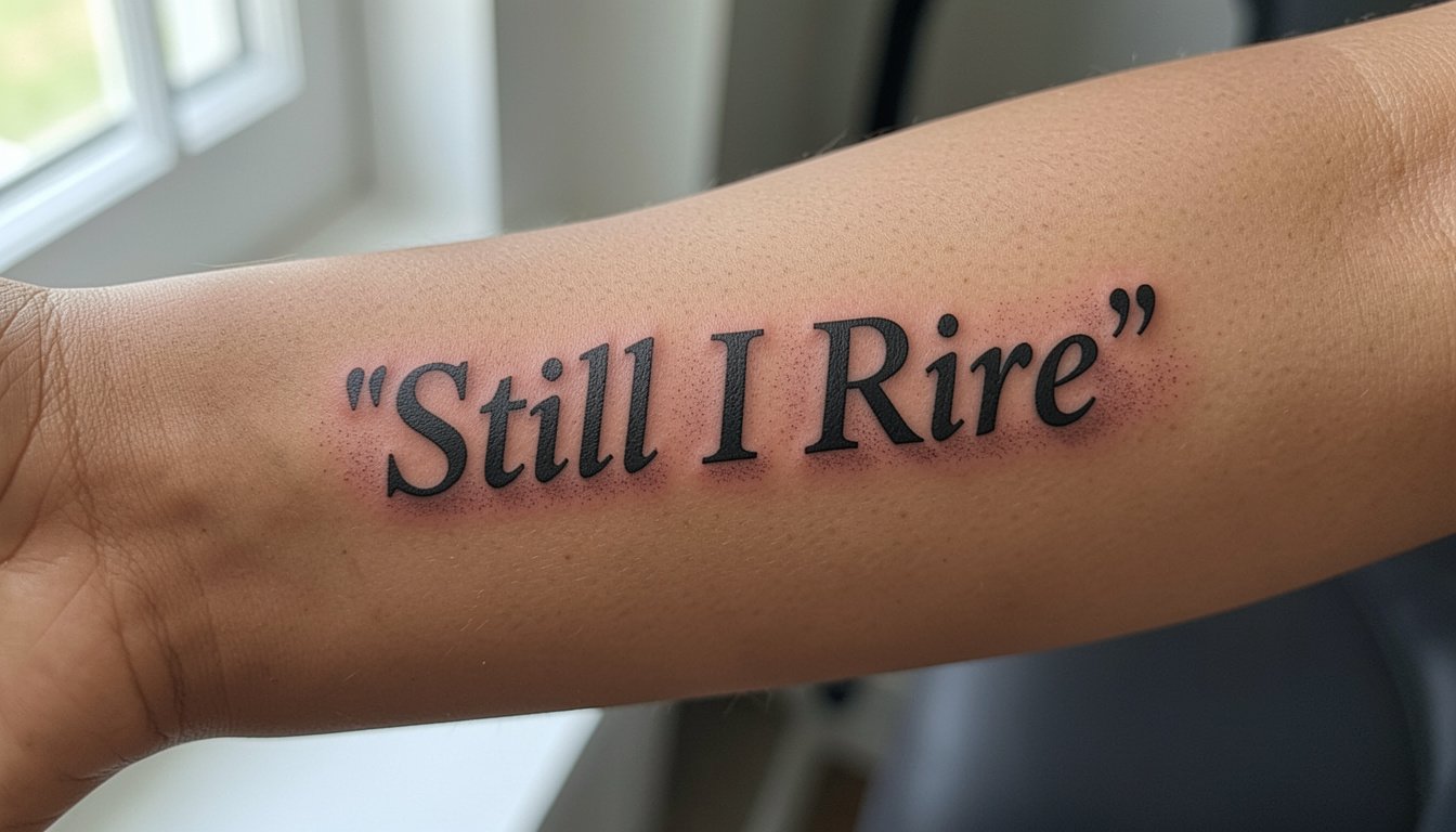
The forearm quote that still reads clear at year five usually started with bigger letter spacing and a slightly heavier hand than the viral single-needle scripts people save. Small text and tiny flourishes disappear into pores and friction, while modestly bolder letters preserve meaning without shouting. Below are forearm quote treatments that balance readability, longevity, and how you dress, starting with a fine-line inner-forearm script rethought for long-term clarity.
1. Fine-Line Inner Forearm Script, "Breathe"
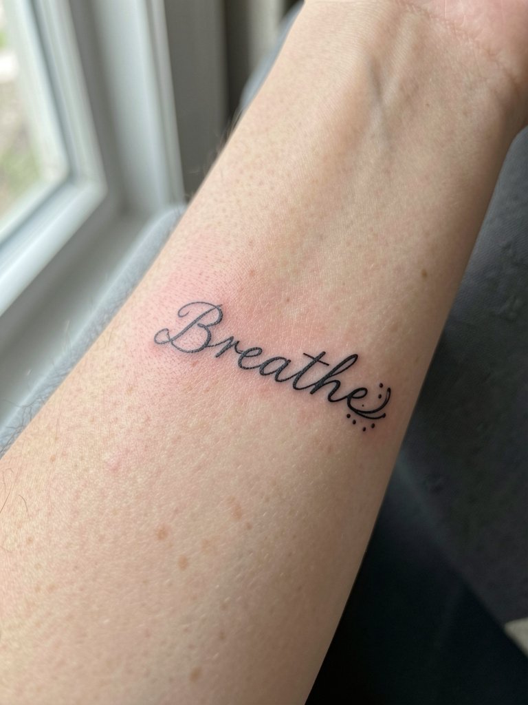
This close-cropped single-word script reads intimate without being illegible. I recommend this when you want a quiet reminder that sits under your sleeve but shows when you roll it up. Request slightly heavier line weight than a one-shot single-needle reference, because the inner forearm softens thin lines over time. A common mistake is asking for flourished loops that collapse into a gray blur by year three. At six months the tails are crisp, at two years some thin cross-strokes thin further, and a touch-up at three to five years keeps the lettering distinct. For showing it off, try a rolled-sleeve linen shirt in cream so the light hits the inner forearm.
2. Small Typewriter Quote Along the Wrist
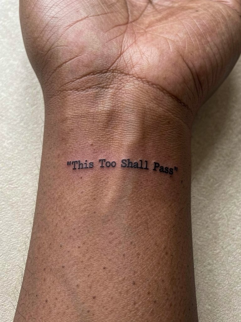
A wrist-located miniature typewriter quote wears well if kept simple and spaced. Pick a short phrase or move to a two-line layout if you want small caps that stay legible. Mention to the artist that the wrist skin sees constant washing and friction so letter spacing should be open, not cramped. The pain is mild and the session is quick, generally under an hour for short phrases. A frequent error is squeezing a long sentence into one line, which becomes unreadable after a year. When you want to show it, sleeve-length watches or cuff bracelets frame this area, and a lightweight mesh watch complements narrow scripts without covering the ink.
3. Bold Block Script on the Outer Forearm
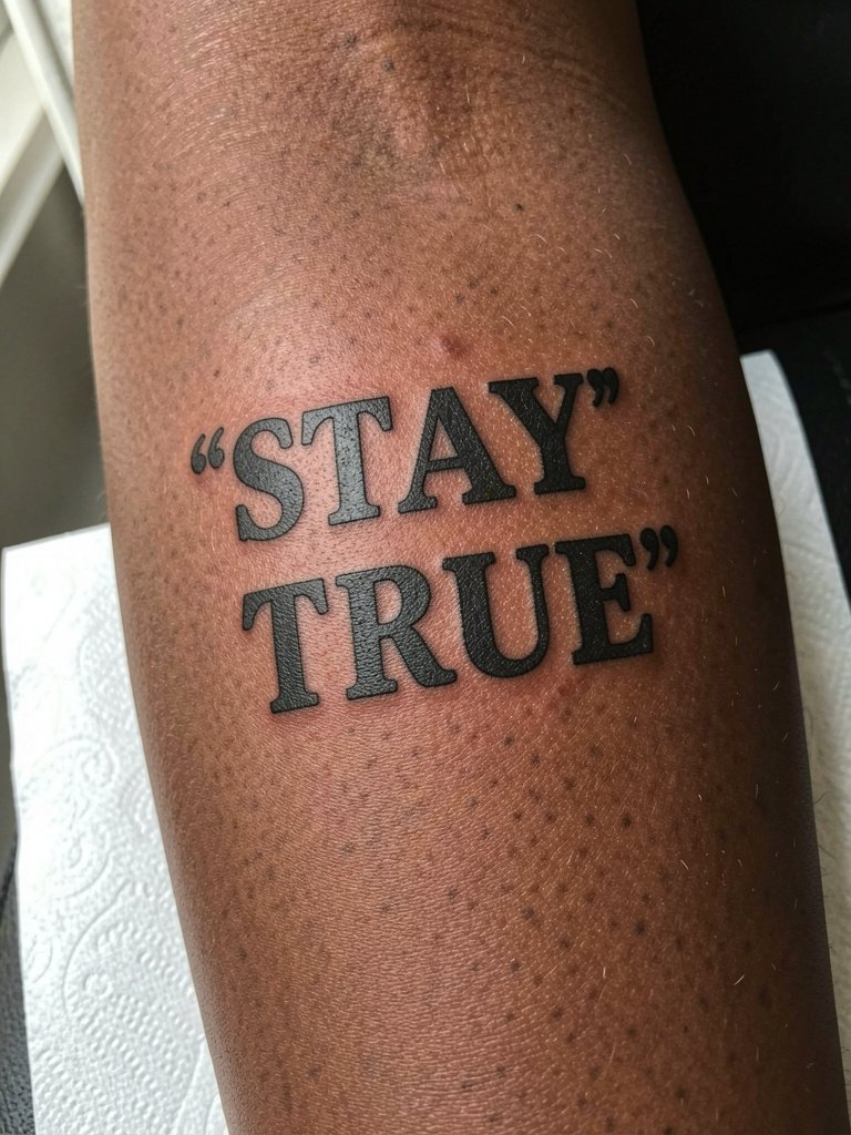
Choose bold block lettering when you want durability and instant readability across distance. This works best for longer-wearing pieces because thicker linework resists blowout and spread. Specify letter height and stroke thickness during the consultation, and ask for modest negative space between letters to prevent filling in. At six months the saturation looks rich, at two years the edges soften but the word remains legible. People sometimes request ultra-saturated black with tight kerning and then find letters merge over time. For outfits, a short-sleeve tee or a structured denim jacket frames the outer forearm and keeps the quote visible when you want to show it.
4. Curved Script Following the Forearm Contour

Curving text to match the forearm avoids awkward warping when the arm moves. I suggest drafting the phrase on a curved template at the scale you want and bringing two sizes to the consultation. The common mistake is using a rigid straight baseline on a rounded surface, which makes the read break when you turn your wrist. Expect mild to moderate pain and a one- to two-hour session depending on scale. For a casual look, pair with a short-sleeve linen shirt with the sleeves rolled so the curve shows naturally.
5. Minimalist Block Quote in a Narrow Column
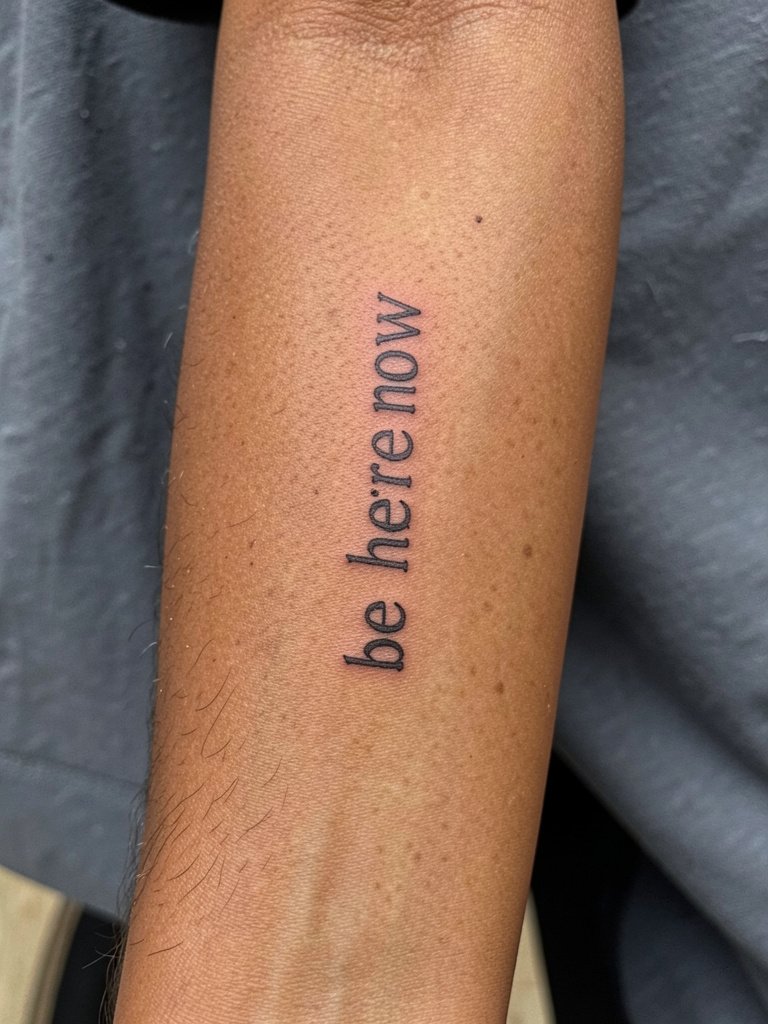
A vertical column suits the forearm's long canvas and reads differently than a horizontal phrase. Ask for slightly increased letter spacing and a modest increase in stroke to resist softening along the column. People sometimes ask for hairline single-needle columns that disappear into texture after a year. The session runs quickly when the layout is narrow, and touch-up at two to four years keeps crisp edges. Wear cropped sleeves or a three-quarter sleeve cotton tee to reveal the stacked type when you want it visible.
6. Script with Simple Illustrative Accent
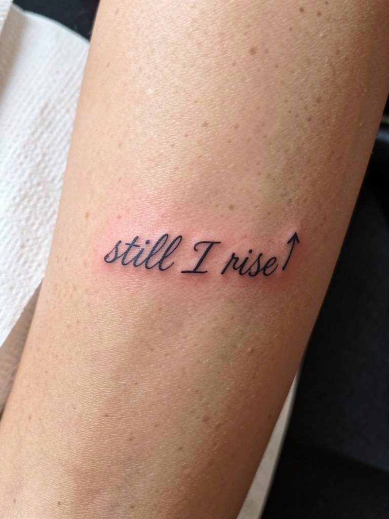
Adding a small graphic accent clarifies the emotional cue without clutter. For longevity, specify the accent be slightly bolder than the script so it reads at distance. A common mistake is placing stipple shading tight to thin letters which muddies the script as healing progresses. This combo typically takes under two hours. For evenings out, pair with rolled-up sleeves or a cuff bracelet that points attention to the accent.
Session Day Picks
The inner and outer forearm ideas above benefit from a few session and first-week items that make the day smoother and protect delicate linework.
-
Stencil transfer paper kit. Lets you preview exact letter spacing on skin before the needle touches down, helpful for the curved and column layouts above.
-
Topical numbing cream. Applied as directed eases the forearm's more sensitive spots so a longer script session finishes with fewer breaks.
-
Thin protective film roll. Keeps a wrist or outer-forearm quote clean while the scab phase passes, especially useful for people who type or wash hands frequently.
-
Fragrance-free gentle body wash. Cleanses the area without stripping ink or irritating sensitive new lines.
-
Aquaphor healing ointment. Thin applications in the first 48 hours protect fine lines without clogging, which helps scripts avoid premature blurring.
7. Micro-Realism Quote with Tiny Portrait Accent
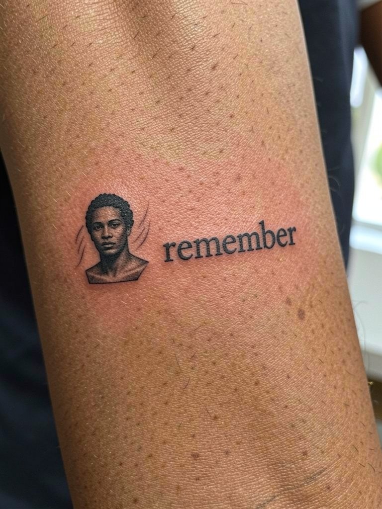
Micro-realism pairs well with a short quote when you want an emotional anchor plus an image. The portrait detail requires a steady hand, and you should ask for scale proofs to ensure the portrait remains identifiable at three years. A common mistake is requesting an overly tiny portrait that becomes a gray smudge with hairs and texture. The session feels fiddly and can take longer than a plain script, so plan for an extra half hour. To show this combination, a fitted short-sleeve or a sleeveless knit top keeps the inner forearm exposed without glare.
8. Split Quote Around a Central Motif
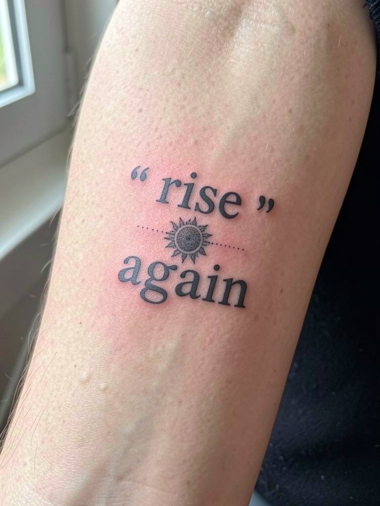
Breaking a quote into two parts around a small motif gives visual rhythm and reduces continuous thin strokes. Tell the artist the exact spacing you want and test the negative space between the motif and text. Mistakes happen when motifs are too detailed for the scale and distract from the lettering. Expect a one- to two-hour session depending on the motif size. This layout pairs well with short sleeves or rolled cuffs and looks good with a casual bomber jacket left open so the forearm is visible.
9. Lower Forearm Script Above the Wristband
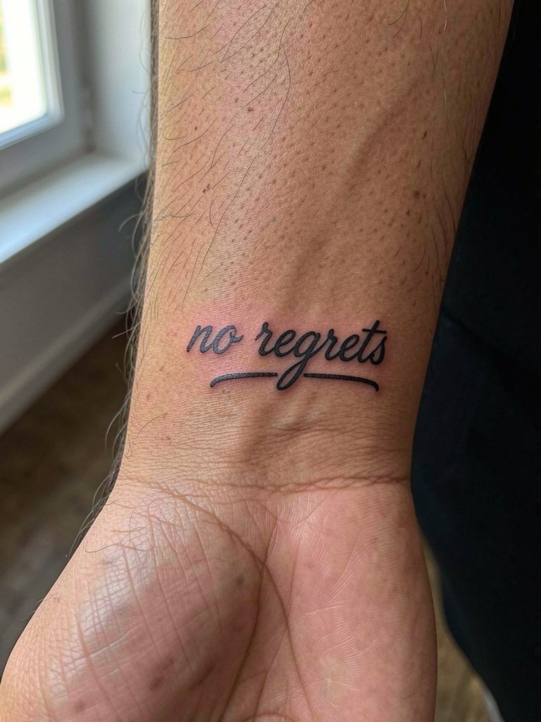
Placement just above the wrist needs planning because bracelets and watches can rub the area. Specify slightly higher placement than you think to avoid constant bracelet abrasion. A common error is placing the text under a watch band line that causes friction and delayed healing. Sessions are short but expect a sensitive finish near the wrist. When wearing accessories, choose slim bands or leather straps; a minimal leather bracelet frames the phrase without rubbing it.
10. Slanted Italic Script for Motion
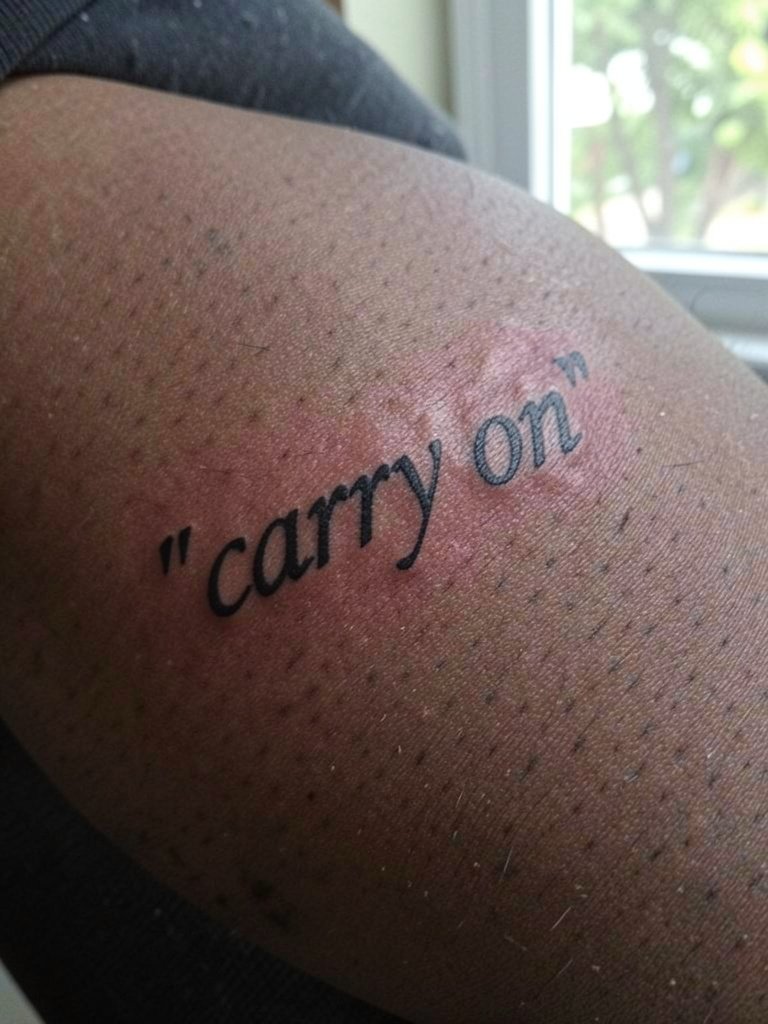
An italic slant gives the quote a sense of motion and suits forearm lines. Ask for consistent slant across letters and a mockup on skin at your chosen angle. The risk is overly tight cursive slant that compresses counterspace and becomes muddy. Pain is moderate and session time depends on length. For style pairings, long-sleeve shirts with a slightly cropped cuff let the italic angle peek out, and a classic button-up shirt worn casually shows off the slant.
11. Handwritten Note Style, Small Block
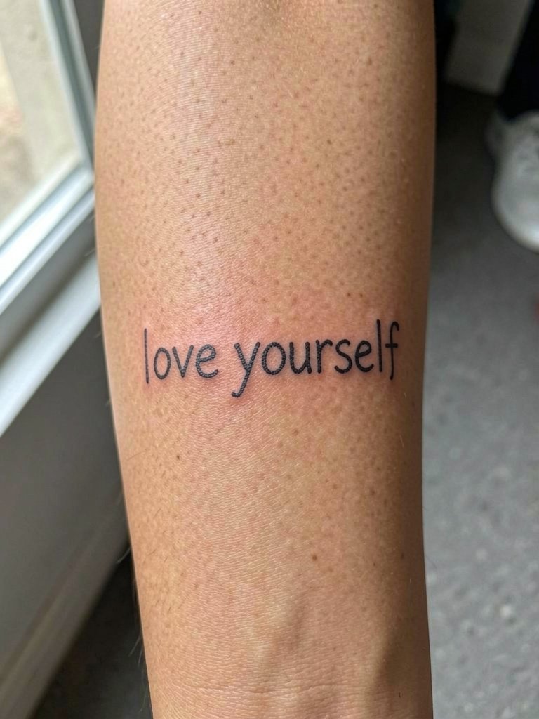
A faux-handwritten block reads personal and casual. Bring handwriting references so the artist can replicate the specific imperfect baseline and spacing you want. The usual mistake is pushing for extremely thin strokes that mimic pen ink and then losing the personality as lines spread. The session is generally comfortable and quick. For outfits, rolled sleeves and a simple chain bracelet highlight handwritten energy without hiding the piece.
12. Roman Numerals as a Quote Replacement
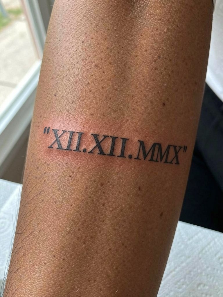
Roman numerals compress sentiment into a graphic string that occupies little horizontal space. When choosing numerals, confirm exact punctuation and spacing you want, as tiny changes alter legibility. A common error is placing numerals too small, making them hard to read as pores and texture dominate. The session time is short and healing is straightforward. Pair with short-sleeve cotton shirts and a slim cuff watch that sits below the numerals.
13. Two-Word Quote Split by Negative Space
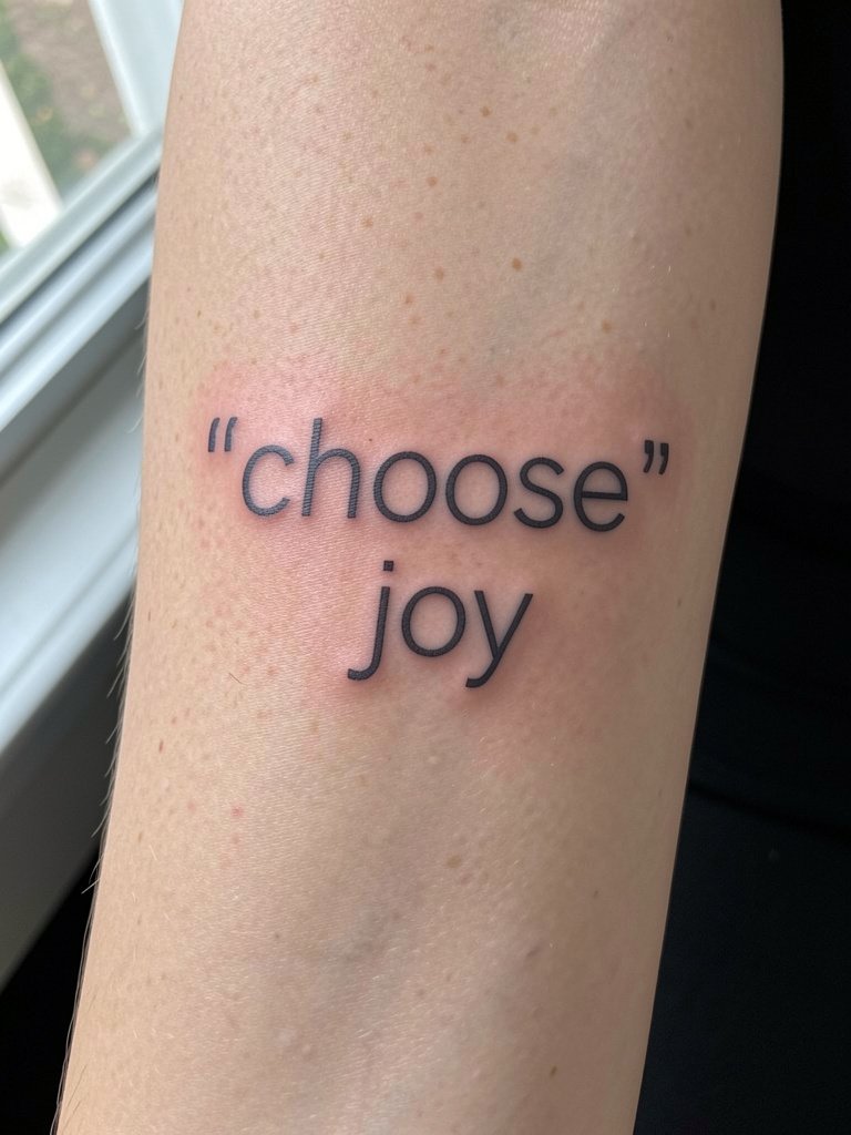
Using negative space as a design element makes short quotes feel intentional and modern. Ask the artist for exact kerning and line-height so the balance between words feels deliberate. The mistake is cramming words together to save space. Expect a one-hour session and a touch-up around three years for crisp edges. For showing off, cuffed sleeves or a rolled denim jacket keep the spacing visible, and a clean white tee frames the text.
14. Blocky Script With Shadowed Drop Line
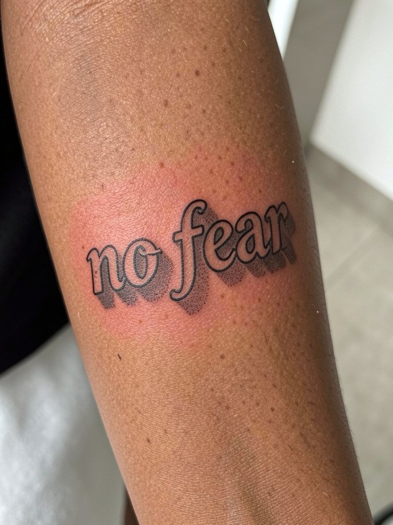
A drop shadow increases perceived dimension and helps blocky letters stay legible as edges soften. Specify shadow density during your consult so it does not overwhelm thin counters. People sometimes add heavy shadow that fills in thin letter interiors after healing. Sessions are moderate in length and feel mildly more abrasive where shading is applied. Pair with a short-sleeve button-up and a textured cuff bracelet to balance boldness.
15. Whisper Script Near the Elbow
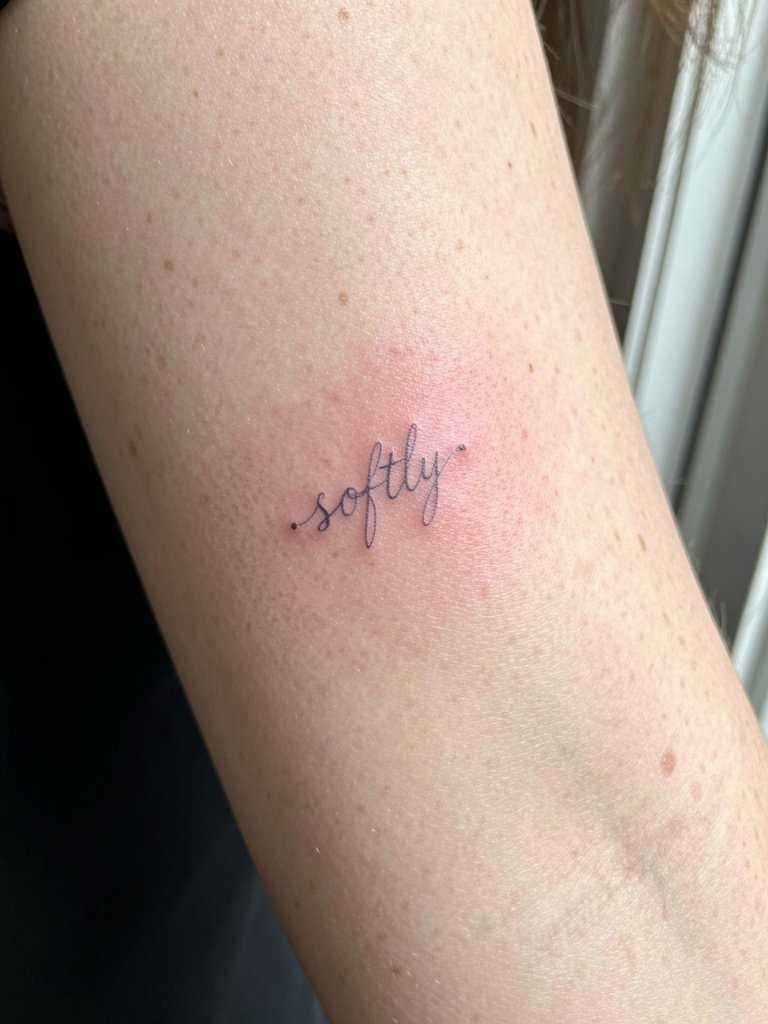
The inner elbow area is mobile and the skin there moves more than flat forearm skin. For ultra-fine whisper scripts, be prepared for faster loss of extreme thinness. Artists are split on this placement. One camp argues the constant bending blurs single-needle work within a short period. The other camp says careful depth and slightly wider spacing make it hold up. If you choose this spot, increase lineweight slightly and expect a possible touch-up earlier than other forearm locations. A loose short-sleeve or rolled-up sweatshirt shows this subtle placement without discomfort.
16. Stacked Serif Words With Natural Gaps
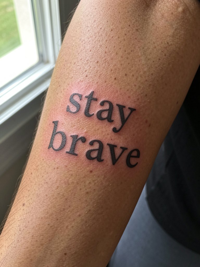
Stacking words and leaving natural breathing room reduces the risk of letters merging. Ask the artist to mockup the exact vertical spacing on your arm so you can see how it sits when you bend the elbow. A typical mistake is compressing the rows too tightly to fit a shorter canvas. Session time is moderate and most people feel manageable soreness rather than sharp pain. This layout looks great with rolled sleeves and a textured knit cuff on cooler days.
17. Negative-Space Lettering Over a Wash
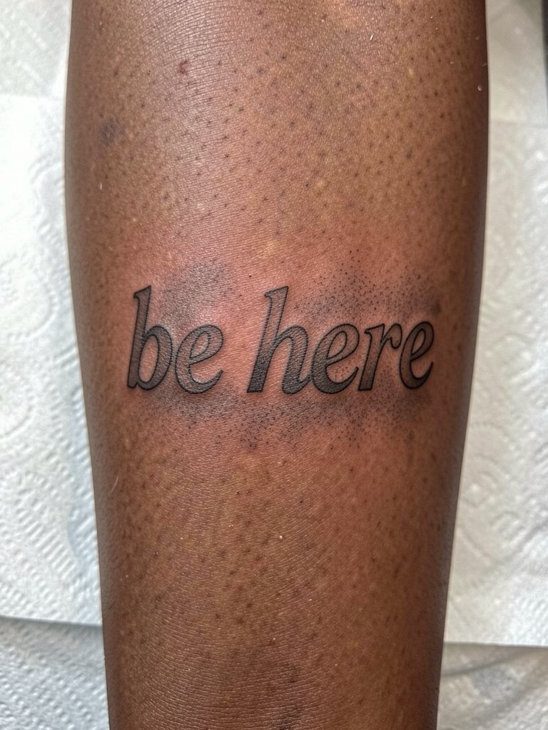
Negative-space text can be striking, but it relies on consistent saturation of the surrounding wash so the skin letters remain readable. Ask the artist to test saturation samples because lighter washes fade more quickly. People often pick extremely pale washes that disappear into skin undertones. This style takes longer to tattoo and sometimes needs a touch-up at two years. For presenting the piece, short sleeves and neutral colors let the negative-space letters hold focus, and a soft grey sweater contrasts well.
18. Calligraphic Flourish With Anchor Word
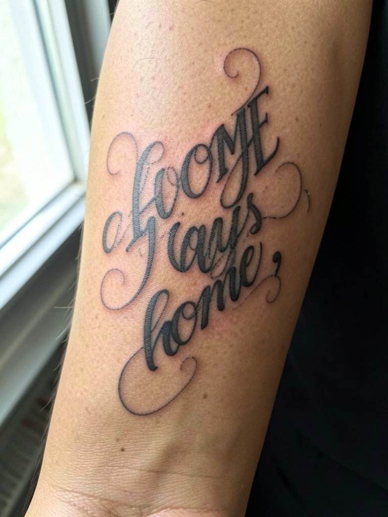
Using a bold anchor word surrounded by lighter calligraphic elements balances presence and personality. During consultation, clarify which word you want emphasized and how much contrast between stroke weights is acceptable. The error I see most often is overdoing flourishes that obscure the main word. Sessions are longer when heavy downstrokes require multiple passes for even saturation. Pair with sleeves that can be pushed up and a soft leather band when you want the anchor word to read as intended.
19. Wrapped Quote That Follows Arm Rotation
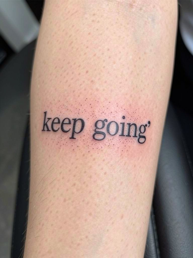
A wrap-following layout uses arm rotation to reveal the phrase in motion. Ask the artist to demonstrate how the text reads when your palm faces up and then down so you can confirm flow. The mistake is starting a wrap too close to a joint so movement distorts the letters. Sessions take longer because mapping is precise. This design looks especially good with rolled sleeves and an open-collar shirt that keeps forearm movement visible.
20. Thin Serif Text with Slight Tracking Increase
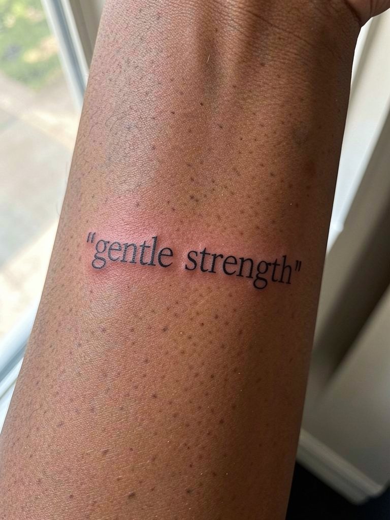
Small serif scripts benefit from deliberate tracking to keep counters open as skin texture changes. Specify the exact tracking increment in millimeters or bring a printed template so the artist can reproduce it on skin. A common error is assuming default tracking will hold across skin tones. Expect a comfortable session and plan for a potential touch-up around three years. For visibility, cuffed sleeves or sleeveless tops reveal the serif detail, and a lightweight cardigan layers without hiding the piece.
21. Mirrored Text on Both Forearms
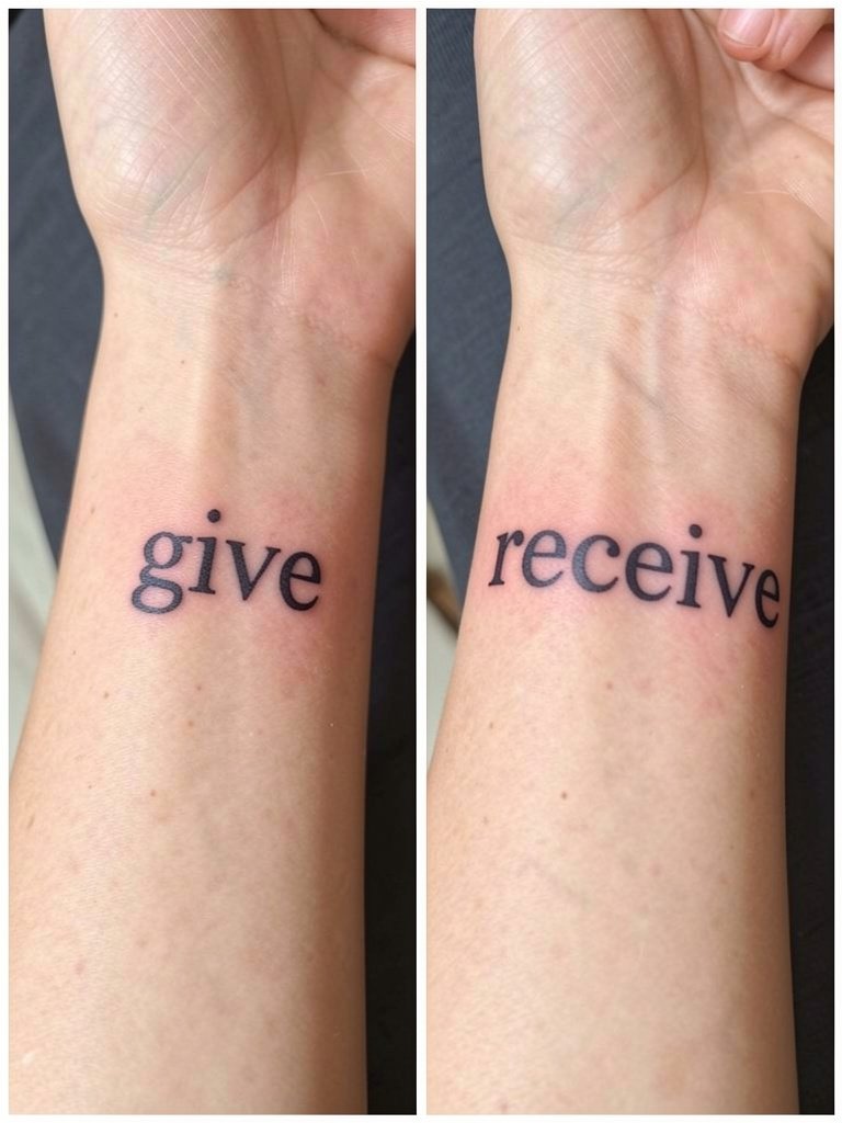
Mirrored text across both forearms creates a conceptual pair and balances presence. When planning, confirm both scales precisely so one side does not overpower the other. The main trap is asking for exactly identical hand-drawn scripts without considering natural asymmetry of each arm. Sessions are usually split across two appointments or arranged in one longer session. For showing the duo, short sleeves on both arms or a lightweight utility shirt keep both pieces visible.
22. Script Around a Wrist-Facing Curve
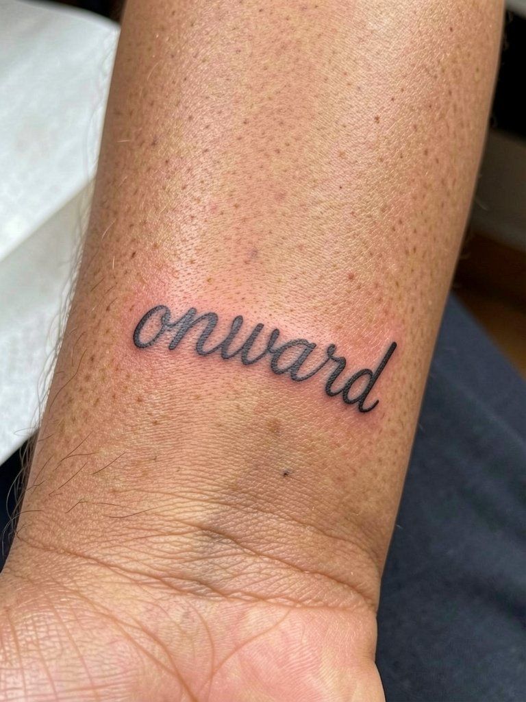
Curving text to face the wrist makes messages personal and direct when you glance down. Ask for a stencil that is placed while your arm is relaxed so the curve matches how you will actually view it. Mistakes happen when stencils are set with the wrist flexed, changing the curve appearance when relaxed. Sessions are short and sensitive near the wrist. For daily wear, a thin bracelet that sits below the curve, like a minimal bangle, complements without rubbing.
23. Heavy Script Anchored by a Small Illustration
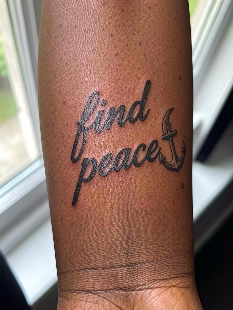
Pairing heavier script with a small icon gives presence and an identifying mark that resists aging into generic text. Ask the artist to slightly oversize the icon relative to the script so it continues to read as a separate element after years of wear. A mistake I see often is shrinking the icon until it disappears into the script. The session can be longer depending on the size of the icon and the amount of saturation needed. For nights out, push up sleeves and wear a short-sleeve buttoned shirt so the anchor stays visible.
Frequently Asked Questions
Q: How small can a forearm quote be and still stay legible over time?
A: It depends on letter style and spacing. As a rule of thumb, keep x-height large enough so counters are visible and increase tracking if you choose thin serif or script. For most people, a modest increase in stroke weight and spacing prevents early blurring and reduces the need for touch-ups.
Q: Are single-needle scripts on the forearm a bad idea?
A: Artists are split into two camps on single-needle forearm work. One camp argues micro single-needle scripts blur and lose distinct counters within two to three years because of skin texture and daily friction. The other camp believes with careful depth control and slightly wider spacing single-needle can hold up for many years and will point to healed examples. If you prefer single-needle, plan for a touch-up window and ask for slightly larger spacing during the stencil stage.
Q: What should I wear to my appointment for a forearm quote?
A: Wear something that gives the artist clear access without discomfort. For inner forearm work, a loose tank or sleeveless tee is ideal. For outer forearm pieces, a short-sleeve shirt or a button-up you can roll saves time. A loose tank top is a practical choice for the studio.
Q: How often do forearm quotes need touch-ups?
A: It varies by style, skin type, and sun exposure. Bold block scripts often go longer between touch-ups, sometimes five years or more. Very fine scripts or heavy washes tend to need revisions sooner, often around two to four years. Plan touch-ups as part of long-term maintenance rather than a one-time event.
Q: Where can I find healed forearm quote examples and portfolios without naming specific artists?
A: Search platform hashtags and location filters to find healed photos and portfolios. Try hashtags like #ForearmQuoteTattoo and #HealedScriptInk, use TikTok and Instagram location filters to view nearby studios, and browse community threads on Reddit for real healed shots across skin tones. These pathways help you compare healed work and decide which treatments hold up.
Q: Do darker skin tones affect lettering choice for forearm quotes?
A: Yes, skin tone affects contrast and perceived sharpness. On darker skin, medium-to-bolder strokes and slightly larger spacing improve readability. Ask for healed photos from artists showing similar skin tones so you can judge how lineweight and saturation translate over time.