
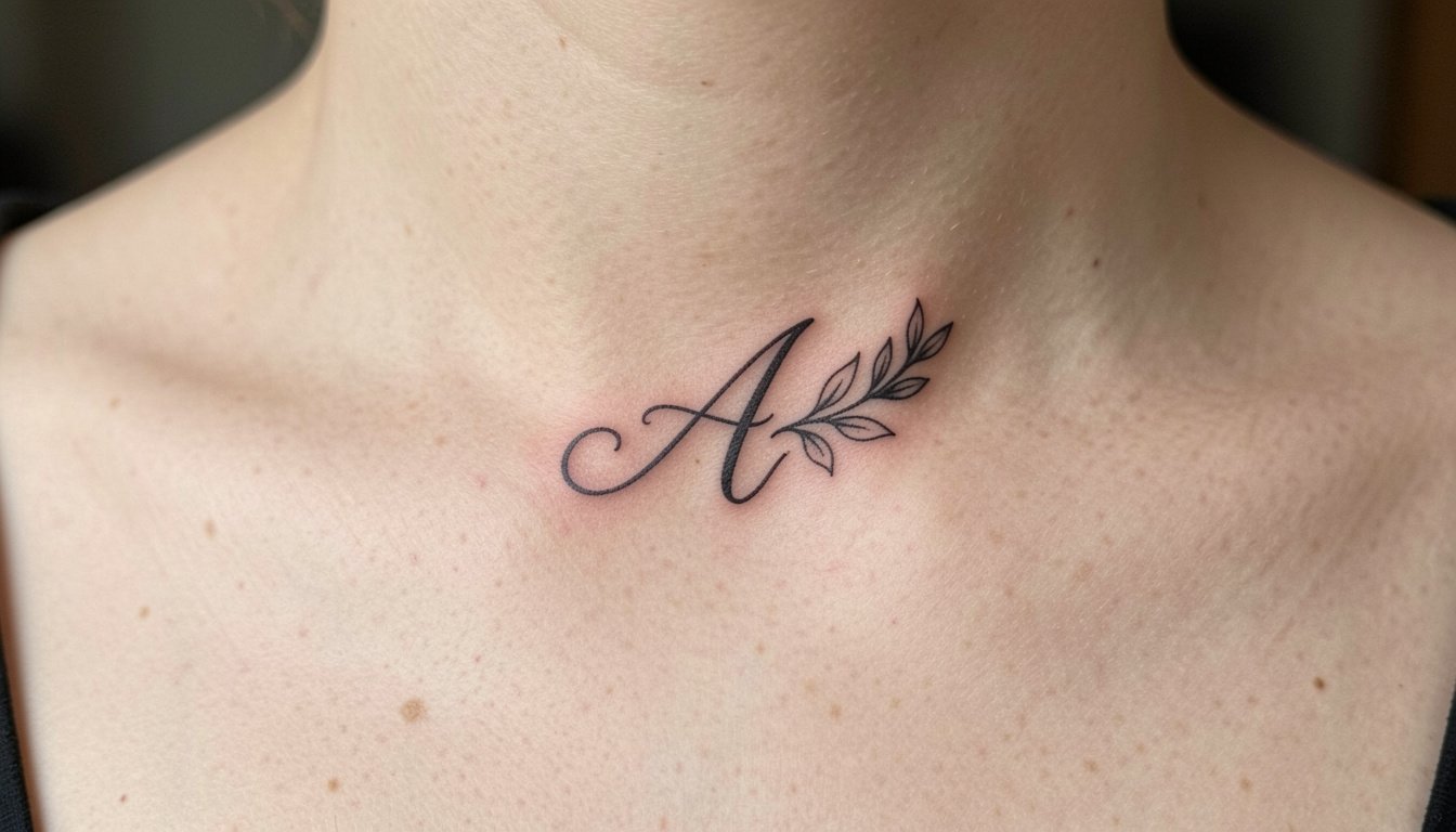
A lot of people pick a single letter because it feels private, but the surprising truth is that a tiny initial often fails visually long before a larger, considered design does. A one-stroke script A on the wrist can blur into an unreadable mark within a couple of years if line weight and spacing are wrong. Start the conversation by deciding how you want the A to read at year three, not just how it looks on day one.
1. Fine Line Script A on Inner Forearm

This is the classic first-tattoo move for someone who wants readable detail in a small space. I recommend a slightly heavier downstroke than a flash script reference because the inner forearm eats the finest hairline detail over time. Talk with your artist about line weight at the stencil stage and request a printed mockup scaled to the exact size you want. Count on a single short session and a possible touch-up around year two if you keep the A very small. For the appointment wear a rolled-sleeve linen button-down so the artist can access the area easily, and consider pairing the finished piece with a slim watch on the opposite wrist, which frames the forearm without covering the ink. linen button down shirt
2. Botanical Wrap A at the Collarbone
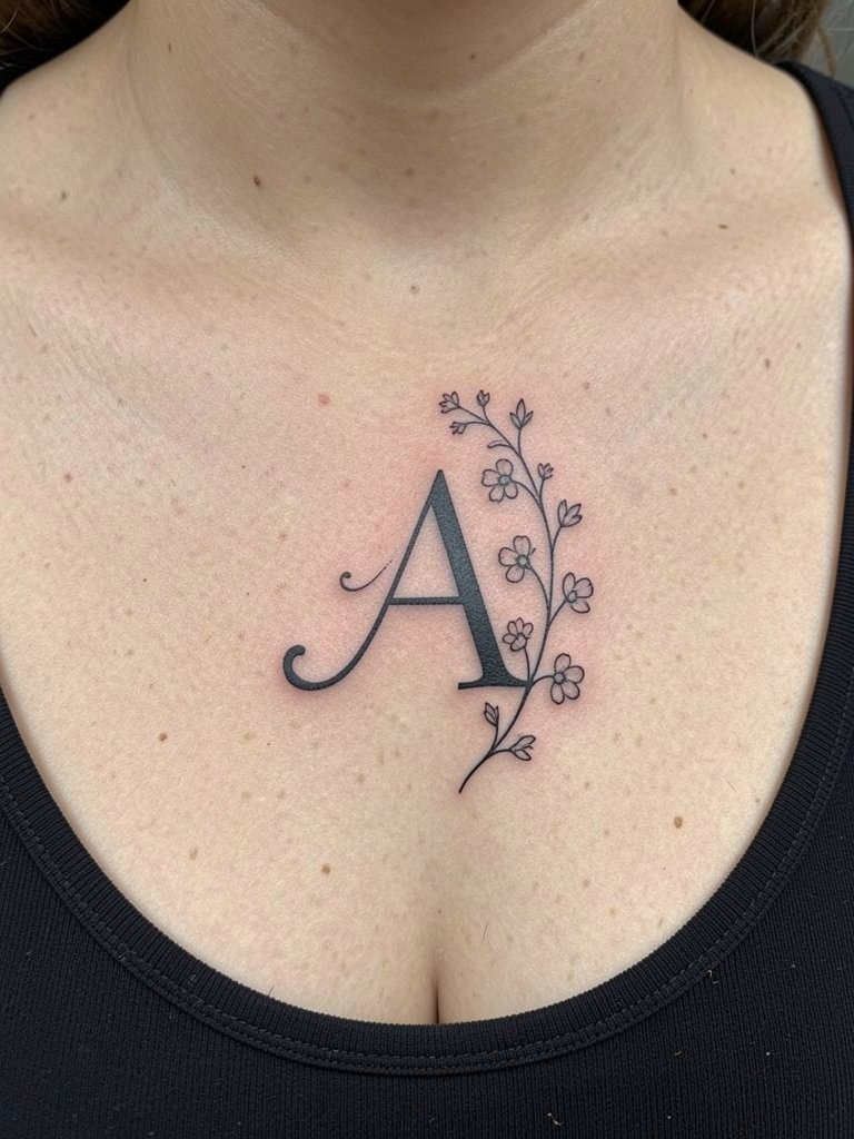
A collarbone A reads intimate because it sits near the heart. The practical bit is that clavicle skin moves with breathing and can be sensitive during the session. Mention exact spacing for the vine so the ornamentation does not crowd the letterform. A common mistake is insisting on ultra-thin floral stems that disappear after a year. Request slightly bolder stems and ask for healed examples on similar skin. Session feel is moderate, and most clients get through it with short breaks. For showing it off, square-neck tops and layered necklaces that sit above the tattoo make the vine feel deliberate. square neck top
3. Geometric A Framed in a Triangle on the Outer Forearm
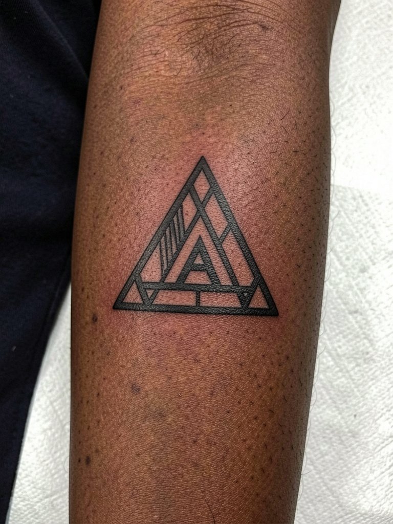
Geometric frames make a single letter feel intentional and give the artist room to set line spacing that lasts. For this, bring two scaled references so the artist can show how line thickness changes readability at three and five inches. The mistake is shrinking the whole composition to finger-sized proportions where the triangle sides become one blurry mass later. Outer forearm placement reduces friction and keeps the triangle crisp longer, and the session is low discomfort. Wear a short-sleeve shirt you can roll up easily. For a clean everyday look, pair it with a minimal gold ring set on your dominant hand. minimal gold ring set
4. Nature-Integrated A with Waves and Mountains on the Calf
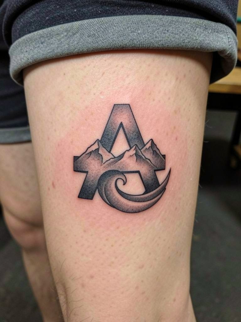
This is for someone who wants the letter to double as a landscape. The design gains longevity if the peaks and waves are allowed breathing room inside the A. A common aging issue is cramming tiny landscape details into a small letter. Tell the artist you want the mountain ridges simplified to blocks of negative space and the wave to remain a bold silhouette. Calf skin tolerates slightly denser saturation so this can take more punch than a wrist piece. Session time is medium and pain is low. For showing it off, tailored shorts or midi skirts with a split let the calf read naturally. tailored shorts women
5. Animal-Motif A with Eagle Feathers on the Shoulder
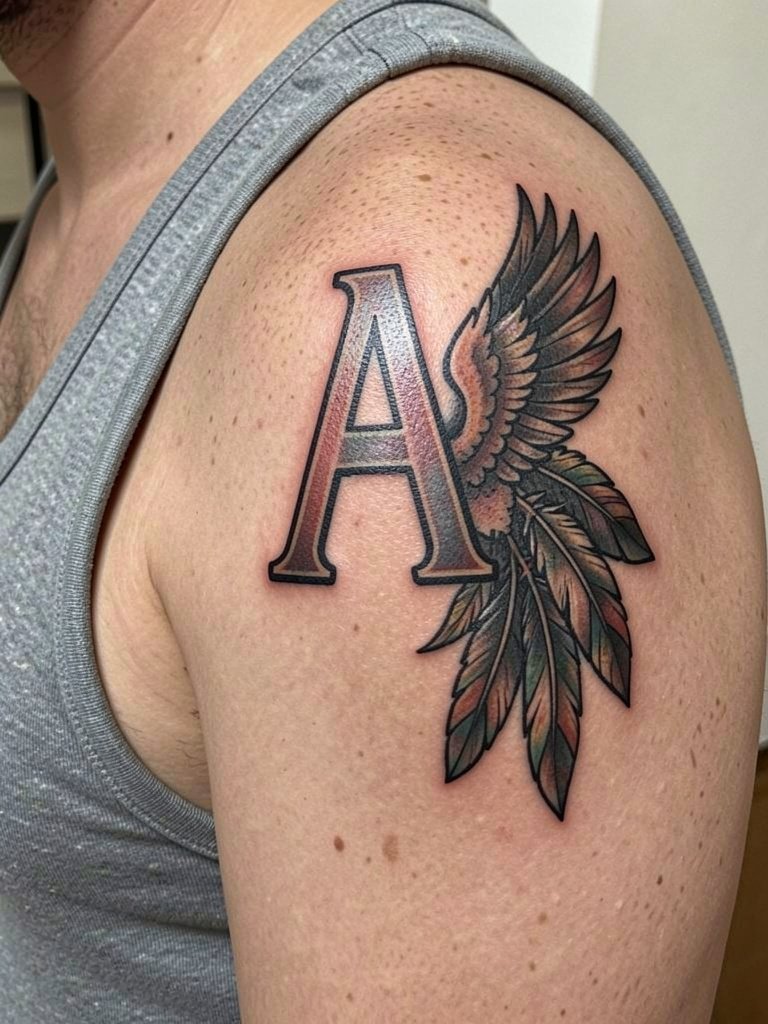
Pairing an animal motif with the initial lets you encode traits without a portrait. The design reads best if the feathers follow the shoulder's natural contour rather than forcing symmetry. Ask for a mockup that sits with your deltoid curve so the piece does not distort when you move. A typical mistake is crowding the feather detail, which loses its visual impact as the ink settles. Shoulder placement handles saturation well and usually needs no early touch-up. For the session wear a racerback tank so the artist has clear access. Tank tops with a racerback cut create a natural frame when you want to show the tattoo. racerback tank top
6. Altered-Stroke Script A on the Wrist
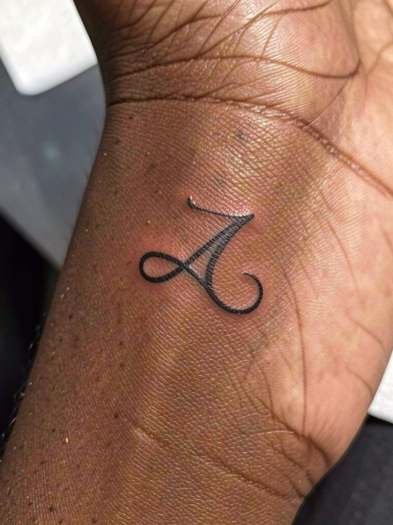
The wrist is showy and personal but it is also high-friction. One camp in the artist community prefers ultra-fine single-needle scripts for the wrist because they look elegant at first. Another camp argues for a slight increase in core stroke thickness so the letter stays readable after frequent washing and bracelets. Both positions have merit. If you prefer a delicate look, plan for a touch-up timeline and schedule a follow-up at the one-year mark. For the session wear short sleeves and remove any bracelets. A slim watch on the opposite wrist balances the composition when you want to highlight the piece. slim watch women
Session Day Picks
The first six ideas lean on delicate linework and small decorative elements, so a few simple items smooth the appointment and the first week of healing.
-
Disposable stencil transfer sheets. These help preview the exact line weight on skin before the needle, which is crucial for decisions you made in the forearm and collarbone pieces.
-
Topical numbing cream alternative. Apply 30 to 45 minutes before a sensitive wrist or clavicle session to reduce discomfort without interfering with the artist's linework.
-
Thin protective film roll. Useful on finger and wrist placements to guard against early friction while you shower and type.
-
Fragrance-free body wash. Gentle cleansing helps prevent irritation on small linework during the first week.
-
CeraVe Hydrating Cleanser. A mainstream gentle cleanser many people use during healing to avoid stripping moisture from delicate lines.
7. Micro Initial on the Finger
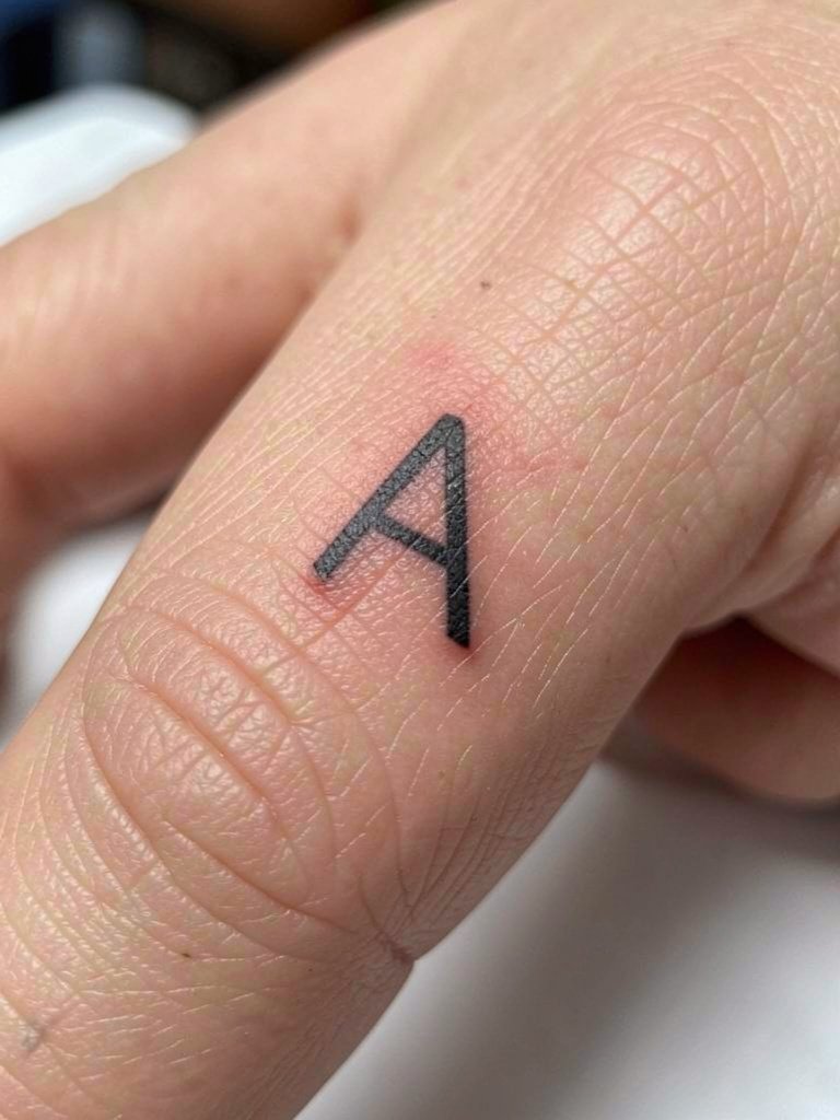
Finger initials are intimate and visible, but they demand maintenance. One camp loves fingers for their visibility and matching potential for couples. The other camp warns that fingers experience the most wash-related fading and often need yearly touch-ups. Both perspectives are accurate depending on lifestyle. If fingers suit you, ask the artist to plan for simplified shapes and open counters that age more gracefully. A frequent error is asking for dense shading on a fingertip where the skin layers do not hold pigment well. Session feel is short but sharp. Style-wise keep rings light or skip heavy signet rings on the tattooed finger to let the A read clearly. simple ring set
8. Serif A in Tiny Blackwork on the Ankle
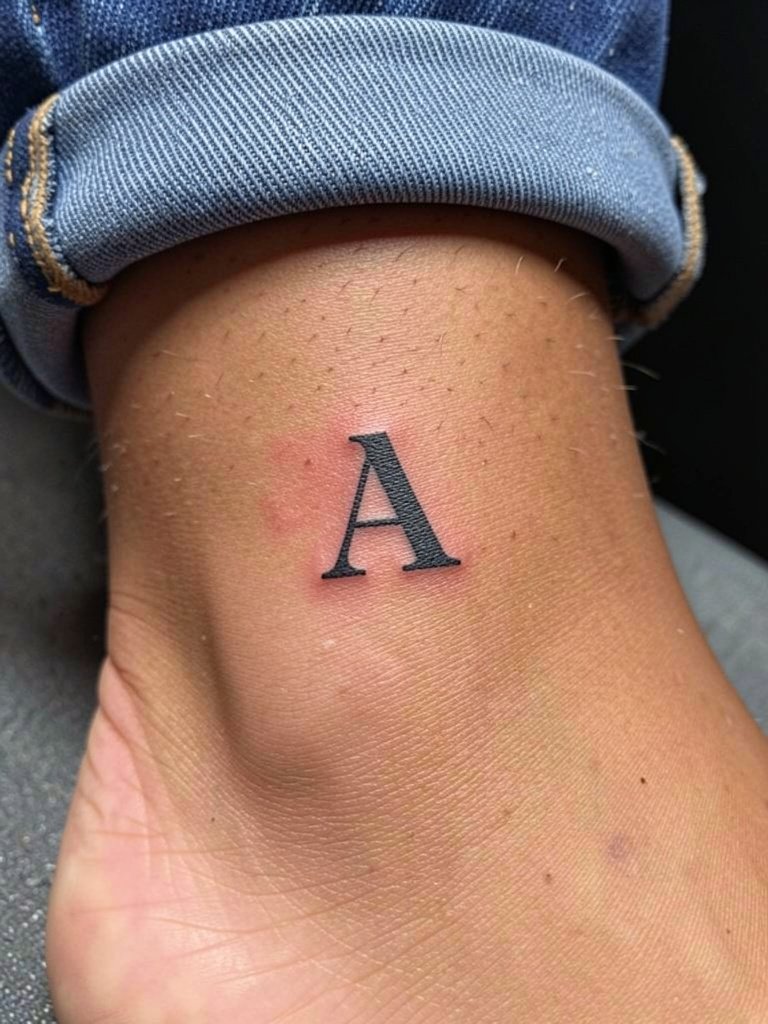
A serif initial gives the single letter more personality and helps readability when scaled small. The main issue on the ankle is friction from socks and shoes during the first weeks. Tell the artist you want slightly shorter serifs so they do not act like thin spokes that blur. The piece benefits from denser blackwork inside the stems for longevity. Expect a medium session and moderate pain. When you want to show it off choose cropped pants or low-profile sneakers that keep the ankle visible without rubbing the fresh ink. cropped linen pants
9. Ornamental A with Dot Work on the Upper Chest
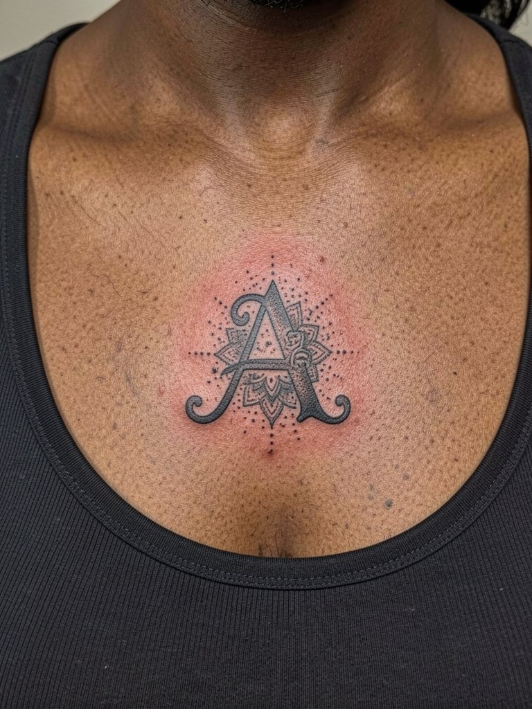
Dot work and stippling can be striking around a single letter, but tiny stipple fills can lose contrast on darker or textured skin if the artist does not plan heavier anchors. Ask the artist to show healed dot-work examples on similar skin tones and to adjust the dot density accordingly. A common mistake is relying on pale gray fills that vanish on deeper tones. Sternum and upper chest areas have variable pain levels, so plan for breaks and a longer session window. For evenings out, square-neck dresses frame ornamental work nicely. square neck dress
10. Block Letter A with Negative Space on the Bicep
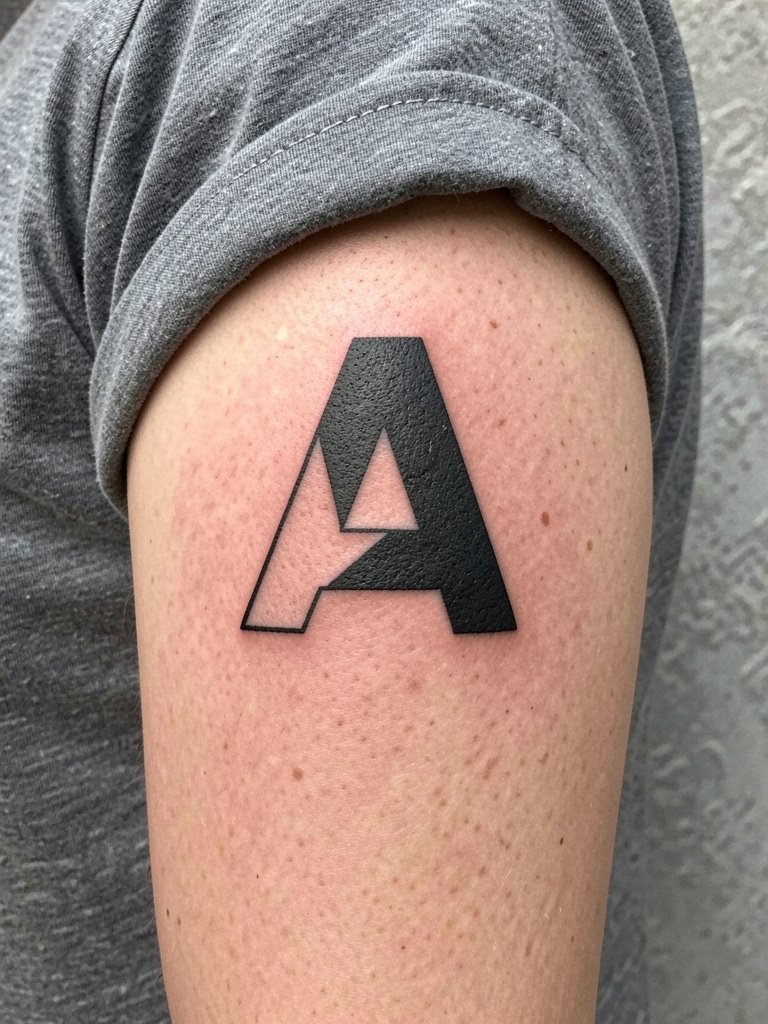
Block letters scale well and age predictably because they give the ink room. For a bicep piece, ask the artist to map how the negative space moves with the muscle. A common error is drawing the negative spaces too thin so they collapse visually as the area settles. Bicep skin handles denser saturation so this design can be slightly more graphic. Session is short to medium and usually tolerable. To show it off roll sleeves up or wear a sleeveless button-front shirt that frames the upper arm. sleeveless button shirt
11. Script A in a Matching Pair for Couples on the Ribcage

Matching initials for couples live or fade together in a sense, but ribcage placement is a commitment in session time and pain. One artist camp accepts fine single-needle ribs if spacing is increased. Another insists ribs stretch and blur lines, so they recommend thicker strokes. Both viewpoints are credible depending on your pain tolerance and follow-up plan. If you go for ribs, request a slightly heavier core stroke and schedule a touch-up window at nine to twelve months. During the session wear a button-front layer so you can open it without moving clothing over the new ink. fitted cropped athletic top
12. Minimalist A with Geometric Negative Space on the Back of Neck
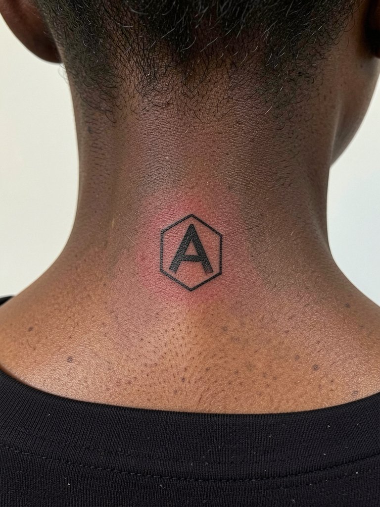
The nape reads as a subtle placement that is easy to hide when needed. Make sure you and the artist agree on exact placement relative to the hairline and spine. A common mistake is placing it too low where clothing rubs or too high where hair and styling obscure the shape. The back of neck usually tolerates short sessions and heals well with minimal fuss. For showing it, wide-neck tops expose the area tastefully. Consider short, regular trims or updos if you want the tattoo visible more often. wide neck top
13. Watercolor Accent A with a Single Bloom on the Upper Arm
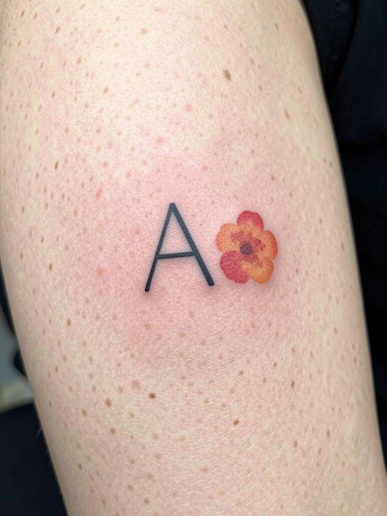
Adding restrained color can personalize a single letter, but color choices change how a piece ages. One view favors black-only initials for predictable longevity. Another view accepts a small, saturated accent if the pigments and placement are chosen for low friction. Both are valid. If you want color, pick a single saturated bloom and request color-saturation tests or healed swatches from the artist. Upper arm placement shields color from daily washing and sun exposure better than hands or wrists. For the session wear a loose tank so the palette is not smeared by tight clothing. loose tank top
14. Handwritten A from a Note on the Inner Wrist
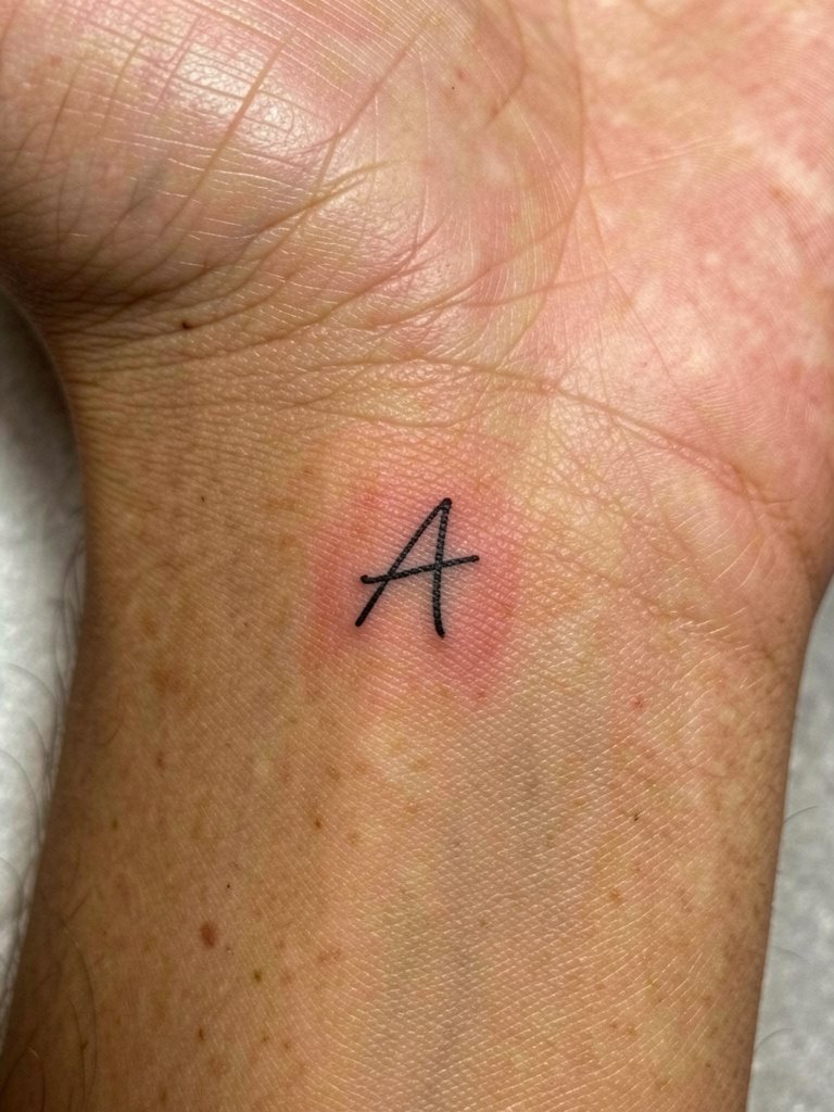
Translating a loved one’s handwriting into a tiny initial adds a personal graphic cue, but the same rules about scale apply. Ask the artist to digitize and simplify any handwriting loops that would otherwise collapse. A common mistake is requesting an exact micron-level recreation of a shaky cursive line that becomes illegible once healed. Inner wrist sessions are short and sensitive. Keep bracelets off during healing and consider pairing the piece with a delicate chain bracelet on the opposite wrist when you want balance. thin chain bracelet set
15. Mirrored Pair A for Siblings on Collarbone and Wrist
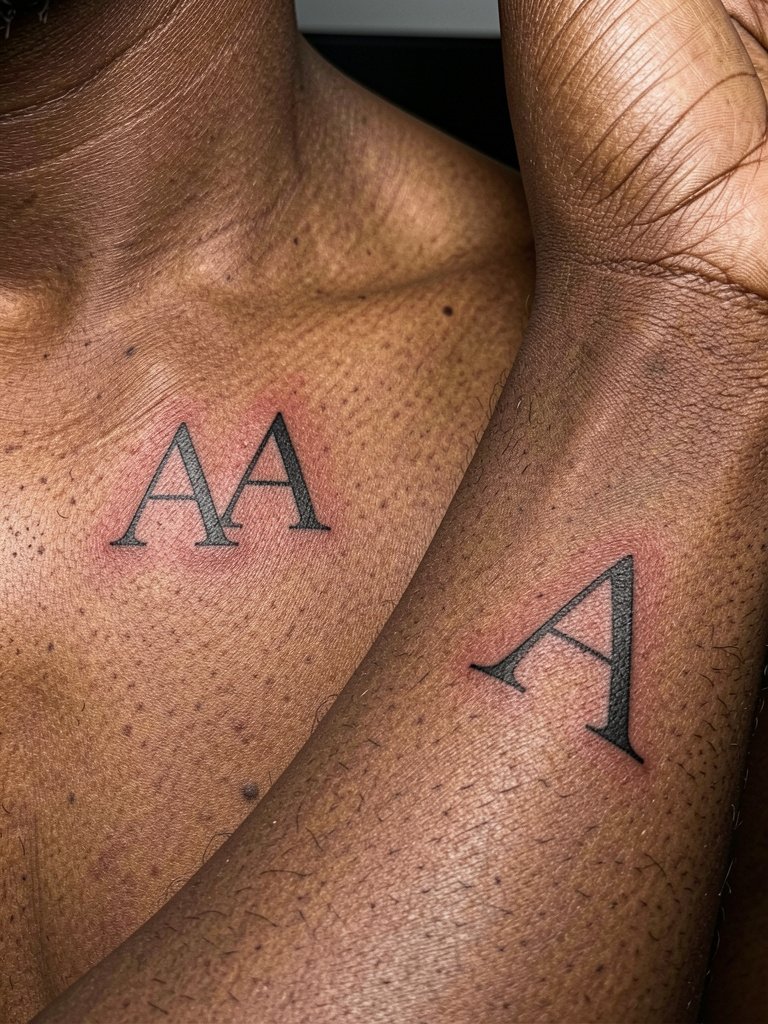
Mirrored initials let siblings or friends coordinate without full matching tattoos in the same place. When planning mirrored pieces, confirm scale and line weight so the wrist and collarbone reads as a pair despite different skin movement. The frequent error is insisting both be identical in dimensions without adjusting for placement. If one is on the wrist, increase the core stroke a touch compared with the collarbone version. Expect different touch-up needs for each location. For the session wear a fitted scoop-neck top for the collarbone and a short-sleeve tee for the wrist so both areas are easily accessible.
Frequently Asked Questions
Q: How big should a single-letter A be to avoid it blurring into a blob over time?
A: In my experience, an A that reads cleanly at about two to three inches tall gives the artist space to set line weight and counters that last. If you want it smaller, plan for slightly heavier strokes and accept that a touch-up in one to three years is common. Ask for healed examples at the size you want so you can see the real-world trade-off.
Q: Where can I find healed examples and local artists without naming specific people?
A: Search style and placement hashtags on Instagram and TikTok like #initialtattoo, #finelinetattoo, and #microtattoo, then add your city to the query to filter locational results. Look for posts that say "healed 1 year" or show close-ups under natural light. Reddit threads on r/tattoos and r/tattooadvice also surface honest healed photos and touch-up timelines. Use those healed examples to compare how certain line weights hold up on similar skin tones.
Q: Will a tiny A on darker skin look as crisp as on lighter skin?
A: It depends on contrast and line choice. For darker skin tones, artists often use slightly thicker core strokes and avoid faint gray washes that vanish. Request healed photos on similar skin and talk about increasing black saturation in the main strokes. That adjustment keeps the form readable without losing the subtlety you want.
Q: What should I wear to the appointment for different placements?
A: Match clothing to the placement so the artist has easy access. For collarbone pieces choose a scoop-neck or button-front shirt you can open. For inner forearm and wrist wear a rolled-sleeve linen or short-sleeve tee. For shoulder and back-of-neck pieces wear a racerback or wide-neck top. For calf and ankle, bring shorts that sit normally above the area. These wardrobe choices let the artist work without you shifting fabric over fresh ink. rolled cuff shirt
Q: How often do small initials need touch-ups?
A: Small initials commonly need a touch-up between one and three years depending on placement, daily abrasion, sun exposure, and how conservative the original line weight was. Fingers and wrists tend to require more frequent touch-ups. If longevity is critical, opt for slightly heavier strokes up front and plan a maintenance check after the first year.