
Someone I know spent six months bookmarking gaming art before booking a session. The real problem was picking a design that reads well on skin after years of sunlight and gym time. These 15 ideas focus on linework, saturation, and placement choices that actually age, plus what to tell your artist so the tattoo still looks like your favorite game a few years from now.
1. Fine Line 8-bit Heart on Inner Forearm
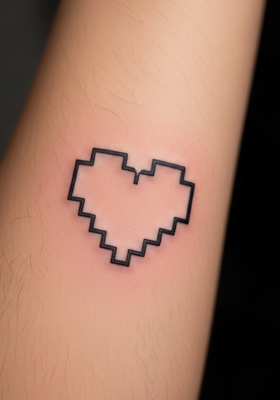
Someone I know picked this for a first visible piece because it nods to retro games without dominating a sleeve. Expect a low to medium pain level on the inner forearm and a single short session for a crisp micro design. Ask your artist for slightly thicker outer pixels than an exact 1-pixel map, so linework holds as the skin ages. A common mistake is going too small, which invites blowout. At six months the blocky look still reads. At two years the edges soften and may need a touch-up. This is best for people who want nostalgia that stays readable.
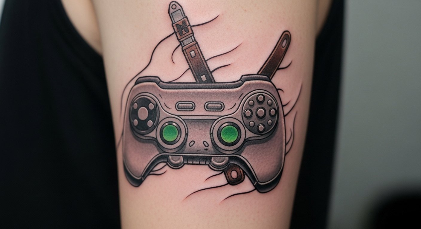
2. Micro-Realism Game Controller on the Chest
Fair warning: chest placements can be a five to seven on pain for some people, and breathing moves the canvas during the session. This style uses tiny gradients for metal and plastic texture. Tell your artist you want defined contrast and solid saturation in shadow areas so the controller keeps depth after healing. A mistake is asking for ultra-thin highlights that disappear after three months. On chest, touch-ups at year two are common because the area gets sun and friction from shirts. For those who like subtle realism without full sleeves, this placement reads personal and guarded.
3. Pixel Sword on Outer Bicep
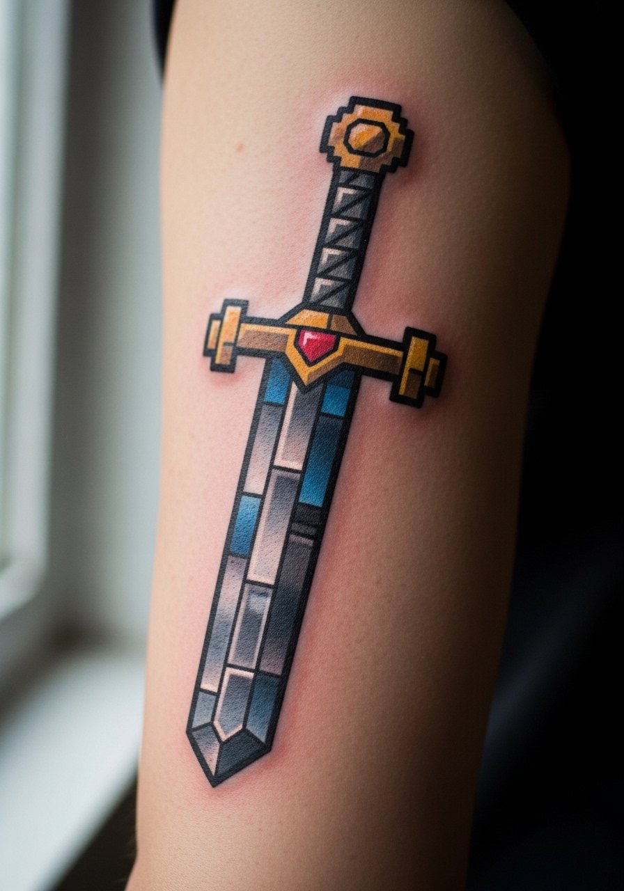
There is something about bold black outlines filled with saturated color that reads from across a room. Outer bicep is a low pain spot and great for a 45 to 90 minute session depending on size. Ask for clean outlines and color segments that are slightly larger than exact pixels so the form does not blur into a single shape over time. Common aging note: saturated reds and blues can fade faster, so expect a color touch-up around year three. This design scales well to sleeves if you later want fantasy elements added.
4. Minimalist Controller Glyph Behind the Ear
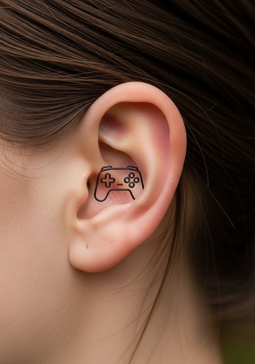
Mistake lead: the biggest error with tiny ear placements is expecting fine line to last forever. Behind the ear, skin shifts and ink can spread. If you want this spot, tell your artist to use slightly bolder linework and leave breathing room between strokes. The session is short and pain is sharp but brief. This placement reads as a discreet nod to gaming culture. Keep in mind face and head placements require specialized experience from artists who work that area often. Ask about their healed portfolio in person or through directories and hashtag searches.
5. Retro Arcade Cabinet on Calf
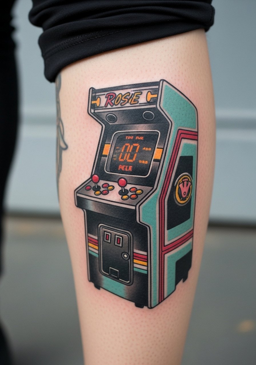
Visual impact lead: a vertical arcade cabinet plays well on the calf because it follows natural muscle lines and stays visible standing up. Calf pain is moderate and sessions can be a single long block for detail. Tell your artist you want heavy black anchors around the edges to prevent color washout. A common version that ages poorly is low-saturation color with thin outlines. At two years the cabinet should still pop if the saturation was strong initially. This piece adapts into a leg sleeve if you later want more arcade elements.
6. Stipple-Shaded Dragon from an RPG on the Back Shoulder

When you sit down with your artist for this one, bring references that show stipple shading and dot work at varying scales. Shoulder placement reads well in shirts and allows for mid-length sessions. Stipple holds better than smooth gradient work on textured skin because the negative space preserves shape as saturation softens. A real mistake is asking for too much tiny dot density in a small area. At six months the dragon has crisp texture. At five years the stippling keeps the form and is easier to touch up than a full wash of color. This is best for people who like hand-drawn, illustrative feels.
7. Monochrome Boss Portrait in Micro-Realism on the Ribcage

Controversy lead: fine line on the ribs splits artists into two camps. One group argues ribs stretch and blur lines within two years. The other group says with correct depth and spacing, micro-realism can settle fine. My advice is to ask your artist which camp they are in and to see healed rib work in similar tonal ranges. Rib pain is high, the session will likely be split into two shorter appointments, and touch-ups may be needed at year two. The portrait style reads dramatic in monochrome and plays well under shirts.
8. Geometric Mandala Controller on the Sternum

There is a cultural origin here because mandala-style patterns trace to spiritual traditions. Some people choose stylized variations rather than direct replicas out of respect. Sternum work can be painful and requires an artist experienced with centerline symmetry. The biggest mistake is making the pattern too tight toward the nipple line which can distort. Over time the symmetry still reads if linework spacing had room to breathe. Expect one to two sessions and plan for chest sun protection during healing because UV kills saturation.
9. Watercolor Spell Effect on the Forearm
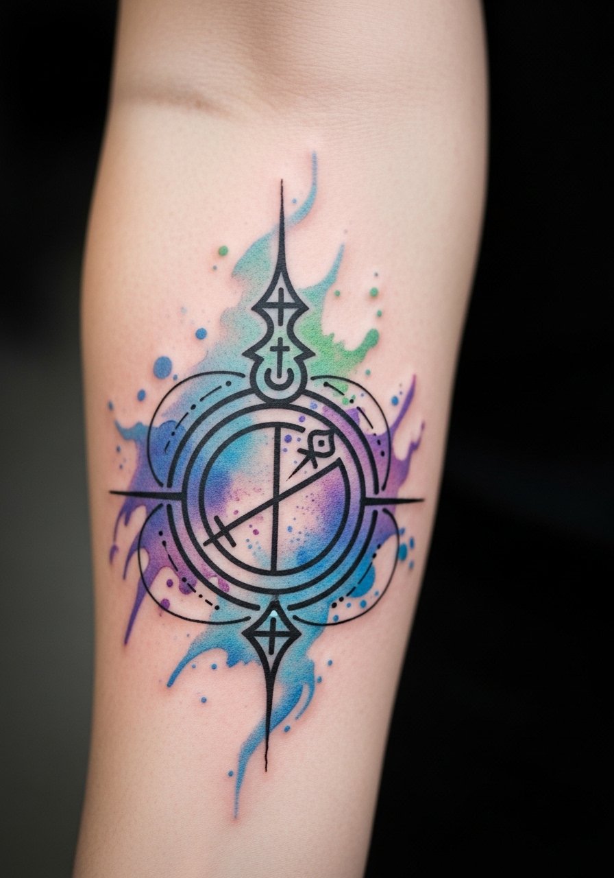
Aging and healing lead: most watercolor tattoos from five years ago look muted now. This version keeps a crisp line overlay that protects the shape as the washes fade. Forearm is a mid-pain, high-visibility spot and sessions vary by size. Tell your artist you want a solid black or dark gray outline to preserve the form. The common mistake is relying on watercolor alone with no line anchors. At six months the washes look vibrant. At two to three years the color will soften and you may want a refresh of selective saturation.
10. Blackwork Boss Emblem on the Thigh
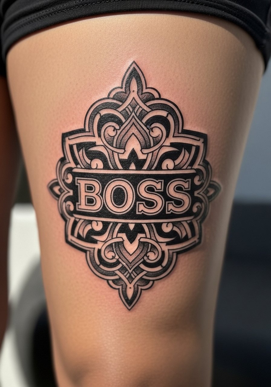
Visual impact and session feel: the thigh takes heavy saturation well and tolerates longer sessions with less blowout risk. This style uses bold black shapes and negative space to create the emblem. A mistake is too many thin interior details at small scale. Expect a single multi-hour session or split sessions for very large pieces. Healed saturation tends to last longer on the thigh than on hands or feet. This is a solid pick for someone who wants a statement piece that ages predictably.
11. Linework Achievement Icons Around the Wrist
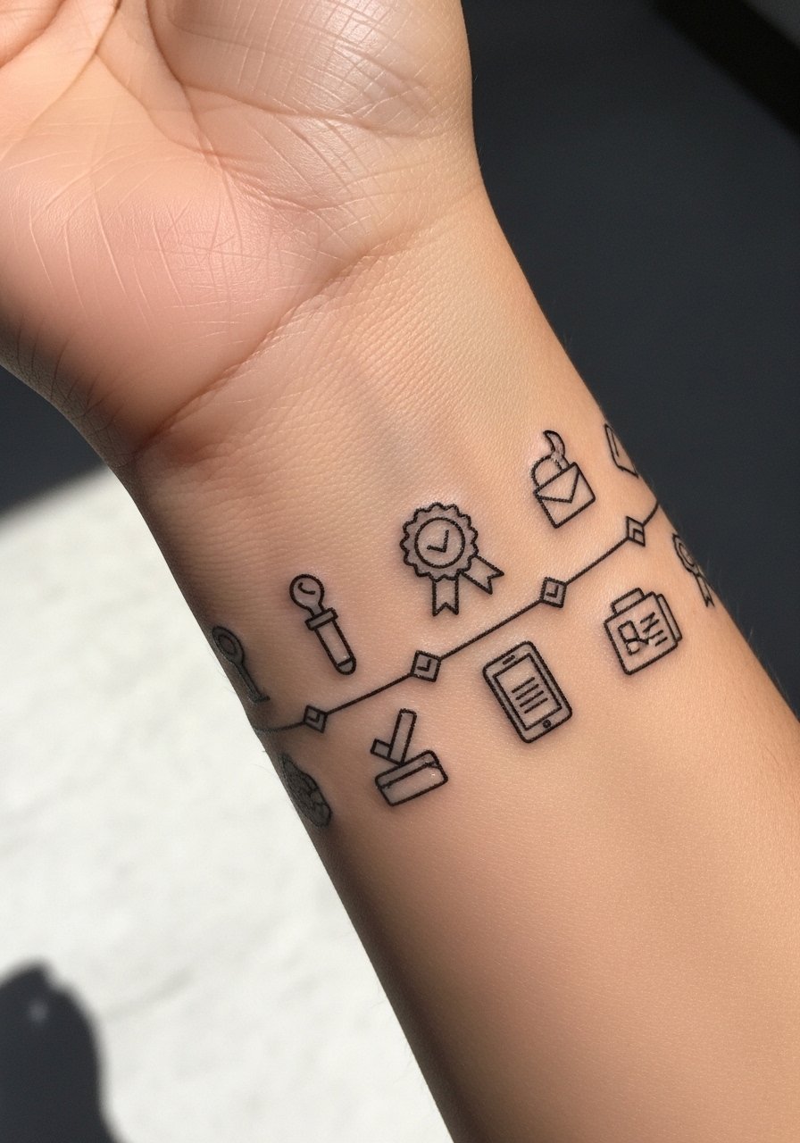
Personal observation lead: I have seen people use a wrist cluster for achievements they want to glance at daily. Wrist skin moves and gets sun, so ask for slightly bolder linework than your screenshots. A common mistake is cramming too many small icons into a single band. Session time is short for each icon, but the wrist may need touch-ups sooner because of daily wear. This placement still reads intimate and collectible, and it is easy to add new icons later.
12. Dot Work World Map from an Open-World Game on the Upper Back
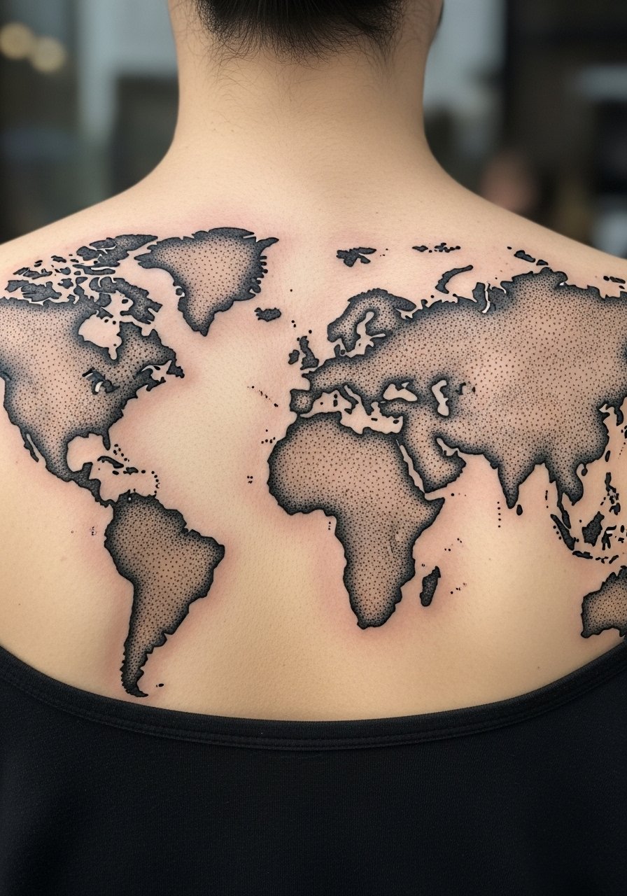
Consultation lead: when you book this, bring the exact map silhouette and tell your artist the scale you want for stippling detail. Upper back tolerates longer sessions and dot work tends to age well because it relies on contrast and negative space. Mistake to avoid is pushing dot density too high in shadowed areas. At two years the map still reads because dots preserve edges. This placement offers expansion into shoulder or sleeve narratives if you want to build a larger piece.
13. Minimal Pixel Familiars on the Ankle

Mistake lead: the biggest mistake with ankle pixels is going ultra-tiny and expecting perfect edges. Ankles get scuffed and the skin is thin. Ask for slightly larger blocks and bolder outlines so the familiars stay readable. Session time is brief. Expect touch-ups at year two if you keep shoes that rub the area. This design is great for gamers who want a low-commitment, playful piece that can be hidden easily.
14. Bold Traditional Boss Skull on the Forearm
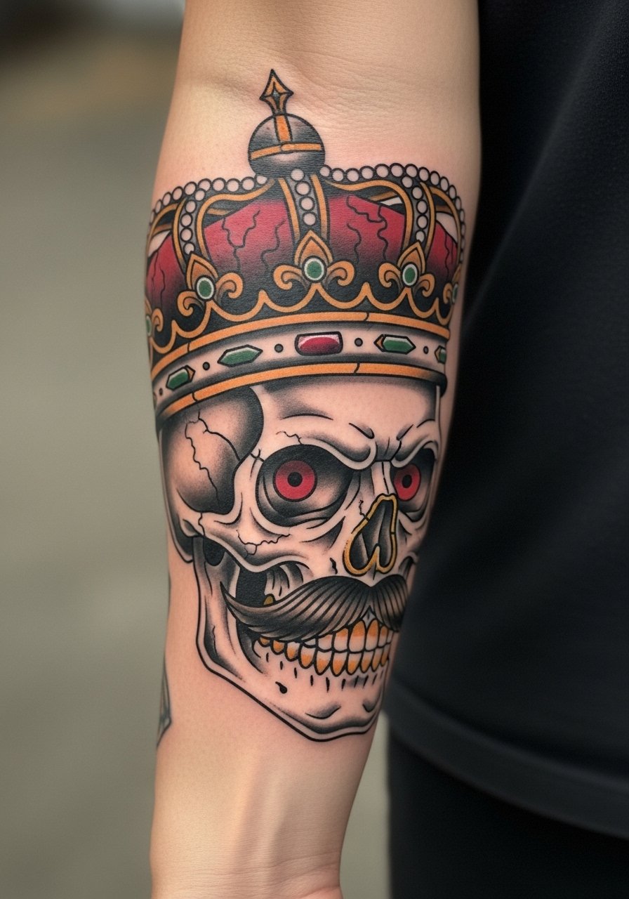
Visual impact lead: traditional line anchors and saturated fills read into the long term because they resist blur. Forearm is a visible spot and the session is usually a single block for a medium piece. Mistake to avoid is requesting tiny florals inside the skull which will clog. Over years, bold edges and solid black work maintain contrast. This design works well for someone who wants a gaming motif with classic tattoo heritage.
15. Micro-Realism Pixel Pet Portrait on the Inner Arm

Consultation lead: bring a reference photo of the pet and specify you want pixel treatment that still reads as a portrait. Inner arm is comfortable for most people and holds detail nicely. Common mistake is asking for both extreme micro-realism and extreme pixelation at the same time. Expect the piece to remain recognizable at six months and to need a touch-up by year three if you want crisp contrast. This one reads personal and can be tucked under short sleeves.
Tattoo Prep and Aftercare Essentials
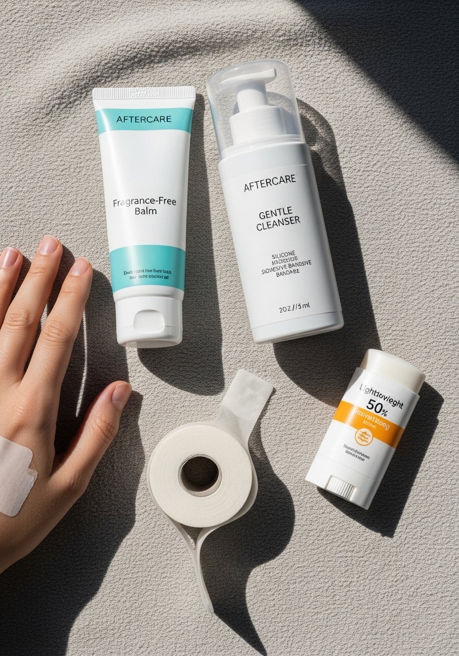
Shopping list, grouped by use:
Healing and soothing
- Fragrance-free moisturizing balm for tattoos, travel tube. Use after the initial skin seal has formed. It soothes and reduces itch while keeping the area pliable.
- Medical-grade second skin bandage, sheet style. Useful for the first 24 to 48 hours if your artist recommends occlusive care.
- Gentle foaming cleanser, fragrance-free. Cleanse with light hands twice daily to remove serum and prevent crusting.
Pre-appointment prep
- Lightweight barrier balm for pre-ink hydration. Use a few days before your session if your skin is dry to improve needle glide.
- Soft compression sleeve or loose shirt to wear post-session. Helps protect forearm or calf pieces during travel home.
Long-term maintenance
- Fragrance-free mineral sunscreen stick, SPF 50. UV is the biggest color killer, so use this on healed tattoos anytime you expect sun.
- Silicone scar and tone gel in travel size. Good for smoothing texture after a healed touch-up.
One mainstream option
- Aquaphor style healing ointment search. If you use a heavy occlusive for the first day, choose a small amount and switch to a lighter balm after 24 hours.
Every tattoo is different. Always follow your artist's specific aftercare instructions. Consult a dermatologist if you have skin concerns or unusual healing issues.
Frequently Asked Questions
Q: Will fine line gaming icons blur faster if I build a sleeve of them?
A: It depends on scale and spacing. Fine line icons need breathing room, so spacing them like small flash panels helps. On forearms and biceps they last longer than on hands or ribs. Ask for slightly stronger linework and plan for a touch-up in two to three years if you want them needle-thin.
Q: Do watercolor-style gaming effects need different aftercare than traditional pieces?
A: Yes, to an extent. Watercolor washes benefit from careful sun protection because the color relies on soft saturation. Clean gently and use a lightweight balm rather than heavy occlusives after the first day. A mineral sunscreen stick from the shopping list helps preserve washes on exposed spots.
Q: Why do geometric mandalas in chest areas fade faster than the same design on the forearm?
A: Chest skin gets more stretching and sun exposure depending on shirts and posture. Tight symmetry needs space between lines so small movement does not merge them. On the forearm the canvas is flatter and sees less frequent severe stretching.
Q: For a pixel pet portrait, what do I say in the consultation to get a durable result?
A: Bring a clear reference photo and say you want pixel treatment with defined contrast and larger pixel blocks than a computer sprite. Ask to see healed work in similar styles and on similar skin tones. That helps set realistic expectations about touch-ups.
Q: Is it safe to use occlusive bandages for all pieces during the first 24 hours?
A: That depends on your artist and your skin. Some artists prefer medical-grade second skin for the first day. Others recommend open-air care after a short seal period. If you choose occlusive, follow the product instructions and watch for signs of unusual irritation.
Q: How often should I plan touch-ups for bold blackwork versus fine line icons?
A: From what I have seen, bold blackwork often holds for longer and might need fewer interventions. Fine line and small detailed icons typically benefit from a touch-up at two to three years if you want crisp edges. Skin type and sun exposure change that timeline.
Q: Are there discovery pathways to find artists who specialize in micro-realism or stipple work without naming creators?
A: Yes. Search local shop directories, use hashtags that specify the technique plus your city, and browse convention guest lists. Look for healed photos in portfolios, and message studios to ask who specializes in the technique you want.
