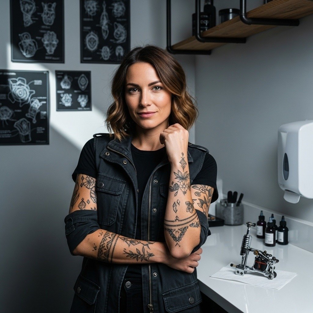
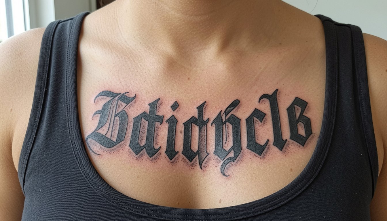
Chrome Hearts lettering looks like effortless cool in photos, but the gothic letterforms that read so clean on a tee often need more space and bolder line weight to last on skin. Pick the right placement, add a touch of ornament, and the piece reads like jewelry instead of a smudge by year three. These 23 takes show how to get the vibe without copying a logo, where each one sits best, and what to wear to show it off.
1. Inner Forearm Minimal Script in Gothic Lettering
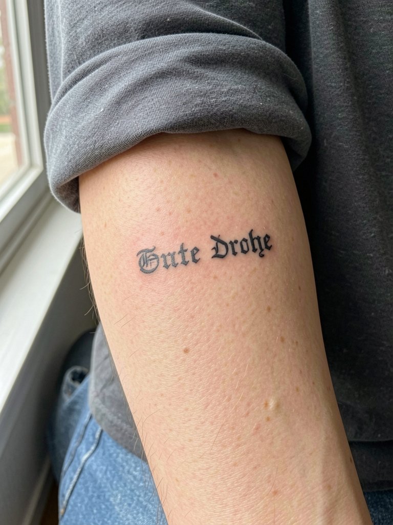
A small inner forearm script reads like a bracelet when the letters have room. Recommend modest kerning and a hair thicker line weight than your Pinterest sample so the letters do not blur into one another after two years. On the consultation bring two scale photos so the artist can show the design at three inches and five inches. Common mistake is shrinking the word to fit a wrist reference; that version softens into a smudge. Pain is low to moderate and a single short session usually suffices. For showing off, rolled sleeves and a rolled-sleeve tee keep the piece visible without overpowering accessories.
2. Shoulder Logo-Style Emblem with Small Lettering
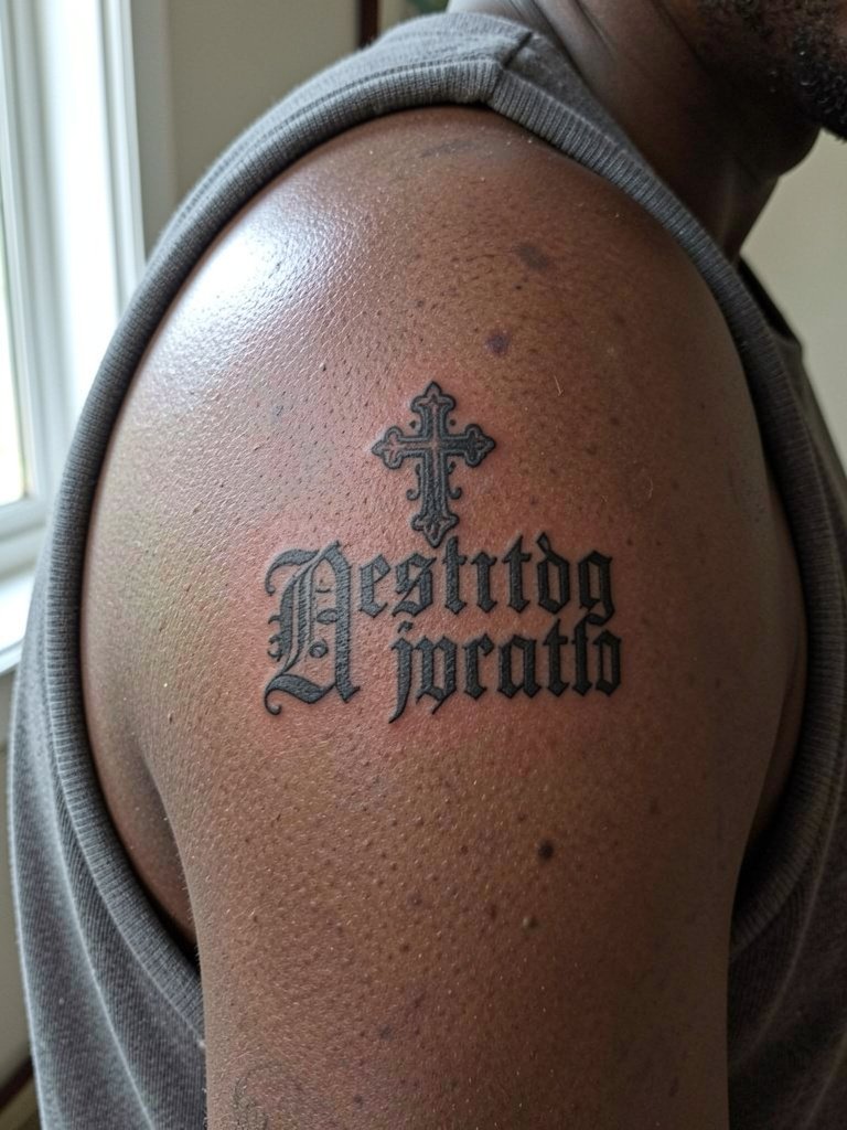
A shoulder emblem gives logo legibility while staying easy to conceal. One camp prefers exact logo replication for brand clarity. Another camp favors translating the aesthetic into ornamental crosses and compact lettering to avoid a literal logo. Both positions are common. Ask for balanced negative space and crisp outline because the shoulder moves and the skin stretches. A frequent mistake is making the letters too small inside the emblem. The session is brief and low pain. Wear a tank top for the appointment and consider a muscle tank to keep the area accessible while you heal.
3. Collarbone Gothic Typography Phrase
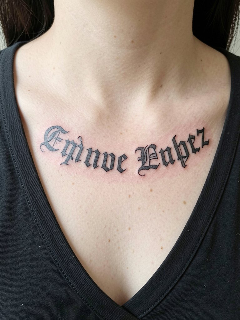
Collarbone lettering needs deliberate arc and extra spacing because that skin stretches with breath and posture. Recommend asking the artist to mock the stencil in standing and seated positions so the phrase sits naturally. A common aging error is tight letter spacing and ultra-fine strokes that soften into a ribbon by year three. Expect moderate pain and a one-session job for medium-length phrases. For styling, open collars and layered thin chains frame the script. Try showing the look with an open-collar shirt when planning outfits for reveal nights.
4. Wrist Micro Cross with Lettering Accent
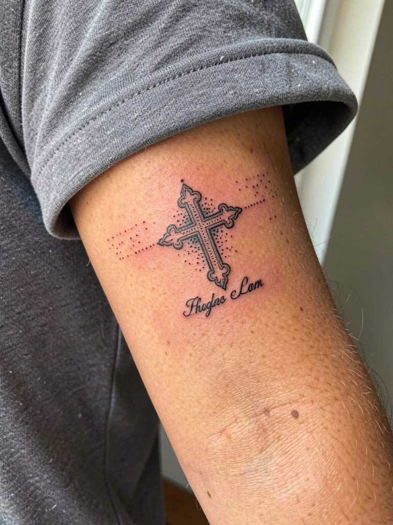
Tiny wrist crosses with small lettering look delicate but can blur if the lines are too thin. Use slightly stronger line weight and more spacing under the cross to keep the word legible. Common mistake is one-needle hairlines with zero negative space. The wrist sees friction from watches and sleeves, so expect touch-ups sooner than forearm pieces. Pain is quick but sharp. For showing off, minimal bracelets on the opposite wrist work best. Remove watches and bracelets during the session and bring a short-sleeve tee you can roll or pull up easily.
5. Outer Forearm Patchwork Fragment Sleeve Starter
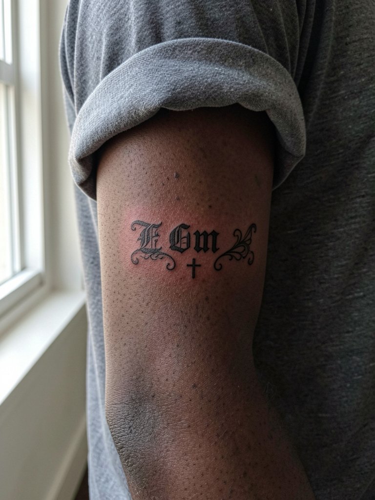
Patchwork fragments are the collector route. Start with a piece sized to breathe so future fills and connectors read. Specify to the artist that each fragment needs its own margin of skin to avoid overcrowding later. A common mistake is packing too many small elements close together, which merges into one blotch after a few years. Sessions are short and you will build the sleeve over time. For showing off, straight-cut tees and open overshirts complement the fragmented collector vibe. Bring an overshirt to the session so you can keep the area accessible without freezing.
6. Sternum Chest-Spanning Script Piece

Full sternum script divides opinion. One camp loves the dramatic chest-spanning statement and treats it like a fashion graphic. The other camp favors smaller or more ornamental translations of the look because chest skin moves and heavy scripts can age unpredictably. Both viewpoints are common and worth weighing. For this placement, ask for bolder letter terminals and slightly wider spacing so the words avoid merging under the breast crease. Pain is higher and sessions may be split. During the appointment wear a front-opening bra or loose button-down to allow access. For nights out, layered chains or a low-cut blazer frame the type without covering it.
7. Fine Line Back-of-Neck Mini Cross

The mastoid nape is perfect for minimal crosses that are revealed with hair up. Fine line here reads as a delicate reveal piece, but single-needle work needs careful spacing to avoid early loss of definition. A common misstep is making the cross too detailed for the tiny canvas. The session is quick with low to moderate pain. For showing off, high buns and cropped collars do the job. Bring a hair claw clip for the session so the artist has clear access without tugging.
8. Ornate Cross on Upper Chest with Floral Accents
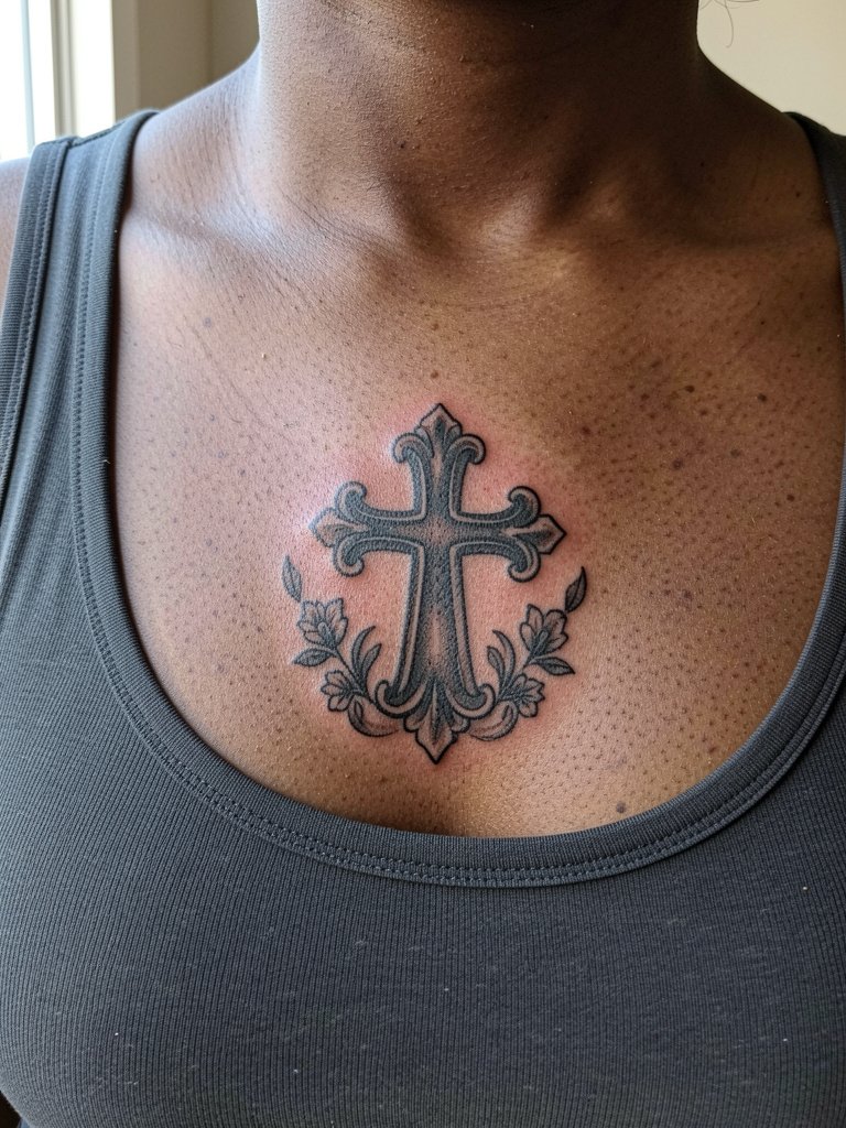
An ornate cross with floral accents softens the goth and customizes the look. I recommend medium-weight outlines and layered shading so the florals still read after two years. A frequent error is overly intricate petal detail at micro scale. Session time is moderate and may include two passes for saturation. Sternum proximity means higher pain. For styling, scoop-neck tanks and thin silver chains frame the artwork. Consider a thin silver chain necklace when choosing outfits to keep the focus on the chest piece.
9. Fine Line Collarbone Word with Floral Tail
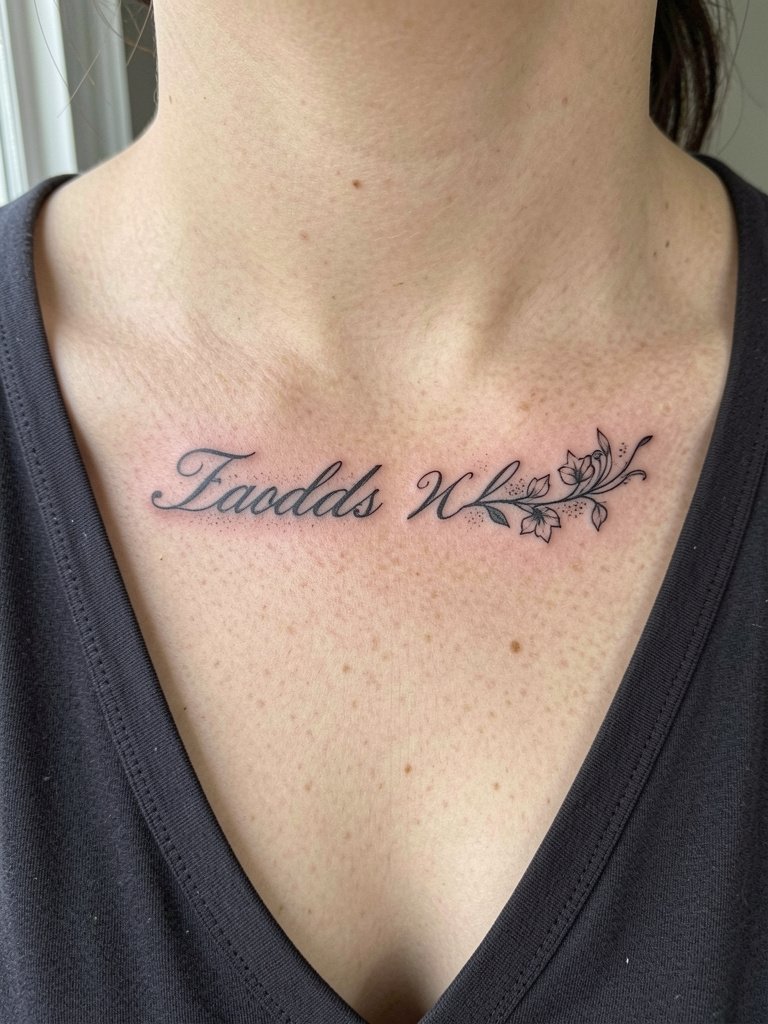
Pairing delicate cursive with a floral flourish makes the piece feel customized. Ask the artist to show how the flourish reads when you lift your chin and when you look down so the flow works with movement. The mistake to avoid is a flourish drawn too tightly into the letters which clogs with time. Expect a light to moderate pain level and a single session for a small phrase. For evenings out, low-cut tops and layered necklaces keep the flourish visible. A layered chain necklace frames the collarbone without hiding the letters.
10. Micro Heart-and-Cross on Wrist

Micro heart-and-cross combos read as jewelry when placed on the wrist. Use clean negative space around each element so the pair does not become one blob. A common version that ages poorly tightens the heart and cross into a dense black spot. Expect quick session time and sharp but short pain. For session wear, short sleeves help. For styling, minimal bracelet stacks on the opposite wrist keep attention on the piece. Bring a minimal bracelet stack for outfit planning after healing.
11. Skull-Infused Lettering on Outer Forearm
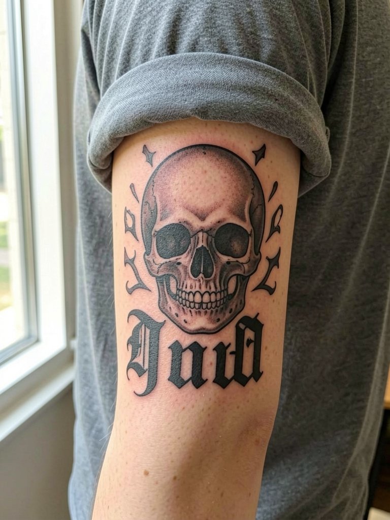
Merging skull imagery with lettering makes a heavier collector piece. Recommend bold letterforms and solid black fills to match the skull's volume so nothing vanishes in tanning or time. A common mistake is pairing delicate script with a saturated skull; the mismatch causes the script to disappear visually. Outer forearm placement means medium pain and solid longevity. For showing off, straight-cut tees and workwear overshirts highlight the motif. Try an open overshirt for staged reveals.
12. Fine Line Rib Cage Single Word
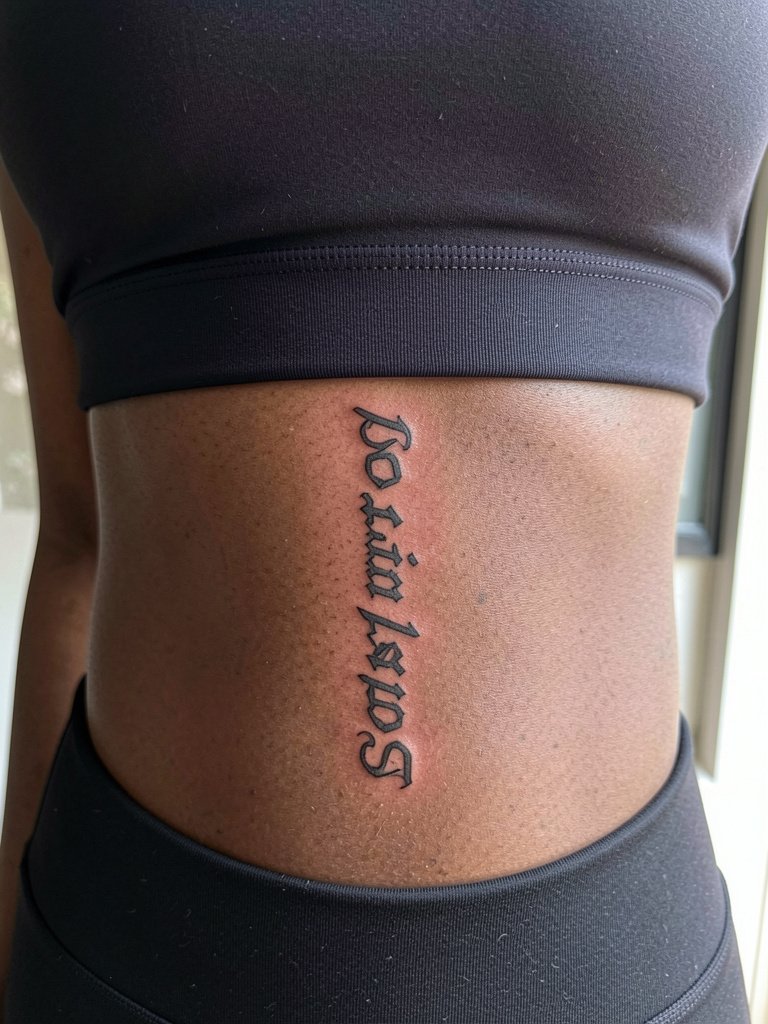
Ribcage script is dramatic but risky for ultra-fine styles. One group of artists says fine line on ribs blurs quickly because the skin flexes and stretches. The other group argues that with slightly wider letter spacing and correct needle depth the work can hold. Both approaches exist in portfolios, so request healed photos from the artist to judge. Expect higher pain and possibly two sessions. Session wear should be a front-opening bra or loose top. Avoid making the letters so tiny they survive only a season.
13. Tiny Ornamental Lettering Behind the Ear
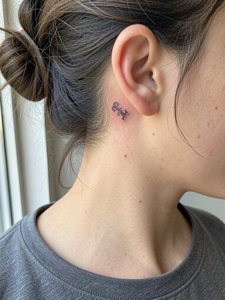
Behind-ear letters are intimate reveal pieces. Keep the motif simple and avoid extra filigree that the tiny canvas cannot support. Mistakes include attempting detailed flourishes that congeal into a blob. Pain is low to moderate. For the session, pin hair back with a clip and wear a wide-neck top. This placement pairs well with small hoop earrings which draw attention when your hair is up. Bring a small hoop earring set to visualize post-heal styling.
14. Chest Cherub Accent with Script
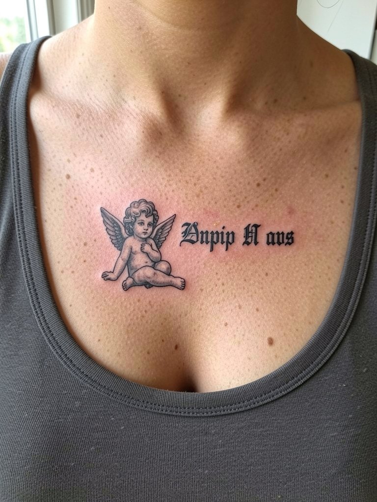
Combining cherubs and script softens the gothic edge and customizes the motif. When adding illustrative elements, insist the artist balance scale so the cherub does not dwarf the lettering. A common mistake is over-detailing the cherub at small scale which loses clarity. Pain is moderate and the piece may need a long single session. For display, open blazers and layered chains frame chest accents. A front-closure bra makes dressing and session access easier.
15. Fine Line Wrist Phrase with Negative Space
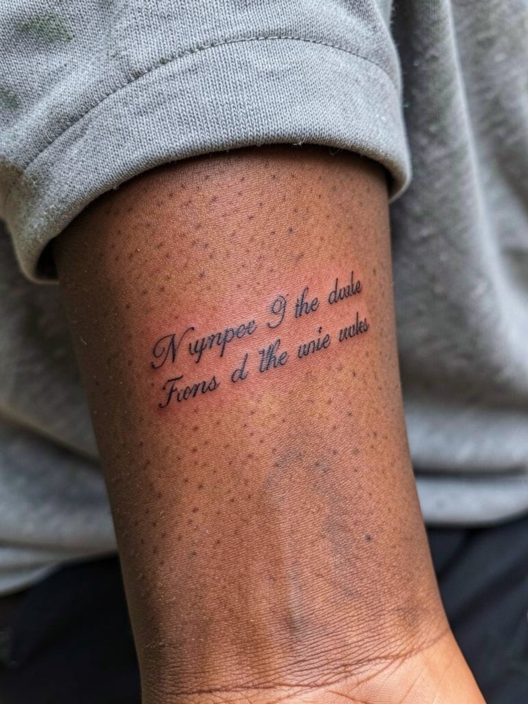
Wrist phrases can feel airy if the artist leaves breathing room around each word. Avoid tiny tightly packed letters. The wrist is high-friction so a slightly bolder outline keeps the phrase readable longer. Expect touch-ups earlier than arm pieces. For the session, remove watches and bracelets. Style-wise, a slim watch on the opposite wrist balances the look. An example piece goes well with a minimal watch.
16. Outer Bicep Bold Script with Shadow
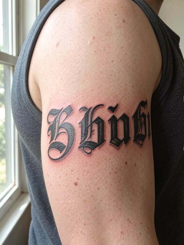
Outer bicep lettering handles heavier weight and shadowing well. Recommend solid saturation and a clear shadow plane to keep letters legible from a distance. The mistake is adding thin hairline details that vanish against solid black fills. Session time is moderate and pain is typically low. For display, sleeveless tanks and open shirts make the bicep statement without over-accessorizing. A sleeveless tank is handy during the appointment and afterward for staged reveals.
17. Ankle Tiny Script with Micro Cross
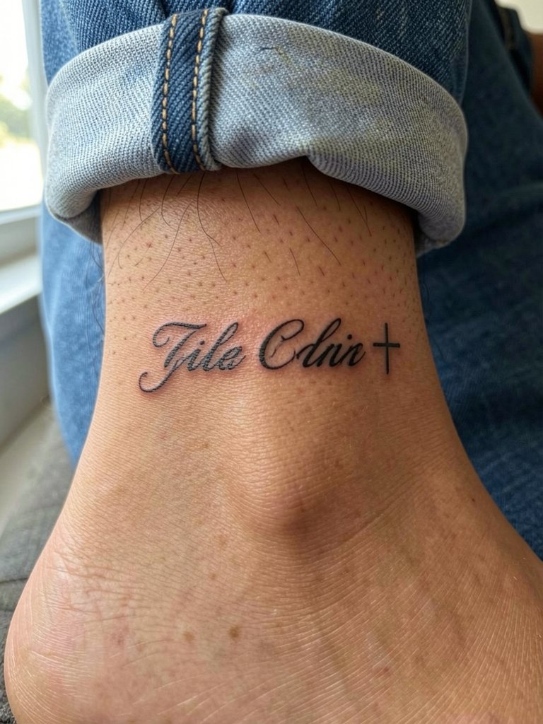
Ankle scripts suffer from rubbing against socks and shoes. Use slightly bolder strokes and leave more negative space than you would on a forearm. Mistakes include placing elements too close to seams or shoe lines. Pain is low to moderate and healing needs careful foot care. For the session, wear pants with cuffs you can roll up easily. A minimal sandal or rolled-jeans look pairs well. Consider a rolled cuff denim when planning how the piece will show off.
18. Throat or Side-Neck Script Tag
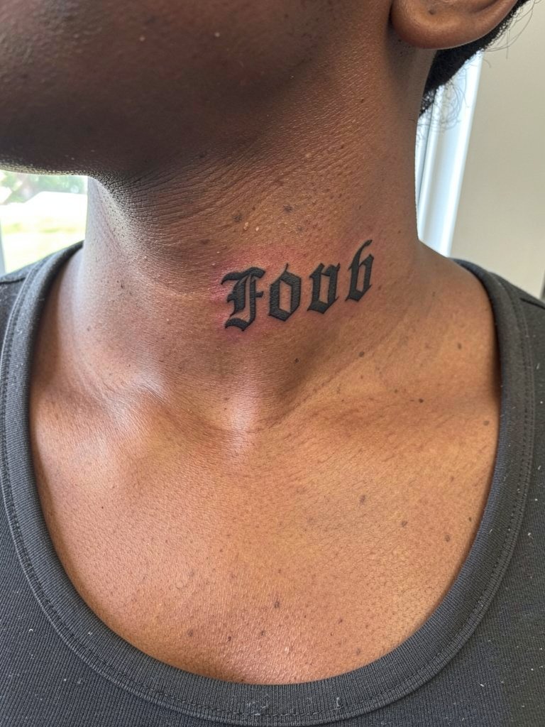
Side-neck tags read like jewelry when executed with confident lines and a few millimeters of spacing. Keep letterforms relatively bold since neck skin can soften detail. A common error is using micro script that fades into a gray blur. Pain is moderate and aftercare is vital because of constant movement. For session wear, pick a wide-neck top. Hair up or cropped cuts show the piece cleanly and pair well with off-shoulder tops.
19. Upper Thigh Statement Lettering
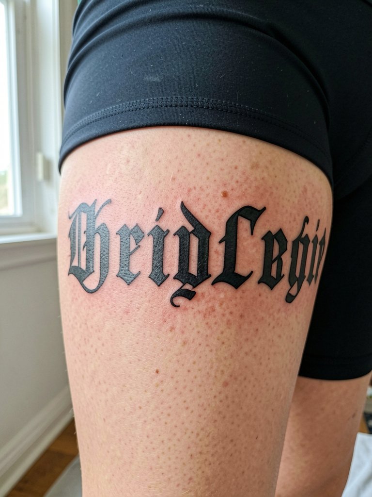
Upper thigh lettering gives room to breathe which favors larger, more detailed type. Recommend heavy outlines and consistent spacing because the thigh's softer tissue can absorb ink differently. The frequent mistake is trying to cram ornate serifs into a tight band. Pain varies and sessions are moderate. For the appointment wear loose drawstring pants and a loose drawstring linen pant so the artist can roll the leg up without pressure. Thigh pieces pair well with fitted skirts that reveal the placement selectively.
20. Ribcage Phrase with Ornamental Frames
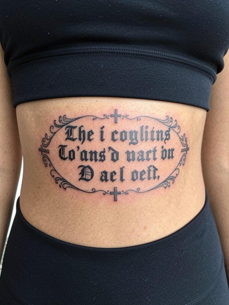
Ribcage ornamental phrases look bespoke when the frame keeps the letters from sitting directly in a crease. Avoid tight frames that press letterforms together. One camp says ribs are a poor fit for fine line because movement blurs detail. The opposing view is that with proper depth and spacing the design holds. Both positions are valid, so request healed examples from the artist showing similar scale and placement. Pain is high and sessions may split. Wear a front-opening bra for access and expect longer healing.
21. Calf Vertical Script with Cross Motifs
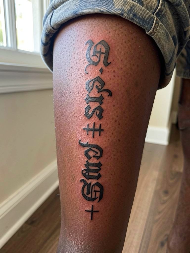
Calf vertical scripts enjoy a low blowout risk and read well from a distance. Recommend bold outlines and even spacing to travel around the calf curve. The usual mistake is thin one-needle script on the calf that disappears against muscle tone. Sessions are moderate and healing is straightforward. For showing off, shorts and straight-cut tees work well. For the session, bring a straight-cut tee you can roll or remove easily.
22. Hand Lettering Accent Between Fingers
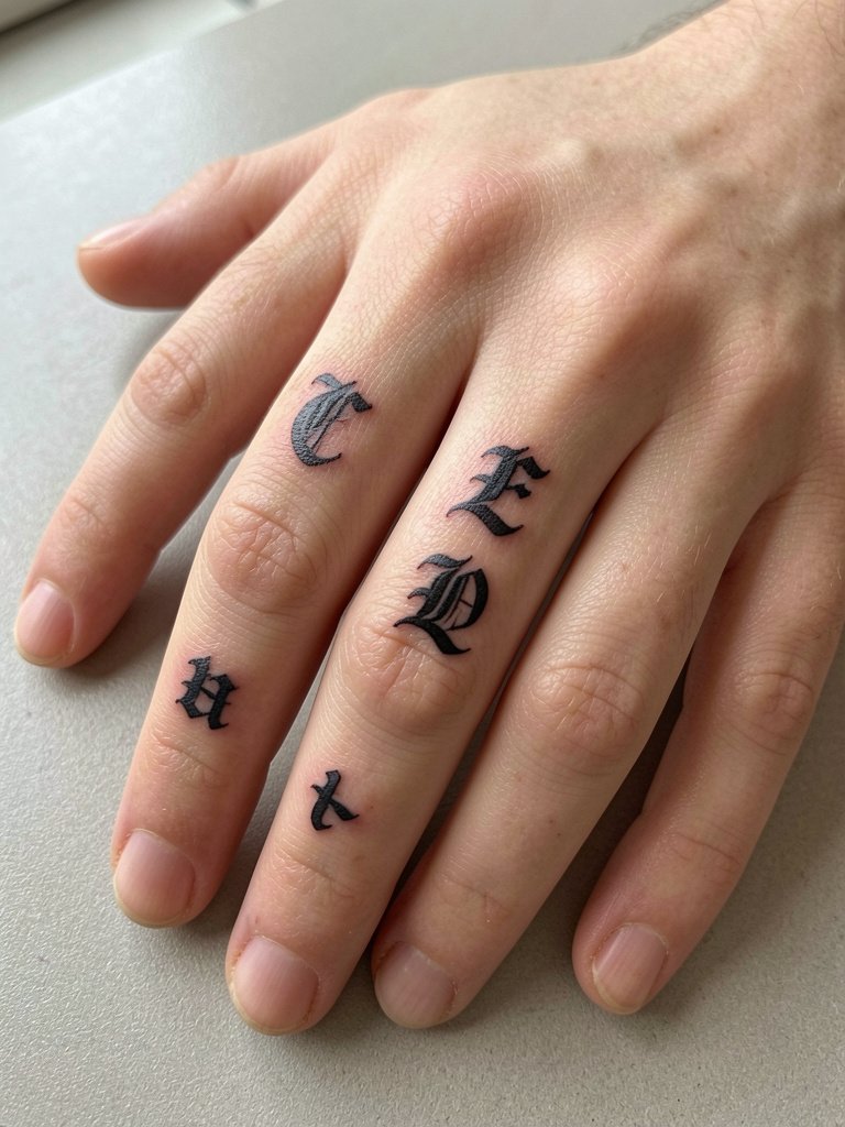
Hand and finger lettering ages fast due to constant washing and skin turnover. Ask the artist to thicken strokes and simplify shapes so they survive. Tiny ornamental serifs on fingers are a common regret because they fill in. Sessions are quick but touch-ups are often needed within a year. For the session, keep the hand clean and avoid jewelry on the tattooed fingers. Styling-wise rings on other fingers direct attention without rubbing the new ink.
23. Chest Anchor Phrase with Jewelry-Framing
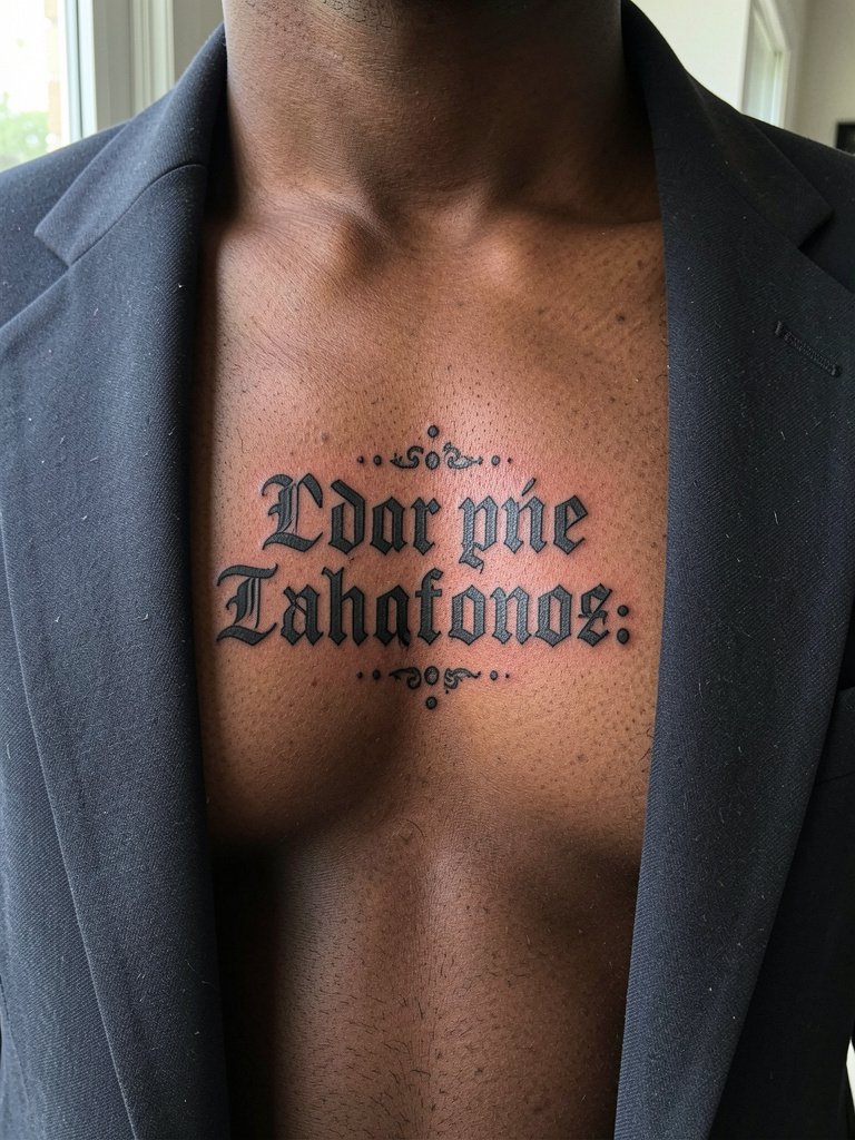
A centered chest anchor phrase reads like a fashion badge when framed by jewelry. Use bold terminals and leave breathing room around the phrase so layered chains do not sit on top of the ink. A typical mistake is over-ornamenting the immediate area which competes with necklaces. Pain is moderate to high depending on proximity to bone. For session wear choose a front-opening bra and open blazer so the artist can work without interference. For nights out, layered chains frame the phrase. A good visual tool is a layered chain set to test how the tattoo will look once jewelry is added.
Pre-Session Essentials
These first six designs favor small delicate work and chest placements that need easy access, so a few items smooth the appointment and the first week of healing.
- Hydrocolloid tattoo bandages. Helps protect wrist and finger micro pieces from friction during the initial healing window and reduces scabbing interference.
- Topical numbing gel. Useful for sensitive sternum and rib sessions when applied per product instructions about 30 to 45 minutes before the appointment.
- Silicone protective film roll for coverings. Keeps active areas like the ankle and hand clean during high-friction days without bulky dressings.
- Gentle fragrance-free body wash. A mild cleanser that avoids irritation when washing delicate linework in the first two weeks.
- Multi-purpose healing ointment. A thin layer for the first few days locks in moisture on chest and forearm scripts while allowing the skin to breathe.
Frequently Asked Questions
Q: How do I get the Chrome Hearts lettering vibe without copying a trademarked logo?
A: Translate the aesthetic into gothic letterforms, ornate crosses, and ornamental framing rather than recreating a logo. Bring reference images that show the letter shapes and the kind of spacing you like, and ask the artist to adapt the letter terminals and serifs so the piece reads like a custom script.
Q: What size should I use for inner wrist versus sternum lettering to keep it readable long term?
A: For the inner wrist, plan for letters that are wider and a hair heavier in line weight than your favorite tiny sample. Sternum and chest allow for more intricate terminals but keep spacing wider between words. If you want a concrete rule, increase letter spacing by roughly 20 percent compared with a printed font at the same point size so the letters have room to age.
Q: Where can I find healed examples and artists who do gothic lettering without naming creators?
A: Search Instagram and TikTok with style-based tags like #gothiclettering and #blackworklettering, filter by location to find nearby portfolios, and use Reddit tattoo communities to ask for healed photos. Look for repeated examples of the same style in a portfolio to judge consistency rather than a single flash shot.
Q: How often will I need touch-ups on tiny script on the fingers or hands?
A: Expect finger and hand lettering to need touch-ups more often than forearm or chest pieces, commonly within one to three years depending on care and exposure. Thicker strokes and simplified shapes reduce the frequency, but plan on follow-up work if you want the lettering to stay crisp.
Q: What should I wear to the appointment for chest, shoulder, and inner arm placements?
A: For chest or sternum pieces choose a front-opening bra or a loose button-down shirt. For shoulder work a tank or muscle tee gives easy access. For inner arm and forearm pieces wear a short-sleeve or rolled-sleeve tee so the artist can position your limb naturally without tight fabric. If you want a quick reference shop before the session try a front-opening bra for chest appointments.