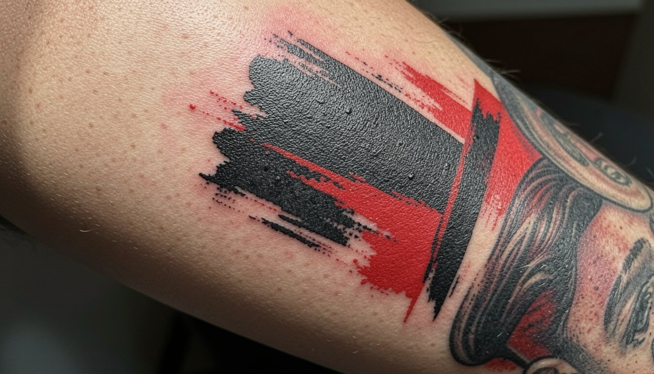
The red-and-black collisions that define trash polka look dramatic when fresh. Healed, they either hold that contrast or collapse into a gray patch if too many tiny details were packed in. This list focuses on designs and placements that keep the signature chaos legible for years, with concrete consultation points and wardrobe tips so the first session and the first year both go better than expected.
1. Red-and-Black Collage Sleeve for Outer Arm
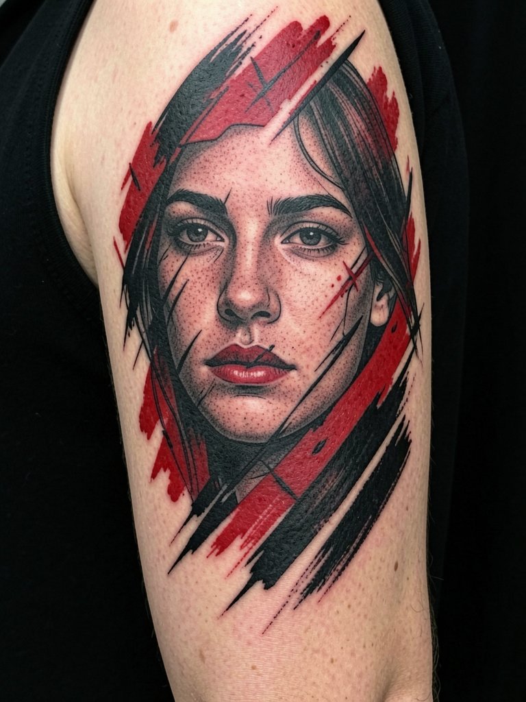
This is the canonical trash polka application, built to read from across a room. Go big enough so the portrait fragments sit at least three to four inches across, and bring two printed references at different scales so the artist can show how that face will read at a sleeve level. Expect multiple sessions spread over weeks, with heavy fill areas feeling like a steady buzzing pressure rather than sharp stabs. A common mistake is cramming tiny text or micro shading into the collage. For longevity, favor broad black masses and bold red strokes over filigree. If you plan to show it off, pair this with solid color t shirts or sleeveless tops that let the outer arm read clean.
2. Portrait-Plus-Abstract Chest Piece Below the Clavicle
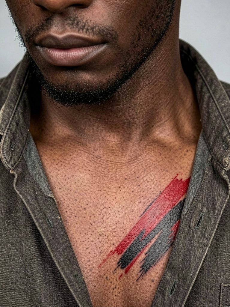
The chest acts like a billboard for a trash polka portrait plus abstract marks. Because the clavicle area moves when you breathe and when you layer clothing, plan the portrait center slightly off the most mobile zones. During the consult, request proportion mockups on the exact chest contour and ask for slightly heavier mid-tones so the portrait keeps depth at year two. This placement rates around a 6 to 7 on most pain charts, and longer sessions may need breaks. Avoid tiny facial details inside narrow negative spaces because the chest tissue softens with time. For evenings out, an open collar shirt frames the piece without hiding the upper edge.
3. Skull with Slash Marks, Drips, and Typography on Forearm
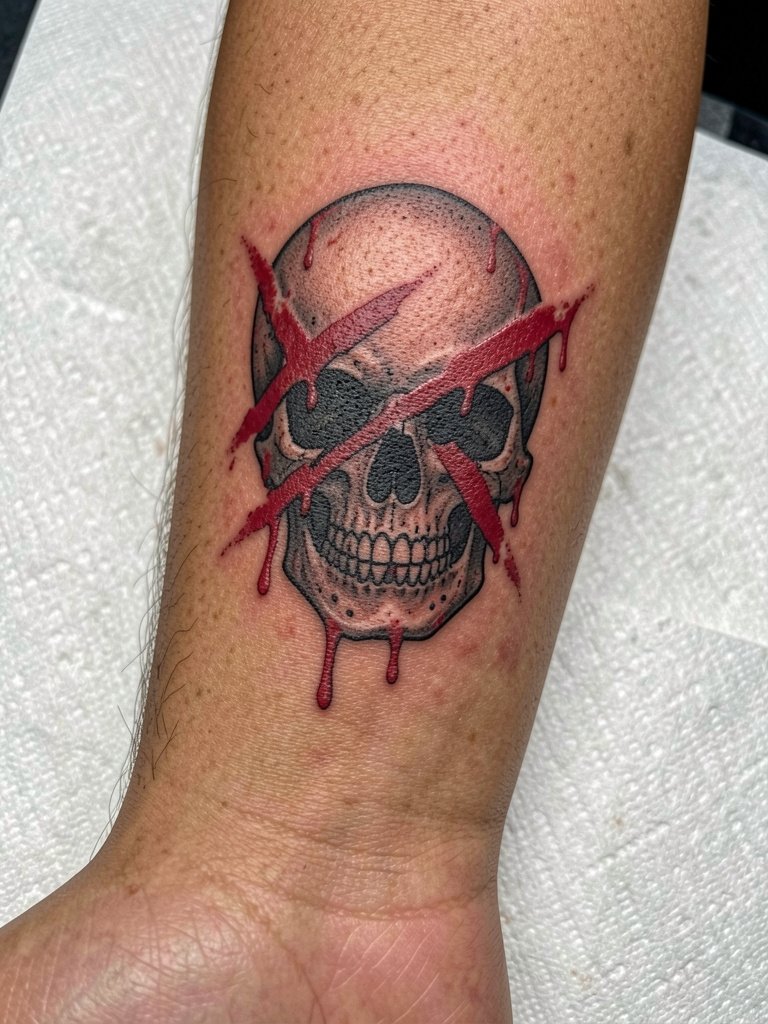
The outer forearm is one of the most forgiving places for trash polka text and skull work. Keep letterforms large and choose a sturdy typeface so the counters do not fill in over time. Mention exact letter height during the consult and have the artist stencil the word at full size on your arm before the needles hit skin. A common error is requesting extremely tight tracking in the lettering. Expect a one to two hour session for a medium composition. For everyday outfits, a short-sleeve fitted tee or cuffed overshirt keeps the piece visible without rubbing the ink during the first week.
4. Compass or Navigation Motif with Broken Geometry on Inner Forearm

The inner forearm is ideal for readable central objects because it offers a long flat canvas. For a compass, insist on clear central axes and slightly heavier linework for the cardinal points so they stay crisp by year three. If you want a compact piece, review how the geometry reads at three inches and five inches. The inner forearm has low blowout risk compared with the wrist but it still benefits from slightly bolder strokes. For showing it off, roll sleeves or layer with linen button down shirts that you can cuff to reveal the palm-up surface during warmer months.
5. Viking-Inspired Face or Warrior Composition on Outer Upper Arm

Heritage imagery takes on more attitude in trash polka, so choose a single focal face or helmet element rather than trying to collage three ancestral symbols together. Tell the artist which feature must remain legible at arm length, like an eye or a rune, and have them space the red overlays away from that anchor. Expect two to three sessions for a medium wraparound that includes lettering. The outer upper arm handles saturation very well, so heavy black areas age sturdily. If you like wearing sleeveless looks, pair with men tank top cotton or muscle tanks to let the shoulder panel breathe.
6. Eagle in Motion with Splatter and Slash Elements on Upper Arm
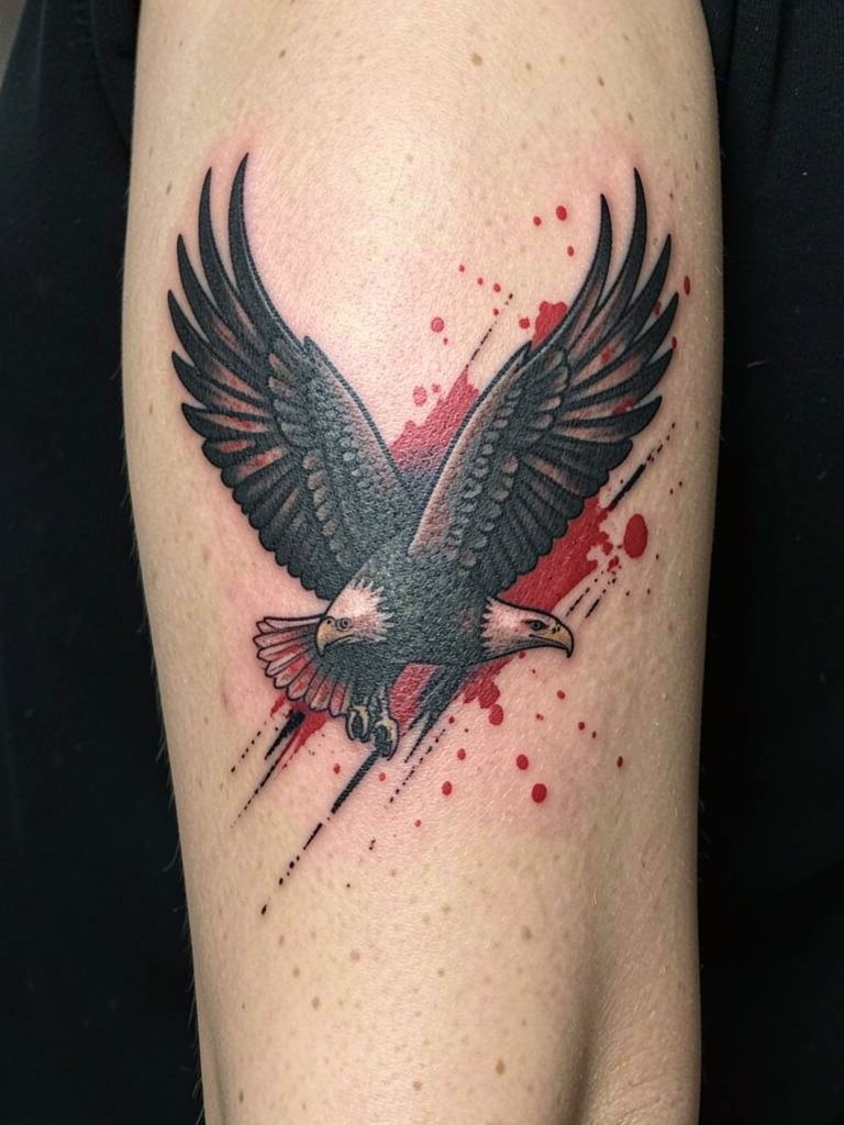
Birds are natural fits for the trash polka rhythm because wings extend the motion. Ask the artist to map the wing spread to your arm length so the tips do not fall into the elbow crease where detail will blur. A typical mistake is centering the wing too close to the armpit where movement distorts the image. For sessions, wear a tank top so the artist can access the shoulder without fabric bunching. Expect a solid visual that needs touch-ups in the first year to reset any thin red splatter that lost saturation.
Pre-Session Essentials
These picks are chosen for the kinds of outer arm, chest, and forearm work shown above and to make the first two weeks smoother.
-
Stencil transfer paper kit. Lets you preview the exact linework placement on skin before committing, which is helpful for the portrait and compass mockups in ideas above.
-
Topical numbing cream. Applied per product directions about 40 minutes before the session reduces surface pain for sensitive chest and rib work without affecting saturation.
-
Thin protective film roll. Useful after forearm and wrist sessions to guard against friction during the first 24 to 48 hours.
-
Fragrance-free gentle body wash. Cleanses the healing area during showers without harsh additives that can dull early color.
-
Aquaphor healing ointment. Lightweight occlusion for the first few days that keeps heavy blackwork saturated without creating a greasy barrier.
7. Large Readable Script with Photo-Real Object on the Ribcage
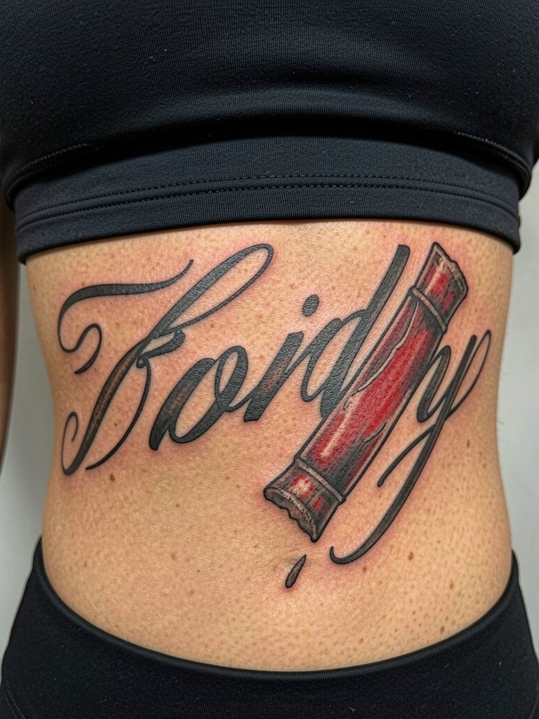
Ribcage pieces read best when the script is large and the image anchor has broad tonal values. The ribs are higher on the pain chart, often an 8 out of 10, so plan for shorter sessions with multiple visits. One common failure is insisting on very thin script across curved ribs. Have the artist slightly thicken the strokes and show a stencil while you stand so you can see how the letters flow with your breathing. Healed examples at three years often need a touch-up along the lowest stroke lines. For session comfort, wear loose drawstring shorts or a zip-front top so the artist can expose the side torso without bunching.
8. Clock or Hourglass with Torn-Paper Texture on Calf
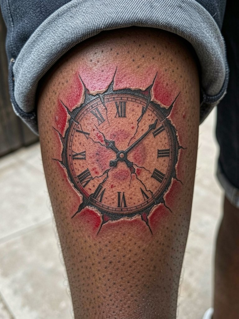
Calf panels are convenient for larger symbolic images because they sit on relatively stable tissue that ages predictably. For a clock, keep the dial elements bold and avoid micro-detail within the numerals. Ask the artist to show how the torn-paper texture will hold at six months and at two years because that distressed look is where trash polka either gains grit or turns muddy. Session wear is simple, roll shorts or wear cuffed jeans so the leg is exposed without pressure on fresh ink. In most cases a medium calf composition needs only one or two touch-ups in the first two years.
9. Abstract Geometric Trash Polka Panel on Inner Upper Arm
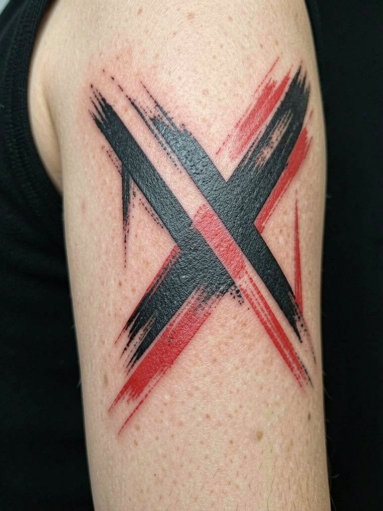
If you want the trash polka aesthetic without a literal subject, an abstract panel on the inner upper arm is subtle and modern. The inner upper arm tolerates bold brushwork well as long as the negative space is intentional. A common mistake is over-layering tiny marks in a tight field. During consultation, compare how much negative space the artist leaves between the black masses because that spacing is what preserves contrast. For appointments, bring a short-sleeve shirt that rolls cleanly so the artist can access the medial bicep without elastic pressure.
10. Blue-and-Black Variation Instead of Red-and-Black
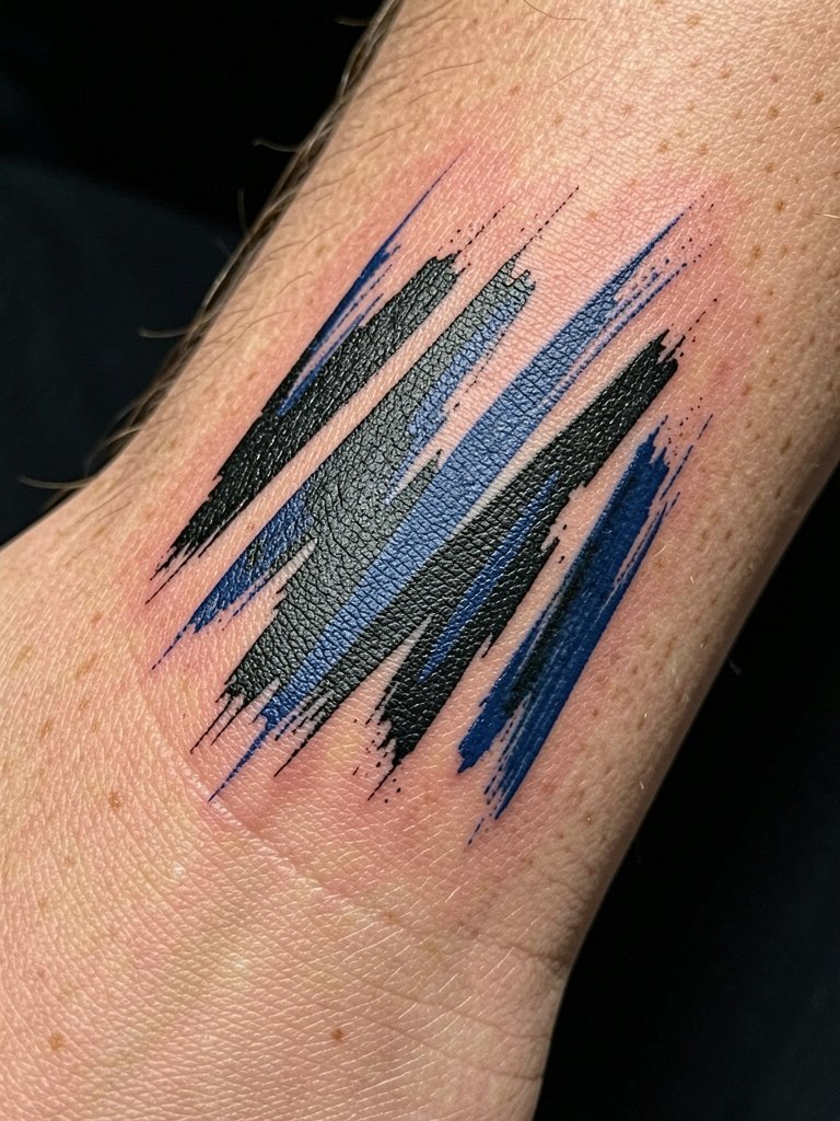
The color palette debate is active. One camp insists that the classic trash polka signature comes from strict black-and-red duotone contrast. They argue the red creates a visceral push against black that reads instantly. The other camp says the structure and collage marks define the style more than the specific accent color, so deep blues or cool tones can preserve the same visual tension. If you prefer blue, request swatches applied to a small healed test patch or ask the artist to show healed examples in similar skin tones so you can judge saturation. Blue behaves differently with aging and may need a touch-up within the first two years to retain crispness.
11. Full Ribcage Statement Piece with Realism and Brush Strokes
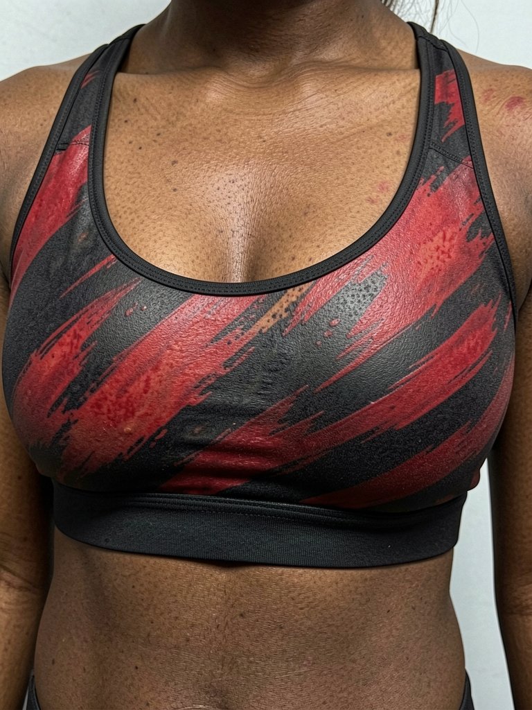
This is the scale where trash polka breathes. A ribcage wrap with realism anchors and editorial brushwork looks cinematic when planned around ribs and the waist. Be candid about tolerance for pain because full ribcage sessions are intense and usually split across multiple appointments. A technical pitfall is packing too many facial or fine elements into narrow horizontal bands. For longevity, ask the artist to convert some planned fine detail into stipple shading or slightly larger halftone textures so the image keeps form as it settles. Session wear that lets your torso be exposed with minimal shifting makes the process smoother.
12. Shoulder-to-Chest Wraparound Design
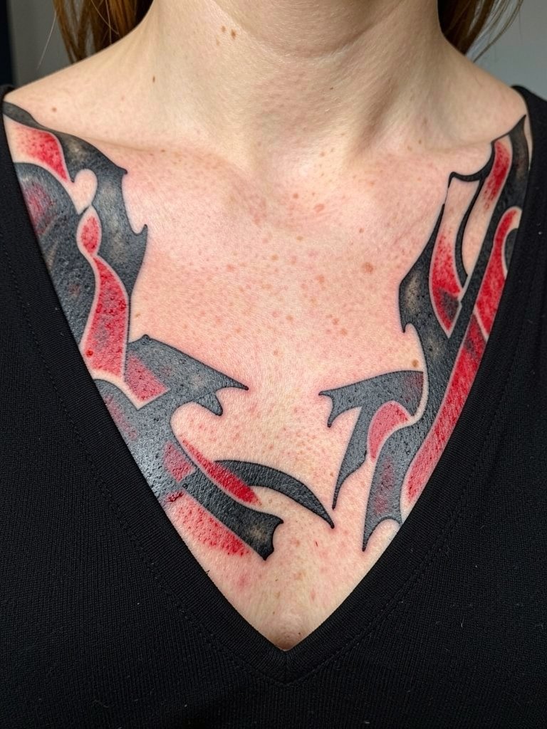
Wraparounds are effective because they use the body contours to sell motion. When planning, have the artist trace the shoulder arc and show how brush strokes will flow onto the chest so the composition does not look truncated when you wear a tee. The shoulder surface tolerates dense blackwork well, while the collarbone edge benefits from softer transitions. Avoid tiny cross-hatching along the shoulder seam because movement can soften those marks. For dressing, open-collar shirts or crewnecks with a slightly wider neck frame the piece without obstructing the shoulder flow.
13. Text-and-Splatter Forearm Piece with Bold Type
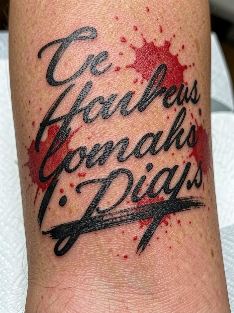
Typographic trash polka is one of the clearest ways to read the style at arm scale. Pick a type weight that keeps counters open, and insist on a minimum x-height so the letters do not blur into the surrounding texture. A frequent error is pairing a delicate script with heavy splatter that overwhelms the counters. For the session, short sleeves and removing watches on the tattoo wrist prevent cuff friction. If you want a fashion-forward pairing, try rolled sleeve shirts that frame the forearm without crowding the type.
14. Minimal Trash Polka Fragment for Wrist or Ankle
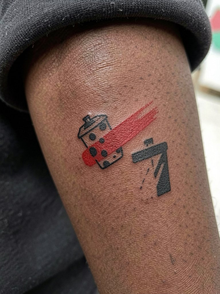
Smaller trash polka pieces are possible but they must be simplified. One controversy here is scale. One camp maintains the style works best at large scale because layers and text need room to breathe. The other camp points to successful small fragments on wrists and ankles that distill the aesthetic into bold marks and a single accented color. If you want a wrist or ankle fragment, map exactly how the brush stroke tapers at three-quarter inch and at two inches so the artist can translate it into a compact stencil. Wear short sleeves and remove bracelets from that wrist during the session. Expect a touch-up in the first year because the wrist sees high friction.
15. Floral or Clock Hybrid on the Calf for Softer Boldness

If the classic skulls and portraits feel too aggressive, this hybrid pulls in softer imagery while keeping the high-contrast grammar. For a floral-plus-clock piece, choose one dominant element and let the other act as texture. A common mistake is trying to equalize both elements at small scale so they compete. The calf is forgiving for layered texture, but red accents need to be placed where the skin does not get too much sun exposure if you want longer color retention. For summer months, pair the leg panel with athletic shorts men or midi skirts with side slits to show the artwork without rubbing the fresh ink.
Frequently Asked Questions
Q: How much space does trash polka actually need to look right over time?
A: In my experience trash polka reads best when the main image sits at least three to four inches across. Smaller pieces can work if the artist simplifies shapes and prioritizes negative space, but compact versions often need touch-ups sooner.
Q: What is the typical pain and session plan for chest, ribcage, and forearm pieces?
A: Ribs and sternum are among the most painful and usually require short sessions across multiple visits. Forearms and calves are much easier and often finish in one or two visits depending on saturation. Plan breaks and bring comfortable clothing for the session.
Q: Where can I find artists and healed examples for trash polka in my city?
A: Search Instagram and TikTok hashtags such as #trashpolka and #blackandredtattoo with your city name. Browse style tags plus subject keywords like "trash polka forearm" on Tattoodo. Reddit communities such as r/tattoos and r/tattooadvice are also good for seeing healed shots and real client notes.
Q: Will blue accents hold up like red does, and how often do those need touch-ups?
A: Blue can look great but it behaves differently with sun exposure and skin undertones. Expect blue accents to require a touch-up within the first two years more often than saturated red, especially on areas that see frequent sun.
Q: What should I wear to the appointment for different placements?
A: For shoulder and outer arm work wear a muscle tee or tank so the artist gets full access. For rib or chest sessions, choose a button-up or a fitted sports bra that can be moved aside without tugging. For leg work, bring loose shorts that roll up cleanly.