
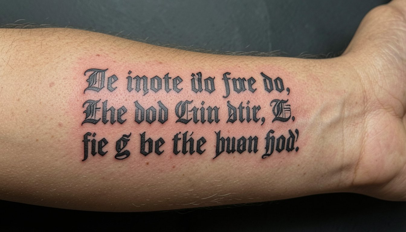
Bold black script often looks sharper for longer than the wispy hand-drawn styles people pin most. If you want a quote or name that still reads at year five, pick letterforms with clear counters, steady saturation, and enough space between characters. The first idea below shows how inner forearm scripts combine durability with clean presentation so the letters stay legible after healed settling.
1. Bold Gothic Quote on Inner Forearm
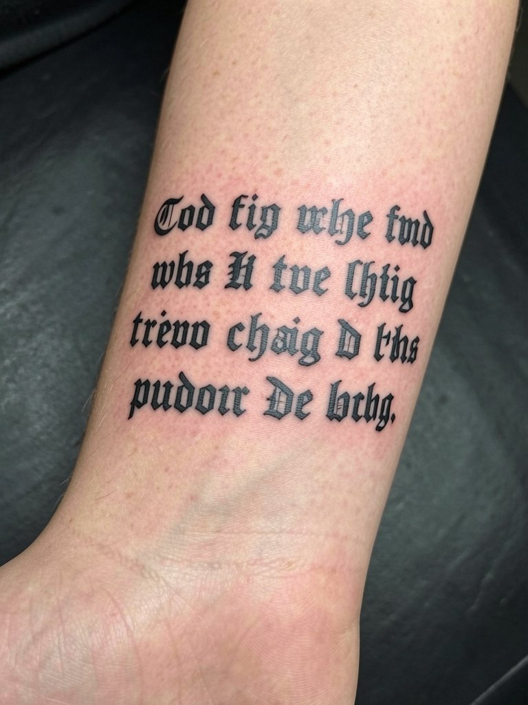
A bold gothic quote on the inner forearm is a classic for a reason. I recommend letters scaled to three to five inches in length so each word breathes and the counters do not collapse as the skin softens. During your consultation bring one close-up photo that shows line weight and one full-arm shot so the artist can confirm flow and spacing. Common mistakes are asking for ultra-condensed gothic fonts that pack strokes too tightly or requesting single-needle weight on this placement. For showing this off, roll up an oversized black tee to mid-forearm so the quote sits against neutral fabric without distraction. Expect a one to two hour session and a touch-up possible at year two for perfect counters.
2. Upper Chest Centered Script Under Clavicle

A centered chest script reads intimate and strong when the strokes are saturated and slightly wider than a cosmetic pen line. Ask the artist to test two sizes with a stencil so you can check how the phrase sits under your collarbone during different postures. The main aging risk is placing the letters too close to the sternum crease where movement compresses the ink. Wear a scoop neck tee to the session for easy access and to preview how the piece will look with everyday shirts. Chest sessions can feel like medium pain for most people and usually finish in a single appointment for a medium-length phrase.
3. Outer Forearm Block Letter Sleeve Accent
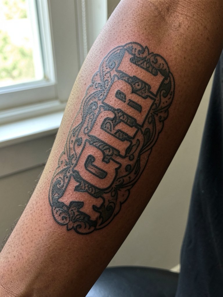
Use heavy block letter script as a unifying element in a sleeve. It acts like an anchor that gives the rest of the blackwork something to sit around. Tell the artist you want letters that can hold solid saturation so the surrounding stipple and fill do not overwhelm the word. A common mistake is letting tight flourishes crowd the letters near the elbow crease where blowout risk is higher. For wardrobe, roll a cuff on a structured denim jacket to show the outer forearm without covering the blackwork. Multiple sessions are typical when integrating lettering into a sleeve.
4. Collarbone-Adjacent Minimal Bold Script
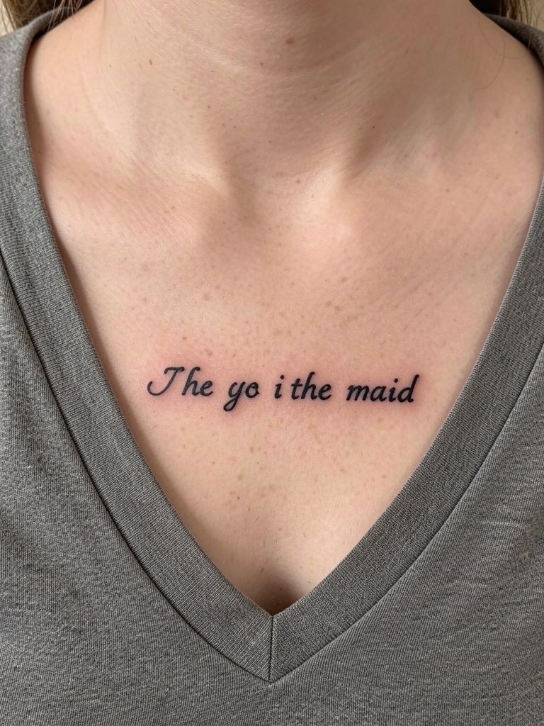
A short, bold script sitting just below the collarbone reads as elegant without being dainty. For placement, try the stencil in standing and seated positions so the artist can avoid distortion from posture. The mistake I see most is choosing a decorative script that looks attractive in a tiny reference but loses its counters on the collarbone contour. For evening wear, layered chain necklaces pair well with a small bold phrase. The session time is usually short and sensation is moderate because the area has more padding than the wrist.
5. Inner Upper Arm Private Script Band
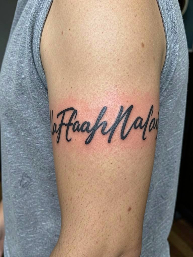
Inner upper arm text feels private because the medial bicep faces the torso. For a band, widen letter spacing by about 10 percent compared with a forearm piece so the curvature does not squeeze the words as the arm moves. Mention touch-up expectations specifically for the client: this placement is less exposed to sun but can experience minor fading from regular friction. Wear a loose tank top for the appointment so the artist has full access. For showing it off casually, sleeveless tops and muscle tees work best and a search for muscle tee women finds breathable options that frame the inner arm without covering it.
6. Wrist Single-Word Bold Script
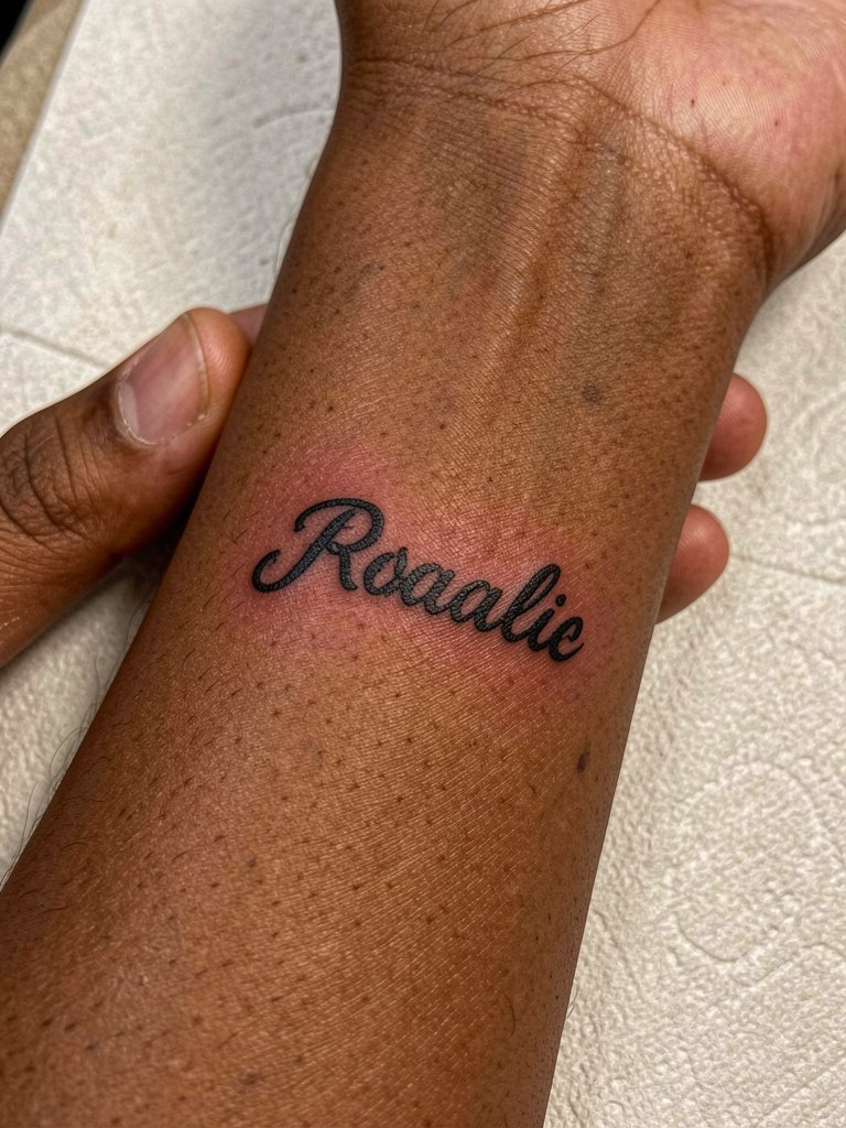
Wrist script is visible and easy to photograph but the skin here is thin and moves constantly. Use slightly thicker strokes and extra letter spacing so the word remains legible after a year. A frequent error is asking for ornate flourishes that get lost with wrist motion. For the session, remove bracelets and wear short sleeves so the artist has unobstructed access. Thin sentences heal quickly but often need a small touch-up at the one-year mark because of high use and sunlight exposure.
Studio Day Picks
The inner forearm, wrist, and collarbone pieces above need different session day tools, so a compact product set smooths the booking and first week.
-
Stencil transfer paper kit. Helps you and the artist preview the exact line width and spacing on skin before the first pass, especially useful for forearm and chest scripts.
-
Topical numbing cream. Applied about 45 minutes prior for sensitive wrists or sternum work reduces discomfort without altering linework when used sparingly.
-
Thin protective film roll. Protects wrist and hand pieces from early friction and keeps showers tidier during the first 48 hours.
-
Fragrance free gentle body wash. Mild cleansers remove surface oils without irritating fresh linework on chest and rib placements.
-
Aquaphor healing ointment. A mainstream classic for the first two to three days that locks moisture without sealing the skin excessively.
7. Gothic Script Across the Shoulder Cap
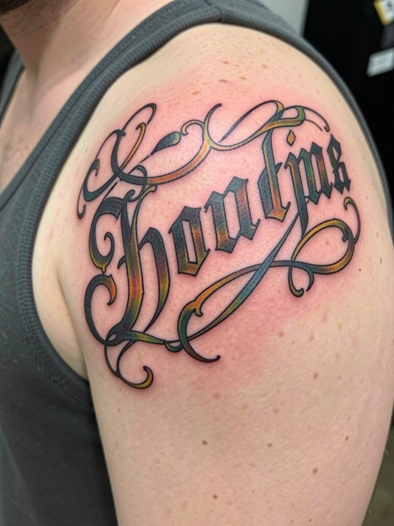
Shoulder script reads well from multiple angles and pairs cleanly with short sleeve or sleeveless shirts. For this placement ask the artist to map how each letter follows the deltoid curve so the word keeps consistent proportion when the arm moves. Avoid overly tight flourishes near the shoulder joint because movement increases blowout risk. To show it off, sleeveless workout tops or rolled sleeve shirts keep attention on the cap line. Sessions can be comfortable and usually finish in one sitting for medium phrases.
8. Ribcage Horizontal Quote Band
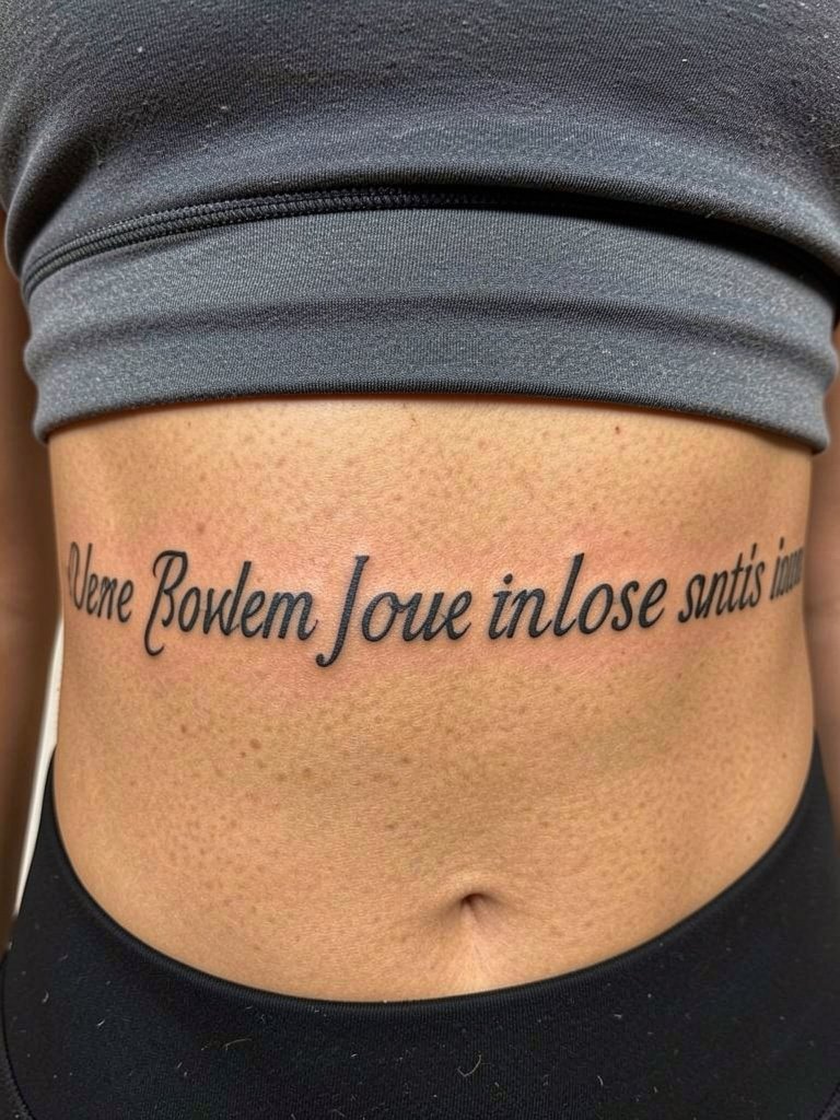
Long quotes suit the ribcage because the length reads naturally with the torso. The consultation should focus on scale and where sentence breaks occur so words do not wrap awkwardly under the arm. A common mistake is choosing fine single-needle text for this area because breathing moves the skin and can blur thin strokes. Rib sessions are higher on the pain scale but reward patience with a discreet, long-format canvas. Wear a loose sports bra so the artist can access the side torso without fabric tugging.
9. Ornamental Script with Underline Flourish
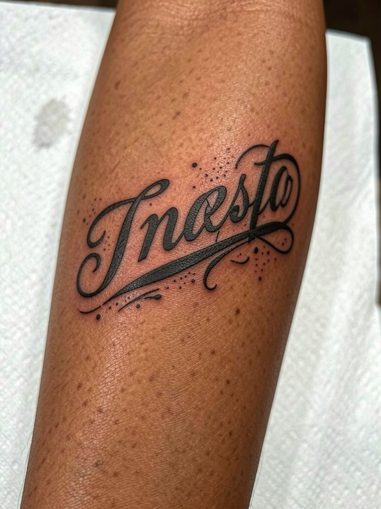
An ornamental underline gives a script piece personality but the flourish must not crowd letter counters. Tell the artist the flourish should sit at least a finger-width below the baseline so it does not merge into the letters with healed spread. A typical mistake is requesting a thin decorative tail that disappears after six months. For day-to-day outfit pairing try rolled-up linen shirts in neutral tones and a search for loose button down shirt for relaxed framing. Sessions for this style usually take one to two hours depending on flourish complexity.
10. Fine Script Quote for First-Timers
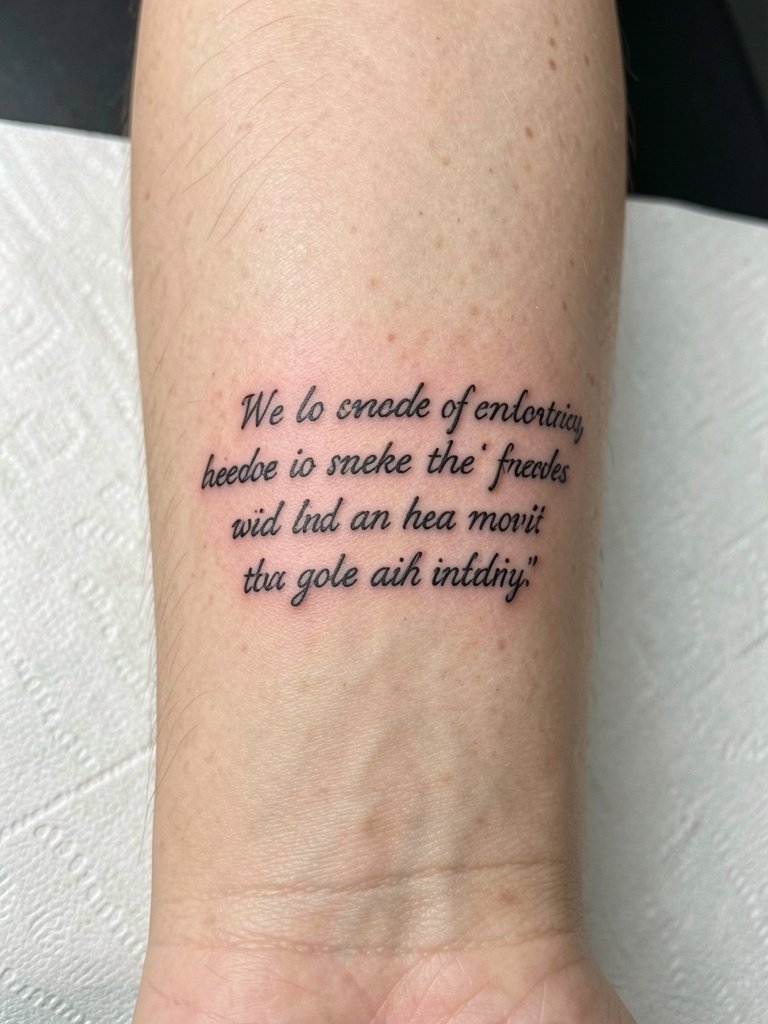
Fine script splits opinion. One camp says bold script ages better because thicker strokes maintain counters and resist blowout over years. The other camp argues that fine script can age gracefully if the letters are spaced wider and the artist uses slightly more depth than a cosmetic single pass. If you prefer a dainty look, ask for a tested compromise: a finer letterform with a small increase in stroke width to help retention. First-timer sessions are brief but expect a possible touch-up at year one to restore crispness around junctions.
11. Script Wrapped Around the Bicep
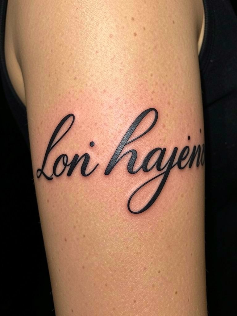
A wrapped bicep script is great for single words or short phrases because the curve accentuates motion. Make sure the artist places a full-size stencil and marks the wrap point so the word does not pinch at the seam. The session feels like low to moderate pain for most people and usually completes in one visit. For apparel, sleeveless tanks and cropped workout tops let the wrap read cleanly. Avoid tiny serif details that can smudge where the band overlaps slightly when the arm moves.
12. Chest Spanning Name Banner
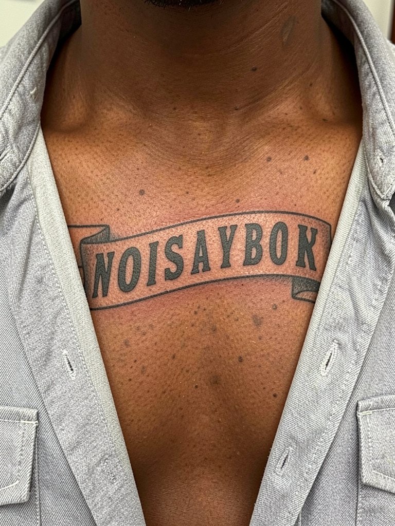
A chest-spanning name in bold script has presence and reads well in photographs. Decide beforehand whether you want the name centered or offset because posture and chest shape change how the letters settle. Common errors include adding ornate tails that cross the sternum crease and risk softening. For session wear, choose an open-collar shirt you can easily remove and put back on. Expect a medium-level session and possibly a short touch-up to perfect letter junctions after healed settling.
13. Wide-Tracked Serif Script on Calf
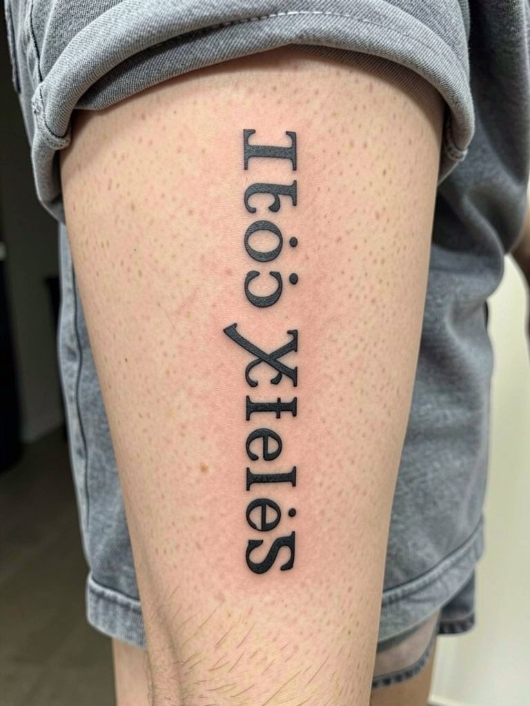
Calf lettering benefits from a slightly wider track because the muscle shape can distort narrow forms when standing. Specify the intended viewing angle so the artist balances the letter proportions for the vertical stretch. A mistake is choosing extremely narrow condensed fonts that appear compressed. For footwear and outfit pairing try high-waisted shorts to frame calf pieces for casual wear. Calf sessions are typically low to moderate pain and heal cleanly with limited friction.
14. Script Ribbon Across the Sternum
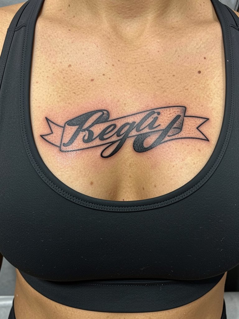
Sternum script can be striking but it sits on sensitive tissue and sees more stretch when breathing. Ask the artist to set the baseline slightly curved to follow the rib shape and to increase stroke width modestly to aid durability. Pain is higher here, so plan breaks and numbing if needed. For session day wear, a fitted sports bra makes access simple and comfortable. If the design has cultural or sacred text, discuss origin and respectful treatment with the artist before booking.
15. Dark Blackwork Script Along the Spine
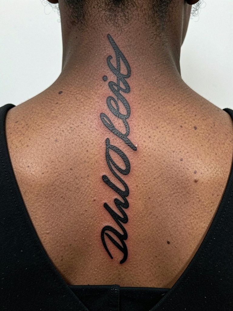
A vertical spine placement reads symmetrically and suits compact phrases. The main technical ask is consistent letter alignment along the spine axis so the word does not drift left or right as you move. Spinal skin can be bony and the session can be sharp, so expect a higher discomfort rating. For evening looks, open-back tops frame spine scripts well. A typical mistake is underestimating how much longer a vertical word needs to be to fill the space elegantly.
16. Heavy Script Collarbone Accent for Men
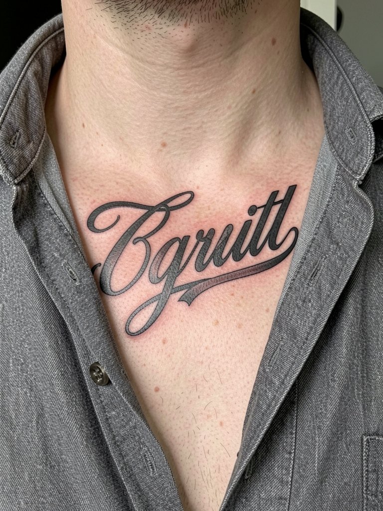
A heavy script across the collarbone can feel assertive without being aggressive when the strokes taper subtly. Request mockups in three sizes so you can pick the scale that reads in photos and in person. Men often choose bolder spacing and thicker terminals to maintain legibility. For wardrobe, open-collar shirts with layered necklaces create a balanced frame so the script does not compete with clothing. Sessions are moderate and usually complete in a single visit for medium-sized phrases.
17. Script with Stippling Drop Shadow
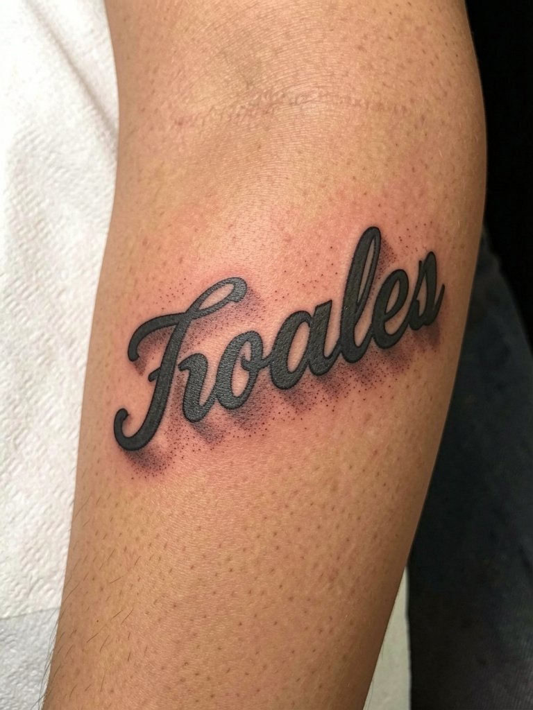
Adding stipple shadow behind bold letters gives depth while keeping the main strokes readable. Stipple holds better than heavy gray wash near fine junctions because dots separate rather than blend into the counters. Ask for a healed example of stipple near lettering to confirm the artist's spacing choices. For casual outfits try neutral linen shirts that let your forearm be the focal point. Expect a slightly longer session time than plain lettering because the stipple requires additional passes.
18. Script Wrapped into a Blackwork Patch
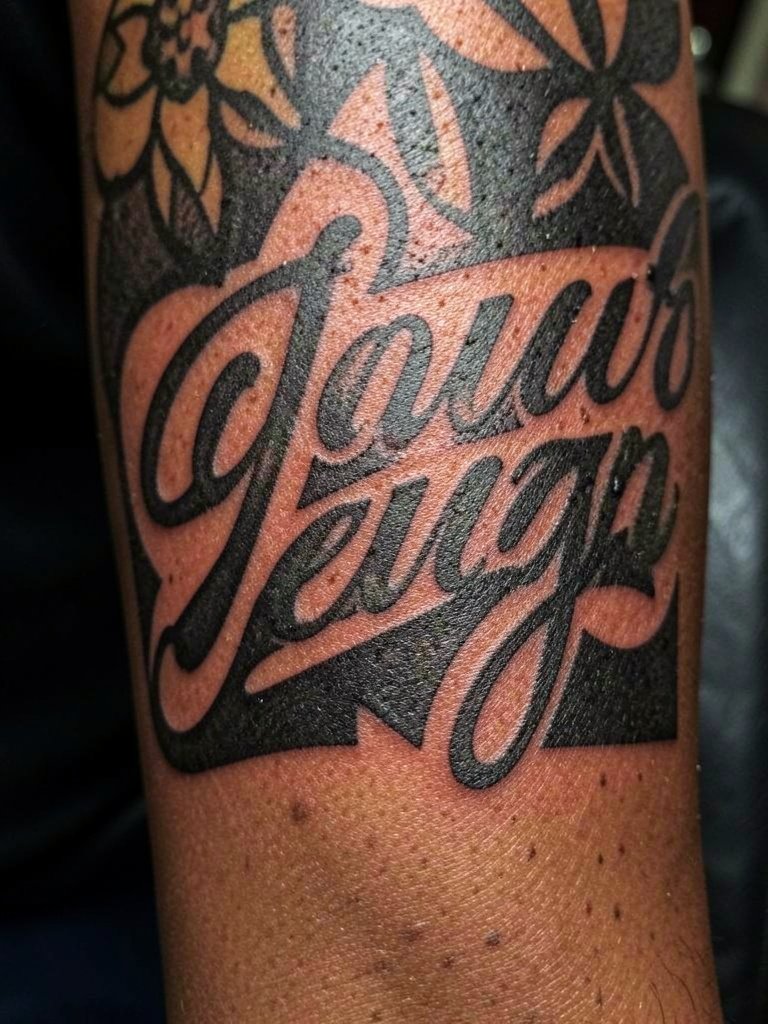
When letterforms live in negative space inside blackwork, the contrast is dramatic and durable. The critical design choice is ensuring the counters are large enough so the black filler does not eat the inner shapes over time. The main mistake is making the counters hairline thin. For session wear, a short sleeve or tank is best. Blackwork sections usually take longer and may require multiple sessions to reach even saturation.
19. Thin-but-Solid Script Along the Ribs
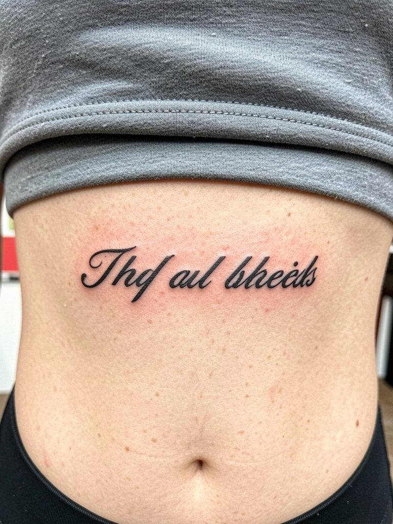
Ribcage text is close to the debate about fine line versus bold. One group of artists warns that the constant movement and stretch there blurs very fine lines within a couple of years. Another group says that with slightly wider spacing and proper depth, narrow scripts can still look refined and hold up. For a long quote on the ribs choose a slightly bolder track than your reference image. Wear a loose sports bra so the artist can move the fabric without tension and expect a higher pain rating.
20. Script in a Banner Over a Traditional Rose
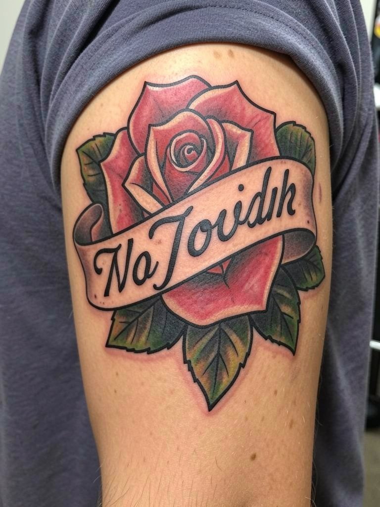
Combining banner script with traditional roses gives a familiar silhouette that photographs well. The key is to keep the banner width consistent and avoid tiny serif ornamentation that competes with the flower details. A routine error is shrinking the banner text to fit the art instead of scaling the banner to suit readable lettering. For casual looks try open shirts or a layered chain necklace that complements the chest or arm placement. Session time depends on the floral detail and text length.
21. Short Phrase on the Side of the Hand
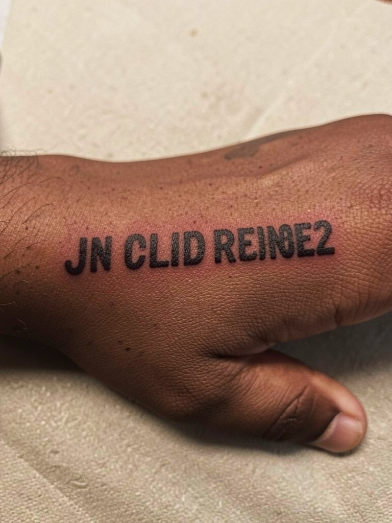
Hand and thumb-side text is highly visible and sees heavy washing and use. For durability select bold letterforms with generous spacing. The common mistake is tiny script that fades or blurs quickly from daily friction. This placement benefits from a clear aftercare plan and acceptance that touch-ups may be needed sooner than other spots. For showing the piece without covering it, minimal rings on the opposite hand keep the focus on the script. Sessions are quick but can be sharp due to thin skin.
22. Script Along the Hip Bone

Hip scripts work well for slightly curved phrases and seasonal show-off moments. The studio discussion should include how the waistband will sit next to the text so the tattoo does not end up hidden under clothing. Avoid overly delicate terminals that can be lost where fabric rubs. For session day, low-rise jeans that fasten normally make access easy. Healing is generally smooth as long as tight waistbands are avoided for the first two weeks.
23. Bold Script on the Nape of the Neck
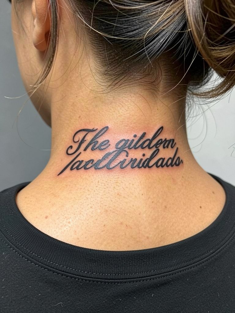
Nape script sits at the hairline and can be partly hidden or shown depending on hairstyle. Request a stencil placed while the hair is up so you can evaluate visibility. A typical error is picking script that is too small for the nape's texture, which can make letters fade into the hairline. For showing off at events, wide-neck tops complement nape pieces. The area is slightly sensitive but sessions are brief and touch-ups may be needed where hair follicles and rubbing from collars affect ink.
Frequently Asked Questions
Q: How do I decide between bold script and fine script for longevity?
A: Bold script tends to hold shape better because thicker strokes maintain counters as the skin softens. Fine script can still work if the letters are spaced wider and the artist uses a slightly heavier hand than a cosmetic single-needle pass, so ask for healed examples of that artist's thin lettering before committing.
Q: Where can I find artists who actually show healed script work without naming specific people?
A: Search hashtags like #scripttattoo, #letteringtattoo, and #blackworktattoo on Instagram and TikTok while using the location filter to narrow to your city. Use Pinterest for font ideas but prioritize portfolios that post healed follow-ups. Reddit tattoo communities also reveal common mistakes and realistic touch-up timelines.
Q: Will bold dark script look good on darker skin tones?
A: Yes, high-contrast saturated black with slightly wider letter spacing translates better across darker tones than ultra-thin strokes. Look at healed examples on a range of skin tones and prioritize artists who post diverse healed photos.
Q: What should I wear to the appointment for a ribcage or sternum script?
A: Wear a fitted sports bra or a cropped top that sits naturally so the artist can move fabric without pulling. For ribcage work, a loose sports bra allows access while keeping you comfortable. Bringing a clean loose shirt to put on after the session is also helpful.
Q: How many touch-ups can I realistically expect for script tattoos?
A: It depends on placement and daily wear. Wrists, hands, and ribs often need at least one touch-up in the first year, while forearm and chest scripts may hold without touch-ups for longer. Plan for a one-year check-in to evaluate any softening along junctions.
Q: Are gothic and ornamental scripts overdone or still worth choosing?
A: One camp sees gothic and ornamental scripts as timeless because the heavy contrast reads well and photographs consistently. The other camp argues they can look formulaic if copied from the same inspiration boards, so choose custom tweaks that make the lettering personal rather than a stock paste-up.
A: