
The stencil sat across the vertebral midline and the client flinched when the needle passed the ribs. The artist paused, smoothed the stencil, and adjusted line weight before the second pass. Those small course corrections decide whether a spine piece still reads after five years. Read through these vertical ideas with placement, aging notes, and what to wear on chair day so you pick a spine tattoo that looks intentional now and later.
1. Single-Word Vertical Script, Upper-to-Lower Spine

A single vertical word follows the spine beautifully and fits between shoulder blades on most bodies. Pick a slightly heavier single-needle weight than your screen reference so the letters stay legible after two years. One camp favors ultra-fine script for the refined look. The other camp prefers a touch more line weight because the back moves and fine lines can blur. For the appointment, wear a loose button-down shirt that unbuttons easily so the artist can adjust the stencil without stretching skin. Expect one session and a touch-up window at 9 to 18 months for saturation.
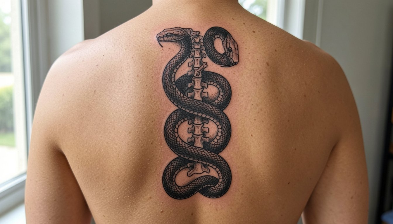
2. Twin Serpents, Symmetrical Blackwork Column

A coiling pair of snakes uses symmetry to make the spine read like a designed axis, which suits masculine silhouettes. Ask for spacing so the coils have breathing room; tiny interscale detail looks great fresh but compresses with movement. Pain sits around a 6 out of 10 along the thoracic spine, with sharper twinges near the vertebral knobs. For showing it off, try an open-back tank top that frames the centerline. Session time is usually two to three hours for a medium column and most pieces need a touch-up around year two if you want that crisp contrast maintained.
3. Vertical Sword or Dagger, Blade Aligned to Spine

A vertical blade reads strong because its silhouette mimics the spine. Choose a flat black core and controlled shading to avoid gradients that soften with time. Common mistake is loading the blade with tiny filigree that loses detail when the skin settles. Talk about line weight and contrast so the fuller stays defined after healing. Pain is concentrated at the spine line and upper lumbar because there is less cushioning. For the session, pull on a zip hoodie you can open so the artist can work without fabric friction. Expect one to two sessions depending on length and ornamentation.
4. Vertical Runes or Ancient Script Stack

A vertical stack of runes uses the spine as a natural column for symbolic lettering. One camp argues small, tightly packed runes create a refined look. The opposing camp insists wider spacing and slightly bolder characters are safer for longevity since the back stretches. Be explicit about spacing and character height in your consult. For session wear, a wide collar t-shirt makes access to the upper spine easier without full undressing. Keep the characters at least half an inch apart to avoid merging over time.
5. Ornamental Medallion Chain, Repeating Centers

A medallion chain makes a decorative column without filling the whole back. The common error is packing discs too small. I recommend slightly larger medallions with bold outer rims so the shapes stay readable as the skin ages. When you book, bring photos that show the exact rim weight and spacing you want, so the artist can scale appropriately. For showing it off, use a fitted crew neck that can be lifted briefly during photos without stretching the skin. These pieces typically take two sessions if you want stippled interior shading.
6. Minimalist Symbol Column, Tiny Icons in a Line

Minimalist stacks are great for first-timers who want centered symmetry. The tradeoff is how small you go. Ultra-micro dots and tiny glyphs look delicate fresh and often need touch-ups by year two. Instead, pick slightly larger glyphs and allow a small vertical gap between each to preserve clarity. For the appointment, wear a loose button-down so the artist can access the mid-spine without bending. These usually fit into a single short session but plan for a touch-up if you want perfect crispness later.
Session Day Picks
A few practical items make chair day smoother for the vertical pieces above, especially the upper spine details and medallion chains.
- Stencil transfer paper kit. Lets you preview placement on the centerline so a fine script or symbol stack sits where you want it before any needle touches skin.
- Topical numbing cream. Applied ahead of time this eases the sharper twinges at the vertebral line for long sessions.
- Thin protective film roll. Keeps freshly inked vertical work clean during showers and light friction from clothing.
- Fragrance-free gentle body wash. Gentle cleansing around the spine reduces irritation while the tattoo seals.
- Aquaphor healing ointment. Thin layers in the first days protect fine line work without over-saturating the skin.
7. Caduceus or Medical-Symbol Column

A medical-symbol spine piece expands visually while keeping a vertical read. Simplify the wings so they do not crowd the shoulder blades; too much feather detail can fall into muddiness as the back moves. A common consultation mistake is bringing multiple complex references and asking the artist to merge everything. Instead, bring one clear comp that highlights the wingspan and central rod so the artist can scale the wings to your back width. For the session, a fitted crew neck that can be lifted briefly is handy. Expect one to two sessions depending on wing detail.
8. Gothic Occult Axis, Dark Illustrative Column

Gothic spine pieces let you build a narrative down the center of the back. The mistake is cramming too many tiny images into a narrow column. Instead, design slightly larger focal pieces spaced by ornamental connectors so each element keeps identity as it heals. Pain and sensitivity spike near the lower thoracic spine. For session comfort, wear an open-back tank or a shirt you can remove without twisting. These often need multiple passes if heavy black saturation is part of the look.
9. Fallen Angel or Winged Centerpiece, Spine as Anchor

Using the spine as the anchor point for wings gives breadth to a back design without losing the vertical narrative. Artists often debate how much wing detail to include near the shoulders. Too much micro-feathering at small scales blurs in time. For photos or nights out, a sleeveless gym tank frames the wings and keeps the spine visible. Large winged pieces usually run across multiple sessions and need strong black and grey saturation to retain depth after healing.
10. Large Ornamental Back That Tracks the Spine

If you want full visual impact without a full back piece, a spine-tracking ornamental motif gives scale and presence. The common error is treating the spine as a separate element rather than the axis of a wider composition. During your consult, discuss how the design reads from a distance and how the flanking panels taper toward the hips. Pain and session length are higher for large work. For chair day, a front-opening shirt helps with frequent re-dressing between longer sessions.
11. Micro-Realistic Stack, Tiny Animals or Objects in a Line

Micro-realism down the spine reads editorial and discreet but it asks for strict sizing discipline. One camp favors very small, tightly packed motifs for subtlety. The other camp warns that anything under a certain size loses definition and needs frequent touch-ups. I side with slightly enlarging each element so you retain detail at one, two, and five years. For outfit pairing, neutral minimalist shirts keep the focus on the vertical line. Bring healed references so you and the artist agree on how these elements scale.
12. Back-to-Spine Symbolic Composition, Big Canvas Vertical Anchor

This approach treats the spine as part of a larger story. The key mistake is weak central anchoring, which makes the spine look accidental rather than intentional. Specify how the central column should taper and whether the lower end will carry into the lumbar area. These builds usually take multiple long sessions and require planned healing windows. For the session, wear comfortable layers you can peel off without twisting the torso. Expect touch-ups at the one- to two-year mark if you want saturated black panels to remain solid.
13. Memorial Vertical Script with Dates

Memorial scripts on the spine are quietly powerful when the letterforms remain legible. Avoid tiny flourishes that collapse into blur with motion. Bring the exact text and date formatting so the image generator or artist can mock it at scale. For showing the piece, a wide-collar tee keeps the upper spine visible without fuss. Expect a single session for a medium-length vertical script and plan for a touch-up if you want letter edges razor sharp.
14. Tall Geometric Column, Sharp Lines and Angles

Geometric spine work thrives on spacing. Too-tight grids blur into an indistinct block over time. The common mistake is copying screen designs without scaling for human anatomy. During the consult, request a mockup that maps the shapes to your vertebral spacing so lines align with natural contours. For session comfort, a loose button-down that can be opened is practical. Expect one to three sessions depending on the amount of linework and stippling.
15. Stylized Vertebrae Column, Anatomical Motif

A vertebrae column plays cleverly with the anatomy but the risk is being too literal or too tiny. I recommend slightly abstracted vertebrae with bold outer rims so the shapes do not merge. Discuss with your artist how far into the lumbar you want the column to extend and whether to stop at the natural dip above the waistband. For chair day, wear low-rise joggers so the lower spine is accessible and you do not tug at the waistband. These pieces take multiple passes for shading and contrast.
16. Cultural Motif Chain, Respectful Ornamentation

If the idea borrows from a living cultural tradition, mention origins and ask the artist about respectful adaptation. Cultural origin matters and should be acknowledged in the consult. The common mistake is copying sacred patterns without context. State your intent and be open to the artist suggesting authentic motifs or alternative compositions. Pain and aging are similar to other spine work, but intricate patterning needs slightly larger scale to remain crisp. No outfit link here since the focus should be the consult and responsible design choices.
17. Neo-Traditional Totem Stack, Animal Figures in Line

A totem stack of animals gives narrative verticality. Keep color accents minimal on the spine since color saturation fades faster on moving skin. Tell the artist which element should be the focal point so composition scales top to bottom. For wearing it out, a sleeveless workout tank shows the column without distraction. Expect several sessions if you want both bold blackline anchors and selective color.
18. Solid Blackwork Column with Negative-Space Details

Blackwork ages predictably if saturated well. The controversy here is fine-line minimalism versus bold black long-term. One group prefers bold black pillars for durability and contrast. The other group prefers cleaner fine-line negatives for a subtle aesthetic. If you pick solid blackwork, expect a longer session and a healing phase that needs careful sun protection. No clothing link here because black pillars are most about saturation and aftercare, which your artist will outline.
19. Ornamental Gothic Dagger with Filigree

A gothic dagger mixes sharp geometry and ornamental filigree. The usual mistake is over-detailing the filigree at a scale the spine cannot support. Pick strong outline anchors and let filigree breathe with negative space. For the session, a zip hoodie you can open helps with dressing between runs. Expect moderate-to-high pain along the midline and plan for a follow-up session to darken the blades or filigree if needed.
20. Compass or Navigation Column, Directional Motifs

A compass column reads as intention down the centerline. Keep the primary compass rings larger and anchor smaller directional markers with simple dots to avoid crowding. A practical session tip is to ask the artist to test-stencil the largest ring at full scale before inking. For occasional visibility, a fitted tee that can be lifted briefly takes minimal effort. These pieces are usually one session for a medium column.
21. Micro-Realism Animal Stack, Discreet and Editorial

Micro-realism on the spine looks editorial but requires realistic scaling. The mistake is pushing for photo-detail in a four-centimeter column. Increase scale slightly so the textures hold. For showing it off, minimalist neutral tops work best, but if you want a wardrobe suggestion try a neutral soft cotton tee that keeps the silhouette clean. These are short sessions but expect to revisit for touch-ups as the fine shading softens.
22. Vertical Botanical Vine, Creeping Up the Spine

Botanical columns are soft and organic, which can conflict with the spine's rigid centerline. To avoid a droopy look, anchor the vine with slightly heavier leaf rims and let stems be lighter. The common error is too many tiny petals. For the appointment, wear a loose button-down shirt that opens for easy access. These pieces usually finish in one session for a mid-length vine, with an optional touch-up for line crispness.
23. Medallion Chain of Symbols, Heirloom Column

A personalized medallion chain reads like an heirloom when each symbol has room to breathe. Too many interior lines in small discs cause detail loss, so increase disc diameter slightly and simplify interior motifs. For session wear that helps with photos and casual visibility, consider a fitted crew neck that can be propped during follow-up photos. These require careful spacing and a likely touch-up to keep stippled interiors crisp.
Frequently Asked Questions
Q: How much does a spine tattoo cost and how many sessions will I need?
A: Prices vary a lot by city and artist, but think in session blocks rather than fixed prices. Minimal single-word scripts often fit a single session. Large ornamental or winged compositions are multiple sessions. Plan for at least one touch-up within the first two years for fine work, and longer builds usually include planned re-saturation sessions.
Q: How painful is a spine tattoo compared with other placements?
A: The spine sits higher on most pain scales because the needle tracks over bone and thinner tissue. The thoracic midline and lumbar apex can be sharper than fleshy areas. Shorter sessions and breaks help. Numbing options and pacing are practical strategies to manage longer builds.
Q: What ages better on the spine, fine line or bold blackwork?
A: Artists split into two camps. One camp prefers fine line for its refined modern look and will point to carefully executed single-needle work that initially reads delicate. The other camp argues bold blackwork wins long term since thicker lines and saturated fills resist spread and maintain contrast. Your choice should balance the immediate aesthetic you want with the maintenance you are willing to commit to.
Q: How do I find artists who show healed spine work without naming specific people?
A: Search hashtags like #spinetattoo, #blackworktattoo, and #finelinetattoo on TikTok and Instagram and filter by location to narrow local portfolios. Tattoodo galleries and Reddit communities are good places to spot healed photos in different skin tones. Prioritize portfolios that show multiple healed shots over time.
Q: What should I wear to the appointment for upper or lower spine placements?
A: For upper spine work, a wide-collar tee or open button-down is easiest. For lower spine work, low-rise pants or joggers with a soft waistband let the artist access the lumbar area without fabric pressure. Loose, easy layers reduce friction during re-dressing between runs.
Q: Will my tattoo look different on darker skin and what should I ask the artist?
A: Contrast matters more than color choice. Strong black anchors and slightly heavier line weight help designs read clearly on deeper skin tones. Bring healed examples on skin tones similar to yours and ask how line weight and saturation will be adjusted for visibility rather than just copying a light-skin reference.
