
The simplest forearm quotes often hold up the best when you plan for readability, placement, and how the skin will change over time. If you worry a phrase will look cheesy in five years, or that tiny cursive will blur into a smudge, you are not alone. Below you will find compact, practical options that prioritize spacing, lineweight, and wardrobe so the message still reads after touch-ups.
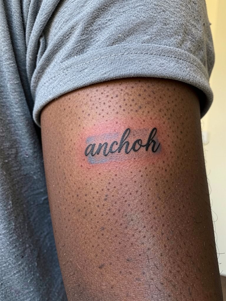
1. Single-Word Cursive on the Inner Forearm
A one-word cursive piece is the low-commitment pick for a first forearm tattoo. I recommend a slightly heavier single-needle weight than the flattest Pinterest scripts, because the inner forearm moves and ultra-thin strokes often fuzz by year two. Plan for a 30 to 60 minute session depending on length. A common mistake is asking for the exact microscopic font from a photo without accounting for spacing. For the appointment wear a rolled sleeve linen shirt so the artist can expose the inner forearm without rubbing skin against fabric.
2. Short Curved Quote That Wraps the Arm
Curving a quote along the forearm makes it read like it belongs to your body rather than pasted on. For a short wrap you want even letterspacing across the arc so key words do not squish at the ends. In consultation bring one top-down photo and one side-angle to show how the curve reads when the arm is relaxed. Expect low blowout risk on the outer forearm, but note the outer side is slightly more sun-exposed so plan for sunscreen later. The session typically runs 45 to 75 minutes depending on shading. For showing it off, pair with a clean solid tee and a denim overshirt that can be pushed up without rubbing the new ink.
3. Laconic Micro-Quote Near the Wrist
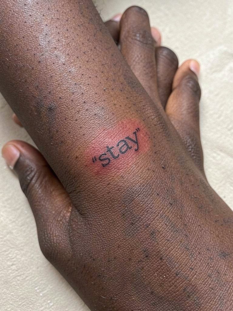
Micro-quotes read clean when they stay ultra-short. One to three words age better than long sentences on the wrist where movement and washing add friction. A big error is keeping letters too tight. For a wrist-area micro-quote, increase kerning slightly and keep stroke weight a hair thicker to avoid early blurring. The pain level is lower on the outer wrist, higher on the inner wrist. Session time is typically 20 to 40 minutes. Style tip: minimal wrist pieces pair with a slim watch on the opposite wrist so the tattoo reads without competing accessories.
4. Black-and-Gray Quote with Soft Shadowing
Gray shading adds depth without competing with legibility. For quotes that use layered fonts, use soft gray behind heavier letters so the eye reads the hierarchy first. A typical version that ages poorly uses tiny shadow lines too close to the main strokes. To avoid that, the shadow should sit slightly offset and be feathered with stipple shading. Expect a 60 to 90 minute session. If you like a low-contrast wardrobe, try a solid color t shirt to let the gray tonal range read clearly.
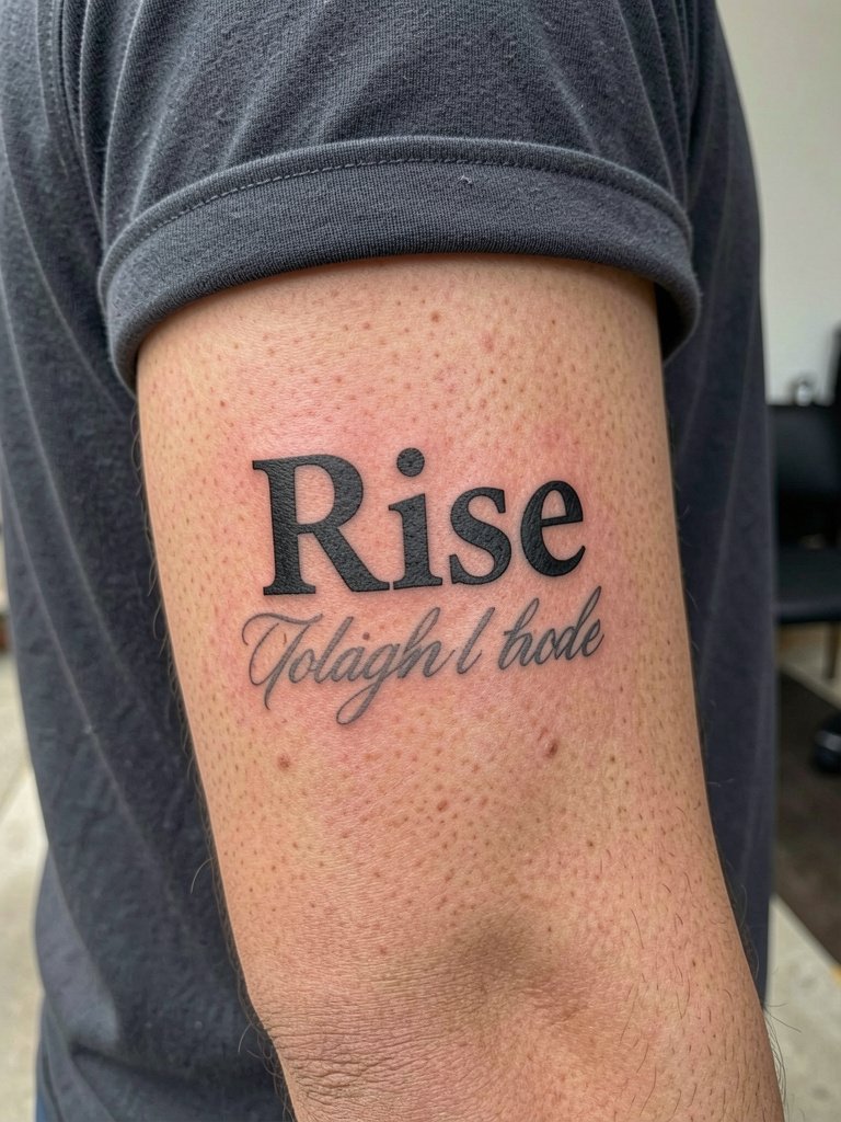
5. Mixed Fonts for a Hierarchical Quote
Mixed fonts let you emphasize a single keyword without adding more words. One camp prefers cursive keywords for elegance. The other camp prefers bold sans for readability. If you want both, let the serif carry weight and the sans hold the supporting text. A common mistake is matching fonts that read as cluttered when the size difference is too small. Discuss scale and spacing with your artist by showing a printed mockup at the size you want to wear. For outfit pairing, a cropped jacket or clean denim shirt frames the outer forearm and keeps the lettering in view.
6. Illustrative Quote with Tiny Ornamentation
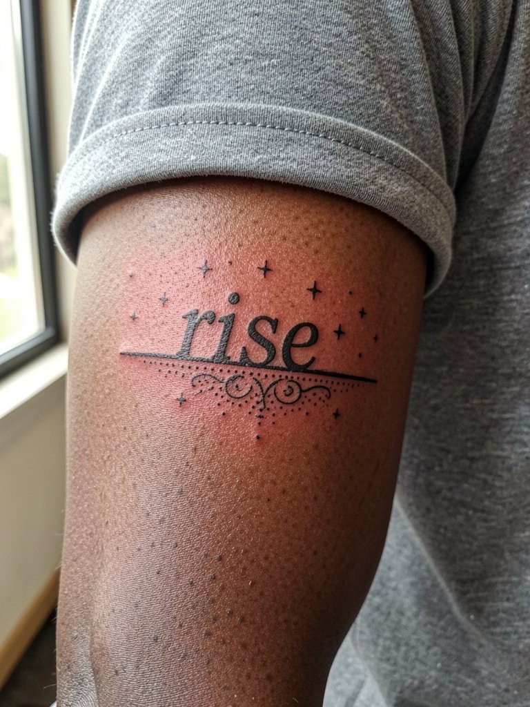
Pairing small illustrative elements with a quote can make a short phrase feel custom. One mistake is crowding ornamentation too close to the letters. Leave breathing room so the dotwork and stipple shading can age without merging into the word. Session time is often 45 to 90 minutes depending on ornament density. For session comfort wear a loose drawstring linen pant if you expect to sit for longer, and carry a lightweight jacket you can roll so the artist has clear access.
Pre-Session Essentials
Those first six ideas include wrist and outer forearm options that heal differently, so a few small items make the session and the first week easier.
-
Stencil transfer paper kit. Lets you preview how the layout reads on skin before the needle starts, helpful for curved and mixed-font designs above.
-
Topical numbing cream. Applied as directed can ease wrist sensitivity so you can complete a delicate script without tensing up.
-
Thin protective film roll. Useful for keeping forearm pieces clean during the first couple of days when clothing rub and showers risk scabbing.
-
Fragrance-free body wash. Gentle cleansing without perfumes helps prevent irritation around fine line work.
-
Aquaphor healing ointment. A thin layer in the initial healing window protects fine line areas without over-saturating the skin.
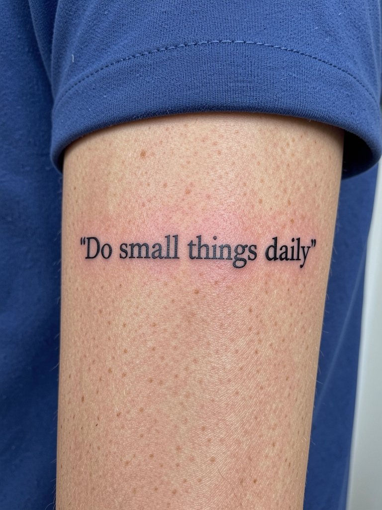
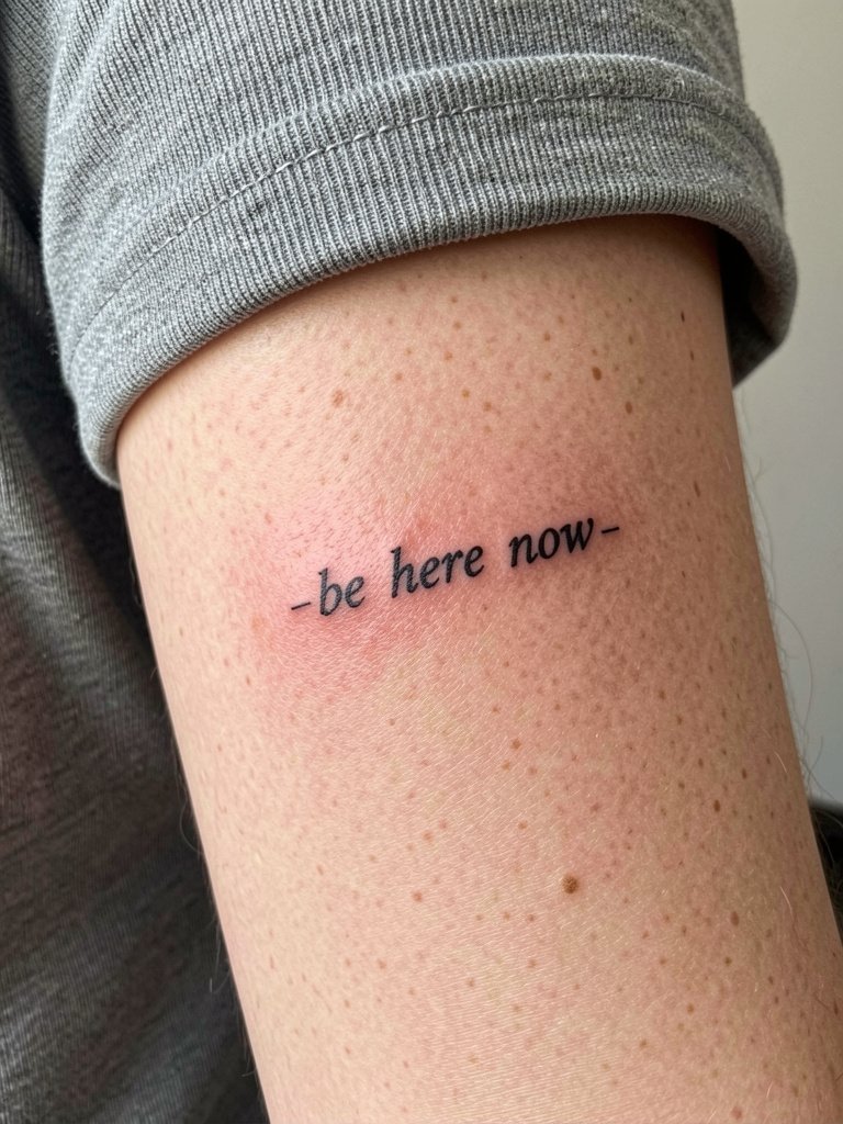
7. One-Line Mantra Running Along the Forearm
A one-line mantra uses the forearm as a natural reading surface when your palm is up. The inner forearm offers visibility to you and lower blowout risk than bony zones. A common error is forcing too many words into one line which shrinks the type and hastens blur. Ask for letterspacing tests at three sizes so you can see how the phrase reads from arm length. Plan for a 45 to 75 minute session. For daily wear try a thin bracelet set on the opposite wrist to balance the visual weight.
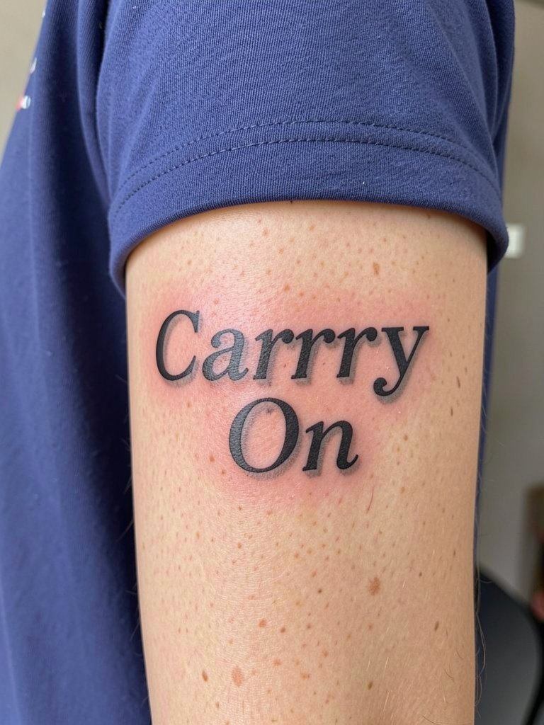
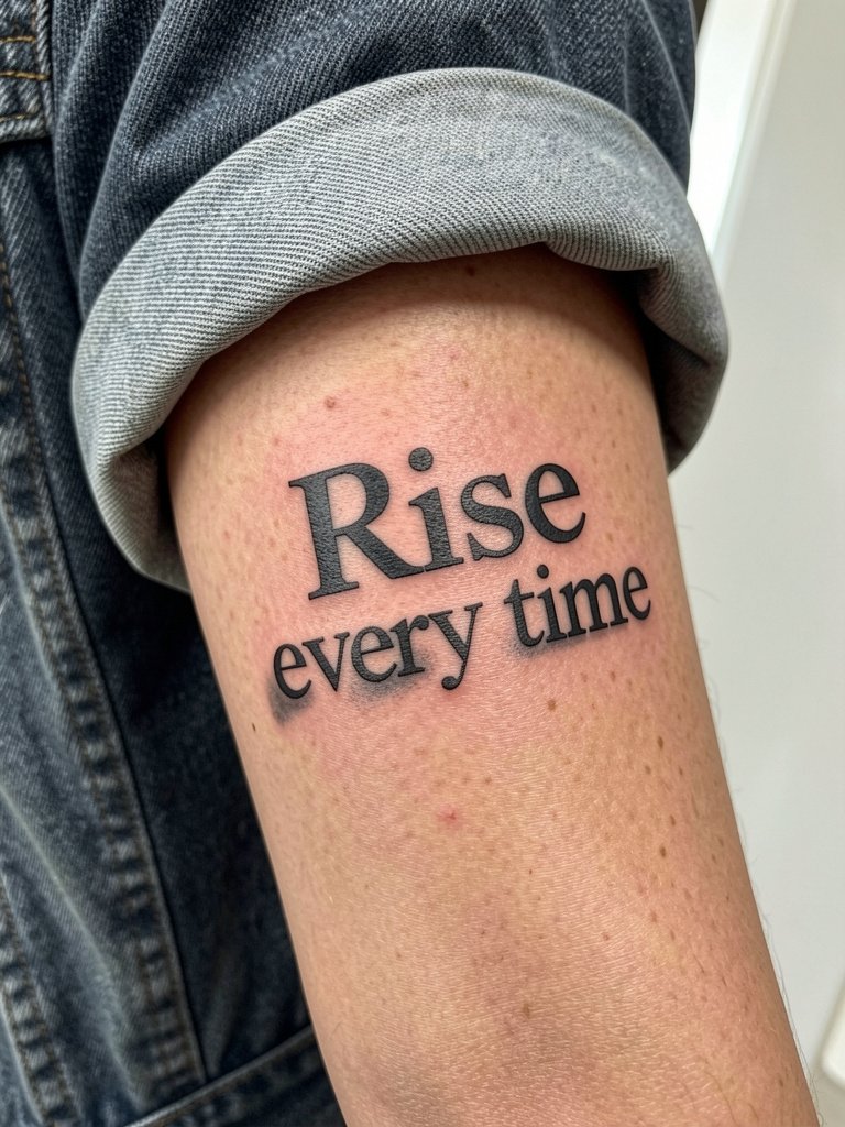
8. Classic Sentence Case Wisdom in Two Lines
Longer sentences require careful sizing to avoid microlettering. If the phrase matters more than scale, consider breaking it into two staggered lines to preserve legibility. Artists differ on whether longer quotes belong on the forearm. One camp says keep it short because skin movement and future touch-ups are easier. The other camp says a well-spaced two-line layout reads fine when fitted by an experienced hand. Expect a session in the 60 to 120 minute range. For show-off styling, a cropped sleeve or bracelet stack that exposes the lines works well.
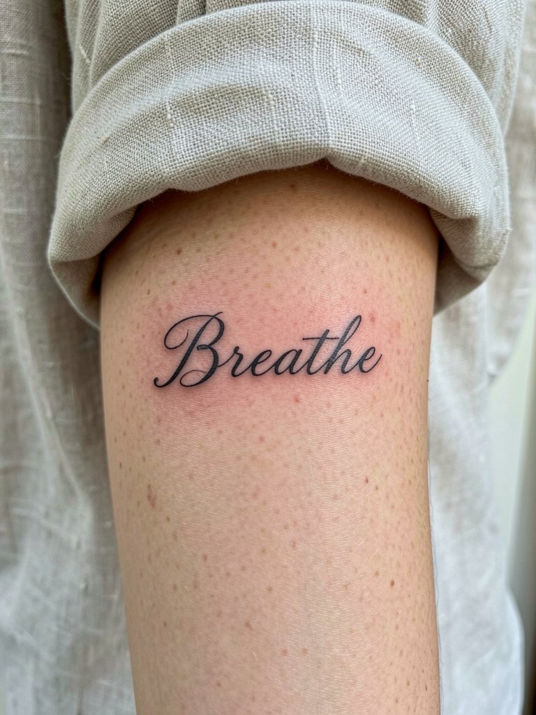
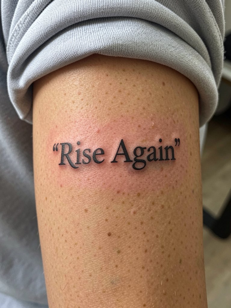
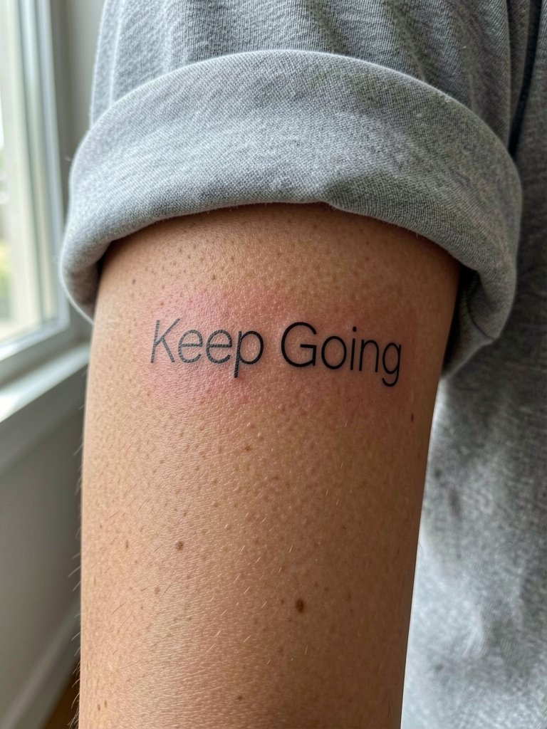
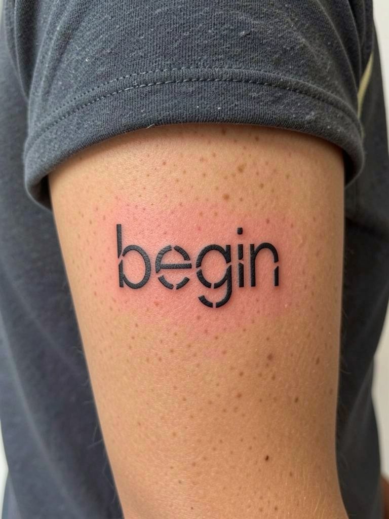
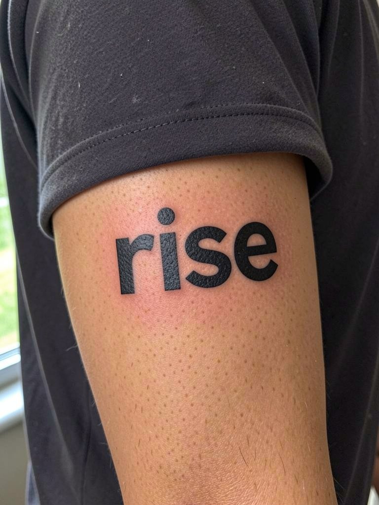
9. One-Word Bold Lettering for Impact
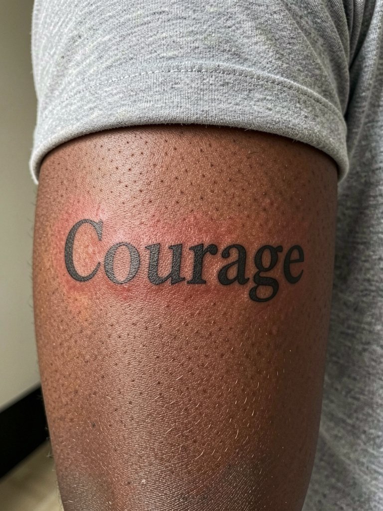
One-word tattoos read as daily reminders without the long-term blurring risk of paragraphs. Use a medium-weight letterform so the letter counters hold up. The inner forearm and outer forearm both suit this style but pick the side that matches your visibility goals. Session time is commonly 30 to 60 minutes. A real mistake is going ultra-tiny with a bold type, which removes the intended presence. Try pairing the piece with a minimal bracelet set to keep attention on the word.
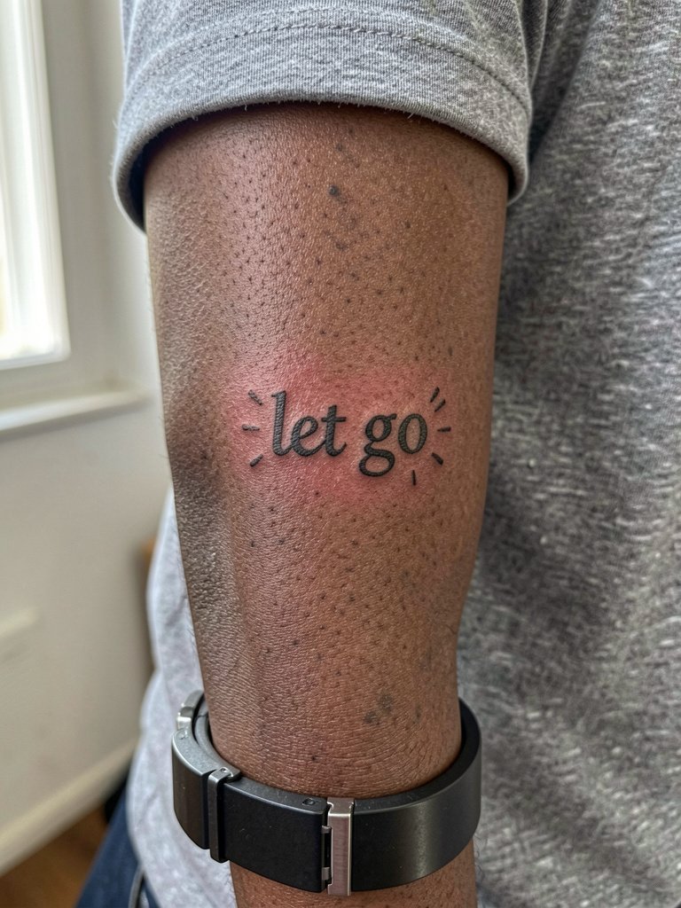
10. Quote Paired with a Tiny Symbol
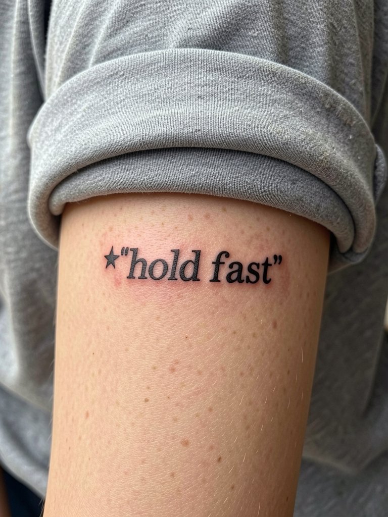
Adding a small symbol helps a common phrase feel more bespoke. Make sure the symbol is large enough to keep its shape as the skin stretches. A tiny star or simple line mark often shows better than a complex miniature image. Talk specifics about spacing so the symbol does not crowd the text. Sessions run 30 to 60 minutes. Pair this look with a sleeve pushed-up tee for effortless viewing.
11. Layered Text with Soft Gray Backing
Layering can add hierarchy and depth without increasing word count. The trick is contrast and spacing so the gray layer reads as background rather than muddle. A common long-term issue is placing the gray wash too close to the black strokes so the edges merge as the tattoo ages. Plan for a touch-up timeline of 18 to 36 months for layered work. For wardrobe, a lightweight jacket that pushes up neatly shows the layered effect.
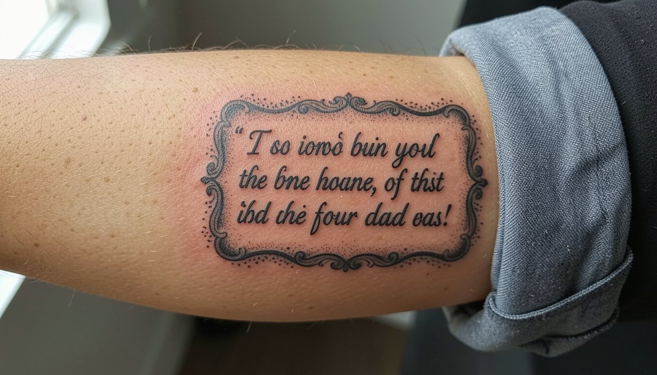
12. Ornamental Framed Quote on Outer Forearm
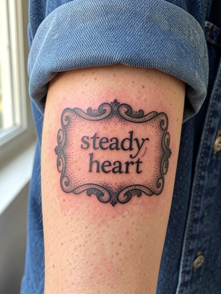
A framed quote reads like a designed object. Frames give structure so longer lines stay legible from a distance. The downside is frames demand more real estate and take longer to tattoo. If you want a frame, ask the artist to increase internal spacing slightly compared to a tight graphic version. Sessions may be 90 to 180 minutes depending on embellishments. For evenings out, the frame pairs well with a cropped jacket that keeps the forearm visible.
13. Sans Serif Minimal Phrase on the Inner Forearm
Simple sans serif is a modern choice for clarity. It avoids flourishes that can bulk up over time and become unreadable. A common mistake is choosing the absolute thinnest weight you can imagine. Ask for a slightly heavier stroke for longevity. Session time is 30 to 60 minutes. For a clean everyday aesthetic, wear neutral knit tees in cream or olive to keep the text the visual focus.
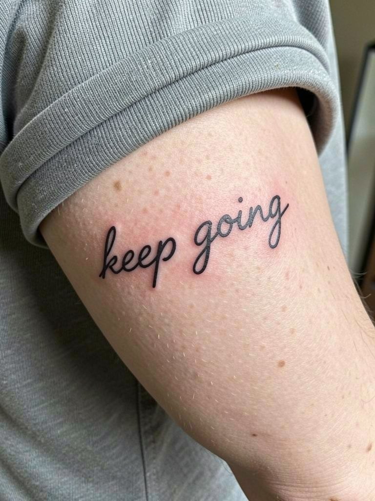
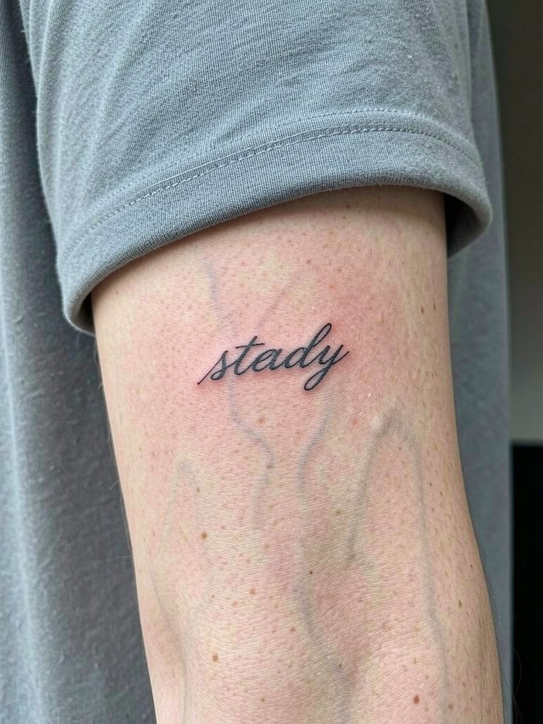
14. Script with Slight Slant to Follow Muscle Flow
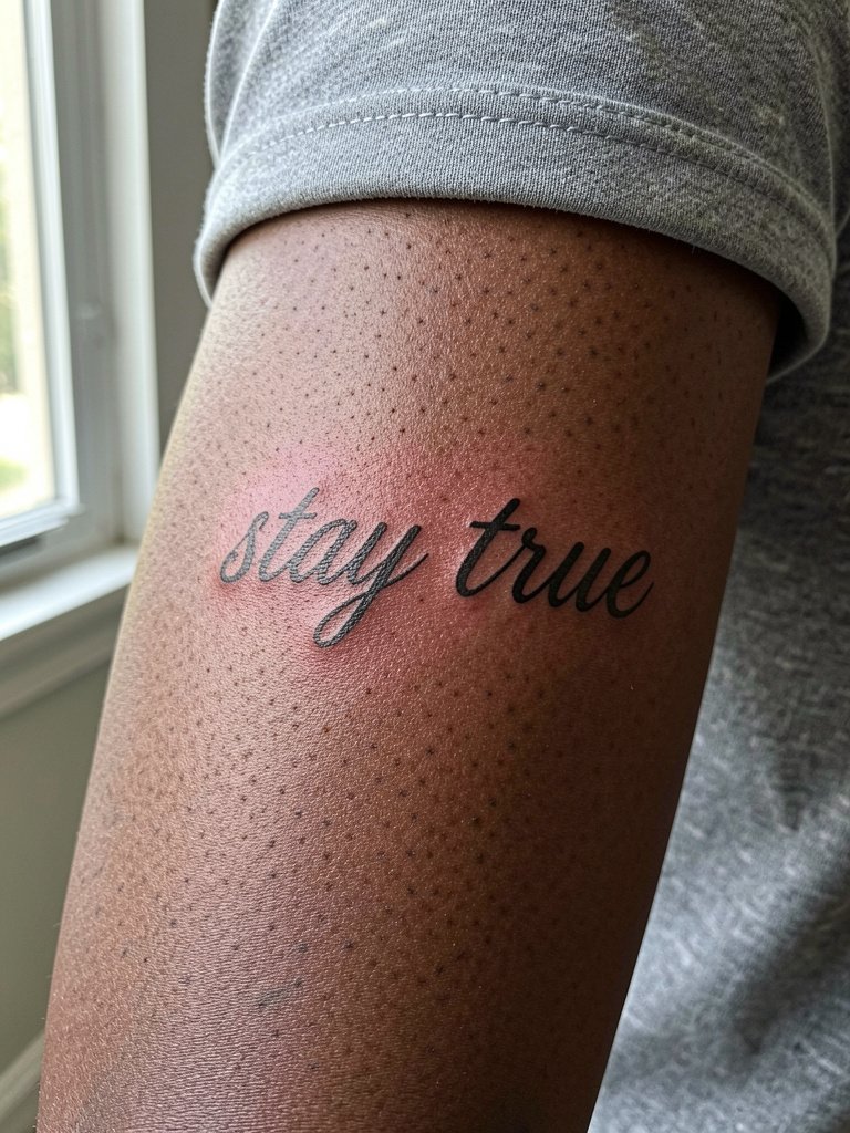
Letting script slant with muscle lines gives the tattoo an organic feel. One camp argues cursive matches arm movement and looks elegant. The other camp points out that cursive can lose letter separations as the skin changes. Name both positions openly and then choose based on your priority for ornament or lifetime clarity. Expect 45 to 90 minutes for a flowing script. For sessions, pick a loose button-down shirt that can roll up without rubbing the fresh ink.
15. Tiny Quote Sandwiched Between Two Lines
Sandwiching a short quote between lines creates a compact visual unit that reads well at a glance. Avoid making the lines too thin or too close to the letters. The elbow-adjacent area flexes, so slightly heavier linework prevents early spread. Session time is often 30 to 60 minutes. This design pairs well with sleeveless tops that show the arm shape, and a muscle tank top works for staged reveal.
16. Vertical Stack on the Forearm Edge
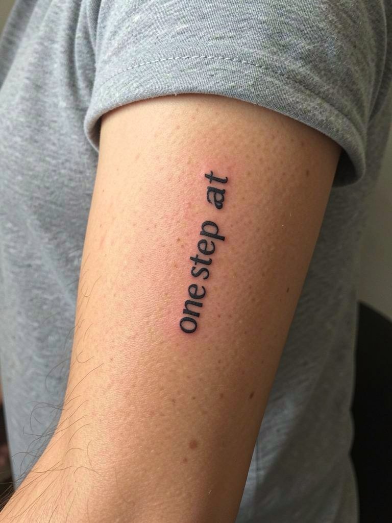
Vertical stacks make the forearm read like a column and can conserve horizontal space. Watch for the wrist crease and avoid placing letters directly across deep folds. A vertical arrangement may need slightly taller type to remain legible after healing. Sessions take 30 to 60 minutes. For casual show-off, pair with a sleeve rolled tee so the column is visible when you move your arm.
17. Lower Forearm Quote with Negative Space Accents
Negative space accents can breathe around a word and keep the type from feeling dense. The lower forearm sees more washing and contact, so plan for slightly bolder strokes. A common mistake is adding tiny negative details that disappear as the ink spreads. Expect 30 to 60 minutes. For accessories, a slim watch on the other wrist balances attention without covering the tattoo.
18. Script That Follows Vein Lines Subtly
Matching script to subtle arm anatomy can make a piece feel integrated. Keep letters slightly larger than a tiny script so vein movement does not break counters. This style is ideal for people who want a gentle, flowing look. Sessions are usually 45 to 75 minutes. Wear a breathable top so the artist can see the vein lines at rest.
19. Broken-Line Type for a Modern Look
Broken-line type reads as modern and graphic. The risk is that missing segments can blur into each other, so keep gaps sizable enough to remain visible when settled. This is better suited to the outer forearm where lines do not crease much. Expect a 45 to 90 minute session. Pair the piece with clean denim shirts or cropped jackets to emphasize the graphic intent.
20. Small Quote with a Faint Watercolor Wash Accent
Adding low-saturation color can individualize a quote. One camp insists black and gray preserves clarity. Another camp accepts small color accents for personality. Name both positions: black-and-gray defenders say color distracts from legibility. Color advocates say an accent can make a phrase feel unique. If you choose color, keep saturation low and limit the area so the black text remains dominant. Sessions may take 60 to 120 minutes. For a complementary palette try neutral clothing that lets the faint wash read.
21. Script with Small Botanical Accent
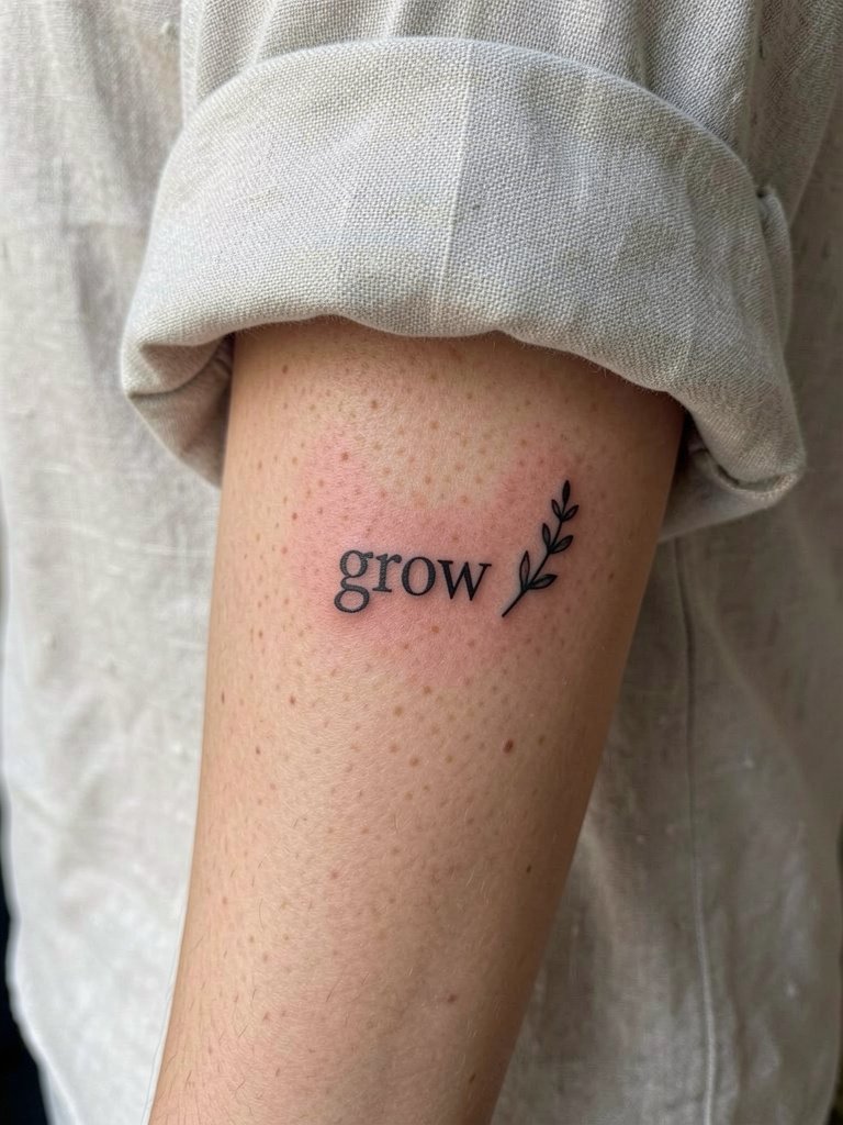
A small plant accent can soften a motivational line and give it context. Keep the botanical simple so the fine leaves do not blur into the lettering. A typical error is adding dense dotwork immediately adjacent to script. Leave space and let stipple shading create background atmosphere if needed. Sessions are 45 to 90 minutes. For a coherent look, try neutral linens or earth tones that echo the botanical feel.
22. Negative Space Lettering for a Subtle Finish
Negative space treatments can be striking while keeping the overall palette minimal. The challenge is that as black blocks age they can soften at edges and encroach on the intended counters. Keep blocks compact and ask for slightly cleaner edges than you would for pure text. Sessions may reach 90 minutes. For styling, a clean denim overshirt helps the high-contrast shapes read well.
23. Forearm Band Quote That Wraps into a Bracelet
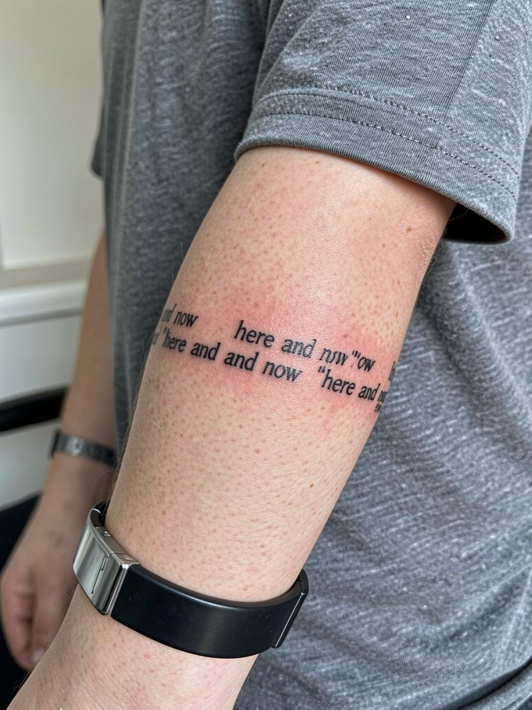
A band quote reads like jewelry and is a good alternative to bracelets that can rub new ink. The trick is even spacing around the circumference so words do not compress near the inner wrist. Expect a session of 60 to 120 minutes depending on how continuous the wrap is. For a balanced look, wear a slim watch on the opposite wrist rather than stacking on top of the band.
Frequently Asked Questions
Q: How do I choose inner forearm versus outer forearm for a quote?
A: Inner forearm gives you more control over who sees the message and is a comfortable surface for longer script. Outer forearm shows more publicly and handles bold, graphic lettering well. Consider visibility, sun exposure, and whether you want the quote to align with muscle lines or be read flat from a distance.
Q: How small can lettering be before it becomes unreadable over time?
A: Tiny single-word tattoos can stay legible if letters have breathing room and slightly heavier strokes. If you want multiple words, increase point size and spacing. I suggest viewing a printed mockup at the exact size so you can see how counters and serifs look before committing.
Q: Which ages better, a short quote or a long paragraph?
A: Some people argue short quotes age better because they keep letter size larger and spacing simpler. Others say longer quotes are worth the compromise for meaningful wording and that an experienced letterer can make them work. Choose based on whether the exact wording matters more than future legibility.
Q: What are simple wardrobe tips to show off a forearm quote?
A: Rolled-sleeve shirts and cropped jackets expose forearm work without overcomplicating the look. For wrist-area pieces keep bracelets minimal and consider a slim watch on the opposite wrist. Try a denim overshirt or neutral linen pieces that let the text remain the focal point.
Q: Where can I find healed portfolio examples and artists who specialize in lettering?
A: Search social platforms using hashtags like #forearmtattoo, #quotetattoo, #finelinetattoo, and #scripttattoo while using your city as a location filter. On Pinterest, look for "forearm script healed" and prioritize posts labeled healed. Reddit communities such as r/tattoos and r/tattooadvice also share firsthand healed photos and practical notes on longevity.
Q: How much should I budget for a forearm quote tattoo?
A: Expect small single-word or micro-quote sessions to fall in the 50 to 150 range. More elaborate framed or ornamented quotes usually fall into a 200 to 500 range depending on artist rates and session length. Tip your artist 15 to 25 percent on top if you are pleased with the work.
