

The line "Never Give Up" can be tiny and private or bold and impossible to miss, but the choice you make now affects how it reads in sunlight and in two years. Pick a font that breathes, a placement that matches the phrase length, and plan for touch-ups rather than expecting forever-perfect strokes. These ideas pair readable lettering with small accents so the mantra stays clear.
1. Fine-Line "Never Give Up" on Inner Forearm

A thin single-needle script on the inner forearm reads like a private mantra you can glance at during a long day. Expect a one-session appointment under an hour for a small line like this, with mild wrist-area sensitivity. Fine line fans and preservation advocates disagree openly about this approach. One camp favors fine line because it looks modern and subtle. The other camp warns that ultra-thin strokes on the forearm can soften and require a touch-up sooner. To avoid a mushy healed look, ask for slightly wider letter spacing and a modest line weight so the linework has room to settle. For showing it off, roll a sleeve up and pair it with a linen button down in cream.
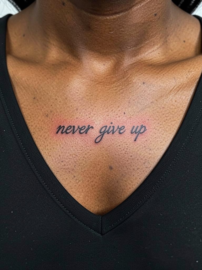
2. Flourished Calligraphy on the Collarbone

A collarbone script gives the phrase more presence without needing a large piece. Plan for a slightly longer session than a tiny wrist script if the flourishes are elaborate. The main mistake people make here is asking for extreme swashes that crowd each other. That looks neat at first and then blurs where lines cross. For longer-term clarity, request bolder main strokes for capitals and keep decorative tails small. Session wear is simple. Bring a strapless bra or a button-down you can open so the artist has clear access. For nights out, the piece pairs well with off-shoulder tops that frame the clavicle.
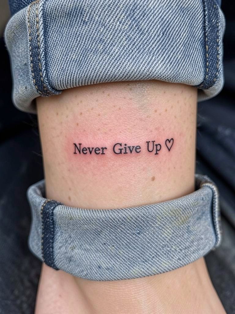
3. Wrist Quote with Tiny Feather Accent

A wrist quote with a feather gives a subtle lift to the line without stealing focus. Tiny wrist work can take under an hour but the skin there sees a lot of washing and jewelry friction. Punching the feather in too small is a common mistake because the fine barbs can melt into a blur. I recommend asking for a simple silhouette feather and slightly heavier script strokes than the reference so the quote reads after a year. If you want to style it, a thin chain bracelet on the opposite wrist helps balance the look. Try pairing with a minimal watch on the other side when you want the script visible.
4. Micro Quote Wrapped Around the Ankle
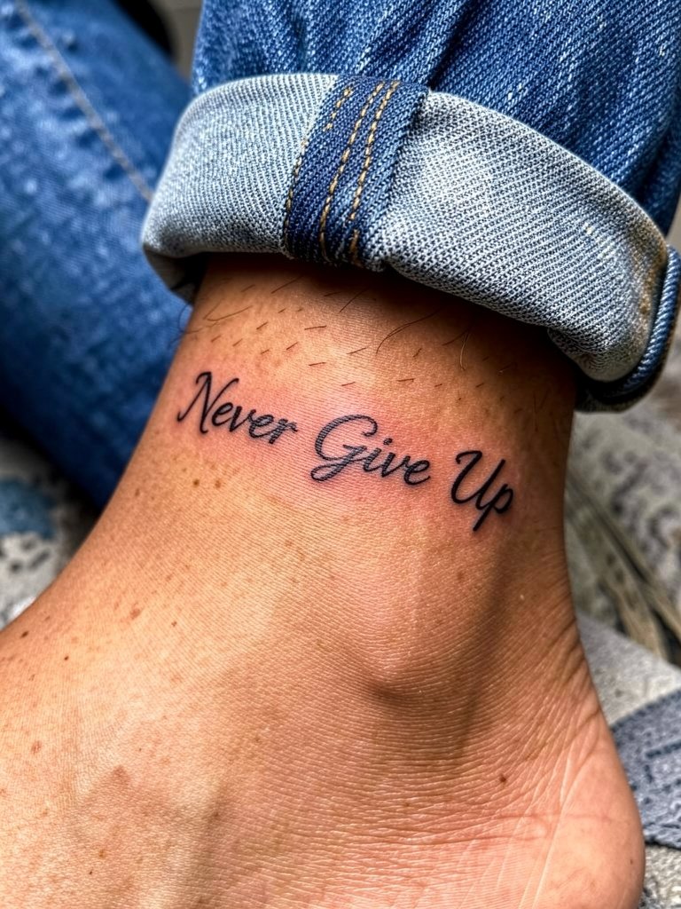
An ankle wrap suits a very short mantra and stays private when shoes and socks cover it. Expect moderate discomfort near bone contact points, and note that ankle tattoos take friction from socks and shoes. The common error is trying to pack too much text in a tiny circumference. Keep the phrase short or choose a thinner word count variant like "Keep Going" to maintain legibility. For footwear that shows the piece, cropped jeans and strappy sandals make it read clearly. Pack a session outfit like shorts for easy access and try a cropped straight jean for aftercare showers.
5. Compact Chinese Character Version on Forearm
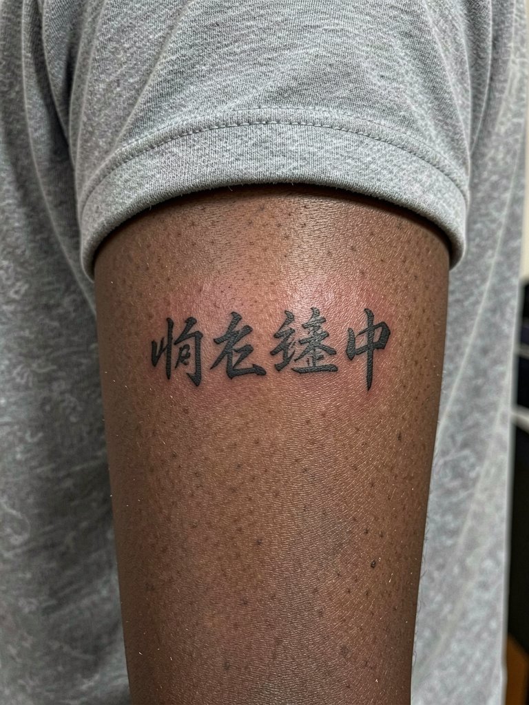
A character-based tattoo condenses the phrase into a graphic silhouette. Translation accuracy matters here more than font choice. A frequent regret is choosing a pretty character image from a board without verifying meaning or modern usage. Bring a verified translation sample and request the artist show you the character at full scale on skin before inking. This placement ages predictably and usually needs one year touch-up for saturation if the first pass sits light. For session wear, keep sleeves short and unobtrusive. If you plan to reveal it, neutral cotton tees and a minimalist bracelet stack complement the linear feel.
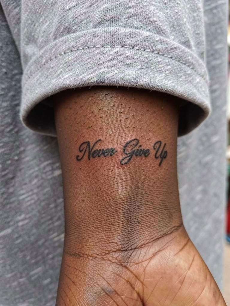
6. Triceps Script, Private and Long
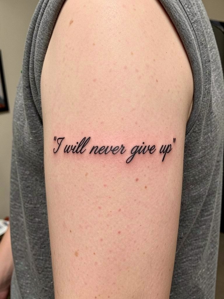
Placing a longer line on the triceps keeps it private under sleeves and lets you write full, resolute versions like "I will never give up." The outer arm gives the letters room to breathe and avoids the wrist-level washout risk. Pain is usually lower than ribs, and session time can be under an hour for short sentences. A mistake is requesting ultra-fine typography that disappears when the arm moves or gains a tan. Ask for a modestly heavier script to lock in linework and plan a touch-up after healing if saturation drops. Show-off pairing includes racerback tops and sleeveless tees. For easy removal and styling on shoot days, try a racerback tank top.
Pre-Session Essentials
The small placements above heal differently, so a few items smooth the session and the first week.
- Breathable silicone healing patches. These gentle patches protect high-friction zones like fingers and ankles during early movement.
- Thin protective film roll for tattoos. Useful for covering tiny wrist and hand pieces when you need a barrier against moisture for short periods.
- Fragrance-free gentle body wash. A mild cleanser reduces irritation during the healing window without stripping ink.
- Allergen-free aftercare balm. A thin layer for the first few days keeps micro-needled channels from crusting excessively.
- Aquaphor healing ointment. A widely used option for initial moisture control on small blackwork pieces.
7. "I Will Never Give Up" Inner Forearm Line
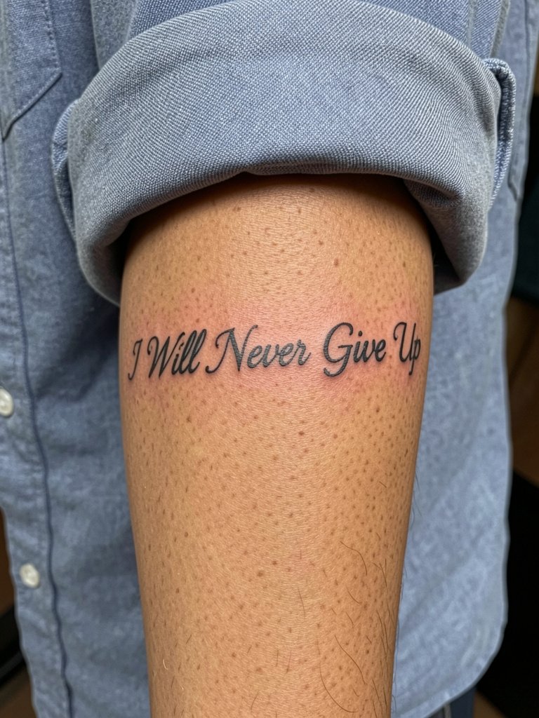
Spelling out the full sentence reads more emphatic and personal than a two-word motto. The inner forearm supports longer lines with good readability. A common error is choosing a very thin script for a long sentence. Thin lines add up and can blur where letters sit closely. For longevity, plan for slightly heavier main strokes and wider inter-letter spacing. Expect light discomfort and a short session under ninety minutes for a medium-length line. Style it with rolled sleeves and a cropped knit. A rolled sleeve shirt makes the forearm visible without trying.
8. Finger Micro-Word, Highly Personal

Finger tattoos are intimate because you see them constantly. That visibility comes with a downside. Fingers suffer heavy wear and fading because of frequent washing. Expect a touch-up at year one or sooner. The mistake people make is choosing long phrases or ultra-small scripts for fingers. Keep it to one word or a symbol. The session is short but stinging. For display, minimal ring stacks and a clean manicure help the tiny script read. Consider pairing with thin ring sets when you want the tattoo to pop.
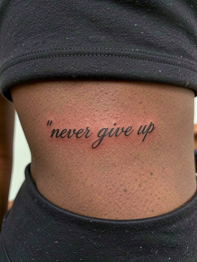
9. Ornamental Framed Quote on the Ribcage
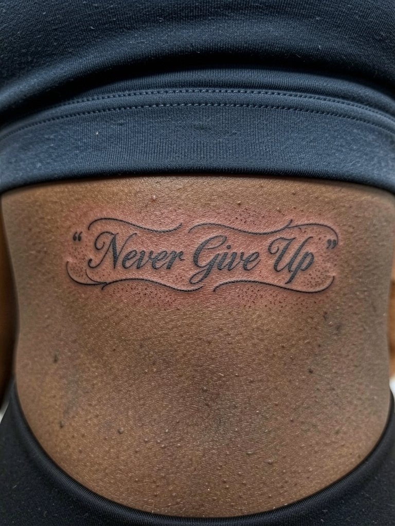
A framed rib quote looks finished and gallery-ready when kept subtle. This placement is sensitive and movement there changes how letters sit. Artists argue about fine line on ribs. One group says fine line blurs quickly because the skin stretches and breathes. The other group says careful needle depth and slight spacing let fine line settle nicely. Both sides make valid points and the difference often comes down to the specific artist technique and how the piece is spaced. If you choose the ribcage, accept that touch-ups are common and that the session will be more painful than a forearm appointment.
10. Quote Plus Dandelion Seeds on Forearm

Adding a small visual like dandelion seeds introduces motion and hope without crowding the text. Keep the accent small so it supports the wording instead of competing with it. The usual misstep is creating a detailed botanical that competes for scale with the script. Ask for a simple silhouette or stipple accent and keep the quote dominant. Expect a typical forearm session with low to moderate pain. Pair it with an oversized button-down and stack rings. A stack ring set complements the airy feel.
11. Minimal Block Letters on the Forearm
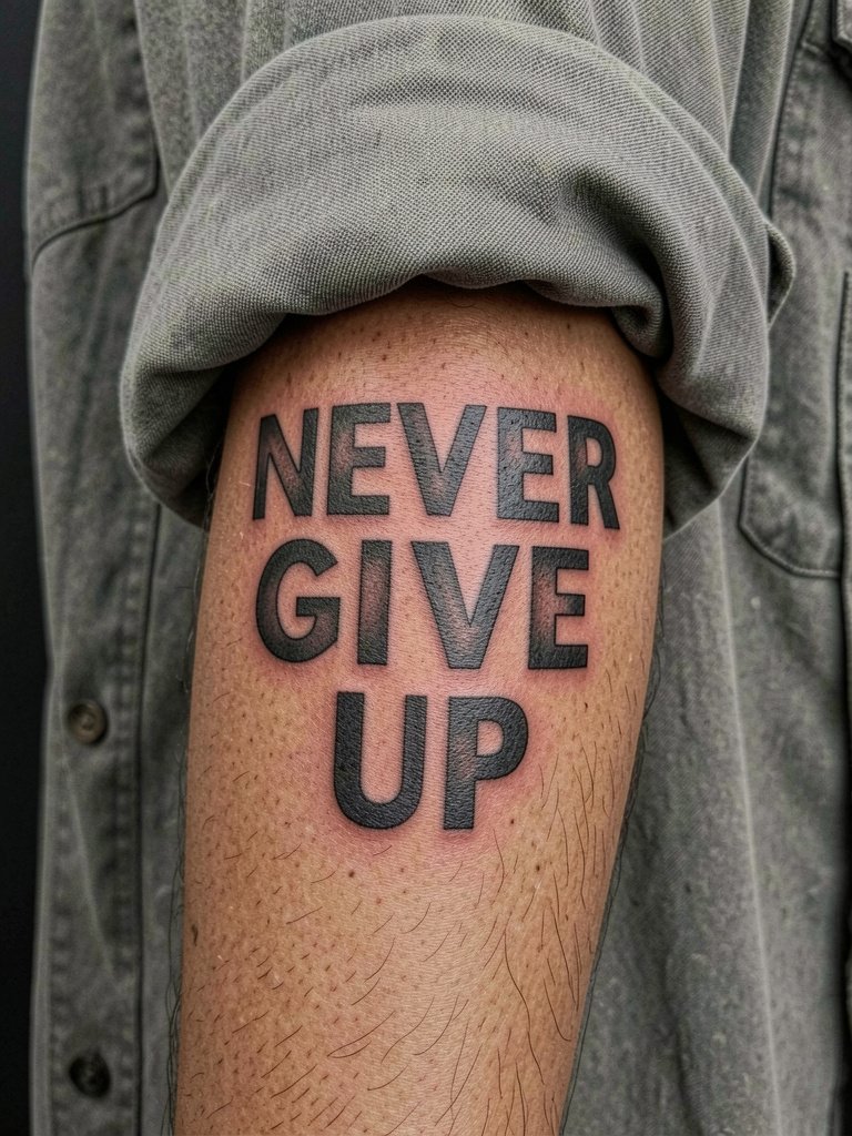
Block letters make the phrase legible from further away and they age predictably because of saturation. This style is a good compromise for people who worry about fine-line blowout. A common error is spacing the letters too tightly. Keep kerning open and the stroke weight consistent so the text holds. Expect more needle passes for saturation, which can raise sensitivity slightly. For wardrobe, oversized shirts with sleeves pushed up and simple denim bring focus to the bold lettering. Try an oversized button down for a casual reveal.
12. Tiny Quote on the Side of the Hand
Hand-side tattoos make the phrase part of gestures, which is powerful and risky. The hands are high-contact zones, so micro-script here often requires multiple touch-ups. The common mistake is underestimating how fast the ink fades. If you want this area, plan for at least one touch-up within the first year. For session wear, keep hands bare and avoid rings. For showing off, a simple bracelet on the opposite wrist keeps attention balanced. A minimal bracelet helps frame the hand.
13. Block Quote with Small Heart Accent on the Ankle
A tiny heart softens the resolve of the phrase for memorial or reassurance meanings. The ankle tolerates small blackwork well but friction from shoes is the main issue. Avoid placing the heart too close to the pant edge where abrasion increases. The session is short and the pain is modest near bone. For styling, cropped pants and ankle straps show the piece cleanly. Pair with ankle strap sandals in warm weather.
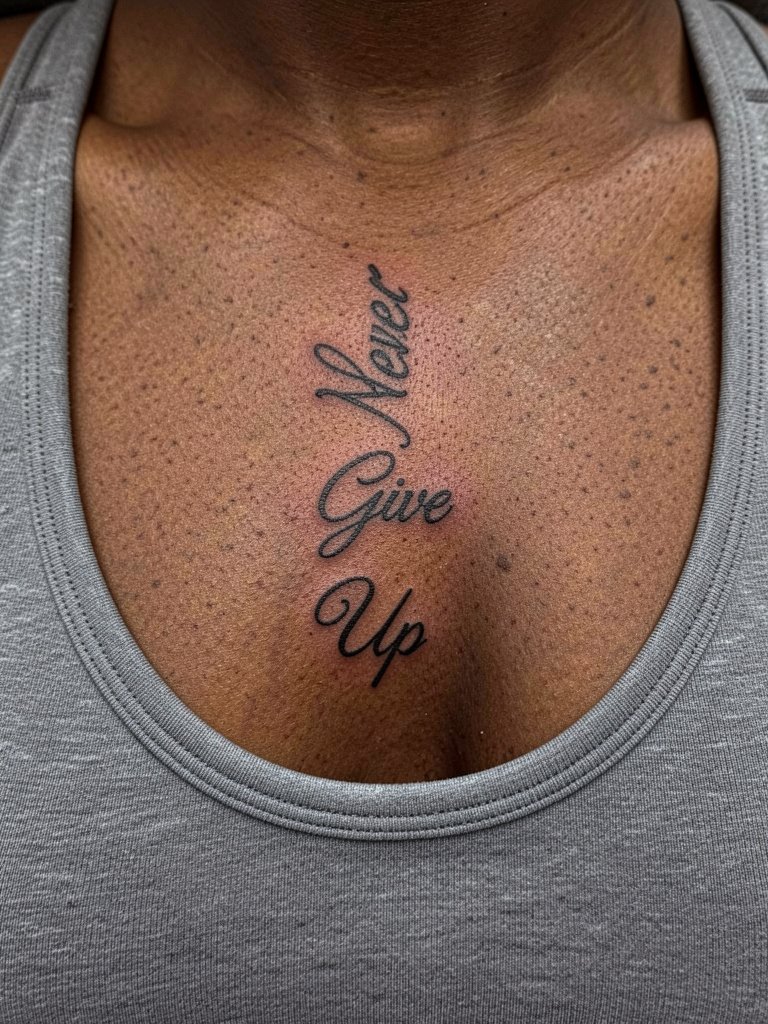
14. Script Under the Collarbone, Centered Near the Heart

A centered chest script reads intimate and can sit close to where a person feels it most. Sternum and chest placements rank higher on a pain chart than the forearm. The biggest mistake is crowding words too close to the breast crease where movement alters line flow. Keep line length modest and the script slightly heavier for stability. The session will be longer than a wrist piece if you want symmetry. For clothing, off-shoulder tops and bralettes frame the area well. A soft bralette makes sessions simpler and keeps pressure off the zone.
15. Dainty Script Along the Side Rib
Rib placements produce beautiful, private layouts but they are one of the most painful zones for short scripts. If pain tolerance is a concern, plan for breaks and numbing timing. A frequent regret is choosing extremely thin fonts for rib text. Movement and breathing exaggerate any loss of saturation here. Consider slightly heavier stroke weight and accept that touch-ups are common. The session feels intense but brief when the piece is short. For reveal looks, high-waisted pants and open shirts make the line sing without exposing the whole torso.
16. Tiny Script Behind the Ear
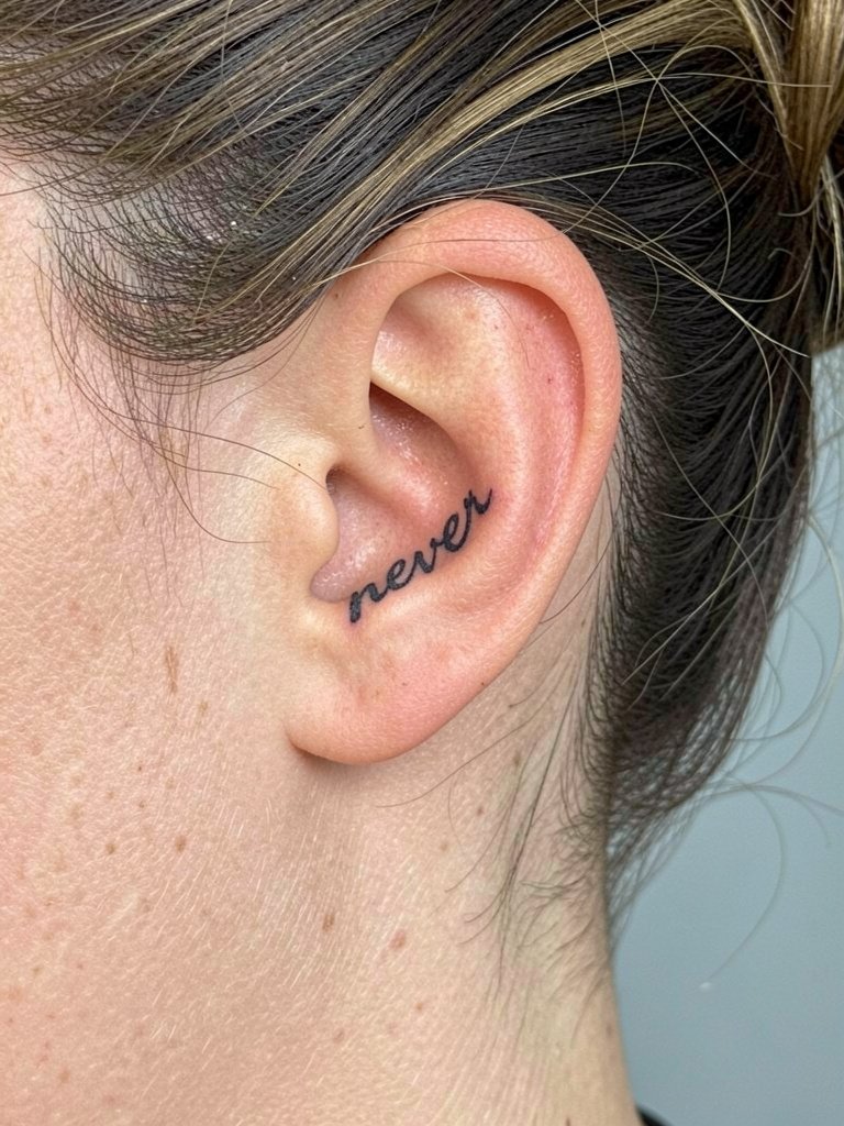
Behind-the-ear scripts are whisper-quiet and excellent for people who want a concealed mantra. The area is sensitive but sessions are short. A mistake is selecting script that is too ornate for the small curve, which disappears into hairline shadows. Keep letterforms simple and avoid dense flourishes. For styling, an updo or short haircut makes the piece visible. Bring a hair claw clip for the session so the artist has clear access.
17. Vertical Sternum Line that Reads With Breath
A vertical chest layout interacts with breathing, which is poetic but also means the letters move during the session. Expect higher pain and slightly longer work time. The common mistake is going too small in vertical layouts which makes the stacked words hard to read. Space each line generously and plan for a touch-up if lines settle lighter. For showing the piece, cropped tops and layered necklaces that sit below the stack create a composed look.
18. Small Quote Along the Side of the Hand Near Thumb

Side-of-hand tattoos age fast because hands are washed and used constantly. Keep text minimal and expect touch-ups. A shared error is underestimating how quickly letters thin from friction. The session is short but can be sore for a few days. For styling, simple rings on other fingers keep attention balanced. Avoid heavy creams that can pull ink in the first week and consider a thin protective film if daily work requires it.
19. Script Paired with a Small Bird on the Forearm
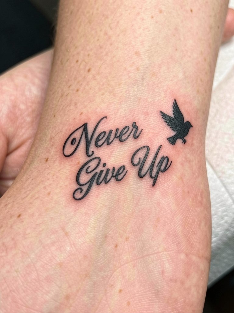
A bird accent suggests uplift and continuity without overwhelming the lettering. The main mistake is over-detailing the bird for the scale, which leads to loss of silhouette over time. Keep the bird a graphic silhouette or light stipple shape and let the script remain the star. Expect a standard forearm session with moderate sensitivity. For wardrobe, an oversized button-down with sleeves pushed up or a cropped knit complements the composition. Consider a cropped knit for casual styling.
20. Horizontal Chest Quote Near the Collarbone
A centered collarbone placement is classic for short lines. Keep length modest because the collarbone surface is narrow. The frequent blunder is stretching the phrase too long which forces tight letter spacing. Expect minimal bleeding risk but a moderate sensitivity during the session. For wardrobe, scoop neck and off-shoulder tops showcase the work. Layering thin necklaces that sit below the text can frame the phrase nicely.
21. Script with Tiny Arrow Accent on the Wrist
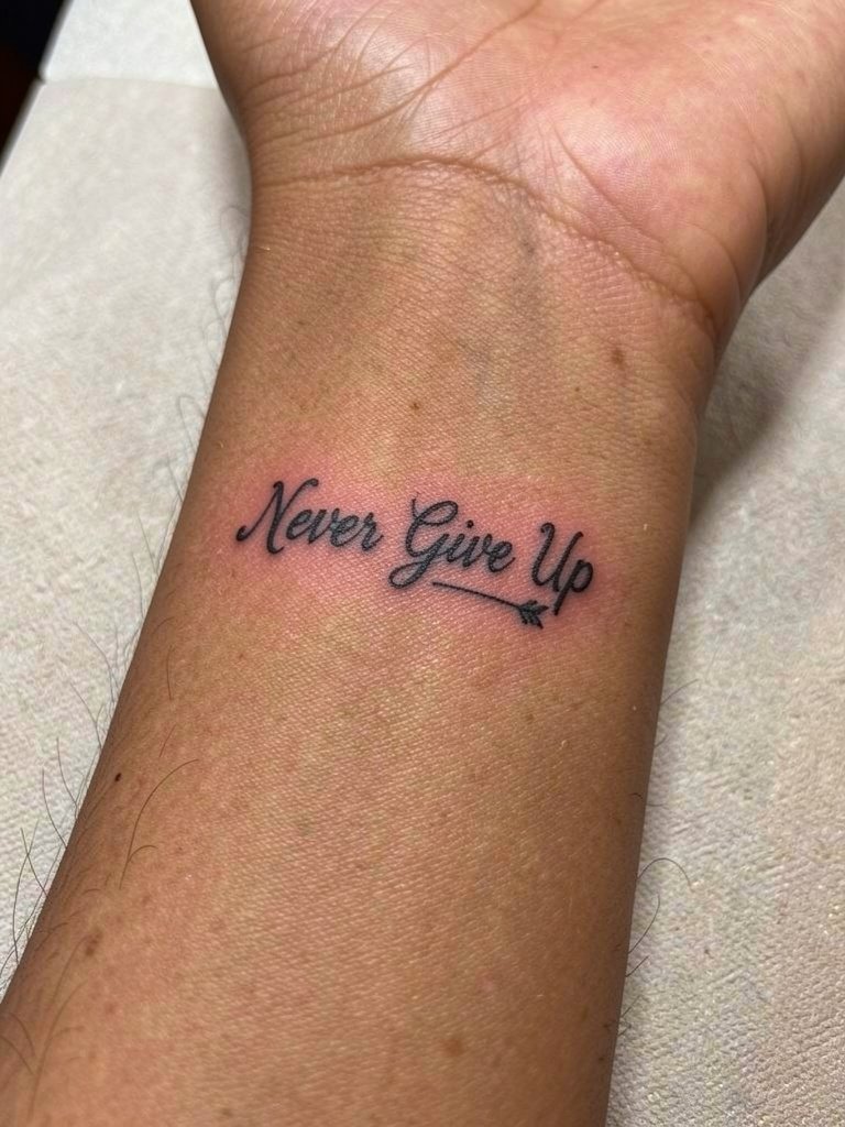
An arrow underline gives subtle direction to the thought and keeps the script compact. The wrist is busy, so avoid overly ornate arrow heads that fight the script. The usual mistake is making the arrow too detailed for the small space. For clarity, keep the arrow silhouette simple and match the line weight to the text. Session is quick and slightly sensitive. Style with a slim watch on the opposite wrist. A minimalist watch helps balance the look.
22. Bold Block Letters Across the Upper Chest
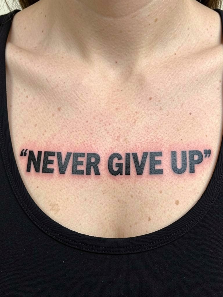
Bold uppercase across the upper chest is a statement with longevity. Block work resists softening because of saturation and simpler linework. The controversy around fine line versus bold surfaces here. One side favors bold letters for durability and readability. The other side prefers fine script for subtlety. Both viewpoints are valid because the piece goal differs by wearer. If you want this approach, expect a longer session for saturation and be ready for a one-year touch-up to keep edges crisp. For show-off outfits, strapless dresses and scoop necks frame the piece well.
23. Micro Script Near the Wrist Bone, Healed Look
A placement right at the wrist bone keeps the phrase visible and private. The wrist bone area is thin and can show blowout if linework is placed too deep. The common error is asking for ultra-fine lettering so small it bleeds after a year. Ask for conservative depth and slightly stronger strokes. The session is short but can sting because of proximity to bone. For styling, a thin bracelet or minimalist watch on the opposite wrist directs focus. Try a thin chain bracelet for subtle balance.
Frequently Asked Questions
Q: How do I pick the right size and placement so "Never Give Up" stays readable after years?
A: Think of letters as living things that need room. Wider letter spacing and modest stroke weight help readable scripts last longer. For longer phrases, favor forearm or upper chest placements where skin moves less. Bring a full-size stencil to your appointment so you can view the exact scale on-site before any ink goes down.
Q: Where can I find artists' healed portfolios and not just fresh photos?
A: Search hashtags like #quotetattoo, #finelinetattoo, and #scripttattoo with your city name on Instagram and TikTok, then filter by location to find nearby portfolios. Prioritize posts that explicitly say "healed" or include a timeframe in the caption. Pinterest is useful for collecting references but look for social posts that show the same piece months or years later.
Q: Do fine-line scripts or bold block letters last better for this phrase?
A: Artists split into two camps on this. One camp says fine-line scripts look modern and subtle. The other camp says bold block letters age more predictably and resist softening. Your best move is to choose the end result you prefer visually, then bias the execution toward slightly thicker strokes or a small touch-up plan so the look you want persists.
Q: Will a small quote on my finger or hand need touch-ups often?
A: Yes, hands and fingers wear out faster because of washing and friction. Expect at least one touch-up within the first year for clarity. Consider a very short word or symbol if you want fewer touch-ups. For live work days, wear your hands bare to the appointment and consider a protective film for the first few days.
Q: What should I wear to a collarbone or chest session?
A: Wear something that gives clear, unobstructed access without needing to be pulled. For collarbone work, a wide V-neck or strapless bra in normal worn position makes the session simple. For rib or sternum work, a sports bra or fitted bandeau is best. For a small forearm piece, a short sleeve or button-down that easily rolls up is ideal. If you want, bring a soft bralette for comfort during chest sessions.
Q: How much should I expect to pay for a small quote tattoo?
A: Prices vary regionally and by studio, and many shops have minimums that apply even for tiny pieces. Expect a sensible floor price rather than assuming a tiny tattoo will cost very little. If budget is a concern, ask for a clean, shorter line or consider a walk-in flash option at a reputable studio that lists clear pricing.
