
The collarbone sits at a crossroads of style and structure, so a small misstep in scale or placement shows fast. Some collarbone pieces look jaw-dropping on day one but soften into blurred ghosts if the lineweight is too thin or the spacing is tight. This list focuses on designs that follow the clavicle, how they age, and simple wardrobe moves that make them read like they belong to your body rather than a sticker on top.
1. Fine-Line Butterfly Nestled on the Clavicle
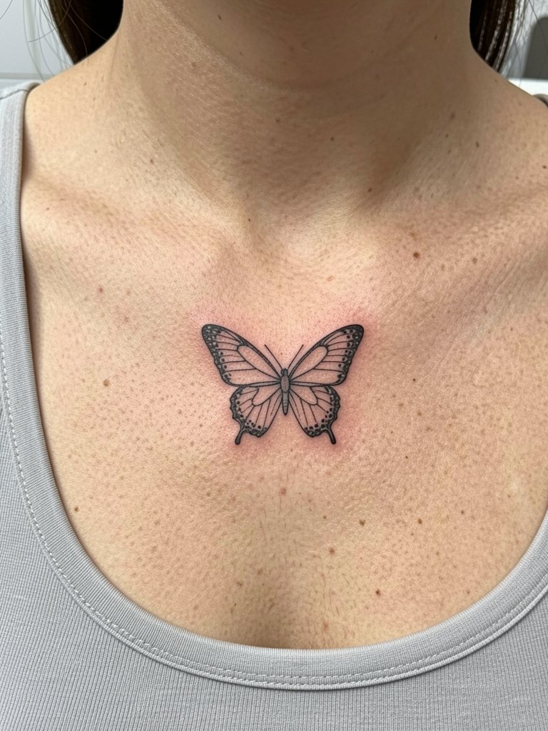
A tiny butterfly reads like movement across the clavicle when the wings follow the bone curve. One camp loves ultra-fine single-needle work for its airy look. Another camp warns that single-needle details can blur on high-movement skin, and recommends a hair heavier lineweight for longevity. Ask for linework that has a slight backbone to it and for the artist to space the dots so they do not pack inside the wing. For showing it off, pair with a scoop-neck tank and a short layered chain so the butterfly sits between the collarbone and the jewelry.
2. Swirl-Line Ornamental Trace That Follows the Bone
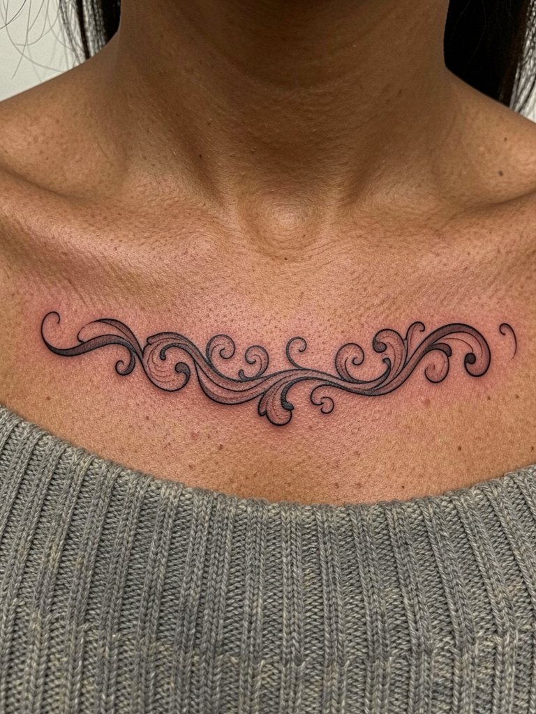
This style wins when it leans into the clavicle curve instead of forcing symmetry. A common mistake is centering a swirl and ignoring the bone tilt, which makes the design look like it is floating. Ask the artist to mock the stencil while you move your shoulder to see the natural slope. Session time is usually short, but plan for precise linework and a possible touch-up in the first year. For outfits, try an off-shoulder top that mirrors the tattoo’s flow.
3. Camellia Bloom Tucked Below the Clavicle
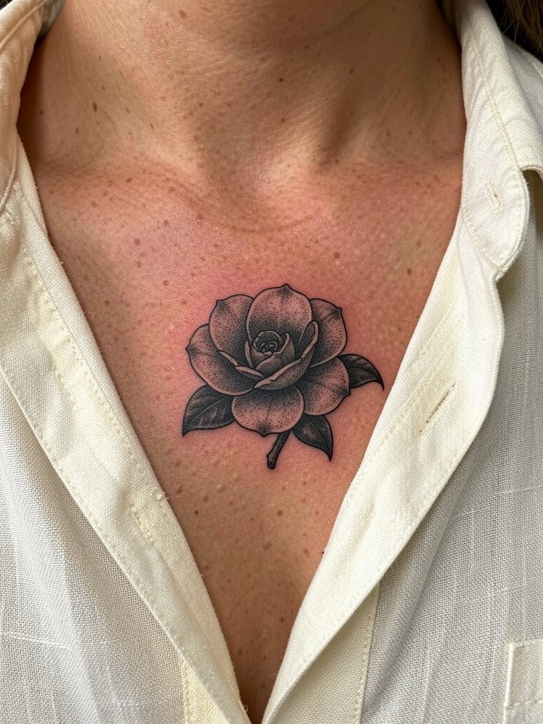
A camellia with soft shading reads like a secret accent on the upper chest, and the single blossom keeps the composition from crowding the bone. The biggest aging risk is tiny petal veins done too faint; they can lose shape within a few years. Specify slightly stronger stipple shading in the midtones and ask for reference photos scaled to the exact width you want. This placement looks elegant under a linen button-down left open for the session and later as a soft framing layer when you wear it unbuttoned.
4. Hydrangea Bud for “Fresh Start” Symbolism
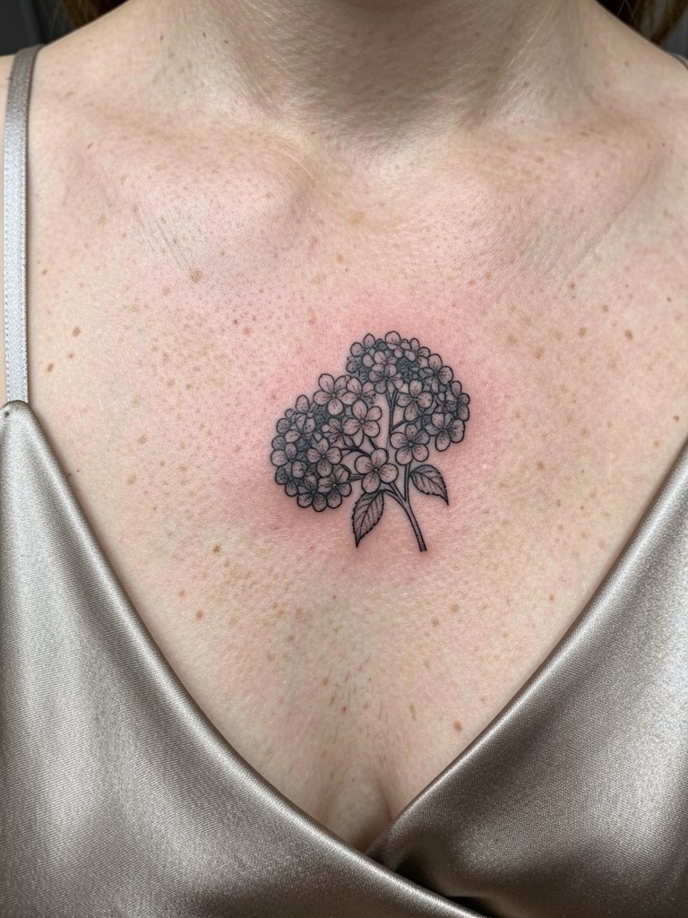
A partial bloom signals growth without committing to a full bouquet. People often ask for a tiny hydrangea and then regret the loss of detail after healing. To avoid that, request slightly larger petal outlines and denser dot work in shaded areas so the petals stay legible at two and five years healed. The session is gentle on pain for this spot but plan for careful placement so the bud sits just below the bone ridge. Show it off with a satin camisole that keeps attention on the upper chest.
5. Plum Blossom With a Sinuous Snake Accent
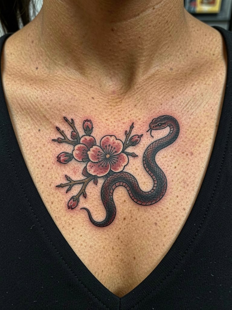
Combine softness and edge by pairing a bloom with a slender snake. Make sure the snake’s scales are rendered with clear spacing so they do not merge into the flower’s shading. Finger-point technique and subtle black-and-gray saturation keep the snake readable over time. For the appointment, wear a wide V-neck shirt so the artist can access the shoulder-to-clavicle area easily without fabric rubbing during healing.
6. Tiny Wave With Starry Accents Along the Bone
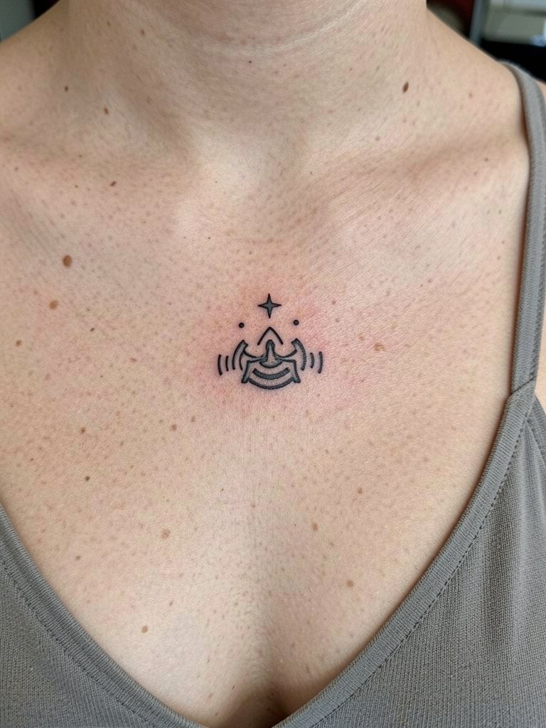
Micro landscapes and tiny celestial details suit the clavicle when kept horizontal and low contrast. A frequent mistake is compressing the stars too close to the wave, which makes the whole motif read like a smudge at six months. Ask for negative space around the accents and for the artist to show you the stencil in motion. For sessions wear a thin-strap camisole so straps do not rub the fresh ink during the first 48 hours.
Session Essentials
The first six ideas lean small and precise, so a few practical items cut down on irritation and speed the early healing window.
- Tattoo numbing cream. Helpful for people sensitive to clavicle work because the skin over bone is thin and the numbing cream applied before the session reduces flinching.
- Medical-grade transparent film roll. Use a small strip after the first few hours when the artist allows it to shield the area from friction with clothing.
- Fragrance-free gentle body wash. Cleans the upper chest without irritating the tattoo during showers in the first week.
- Thin cotton travel pillow cover. Keeps sheets soft if you sleep on your back while the area is healing.
- Unscented healing ointment. A thin application for the first two to three days helps fine line pieces maintain saturation without clogging.
7. Mountain Silhouette That Climbs the Clavicle
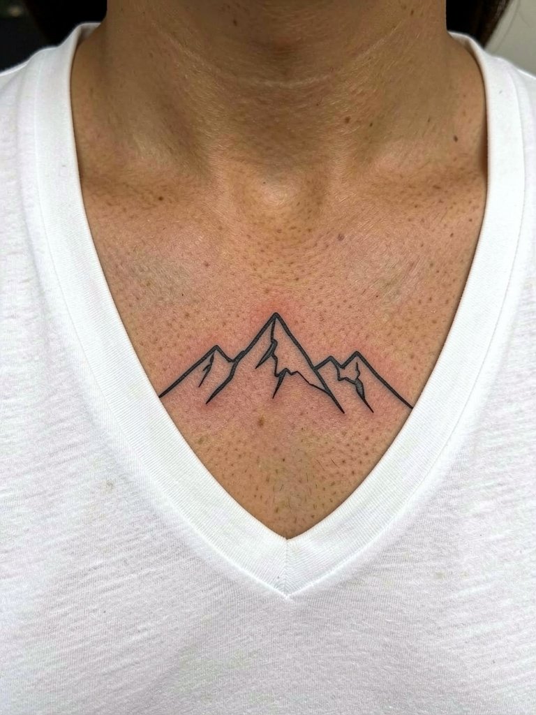
A horizontal mountain line complements the clavicle's rhythm and photographs well when placed just below the bone. The design ages best if the peaks are spaced and not made of hair-thin strokes. A common consultation misstep is requesting a three-inch line that reads fragile in photos. Instead, ask for clear peak separation and midline spacing so the silhouette holds at two and five years. For casual wear, a plain white tee with a relaxed neckline frames the ridge without covering it.
8. Larger Collarbone Composition Extending to the Shoulder
Making the piece larger solves the "floating tattoo" problem, but it raises placement decisions. One camp favors placing elements right on the bone to emphasize the clavicle line. Another camp recommends starting slightly below the bone to avoid awkward curvature and to let the design breathe. If you want an extended composition, bring in photos of how the shoulder and collarbone look when you raise and lower your arm so the artist can map the flow. Wear a one-shoulder top for session access and for revealing the finished wrap.
9. Script That Rides the Clavicle Curve
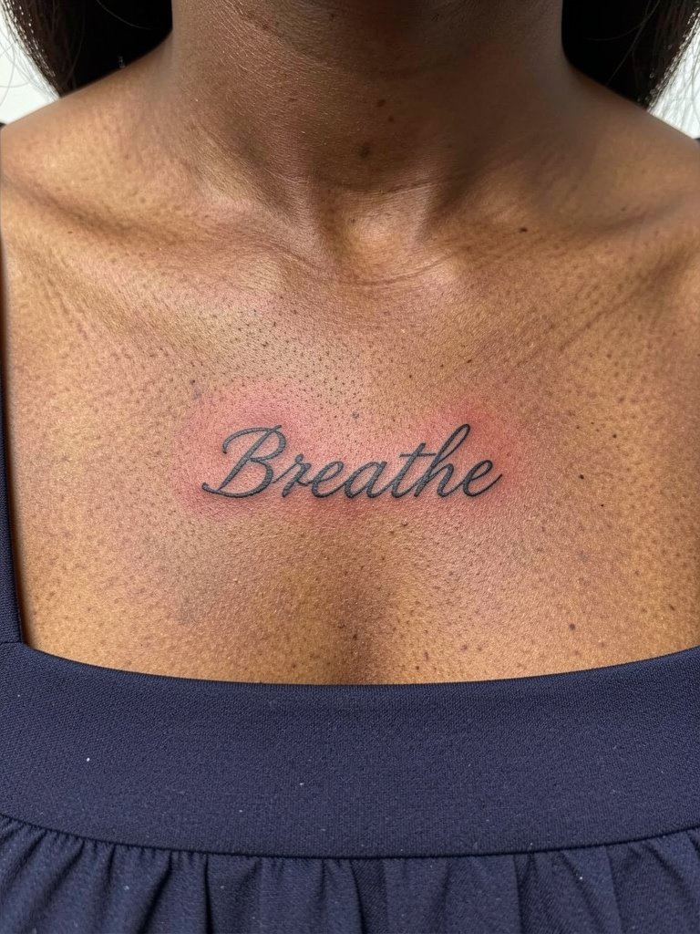
Script works when the lettering follows the clavicle arc and the letters are sized for longevity. The common mistake is choosing a super-thin script from a screenshot without considering how the loops will merge. Bring two reference scales so the artist can show how that same word reads at three inches and at five inches. Plan for linework that is slightly bolder than the on-screen font, and expect a touch-up window after healing if the increments are tiny. For nights out, a square-neck dress frames the script neatly.
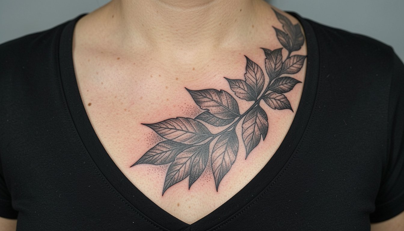
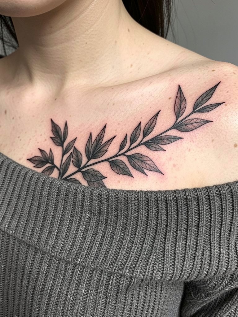
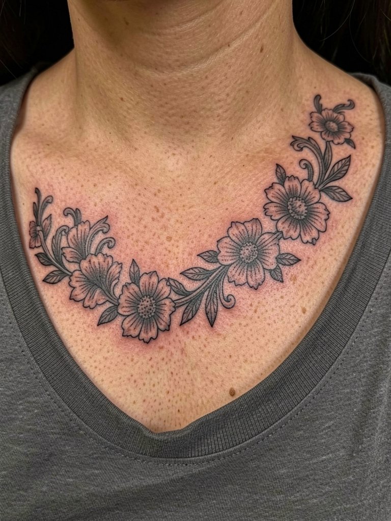
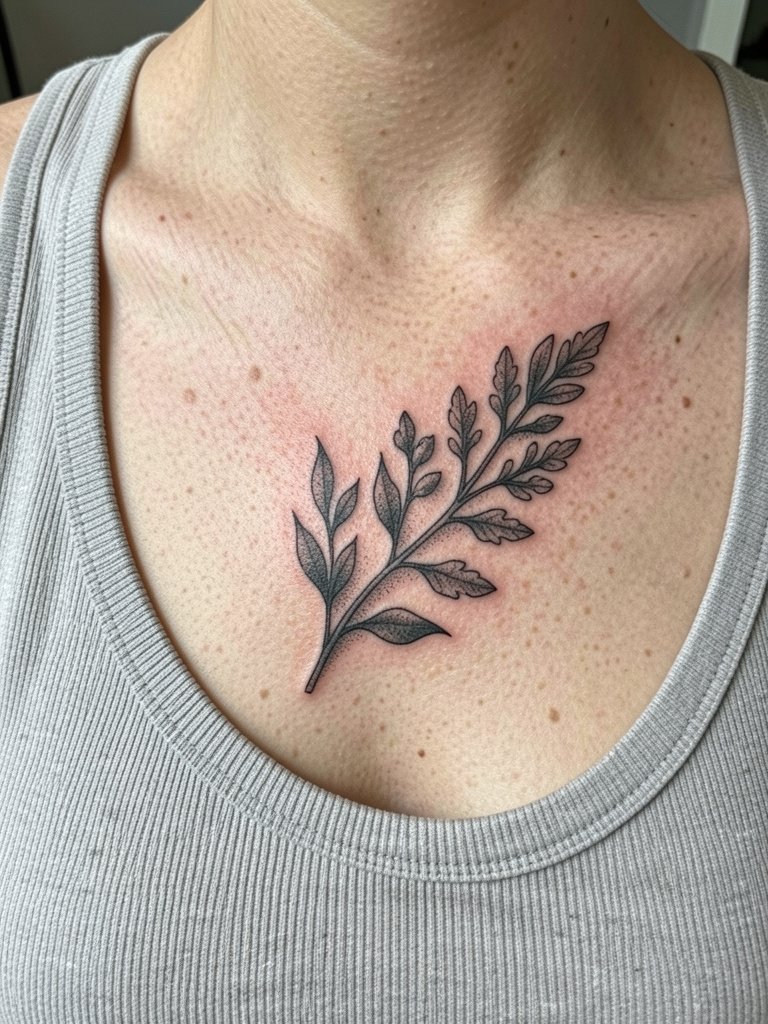
10. Black-and-Gray Floral Sprig Spanning the Clavicle
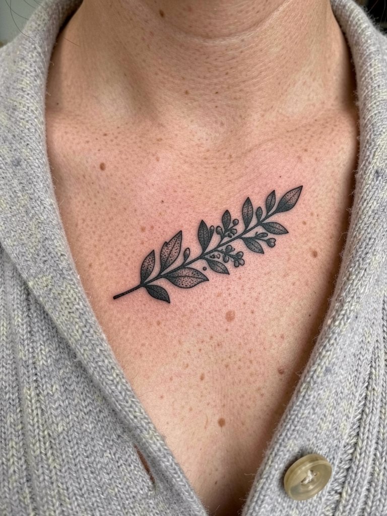
A classic black-and-gray sprig softens the shoulder line and usually ages more predictably than selective color. Artists split on color versus monochrome for collarbone pieces. One group argues color makes florals pop and feel fresher on camera. The other group says black-and-gray sustains contrast longer on sun-exposed upper chest skin. If longevity matters, request saturated midtones and denser stipple so the sprig keeps shape through seasonal sun. Pair it with a cream cardigan that lets the shading read without competing color.
11. Small Flying Motif That Leans Into Motion
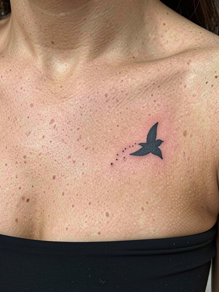
Motion motifs use negative space and slight tilts to make the area feel alive. The common error is placing a flying motif perpendicular to the bone so it fights the body shape. Instead, tilt the bird slightly so the trajectory follows the clavicle. Session time is short but expect detailed dot work around the trail, which can need a tiny touch-up in year one. For showing off the flight, a strapless top leaves the line visible and photographable.
12. Micro-Realism Insect or Miniature Flower
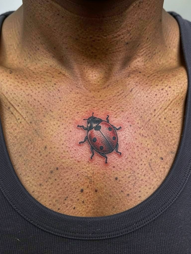
Micro-realism on the clavicle reads refined when you pick subjects with clear high-contrast features. The catch is that tiny shading details can blur, so find an artist with a healed micro-realism portfolio and ask to see how their pieces look at two and three years. Expect a specialist session and slightly longer appointment time than a standard micro piece. For understated looks, keep jewelry minimal and go with a layered chain necklace that frames the tiny subject without covering it.
13. Shoulder-to-Collarbone Wrap That Anchors the Design
A wrap keeps the tattoo from looking isolated. The mistake is choosing a tiny motif and asking it to span a shoulder without scaling detail, which reads sparse. Ask the artist to map the negative space and show how the piece looks in motion when you lift your arm. For session comfort, pick a top like a wide-neck tee that gives shoulder access and can be worn afterward without rubbing the area.
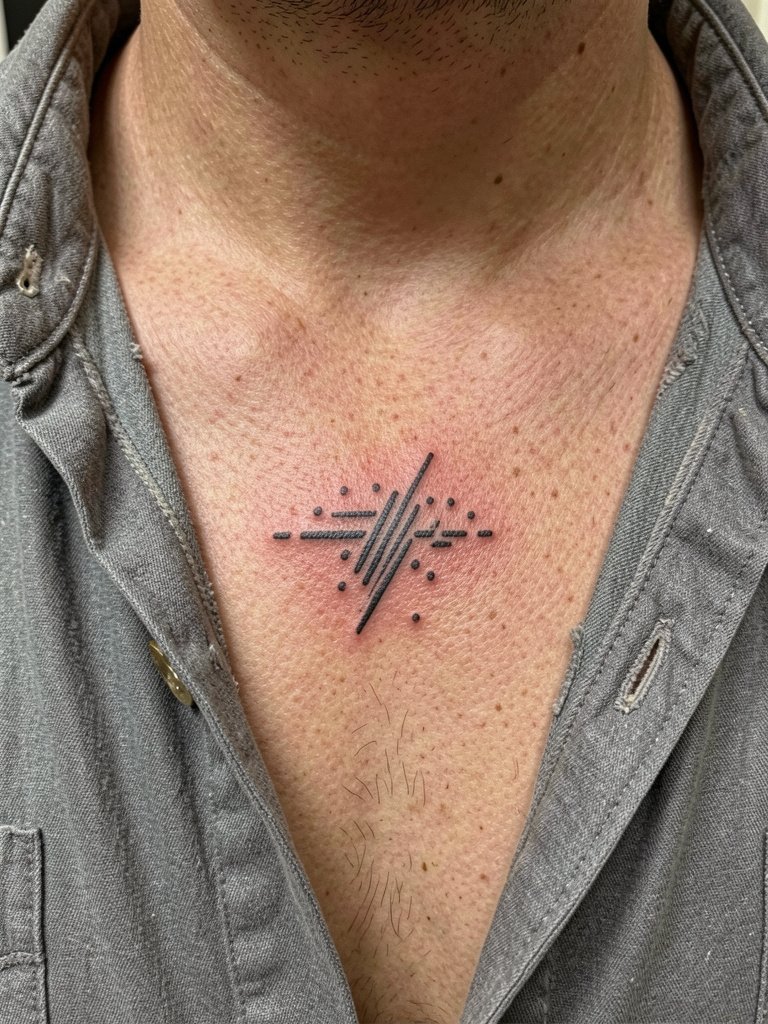
14. Minimal Symbol Line Art Near the Collarbone
Minimal symbols feel modern, but tiny continuous lines need breathing room. A frequent error is asking for a single uninterrupted line that crosses junctions where the skin moves and then expecting eternal crispness. Specify where you want the line to end, and plan for a slightly thicker line at directional turns. For session wear, a thin-strap cami keeps the area accessible and avoids strap pressure.
15. Geometric Accent That Mirrors the Clavicle
Geometric elements read as modern accents when scaled to the bone. The common mistake is squashing multiple thin triangles into one tiny space. Instead, ask for spacing that lets each shape breathe and for the artist to draw the stencil on you sitting and standing. Expect a short session and a possible touch-up for crisp corners. Pair with a plain black tank for a clean, framed look.
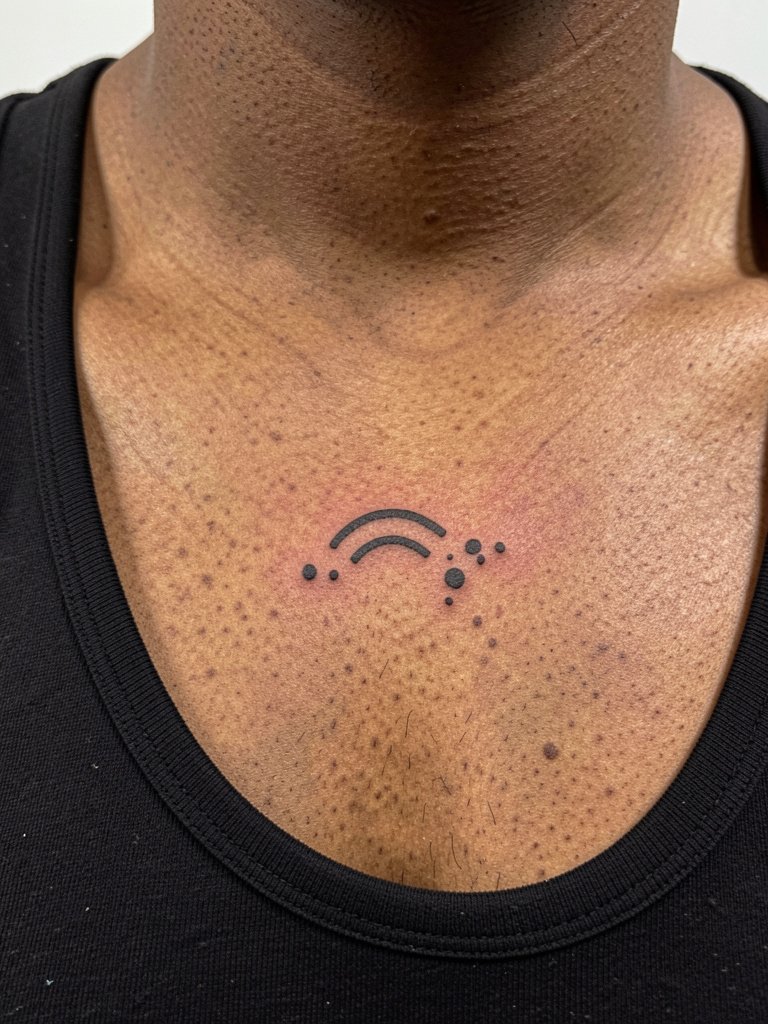
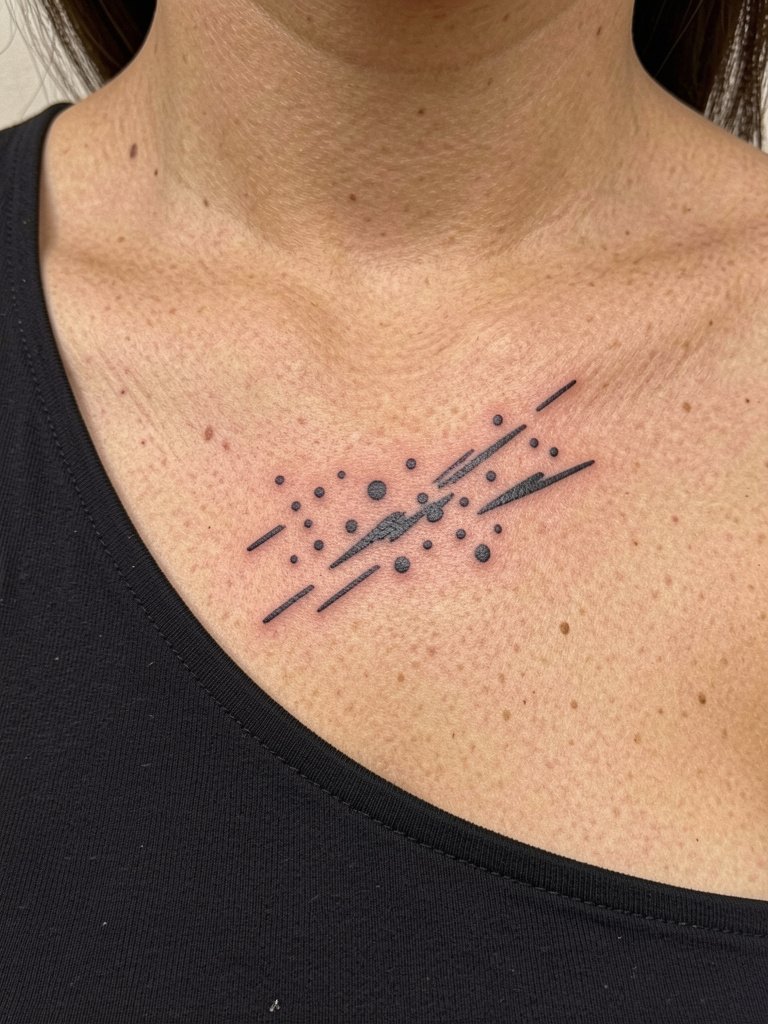
16. Tiny Constellation That Wraps the Collarbone
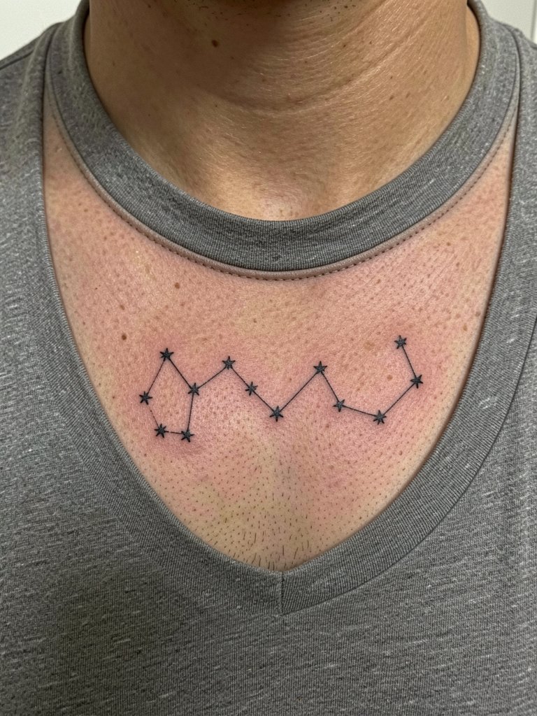
Constellations read elegantly when the stars have spacing that avoids later merging. The session feels quick but require precise placement mapping. If you want a star cluster to sit closer to the bone, ask the artist to preview the stencil while you tilt your head and raise your arms so the design is tested against motion. For casual outfits, a crew-neck tee keeps the cluster visible without exposing the whole chest.
17. Single-Petal Bloom Sitting on the Clavicle
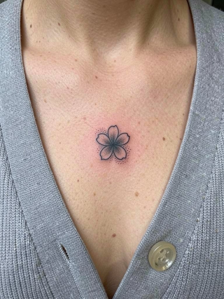
A single petal is a quiet choice that reads well when balanced against jewelry or neckline lines. The typical error is making the petal too tiny and expecting complex texture to survive healing. Instead, ask for clear edge definition and slightly denser stippling along the midtones so the petal keeps shape. The session is short and low pain, and a thin layer of protective dressing overnight minimizes friction. Try a fitted cardigan unbuttoned for a soft reveal.
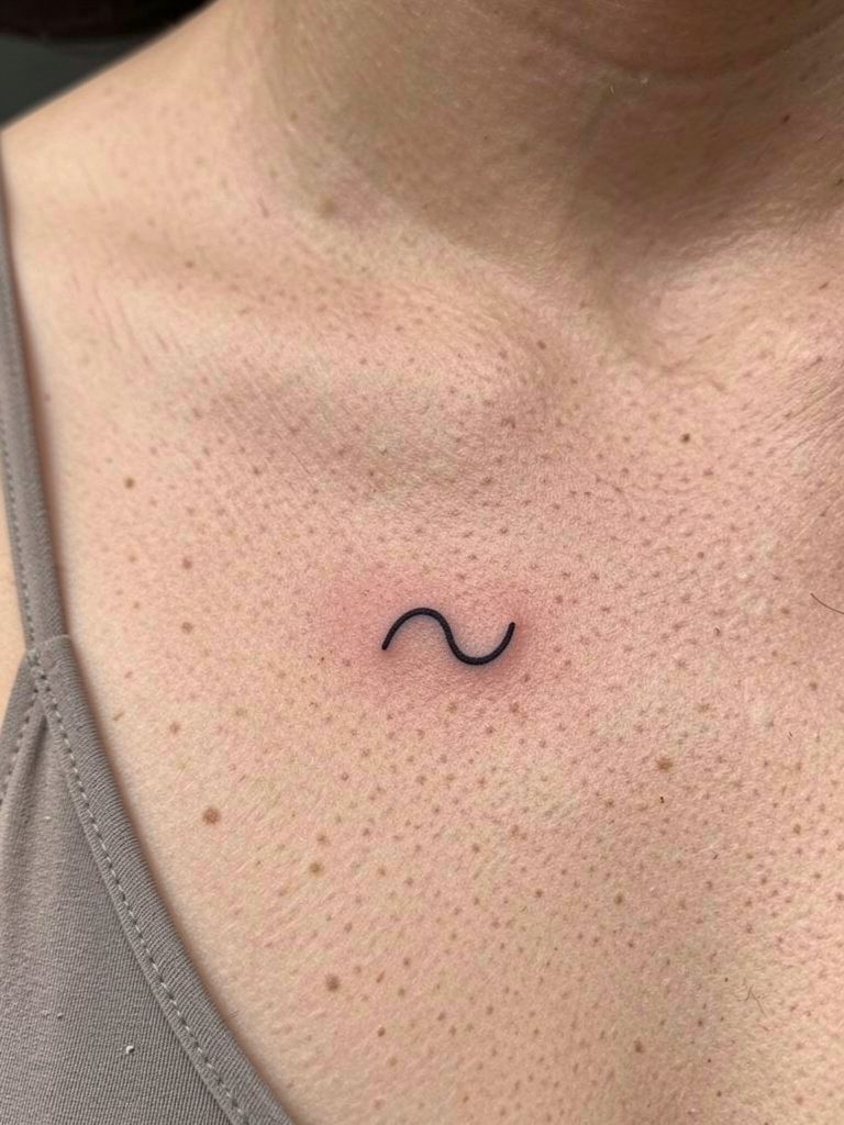
18. Abstract Line Cluster That Skims the Bone
Abstract clusters let you experiment with rhythm and negative space. Avoid packing too many tiny parallel lines in a small area, since the skin can blur them into a gray block. Request mockups at different scales and ask the artist which scale will hold best for the clavicle. For appointment comfort wear an open-collar shirt so you can keep it on without stretching the area.
19. Crescent Moon Accent Paired With Tiny Stars
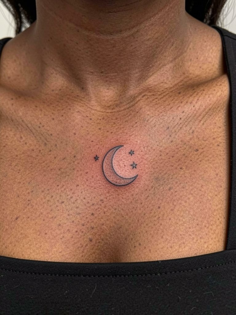
A small lunar motif reads as a delicate marker when left with clear negative space. The mistake is choosing a crescent with interior shading that sits too close to the bone, inviting blur. Ask for a clean outer contour and for the stars to have breathing room. The session is short and ideal for a mid-day appointment. For evenings out wear a square-neck top that showcases the moon.
20. Stipple-Shaded Botanical Sprig With Whip Shading
Stipple and whip shading give botanicals texture that ages softly. Ask the artist about the dot density and how that will read in photos over time. Too sparse, and the shading can disappear; too dense, and the piece looks heavy. Expect a slightly longer session for the stipple work and a possible minor touch-up after the initial healing if a few dots fade. A ribbed tank is a simple way to frame the sprig without distraction.
21. Asymmetrical Compositions That Lean With the Bone
Asymmetry can feel more intentional than centering everything above the bone. Mistakes happen when the design ignores the clavicle’s tilt and the asymmetry looks like accidental off-centering. Ask the artist to mark the highest and lowest visual points while you sit and stand so the composition reads balanced. For a night look, a one-shoulder top lets the asymmetry sing.
22. Tiny Anchor or Nautical Motif on the Clavicle
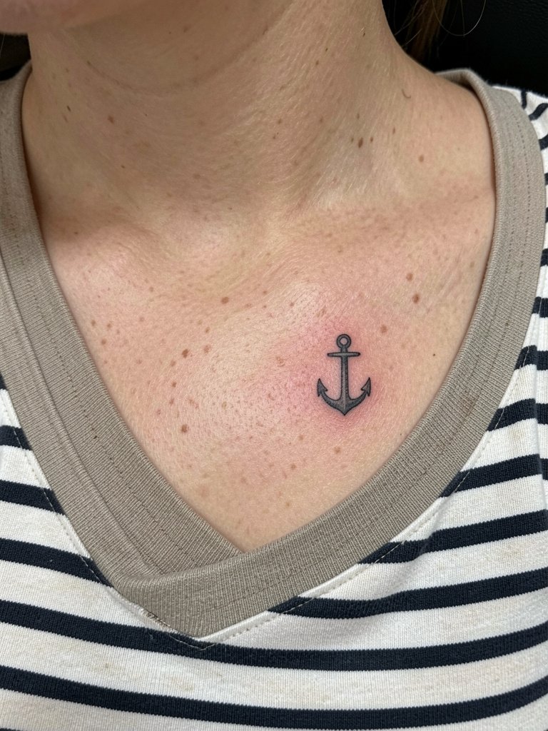
Anchors are compact and readable if the shank and crossbar are given width. Tiny anchors with super-thin bars risk blending. Ask for slightly squared edges and check the stencil at natural sitting angles to make sure the shank does not align with a severe skin fold. The session is quick and low pain. A striped tee channels the nautical vibe without covering the clavicle.
23. Micro Script Paired With a Mini Motif
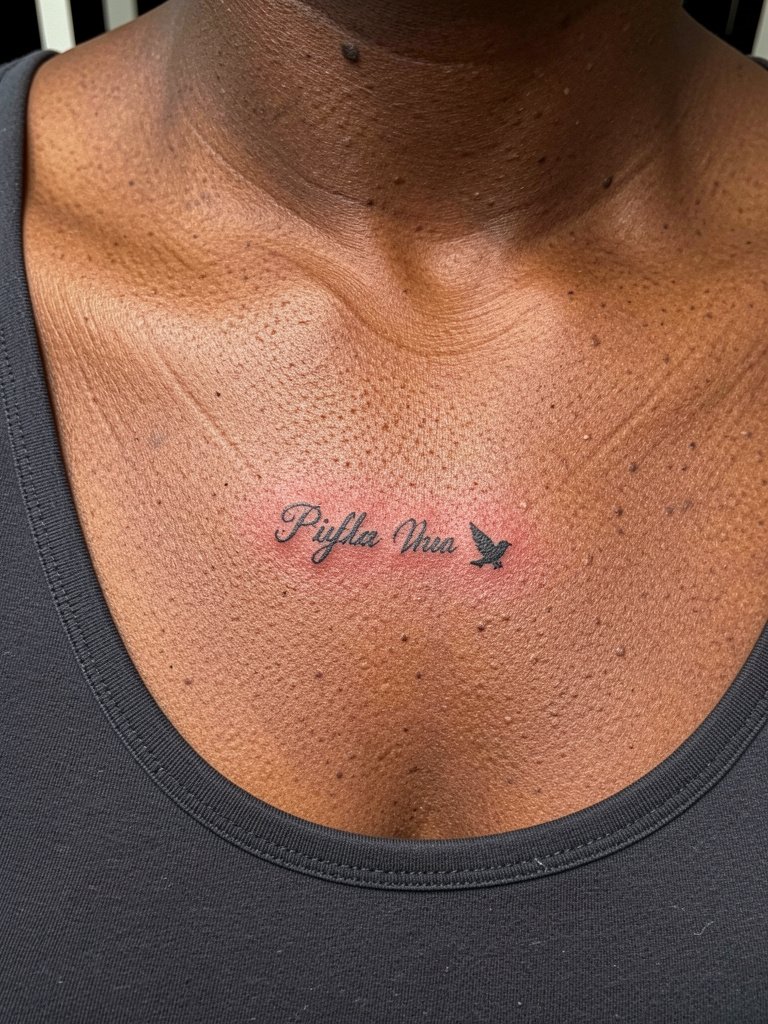
Combining a micro word with a tiny motif requires planning around legibility. The usual slip-up is matching a decorative script to a tiny motif without considering spacing. Bring both references and ask the artist to scale the script so counters and joins do not fill in. Expect a short session and book about 30 extra minutes for stencil tweaks. For simple styling pair with a scoop-neck top.
24. Ornamental Chain or Beaded Line Along the Bone
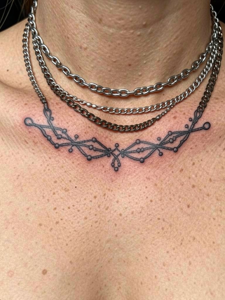
A beaded chain design is jewelry for the skin, so spacing and bead size are crucial. The risk is choosing beads too small, which will blur into a thin bar. Ask the artist to draft the bead spacing on you and to show the scale against your actual necklace choices. Session time is moderate because of repeated precise dots. For photos, layer a real beaded chain necklace above the piece to create a three-dimensional jewelry effect.
25. Small Key or Lock Motif Near the Clavicle
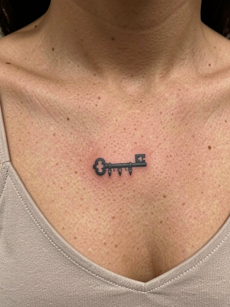
Keys read as sentimental charms in small sizes but need clear negative space between the shaft and teeth to avoid filling. A typical mistake is trying to miniaturize an ornate key design from a larger reference. Ask the artist to simplify the teeth and test the stencil at the scale you want. The session is compact and low pain. A soft camisole keeps the area clean and easy to access.
26. Tiny Compass Pointing Along the Collarbone
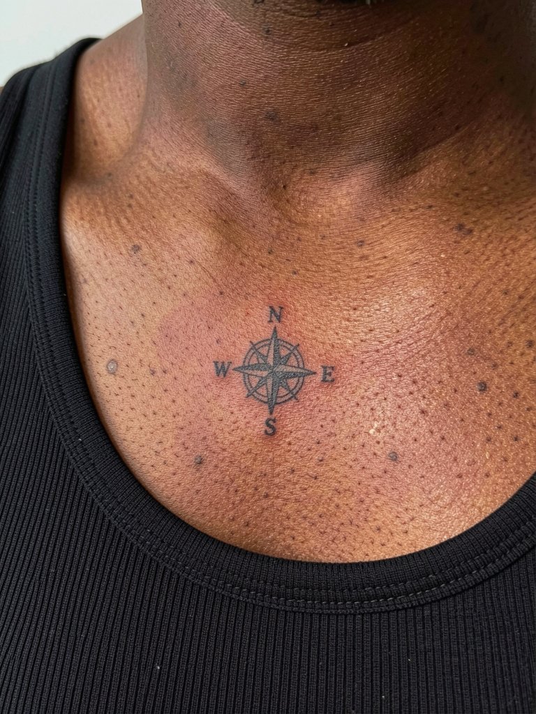
Compass motifs are tiny directional anchors, so keep the needle simple rather than ornate. People often pick a decorative compass that requires tiny detail that will soften. Instead, ask for a minimalist pointer with a single north marker and clear contrast. Sessions are quick, and this spot is easier on pain than ribs. For lifestyle photos a fitted ribbed tank showcases the compass without distraction.
27. Miniature Portrait Silhouette Tilted With the Bone
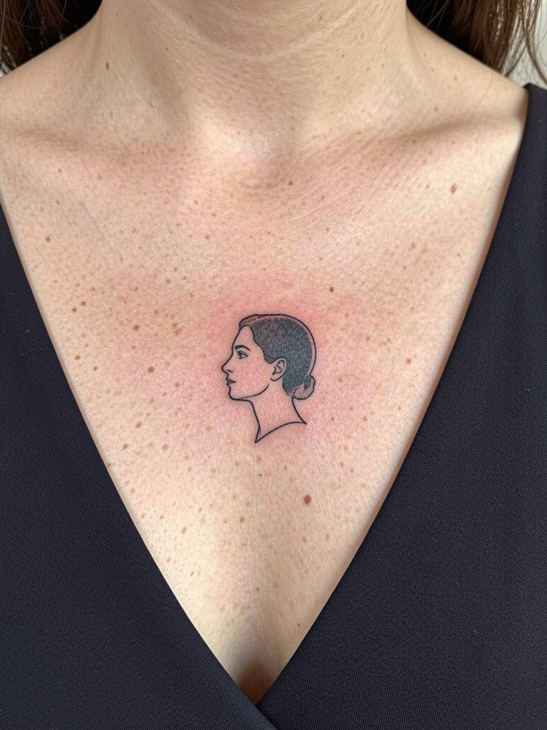
Mini portrait silhouettes can be striking when simplified to clean contours and negative space. The usual pitfall is asking for facial detail that the area cannot hold at a micro scale. Ask the artist to reduce the portrait to its strongest edge lines and test the silhouette at the size you want. Sessions need a steady hand and precise stencil placement. For reveal, a wide V-neck dress frames that profile naturally.
Frequently Asked Questions
Q: How painful is a collarbone tattoo compared with other placements?
A: The clavicle is thin-skinned over bone so pain is often rated higher than soft-tissue spots. Most people report a sharp, localized sensation when the needle crosses the bone ridge, and a duller vibration for surrounding shading. Numbing cream applied before the session and short breaks help, and plan for a 45- to 90-minute appointment for small pieces.
Q: Will fine-line collarbone tattoos blur faster than bolder linework?
A: Artists are split on this. One camp argues single-needle fine lines look elegant but often lose crispness within a few years on high-movement, high-sun areas. The other camp shows healed examples where slightly heavier fine lines and strategic spacing kept the design legible. If longevity matters, ask for a modest increase in line weight and for the artist to space adjacent strokes a little wider.
Q: What should I wear to a collarbone tattoo appointment?
A: Choose a top that gives clear access without the artist needing to tug fabric. Good choices are loose button-front shirts, scoop-neck tanks, or off-shoulder tops worn in their normal position. For the first week of healing, lightweight tops and open collars reduce rubbing. A scoop-neck tank is a practical pick that works for most designs.
Q: How do I find artists and healed examples for collarbone work?
A: Search social platforms using specific tags like #collarbonetattoo and #healedcollarbonetattoo, and filter by location to find portfolios near you. Reddit threads in tattoo communities help with real client experiences. For vetting, prioritize artists who post healed photos on the upper chest skin just below the clavicle rather than only fresh, red shots.
Q: How should I plan for touch-ups on collarbone tattoos?
A: Expect a possible light touch-up within the first 6 to 18 months for fine-line work, especially if the piece sits very close to the bone or receives a lot of sun. Keep sun exposure low and follow the shop’s recommended healing protocol to reduce the need for early touch-ups.
Q: Are there anything cultural or professional considerations I should think about before getting a collarbone tattoo?
A: Collarbone tattoos are visible with many professional dress codes, so consider your workplace norms. For culturally derived motifs check origin and meaning and use respectful adaptation rather than direct appropriation. If the design has specific cultural significance, mention that during consultation and ask the artist how they approach respectful rendering.
