
Someone I know spent six months bookmarking arrow tattoos, then realized the real problem was knowing which style would actually hold up on their skin. I have spent weekends in five shops across Brooklyn comparing healed pieces, and an artist at a Brooklyn shop who specializes in fine line told me what usually needs touch-ups. Below are 20 arrow designs that work for different bodies, placements, and long-term wear, with what to ask your artist so the ink still looks deliberate after a few years.
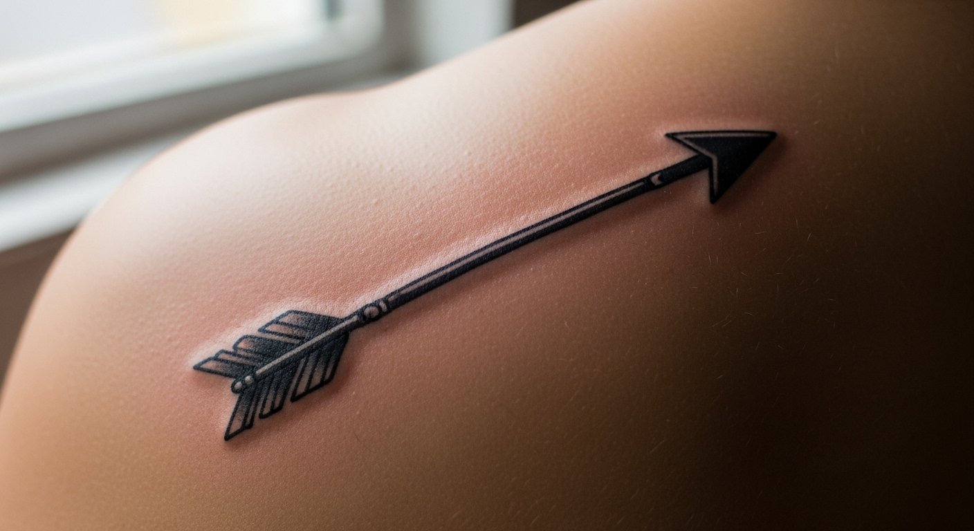
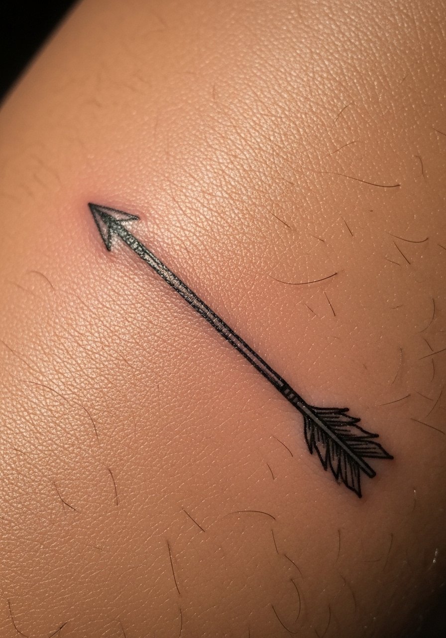
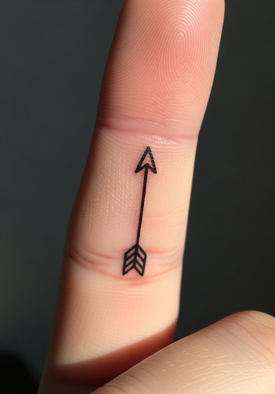
1. Fine Line Arrow on Inner Forearm
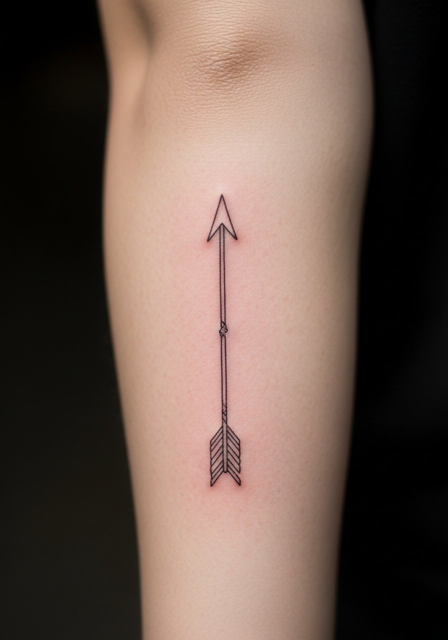
Someone I know first saw this style on a friend's forearm and booked it because the linework read like handwriting. It is a low pain placement and usually fits in a single short session. Tell your artist you want single-needle finesse with modest spacing between the shaft and fletching so the lines do not merge as it heals. A common mistake is asking for lines too thin in a cramped design, which leads to early blur. At six months the lines usually soften a little. Expect a touch-up around year two to preserve crispness, and watch for blowout if the artist goes too deep.
2. Tiny Arrow Behind the Ear
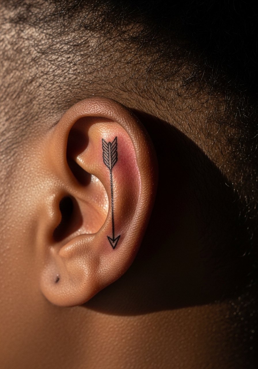
Fair warning: behind the ear is a bony, sensitive spot that stings more than the forearm. This micro placement is ideal for anyone who wants something discreet that peeks out with their hair up. Ask for a simple flash-sized arrow with a tiny head and a short shaft, and mention you want conservative needle depth to avoid blowout. The risk here is migrating ink in the delicate subdermal tissue, so smaller is safer. Session time is usually under 30 minutes. Expect subtle fading by year two and a small touch-up sooner if you sleep on that side often.
3. Minimal Geometric Arrow on Collarbone
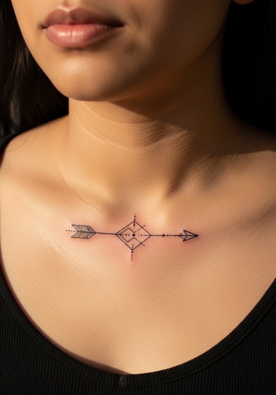
Most collarbone pieces need to balance the curve of the bone, or the arrow will look off-kilter as you move. I tell people to bring photos showing the exact collarbone line they want the design to follow. The collarbone is a medium pain zone, and stipple shading near the shaft stabilizes the visual weight. The mistake I see is forcing a long, skinny arrow into a narrow collar area. At two years the linework may fade unevenly where the skin moves, so plan a touch-up at year three if you want preserved contrast.
4. Watercolor Arrow Wrapped Around Wrist
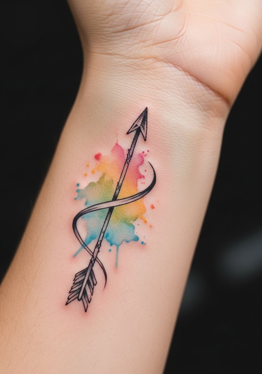
There is visual impact in pairing a crisp black arrow with soft watercolor washes because the black anchors the color. When you consult, show examples where the black line is dominant so the artist keeps saturation high in the shaft. Watercolor fades differently than solid black, so anticipate more frequent color refreshes. The wrist sees a lot of sun and friction, so use long-term sunscreen and expect a touch-up at year two for the color. The common mistake is too much color saturation without a strong outline, which makes the wash blur into a bruise-like haze.
5. Tiny Cluster of Arrows on Ankle
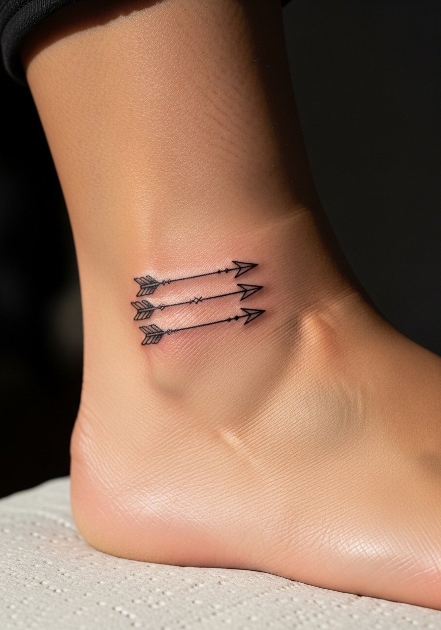
The biggest mistake with clustered designs is cramming arrowheads too close together. The ankle has thin skin and moves a lot with footwear. I recommend spacing each arrow so the tails breathe, and asking the artist for slightly thicker linework than you think you need to allow for future softening. Session time may be split if you want different directions. Pain is moderate because of bone proximity. At six months the cluster looks cohesive; by year three the smallest lines may need a touch-up to restore definition.
6. Traditional Black Arrow on Outer Thigh
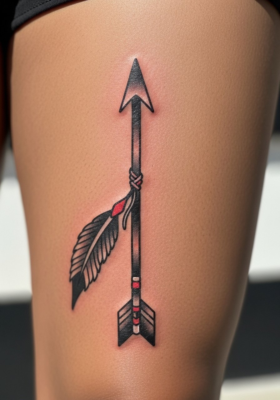
When you sit down with your artist for this one, bring reference photos that show the exact line weight and head style you prefer because traditional work relies on saturated blacks and clean outlines. The outer thigh tolerates larger, bolder pieces and is a lower pain area than ribs. This style ages well because saturation resists fading, and solid black requires fewer touch-ups than thin work. A real mistake is trying to miniaturize a traditional arrow. Make it big enough to carry the weight and the thigh will keep it looking bold for years.
7. Stipple-Shaded Arrow Across the Ribcage
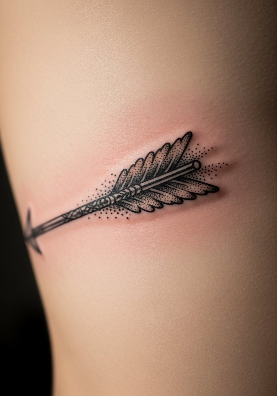
Artists split on whether fine line on ribs holds up. One camp says the skin stretch and breathing motion blur delicate lines within a couple of years. The other camp argues that with proper needle depth and spacing, fine detail settles fine on ribs. If you pick ribs, name the debate when you book and ask how the artist manages depth. Expect higher pain. Stipple shading here helps the piece feel textured and hides small shifts. Plan for possible touch-up timelines around year two to three, and know that compression from clothing can affect early healing.
8. Arrow and Botanical Combo on Upper Arm
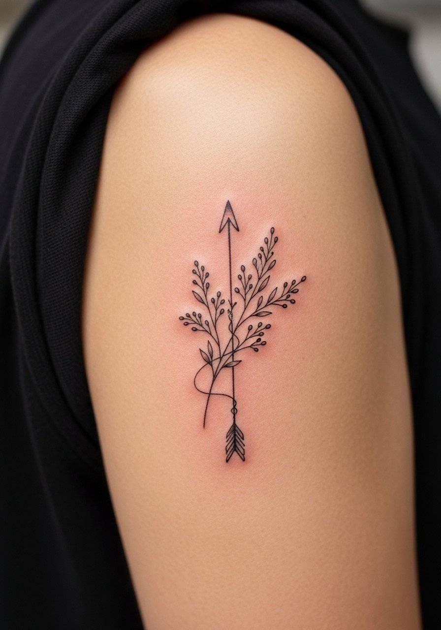
I spotted this pairing at a convention and it reads as intentional rather than decorative when the leaves are scaled to the arrow. The upper arm is forgiving for size experiments and the piece is good for someone who wants a readable design at arm's length. Tell your artist you want the arrow to remain the focal point by keeping the botanical elements lighter in saturation. A common mistake is equal saturation across both elements, which makes the arrow disappear. Expect a one to two hour session depending on detail, and a touch-up around year three if the leaf shading softens.
9. Broken Arrow Motif on Sternum
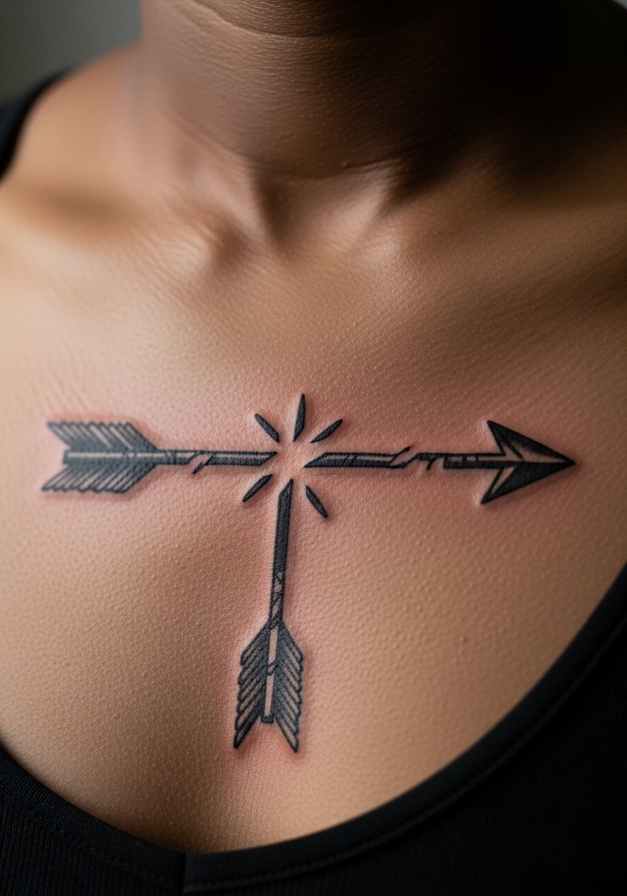
Aging and healing matter a lot here because sternum skin moves with breath. Most watercolor and ultra-fine line work on sternum can blur faster than solid black. If you want a broken arrow, ask for slightly increased line weight and modest negative space at the break so the design reads as intentional over time. Pain is higher at the sternum. The bad choice is going ultra-small; the sternum benefits from deliberate scale. Plan a touch-up after the first year to correct any softening along the break.
10. North Star Arrow on Back of Neck
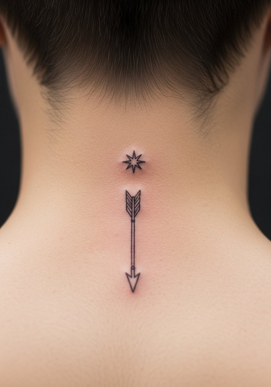
Most watercolor-style tattoos from five years ago look like faded bruises now when placed on the neck. This version holds up because the black arrow is the anchor and the star is minimal. The neck can be sensitive and visible, so mention career considerations during consultation. Ask for a short shaft to avoid the design creeping into hairline changes. Expect a quick session and a touch-up at year two if you notice fading from sun exposure. The common mistake is choosing too much color here without a strong black anchor.
11. Geometric Arrow Sleeve Accent
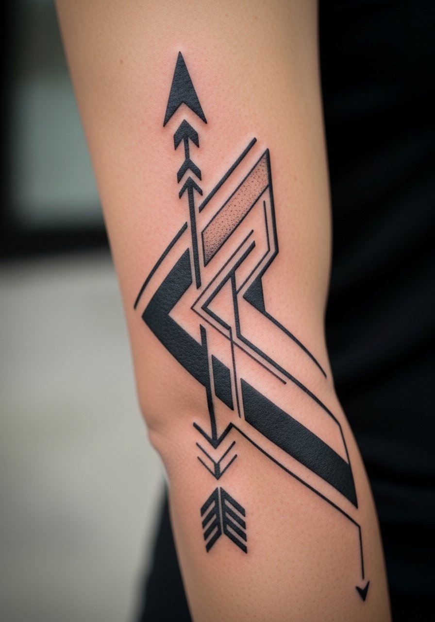
There is something about bold geometric outlines that holds up across a sleeve because the shapes give the artist space to manage spacing and saturation. If integrating into a sleeve, show the full sleeve plan and ask how the arrow will read when your arm stands at rest. Pain varies by zone. Avoid asking for lines that are too close to existing flash, or the piece will look cluttered. At two years, small geometric lines may soften but the shapes usually remain readable. Expect sessions across more than one appointment depending on the sleeve complexity.
12. Micro-Realism Arrow with Tiny Feather
The biggest mistake with micro-realism is squeezing too much detail into a tiny space because the skin cannot hold extreme micro detail forever. For a feathered arrow, ask the artist to favor implied detail over tiny strokes, and mention you want the feather to read at arm's length. Session time is short but precise. This style tends to need a touch-up sooner than larger pieces, often around year two, because micro strokes soften. Discuss where the feather will sit relative to motion zones, as friction speeds fading.
13. Arrow with Roman Numeral Tail on Rib
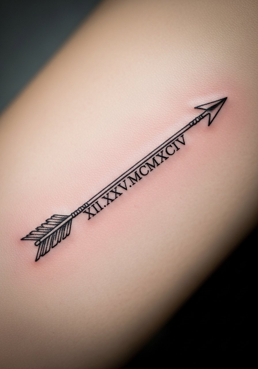
When a design has visible text choose exact characters and placement before booking. For a rib arrow with Roman numerals, tell the artist the exact numerals you want and how bold you want them. The ribs are high pain and the skin stretches, so expect the numerals to soften more than on the forearm. A common mistake is not proofing the spacing of numerals along a curved line. Plan for a touch-up by year two or three and ask the artist how they place lettering so the numbers remain legible as the skin changes.
14. Blackwork Broad Arrow Across Chest
There is controversy about saturation and scabbing on highly filled areas. One camp says dense blackwork scars more during healing and can trap scabs, which alters saturation. The other camp points out that a skilled artist can pack black without aggressive trauma so the piece heals clean. If you want dense black, ask how the artist manages sessions to reduce scabbing. The chest allows for bold scale and ages predictably if saturation is consistent. Expect a multi-hour session and a possible touch-up at year two to even saturation.
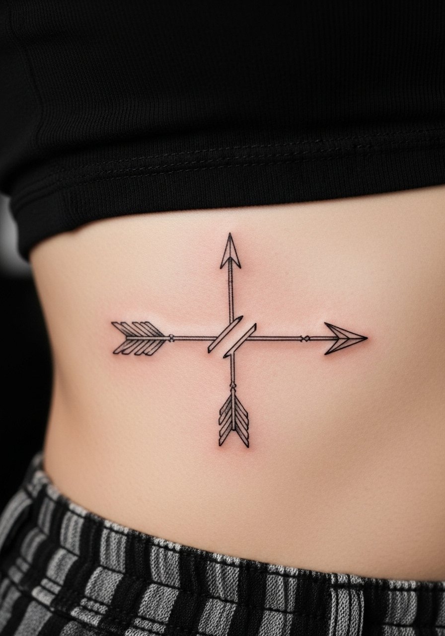
15. Arrow and Compass on Upper Back
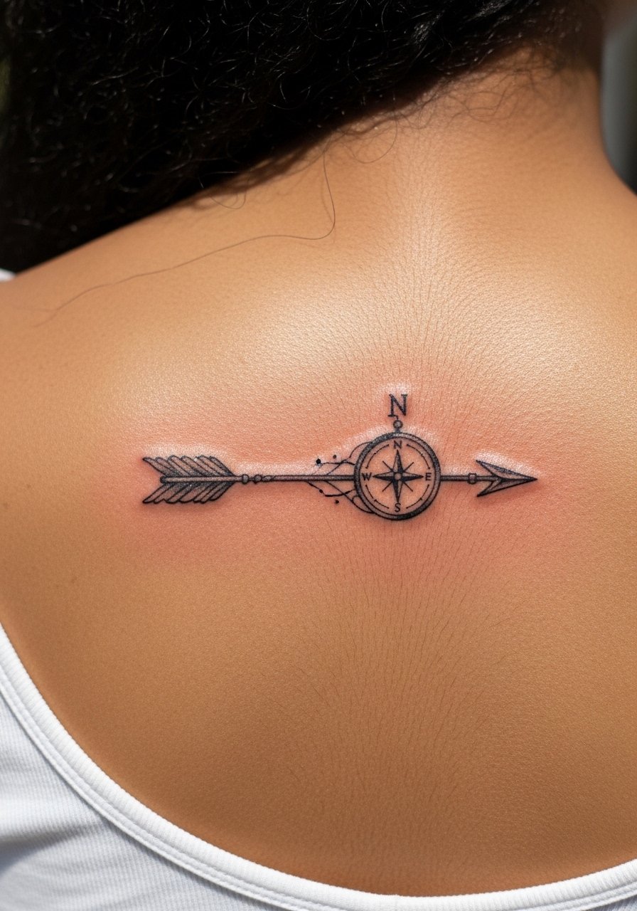
Someone I know chose this for a travel-themed sleeve and found the upper back gave the piece room to breathe. The upper back is a forgiving placement for medium-scale designs and is lower on the pain scale. Tell your artist you want the compass to remain secondary, with the arrow cutting through as the focal. A common mistake is over-detailing the compass, which competes with the arrow visually. At two years the piece should stay consistent, but expect a touch-up at year three if you want crisp compass points.
16. Small Arrow on Side of Finger
Fair warning: finger tattoos are notorious for faster fading because of constant hand use and washing. If you want a finger arrow, ask for slightly bolder linework and realistic expectations about touch-ups. Sessions are brief but the lifetime of the piece may include annual top-ups. Avoid placing it on the pad where rubbing is constant. The mistake I see is treating fingers like forearms. They need thicker lines to last, and you may need touch-ups as often as every year.
17. Split Arrow for Relationship Ink on Rib Side
Most people pick this as a paired piece because ribs let each half read independently. Aging is a concern for symmetrical designs across moving flesh. I advise clients to agree on scale exactly because one side settling faster can look uneven. The ribs hurt, and the session may be split. Expect a touch-up around year two for symmetry corrections. A typical mistake is mismatched spacing when photographed, so have a friend check placement with you in the chair.
18. Arrow in Negative Space on Thigh
There is visual impact when an arrow is defined by the surrounding ink instead of internal linework. Thigh skin tolerates bold fills and negative space stands out well here. Tell the artist you want crisp edges around the negative shape since any feathering of the black will reduce contrast. Sessions can be longer if a large fill is involved. Expect excellent longevity for this approach because the negative space is less prone to blur than ultra-fine internal lines.
19. Arrow and Crescent Moon on Wrist Inner Side
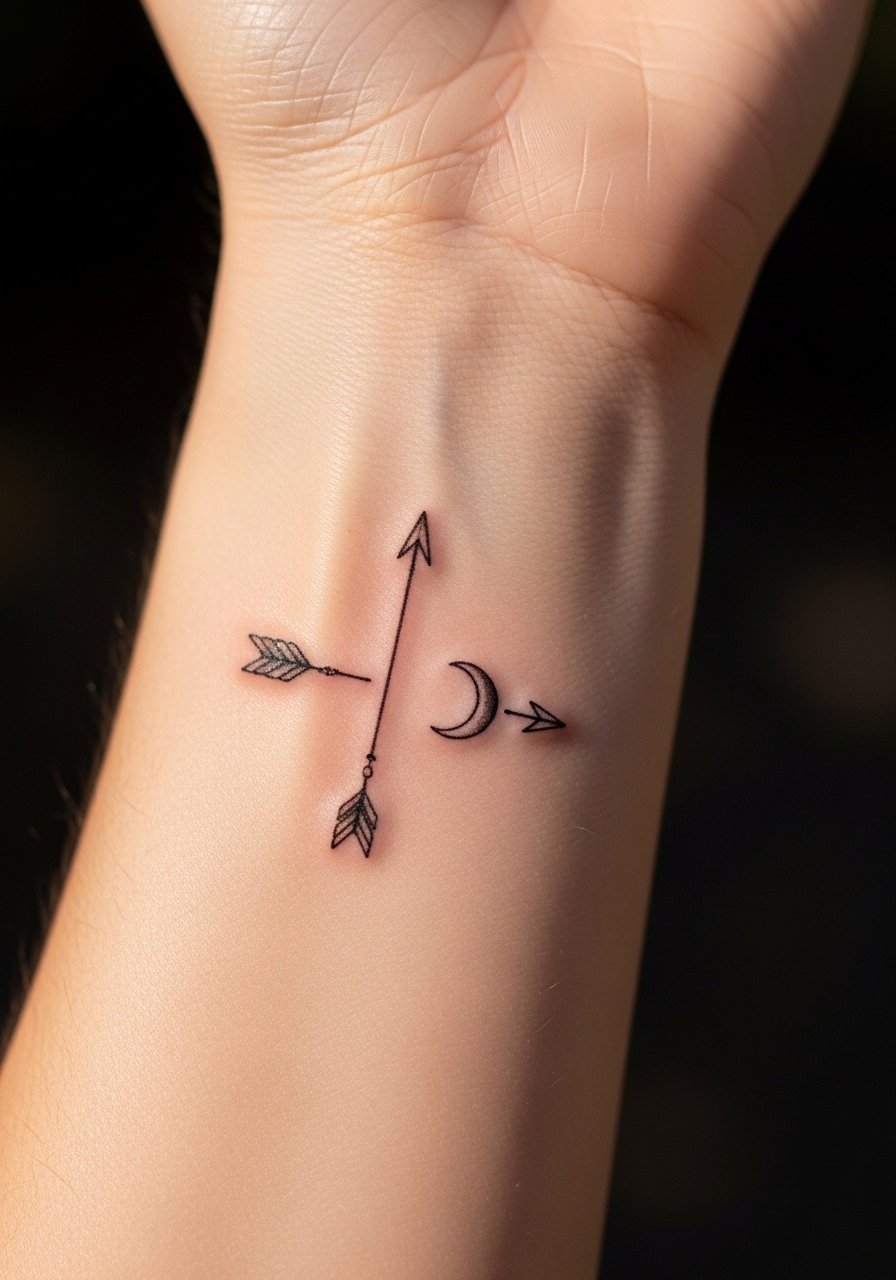
There is a quiet visual balance when a small arrow meets a crescent because the moon curves soften the linear arrow. The inner wrist is a moderate pain site and sees sun exposure. Ask for slightly bolder outlines than you think you need to account for future sun fading. A frequent mistake is asking for too much shading in the moon, which can look muddy as it fades. Touch-ups at year two are common for wrist pieces that get daily sun.
20. Arrow Wrapped with Script "Breathe" on Forearm
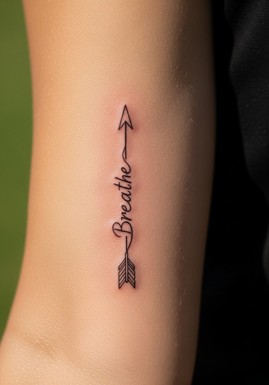
When text appears in a tattoo always specify the exact wording and style. The word 'Breathe' in lowercase cursive pairs well with an arrow because the script follows the shaft. The forearm is lower pain and shows designs clearly. Tell your artist the exact placement of the word relative to the arrow and how large each letter should be. A common mistake is making the script too small, which causes legibility issues over time. Expect a touch-up at year two if the script softens.
Tattoo Prep and Aftercare Essentials
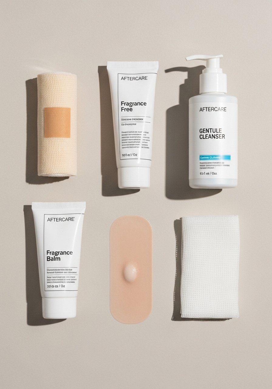
Fragrance-free healing balm, lightweight texture for fresh ink. Use sparingly after the first scab stage to keep the skin hydrated without clogging pores. Good for short-term barrier maintenance during the first two weeks.
Medical-grade second skin bandages, small rectangular sheets for new tattoos. Useful for high-friction placements like wrists and ankles during the first 48 hours to protect from rubbing.
Gentle pH-balanced foaming cleanser, fragrance-free. Use to clean the area twice daily while avoiding scrubbing, especially in textured placements.
Lightweight fragrance-free moisturizing lotion for long-term care. Helps maintain saturation as the years pass. Apply once the tattoo is fully healed.
Silicone-based scar management sheets, small size for targeted use. Good for pieces that show raised scarring after healing and for smoothing texture prior to touch-ups.
Breathable gauze pads for initial coverage and blotting. Handy to manage early weeping without trapping moisture against the skin.
Aquaphor Healing Ointment. A widely used mainstream option for short-term use, but ask your artist whether they prefer a dry healing method or an occlusive ointment.
Lightweight sunscreen stick SPF 50 for healed tattoos. Protects ink from UV fade after the healing window closes, especially for wrist, forearm, and chest pieces.
Every tattoo is different. Always follow your artist's specific aftercare instructions. Consult a dermatologist if you have skin concerns or unusual healing issues.
Frequently Asked Questions
Q: Will fine line arrows on the ribs blur faster than on the forearm?
A: It depends on motion and skin type. Ribs move with breath and tend to soften delicate lines faster. From what I've seen, requesting slightly increased line weight and spacing helps, and planning a touch-up around year two to three is realistic.
Q: How often do wrist arrow tattoos need touch-ups compared to thigh pieces?
A: Wrist tattoos typically need touch-ups sooner because of sun exposure and friction from clothing. Thigh pieces enjoy longer periods between touch-ups due to less daily wear. Expect wrist refreshes around year two and thigh refreshes closer to year three or four depending on lifestyle.
Q: If I want a geometric arrow sleeve, what should I ask during consultation?
A: Bring sleeve-scale references and ask how the artist plans spacing and negative space so the arrow reads at a glance. Discuss session breakdowns and which areas they want to do first to manage swelling and consistency across appointments.
Q: Are finger arrows a bad idea for people who wash hands a lot?
A: Frequent washing accelerates fading on fingers. If you wash hands often for work, consider a thicker line or a placement on the side of the finger less exposed to abrasion. Be prepared for more frequent touch-ups.
Q: For paired split arrows on ribs, what do artists recommend for symmetry?
A: Artists will mark placement with you in the chair and often photograph both sides before starting. Agree on scale and spacing in the consultation and ask for mirrored stencils to minimize asymmetry. A minor touch-up after initial healing is common to even things out.
Q: Is it okay to get an arrow with lettering like 'Breathe' incorporated into the shaft?
A: Yes, but always provide the exact text and the script style you want. Make sure the letters are large enough to remain legible as the tattoo ages, and discuss placement to avoid areas that will distort the script during movement.
